10,000 search results
(0.03 seconds)
- Salvation by Device,
$39.00 Rough and ready, bold and urgent. Or playful and fun in bright colours. The original letters were cut from actual potatoes, then scanned in and converted to vector outlines. Lighter and more heavily inked versions were used for the three variants. Using Opentype character-substitution technology, Salvation rotates through three versions of each letter to create a naturally uneven printed effect. Unlike hot metal type, the potatoes were cut the right way around. This produced reversed prints, which were then flipped back in Photoshop. Originally produced for Hughes' Get Lettering activity book, the font was then extended to cover numbers, punctuation and full European language support.
 - Altemus Stars by Altemus Creative,
$11.00 Stars contains 174 characters; a variety of solid and dimensional star designs with from three to twelve points, pentagrams, sheriff stars, stars of david, outline stars, burst stars and airforce stars. Stars Two contains 174 characters; a variety of five pointed outline stars with centers, star designs composed from various geometric shapes with from three to eight points, jagged stars, quilt stars, outline stars, starfish, arrow stars, burst stars, drop shadow stars, ragged starbursts, double stars and air force stars. Stars Three is a collection of 174 star designs.
 - Stack by James Todd,
$40.00 Stack brings the spirit of industrial chimney lettering from the early twentieth century to the digital age. The typeface is designed to work both horizontally and vertically. Additionally, the fonts can work together in myriad chromatic expressions—providing limitless design possibilities. The family is true to the spirit of masonry lettering without being a direct lift of any specific lettering style from the industrial age. Like some of its masonry predecessors Stack is built as a typeface of 15 courses (horizontal rows) of ‘bricks.’ Based on several years of research a collection of 150+ photographs and roughly two dozen archival engineering drawings were amassed. The value of the historical references is a type family that is a legitimate reflection of masonry lettering styles of the period. In updating Stack for the digital age, the proportions of the base-unit ‘bricks’ and the thickness of ‘mortar’ joints have been optically adjusted to work in both screen-based and print media. Stack would not have been possible without the research and design input from Craig Welsh and Jenna Flickinger of GoWelsh.
 - Super Ride by Realtype,
$16.00 Super Ride is a manual written font to get the best texture for each letter. Super Ride is perfectly designed, each letter character will make your design strong and dazzling. Each letter and symbol is painted using the best brushes and ink. Super Ride contains uppercase and lowercase characters, numbers and various punctuation marks ready for you to use with unique and charming characters.
 - Huxley Cyrillic by HiH,
$12.00 Huxley Cyrillic is based on our Huxley Amore Bold, retaining all the Western and Central European characters of the latter, while adding upper and lower case Cyrillic characters. Huxley Cyrillic, like Huxley Amore, is visually simple and direct and yet sophisticated and unexpected. Those are the qualities that give it such freshness in so many applications. This font is intended for display use. It is highly condensed and is therefore difficult to read below 18 points. It works well at 36 points, but really works best at 48 points and larger. Huxley Cyrillic has 499 glyphs. I think we should have made at least one more!
 - Sassoon Handwriting Starter by Sassoon-Williams,
$45.99 Sassoon fonts package for handwriting starters The three upright "infant" fonts developed to meet the demand for letters to produce pupil material for handwriting as well as for reading. Letters have extended ascenders and descenders ideal on screen and print. They facilitate word recognition. The exit strokes link words together visually, also crucially, they space the letters for improved legibility. The "joined" font puts the skills gained into practice producing joined-up handwriting. Together these typefaces provide a valuable resource for Teachers to create consistent material across the curriculum. Sassoon Infant Tracker B font: This font with its direction arrows helps pupils to start in the correct place. Motor movements can be refined by keeping inside the line. When starting and direction is no problem, the arrow font can be dropped and the Dotted font used. Sassoon Infant Dotted B font: Writing over the dots of this font refines motor skills. The aim here is to give confidence by reinforcing starting points, exits and to now encourage fluidity. Sassoon Infant font: With some words in this font and a baseline beneath to copy onto, pupils can use their learned starting points and exit strokes to write freely along the baseline - still unjoined. Once learned, this leads to spontaneous joins along the baseline leading logically to a joined-up hand. Sassoon Joined font: Having learned to write letters with correct starts and exits, this is when the joined font for teaching handwriting can be used. With some words in this font and a baseline beneath to copy onto, pupils can use their learned starting points and simply extend their exit strokes to make joined-up writing. The default joins the font provides are recommended, however there are alternative letterforms that are so important for some Teachers which can be accessed. Create ‘pen lifts’ anytime too! NOTE: Fonts display unjoined by default on this website and are delivered that way - joining is controlled by your text editing application such as Word or TextEdit, read more for instructions… Free to download PDF resources: Stylistic Sets and how to access the alternative letters feature in these OpenType fonts. Using the separate letter fonts Using the joined font Teachers copybooks using these fonts: How to teach pre-cursive Copybook How to teach cursive handwriting Copybook
 - MAWNS' Graffiti Filled - Personal use only

- Antibes by Barmoor Foundry,
$15.00 Antibes is a casual italic face with print caps and cursive lowercase letters. Antibes works well with colorful, freeform illustration and travel-related material like illustrated travel brochures and callouts for maps. All-caps paragraphs are an easy read and letter-spaced all-cap treatments can be used for titling.
 - Orange by ITC,
$40.99Orange is the work of British designer Timothy Donaldson and defies the conventional rules of letter construction. Its soft appearance and unusual stroke style produces a fascinating texture in both small and large point sizes. Orange is a departure from standard sans serif styles and ideal for a slightly off-beat look. - Antiqva by Ultramarin,
$40.00 An alphabet based on classic Roman letterforms. As a model for our typography since ancient times, Roman stone inscription remains the starting point for all Latin letterforms. Working with these classical letters is an eternal dance for the graphic artist. The constant drawing and refinement of detail. A typographical relationship for ever.
 - Alta California by steve mehallo,
$18.80 Alta California became designer steve mehallo's "vector-based artist's response" to the early Apple Macintosh bitmapped font San Francisco. Alta California was developed using "sampled" wood type and letters from numerous historical sources. The name comes from the Alta California newspaper, the first daily published in California, one of a dubious Barbary Coast nature, a sheet that shaped the bias of San Franciscans and attracted its own grade of reporters, including a printing specialist who went under the nom de plume Mark Twain. Alta California's edges were meticulously redrafted by hand, with letterpress-inspired fallout and 19th century pointing hands. The final collection of rough hewn letters jump, dive, fall, zag and zig. Alta California looks great on greeting cards, food packaging, as retail signage for boutiques, vintage stores or at D.I.Y. sales, on band posters or club cards, in and around historical quarters, or for use on any ransom note that needs to evoke a wild west look and feel.
 - 1589 Humane Bordeaux by GLC,
$38.00 This family was created inspired from the Garamond patern set of fonts used by S. Millanges "imprimeur ordinaire du Roy", in Bordeaux, circa 1580-1590. Especially for reprint L'instruction des curés (Instructions to parish priests), from Jean Gerson. The set contains two styles, Normal and Italic, the second one with a lot of caps and ligatures variants. The initials, except a few decorated letters (six in total) where only large caps, covering no more than three lines. Added are a few fleurons. It can be used as variously as web-site titles, posters and flyers design, publishing texts looking like ancient ones, or greeting cards, all various sorts of presentations, as a very elegant and legible font... This font supports strong enlargements as easily as small size (legible from 6 points when printed) remaining very smart and fine. Its original cap height is about five millimeters. Decorated letters like 1512 Initials, 1550 Arabesques, 1565 Venetian, can be used with this family without anachronism.
 - Tapas Signpainting by Cifonts,
$50.00 Tapas Signpainting is a typeface based on traditional sign painting letters designed by Cifonts. This family has six variants and is useful to compose display texts, vintage logos, headlines & packaging.
 - Indigo Sky by Fenotype,
$25.00 Indigo Sky is a bold and plush rounded serif with plenty of nostalgia and a touch of psychedelia. With its large x-height and wide characters Indigo Sky makes striking headlines taking over the space. Indigo Sky is great for any display use from posters to products and from online to print. Indigo sky is equipped with large arsenal of OpenType features - Try Swash, Stylistic or Titling Alternates for less conventional letterforms. Turn on Discretionary Ligatures for ck, sk, ri or rj -ligatures. Keep on Standard Ligatures to prevent f colliding poorly on other letters. Try combining Discretionary Ligatures and Swash for special versions of ck, sk, fk or fh -ligatures.
 - Kartago by DSType,
$35.00Kartago was inspired by the inscriptions in the Roman ruins in the city of Cartago in Tunisia. Designed with plenty of uppercase ligatures for better design possibilities. - Belle Script by melifonts,
$- Belle Script is the first in a new series of melifonts, created entirely digitally using a pen tablet. A hybrid of script and print, it combines structure and elegance and makes for a stylishly clear typeface. Belle Script is the perfect font for a letter to a friend, printed labels, or graphic logos.
 - Aisyah by Malindo Creative,
$10.00 Aisyah is a modern hand-based typography, This font is made up of irregularly flowing letters, both between top-down and with subsequent letters,which makes it suitable for Logotype, posters, businness cards, merchandise, wedding invitations, greeting cards, banners blogs, clothing, water-based paint designs / prints, correspondence, quotes and more!. Aisyah has given PUA encoded (fonts with special code). This Font Equipped: -Uppercase -Lowercase -Figures & Punctuation -Stylistic Alternatives -Ligatures -Language Support To enable the OpenType Stylistic alternates, you need a program that supports OpenType features such as, Adobe Indesign,Adobe Illustrator CS & CorelDraw X6-X7, Microsoft Word 2010 or later versions. Files include: Aisyah otf. -If you have any questions, please contact me at. malindocreative@gmail.com. -Thanks for support -Feel free to contact me if you have any questions, I am happy to help you
 - Ultimate Class by Putracetol,
$28.00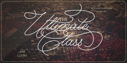 Ultimate Class is an elegant, classy and stylish script typeface. This font also have plenty of beautiful swashes with swirls, 13 - 17 alternate character for lowercase letter. Ultimate Class perfect for signatures, quotes, branding, wedding invite and card, elegant logo, poster, packaging, stationery, website, and many more. It include OpenType feature with a lot of alternates which help you to make great lettering.
 - Petroglifos by John Moore Type Foundry,
$19.00 Petroglifos is a dingbats font as a collection of pre-Hispanic petroglyphs of indigenous ethnic Venezuela, most of them are found in signs carved in stone or painted in caves of the pre-Hispanic period, each icon is an accurate representation of these ancestral signs. Forms are very interesting from a visual, anthropological, historical and semiotic point of view.
 - Balboat by Ingrimayne Type,
$9.95 Balboat is a plain calligraphic face with a very small x-height, long descenders, and tall ascenders. Having the appearance of a pen-drawn sans serif, it has four styles: regular, bold, italic, and bold italic. Although Balboat is quite legible, it is condensed and may need to be printed at a larger point size than other typefaces.
 - Code Pro by Fontfabric,
$29.00 Code Pro is a font family inspired by the original Sans Serif fonts like Avant Garde or Futura, but with a modern twist. It is clean, elegant and straight-to-the-point. Code font is applicable for any type of graphic design—web, print, motion graphics, etc.—and perfect for t-shirts and other items like posters and logos.
 - Kodiak by Borges Lettering,
$45.00 Kodiak was designed by 40+ year sign painting veteran, Brian Grant, and is loosely based on the works of many great sign painting masters. Brian and Charles Borges de Oliveira teamed up to bring this beautiful sign painters classic to the digital age. Kodiak retains the warmth of a hand lettered font without being stiff and mechanical. Great for period style lettering to modern day logos. With over 160 alternates and 10 ornaments you are bound to find the right look for your next design!
 - Gothic Tuscan Round by Wooden Type Fonts,
$20.00A revival of one of the popular sans serif wooden type fonts of the 19th century, narrow, rounded strokes at top and bottom, pointed horizontal devices in centers, no lower case designed. - P22 Aragon by IHOF,
$24.95 A whimsical font with robust curlicues. Designed for display lines on show programs, posters, print ads etc. Many—but not all—of the letters are based on rounded Lombardic medieval forms.
 - Pitkin JNL by Jeff Levine,
$29.00Borrowing from the 1940s, and inspired by printed text found in an old catalog, the slightly imperfect letterforms of Pitkin JNL emulate the hand-lettered look of signs and show cards. - JWX Twisted Star by Janworx,
$19.95 Being a Star is one thing, but being a Twisted one is even better! JWX Twisted Star incorporates your deep desire for stardom into each alpha and numeric glyph, in a bold bordered font. The upper case letters sport a trailing accent, making them shooting twisted stars. This is a single bold typeface, and is intended to be used at a large size in graphics work, adding a not-so-subtle statement to everything from screen printed t-shirts to posters or even embroidery (available at www.janworx.com).
 - Goody Buttie by Zamjump,
$13.00 Hello goody butty is a laid-back, casual paint brush handwriting font. Whatever the topic, this font will be a wonderful asset to your font library, as it has the potential to enhance any creation. Included uppercase and lowercase multi language ligature
 - Bohemian Initials by Kaer,
$24.00 I’m happy to present you the Bohemian initials font family. Regular and Colored styles (Uppercase & Numbers) based on Codex Gigas originated in medieval Bohemia. The manuscript has been dated 1230. The elaborate initials are at the beginning of the main texts and their principal divisions. The painter was aiming to achieve a plastic depiction of the trailing vines of the initials, and he painted with solid colours. He used only four of the primary colours cinnabar red, blue, green and yellow, brightly toned, as well as white accents and contours. The trailing vines of the initial letters are painted in a decorative, advanced Romanesque style, already bordering on naturalism. The plant taken as the starting point is the acanthus, a thistle-like plant which grows wild in the Mediterranean countries. The decoration of the Devil’s Bible is not the work of an amateur. Scholars have concurred: it is book illuminations created in Northeast France and Southern England in the so-called Channel style which provided the starting point for the coiled trailing-vine shapes in the initials of the Devil’s Bible. --- You can use color fonts in PS CC 2017+, AI CC 2018+, ID CC 2019+, macOS 10.14 Mojave+ Please note that the Canva & Corel & Affinity doesn't support color fonts! --- Please feel free to request any help you need: kaer.pro@gmail.com Thank you!
 - P22 Tai Chi by IHOF,
$24.95 Experimental lettering Stephen Rapp created in 1999 became the spark that Stephen's imagination transformed into the Tai Chi design. Tai Chi is a display face but it could also be used as a textured calligraphic script. Its delightful sense of movement distinguishes it from other scripts. Individual characters stand poised in a vertical Zen-like balance while at the same time displaying an inner rhythm that makes them appear to dance along the line. Rich in texture and variation, Tai Chi works very well at medium and large point sizes. The font contains several alternate letters that help maintain a hand-lettered look. Tai Chi includes both upper and lowercase letters but works well in all uppercase settings.
 - Egoism by WTFont,
$10.00 Presenting a proud and tall font! The ability to express emotion through typography is one that is very much needed. Thus, the idea of emotional typography to communicate feelings was born. The emotion of Egoism is primarily one that is self serving and personal. While appearing to be deceptively simple, it is designed to have a handmade effect. The center point of the letters has been raised, giving the letters and glyphs a taller appearance. This reflects the feeling of having an inflated Ego. The handmade aspect of this font is what makes it great for giving any design a personal touch. Pair it with a bold Sans Serif font which also has a hand made appearance. Create designs with this Egoism font that enhances your hand made looking pieces!
 - Salminah by Letterafandi Studio,
$14.00 Salminah is a fashionable and thin lettered script font. Suitable to a wide variety of designs due to its neat and simple style, this font has the potential to become your favorite go-to font, no matter the occasion!
 - Viktor by Librito.de,
$10.00 The design for the font "Viktor" is based on original woodcut letters I purchased on a Flea Market. I handprinted the letters and converted the result into a font. The font preserves the rough and handmade character of the printed letters. To make the font more useful especially for packaging I designed in addition to the original font an outline version, a shadowed version and a striped font.
 - Driveway Stencil JNL by Jeff Levine,
$29.00We've all seen the informational markings on commercial driveways or roadways instructing us which way to turn, where to park, etc. They are usually in stencil lettering 16 inches or taller, with compressed letters that make the horizontal strokes look slightly thicker than the vertical ones. By condensing the lettering in Narrow Stencil JNL by 20 percent, the result is Driveway Stencil JNL - a digital emulation of those painted road markings. - Bonjour by Nicky Laatz,
$25.00 Say hello to BONJOUR! A bold and beautiful brush-lettered font with inky watercolour-like contours, and a natural hand-painted look. Bonjour comes with Opentype alternate upper and lowercase characters, - switch between the letters available to make your lettering look more natural and less like a font. Perfect for using in ink or watercolour based designs or on its own as bold hand-brushed lettering. Bonjour makes for fun, bold branding, quotes, greetings, adverts, posters, packaging and so much more.
 - Jonesy by Ksenia Belobrova,
$39.00 Jonesy is a funny modern looking script with a touch of vintage. It’s based on calligraphy and pretends to look like real lettering having almost 700 alternates and ligatures, organic forms and realistic connections. Jonesy is good for menu, packaging, posters and as a starting point for lettering and logos. All contextual alternates are built into the “Liga” feature that is turned on by default. However, when your work with the typeface, please make sure that “Liga” is turned on.
 - Edits And Credits JNL by Jeff Levine,
$29.00Edits and Credits JNL is a cheerful sans serif typeface modeled from ceramic letters in a movie titling set from the late 40s or early 1950s. In the original kit, letters would be lined up accordingly against a contrasting background and photographed for home or professional movie and slide titles. Note: The cap height is slightly smaller than normal for the respective point size. This will give the effect of wider line spacing - similar to that of home movie titles. - Arepo by Stone Type Foundry,
$49.00 Arepo is a display typeface inspired both by the Imperial Roman letter and the forms of Giambattista Bodoni. Together with Stone Print, SFPL, and Cycles it makes up a superfamily of typefaces.
 - Pagnol by Typorium,
$15.00 The Pagnol typeface has been designed with a principle developed by A. M. Cassandre in 1937, when the great French designer created the Peignot typeface following paleographic studies on the evolution of letterforms. Researches in the history of writing have proved that the lowercase "a" is at its origin nothing but the "A" shape transformed through centuries by scribes until the invention of printing. A large number of lowercases meanwhile kept their original shapes. If the scribes’ hand didn’t find the necessity to simplify them, it is only because these letters could be easily written. Integrating the classical shapes of capitals to the lowercases has already been used, keeping the lowercases which are only a deformation of capitals. Nevertheless, the respect of readability imposes to keep ascendants and descendants from traditional lowercases which serve as optical focus points in a text and make reading easier. The particularity of Pagnol is to use rounded shapes on top and bottom of pointed capital letters to make them fit with corresponding lowercases (Aa, Mm, Nn, Vv, Ww, Zz). Lowercases proportions are wide, to be in tune with classic lowercase shapes in order to optimize readability. Five weights in roman and italic have been designed to offer a wide palette of typographic possibilities in all sizes and all paper and screen supports.
 - Society Members by Ali Hamidi,
$10.00 Society Members is a cool, quirky and thick lettered display font. Whether you’re using it for crafts, digital design, presentations, or making greeting cards, this font has the potential to become your favorite go-to font, no matter the occasion!
 - Faqro Extended by ffeeaarr,
$9.00 Ditch the generic, embrace the expressive. In a world saturated with pixels and noise, your brand deserves to stand out. Our meticulously crafted digital tech fonts are more than just letters – they're the secret weapon to unlocking your brand's full potential
