3,636 search results
(0.008 seconds)
- Zebramatic by Harald Geisler,
$14.99 Zebramatic - A Lettering Safari Zebramatic is a font for editorial design use, to create headlines and titles in eye-catching stripes. Constructed to offer flexible and a variety of graphical possibilities, Zebramatic type is easy to use. The font is offered in three styles: POW, SLAM and WHAM. These styles work both as ready-made fonts and as patterns to create unique, individualized type. The font design’s full potential is unleashed by layering glyphs from two or all three styles in different colors or shades. Working with the different styles I was reminded of the late Jackson Pollock poured paintings—in particular the documentation of his painting process by Hanz Namuth and Paul Falkernburg in the film Jackson Pollock 51. In Pollock’s pictures the complex allure arises from how he layered the poured and dripped paint onto the canvas. Similar joyful experience and exciting results emerge by layering the different styles of Zebramatic type. Texture In the heart of the Design is Zebramatics unique texture. It is based on an analog distorted stripe pattern. The distortion is applied to a grade that makes the pattern complex but still consistent and legible. You can view some of the initial stripe patterns in the background of examples in the Gallery. Zebramatic POW, SLAM and WHAM each offer a distinct pallet of stripes—a unique zebra hide. POW and WHAM use different distortions of the same line width. SLAM is cut from a wider pattern with thicker stripes. The letter cut and kerning is consistent throughout styles. Design Concept Attention-grabbing textured or weathered fonts are ideal for headlines, ads, magazines and posters. In these situations rugged individuality, letter flow, and outline features are magnified and exposed. Textured fonts also immediately raise the design questions of how to create alignment across a word and deal with repeated letters. Zebramatic was conceived as an especially flexible font, one that could be used conveniently in a single style or by superimposing, interchanging and layering styles to create a unique type. The different styles are completely interchangeable (identical metrics and kerning). This architecture gives the typographer the freedom to decide which form or forms fit best to the specific project. Alignment and repetition were special concerns in the design process. The striped patterns in Zebramatic are carefully conceived to align horizontally but not to match. Matching patterns would create strong letter-pairs that would “stick out” of the word. For example, take the problematic word “stuff”. If Zebramatic aligned alphabetically, the texture of S T and U would align perfectly. The repeated F is also a problem. Imagine a headline that says »LOOK HERE«. If the letters OO and EE have copied »unique« glyphs - the headline suggests mass production, perhaps even that the designer does not care. Some OpenType features can work automatically around such disenchanting situations by accessing different glyphs from the extended glyph-table. However these automations are also repeated; the generated solutions become patterns themselves. Flip and stack To master the situation described above, Zebramatic offers a different programmatic practice. To eliminate alphabetic alignment, the letters in Zebramatic are developed individually. To avoid repetition, the designer can flip between the three styles (POW, SLAM, WHAM) providing three choices per glyph. Stacking layers in different sequences provides theoretical 27 (3*3*3) unique letterforms. A last variable to play with is color (i.e. red, blue, black). Images illustrating the layering potential of Zebramatic are provided in the Gallery. The design is robust and convenient. The font is easily operated through the main font panel (vs. the hidden sub-sub-menu for OpenType related features). The process of accessing different glyphs is also applicable in programs that do not support OpenType extensively (i.e. Word or older Versions of Illustrator). International Specs Zebramatic is ready for your international typographic safari. The font contains an international character set and additional symbols – useful in editorial and graphic design. The font comes in OpenType PostScript flavored and TrueType Format.
 - Origami by Monotype,
$29.99In spite of its angular appearance, Origami is composed almost exclusively of curves. Designer Carl Crossgrove derived the typeface from experiments in designing a low resolution type. The resulting face is reminiscent of Eastern European expressionist designers such as Oldrich Menhart and Vojtech Preissig. It is paired with an equally angular chancery italic. Origami works effectively for short blocks of text or at display sizes, while the capitals are especially suitable for titles. - Sorren by Reserves,
$49.00 Sorren is a definitive bold condensed sans influenced by neo-grotesque designs. A relatively low stroke contrast complimented with sharp, horizontal stroke ends lend an unyielding appearance, while it’s rounded forms and refined curves juxtapose its inherent strength with grace. Stylistically, Sorren has a classic, timeless feel with a contemporary finish and attention to detail. It is characteristically more elegant and considerably sturdier than the typical condensed sans, lending to its singular disposition.
 - Decutto by Michael Rafailyk,
$15.00 Decutto is a neo-grotesque that packs the Marionette formula and some blackletter ideas into a low-contrast sans serif design. Its name plays on the phrases “off cut” and “cut to” which express the key feature – the contemporary legible letter shape is decorated with cut carved edges and counters, giving the typeface crisp and simplistic look, like that of an old minted coin. Scripts: Latin, Greek, Cyrillic, Hebrew. Hinting: Manual PostScript.
 - Otterco by Adam Ladd,
$24.00 Otterco is a geometric sans serif with varied round and narrow characters. Blending a touch of retro and modern qualities, this typeface is clean and neutral but not boring. It’s professional yet unique and fun. The contrast in character widths creates a distinct visual rhythm and the vertical cut terminals keep it consistent, strong, and sharp looking. Constructed with a large x-height and low stroke contrast, it can fit a variety of applications.
 - Aribau Grotesk by Emtype Foundry,
$69.00 Born from the intersection of the geometric and grotesque typefaces. Aribau Grotesk combines low contrast and generous width proportions with typical traits of american gothics from the early 20th century, like the counters aperture and a double story ‘g’. Driven by the process, some details that come from the geometric style arose, like the clean-shaped figures and the circular dots that convey a more affable and contemporary look. Aribau Grotesk PDF.
 - Benton Sans RE by Font Bureau,
$40.00 A redesign of drawings of News Gothic from the Smithsonian, Cyrus Highsmith and the Font Bureau studio created Benton Sans, one the most popular and versatile families in this genre. This version of the family is part of the Reading Edge series of fonts specifically designed for small text onscreen, having been adjusted to provide more generous proportions and roomier spacing, and having been hinted in TrueType for optimal rendering in low resolution environments.
 - BR Segma by Brink,
$30.00 BR Segma is a geometric sans-serif type family of 8 weights plus matching italics. Geometric precision and modern utility create a contemporary modern aesthetic, while open apertures, and low contrast strokes provide a comfortable reading experience. Segma builds upon geometric traditions but remains firmly in the present. BR Segma provides advanced typographic support with features such as case sensitive forms, fractions, slashed zeros and multiple figure sets. For custom enquiries please contact: mail@brinktype.com
 - Susan Classic by ParaType,
$30.00 An original text and display type family was designed for ParaType in 2008 by Manvel Shmavonyan to be used together with Susan, earlier released sans by the same author. This is a low-contrast slabserif font with open letterforms. Its shape is distinguished by one- and two-sided rounded serifs. Susan Classic is well suited for short and middle range text composing as well as for use in advertising and display typography.
 - Luxus Brut by phospho,
$25.00 Luxus Brut breathes the spirit of hand lettered signage of the Fifties. It’s a formal script, inspired from a well concealed shop portal in Vienna/Austria. Large and distinctive capital letters, wide spacing as well as a low x-height make it an excellent choice for posters, magazine headlines, logotypes, branding and any design that requires a touch of luxury and sensuality. You might also have a look at the stylistically related Luxus Brut Sparkling.
 - Muffin by ParaType,
$30.00 Muffin is a soft and rounded humanistic low-contrast sans serif based on broad nib writing. It comes in five weights ranging from Regular to Black. The friendly character of the font becomes even more pronounced in the darkest styles. Muffin is well suited for food packaging, menus, children's products, while Regular may be easily used for long runs of text. The font was designed by Natalia Vasilyeva and released by Paratype in 2017.
 - Broide by Craft Supply Co,
$20.00 Broide: Softness Meets Serif Introducing Broide – Display Serif, where softness shapes strength. This bold, low-contrast serif font is friendly. Rounded serifs give it a gentle character. It’s a font that combines clarity with warmth. A Friendly Touch Broide brings a friendly vibe to your words. Its rounded serifs soften its bold stance. This typeface looks strong yet approachable. It’s ideal for invitations and branding. Also, it’s perfect for creating a welcoming feel.
 - MC Raktor by Maulana Creative,
$18.00 Raktor is a modern Display serif font with medium-low stroke contrast, fun characters with a few ligatures and alternates to let you unlock extra creative work. Raktor supports more than 100+ languages. This font is good for logo design, social media, movie titles, books titles, short and even long text, lettering. Raktor also works great when combined with other script or serif fonts as a secondary text font. Create stunning work with Raktor!
 - Lucca by João Henrique Lopes,
$39.00 Inspired by Italian Renaissance fonts like Poliphilus, Blado, Centaur and Arrighi, Lucca presents a simple charm and a powerful classic feel. It is cute, friendly, clear and superbly readable. Its low contrast provides Lucca a firm yet flexible substance, making it sensual and enticing. There’s a certain degree of abstraction in the precise endings, and the whole design was made to survive even in the harshest conditions, conserving its readability and beauty.
 - Noam Text by TypeTogether,
$69.00 Adi Stern’s Noam Text shows that typographic progress is often in the small things — in the perfecting of familiar traditions and in staying loyal to the spirit of what came before. It can’t really be called progress unless it honours its history. In this way, TypeTogether is happy to introduce Noam Text: A Hebrew and Latin serif font that builds on its heritage with the twin tools of honour and progress. Since 1908, the Frank-Rühl fonts have dominated the Hebrew book and newspaper market. Noam Text’s design goal was to create a coherent family with both Latin and Hebrew serif text typefaces, each authentic to its own script, and which would serve as an alternative to last century’s predecessor. In short order, users will recognise Noam Text as a source of progress in its bilingual abilities. Hebrew and Latin have opposite reading directions, creating many issues: opposing directionality of the open counters; vertical stress in Latin, but horizontal in Hebrew; fewer extenders in Hebrew; and no Hebrew capital letters. All these have been taken into account in Noam Text’s modern design. Of unique importance — all punctuation marks have a Hebrew version, which makes each script complete and uncompromising. Among other technologically advanced details, Noam Text was programmed for all expected scenarios of mixing Hebrew, Latin, figures, and punctuation. Noam Text is intended mostly for setting long texts, so it strives to achieve maximum legibility in minimum space with its large x-height, short and fairly condensed Latin capitals, large and open counters, and low contrast. Originally derived from the Hebrew, the shallow horizontal curves and strong baseline serifs provide dynamism and enhance the reading flow. Noam Text Latin’s italic is rounded and reading friendly, is condensed to generate a lighter texture than the roman, and has a flowing stance. These virtues help it endure harsh printing conditions and subpar inks and paper. Noam Text’s three total weights provide a proper solution for integrating texts in both scripts, as well as a contemporary alternative for use in books, newspapers, and magazine design. Aligned with TypeTogether’s commitment to produce high-quality type for the global market, the complete Noam Text family displays an impressive amount of discretion, applying to wide use-cases by not edging too close to religious motifs or imbibing in secular indulgence. This means Noam Text can be the go-to family across the board and capitalise on the desire for clear typographic progress in this modern age.
 - Night Sign JNL by Jeff Levine,
$29.00 For decades, the soft glow of a neon sign beckoned weary travelers to roadside rest courts, told the hungry individual where to eat; let enthusiastic revelers know where the night life was happening. There is something special about a neon sign, yet changing times, city ordinances and even technology itself is turning this staple of urban life for over a hundred years into a museum piece. Night Sign JNL emulates the craft of hand-formed neon signage and it (along with a few added special effects) can really add some good-old-fashioned pizzazz to a print or web project.
 - Linotype MhaiThaipe by Linotype,
$29.99Linotype Mhai Thaipe is part of the Take Type Library, chosen from the entries of the Linotype-sponsored International Digital Type Design Contests of 1994 and 1997. The work of German designer Markus Remscheid, the name is not hard to recognize as an English-Asian play on my type and describes its general character. The small circles which ornament the alphabet and the unusual flowing forms which look like a mixture of Arabic and Sanskrit combine to give the typeface an ornamental, exotic look. Linotype Mhai Thaipe is best used for headlines with point sizes of 12 or larger. - Contane Condensed by Hoftype,
$49.00 Contane Condensed is the slim complement to the Contane Family. Its economic proportions permit space saving applications, in particularly, eye catching headlines and subheads. Contane Condensed is high-contrasted, and the spiky wedge shaped serifs, still result in an elegant text flow. Contane supports up to 80 languages and it’s OpenType format allows a wide range of typographic applications. 20 styles offer fine graduation of the weights. All weights contain small caps, ligatures, superior characters, proportional lining figures, tabular lining figures, proportional old style figures, lining old style figures, matching currency symbols, fraction- and scientific numerals, matching arrows and alternate characters.
 - Kyoto Northern by 38-lineart,
$14.00 Kyoto Northern is a great choice for a brand identity, suitable for packaging, web banners, headlines and business cards, very unique and natural. This font is handwritten using a marker pen, equipped with a ligature following the habit of writing quickly, so you can feel the sensation of handwriting which is very natural. When you write in a relaxed and calm state, your writing will look very good and the writing flows well. Kyoto is the name of the city that we chose as a representative of calm and natural. Type and feel the amazing handwriting.
 - Carolyna by Emily Lime,
$59.00 Carolyna is an elegant, yet whimsically handwritten calligraphy font that was created with readability in mind. It uses open-type features to assist with letter flow and to give each creation that modern, hand-lettered touch. With over 1000 characters, there are many stylistic alternates to choose from, tons of foreign characters so you can write in other languages, and fun swashes to give headings a little something extra. Note: The Pro version contains ALL characters - but if you can't use open-type, I highly recommend opting for one of the other options where what you see is exactly what you get!
 - Mangosteen Font Duo by Scratch Design,
$12.00 Say hello to "Mangosteen Font Duo". Just like mangosteen, these handwriting duo fonts are also sweet, soothing and very suitable for use as a font in casual designs. This font will be perfect for casual typeface in greeting cards, illustrations, quotes, branding, book covers, children's books, packaging, and more. Mangosteen Font Duo has a natural flow handwritten signature containing upper & lowercase characters, numerals, and punctuation. This font also has a ligature, stylistic alternate, swashes, and multi-language support Both have some pretty ligatures built into their OpenType features - make sure you have your ligatures turned on to get their benefit.
 - Bandleader JNL by Jeff Levine,
$29.00 How does one arrive at a font name? With the thousands of digital typefaces available, it's not an easy process. Bandleader JNL was modeled from the hand-lettered title on a piece of sheet music called "Largo", which means "slow tempo". Since the names "Largo" and "Tempo" were already taken, what other musical theme would fit? The lettering is in an Art Deco style, and Big Band was all the rage of the Art Deco period; therefore "Bandleader". Sometimes the road to naming a font takes on many twists and turns but the end result is always gratifying.
 - Bountiful Signature by Arendxstudio,
$17.00 Bountiful Signature is a high energy signature-style script font guaranteed to make a big impression. Digitally hand-drawn, it's super-clean smooth flow and high-intensity pen strokes make an unmistakeable impact in logo/branding projects, large header text and product packaging. Features: 1.Uppercase & Lowercase 2.Numer & Punctuation 3.Multilingual support 4.Ligatures 5.Alternates There it is! I really hope you enjoy it - comments & likes are always welcome and accepted. More importantly, don't hesitate to send a message if you have a problem or question. Now just read this, go there and make it happen :)
 - Suave Script Pro by Sudtipos,
$49.00 Sun-tanned, smooth, and fluid. Suave Script is based on disconnected calligraphy originating from a how-to lettering book from the 1950s. The uppercase letters dance, and then dance some more - Samba, Tango, Mambo or Candombe - take your pick. The lowercase flows like honey waiting to be licked off the comb. A rare gem - depicting the sweet hustle and bustle of life of a history-rich urbanism. Suave Script is at once fashionable, human, and creative. For this new Pro version a number of endings, ligatures and an extensive range of languages were covered (Western and Eastern European, Baltic, Turkish, Maltese and Celtic)
 - Slenderz by CozyFonts,
$25.00 Slenderz is a handwritten font designed by Tom Nikosey, an American Graphic Designer specializing in Typographic Design and Illustration. Slenderz is available in Light, Medium & Bold weights. CozyFonts Foundry is Tom's intro into the world of font design. Slenderz is a casual, handwritten font that gives a reserved yet firm and legible personality to any headline or copy. Each of the 3 weights has it’s own personality yet like 3 brothers they represent the and belong to the same family. Intermixing Light & Bold or Medium & Bold won’t ruin the flow but will enhance it. Slenderz is the 9th font family from CozyFonts Foundry.
 - Gastonica by Atharuah Studios,
$16.00 Introducing Gastonica; A stylish script font! Gastonica is a stylish handwritten script font designed with love and completely hand-drawn. Every letter created, shows a flow that looks elegant and stunning. Gastonica also has several ligatures to add an organic feel to every word that is displayed. It's the perfect choice for stylish branding & logo projects, product packaging, handwritten quotes, editorial design, and more. What's Included: Gastonica comes with a single font file that includes uppercase, lowercase, numbers, punctuation, and multilingual support. That's it! I hope you enjoy it. You can also say hello to me on Instagram: https://www.instagram.com/atharuah_ Thank You!
 - Saltbush by Estudio Calderon,
$39.00 Saltbush is a collection of 3 hand made fonts following Pistacho's design line. Through an intelligent ligatures system we could design a typeface that imitates the strokes of a round brush pen and generates a flowing and organized writing. Saltbush contains 3 variables: 2 scripts, regular and bold, each one has 776 glyphs and; a beautiful display font. This typefamily has an extended characters set to support the languages in central and east Europe, as well as the ones used in west Europe. Keeping in mind the particularity of Saltbush design, it is possible to create beautiful graphics with a "hand made" look.
 - Cargan by Hoftype,
$49.00 Cargan merges the strength of the slab serif with a gentle line flow. The result is a versatile typeface family with a distinct personality that performs superbly in headlines as well as subheads and shorter text applications. The Cargan family consists of 16 styles and is well suited for ambitious typography. It comes in OpenType format with extended language support. All weights contain ligatures, superior characters, proportional lining figures, tabular lining figures, proportional old style figures, lining old style figures, matching currency symbols, fraction- and scientific numerals and matching arrows. The roman styles offer alternative versions for the ”a” and ”g” characters.
 - Chrysante by Mans Greback,
$29.00 Chrysante is a flowing pen script. The typeface was drawn and created by Måns Grebäck between 2018 and 2020. Its thin lines are inspired by mid-century advertising, emits optimism and has a strong personality. The ink script family consists of three weights: Chrysante Thin, Chrysante Medium and Chrysante Bold. Its multiple alternate alphabets gives the font a true handwritten feeling. Use it for a logotype, a greeting card or as a headline. The font contains all characters you'll ever need, including all punctuation and numbers. It has an extensive lingual support, covering all European Latin-based scripts.
 - Italian Breakfast by Roland Hüse Design,
$12.00 Italian Breakfast is a handwritten, fun and happy modern calligraphy script font designed with iPad. Carefully crafted, clean vectors in Glyphs App. You can create beautiful hand-made typography with its bouncy, organic flow. Contains all Wester and Central European accented characters, currencies: Thai Baht, Euro, Dollar and Yen. For additional accents and/or customisation please feel free to message me here or email contact@rolandhuse.com Italian Breakfast is perfect for all your creative projects wether it be indie logos, printed quotes, invitations, greeting cards, Instagram posts, products, packaging, blog headers etc. Happy creating and good luck with your work!
 - The Billates by Letterhend,
$14.00 Looking for a script font with a casual flair? Look no further than Billates! With its natural and free-flowing style, this font exudes a relaxed and informal look that is perfect for capturing a laid-back atmosphere. From handwritten notes to product packaging, Billates brings a touch of casual elegance to your design projects. Features : Uppercase & lowercase Numbers and punctuation Alternates & Ligatures Multilingual PUA encoded We highly recommend using a program that supports OpenType features and Glyphs panels like many of Adobe apps and Corel Draw, so you can see and access all Glyph variations.
 - Hand Cursive by Okaycat,
$25.50 Hand Cursive design is a cute cursive font, written by hand—careful writing with a steady pen! The applications of this full-out cursive font are many. It is designed to be creative & free-flowing, but I also wanted it to be at least somewhat proper. Use Hand Cursive any time you want fancy, legible, and luxurious text. Works great for logo design and beautiful for titles. Go ahead and have fun with it. Hand Cursive is extended, containing the full West European diacritics & a full set of ligatures, making it suitable for multilingual environments & publications.
 - Thermind by Maculinc,
$15.00 Thermind is a bold script typeface with a unique angle and is easy to read so that it is comfortable to use. This font is made with an old feel which is perfect for vintage/retro themed events. You can also use them as logos, badges, badges, packaging, titles, posters, t-shirts/clothing, greeting cards, business cards and wedding invitations and more. Flowing characters are ideal for crafting a compelling message to your taste. mix and match with many alternative characters to suit your project. It will be more interesting if you add Extruded Fonts and alternatives.
 - Garrison by Latinotype,
$39.00 Garrison is a contemporary sans serif that offers a straightforward interpretation of the English humanist sans, gently blending rigid tones over a warm structure. It’s available in 7 weights and it comes with a duo-italic set; on the one hand the Oblique complements your text as the slanted version of the Regular, and the smooth, flowing italic will make your written piece stand out brightly. This simple and carefully crafted typeface, with traits flirting with geometry, becomes a powerful workhorse. Its versatility makes it ideal for both paragraphs and bigger typesettings, a great choice for branding, signage, editorial, and more.
 - Rimeland by Letterhend,
$19.00 Introducing, Rimeland Script - A beautiful modern calligraphy script based on manual hand writing. The natural flow with the swashes make this font looks even more prettier. This type of font perfectly made to be applied especially in wedding invitation, labels, logos, magazines, books, greeting / wedding cards, packaging, fashion, make up, stationery, novels, labels or any type of advertising purpose. Features : uppercase & lowercase numbers and punctuation multilingual swash and ligature alternates PUA encoded We highly recommend using a program that supports OpenType features and Glyphs panels like many of Adobe apps and Corel Draw, so you can see and access all Glyph variations.
 - Sainthorn by Maculinc,
$18.00 Sainthorn Script is a typeface thick and easy to read, it would be so comfortable to wear .You can use it as a logo, badge, headline, and on insignia, packaging, posters, t-shirts/apparel, greeting cards, business cards, wedding invitations and more. The flowing characters are ideal to make an attractive messages to your taste. Mix and match with many alternative characters to fit your project.It will be more interesting if you add swash / alternative swash. The alternative characters in this font were divided into several OpenType features such as Stylistic Alternates, Ligature and Ligature Alternates. Mail support : maculinc@gmail.com Thank you! Maculinc
 - Fresh Script by TRF,
$15.00 Fresh Script is a handwritten calligraphy font, free flowing, casual and with an elegant touch. This modern style font is perfect to be applied in various formal forms such as invitations, labels, restaurant menus, logos, fashion, make up, stationery, novels, magazines, books, greeting / wedding cards, packaging, labels or any type of advertising purpose. Fresh Script has 385 glyphs and 190 alternative characters, including various language support. With OpenType features with alternative styles and elegant ligatures. The OpenType feature does not work automatically, but you can access it manually and for the best results needed for your creativity in combining this Glyph variation.
 - Captivate by Letterhend,
$19.00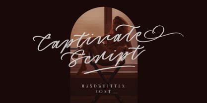 Introducing, Captivate Script - A beautiful modern calligraphy script based on manual hand writing. The natural flow with the swashes make this font looks even more prettier. This type of font perfectly made to be applied especially in wedding invitation, labels, logos, magazines, books, greeting / wedding cards, packaging, fashion, make up, stationery, novels, labels or any type of advertising purpose. Features : uppercase & lowercase numbers and punctuation multilingual swash and ligature alternates PUA encoded We highly recommend using a program that supports OpenType features and Glyphs panels like many of Adobe apps and Corel Draw, so you can see and access all Glyph variations.
 - Paula Matilda by Grezline Studio,
$12.00 Paula Matilda is an elegant and flowing script font. It is PUA encoded which means you can access all of the glyphs and swashes with ease! It features a varying baseline, smooth lines, gorgeous glyphs and stunning alternates. It maintains its classy calligraphic influences while feeling contemporary and fresh. Fall in love with this script font and bring your projects to the highest levels! Feature : - A lot of Alternates ( With a Total of 480+ Glyphs ) - Multilingual Language - Works on PC & Mac - Simple installations - Accessible in the Adobe Illustrator, Adobe Photoshop, Adobe InDesign, even works on Microsoft Word.
 - Rachele by Resistenza,
$39.00 Rachele is a mono line based script thin font. Inspired on the cute “Italian Bella Scrittura” handwriting but influenced by Spencerian. Ornaments and ligatures make this hand more expressive offering round stroke endings and a flowing shape. Rachele is a big family, its stroke expand into extra light till medium and passing through a calligraphic/ribbon effect. At the same time the width varies, that’s make this script even more flexible, from Ultra Condensed to Super Extended. Enjoy it. Check out also Check out also ‘Mentha’ based on Rachele’s skeleton. We recommend to combine Rachele with: Turquoise