10,000 search results
(0.023 seconds)
- Brightline by Lucky Type,
$18.00 Let me introduce my newest font Brightline is a new modern font with an irregular baseline. This is the latest script font for those of you who need elegant writing and the latest design styles and is perfect for wedding invitations, business cards and more. Complete with upper and lower case, as well as multi-language support, numbers, punctuation, and multiple ligatures and swash glyphs.
 - Underland by Wacaksara co,
$10.00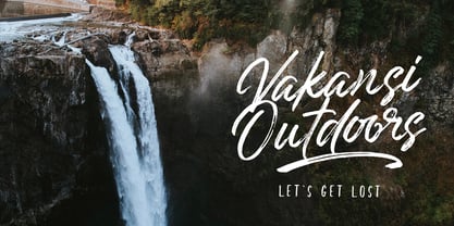 Underland is a rough brush script font with a clear style and dramatic movement this font is great for your next creative project such as logos, printed quotes, invitations, cards, product packaging, headers, Logotype, Letterhead, Poster, Apparel Design, Label, and etc. Underland comes with 4 styles also with uppercase, lowercase, numerals, punctuations, common ligatures and also additional swash to let you customise your designs.
 - Angry Brush by Joy Studio,
$13.00 Introducing ANGRY BRUSH - a very bitter display brush font made for all your resentful ramblings. Available only in upper case (shout mode) and with 17 different unique variations of every single character so it always looks fresh, with no duplicated letters in sight. You can either manually choose your preferred character, or let the contextual alternates rotate through each stylistic set whilst you type.
 - Kuzimy by Twinletter,
$15.00 Introducing kuzimy Arabic style font. With this, Font lets you create designer-quality designs with ease. You will get a variety of styles for your project. They come in upper and lower case and alternate with different shapes. You will be able to easily create professional designs with an Arabic Style theme. This font gives you the best results when used in your projects.
 - Grand Astoria by Pen Culture,
$19.00 Introducing "Grand Astoria - Chic Calligraphy Font" It's a modern chic calligraphy font with natural handwriting. This font perfect for branding, logo design, wedding, invitation and many more. Grand Astoria come with authentic uppercase and lowercase, number and punctuation, beginning and ending swash, lovely ligature. I really hope you enjoy it – please do let me know what you think, always hugely welcomed and appreciated. Thank you
 - Kehunix by Twinletter,
$15.00 Introducing New font KEHUNIX This Halloween Font is the perfect way to create a fun Halloween invitation, party poster, or another type. Simply download and add it to your design using simple instructions and let your imagination go! Of course with this font your various design projects will be perfect and amazing, get a beautiful title and start using our font for your special project.
 - Champloo by One Fonty Day,
$10.00 Champloo is very unique typeface which combines serif features and brush stroke. Some letters have serif, but some don’t. Serif to be found on left side of stem only. It gives a quirky impression on short text. However the larger the text become, the more consistent look it gets as a whole. These two versatile weights let you play with the typeface freely and beautifully.
 - Rollinkland by Almarkha Type,
$29.00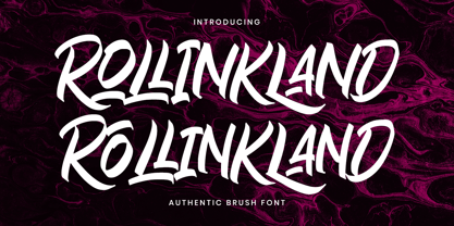 Rollinkland is a Authentic brush font with a clear style and dramatic movement this font is great for your next creative project such as logos, printed quotes, invitations, cards, product packaging, headers, Logotype, Letterhead, Poster, Apparel Design, Label, and etc. Rollinkland comes with uppercase, lowercase, numerals, accents (Multilingual characters), punctuations and so many variations on each character include OpenType alternates, swash to let you customize your design
 - Quote Note by PizzaDude.dk,
$16.00 With Quote Note I did my best to make a simple and unsophisticated font. I wanted the letters to come out as if they were made with a fat marker on a note. Well, I'll let you be the judge on how I succeeded. I've added 4 different versions of each lowercase letter and even did a simple complimentary dingbat. And of course there is multilingual support!
 - Morton by Deltatype,
$59.00 Morton, another modern grotesque typeface which deliver a extraordinary unique within typeface with the style of condensed let you create more impact with your design. Morton Type Family available in nine weights, the Thin weight deliver you a simple hair line stem until you reach the bold weight, you will get more dynamic with three stem weights which give you a modern, old school look and feel.
 - Queensila by Zamjump,
$23.00 Queensila is a comely styled serif font with beautiful ligatures, lots of custom alternative glyphs, and multilingual support. This is a very versatile font that works well in large and small sizes. Queensila is a perfect fit for your project and lets you create beautiful designs, headlines, posters, logos, badges, t-shirts and more. It's also best used for posts, logos, posters, certificates, labels and more.
 - Ritz Stencil JNL by Jeff Levine,
$29.00Browsing online auctions and other webs sites often unearths wonderful examples of lettering from the past. A perfect example is Ritz Stencil JNL, modeled after a page from a 1930s-era lettering book. Although this font has similar characteristics to other better-known designs, there are enough unique differences to let it stand on its own as a great example of the Art Deco era. - Sweetgum by Daily Studio,
$15.00 Sweetgum is an elegant and modern curved font with beautiful alternates. It is easy to use and suitable for headlines, invitations, quotes, business card, posters, etc. You can have fun combining each letter with the alternates. Let yourself explore and use it to create something wonderful. This font includes full uppercase, lowercase, punctuation, and standard multilingual support. With 289 glyphs and in OTF file.
 - Bugatine by Typebae,
$15.00Bugatine is a captivating handwritten monoline signature script font. With its graceful curves and fluid strokes, this font exudes an air of elegance and sophistication. Bugatine perfect for branding, logos, invitations, and more. Let your words dance across the page with this mesmerizing font that effortlessly captures the essence of hand-drawn beauty.Handwritten, Handwriting, Script, Monoline, Signature, Vintage, Stylish, Calligraphy, Wedding, Logo, Fashion, Feminine, Magazine, Branding, Elegant - Liaisons by The Ampersand Forest,
$35.00 A Belle Époque humanist serif in two styles: crisp, high-contrast Haut-Monde and soft, low-contrast Demimonde… When you design a lot of display pieces, you’re often in need of tall, slim type. Liaisons provides that, in a distinct fin-de-siècle style inspired by the great posters of the Gilded Age from Sweden, Denmark, France, and Scotland. (The ampersand alone is a bit of a love letter to Charles Rennie Mackintosh!) Both styles use the same slim skeleton, and are named after the stratum of society where one might find… a “dancing partner.” HAUT-MONDE is a high contrast face of the sort that says “High Society.” Elegant and sleek, it speaks to the refinement of the moneyed classes of a bygone era. Great for high-end products, too! DEMIMONDE is soft and low-contrast — more reminiscent of hand-lettering on Art Nouveau/Jugendstil/Wiener Werkstätte advertisements and posters. A comfortably chic display face all around! Both typefaces feature full Western and Eastern Latin character sets, as well as full Cyrillic/Slavic ones. And, perhaps best of all, both typefaces feature capitals with high, middle, and low waists, so you can change up the look as you see fit! Part of The Ampersand Forest's Sondheim Series
 - Broted Young Plant by Alit Design,
$12.00 Introducing Broted Young Plant Font Duo. Unique and fantastic duo fonts combined or they stand alone. Broted Young Plant Sans Serif font family consists of 14 families, from Thin to Heavy style. The elegant modern font creates a unique design and is sure to steal the eye of the design target audience. Besides being unique, the Broted Young Plant Sans Serif font also has a luxury simple character that makes the design charming and luxurious. Broted Young Plant Script is a signature script that has cool strokes. The line shape of Broted Young Plant Script is inspired by a unique elegant style. In addition, Broted Young Plant Script has an altenate ligature that looks natural and not stiff. Combining the two Broted Young Plant Script and Sans serif fonts will create a design that is charming, unique, elegant and cool. you can see from the design preview. These two fonts are perfect for designs with the concept of elegant, luxury, romance, fashion and so on. In order to use the beautiful swashes, you need a program that supports OpenType features such as Adobe Illustrator CS, Adobe Photoshop CC, Adobe Indesign and Corel Draw. but if your software doesn't have Glyphs panel, you can install additional swashes font files.
 - Katlynne by Ryan Williamson,
$5.00 Katlynne is unpredictable. Katlynne is erratic. Katlynne is beautiful. Katlynne is an alternating contrast, sans serif type family. Arbitrarily separating the characters into ‘rounder’ and ‘straighter’ letterforms to determine what contrast each glyph will take. Katlynne is inspired by the observations made while watching the inexperienced use of broad tip pens. I found how and when individuals rotated their pen gave a visually intrusive, if not also pleasantly conspicuous effect. Often, the pen would naturally rotate horizontally (vertical contrast) on the rounder letterforms, and vertically (reverse contrast) on the straighter ones. This is more or less the formula Katlynne adopts as the contrast changes throughout the styles. Katlynne’s severity of contrast varies from ‘Negative Three’ to ‘Positive Three’ in four weights. With a central style ‘Book’ being the sensible, low contrast font in the family. Within the family there are four weights with 7 contrast styles, with complimenting true italics. Giving a total of 56 fonts! Katlynne's array of options works for creating stylistic similitude within layouts, where conspicuous title faces are needed with a cohesive text face to compliment. Alone, the ends of the contrast spectrum (Negative and Positive Three) create striking word forms for advertising, packaging and anywhere else a loud voice is needed.
 - Aviano Wedge by insigne,
$24.99 Firm and resolute, the sharp, triangular wedge serifs of the new Aviano Wedge stamps your copy with the confidence of late 19th century luxury, wealth, and power. Indicative of banknotes and financial strength, the large, elegant Aviano Wedge is composed in the Latin style. Aviano Wedge takes its original footing from period signage found on a building in Asheville, NC. While shaped largely by engraved faces, the elegant Aviano Wedge maintains the extra-wide comfort and ease found with the rest of the Aviano series. Aviano Wedge comes in six different weights and is packed with OpenType features. As a complement to these characters, Aviano Wedge includes 40 discretionary ligatures for artistic typographic compositions. To see these features in action, please see the informative .pdf brochure. OpenType capable applications such as Quark or the Adobe Creative suite can take full advantage of the automatically replacing ligatures and alternates. Aviano Wedge also includes support for all Western European languages. This new face has also been designed to pair well with the rest of the Aviano series, including our best-selling Aviano, Aviano Serif, Aviano Sans, Aviano Didone, Aviano Flare, Aviano Contrast, and Aviano Slab. Use it alone, or combine Aviano Wedge with any of these other fonts to build the strong presence you’re looking for.
 - New Age Gothic by Type Innovations,
$39.00 New Age Gothic is an original design by Alex Kaczun. It is a contemporary gothic design based on generous proportions and clean crisp lines. Ideally suited for easy reading and long lines of copy. The concept for the design came from a previously successful font family Contax Pro. Alex felt that the skeleton for Contax Pro was ideally suited to modify the design into a true gothic companion typeface series. Numerous modifications where made to the body proportions, stems and shapes. Serifs where added reminiscent to Copperplate Gothic to solidify the overall design. The result is a truly unique modern gothic font. Unlike other typefaces, New Age Gothic incorporates uniform stems throughout the capitals, lower case and figures. This gives the design a uniform appearance in overall color and strength. There is a perfect visual balance between inter-letter spacing, stem weights and proportions. The large Pro font character set, which supports most Central European and many Eastern European languages, also include small caps to compliment the old style figures. As a result, the design is ideally suited for display copy as well as text composition. In the near future, Alex plans to expand the typeface to include a broad range of weights along with italics.
 - Correspond by Create Big Supply,
$17.00 Create beautiful invitations, eye-catching logos, engaging social media posts, and more with Correspond. Its seamless integration of uppercase and lowercase characters, along with its extensive range of numbers and punctuations, ensures a harmonious and cohesive look throughout your design. One of the key features of Correspond is its multilingual support, allowing you to express your creativity in various languages and reach a global audience. No matter the project, Correspond has you covered with its wide array of characters and symbols. Unlock the full potential of Correspond with its PUA encoding, granting you easy access to a wealth of alternate glyphs and ligatures. This enhances your design possibilities and lets you add your personal touch to every project. Experience the power of Correspond Script Font and elevate your typography game. Its seamless curves and elegant flourishes make it a timeless choice for any design. Discover the beauty of Correspond and let your creativity shine.
 - Novera by René Bieder,
$29.00 The Novera family is a sharp geometric sans in ten weights plus matching italics, available in two versions – Modern and Classic. It has a contemporary, approachable and multifunctional yet characteristic design, that comes with an extensive glyphs set of 1000+ glyphs per font, meeting all typographic demands. The Design Vertical terminals, circular shapes and angular apexes – Novera truely breathes geometry! But the concept goes beyond the application of rational geometry. The intension was to create a highly legible family suitable for every day usage inspired by the work of Paul Renner, Eric Gill or Jakob Erbar, combining the geometric with the human and the functional with the unconventional. Although Novera is inspired by the past, its appearance is unmistakingly modern. Modern vs Classic Novera is available in two versions - Modern and Classic - born from the same source file but with different characters set as default. This creates subtle but effective distinctions such as the double-storey a (Novera Modern) which is optimized for legibility in longer text paragraphs, as opposed to the single-storey a (Novera Classic) which allows a purely geometric appearance. Another distinguishing feature are the ascenders on Novera Mondern, which extend above the cap height for an elegant presence, compared to the ascenders on Novera Classic, ending at the cap height, for a compact and helvetica-flavored look. Novera Modern was intended for usage in body copy, whereas Novera Classic was planned for headlines, short paragraphs or logos, but both versions can be used vice versa too, of course. Alternate Characters To maintain neutrality and a modern appearance, the standard character set largely dispenses with idiosyncratic forms. This is in contrast to the alternative forms with the gill-like lowercase letters g and t as well as a traditional shape of S and the German ligature t/z, which traces back to old German spellings. Also inspired by German poster designs from the early 20th century are the elongated i-dots and dieresis-dots that can create eye-catchers in headlines or logos. By the way, both versions, Novera Modern and Classic, can be created via stylistic set 1, 17 and 18. Opentype Features and Symbols The family comes with many opentype features to support modern typesetting. This includes ligatures, different number sets or alternative shapes for texts set in all caps. If you like arrows and other shapes, you will love Novera! The family has a built-in extensive symbols-set including 48 different arrows and various geometric shapes or icons. Weights With its 40 styles and 1000+ glyphs per font, the Novera family covers all thinkable design scenarios from branding to web, app or editorial usage. It blends in perfectly in text heavy paragraphs with its mid-weights like Light, Regular, Medium or Bold or stands out like a monument in headlines and posters with its extreme weights like Thin, ExtraLight, Black or Ultra. Testfonts If you like to test the fonts before buying the full version, please follow the link below. Please note, all test fonts are available for evaluation purposes only and contain a limited character set! A commercial license for the full version must be purchased separately. Please send a mail to contact@renebieder.com for more information. Download the test fonts here: https://www.renebieder.com/test-fonts
 - Sagittarius by Hoefler & Co.,
$51.99 A typeface with lightly-worn futurism, Sagittarius is equally at home among the beauty and wellness aisles, or the coils of the warp core. The Sagittarius typeface was designed by Jonathan Hoefler in 2021. A decorative adaptation of Hoefler’s Peristyle typeface (2017), Sagittarius’s rounded corners and streamlined shapes recall the digital aesthetic of the first alphabets designed for machine reading, a style that survives as a cheeky Space Age invocation of futurism. Sagittarius was created for The Historical Dictionary of Science Fiction, where it first appeared in 2021. From the desk of the designer: Typeface designers spend a lot of time chasing down strange valences. We try to figure out what’s producing that whiff of Art Deco, or that vaguely militaristic air, or what’s making a once solemn typeface suddenly feel tongue-in-cheek. If we can identify the source of these qualities, we can cultivate them, and change the direction of the design; more often, we just extinguish them without mercy. Sometimes, we get the chance to follow a third path, which is how we arrived at Sagittarius. During the development of Peristyle, our family of compact, high-contrast sans serifs, I often found myself unwittingly humming space-age pop songs. Nothing about Peristyle’s chic and elegant letterforms suggested the deadpan romp of “The Planet Plan” by United Future Organization, let alone “Music To Watch Space Girls By” from the ill-advised (but delicious) Leonard Nimoy Presents Mr. Spock’s Music from Outer Space, but there they were. Something in the fonts was provoking an afterimage of the otherworldly, as if the typeface was sliding in and out of a parallel universe of high-tech spycraft and low-tech brawls with rubber-masked aliens. It might have had something to do with a new eyeglass prescription. But I liked the effect, and started thinking about creating an alternate, space-age version of the typeface, one with a little more funk, and a lot more fun. I wondered if softer edges, a measured dose of seventies retrofuturism, and some proper draftsmanship might produce a typeface not only suitable for sci-fi potboilers, but for more serious projects, too: why not a line of skin care products, a fitness system, a high-end digital camera, or a music festival? I put a pin in the idea, wondering if there’d ever be a project that called for equal parts sobriety and fantasy. And almost immediately, exactly such a project appeared. The Historical Dictionary of Science Fiction Jesse Sheidlower is a lexicographer, a former Editor at Large for the Oxford English Dictionary, and a longtime friend. He’s someone who takes equal pleasure in the words ‘usufructuary’ and ‘megaboss,’ and therefore a welcome collaborator for the typeface designer whose love of the Flemish baroque is matched by a fondness for alphabets made of logs. Jesse was preparing to launch The Historical Dictionary of Science Fiction, a comprehensive online resource dedicated to the terminology of the genre, whose combination of scholarship and joy was a perfect fit for the typeface I imagined. For linguists, there’d be well-researched citations to explain how the hitherto uninvented ‘force field’ and ‘warp speed’ came to enter the lexicon. For science fiction fans, there’d be definitive (and sometimes surprising) histories of the argot of Stars both Trek and Wars. And for everyone, there’d be the pleasure of discovering science fiction’s less enduring contributions, from ‘saucerman’ to ‘braintape,’ each ripe for a comeback. A moderated, crowdsourced project, the dictionary is now online and growing every day. You’ll find it dressed in three font families from H&Co: Whitney ScreenSmart for its text, Decimal for its navigational icons, and Sagittarius for its headlines — with some of the font’s more fantastical alternate characters turned on. The New Typeface Sagittarius is a typeface whose rounded corners and streamlined forms give it a romantically scientific voice. In the interest of versatility, its letterforms make only oblique references to specific technologies, helping the typeface remain open to interpretation. But for projects that need the full-throated voice of science fiction, a few sets of digital accessories are included, which designers can introduce at their own discretion. There are alternate letters with futuristic pedigrees, from the barless A popularized by Danne & Blackburn’s 1975 ‘worm’ logo for NASA, to a disconnected K recalling the 1968 RCA logo by Lippincott & Margulies. A collection of digitally-inspired symbols are included for decorative use, from the evocative MICR symbols of electronic banking, to the obligatory barcodes that forever haunt human–machine interactions. More widely applicable are the font’s arrows and manicules, and the automatic substitutions that resolve thirty-four awkward combinations of letters with streamlined ligatures. About the Name Sagittarius is one of thirteen constellations of the zodiac, and home to some of astronomy’s most inspiring discoveries. In 1977, a powerful radio signal originating in the Sagittarius constellation was considered by many to be the most compelling recorded evidence of extraterrestrial life. Thanks to an astronomer’s enthusiastically penned comment, the 72-second transmission became known as the Wow! signal, and it galvanized support for one of science’s most affecting projects, the Search for Extraterrestrial Intelligence (SETI). More recently, Sagittarius has been identified as the location of a staggering celestial discovery: a supermassive black hole, some 44 million kilometers in diameter, in the Galactic Center of the Milky Way. <
 - Sublime by Coniglio Type,
$19.95 Sublime45-Regular Sublime Revised for 2021. One font in Opentype format as Sublime45. Families and all TT Truetype versions eliminated in this wonderful stand alone. The Spring 1997 original release of Sublime —borne an organic creature of black water soluble ink & digitized by Coniglio Type. Sublime is a fun font to use in commercial layouts. It is soft and fluid as ink. Like the wrinkles of time, it is imperfect. That in itself makes it incredibly attractive, warm and “human factor”. Sublime offers legibility so sorely missed in the current recreational font market. Sublime was inspired by World War II US fighter pilot Donald Alling. He flew missions over Nazi Germany. His squadron also dropped food, medicine and relief supplies over the Netherlands. Known as “the Colonel” to his friends. Don as a civic engineer ruled literally miles of ink letter callout’s with a template device called a LeRoy in peacetime on vellum and mylar across his career as a technical illustrator. You didn't want to screw up inking into a template with wet black permanent ink. You really had to have a steady hand and it was all done by hand. You can say Don worked “unplugged”. And that is cool! He was part of the broad stroke of postwar industrial expansion that helped keep America strong, rendering exploded views on top secret projects. Many of us were not even born yet when all this was going on. Today at over 80 years young Don is like a national treasure, savvy and bright—and the ladies love him! The Colonel remains a dedicated master airbrush man, stand–up man, caricature artist and letterman all without use of a computer! He was lucky enough to retire before a desktop cathode tube was put in his face. Today the Colonel enjoys restoring VW’s, flying and freelance consulting when not being called to supper by his lovely wife Rea.
 - JAF Lapture by Just Another Foundry,
$59.00 Lapture is based on the Leipziger Antiqua by Albert Kapr, released in 1971 by the East German foundry Typoart. It has been extended and carefully redesigned by Tim Ahrens in 2002-05. The strong calligraphic characteristics are a result of the design process: "The size of the counters and the width of individual characters at small optical sizes were analysed with a steel pen while the letter shapes were designed in larger size with a specially trimmed reed pen. Sometimes the hand is more innovative than the head alone," says Kapr. A unique feature of this font is the introduction of gothic shapes into a latin typeface. "The basic concept is to string together narrow white hexagons as counters and inter-letter spaces, defined by vertical stems and triangular serifs. The interior spaces are at least as important as the strokes that make up the characters." Lapture is an ideal choice if a reference to gothic style is desired, as true black letter types are often too eye-catching and not as legible as latin fonts for unfamiliar readers. "The last few years have seen a number of very elegant typefaces based on the mellow and feminine renaissance model. However, sometimes we require a font that is strong and robust, harmonic yet rigid," says designer Tim Ahrens. JAF Lapture is provided in OpenType format. Each font contains more than 600 glyphs, including true small caps, nine sorts of figures, contextual and stylistic alternates and accented characters. This means that you only need to purchase one font whereas in other families you would have to buy two or three fonts in order to get the same. Technically, they follow the Adobe Pro fonts and provide the same glyph set and OpenType functionality. JAF Lapture Basic is provided in OpenType format. Each font contains the standard sets of both MacOS and Windows. In contrast to JAF Lapture they do not provide any advanced OpenType features and no extended glyph set.
 - Vocaloid - Personal use only

- Vocaloid Oblique - Personal use only

- Nova Horst by PintassilgoPrints,
$35.00 Nova Horst is an amplified version of Horst, a highly original font (MyFonts Rising Star) based on etchings by the extraordinary artist and printmaker Horst Janssen. Nova Horst keeps all the amazing wilderness of the original font, while enriched with sharp OpenType programming, plus a whole new set of alternates, a handy set of ornaments and loads of cool unpredictable overlapping glyphs. Language support was also expanded. Now there are 5 sets of letters, 2 sets of numerals and a robust set of discretionary ligatures. OpenType functionalities now include an extremely playful Contextual Alternates feature and also Discretionary Ligatures and Stylistic Alternates. Nova Horst is an energizing blend of eccentric characters, cool OpenType features, loads of alternates and a meticulous kerning table. But be warned: as the original font, this one is quite addictive! A quick roadmap: • All features turned off: you can choose the different letterforms stored on upper- and lowercase sets. There are no overlapping letters. • Contextual Alternates turned on: you get alternating characters from 4 sets of glyphs, with loads of overlapping letters, all managed by a carefully handcrafted kerning table. The result is a very cool random effect on glyphs distribution. • Discretionary Ligatures turned on: now some additional glyphs enter the scene. There are more than 60 ligatures glyphs which substitute pairs of letters for some extra-coolness • Stylistic Alternates turned on: access the counterless glyphs from the Stylistic Alternates set. Use each feature alone or mix them up for added boldness. Gorgeous extravaganza guaranteed!
 - Hubber by LomoHiber,
$16.00 Presenting my font called Hubber. This font has been inspirited by product retro posters from 60s-70s. I tried to make letters as much streamlined and gentle as possible. I hope you'll enjoy how sweet it came up. Hubber consists of such features as swashes, alternate glyphs, ligature, and additional shadow font. Hubber perfectly fits for retro designed logos, posters, prints. Hubber Features: Up to 19 alternates for each letter with swashes Contextual alternates feature will automatically match alternate letters depending on their position or pairing 21 ligatures Shadow effect font to save your time. Just place the layer with Shadow font behind Regular to make the shadow effect Carefully tuned kerning (preview above doesn't show it for some reason) If you have some issues, questions, please let me know: lhfonts@gmail.com Hope you'll enjoy using Hubber!
 - Rigatoni by Sudtipos,
$39.00 Rigatoni is a didone display family with exceptional readability. Based on a German mid-century lettering specimen by Nerdinger, designer Alejandro Paul expanded the face into an extensive family, with 5 weights, italics, and a 2 weights stencil version. Its tall letterforms and sturdy serifs give it a noble bearing when set in all caps; in the lower case its large x-height and spacious counters imbue it with a welcoming tone. A plethora of alternate and swash characters let you create distinctive settings for identities, labels, titles, and headlines. Use the shorter ascender and descender variants for aesthetic effects, or to prevent collisions in tightly stacked text. Since we've imagined Rigatoni being used for restaurants, menus, and food packaging, Sudtipos asked to designer Esteban Diácono to create some 3D visualizations. Ale’s type has never looked saucier!
 - Desirable Calligraphy by Alcode,
$23.00 The Desirable calligraphy is a font with a classic style and a touch of elegance, inspired by the handwriting of Italian women and ancient manuscripts. Carefully designed to work together in harmony that makes it very suitable for wedding media, book covers, greeting cards, logos, branding, business cards and certificates, even for any design work that requires a classic, formal or luxurious touch. Try Desirable Calligraphy, enjoy the richness of OpenType features and let her fun and elegant excitement make you happy and enhance your creativity! You can use this font very easily. Multiligual support and special ligatures Your download will include OTF & TTF format files. If you do not have programs that support OpenType features like Adobe Illustrator and CorelDraw X Versions, you can access all alternative flying machines using Font Book (Mac) or Character Map (Windows).
 - Hanney by Prestigetype Studio,
$18.00 The signature styles are the best representation of classy and professional visual identity, hence choosing the right signature font is necessary when you come to build a professional visual brand identity. Introducing Hanney, with elegant and unique curves, this font can represent the classy and professional personality of your brand's visual identity. Hanney perfect used for branding purposes such as logo, business card, photography, headlines, titles, labels, fashion industry, social media, product packaging, and any advertising purposes. Hanney includes : numbers and punctuation multilingual ligatures alternates opentype features We highly recommend using a program that supports OpenType features and Glyphs panels like many Adobe apps and Corel Draw so you can see and access all Glyph variations. We hope you enjoy our font – please do let us know by emailing us at info@prestigetype.com or prestigetypestudio@gmail.com if you need something!
 - Ackerley Script by ijemrockart,
$15.00 Ackerley Script is a new carefully crafted and nicely balanced curves on a script typefaces with personality. You can use it as a logo, badges, insignia, packaging, headlines, posters, t-shirt/apparel, greeting cards, and wedding invitations. The flowing characters are ideal to make an attractive message. Mix and match Ackerley Script with a bunch of alternative characters to fit your project. The alternative characters in this font were divided into several OpenType features such as Stylistic Alternates, Stylistic Sets, and Ligature. The OpenType features can be accessed by using the OpenType program such as Adobe Illustrator, Adobe Photoshop, and Adobe InDesign. That’s it! I really hope you enjoy it - please do let me know what you think. More importantly, please don't hesitate to drop me a message if you have any issues or queries. Thank you!
 - Ink Outlaw by Rochart,
$25.00 Ink Outlaw is not just a font; it's a rebellious statement in every stroke. Inspired by the raw energy and urban artistry of graffiti and vandalism, this font unleashes a torrent of creativity onto your canvas. Each letter is a work of defiant art, meticulously designed to capture the edgy spirit of street culture. With Ink Outlaw, your designs will command attention and provoke thought. Its bold and irregular lines, dripping paint effect, and rugged edges give your text a gritty, authentic graffiti feel. Whether you're working on posters, apparel, album covers, or any project that needs an unapologetically bold aesthetic, Ink Outlaw will be your accomplice in making a powerful statement. Embrace the outlaw spirit, break free from conformity, and let Ink Outlaw become the voice of your artistic rebellion. Transform your designs into urban masterpieces with this distinctive and daring font.
 - Blacglona by Pista Mova,
$15.00 Blacglona is a calligraphic font with a classic style and a touch of elegance, inspired by Italian women's handwriting and ancient manuscripts. Carefully designed to work harmoniously together they are perfect for wedding favors, book covers, greeting cards, logos, branding, business cards and certificates, in fact for any design work that calls for classic, formal or extravagant. Try Calligraphy Wanted, enjoy the rich features of OpenType and let its elegant fun and joy make you happy and boost your creativity! You can use this font very easily. multilingual support and custom ligatures If you don't have a program that supports OpenType features such as Adobe Illustrator and CorelDraw X Versions, you can access all the alternative glyphs using Font Book (Mac) or Character Map (Windows): And don't hesitate if you have any questions, please contact me: pistamova02@gmail.com Thank you for the purchase!
 - Dextor Script by ijemrockart,
$15.00 Dextor Script is a new carefully crafted and nicely balanced curves on a script typefaces with personality. You can use it as a logo, badges, insignia, packaging, headlines, posters, t-shirt/apparel, greeting cards, and wedding invitations. The flowing characters are ideal to make an attractive message. Mix and match Dextor Script with a bunch of alternative characters to fit your project. The alternative characters in this font were divided into several OpenType features such as Stylistic Alternates, Stylistic Sets, and Ligature. The OpenType features can be accessed by using the OpenType program such as Adobe Illustrator, Adobe Photoshop, and Adobe InDesign. That’s it! I really hope you enjoy it - please do let me know what you think. More importantly, please don't hesitate to drop me a message if you have any issues or queries. Thank you!
 - Sassoon Infant by Sassoon-Williams,
$48.00 An upright typeface family developed to meet the demand for letters to produce pupil material for handwriting as well as for reading. Upright letters with extended ascenders and descenders are ideal on screen. They facilitate word recognition. The exit strokes link words together visually, and in handwriting they lead to spontaneous joins along the baseline leading logically to a joined-up hand. Teachers can print desk strips, charts of letter families and alphabet friezes, as well as consistent material across the curriculum. Together these typefaces provide a valuable resource for special needs teachers. When starting point and stroke direction has been learned, the arrow font (Tracker B) can be dropped and the simpler Tracker font used. Tracker B font, with its direction arrows helps pupils to start in the correct place. Motor movements can be refined by keeping inside the line. When starting and direction is no problem, the arrow can be dropped and the plain Tracker font used. When starting point and stroke direction have been learned, the arrow font (Dotted B) can be dropped and the simpler Dotted font used. Free to download resources How to access Stylistic Sets of alternative letters in these fonts Purchasers of this font package may use their Order Number to receive a free Copybook PDF by Rosemary Sassoon recommended for effective teaching
 - Neue Frutiger Paneuropean by Linotype,
$79.00During planning for the new Roissy Charles de Gaulle airport in Paris at the beginning of the 1970s, it was determined that the airport's signage system had to include the clearest and most legible lettering possible. The development of all signage was put into the hands of Adrian Frutiger and his studio. The team carried out their task so effectively that a huge demand for their typeface soon arose from customers who wanted to employ it in other signage systems, and in printed materials as well. The Frutiger® typeface not only established new standards for signage, but also for a range of other areas in which a clear and legible design would be required, especially for small point sizes and bread-and-butter type. The typeface family that which emerged as a result of this demand was added into the Linotype library as "Frutiger" in 1977. Frutiger Next, created in 1999, is a further development of Frutiger, not necessarily a rethinking of the design itself. It was based on a new concept, the most obvious visual characteristics of which is the larger x-height, as well as a more pronounced ascender height and descender depth for lower case letters in relation to capitals. This new design created a balanced image and included considerably narrower letterspacing. Frutiger Next meets the demand for a space-saving, modern humanist sans. 2009's Neue Frutiger is a rethink of the 1977 Frutiger family, now revised and improved by Akira Kobayashi in close collaboration with Adrian Frutiger. Despite the various changes, this "New Frutiger" still fits perfectly with the original Frutiger family, and serves to harmoniously enhance the weights and styles already in existence. The perfect mix, guaranteed Neue Frutiger has the same character height as Frutiger. As a result of this, already existing Frutiger styles can be mixed with Neue Frutiger where necessary. Likewise, Neue Frutiger is perfect for use alongside Frutiger Serif. Newly added are the "Neue Frutiger 1450" weights. Especially for the requirements of the newly released German DIN 1450 norm we have built together with Adrian Frutiger specific weights of the Neue Frutiger. The lowercase l" is curved at the baseline to better differentiate between the cap "I", additionally the number "0" has a dot inside to better differentiate between the cap "O", and the number "1" is now a serifed 1. The font contains additionally the origin letterforms from the regular Neue Frutiger font which can be accessed through an Opentype feature." - Neue Frutiger Cyrillic by Linotype,
$89.00During planning for the new Roissy Charles de Gaulle airport in Paris at the beginning of the 1970s, it was determined that the airport's signage system had to include the clearest and most legible lettering possible. The development of all signage was put into the hands of Adrian Frutiger and his studio. The team carried out their task so effectively that a huge demand for their typeface soon arose from customers who wanted to employ it in other signage systems, and in printed materials as well. The Frutiger® typeface not only established new standards for signage, but also for a range of other areas in which a clear and legible design would be required, especially for small point sizes and bread-and-butter type. The typeface family that which emerged as a result of this demand was added into the Linotype library as "Frutiger" in 1977. Frutiger Next, created in 1999, is a further development of Frutiger, not necessarily a rethinking of the design itself. It was based on a new concept, the most obvious visual characteristics of which is the larger x-height, as well as a more pronounced ascender height and descender depth for lower case letters in relation to capitals. This new design created a balanced image and included considerably narrower letterspacing. Frutiger Next meets the demand for a space-saving, modern humanist sans. 2009's Neue Frutiger is a rethink of the 1977 Frutiger family, now revised and improved by Akira Kobayashi in close collaboration with Adrian Frutiger. Despite the various changes, this "New Frutiger" still fits perfectly with the original Frutiger family, and serves to harmoniously enhance the weights and styles already in existence. The perfect mix, guaranteed Neue Frutiger has the same character height as Frutiger. As a result of this, already existing Frutiger styles can be mixed with Neue Frutiger where necessary. Likewise, Neue Frutiger is perfect for use alongside Frutiger Serif. Newly added are the "Neue Frutiger 1450" weights. Especially for the requirements of the newly released German DIN 1450 norm we have built together with Adrian Frutiger specific weights of the Neue Frutiger. The lowercase l" is curved at the baseline to better differentiate between the cap "I", additionally the number "0" has a dot inside to better differentiate between the cap "O", and the number "1" is now a serifed 1. The font contains additionally the origin letterforms from the regular Neue Frutiger font which can be accessed through an Opentype feature." - Neue Frutiger 1450 by Linotype,
$71.99 During planning for the new Roissy Charles de Gaulle airport in Paris at the beginning of the 1970s, it was determined that the airport's signage system had to include the clearest and most legible lettering possible. The development of all signage was put into the hands of Adrian Frutiger and his studio. The team carried out their task so effectively that a huge demand for their typeface soon arose from customers who wanted to employ it in other signage systems, and in printed materials as well. The Frutiger® typeface not only established new standards for signage, but also for a range of other areas in which a clear and legible design would be required, especially for small point sizes and bread-and-butter type. The typeface family that which emerged as a result of this demand was added into the Linotype library as "Frutiger" in 1977. Frutiger Next, created in 1999, is a further development of Frutiger, not necessarily a rethinking of the design itself. It was based on a new concept, the most obvious visual characteristics of which is the larger x-height, as well as a more pronounced ascender height and descender depth for lower case letters in relation to capitals. This new design created a balanced image and included considerably narrower letterspacing. Frutiger Next meets the demand for a space-saving, modern humanist sans. 2009's Neue Frutiger is a rethink of the 1977 Frutiger family, now revised and improved by Akira Kobayashi in close collaboration with Adrian Frutiger. Despite the various changes, this "New Frutiger" still fits perfectly with the original Frutiger family, and serves to harmoniously enhance the weights and styles already in existence. The perfect mix, guaranteed Neue Frutiger has the same character height as Frutiger. As a result of this, already existing Frutiger styles can be mixed with Neue Frutiger where necessary. Likewise, Neue Frutiger is perfect for use alongside Frutiger Serif. Newly added are the "Neue Frutiger 1450" weights. Especially for the requirements of the newly released German DIN 1450 norm we have built together with Adrian Frutiger specific weights of the Neue Frutiger. The lowercase l" is curved at the baseline to better differentiate between the cap "I", additionally the number "0" has a dot inside to better differentiate between the cap "O", and the number "1" is now a serifed 1. The font contains additionally the origin letterforms from the regular Neue Frutiger font which can be accessed through an Opentype feature."
 - Metairie by insigne,
$24.99 Get in the swing with Metairie. This high-contrast script from Jeremy Dooley sets the rhythm for your next headline or short phrase with its fresh, expressive forms. Metairie’s (sometimes exaggerated) scrawled letterforms play on the colorful world of calligraphy to bring you a fully developed personality of its own. Inspired by elixirs and pharmaceuticals of the 1800s, this design has forms that dig down deep to the soul. It brings a unique, vibrant feel for your next message. The typeface supports all major Latin languages, and the expanded OpenType capabilities let you slide elements easily and quickly into your design. Metairie also includes a number of distressed options. Improv a bit, too, with Metairie’s decorative ornaments, variations on the fleur de lis. Ornaments and tails are accessed through the glyph palette or using the Swash function. An extensive set of ligatures gives you more options for humanizing the handwriting on the page. Then take it up a notch by using the glyph palette to find the perfect solution for project. You have full access to this amazing capability with InDesign, Illustrator, QuarkXpress and similar software. We recommend that you explore what this font can offer by using the glyph palette. Get a glimpse of the font’s strength by looking over the brochure in PDF format in the "Gallery" section. Ready to step in? Take a stab at your next design with Metairie. It could be just the color you need.

