10,000 search results
(0.021 seconds)
- Solar by Andinistas,
$34.00 Solar is a font family designed by Carlos Fabian Carmargo G. Its members, together or separate, can be used in packaging, posters, cards, invitations and logos that need expressive letters with craft features. First, a set of arbitrary ideas were designed on rough paper, and through changes five styles resulted to mix and compose bright words and phrases. Solar Script comes from crossbreeding and the collusion of primitive visceral strokes and calligraphy on textured paper. This way its letters were planned for empty and full areas deteriorated sometimes simulating irregular ink clots. Therefore, the simulate trajectories with bold brushstrokes made that it works especially well in sizes larger than 12 points. Its rhythmic vitality and energy give personality, reflected in uninterrupted rapid and logical talics with strokes. Solar Words has more than 115 words unstable and inclined. Solar Dingbats has more than 100 brightness generating drawings, Solar Sans and Serif are capitals combined with other members of the family.
 - Genesis by Canada Type,
$29.95Genesis is a digitization and expansion of a Frank Riley metal typeface called Grayda, originally published to much applause by ATF in 1939. The concept for this disconnected script is quite novel and original among cursives and calligraphic fonts: The minuscules are mostly made with slightly clubbed strokes, which becomes clearly visible in the ascenders and descenders. This alone gives the face a bubbly appearance unlike any other. The formula is completed with two sets of beautiful calligraphic majuscules and a few alternates. The character set of Genesis boasts full support for Western, Central and Eastern European languages, as well as Baltic, Celtic/Welsh, Esperanto, Maltese, Turkish and Vietnamese. Genesis is available for all platforms and in all popular formats. Genesis Pro, the OpenType version, is where the caps and a few other variations alternate stylistically at the push of a button in OT-savvy applications. Genesis Pro also contains class-based kerning. - Galano Classic by René Bieder,
$30.00 Galano Classic is the display companion of the Galano Grotesque family. Like the Grotesque family, it also pays tribute to the geometric shapes of Futura, Avant Garde, Avenir and the like. However, instead of that family’s modern interpretation of the geometric genre, Galano Classic prefers to stay in the past, a tendency characterized by a moderate x-height and details like the long stretched leg of uppercase “R”, as well as the traditional shaped lowercase “g”, to mention only a few details. Galano Classic, compared to Galano Grotesque, includes lots of redesigned glyphs and consequently adjusted kerning pairs, an extended number of alternative characters, ligatures and opentype features to match a great many design applications. It comes in 10 different weights with matching italics containing 555 glpyhs per font. Although Galano Classic was planned to be the display version of Galano Grotesque, it feels great in small sizes and long text passages, too.
 - Model by Lián Types,
$49.00 When designing a typeface, one has to be conscious of superfluous details. Although I am always tempted to add little personal touches, experience taught me that the phrase -less is more- is totally true. In Model, the letters (like models do) participated of a contest: An event in which models engage in competition against each other, often for a prize or similar incentive. The prize was staying in the font! yay! Tall, delicate, refined, the right amount of elegancy: These were some of the aspects to be chosen. Typographically speaking, these things were achieved thanks to a tall x-height (which leaded the font to be somehow condensed), a subtle contrast between thicks and thins, and just the right amount of decorative swirls. The result is a nice script that can be used in magazines, invitations, posters, book-covers and works very well when used over photographs. Get Model and let it be the star of the catwalk. STYLES Model Pro and Model Small Pro are the most complete styles of the font. Both have all the ligatures and decorative glyphs seen in posters above (OT programmed). Model Std One, Std Two and Std Three are reduced versions of Pro. This means they have less glyphs inside. TIP If you are planning to print the font in small sizes, it’s highly recommended to purchase Model Small Pro. Its thins are thicker so they will be better printed.
 - Betting Soker by Alcode,
$20.00 Betting Soker is an casual handwitten fontinspired by natural brush typography. Written in rapid motion using a slightly dry brush pen. This will give you a fresh and elegant design. Betting Soker comes with uppercase and lowercase letters, large sets and small sets, numbers, alternative styles for several lowercase characters are also available that make your text and design more attractive. Try Betting Soker, enjoy the richness of OpenType features and let her fun and elegant excitement make you happy and enhance your creativity! You can use this font very easily. - Included multilingual support and special ligatures
 - Cairlinn by Fontdation,
$15.00 New year, new font. Let us introduce our first font on 2019: Cairlinn. A clean serif that is forged with the spirit of vintage typography. It is heavily inspired by the old letters that are used in classic advertisements. This 300+ glyphs monster is packed with wide variation of letters, accessible via OpenType features. If you're a fan of vintage/classic typography (like me), this font is a precious addition to your design arsenal. Suits best for any project that requires a vintage touch, such as: labels, t-shirt design, typographic quotes, packaging, wedding invitations, and many more. THANKS AND ENJOY!
 - Soligant by Reyrey Blue Std,
$19.00 Soligant an unique, elegant and classic serif font with a vintage chic look. Soligant is perfect for your up coming projects. Such as luxury logo and branding, classy editorial design, woman magazine, cosmetic brand, fashion promotional, art gallery branding, museum, historical of architectural, boutique branding, stationery design, blog design, modern advertising design, card invitation, art quote, home decor, book/cover title, special events and any more. Add it confidently to your favorite creations and let yourself be amazed by the outcome generated. Features : · All Uppercase and Lowercase · Number & Symbol · Supported Languages · Alternates and Ligatures · PUA Encoded
 - Maves by Prestigetype Studio,
$18.00 Maves is a modern and elegant font designed with a unique futuristic touch. Perfect use for classy visual brand identities such as logos, headlines, titles, labels, websites, stationery, business cards, or any advertising purposes. Maves includes: Modern all caps fonts Numbers and punctuation Multilingual Opentype features We highly recommend using a program that supports OpenType features and Glyphs panels like many Adobe apps and Corel Draw so you can see and access all Glyph variations. We hope you enjoy our font - please do let us know by emailing us at info@prestigetype.com or prestigetypestudio@gmail.com if you need something!
 - The Fox Tail by Din Studio,
$22.00 Hi Font Lovers! Let me introduce you to The Fox Tail – Font Duo&Extras The Fox Tail – Font Duo&Extras is a font inspired by the retro style and fox’s tail. It has a unique and attractive design so it is suitable for logos, branding projects, product packaging, quotes, greeting cards and many more. Includes: Features: A Full Set of Lowercase and Uppercase Stylistic Alternates Character Set (A-Z) Numerals and Punctuation (OpenType Standard) Accents (Multilingual Characters) PUA Encoded Make your design look unique with retro vibes. I hope The Fox Tail could fit your project’s standard.
 - Dot To Dot by A New Machine,
$9.00 This font is for parents and educators that want to easily be able to print out the alphabet in order to have their child or student then trace them. This eliminates the need for creating the dotted lines by hand and lets the user type out exactly what letters they need instead of relying on pre-made charts. The font is upper and lowercase letters and numbers only - no punctuation. Comes in Regular and Guides (get both for the same price as one) which draws guidelines with the letters. Best when used at a large point size.
 - Vignettic by Allmo Studio,
$19.00 Vignettic font comes with a retro, modern, and vintage touch. Inspired by the dynamic culture, sign, and badges design. Vignettic Script comes with uppercase, lowercase, numerals, punctuations and so many variations on each character include OpenType alternates. This font is great for your creative project such as logos, posters. invitations cards, packaging, badges, logotype, apparel design, and labels. But don't let us restrain your imagination of course. Work well on both vintage and modern designs. You can see our design implementation on preview images to check the resulting sample. Vignettic Font looks Perfect for use in anything from Branding, Web, Packaging, Etc.
 - Rastely by Craft Supply Co,
$20.00 Unleash Your Joy with Rastely Dive into the fun with Rastely – Funky Typeface. It’s a joyful escape, perfect for creative minds. Inspired by psychedelic vibes, this font keeps it chill. Its playful curves promise a good time. Every letter brings a smile, designed for fun at first sight. Playful to the Core Rastely isn’t just a font; it’s a party invitation. Crafted with a relaxed approach, it’s easy-going yet bold. Let each character tell a story of cheer. Imagine your projects with a touch of whimsy. Moreover, its easy legibility makes it perfect for all ages.
 - Victorina by John Moore Type Foundry,
$35.00 Victorina is a fantasy sans letter or display, inspired by the Victorian letters whose stylistic influence dominated the scene graph of the nineteenth and twentieth century. Victorina has a perfect structure of rigorous geometry. Victorina comes in several versions in both Black and Condensed, in italics with a varied repertoire of styles, besides providing small caps and ornaments. Victorina lets you work fine fantasy headlines when they overlap in layers of different styles. Victorina is a letter designed to recreate, with a contemporary vision, the spirit of those days of the industrial revolution and the early days of modernism.
 - Morning News by Wiescher Design,
$39.50 Morning News is the sister font of Evening News which I designed some years ago for use with my local newspaper Abendzeitung. Morning News is an adaption, a little bit rounder, which gives the font a much softer touch. The general design dates back to the pre-Hitler era, the time when Germany had already lost the first World War and was taking a short deadly breath to start the second big war. Lets hope there will be a day when there will never be another war in Europe (or elsewhere!). Another new peaceful font by your pacifistic designer, Gert Wiescher.
 - Umba Slab by TypeThis!Studio,
$29.00 The best thing about Umba Slab is its surprise! UMBA Slab is a clean but eye-catching typeface designed by Anita Jürgeleit. It adds an amazing touch to your corporate design and titling by developing a more dynamic shape from thin to bold. It’s especially designed for a wide range of variety and to create a highly recognizable branding and titling. Twenty styles from thin to bold and matching italics help you to create design with a strong essence. Separate styles for alternate and small caps will show up in your font menu, making sure that you always stay aware of the wide range of possibilities of your new favourite font. Finally, for all those who love caps, there are extra caps-only fonts added to the collections. Would you like to see more of how UMBA can improve your design? Let’s get in touch! INSTAGRAM @anitajuergeleit +++ FACEBOOK AnitaJuergeleitTypefaces
 - Abella Script by Joelmaker,
$18.00 Abella Script, is a calligraphy manuscript, handwritten modern and classic, so soft, perfect for your next design, such as logos, printed quotes, invitations, cards, product packaging, headers and anything else about your imagination. Abella Script allows you to create custom dynamic text. you can access by turning on; Stylistic Alternates, Swash, as well as ligatures in Photoshop, Adobe Illustrator, Adobe InDesign or through a panel of glyphs such as Adobe Illustrator, Photoshop CC, Let's switch from the regular character into character alternative to get the text with the layout of your dreams. Abella Script features 1000 glyphs and has given PUA encoded (specially coded fonts), with tons of alternate characters. The pack can be accessed in full by any crafter or designer, without the requirement for extra design software. Language Support Albanian, Basque, Breton, Chamorro, Danish, Dutch, English, Faroese, Finnish, French, Frisian, Galician, German, Icelandic, Italian, Malagasy, Norwegian, Portuguese, Spanish, Swedish.
 - Tanger Serif by Typolar,
$72.00 Inspired by New Transitional and Egyptian fonts, Tanger Serif has elements of a sturdy work-horse text face and finely detailed headline font. A wide variety of widths and weights support many text sizes. Typically Narrow is used in headlines, Medium in body and Wide in smaller print. Nothing is predefined, though. By combining the right widths with the right weights this traditional approach can easily be challenged. Let’s take an oversized (over 10 pt) body copy for instance. In conjunction with using a bigger size to enhance readability, a narrow and slightly lighter weight will save space and brighten text color. Tanger Serif Narrow is a slim normal rather than a condensed face. As an Open Type “Pro” font each weight includes an expanded character set, small caps, old style figures, tabular figures, ligatures, fractions etc. All these are easily accessible through OpenType features.
 - Newcastle by FaceType,
$9.00 Newcastle gives you great opportunities for spicy typography. If you find some similarities to one of our fonts, ‘Blitzplakat’, you are right. We took it to the next level and made it even better: We extended the range of letters, added optional catchwords, extra shapes, shadows, dust and arrows. Here is a lead to get the most out of Newcastle: Use ‘Discretionary Ligatures’ in the OpenType section of your layout program of choice to turn frequent short words like ‘and’, ‘of’ or ‘from’ into catchwords. Choose ‘Styleformat 01’ to make them vertical. Keep ‘Contextual Alternates’ activated to make consecutive letters look more realistic (the second letter will be replaced automatically by a slightly different looking version). Want to roughen the look of your design even more? Add the dust hidden in the ‘Extras’ style by typing underscore, emdash, endash or hyphen. This font is vintage fun - let’s party!
 - Ysans Std by Typofonderie,
$59.00 Fashion style meets typography in 9 styles The Ysans designed by Jean François Porchez is a sanserif influenced by Cassandre lettering pieces and the geometric sanserif style from the inter-war period. Since Chanel logo, the geometric sanserif style is the favorite typographic thing in fashion. Ysans asserts this reference. Not only Haute-Couture houses use these categories of typefaces for their visual identity, but fashion magazines usually strength their layout with these geometric sanserif when a Didot isn’t used. Details of Ysans drawings Nevertheless, Ysans takes its sources in certain details imagined by the graphic designer Adolphe Mouron Cassandre for the monogram then logotype Yves Saint Laurent (1961 …). One thing keeps coming in again and again in Cassandre’s post-war graphic work: the pointed finish and endings, the references to the Roman capitals engraved and unique features such as the open R or other details influenced by Antiqua and calligraphic forms or ductus (you should have in mind that an earlier typeface by Cassandre is the Peignot, a modern uncial based on researches of the palaeographer Jean Mallon.) Certain letters from the Ysans are directly an homage to the Yves Saint Laurent logo, the R, the narrow U, the apex of the N, and all the details of such pointed endings on the f and t lowercases. The Ysans, a typeface between diversity and synthesis There are several ways to approach the design of a new geometric sanserif. The first approach is to follow the Bauhaus philosophy by designing in the most rational way, typographic forms based on simple geometric elements: square, round, triangle. Another approach is to start a revival based on an historical geometric typeface and optimize the original ideas, in order to adapt certain details to the contemporary needs. For Ysans, the approach is somewhat different because this project started in 2011 at ZeCraft as a typeface designed specifically for Yves Saint Laurent Beauty, still in use by the brand under its original name Singulier. The Singulier-Ysans has been conceptualized by ZeCraft, both drawing its sources from Cassandre and various historical geometric typefaces. Some will spot specific traits as in Futura, others in Metro or Kabel. By closely observing the Ysans, the result can also recall the way Eric Gill draw the curves and endings of his typefaces, of which Jean François Porchez is a fervent admirer. In the end, Ysans is like fashion as envisioned by Yves Saint Laurent who constantly revealed multiple references in his new collections, without being recognisable any other than with his unique style. “Fashions pass, style is eternal. Fashion is futile, not style.” Cherry on the cake: Ysans Mondrian Ysans Mondrian, named in reference to the Mondrian dress created by Yves Saint Laurent, is the multi-layer version of the family. Ysans, fashion style meets typography Club des directeurs artistiques, 49e palmarès
 - Anastia Buttery by HansCo,
$15.00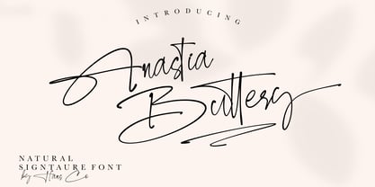 Anastia Buttery is an elegant handwritten font with a unique that look clean and modern. This font come with unique ligature style that give you a sleek, elegant look for your logos, business card, wedding invitations, quotes, advertisements, and more. Let's create something beautiful today with this. Tutorial how to Install & use Alternate / Special Character : https://hanscostudio.com/tutorial/ Enjoy!
 - Going Places JNL by Jeff Levine,
$29.00 Based on hand lettering from a January 26, 1930 ad for the 1930 Fox Studios film "Let's Go Places", the lettering is an ultra bold serif design with numerous ball terminals throughout the character set. The typeface is both formal, yet casual and playful in appearance. Going Places JNL is available in both regular and oblique versions.
 - Soprani Variable by insigne,
$129.99 "Step into a world where the 1920s meet the future with Soprani—a typeface that seamlessly blends vintage charm and modern sophistication. Drawing inspiration from a distinctive plaque unearthed in New Zealand, Soprani showcases serifs that flare and shimmer, capturing the essence of art nouveau and arts & crafts in a contemporary light. Dive into its rich OpenType features, granting designers unparalleled flexibility to bring their visions to life. Its condensed yet elegant letterforms are the perfect fit for everything from artful table books and stylish menus to dynamic media showcases in TV and film. Spanning from the graceful subtlety of its thin variant to the undeniable boldness of the black, Soprani is diverse and dynamic. Soprani isn't just a typeface—it's a revolution in design. Production assistance by Lucas Azevedo and ikern.
 - Chistodella by Keristyper Studio,
$14.00 Chistodella is a calligraphy handwriting with classic style and elegant touch, inspired by lettering on the vintage. Which was created to meet the needs of your next design project. Carefully designed to work together in harmony for creating awesome typographic designs in a flash. This font is good for logo design, Social media, Movie Titles, Books Titles, short text even long text letters, and good for your secondary text font with sans or serif. Make a stunning work with Roselites font. Featured: -Standard Uppercase & Lowercase -Numeral & Punctuation -Multilingual : ä ö ü Ä Ö Ü ß ¿ ¡ -Alternate & Ligature -PUA encoded We recommend programs that support the OpenType feature and the Glyphs panel such as Adobe applications or Corel Draw. so you can use all the variations of the glyphs. Hope you enjoy our fonts!
 - Sharik Sans by Dada Studio,
$29.00 Sharik Sans (named after the brave and smart dog-hero from my favorite TV series) has a warm and gentle personality. It does not shout; it does not stand out. Sharik serves his master in everyday work. Although it is a sans serif, you can feel a calligrapher’s touch in its subtle details and endings. They shine out, especially at display sizes. The family consists of nine weights plus matching italics. It meets most of the needs designers deal with on a daily basis, including web usage. It is stuffed up with various OpenType features such as small capitals, a wide set of numerals, fractions, ordinals, alternates, and, of course, ligatures. And it perfectly harmonises with my other serif-like typeface family Clavo. NB: This font is NOT style linked by weight!
 - Bronzetti by Greater Albion Typefounders,
$10.00 A typographic revolution-Bronzetti has been a long term project for Greater Albion Typefounders, aimed at filling a large gap in the range of typefaces available today. The Bronzetti family of 22 text typefaces combines modern requirements for legibility and readability with the charm of traditional Roman faces in the spirit of those carefully constructed by small scale quality foundries such as the Kelmscott and Vale presses. In short, Bronzetti is traditional letterpress meets modern publishing, offering a real opportunity to make your material stand out from today’s ‘run of the mill’ crowd. The range of typefaces on offer includes five widths of type, as well as small capitals and italic forms and regular and bold weights. Try out Bronzetti today, make your work stand out from the crowd and join the revolution!
 - Palmire by Mas Anis Studio,
$23.00 Hi There! Meet our first modern serif typeface Palmire Palmire is a stylish font that is both modern and minimal. A light font that is perfect for feminine logo marks, fashion mastheads & editorial design (works great in layout design for quotes or body copy). The ligatures feature is so amazing, you can convert regular random word to elegant logo just by using the ligature. And there is 75+ ligature to support your amazing design project! Is there anything else? Of course! it has multilingual characters too! We work so hard to keep this elegant font looks elegant, classy, readable, stylish, eye-catching, and easy to use. You can easily pair them with script or sans serif font from all over the world to make your work more interesting!
 - The Philosopher Script by Colllab Studio,
$19.00 "Hi there, thank you for passing by. Colllab Studio is here. We crafted best collection of typefaces in a variety of styles to keep you covered for any project that comes your way! The Philosopher Script is a different take on what a monoline script should be. It’s not like anything else out there and it works in any context The conciseness of The Philosopher Script makes it well-suited not just for those seeking a new direction in design, but also for anyone producing art, looking to add their own style. Professional design and smoothed curves that are inherently better than a standard font. It comes with a vast array of ligatures, alternates, and many other helpful glyphs not found in any other typeface A Million Thanks Colllab Studio www.colllabstudio.com
 - Haggis by The Ampersand Forest,
$19.00 Meet Haggis! Inspired by the Insular Half-Uncial and Uncial typefaces that have long been associated with Scotland, Ireland, and their Celtic cousins, Haggis is an unusual creature. Unlike traditional Uncials, he's monoline, rounded, sausagey, and distinctly lighthearted! Use him for posters, signage (especially pub signs!), kids' stuff, and packaging — anyplace a little quasi-Celtic flavor is desired, but with a fun twist. Must we say it? He's a Funcial! Tongue-in-cheek though he may be, Haggis has some great features. He comes in Lean and Overstuffed forms, and has full true small caps, standard(ish) Roman alternates for the more out-there characters, lots of ampersand forms (including a true[ish] "Et" and a Tironian and), fun quasi-Celtic bullets, and lots of ligatures. Try him out today — with some tatties and neeps!
 - Yella Delisa by Aqeela Studio,
$25.00 With the help of the distinctive decorative typeface Yella Delisa, you may create the appearance of handmade lettering. Greek (of course), a Latin character set, and diacritics are all included in the multilingual lettering font Yella Delisa. Your modern graphic design requirements are best served by this distinctive style. If you want to add some flair to long text, choose this font because it has a really good flow. It can be applied to packaging, branding, and social media content. Additionally, Yella Delisa is the best typeface for branding and packaging organic products. Additionally, you can design invitations for weddings and baby showers using this typeface's romantic emotions. This typeface is perfect for you, especially if you're seeking one for Instagram quote posts or any other social media content!
 - Trace by Linecreative,
$16.00 Introducing "Trace," a captivating display font that seamlessly marries the ancient mystique of Nordic symbols with a bold, futuristic modernity. This unique typeface transcends traditional boundaries, emerging as a striking fusion of historical symbolism and cutting-edge design. "Trace" is not merely a font; it's a visual journey that bridges the past and the future, offering a distinctive and versatile aesthetic. Inspired by Nordic symbols, "Trace" breathes new life into these ancient motifs, infusing them with a sleek and contemporary vibe. Each character carries the rich storytelling heritage of Nordic culture, interpreted through a lens of modern sophistication. The result is a font that is both timeless and forward-thinking, making it an ideal choice for those seeking a balance between tradition and innovation. As a display font, "Trace" commands attention with its bold and commanding presence. Its carefully crafted letterforms embody a sense of strength and purpose, while the subtle Nordic influences add an air of mystery and intrigue. Beyond its role as a traditional typeface, "Trace" transcends expectations by doubling as a symbol font. Unlock a treasure trove of symbolic possibilities, allowing you to weave intricate narratives or create visually stunning patterns that go beyond the constraints of traditional alphabets. Whether you're designing for futuristic branding, creating a visual language for a tech-forward project, or simply seeking a font that tells a story of cultural richness, "Trace" is your creative companion. Versatile and impactful, this font opens doors to a realm where ancient symbols and modern design converge, allowing you to explore uncharted territories in your creative endeavors. Embark on a design journey that spans centuries with "Trace. What you get, you will get: 1. Trace - Clean San serif font including Uppercase & Lowercase (ALL CAPS) characters, 2. Numbers and Punctuation 3. Support Multi language (Western Europe Latin)
 - Compatil Fact by Linotype,
$50.99Compatil is the first comprehensive type system which enables all typographical elements to be used to full effect in order to reproduce the message conveyed by text information. Four different type styles with a total of 16 weights including italics have been merged into a unique typographical network. There are now no limits to the font user's creativity. The system is a product of technical innovation and constitutes a new design approach which meets the highest aesthetic standards. For almost two years, a team of experts from Linotype has been working with initiator Professor Olaf Leu under the direction of Silja Bilz, Erik Faulhaber and Reinhard Haus to create the Compatil type system. Despite the Internet and TV, it is essential today to be able to absorb information quickly by being able to read it with ease. A fact that is becoming increasingly important both on-screen and on paper. It is the role of the font to increase legibility and to ensure typographically perfect results for text design work. The new Compatil type system meets all these needs. The Compatil is a part of the Platinum Collection. The following four different styles are available: Compatil Exquisit, Compatil Fact, Compatil Letter and Compatil Text. Compatil is available in various font formats: 16 separate OT Pro fonts including the small caps and Adobe Central European character set for OpenType-supporting applications like Adobe InDesign, or as 32 separate OpenType Com fonts for office communication, with the following special features: 1. Optimized display capabilities for computer screens eXcellent Screen Fonts (XSF-quality). 2. An extended, international character set, which supports 48 different languages for Microsoft Office applications like MS Word or as 64 PostScript fonts, which can be used in non-OpenType-supporting applications like Quark XPress. - Compatil Fact Paneuropean by Linotype,
$103.99Compatil is the first comprehensive type system which enables all typographical elements to be used to full effect in order to reproduce the message conveyed by text information. Four different type styles with a total of 16 weights including italics have been merged into a unique typographical network. There are now no limits to the font user's creativity. The system is a product of technical innovation and constitutes a new design approach which meets the highest aesthetic standards. For almost two years, a team of experts from Linotype has been working with initiator Professor Olaf Leu under the direction of Silja Bilz, Erik Faulhaber and Reinhard Haus to create the Compatil type system. Despite the Internet and TV, it is essential today to be able to absorb information quickly by being able to read it with ease. A fact that is becoming increasingly important both on-screen and on paper. It is the role of the font to increase legibility and to ensure typographically perfect results for text design work. The new Compatil type system meets all these needs. The Compatil is a part of the Platinum Collection. The following four different styles are available: Compatil Exquisit, Compatil Fact, Compatil Letter and Compatil Text. Compatil is available in various font formats: 16 separate OT Pro fonts including the small caps and Adobe Central European character set for OpenType-supporting applications like Adobe InDesign, or as 32 separate OpenType Com fonts for office communication, with the following special features: 1. Optimized display capabilities for computer screens eXcellent Screen Fonts (XSF-quality). 2. An extended, international character set, which supports 48 different languages for Microsoft Office applications like MS Word or as 64 PostScript fonts, which can be used in non-OpenType-supporting applications like Quark XPress. - Compatil Letter by Linotype,
$50.99Compatil is the first comprehensive type system which enables all typographical elements to be used to full effect in order to reproduce the message conveyed by text information. Four different type styles with a total of 16 weights including italics have been merged into a unique typographical network. There are now no limits to the font user's creativity. The system is a product of technical innovation and constitutes a new design approach which meets the highest aesthetic standards. For almost two years, a team of experts from Linotype has been working with initiator Professor Olaf Leu under the direction of Silja Bilz, Erik Faulhaber and Reinhard Haus to create the Compatil type system. Despite the Internet and TV, it is essential today to be able to absorb information quickly by being able to read it with ease. A fact that is becoming increasingly important both on-screen and on paper. It is the role of the font to increase legibility and to ensure typographically perfect results for text design work. The new Compatil type system meets all these needs. The Compatil is a part of the Platinum Collection. The following four different styles are available: Compatil Exquisit, Compatil Fact, Compatil Letter and Compatil Text. Compatil is available in various font formats: 16 separate OT Pro fonts including the small caps and Adobe Central European character set for OpenType-supporting applications like Adobe InDesign, or as 32 separate OpenType Com fonts for office communication, with the following special features: 1. Optimized display capabilities for computer screens eXcellent Screen Fonts (XSF-quality). 2. An extended, international character set, which supports 48 different languages for Microsoft Office applications like MS Word or as 64 PostScript fonts, which can be used in non-OpenType-supporting applications like Quark XPress. - Compatil Text by Linotype,
$50.99Compatil is the first comprehensive type system which enables all typographical elements to be used to full effect in order to reproduce the message conveyed by text information. Four different type styles with a total of 16 weights including italics have been merged into a unique typographical network. There are now no limits to the font user's creativity. The system is a product of technical innovation and constitutes a new design approach which meets the highest aesthetic standards. For almost two years, a team of experts from Linotype has been working with initiator Professor Olaf Leu under the direction of Silja Bilz, Erik Faulhaber and Reinhard Haus to create the Compatil type system. Despite the Internet and TV, it is essential today to be able to absorb information quickly by being able to read it with ease. A fact that is becoming increasingly important both on-screen and on paper. It is the role of the font to increase legibility and to ensure typographically perfect results for text design work. The new Compatil type system meets all these needs. The Compatil is a part of the Platinum Collection. The following four different styles are available: Compatil Exquisit, Compatil Fact, Compatil Letter and Compatil Text. Compatil is available in various font formats: 16 separate OT Pro fonts including the small caps and Adobe Central European character set for OpenType-supporting applications like Adobe InDesign, or as 32 separate OpenType Com fonts for office communication, with the following special features: 1. Optimized display capabilities for computer screens eXcellent Screen Fonts (XSF-quality). 2. An extended, international character set, which supports 48 different languages for Microsoft Office applications like MS Word or as 64 PostScript fonts, which can be used in non-OpenType-supporting applications like Quark XPress. - Walbaum 2010 Pro by Storm Type Foundry,
$54.00 Upon numerous demands of highly esteemed users of our fonts I decided to supplement the Walbaum type family by display and poster cuts. Because I obviously cannot compete with world’s renowned type foundries which already offer a number of renderings of forenamed typeface, I thought proper to decline a bit from the original Walbaum’s design, strictly speaking, from the apprehension we commonly keep about this typeface. Therefore I didn’t set forth the way of modernizing (shame!), but rather the opposite direction: towards an analysis of the original neo-classical intention. I took the 10-point character, magnified it enormously and cut off progressively all the optically thickened bobbles which raised by small-size correction. I ended up at the size of about 120 points, where it became obvious that any further thinning would lead to an undesired manneristic fragility. Resulting 8-member family Walbaum 120 is naturally usable in variety of sizes, as well as cuts marked “10” you can use, say, from 6 to 30 points. I only hope that mister Justus Erich won’t pull me by the ear when we’ll meet on the other side...
 - SP Vincent by Studio Pulp,
$19.99 Discover the captivating charm of SP Vincent, a masterfully crafted display font developed in 2023 by Studio Pulp. Inspired by the iconic character Vincent Vega, the central figure in the film classic "Pulp Fiction" (1994), this typeface exudes a powerful and refined aesthetic, befitting a leading role. SP Vincent, with meticulous attention to detail and craftsmanship, showcases versatility that seamlessly complements a variety of design projects, especially excelling in the creation of impressive titles. The three well-balanced weights provide you with the flexibility to unleash your creativity, while the clear, open shapes optimize readability. Anchored in a sleek grid design, SP Vincent embodies modern minimalism and accessible elegance. Whether you are engaged in web design, graphic design, or print materials, this font adds a timeless class to your creations. Be inspired by the seamless blend of functionality and aesthetics in SP Vincent. Specifically designed to meet the demands of 2023, this font brings a contemporary flair to your projects while remaining faithful to Studio Pulp's commitment to quality and innovation. Transform your typographic landscape with SP Vincent and leave a lasting impression reminiscent of the unforgettable moments from "Pulp Fiction."
 - Redrains by Sarid Ezra,
$15.00 Introducing, Redrains - An Elegant Serif Font Family with 3 special weight style! Redrains is a classic and modern serif with 3 weight style and a bunch of alternates for each characters and ligatures that will make your presentation or logo even more stunning and stand out! With three style that you can use for several purpose! You can use this font as a complement of your script collections or use this font as a stand alone font for several purposes such as a wedding invitations or even your own brand! This fonts support Multi Language and already PUA Encoded!
 - Obvia Wide by Typefolio,
$29.00 'Obvia' appeared as a result of direct observation on typefaces classified as geometric and the plan to explore for the first time width axes Condensed, Narrow (soon), Normal and new Wide and Expanded. The idea behind 'Obvia's design was to create a distancing from geometrically pure shapes, in this case, square shapes. Then some details were added, such as subtle inktraps, concave endings of the stems and carefully drawn alternate characters, giving a 'geohumanist' tone to the font. This first family of 'Obvia' has 9 weights ranging from Thin to Black, delivering a strong typographic identity, from the paper to the pixel.
 - Collingar by Sarid Ezra,
$15.00 Introducing, Collingar - An Aesthetic Serif Font with italic version! Collingar is a classic and modern serif with a bunch of ligatures that will make your poster, cover or logo even more stunning and stand out! With italic version that you can use as a complimentary! You can use this font as a complement of your script collections or use this font as a stand alone font for several purposes such as a wedding invitations or even your own branding! This fonts support Multi Language and already PUA Encoded! Features : Regular & Italic Version Uppercase & Lowercase Number & Symbol Ligatures Multilingual and PUA Encoded
 - Obvia Expanded by Typefolio,
$29.00 'Obvia' appeared as a result of direct observation on typefaces classified as geometric and the plan to explore for the first time width axes Condensed, Narrow (soon), Normal and new Wide and Expanded. The idea behind 'Obvia's design was to create a distancing from geometrically pure shapes, in this case, square shapes. Then some details were added, such as subtle inktraps, concave endings of the stems and carefully drawn alternate characters, giving a 'geohumanist' tone to the font. This first family of 'Obvia' has 9 weights ranging from Thin to Black, delivering a strong typographic identity, from the paper to the pixel.