10,000 search results (0.029 seconds)
  1. Zamolxis III - Unknown license
  2. SF Outer Limits - Unknown license
  3. pusher - Unknown license
  4. SF Technodelight - Unknown license
  5. Zamolxis II - Unknown license
  6. suede - Unknown license
  7. Baumarkt - Unknown license
  8. Embargo - Unknown license
  9. Zamolxis IV - Unknown license
  10. Dusty - 100% free
  11. Puzzle Pieces - Unknown license
  12. CorTen by The Northern Block, $12.80
    An industrial-weight typeface inspired by graphics laser-cut from sheet metal.
  13. Orlando by Tim Rolands, $-
    Orlando is a quirky display face inspired by Art Nouveau metal types.
  14. Vineta by Bitstream, $29.99
    An inline shadowed Clarendon designed in 1973 for VGC by Ernst Volker.
  15. Techstencil by Stereo Type Haus, $20.00
    A futuristic stencil typeface characterized by its extended forms and rounded terminals.
  16. Aquarius by Red Rooster Collection, $45.00
    Based on the popular VGC typeface designed by Ronald Arnholm in 1972.
  17. Niju by MikaeleBiana, $5.00
    Niju was designed and published by Mikaele Biana. Niju contains 1 style.
  18. Rosemary by Chank, $99.00
    Here is a nice sign-painterly display font inspired by the 1920s.
  19. Numerals by ParaType, $25.00
    A set of figures designed at ParaType in 1992 by Elvira Slysh.
  20. Cascade Script by Linotype, $29.99
    An original Freehand script designed for Mergenthaler in 1965 by Matthew Carter.
  21. Nellyana Script by ARToni, $14.00
    Inspired by tulips, Nellyana is a modern monoline script featuring beautiful ornaments.
  22. Morning Coffee by Sebastian Cabaj, $19.00
    Hand-drawn typeface, inspired by sunny mornings with cup of good coffee.
  23. Concreta by Just in Type, $20.00
    Concreta was inspired by Josef Albers' work and Augusto de Campos' poetry.
  24. Eiger by Intellecta Design, $26.90
    Eiger, a great display font by Intellecta Design. Contain only capital letters.
  25. Odd Times by Gleb Guralnyk, $15.00
    Introducing medieval blackletter typeface "Odd times". It's inspired by old fracture calligraphy.
  26. Systopie by Sardiez, $20.00
    Systopie is inspired by stories where fears about dehumanized futures are shown.
  27. Pligo by Mans Greback, $29.00
    Pligo - a balloon, graffiti, liquorice, party and cartoon typeface by Måns Grebäck.
  28. Pascal by GRIN3 (Nowak), $16.00
    Pascal is a font inspired by handwriting of mail artist Pascal Lenoir.
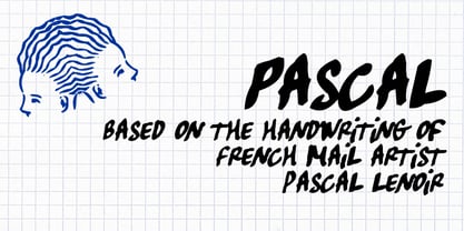
  29. Hadoar MF by Masterfont, $59.00
    Inspired by hand written letters on a street sign in Tel Aviv
  30. Taranatiritiza by Intellecta Design, $9.00
    Free interpretation of the classic Gothic Tuscan 1, by William Hamilton Page.
  31. Janda Silly Monkey by Kimberly Geswein, $5.00
    Cute and fun handwriting inspired by the playful antics of a child.
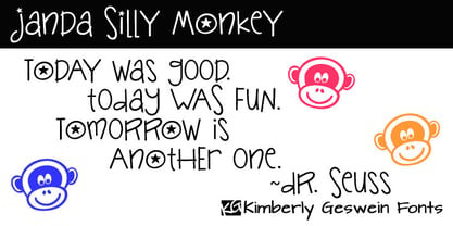
  32. Coin Operated by Dismantle Destroy, $9.00
    This font was inspired by music from the band The Dresden Dolls.
  33. Campi by Intellecta Design, $33.00
    Campi, a great display font by Intellecta Design. Contains only capital letters.
  34. Costa Std by Typofonderie, $59.00
    A mediterranean style sanserif in 4 styles The original idea of Costa was to create a contemporary mediterranean typeface style. Costa is a synthesis of the purity, as found on Greek capitals, and softness, found in Renaissance scripts. First thing was the design concept that take its roots on the Chancery script. Such writing style appeared during Italian Renaissance. Later few typefaces have been developed from such cursive models. Today most serifed typeface italic take their roots on such triangular structure we can find on gylphs like the n, p, or d. The Costa capitals remains close to pure sanserif models when the lowercases features an ending serif on many letters like the a, n, d, etc. This ending serif being more like a minimal brush effect, creating a visual contrast and referencing the exoticness of the typeface. Knowing that the Costa typeface family began life in the 90s as a bespoke typeface for Costa Crociere, an Italian cruise company — it suddenly makes sense and explains well why Jean François Porchez focused so much on Italian Chancery mixed to a certain exotism. The curvy-pointed terminals of the Costa n can obviously get find on other glyphs, such as the ending of the e, c and some capitals. So, the sanserif looks more soft and appealing, without to be to pudgy or spineless. The general effect, when set for text, remains a sanserif, even not like Rotis Semiserif. Costa is definitly not a classical typeface, or serif typeface which convey past, tradition, historicism as Garamond does beautifully. Because of the Costa crocieres original needs, Costa typeface was designed to be appropriate for any uses. Anytime you’re looking for good mood, qualitative effects, informal tone, cool atmosphere without to be unconvential or blowzy, Costa will convey to your design the required chic and nice atmosphere, from large headlines sizes, brands, to small text sizes. It’s a legible typeface, never boring. A style without neutrality which doesn’t fit comfortably into any typeface classification! Does it proves the novelty of its design and guarantees as well as its originality? Its up to you to be convinced. Barcelona trip Originally not planned, this need appeared because of a trip to Barcelona at the time of the project, where Jean François was giving a lecture. He wanted to pay an homage to that invitation to create something special. So, he designed during his flight some variations of the Spanish Ch, following ideas developed by the Argentinian type designer Rubén Fontana for his typeface called Fontana ND (published by the Barcelona foundry Bauer). Then, he presented during his lecture variations and asked to the audience which design fit the best to their language. They selected the design you can find in the fonts today. Read more about pairing Costa Type Directors Club 2000 Typographica: Our Favourite Typefaces 2004
  35. Karmina by TypeTogether, $49.00
    Karmina is a text typeface developed mainly for pocket books and budget editions. It was built to withstand the worst printing conditions: low quality papers, high printing speed with web presses and variations in the ink level of the printing press. Some of Karmina's most representative features are the rather large serifs, intended to work perfectly in small reproduction sizes, the sharpness of the shapes, including some calligraphic reminiscences, and the large and yet graceful ink traps in the acute connections. Structurally, Karmina combines a significantly large x-height with relatively compressed letterforms. The result of these features grants Karmina outstanding legibility and economy. Karmina features four weights and 800 characters per weight, including small caps, discretionary ligatures, fractions and a complete range of numerals for every use. It also supports over 40 languages that use the latin extended alphabet. Karmina was selected in the text typography category at the Letras Latinas exhibition 2006 and won a merit in the European-wide ED-Awards competition 2007. Karmina Basic is a reduced version of Karmina. It is still an OT-font but without any particular features except of a set of ligatures, class-kerning and language support including CE and Baltic.
  36. Silver Linings by Clevus, $14.00
    Proudly present Silver Linings Typeface. Say hello to Silver Linings A classy eighties magazine inspired serif condensed - with a complementary lowercase version. In true Eighties style, they also come in varying degrees of Condensed form - mix and match them to create eye-catching effects. Don't forget to use all caps too in your mixing and matching - it adds contrast and impact to your type design. Design tips! : Tighten your letterspacing for larger titles to create a range of looks. Comes with alternatives and ligatures, and helps to create stunning magazine imagery, quotes, posts, blog posts, branding projects, logo, poster and much more. Font Features : Lettres, numbers, symbols, and punctuation 20+ alternates and ligatures No special software required they may be used even in canva, any basic program /website apps that allows standard fonts That's it folks! Multilingual Support Language Support: Danish, English, Estonian, Filipino, Finnish, French, Friulian, Galician, German, Gusii, Indonesian, Irish, Italian, Luxembourgish, Norwegian Bokmål, Norwegian Nynorsk, Nyankole, Oromo, Portuguese, Romansh, Rombo, Spanish, Swedish, Swiss-German, Uzbek (Latin). Follow My Shop For Upcoming Updates Including Additional Glyphs And Language Support. And Please Message Me If You Want Your Language Included or If There Are Any Features or Glyph Requests, Feel Free to Send me A Message. Have a Good Day !
  37. Campeno by Craft Supply Co, $20.00
    Geometric Precision Let’s step into the world of Campeno, a Geometric Sans Serif font that embodies precision and order. This font is the epitome of geometric perfection, making it an ideal choice for various editorial applications. Editorial Excellence Campeno’s geometric form is what sets it apart and makes it a top choice for editorial needs. Whether you’re working on magazines, long-form text, or other editorial projects, its geometric precision enhances readability and offers editorial excellence. Versatile Typography What makes Campeno even more exceptional is its versatility. It seamlessly adapts to diverse design contexts, ensuring that it can be used for a wide range of projects, from magazines to websites and beyond. Engaging Readability Beyond its geometric aesthetics, Campeno excels in providing engaging readability. It guides the reader through the content, focusing on the message while maintaining a visually appealing design. In Conclusion In summary, Campeno – Geometric Sans Serif is the font that brings precision and clarity to your editorial projects. Its geometric form ensures that your content is not only engaging but also visually appealing, catering to a broad readership while maintaining a high standard of clarity. Whether you’re working on magazines, websites, or other editorial endeavors, Campeno stands out as a font that combines aesthetics with functionality, offering editorial excellence for your projects.
  38. Chilly Medium - Personal use only
  39. Blade Runner Movie Font - Unknown license
  40. Sweetheart Script - Personal use only
Looking for more fonts? Check out our New, Sans, Script, Handwriting fonts or Categories
abstract fontscontact usprivacy policyweb font generator
Processing