10,000 search results (0.028 seconds)
  1. VI University - Unknown license
  2. ballot - Unknown license
  3. kerorin - Unknown license
  4. Hultog - Unknown license
  5. Lousy - Unknown license
  6. Gawain - Unknown license
  7. WBXflack - Unknown license
  8. Fingerprints Inside - Unknown license
  9. Kinex - Unknown license
  10. Michelle Vacuity - Unknown license
  11. Shattered - Unknown license
  12. OpenMind - Unknown license
  13. NewDeli - Unknown license
  14. Deutschische - Unknown license
  15. Demosfen by ParaType, $30.00
    The typeface was designed by Alexey Chekulaev in 2003.
  16. Metallic Sky by SoftMaker, $9.99
    Metallic Sky is a decorative typeface published by Softmaker.
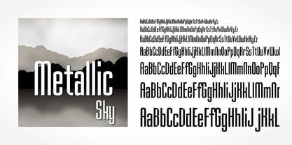
  17. Humanist 970 by Bitstream, $29.99
    Bitstream's version of Adsans originally released by Linotype & Machinery.
  18. Contouration by Intellecta Design, $19.90
    inspired by and advertise lettering publishing from 1920's
  19. Arabic Typesetting by Microsoft Corporation, $49.00
    Original Arabic Typesetting font by Microsoft available in TrueType
  20. Neue Werner Paperclip by Funk King, $5.00
    Neue Werner Paperclip is inspired by the 70s classic.
  21. Hobo No2 by SoftMaker, $9.99
    Herlekin is a decorative script typeface published by SoftMaker.
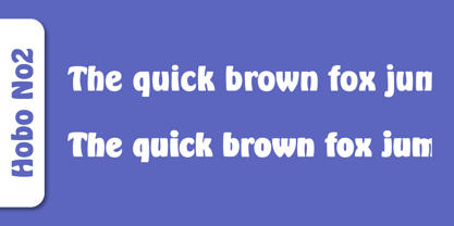
  22. Bluff No2 by SoftMaker, $9.99
    Bluff No2 is a brush font published by SoftMaker.
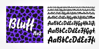
  23. Portobello by Red Rooster Collection, $45.00
    Loosely based on Pontecorvo, a design by Aldo Novarese.
  24. Dom by SoftMaker, $9.99
    Dom is an informal brushwritten typeface published by SoftMaker.
  25. Looking Glass by SoftMaker, $9.99
    Looking Glass is a serif typeface published by SoftMaker.
  26. Durango No2 by SoftMaker, $9.99
    Durango No2 is a decorative typeface published by SoftMaker.
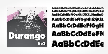
  27. Glossy by Volcano Type, $19.00
    Glossy, a font for starlets designed by Sandra Hofacker.
  28. Fraktur No2 by SoftMaker, $9.99
    Fraktur No2 is a blackletter typefont published by SoftMaker.
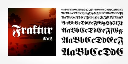
  29. Harlekin by SoftMaker, $9.99
    Herlekin is a decorative script typeface published by SoftMaker.
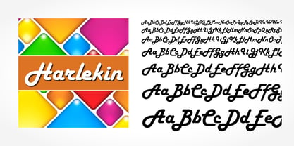
  30. Japanette by SoftMaker, $9.99
    Japanette is a vaguely oriental typeface published by SoftMaker.
  31. Disco by SoftMaker, $9.99
    Disco is a disco-era typeface published by SoftMaker.
  32. Balloon No2 by SoftMaker, $9.99
    Balloon No2 is a decorative typeface published by SoftMaker.
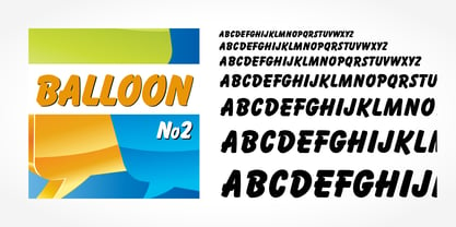
  33. Hudson by SoftMaker, $9.99
    Hudson is a brush script typeface published by SoftMaker.
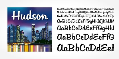
  34. Mister Big by SoftMaker, $9.99
    Mister Big is a decorative typeface published by SoftMaker.
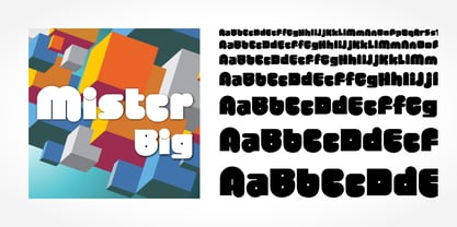
  35. Alright, let's dive into GUNJU by Akihiro OYA, a font that really has its own unique charm and character. At first glance, GUNJU strikes you with its combination of modernity and tradition. It has th...
  36. Lust Script by Positype, $49.00
    Boom. You asked for more, um, well just ‘more’—more swashes, more options, more weights, more of everything. I cannot give you more weights. The design just won’t allow it and anything else would be a compromise or a bastardization of the exemplars just to make money that I am unwilling to do. But, I did give you an overly indulgent, 90% cacao bar and espresso, Lust Script Fine. The ending strokes on these glyphs will literally draw blood. Enjoy it as much as I have. The Lust Collection is the culmination of 5 years of exploration and development, and I am very excited to share it with everyone. When the original Lust was first conceived in 2010 and released a year and half later, I had planned for a Script and a Sans to accompany it. The Script was released about a year later, but I paused the Sans. The primary reason was the amount of feedback and requests I was receiving for alternate versions, expansions, and ‘hey, have you considered making?’ and so on. I listen to my customers and what they are needing… and besides, I was stalling with the Sans. Like Optima and other earlier high-contrast sans, they are difficult to deliver responsibly without suffering from ill-conceived excess or timidity. The new Lust Collection aggregates all of that past customer feedback and distills it into 6 separate families, each adhering to the original Lust precept of exercises in indulgence and each based in large part on the original 2010 exemplars produced for Lust. I just hate that it took so long to deliver, but better right, than rushed, I imagine.
  37. Brillig by Scholtz Fonts, $19.00
    Brillig is a loose and informal handwriting font. It comes in four flavors, each of which has a very different feel. Brillig Gimble: more formal in that the characters are interconnected as in cursive script. To further enhance this effect, the characters have been created with a slightly "blobby" pen which provides a suggestion of precision. Brillig Earth: is bold and strong. It is more "down-to-earth" than the other styles, however, the boldness is tempered with quite wispy ends (terminuses) to the characters. It conveys a suggestion of speed and strength. Brillig Aire: is the most delicate and ethereal of the styles. Think of fairies, dandelions and dragonflies and you have an idea of what Brillig Aire conveys. Not only are the characters very light in weight, but they terminate in a wispy, delicate end. In spite of all this, Brillig Aire is very readable and can be used in a variety of contexts. Brillig Brave: is quite like Gimble in its feel with one important difference -- the characters are not connected as in cursive script. Each character stands alone. Brillig Line: is a clean, lightweight style using a mono width line for an informal, handwritten feel. There is a collection of the above four styles that is attractively priced and gives you the ability to use these four fonts in a variety of ways within the same document. The font is particularly useable for the promotion of products aimed at designers of: wedding invitations, party invitations, young clothing ranges, magazines, cosmetic packaging. It has been carefully letterspaced and kerned. All upper and lower case characters, punctuation, numerals and accented characters are present.
  38. Joanna Nova by Monotype, $50.99
    The Joanna® Nova design, by Monotype Studio designer Ben Jones, is an extensive update to Eric Gill’s original Joanna typefaces and brings this much admired – but underused – slab serif typeface into the 21st century. Joanna Nova features 18 fonts – more than twice as many as the original Joanna – with a wide range of weights including thin and ultra black, which were not available in the original design. Every glyph has been redrawn using a variety of reference sources, including Gill’s original sketches and the copper patterns used in Joanna’s initial production. When Jones set out to design Joanna Nova, he saw that the ‘real Joanna’ was not immediately evident. “Some of Gill’s original drawings have a sloped ‘M’; there is also a ‘K’ and ‘R’ with a curled leg and a letter ‘d’ without the flat bottom,” he explained. “Is this Joanna? Or is it the version used to print Gill’s Essay on Typography? Or is it the digital version with which most people are surely more familiar than any other version? Ultimately, I think, none of these and all of these were ‘Joanna’ because, as with any typeface, it is more the idea or concept behind the typeface that makes it what it is. My approach was to create a version of Joanna that appears in your mind when you think of Joanna.” Jones noted that one of the most distinguishing aspects of Joanna is the italics; and that, for reasons unknown, many of the characters in the current versions are much more condensed than those in the hand-set fonts of metal type., The newer designs being almost unusable at small sizes. The italics in Joanna Nova have been reworked to be more legible and closer to their original widths. Joanna Nova expands the original Joanna in several ways that open up new typographic possibilities, These additions include several new weights, support for Greek and Cyrillic scripts, small caps for all scripts in both upright and italic styles, several numeral options and a host of context-sensitive ligatures. The Joanna Nova typeface family is part of the new Eric Gill Series, drawing on Monotype's heritage to remaster and expand and revitalize Eric Gill’s body of work, with more weights, more characters and more languages to meet a wide range of design requirements. The series also brings to life new elements inspired by some of Gill’s unreleased work, discovered in Monotype’s archive of original typeface drawings and materials of the last century.
  39. Boncaire Titling by insigne, $22.00
    Inspired by the type elements of 17th century Dutch mapmaking, Boncaire Titling provides you with a historic yet adventurous look for your library. This addition from insigne found its muse in a map of Curacao by Dutch cartographer Gerard Van Keulen, a member of the prosperous Van Keulen family from Amsterdam, who were engaged in the manufacture of maps for seafaring. Much thanks on this project goes to The Norman B. Leventhal Map Center, housed at the Boston Public Library. Through the centers kindness, I was able to view a number of period maps in person and to meet with curators, who explained more about the Van Keulen family and the way maps of the period were created. While I studied the maps, I narrowed in on some of the original types unique idiosyncrasies. For instance, the long, exaggerated serifs, which give the forms a sense of stability, aid in the faces legibility--largely a byproduct of the engraving method that was used to create the metal plates for manufacturing these maps. In creating Boncaire Titling, I decided to capture these unique idiosyncrasies, embracing the character of the engravings rather than removing them entirely through over-refining the forms. The result is an elegant family with far more than seafaring potential. This font has a full range of six weights, from thin to black. It also includes a wide variety of OpenType alternates. All insigne fonts are fully loaded with OpenType features. Boncaire Titling is also equipped for complex professional typography, including alternates, smaller titling caps and plenty of alts, including normalized capitals and lowercase letters. There are over 30 autoreplacing ligatures, and the face includes a number of numeral sets, including fractions, old-style and lining figures with superiors and inferiors. OpenType capable applications such as Quark or the Adobe suite can take full advantage of automatically replacing ligatures and alternates. You can find these features demonstrated in the .pdf brochure. Boncaire Titling also includes the glyphs to support a wide range of languages, including Central, Eastern and Western European languages. In all, Boncaire Titling supports over 40 languages that use the extended Latin script, making the new addition a great choice for multi-lingual publications and packaging. Maps are fascinating; they come with the promise of treasure to be uncovered. Examining the map itself, too, you can find great wealth in the details so artfully condensed to that single piece of paper--details carried over into this new insigne font. For your next project, explore the imagination potential in Boncaire Titling.
  40. Elektronik - Personal use only
Looking for more fonts? Check out our New, Sans, Script, Handwriting fonts or Categories
abstract fontscontact usprivacy policyweb font generator
Processing