10,000 search results
(0.046 seconds)
- Melkslijter by PintassilgoPrints,
$29.00 With a stylish Dutch accent, this font draws inspiration from a 1935 brochure by the talented graphic designer and artist Dirk Hart. Carrying different hand-drawn lettershapes on upper and lower case slots despite being a unicase typeface, this font also brings a nice set of ornaments and complete sets of initial and terminal swash forms. When working with OpenType savvy applications these can conveniently be applied at the click of a button, thanks to the smart swashes programming, which will change the first and last letters in words with its corresponding initial or terminal forms. There are also some stylistic alternates for a (yet) more decorated look. The black version, with a somewhat art-deco feeling with added boldness, is also very decorative and contains the same features as the regular cut: smart swashes, different letterforms on upper and lowercase slots, ornaments and stylistic alternates.
 - Back In Black by IKIIKOWRK,
$17.00 Proudly present Back In Black - Hand Brush Type, created by ikiiko. Back in Black is a hand-drawn brush font that attempts to reflect the urban vibe of suburban walls. The expressive stroke style of this typeface mimics the look of graffiti and other street art with bold strokes that produce striking, eye-catching graphics. Large-scale text elements work very well with this font. They can be used to produce a wide variety of designs, from playful and whimsical to edgy and rebellious. Additionally, a level of artistic expression unattainable with more conventional fonts is made possible by the strong strokes and asymmetrical shapes. This type is very suitable for making a poster, magazine layout, book cover, quotes, or simply as a stylish text overlay to any background image. What's Included? Uppercase & Lowercase Numbers & Punctuation Stylistic Ligature Multilingual Support Works on PC & Mac
 - Structia by Typodermic,
$11.95 As you consider the words you need to convey, it’s clear that you’re looking for something that feels just as precise and intentional as the message you’re promoting. Structia is a typeface that does not shy away from its influence—it leans into the hard edges and geometries that are typically associated with brutalist architecture. And yet, even as it draws inspiration from an austere and somewhat daunting aesthetic, Structia also possesses a sense of control and discipline that is undeniably alluring. At the core of Structia’s appeal is its mechanical precision. Every line, every curve, is carefully calculated and crafted to create a sense of mathematical accuracy that is difficult to resist. There is no room for error or imperfection in Structia—every stroke is sharp and precise, with chamfered corners that add an extra layer of texture and visual interest. This is not a typeface that allows for ambiguity—it demands clarity and specificity, and it delivers both with remarkable consistency. But Structia is more than just a collection of angular shapes and precise lines. It is a typeface that conveys a sense of scientific accuracy and chilly logic—a kind of elegance and refinement that is unexpected. There is a beauty in the way that Structia balances the hard-edged geometries of brutalism with a sense of control and finesse that is undeniably modern. It is a typeface that feels at once futuristic and timeless—a design that can be used in a wide variety of contexts and still feel fresh and relevant. And then there are the two effect styles—Structia Panel and Structia War—which take the basic geometry of the typeface and push it even further into the realm of science fiction. Structia Panel feels like something you might see on a spacecraft or in the architecture of an alien planet, with thin, laser-like struts that give it a futuristic edge. Structia War, meanwhile, takes the concept of Structia Panel and adds a layer of battle damage, as if the letters have been through a cosmic conflict and emerged victorious. In the end, Structia is a typeface that demands attention and respect. It is not a typeface that will fade into the background or blend in with the crowd—it is a design that is meant to be noticed and admired. And yet, even as it draws your eye with its hard-edged geometries and precise lines, it also possesses a sense of elegance and refinement that is undeniably alluring. Structia is a typeface that balances the old and the new, the hard and the soft, the mechanical and the human—and the result is something truly remarkable. Most Latin-based European, and some Cyrillic-based writing systems are supported, including the following languages. A Afaan Oromo, Afar, Afrikaans, Albanian, Alsatian, Aromanian, Aymara, Bashkir (Latin), Basque, Belarusian (Latin), Bemba, Bikol, Bosnian, Breton, Bulgarian, Cape Verdean, Creole, Catalan, Cebuano, Chamorro, Chavacano, Chichewa, Crimean Tatar (Latin), Croatian, Czech, Danish, Dawan, Dholuo, Dutch, English, Estonian, Faroese, Fijian, Filipino, Finnish, French, Frisian, Friulian, Gagauz (Latin), Galician, Ganda, Genoese, German, Greenlandic, Guadeloupean Creole, Haitian Creole, Hawaiian, Hiligaynon, Hungarian, Icelandic, Ilocano, Indonesian, Irish, Italian, Jamaican, Kaqchikel, Karakalpak (Latin), Kashubian, Kikongo, Kinyarwanda, Kirundi, Komi-Permyak, Kurdish (Latin), Latvian, Lithuanian, Lombard, Low Saxon, Luxembourgish, Maasai, Macedonian, Makhuwa, Malay, Maltese, Māori, Moldovan, Montenegrin, Ndebele, Neapolitan, Norwegian, Novial, Occitan, Ossetian, Ossetian (Latin), Papiamento, Piedmontese, Polish, Portuguese, Quechua, Rarotongan, Romanian, Romansh, Russian, Sami, Sango, Saramaccan, Sardinian, Scottish Gaelic, Serbian, Serbian (Latin), Shona, Sicilian, Silesian, Slovak, Slovenian, Somali, Sorbian, Sotho, Spanish, Swahili, Swazi, Swedish, Tagalog, Tahitian, Tetum, Tongan, Tshiluba, Tsonga, Tswana, Tumbuka, Turkish, Turkmen (Latin), Tuvaluan, Uzbek (Latin), Venetian, Vepsian, Võro, Walloon, Waray-Waray, Wayuu, Welsh, Wolof, Xhosa, Yapese, Zapotec Zulu and Zuni.
 - New Horizon by Aboutype,
$24.99Inscriptional capital titling face drawn for a magazine. Suitable for a variety of media if used at 30 point and above. New Horizon requires subjective display kerning and compensation. - Everett Mill by Aboutype,
$24.99Outline brush script originally designed for embroidery application. Everett was designed for all media and works best at 24 point and above. Everett requires subjective display kerning and compensation. - Kindly Season by Ahmad Jamaludin,
$17.00 Present to you for New Modern Decorative Serif, Kindly Season! Kindly Season has a lowercase that is a unique uppercase letter, You can easily correct this by replacing the alternate letters with uppercase. It's very simple, isn't it? Comes in 3 versions: Condensed, Regular, and Expanded, with a whopping total of 60+ unique ligatures, it's easy to achieve custom typography for stunning logos, headlines, and quotes. Kindly Season has a unique 'S' that is perfect for headers in projects; it can even be used for logos. Additionally, Kindly Season features other cool, decorative-style letters that add a touch of creativity. Type in all lowercase in the type tester to try it out! What's Included? Kindly Season Main File Condensed, Regular and Expanded 60+ Ligatures Instructions (Access special characters in all apps, even in Cricut Design) Accessible in Adobe Illustrator, Adobe Photoshop, Microsoft Word even Canva! PUA Encoded Characters. Fully accessible without additional design software Language Support: Danish, English, Estonian, Filipino, Finnish, French, Friulian, Galician, German, Gusii, Indonesian, Irish, Italian, Luxembourgish, Norwegian Bokmål, Norwegian Nynorsk, Nyankole, Oromo, Portuguese, Romansh, Rombo, Spanish, Swedish, Swiss-German, Uzbek (Latin) Thank you Dharmas Studio
 - Atoverz by Twinletter,
$17.00 Introducing Atoverz, the perfect retro condensed font for your next project. This font features a classic retro design that is both stylish and functional. With 49 curved alternate characters and 32 beautiful ligatures, Atoverz allows you to easily create unique and stunning designs. Its multilingual support also ensures you can use it for projects in any language. The sleek and elegant design of Atoverz makes it perfect for a wide range of projects, from logos and branding to posters and advertisements. Its retro classic style is sure to catch the eye of your audience and leave a lasting impression. So why wait? Add Atoverz to your font collection today and take your designs to the next level. Browse our collection now to discover the versatility and charm of Atoverz retro condensed font. What’s Included : - File font - All glyphs Iso Latin 1 - Alternate, Ligature - Simple installations - We highly recommend using a program that supports OpenType features and Glyphs panels like many Adobe apps and Corel Draw so that you can see and access all Glyph variations. - PUA Encoded Characters – Fully accessible without additional design software. - Fonts include Multilingual support
 - Getoik by Twinletter,
$18.00 Introducing Getoik, the Retro Condensed Font that will take your designs to the next level. With its clean and smooth edges, this font is perfect for any design project. Getoik features multiple ligatures and alternates, giving you even more design options to choose from. Whether you’re creating a logo, branding materials, or any other design project, Getoik will add a touch of elegance and sophistication to your work. Its condensed shape allows for maximum impact while taking up minimal space, making it perfect for headlines, titles, and subheadings. With its versatility and attention to detail, Getoik is a must-have for any designer looking to elevate their work to the next level. So why settle for less when you can have the best? Get Getoik and take your designs to new heights! What’s Included : - File font - All glyphs Iso Latin 1 - Alternate, Ligature - Simple installations - We highly recommend using a program that supports OpenType features and Glyphs panels like many Adobe apps and Corel Draw so that you can see and access all Glyph variations. - PUA Encoded Characters – Fully accessible without additional design software. - Fonts include Multilingual support
 - Neospace Expanded by deFharo,
$21.00 Neospace Expanded is an avant-garde typeface designed for technology and science fiction lovers. With its elegant geometric minimalism, Neospace redefines typographic aesthetics with a perfect fusion between modern and futuristic. Geometric Inspiration Designed with an expanded proportion and thin thickness, it exudes its own high-tech, futuristic and space style. Each Neospace character has been sculpted from the letter “O”, using the mathematical proportions of the Fibonacci sequence in curves, metrics and kerning, adding a golden ratio to each character. This meticulous approach ensures exceptional readability and a unique aesthetic that evokes a sense of order and precision. Three styles: Regular, which provides a modern and clean look; the Dot Layer, which adds a touch of color and creativity to typographic titles; and the Bold version, which evokes the feeling of futuristic and sophisticated electronic circuits, bringing a sense of avant-garde and advanced technology to your projects. Neospace allows you to create typographic titles in various colors, imitating the sophistication of futuristic electronic circuits. Limitless Versatility Neospace goes further by offering alternative letters and signs, multiple sets of numbers and capital letters, as well as monetary and cryptocurrency symbols. In addition, it incorporates complex OpenType functions that further enrich the design possibilities, allowing even greater customization in your typographic designs.
 - Trencher JNL by Jeff Levine,
$29.00 Trencher JNL is based on hand-cut stencils spray-painted onto a vintage 1947 Cleveland Trencher acquired by the Marine Corps Mechanized Museum at Camp Pendleton, California. Restoration volunteer Brian Platzer supplied to Jeff Levine the images of the stencil markings - and they were quickly re-drawn and turned into a digital type face.
 - Space Quest by Lone Army,
$10.00 This font is inspired by aerospace. I use the negative spaces of each font to form planets or rockets. every glyph has its power. can be used as initials or as a word nicely. and also supports multilingual. the space design side is also found in punctuation to! thanks and enjoy the design! cherrs
 - Astera by ParaType,
$25.00A set of astronomical signs (symbolic representation of the Sun, the Moon, planets and other celestial bodies as well as zodiacal constellations, phases of the Moon, etc), signs of Chinese Zodiac and several ornamental symbols. Designed by Andrey Belonogov. The typeface (under the name Astra) was awarded a Diploma of TypeArt’05 Design Contest. - Pony Xpress NF by Nick's Fonts,
$10.00The 1885 specimen book of the Palmer and Rey Type Foundry of San Francisco featured the inspiration for this typeface under the name Courier. This version has been thoughtfully designed to use Contextual Alternates to avoid unsightly swash collisions. Both versions of this font include the complete Latin 1252 and Central European 1250 character sets. - Song Publisher JNL by Jeff Levine,
$29.00 Song Publisher JNL features a design based on the 1945 Art Deco-era hand lettered sheet music title "When the Old Gang's back on the Corner (Singin' Sweet Adeline Again)". It's a good thing sheet music wasn't sold by the word count found in song titles, because this twelve word example would have been more costly than titles such as "Nola", "Tenderly" or "Ciribiribin".
 - ITC Tyfa by ITC,
$29.99 Some words from the designer, Frantisek Storm... Designed by Josef Tyfa in 1959, digitalized by F. Storm in 1996. This Roman and Italic are well-known perhaps to all Czech graphic artists and typographers ever since their release. Although this type face in some details is under the sway of the period of its rise, its importance is timeless, in contradistinction to other famous types dating from the turn of the sixties which were found, after some time, to be trite. The italics live their own life, only their upper-case letters have the same expression as the basic design. Thin and fragile, they work excellently, emphasizing certain parts in the text by their perfect contrast of expression. When seen from a distance they are a little bit darker than the Roman face. Tyfa Roman was released in 1960 by Grafotechna in Prague for hot setting. Later on, Berthold produced letter matrices - "rulers" for Staromat devices, used for manual photosetting of display alphabets. In the eighties it was available on dry transfers of Transotype and today it is offered also by ITC. The meticulously executed designs of the individual letters in the 288 point size are arranged into a set of signs on a cardboard of about B2 in size. The yellowed paper reveals retouches by white paint on the ink. Blue lines mark the baseline, the capital line, the ascender and descender lines and the central verticals of the letters. With regard to the format of the flat scanner, the designs had to be reduced, with the use of a camera, to the format A4, i.e. to the upper-case letter height of about 30 mm. These were then scanned in 600 dpi resolution and read as a bitmap template to the FontStudio programme. The newly created bold type faces derive from Tyfa's designs of the letters "a", "n", "p", the darkness of which was increased further, approximately by 3%, to enhance their emphasizing function. The text designs have hairstrokes thickened by one third; the contrast between thin and thick strokes has been modified, in order to improve legibility, in sizes under 12 points. We have used electronic interpolation to produce the semi-bold designs. Josef Tyfa himself recommends to choose a somewhat darker design than the basic one for printing of books.
 - Baumarkt - Unknown license

- Yoshitoshi - Personal use only

- Planetary Orbiter Outline - Unknown license

- Radios in Motion - Unknown license

- Slimania - Unknown license

- PetitaMedium - Unknown license

- Planetary Orbiter - Unknown license

- Enter Sansman - Unknown license

- JH Noha by JH Fonts,
$40.00 JH Noha is a geometric modern Arabic typeface. It includes black, bold, medium and regular weights.
 - Quiny by Nestype,
$17.00 Quiny is built with bold and curvy characters, Perfect if you need fun for your projects.
 - Alons Classic by BA Graphics,
$45.00A spurred Roman classic design. Great Headline Font if you are looking for that Bold Statement. - Schneidler Grobe Gotisch by Intellecta Design,
$24.90a revival of a classic bold blackletter from the great german typedesigner F. H. Ernst Schneidler - Curbdog by MADType,
$21.00 Curbdog is a bold, playful display face with light horizontals and curved terminals in the italics.
 - Anthilla by ARToni,
$20.00 Anthilla is a modern and bold paint brushed script font, featuring a smooth and dynamic feel.
 - Skrawl by Haiku Monkey,
$10.00Skrawl will add some creepy boldness to your life. Just don't let it babysit your kids. - Desperado by FontMesa,
$20.00 Desperado is a modern bold type style that will work well in sign and truck lettering.
 - LD Werewolf by Illustration Ink,
$3.00Who says Werewolves don't exist? Well, they do here! LD Werewolf looks like it was clawed and scratched into the very paper it's printed on. Adds a nice touch to a spooky Halloween Party invitation or accompanying fun memories! - Woodout by Justyna Sokolowska,
$15.00 Wooden font block. Taken from the typesetting department at the Academy of Fine Arts in Warsaw. All the letters were printed on paper, scanned and polished on the computer. It’s very detailed font, which are suitable for large prints.
 - Nadall by Solotype,
$19.95This stylish lightface was designed by Bernd Nadall for Barnhart Bros. & Spindler as a caps-only font in 1895. The lowercase was added at Solotype a hundred years later, resulting in a font quite at home in modern advertising. - Poca by Type-Ø-Tones,
$40.00 Poca is made up of right angles and regular strokes. It is a De Stijl typeface provided by Peret. We devised the lower case letters and added some Peret dingbats. Fifteen years later we added a fun bitmap version.
 - Chilling Atmosphere by PizzaDude.dk,
$20.00 Chilling Atmosphere is inspired by classic horror movies and is super useful to for your creepy postcards, flyers, clothing or perhaps packaging. I've added 6 different versions of each letter, to make your creepy text stand even more out!
 - Microgramma by URW Type Foundry,
$35.00 Designed to Swiss principles by Alessandro Butti and Aldo Novarese for Nebiolo in 1952 as an improvement on the squared-off Bank Gothic capitals. The design was revisited by the same designers ten years later; Eurostile was the result.
 - Bestons by Maulana Creative,
$15.00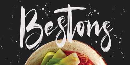 Give your designs an authentic brush handcrafted feel. Bestons Brush Font is perfectly suited to signature, stationery, logo, typography quotes, magazine or book cover, website header, flyer, clothing, branding, packaging design and more. Thanks for use this font. MaulanaCreative
 - Moriss Ward by Maulana Creative,
$14.00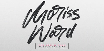 Give your designs an authentic brush handcrafted feel. "Moriss Ward" is perfectly suited to signature, stationery, logo, typography quotes, magazine or book cover, website header, flyer, clothing, branding, packaging design and more. Thanks for use this font. Maulana Creative
 - Sitcom by GroupType,
$19.00 If there was an American Typeface Hall of Fame, Bank Gothic, designed by the great Morris Fuller Benton would hold a place of special distinction considering this design has survived so many trends in typographic fashion since being introduced in 1930. It's just as desirable today as it was over eighty years ago; arguably more. Today, Bank Gothic is a very popular choice as a titling face for science fiction books, posters and countless television and movie titles. It is also a popular typeface for use in computer games and digital graphics. GroupType’s 2010 revival of this American classic is true to the design, the period, and Benton’s aesthetic. GroupType worked with some of the most talented and experienced type designers that were historically grounded and sensitive to this design project. Fortunately, Mr. Benton has left us a large selection of other great typefaces for insight and guidance. GroupType’s new revival includes the original three weights in regular and condensed style but also a new small cap and lowercase in each font necessary for 21st century typography.


