10,000 search results
(0.146 seconds)
- Times by Linotype,
$40.99In 1931, The Times of London commissioned a new text type design from Stanley Morison and the Monotype Corporation, after Morison had written an article criticizing The Times for being badly printed and typographically behind the times. The new design was supervised by Stanley Morison and drawn by Victor Lardent, an artist from the advertising department of The Times. Morison used an older typeface, Plantin, as the basis for his design, but made revisions for legibility and economy of space (always important concerns for newspapers). As the old type used by the newspaper had been called Times Old Roman," Morison's revision became "Times New Roman." The Times of London debuted the new typeface in October 1932, and after one year the design was released for commercial sale. The Linotype version, called simply "Times," was optimized for line-casting technology, though the differences in the basic design are subtle. The typeface was very successful for the Times of London, which used a higher grade of newsprint than most newspapers. The better, whiter paper enhanced the new typeface's high degree of contrast and sharp serifs, and created a sparkling, modern look. In 1972, Walter Tracy designed Times Europa for The Times of London. This was a sturdier version, and it was needed to hold up to the newest demands of newspaper printing: faster presses and cheaper paper. In the United States, the Times font family has enjoyed popularity as a magazine and book type since the 1940s. Times continues to be very popular around the world because of its versatility and readability. And because it is a standard font on most computers and digital printers, it has become universally familiar as the office workhorse. Times™, Times™ Europa, and Times New Roman™ are sure bets for proposals, annual reports, office correspondence, magazines, and newspapers. Linotype offers many versions of this font: Times™ is the universal version of Times, used formerly as the matrices for the Linotype hot metal line-casting machines. The basic four weights of roman, italic, bold and bold italic are standard fonts on most printers. There are also small caps, Old style Figures, phonetic characters, and Central European characters. Times™ Ten is the version specially designed for smaller text (12 point and below); its characters are wider and the hairlines are a little stronger. Times Ten has many weights for Latin typography, as well as several weights for Central European, Cyrillic, and Greek typesetting. Times™ Eighteen is the headline version, ideal for point sizes of 18 and larger. The characters are subtly condensed and the hairlines are finer. Times™ Europa is the Walter Tracy re-design of 1972, its sturdier characters and open counterspaces maintain readability in rougher printing conditions. Times New Roman™ is the historic font version first drawn by Victor Lardent and Stanley Morison for the Monotype hot metal caster." - VLNL TpDuro by VetteLetters,
$30.00 VLNL TpDuro was designed by chef Martin Lorenz and Juanra ‘Wete’ Pastor. Its concept was inspired by an Albrecht Dürer design from 1525, which shows a system to construct a gothic lowercase letter. Following the logic of this lowercase construction, but not the traditional uppercase letters of regular fraktur (brokenscript) alphabets, some brand new upper case letters were designed. The 45 degree tilted square that forms the basis of the letters, is as square and hard as a cracker. And we love crackers. You can put cheese on them. The ‘pixel’ feeling of the downstroke was intensified by repeating the rotated square module as often as they could. All this resulted in a strong, dark typeface with a steady rhythm, with one foot in history and the other in modern times. It works well as a display typeface for short texts, headlines and logos. Music festivals and heavy metal bands should also pay attention. This is hard stuff.
 - Confitería by Sudtipos,
$39.00 Confitería is the Spanish word for a shop where sweets and chocolates are made and sold, which sometimes has a tea room. And now Confitería is also a font that brings to mind lettering piped on delicate cakes ... sweet but never sickly. This font captures something of that simple and innocent beauty of traditional confiterías, where good manners will never go out of fashion, menus are elegant and time comes to a standstill to make way for life’s little pleasures. A confitería is a perfect place to share sweet tidbits with a friend or date, eavesdrop on the conversation at the next table, read a book, or just people-watch from the window. I celebrated my last birthday at one. There is one iconic confitería in Buenos Aires that I love more than the rest because, some 60 years ago, it put up its marvellous sign and never took it down. Walking by it is sure to bring a smile to your face. It’s big. Very big. And the lettering in its name is written in a timelessly beautiful vertical script – the most attractive I have ever seen. I joined forces with Sol Matas – who worked with me to update the Montserrat font –to design this geometrical connected font with pleasant, even strokes. It is elegant and saccharine-free. And to top it off, it comes in several flavors. Welcome! What can we get you?
 - Costiera by Almarkha Type,
$28.00 Introducing Costiera – Elegant Handbrush is a brush script that is written casually and quickly. Letters are made with brushes on paper. Then scanned and carefully drawn into vector format. That is why Costeria has charming, authentic and relaxed characteristic,has 2 styles of regular and slant variations with a more natural look to your text with a more natural look to your text. You can activate Ligature OpenType panel to make these two styles. It also has many alternatives and underlines that make your text and design more interesting. Costiera is perfect for homeware designs,branding projects, Logo design,Quotes roduct packaging Works on PC & Mac Simple installationsAccessible in the Adobe Illustrator, Adobe Photoshop, Adobe InDesign, even work on Microsoft Word. PUA Encoded Characters – Fully accessible without additional design software. Fonts include multilingual support Image used : All photographs/pictures/vector used in the preview are not included, they are intended for illustration purpose only. Cheers! Thank You
 - Cagey by Graphicfresh,
$16.00 Cagey - The Bold Retro Font I named this font cagey. Another picture of the ingenuity of the ancients when they found a masterpiece. Through this font, I want to reminisce and reminisce about the past. This font is synonymous with 70s or 80s style design visuals, Bold and strong. I hope you enjoy using this font and can come up with clever and brilliant ideas in your designs. Thanks Graphicfresh
 - Seasick by Ingrimayne Type,
$8.95Seasick and Seasick-Mirror features wobbly, wavy, distorted letters. They were derived from the almost monoline font Kwersity. The letters of Seasick have a slight backward slant and the letters of SeasickMirror have a slight forward slant. Each of them comes in four weights: Light, Regular, Bold, and ExtraBold. - Dreamland by Comicraft,
$19.00Ring-bearers across Middle Earth will be kissing their Sorceror's Stones, when they hear the news of the debut of this magickal collection of fonts, suitable for Incantations, Faerie talk, Books of Magic and fantastickal Arias. Coincidentally the official font of Scott Sava's DREAMLAND CHRONICLES (how didja guess?), Dreamland is also suitable for any chronicles you may have of your own. - Dreamland Int'l by Comicraft,
$19.00 Ring-bearers across Middle Earth will be kissing their Sorceror's Stones, when they hear the news of the debut of this magickal collection of fonts, suitable for Incantations, Faerie talk, Books of Magic and fantastickal Arias. Coincidentally the official font of Scott Sava's DREAMLAND CHRONICLES (how didja guess?), Dreamland is also suitable for any chronicles you may have of your own.
 - Aranjuez Pro by Sudtipos,
$59.00 Aranjuez is the latest Koziupa and Paul adventure. This time, they max out on calligraphic art deco, then add a healthy dose of the thick-and-thin mantra that's been so trendy for quite a few years now. The result is neo-psychedelia in an upright cross-breed of pseudo-wood deco and ornamental calligraphy, complete with alternates, swashes, endings, playful contrast treatments, and even background possibilities. This font is quite expressive, and its elegance is meant to be shown prominently. So use it for packaging, book covers, or wherever the message needs to be delivered clearly and with a precisely controlled touch of class.
 - Trapezoidal by Ingrimayne Type,
$9.00 The letters of Trapezoidal are like sheep: they do not like being alone but want to be part of a flock. Many of the individual letters of Trapezoidal look strange and unshapely in isolation because they are designed to fit into a pattern with other letters. That pattern is formed by alternating asymmetric trapezoids, with trapezoids that are wide at the top alternating with trapezoids that are wide at the bottom. The magic of the OpenType feature of contextual alternatives (calt) automatically alternates them. The fonts in the family are largely monospaced and have very tight letter spacing. (If for some reason one wants to use only one set of the letters, the letters will overlap unless one widens character spacing.) (If D and O are too similar, use the alternative versions of D.) The family has five weights and each weight has an italics formed by flipping the trapezoidal pattern over a vertical line. Like other alternating-character typeface families from IngrimayneType, this distinctive and visually-arresting family can be used for titles or advertising. (For another but very different typeface based on alternating trapezoids, see PoultrySign.)
 - Digital Delivery by Comicraft,
$49.00 No, we’re not referring to the strange phenomenon of babies who are born pinkies first, and we’re not talking about downloading oven-fresh loaves of bread byte by byte! If you have any UNDERSTANDING of the name of this font then you’re in good shape, because we won’t be REINVENTING it any time soon. Created by John Roshell for the incomparable Scott McCloud to letter REINVENTING COMICS, this friendly & easy-to-read pen style later appeared on the letters pages of ELEPHANTMEN.
 - Allergic to Waffles by PizzaDude.dk,
$15.00 Luckily, I am not allergic to waffles - but a guy named Ethan Tremblay is...and if you know the story about that guy, you know the name of this font is from! What can I say? A handmade font full of quirkiness and a rough outline. Comes in both Regular (outline) and Solid. Use both versions as they are, or combine them. I've added 4 different versions of each lowercase letter and multilingual support!
 - Bluster by Ingrimayne Type,
$5.95 BlusterLeft and BlusterRight are distortions of the font ConcavexCaps. Both are caps only, but some of the shapes on the lower-case keys differ from the corresponding shapes on the upper-case keys. They family was named Bluster because I thought they have a wind-blown, flopping-in-the-breeze look. Others may see them as spooky or eerie, something that could be used for Halloween.
 - Hello Agatha by Zeenesia Studio,
$12.00 "Hello Agatha" - a delightful font pair with a handy set of illustrations This font duo consists of a beautiful script and a playful caps serif font. Together or separate they are perfect for tshirt design, quotes, mug, bag canvas, greeting cards, branding, stationery design, social media, packaging, prints and many more! If you combine them with the illustrations - you can create even more typographic designs, logos, labels and seasonal cards Hello Agatha script comes with tons of alternates for each lower case letter and a selection of standard ligatures so the possibilities are endless. It supports multiple languages and offers PUA encoding. The doodles make this font so perfect.
 - Rabenau by Linotype,
$29.99 Rabenau (formerly Lucinde), the distinctly warm and legible type family For 30 years the graphic designer Axel Bertram worked at creating his typefaces: He developed complete new alphabets for magazines and typewriters as well as for the constant demand for typefaces for use by commercial artists. He has developed wall charts the size of advertising posters as teaching aids for training commercial and graphic artists to write in a clean, classic cursive script. In the eighties he used the American Chyron computer to design a screen font for television. In the mid-nineties he discovered for himself the fabulous possibilities offered by the Fontographer font software program and explored them playfully. From the results of these experiments, Axel Bertram selected a design for further development. From 2003 onwards the calligrapher and type designer Andreas Frohloff collaborated with him on the further development and production of the 16 fonts of the Rabenau™ typeface family.The Rabenau font was inspired by many factors: From the fonts used as book covers to typewriter fonts and even printed material from England dating from the beginning of the nineteenth century (e.g. those used by the skilled printer William Bulmer), Rabenau's relatively high contrast is offset by some organic tapers, subtley rounded bracketed serifs, and a fairly generous x-height. This makes for a typeface that looks especially good in print. Its broad repertoire of weights and styles - Condensed, Poster, and Shadow - give it added versatility, and make it ideal for setting both display and text in the same typeface. Throughout the heavier weights, the contrast is maintained. The Poster Italic sparkles, and will make a fine display type for dynamic headlines, or logotypes. This family of sixteen fonts works beautifully together. All Rabenau font styles have a large set of ligatures and thus cover typical letter combinations in many European languages. Besides the standard ligatures for ff, fi and fl, letter connections are also available for tt, th and fj or ffi, ffl and ffk. The range is completed with lovely arched transitions for the characters st, ck or ct. The latter gives the font that certain something, both in continuous text and above all in headlines.
 - Ongunkan Old Turkic by Runic World Tamgacı,
$50.00 Orkhon inscriptions (Orkhon inscriptions, Orkhon inscriptions, Khöshöö Tsaidam monuments (also known as Khoshoo Tsaidam, Koshu-Tsaidam or Höshöö Caidam) or Kul Tigin steles (simplified Chinese: 阙特勤碑; traditional Chinese: 闕特勤碑; pinyin: Què tèqín bēi )) They are two monumental installations written by the Göktürks in the Old Turkic alphabet in the Orkhon Valley in Mongolia at the beginning of the 8th century. They were erected in honor of two Turkish princes Kül Tigin and his brother Bilge Kagan. Both Chinese and Old Turkish inscriptions describe the legendary origins of the Turks, the golden age of their history, their subjugation by the Chinese and their liberation by İlteriş Kağan. According to one source, the inscriptions contain "rhythmic and parallel passages" similar to those of epics. In the Old Turkish Alphabet, 38 letters are accepted academically and this pattern is generally used in the books. But there are more than 38 letters in this alphabet, these special letters are included in this font.
 - Space Colony by Dharma Type,
$19.99 Before the original sketches, I had imagined and dreamed this font was used for side characters of retro robot animations such as Gundam and Ideon. But the sketches were put in a PENDING folder. It was a few years ago. In the begining of 2011, I restarted working with the sketches to complete as a font file. Detail and some shape were improved retaining the original concept and they were completed, then named ‘Space Colony’. Just as the name implies, this wide and geometric font family consisting of six weights was designed targeting at use for futuristic product of game, movie, logo and so on. Not only that but the rounded shape makes a lovely, cute and soft impressions so this font is also suited for cartoons, animations and character merchandise too. We released 4 big Sci-Fi families in 2013. Check it out! Clonoid Controller Geom Graphic Space Colony
 - ITC Handel Gothic by ITC,
$40.99 The Handel Gothic? typeface has been a mainstay of graphic communication for over 40 years - all the while looking as current as tomorrow. Designed by Don Handel in the mid-1960s, and used in the 1973 United Airlines logo developed by Saul Bass, Handel Gothic was an instant success when released to the graphic design community. Its generous lowercase x-height, full-bodied counters and square proportions make the design highly readable at a wide range of sizes. Handel Gothic's slightly idiosyncratic character shapes gave the face a futuristic look 40 years ago that retains its power today. In addition, its Uncial-like lowercase is instantly identifiable - and unique among sans serif typestyles. Award-winning type designer Rod McDonald was attracted to the simple, decisive forms of the original, but he felt the design needed to be refined and updated. ?One of my goals was to bring a modern typographic discipline to what was really an old phototypesetting font.? To achieve his goal, McDonald re-proportioned every character and balanced the delicate relationship between the curves and the straight strokes. He also added a number of alternate characters to extend the range of the design. ?I wanted to give designers a large enough character set so they wouldn't feel constrained in what they could do. I want them to be able to play with the fonts, not just set words.? McDonald enlarged the family from the single-weight original to five weights, each with a full suite of alternate characters.In 2015 Nadine Chahine designed matching arabic weights to this family.
 - Fruitygreen by Linotype,
$29.99 Fruitygreen is Indonesian designer Andi AW. Masry's second typeface following Coomeec™. Idiosyncratic but appealing forms are the signature feature of Fruitygreen™ and provide this new typeface with its truly distinctive character that you can utilize for your projects - and not just in headlines. The unique forms of fruits are not only individually fascinating, but are just as captivating when they are brought together, for example as decoration on a dining table. For Masry, these can be compared with an alphabet whose letters spell out in combination different words and with this as his inspiration, he based his designs for Fruitygreen on the versatile forms of fruits. However, it was not the whole fruits as such but rather small sections of their curves and ends that he decided to use. It is not only because of the characteristic line terminals that the rounded characters of Fruitygreen seem at first glance reminiscent of a brush-written calligraphic typeface; these are traces of the creation process, in which Masry used a digital brush. At the same time, Fruitygreen is by no means simply a brush font. Its dynamic characters reference biological forms and there is definitely something amoeba-like about them, particularly in the bolder variants, and they exude the same serenity and harmony that is inherent to organic structures. The many unconventionally shaped characters also provide for optical contrast. There is, for example, the very scaled down g", the open "q" and the lowercase "r", which has the form of the capital letter. Other letters, such as the sinuous "k" and the rounded uppercase "F" impart an exotic touch to Fruitygreen. Similarly remarkable is the "@", that has only a semi-circle. Available to the designer are other characters that can be used to accentuate a design, such as swash capitals and numerous ligatures. And, last but not least, there are also various numeral sets with oldstyle and lining figures for setting proportional text and table columns together with a selection of symbols, such as arrows and, appropriately, fruits. "
 - Browood by Alit Design,
$15.00 Presenting the 🗯️💬The Browood Layered Comic Font💬🗯️ by alitdesign. The Browood Layered Comic Font is inspired by the style of letters in comics that have less serious and fun characters. The lettering of the Browood Layered Comic Font is a sans serif with display font characters which gives a fun and design impression for children. The Browood Layered Comic Font has 3 layered font. The Brootahh font is perfect for creating designs with non-serious concepts, designs for children, book headers, and of course for text on comics. The Browood Layered Comic Font also gets a bonus character of 230 Comic-themed illustrations that make creating designs even easier. Simply by downloading The Browood Layered Comic Font creating a Comic and non formal themed design is very quick and easy. The Browood Layered Comic Font is perfect for magazine cover designs, brochures, flyers. Instagram ads, Canva Design and so on with comic, non-serious, pop art, game mobile and fun design. Besides that this font is very easy to use both in design and non-design programs because everything changes and glyphs are supported by Unicode (PUA). The Browood Layered Comic Font contains 544 + 230 bonus glyphs with many unique and interesting alternative options. Language Support : Latin, Basic, Western European, Central European, South European,Vietnamese. In order to use the beautiful swashes, you need a program that supports OpenType features such as Adobe Illustrator CS, Adobe Photoshop CC, Adobe Indesign and Corel Draw. but if your software doesn't have Glyphs panel, you can install additional swashes font files.
 - Mindstay by Letterhend,
$15.00 Presenting Mindstay, a elegant vintage serif font that exudes timeless charm and elegance. Its clean lines and meticulous attention to detail embody the essence of classic typography, making it a chic serif font. Whether you're creating a vintage-inspired logo, a retro-themed poster, or an elegant typographic composition, Mindstay adds a touch of refinement and sophistication to any project. Its meticulously crafted serifs and distinctive letterforms evoke a sense of nostalgia and grace, transporting your designs to a bygone era. Features : Uppercase & lowercase Numbers and punctuation Alternate Characters Multilingual PUA encoded We highly recommend using a program that supports OpenType features and Glyphs panels like many of Adobe apps and Corel Draw, so you can see and access all Glyph variations. !
 - Unique VP by VP Creative Shop,
$49.00 Introducing Unique - Decorative Serif Font Unique is decorative, elegant font with tons of alternate glyphs, ligatures and multilingual support. It's a very versatile font that works great in large and small sizes. Unique is perfect for branding projects, home-ware designs, product packaging, magazine headers - or simply as a stylish text overlay to any background image. Uppercase, lowercase, numeral,punctuation & Symbol Alternate glyphs Ligatures Multilingual support How to access alternate glyphs? To access alternate glyphs in Adobe InDesign or Illustrator, choose Window Type & Tables Glyphs In Photoshop, choose Window Glyphs. In the panel that opens, click the Show menu and choose Alternates for Selection. Double-click an alternate's thumbnail to swap them out. Feel free to contact me if you have any questions! Mock ups and backgrounds used are not included. Thank you! Enjoy!
 - Carnival VP by VP Creative Shop,
$21.00 Carnival VP is a long, clean font with Latin and Cyrillic support, tons of alternate glyphs, and multilingual support. It's a very versatile font that works great in large and small sizes. Carnival VP is perfect for branding projects, home-ware designs, product packaging, magazine headers - or simply as a stylish text overlay to any background image. Uppercase, numeral, punctuation and symbols Cyrillic support - Russian, Ukrainian, Bulgarian and more Alternate glyphs Multilingual support To access alternate glyphs in Adobe InDesign or Illustrator, choose Window Type & Tables Glyphs In Photoshop, choose Window Glyphs. In the panel that opens, click the Show menu and choose Alternates for Selection. Double-click an alternate's thumbnail to swap them out. Feel free to contact me if you have any questions! Thank you! Enjoy!
 - Battlemaze by Typodermic,
$11.95 Attention all Space Marines! The battle for legibility in the galaxy is over! Introducing Battlemaze—the font that will help you obliterate any enemy with its heavy techno headline design. Inspired by the legendary Japanese industrial logo designs and fused with the futuristic 1980s computer printer fonts, Battlemaze is the ultimate weapon in your typography arsenal. With its tightly folded line treatment, this font is built to withstand the most intense space battles. Whether you’re fighting on a distant planet or defending your ship from alien invaders, Battlemaze will never let you down. And if you’re looking for an added advantage, check out its ligatures—the “B” flips when it comes before a “J” period, or comma. So gear up, Space Marines! It’s time to unleash the power of Battlemaze and conquer the galaxy with its angled “A” and “V” glyphs. Trust us, your enemies won’t know what hit them! Most Latin-based European, and some Cyrillic-based writing systems are supported, including the following languages. A Afaan Oromo, Afar, Afrikaans, Albanian, Alsatian, Aromanian, Aymara, Bashkir (Latin), Basque, Belarusian (Latin), Bemba, Bikol, Bosnian, Breton, Bulgarian, Cape Verdean, Creole, Catalan, Cebuano, Chamorro, Chavacano, Chichewa, Crimean Tatar (Latin), Croatian, Czech, Danish, Dawan, Dholuo, Dutch, English, Estonian, Faroese, Fijian, Filipino, Finnish, French, Frisian, Friulian, Gagauz (Latin), Galician, Ganda, Genoese, German, Greenlandic, Guadeloupean Creole, Haitian Creole, Hawaiian, Hiligaynon, Hungarian, Icelandic, Ilocano, Indonesian, Irish, Italian, Jamaican, Kaqchikel, Karakalpak (Latin), Kashubian, Kikongo, Kinyarwanda, Kirundi, Komi-Permyak, Kurdish (Latin), Latvian, Lithuanian, Lombard, Low Saxon, Luxembourgish, Maasai, Macedonian, Makhuwa, Malay, Maltese, Māori, Moldovan, Montenegrin, Ndebele, Neapolitan, Norwegian, Novial, Occitan, Ossetian, Ossetian (Latin), Papiamento, Piedmontese, Polish, Portuguese, Quechua, Rarotongan, Romanian, Romansh, Russian, Sami, Sango, Saramaccan, Sardinian, Scottish Gaelic, Serbian, Serbian (Latin), Shona, Sicilian, Silesian, Slovak, Slovenian, Somali, Sorbian, Sotho, Spanish, Swahili, Swazi, Swedish, Tagalog, Tahitian, Tetum, Tongan, Tshiluba, Tsonga, Tswana, Tumbuka, Turkish, Turkmen (Latin), Tuvaluan, Uzbek (Latin), Venetian, Vepsian, Võro, Walloon, Waray-Waray, Wayuu, Welsh, Wolof, Xhosa, Yapese, Zapotec Zulu and Zuni.
 - Lemonade Peach by Letterhend,
$19.00 Introducing, Lemonade and Peach, a fresh display typeface. As you can see, this typeface has playful and fun look which is perfectly made to be applied especially in storybook cover, comics, cartoon characters, kids theme design, etc. Features : uppercase & lowercase numbers and punctuation multilingual alternates PUA encoded We highly recommend using a program that supports OpenType features and Glyphs panels like many of Adobe apps and Corel Draw, so you can see and access all Glyph variations.
 - Blighted Brush by Letterhend,
$15.00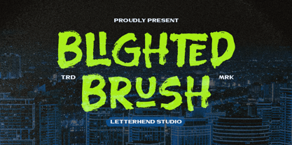 Blighted Brush is a hand drawn brush font. This font with organic freestyle textured which is purposely made for headline, display or logotype, magazines, books, greeting / wedding cards, packaging and signature which need a standout appearing. Features : Uppercase & lowercase Numbers and punctuation Alternates & Ligatures Multilingual PUA encoded We highly recommend using a program that supports OpenType features and Glyphs panels like many of Adobe apps and Corel Draw, so you can see and access all Glyph variations.
 - Tora Caligraphy by Samtype,
$39.95 This font is a new fresh type of caligraphy hebrew font. The opentype features are much better then those are in the font market.
 - Pantographia by Intellecta Design,
$9.00Pantographia Collection is a Intellecta digitization, in facsimile style, without artistical interpretation of any kind, of the work of Edmund Fry (monumental book), Pantographia , a work on languages containing over 200 alphabets. We just are collecting in digital way these alphabets. Each alphabet has a short pdf description (see in the gallery). For example, in the pdf brochure of the "Saracen One" font, according to Edmund Fry, "This characters, according to Theseus Ambrosius, was used by the Saracens at the time of their conquests. Claude Duret, p. 475." Ambrosius, Theseus: Introductio in Chaldaicam lingua, Syriaca, atque Armenicam, [et] dece*. - 1539. Theseus Ambrosius or AMBROGIO, was an Italian orientalist, which born in 1469, and died in 1539 - He wrote his Introduction to the Chaldean, Syrian, Armenian, and ten other tongues, with the alphabetical characters of about forty different languages, 4to." The Pantographia font have only the original characters showed in Fry's book. There are instructions in the PDF files to get them. These fonts have no philological (or linguistic) academic pretentions. They are digitized and faithful versions of the original, like first published at Fry's book. - Aure Declare by Aure Font Design,
$23.00 Aure Declare officiates with dignity and dispassion. These traditional serif forms engage the reader with a no-nonsense subtext of reliability. Declare’s capacity to showcase the message rather than the medium brings a welcome legibility to extended text and a formal assertion to astrological expressions and chartwheels. Declare is an original design developed by Aurora Isaac. After more than a decade in development, 2018 marks the first release of the CJ and KB glyphsets in regular, italic, bold, and bold-italic. The CJ glyphset is a full text font supporting a variety of European languages. A matching set of small-caps complements the extended lowercase and uppercase glyphsets. Supporting glyphs include standard ligatures, four variations of the ampersand, and check-mark and happy-face with their companions x-mark and grumpy-face. Numbers are available in lining, oldstyle, and small versions, with numerators and denominators for forming fractions. Companion glyphs include Roman numerals, specialized glyphs for indicating ordinals, and a variety of mathematical symbols and operators. The CJ glyphset also includes an extended set of glyphs for typesetting Western Astrology. These glyphs are also available separately in the KB glyphset: a symbol font re-coded to allow easy keyboard access for the most commonly used glyphs. In addition to Aure Declare’s versatility as a text font, Declare pairs well as a no-nonsense foil to any decorative design. Aure Sable, for example, will shine all the more beside Declare’s practicality. Aure Declare pairs especially well with its close cousin, Aure Wye. Wye’s decorative forms provide elegant titles and drop-caps for Declare’s extended text. Give Aure Declare a trial run! You may discover a permanent place for this font family in your typographic palette. AureFontDesign.com
 - Smooth Sailing JNL by Jeff Levine,
$29.00 Songs of the early 1900s were anything but the status quo in topic or style. Excessively long titles, novelty tunes and "foreign themes" permeated the piles of sheet music in the local music shops. 1916's "Oh How She Could Yacki Hacki Wicki Wacki Woo (That's Love in Honolu)" covered a number of these quirks within one publication. This Hawaiian-tinged song evoked the mysterious ways of the South Seas islands, despite the abridging of Honolulu to "Honolu". Nonetheless, the hand lettered title of this particular piece of sheet music featured an Art Nouveau-influenced bold block letter with rounded corners. It's now available digitally as Smooth Sailing JNL, in both regular and oblique versions.
 - Megatura by Haksen,
$19.00 Megatura is a Bold elegant modern vintage with upper and lowercase feel nice balanced curves. This font is inspired by lettering from couple of the good talent artist, but it still has a strong modern appearance. Its wide range of stylistic alternates allows versatile design options and works perfectly for headlines, logos, posters, packaging, T-shirts, postcards and much more. Font Features : Regular and Italic version Character set A-Z Stylistic Alternates & Ligatures Numerals & Punctuation Accented Characters Multiple Languages Supported Recommended to use in Adobe Illustrator or Adobe Photoshop with opentype feature. How to access Alternate Characters? Open glyphs panel : - In Adobe Photoshop choose tool Window > glyphs - In Adobe Illustrator choose tool Type > glyphs If you have questions, just send me a message and I'm glad to help Have a great day Haksen Std
 - Grantland by Letterhend,
$19.00 Grantlad is a condensed hand drawn brush font which is purposely made for headline, display or logotype, and signature which need a standout appearing. This font is also suitable to be applied especially in logo, and the other various formal forms such as invitations, labels, logos, magazines, books, greeting / wedding cards, packaging, fashion, make up, stationery, novels, labels or any type of advertising purpose. Features : uppercase & lowercase numbers and punctuation multilingual alternates & ligatures PUA encoded We highly recommend using a program that supports OpenType features and Glyphs panels like many of Adobe apps and Corel Draw, so you can see and access all Glyph variations. How to access opentype feature : letterhend.com/tutorials/using-opentype-feature-in-any-software/ Email us to letterhend@gmail.com if you need something! Happy Designing!
 - Corvus by Artisticandunique,
$40.00 Corvus is a display serif font family, stylized with elegant soft turns that soften the sharp ends. Due to its structure, this font can meet your needs in all your modern or classic creative projects. Corvus is ideal for creating your creative projects on similar subjects with its gloomy and Modern Gothic stance. Absolutely perfect for titles, magazines, books, invitations, logos, packaging design, branding and more! Character Ranges: Basic Latin, Latin-1 Supplement, Latin Extended-A, Latin Extended-B, General Punctuation, Currency Symbols, Letter like Symbols,Arrows, Mathematical Operators, Miscellaneous Technical, Geometric Shapes, Miscellaneous Symbols, CJK Symbols And Punctuation, Private Use Area (plane 0), Alphabetic Presentation Forms Uppercase typeface Lowercase typeface Numbers Symbols Multilingual With this font you can create your unique designs. If you have a question, please contact me. Have a good time.
 - Inkarus by Scratch Design,
$10.00 Introducing Inkarus a playful font with a bold and all uppercase characters style. This font is perfect for posters designs, packaging, logotype, title, label, print ads, gift card, magazine title, movie title, sign, and the beautiful and curvy shape will give your designs that alternative look to your creative work looks innovative. Amazing curvy was hand-drawn and make the outlines look irregular and beautiful. This font has a lot of hand-lettered looks and the characters give a retro or urban feel. Inkarus has a serif style but can collaborate with sans-serif style together because the modern bold sans serif typeface has been the alternatives and ligatures of this font. Combine that bold shapes together will make your work a more unique, retro attitude. Ligatures Inkarus has 32 ligatures that you can turn on via the glyphs panel in Adobe applications. The ligatures make a innovative difference in the look of this font. It switches out between serif and sans serif styles that make your designs look still unity. Opentype The Alternatives and Ligatures use OpenType features. First, you will need a design app to access these options an application such as Adobe Photoshop, Illustrator, or InDesign. Alternatives All lowercase a,d,e,h, I, j,k,l,m,n, p,r, t, r you can switch out letters for other and makes your design look more like hand-lettering and innovative although you using in a repetitive way. Inkarus font includes; All uppercase characters 32 ligatures option Support for multi-languages characters Punctuation, Symbols, and Numbers Alternative lowercase characters ( a,d,e,h, I, j,k,l,m,n, p,r, t, r ) The font format is OTF So what you are waiting for? Grab it fast this font and make your innovative design. If you have any questions drop me a message.
 - Reborn 190 by Wontenart,
$20.00 is a font from the sans serif family that is bold and bold and has character, an update from the previous “Akira Monoletter” font. This font was made to support the languages of countries that require a dialogue arrangement of letters that have special marks. thus forming this special font. thank you
 - Streetscript Redux by Eclectotype,
$40.00 Streetscript Redux is an update to the now discontinued Streetscript. In the original version, it seems a lot of users didn't like the s’s in the font, and after seeing them redrawn (not always with the best results!) a few times, I decided to make a new version of the font with less idiosyncratic s’s, and this is the result, Streetscript Redux. (I should have listened to my other half - “those s’s look like fives,” she said) All other features of the original Streetscript are intact (barring a couple of s-ligatures no longer necessary). There’s been a little tweaking of some outlines, and slight changes with spacing too, but for the most part, all I've done is redraw those pesky five-like s’s, so that you don't have to.
 - RePublic by Suitcase Type Foundry,
$75.00In 1955 the Czech State Department of Culture, which was then in charge of all the publishing houses, organised a competition amongst printing houses and generally all book businesses for the design of a newspaper typeface. The motivation for this contest was obvious: the situation in the printing presses was appalling, with very little quality fonts existing and financial resources being too scarce to permit the purchase of type abroad. The conditions to be met by the typeface were strictly defined, and far more constrained than the ones applied to regular typefaces designed for books. A number of parameters needed to be considered, including the pressure of the printing presses and the quality of the thin newspaper ink that would have smothered any delicate strokes. Rough drafts of type designs for the competition were submitted by Vratislav Hejzl, Stanislav Marso, Frantisek Novak, Frantisek Panek, Jiri Petr, Jindrich Posekany, and the team of Stanislav Duda, Karel Misek and Josef Tyfa. The committee published its comments and corrections of the designs, and asked the designers to draw the final drafts. The winner was unambiguous — the members of the committee unanimously agreed to award Stanislav Marso’s design the first prize. His typeface was cast by Grafotechna (a state-owned enterprise) for setting with line-composing machines and also in larger sizes for hand-setting. Regular, bold, and bold condensed cuts were produced, and the face was named Public. In 2003 we decided to digitise the typeface. Drawings of the regular and italic cuts at the size of approximatively 3,5 cicero (43 pt) were used as templates for scanning. Those originals covered the complete set of caps except for the U, the lowercase, numerals, and sloped ampersand. The bold and condensed bold cuts were found in an original specimen book of the Rude Pravo newspaper printing press. These specimens included a dot, acute, colon, semicolon, hyphens, exclamation and question marks, asterisk, parentheses, square brackets, cross, section sign, and ampersand. After the regular cut was drafted, we began to modify it. All the uppercase letters were fine-tuned, the crossbar of the A was raised, E, F, and H were narrowed, L and R were significantly broadened, and the angle of the leg and arm of the K were adjusted. The vertex of the M now rests on the baseline, making the glyph broader. The apex of the N is narrower, resulting in a more regular glyph. The tail of Q was made more decorative; the uppercase S lost its implied serifs. The lowercase ascenders and descenders were slightly extended. Corrections on the lower case a were more significant, its waist being lowered in order to improve its colour and light. The top of the f was redrawn, the loop of lowercase g now has a squarer character. The diagonals of the lowercase k were harmonised with the uppercase K. The t has a more open and longer terminal, and the tail of the y matches its overall construction. Numerals are generally better proportioned. Italics have been thoroughly redrawn, and in general their slope is lessened by approximatively 2–3 degrees. The italic upper case is more consistent with the regular cut. Unlike the original, the tail of the K is not curved, and the Z is not calligraphic. The italic lower case is even further removed from the original. This concerns specifically the bottom finials of the c and e, the top of the f, the descender of the j, the serif of the k, a heavier ear on the r, a more open t, a broader v and w, a different x, and, again, a non-calligraphic z. Originally the bold cut conformed even more to the superellipse shape than the regular one, since all the glyphs had to be fitted to the same width. We have redrawn the bold cut to provide a better match with the regular. This means its shapes have become generally broader, also noticeably darker. Medium and Semibold weights were also interpolated, with a colour similar to the original bold cut. The condensed variants’ width is 85 percent of the original. The design of the Bold Condensed weights was optimised for the setting of headlines, while the lighter ones are suited for normal condensed settings. All the OpenType fonts include small caps, numerals, fractions, ligatures, and expert glyphs, conforming to the Suitcase Standard set. Over half a century of consistent quality ensures perfect legibility even in adverse printing conditions and on poor quality paper. RePublic is an exquisite newspaper and magazine type, which is equally well suited as a contemporary book face. - Thawed by Larin Type Co,
$13.00 Thawed This is a display font of a narrow specialization, its letters seem to have melted and flowed, but at the same time it retains the shape of the letters and is well read. It is perfect for branding, logos, labels, short display inscriptions and advertising materials from flyers to billboards. This font includes drops of style, they make it possible to make the font more voluminous and give detail.
 - Marcinelle by Fando Fonts,
$4.00 The origin of this family is the classic French-Belgian comics. The screams and onomatopoeia of these comics have so much personality that I needed to create a typeface family that would allow the designer to really replicate them. But this family has many more applications: packaging, logos, posters, signage, packaging, branding, etc. With its wide variety of glyphs you can make your sound effects, logos, etc. in most Latin languages.
 - Santa Fe by ITC,
$29.99Santa Fe was created by British designer David Quay in 1983. Distinguishing are its script characters and the lower case e, which has the form of a capital E. The letters of this font emphasize the base line. Rounded corners pair with elegant forms to give Santa Fe a flowing, cheerful look. The figures are reminiscent of American advertisements of the 1960s with their light, carefree images. Like with most script fonts, the letters of Santa Fe should be set close enough together that they touch. An added bonus are the various alternative forms with which Quay provided Santa Fe and the many design possibilities which they offer.