10,000 search results
(0.047 seconds)
- Moyenage by Storm Type Foundry,
$55.00Blackletter typefaces follow certain fixed rules, both in respect to their forms and to the orthography. Possibly, they were a reaction to the half-developed Carolingian minuscule which was soon to end in the Latin script. Narrow, ordered script was to replace the round, hesitant and shattered shapes of letters in order to simplify writing, to unify the meaning of individual letters, and to save some parchment, too. Opposed to the practice common in monasterial scriptoriums where Uncial, Irish and Carolingian inspiration flew freely and as a result, the styles of writing differed in each monastery, the blackletter type was to define one, common standard. It was to express spiritual verticality, in perfect tune with the architecture of the Gothic era. Typography became an integral part of the overall style of the period. The pointed arch and the blackletter type were the vanguard of the spectacular transformation from the Middle Ages towards the modern era, they were a celebration of a time when works of art were not signed by their makers yet. Some unfortunate souls keep linking blackletter solely with Germany and the Third Reich, while the truth is that its direct predecessor, the Gothic minuscule, evolved mostly in France. Even Hitler himself indicated blackletter type obsolete in the age of steel, iron and concrete – thus making a significant contribution to the spreading of the Latin script in Germany. Once we leave our prejudice aside, we find that the shapes of blackletter type have exceptional potential, unheard of in sans-serif letterforms. The lower case letters fit into an imaginary rectangle which is easily extended both upwards and sideways. In its scope and in the name itself, the Moyenage type family project is to celebrate the diversity of the Middle Ages. I begun realizing the urge to design my own blackletter when visiting the beer gardens of Munich and while walking through the villages of rural Austria. The letters from the notice boards of inns are scented with spring air, with the flowers of cudweed, with white sausage and weissbier. The crooked calligraphic hooks and beaks seem to imitate the hearty yodeling of local drinkers and the rustle of the giant skirts of girls who distribute the giant wreaths of beer jugs. Moyenage is, however, a modern replica of blackletter, so it contains some otherwise unacceptable Latin script elements in upper case. I chose these keeping the modern reader in mind, striving for better legibility. The font is drawn as if written with a flat pen or brush, and with the ambition to, perhaps, serve as a calligraphic model. In medium width, the face is surprisingly well legible; it is perfect for menus as well as posters and CD covers for some of the heavier kinds of music. It has five types of numerals and also a set of Cyrillic script, symbolising the lovelorn union of Germans and Russians in the 20th century. Thus, it is well suited for the setting of bilingual texts of the German classic literature, which, according to the ancient rules, must not be set in Latin script. - Die Lara by Ingo,
$27.00 A girl’s handwriting written on the iPad Writing changes – throughout history over centuries, but also from generation to generation. Each new generation of students learns to write the basic forms of the letters a little differently than their predecessors. The role model is also changing. The cursive handwriting taught in school is getting closer and closer to printed type. The children no longer learn the forms of cursive handwriting required for connected writing, but first the “block letters”, only later should they develop their own individual handwriting from this, which many of them no longer do. And the writing tool is also changing. Of course, script looks different when children no longer learn to write on paper with a fountain pen, but on a tablet computer with the “pencil”. The writing experience is completely different, and the “material properties” are different too. There is practically no writing resistance that would make it difficult to move against the direction of writing. "Die Lara" was created based on the template by Lara Mörwald from the winter of 2023. The font version "Black" corresponds to the handwritten original, all thinner variants up to the wafer-thin "Hairline" are derived from it. In the variable font, the intermediate forms can be selected steplessly. In order to preserve the handwritten character of the font, "Die Lara" contains several alternates to most letters and numerals, so that different character forms alternate in the typeface. If the "ligatures" function is activated in the app (which is the default in most programs), these alternates appear automatically as you type. There is also an alternative "swashed" variant of some letters. So you can set somewhat livelier accents at the beginning or end of a word. "Die Lara" also contains fractions and tabular figures.
 - Tabac Mono by Suitcase Type Foundry,
$75.00 A big advantage of the font family is a consistent width of all sixteen styles, so it is possible to switch between them without changing the typesetting. Tabac Mono extends the means of expression of the other fonts in the font superfamily, with which it shares several OpenType functions, including indexes, fractions, several types of numbers and alternative shapes of the most distinctive letters of the Latin alphabet (a, g, Q), which you can use to significantly influence the character of the final composition.
 - Gnarly by Mans Greback,
$59.00 Dipping into the shadowy corridors of design, the Gnarly font family weaves a tale of both intrigue and artistry. Comprising the eerie elegance of Gnarly Bone, the spine-chilling intricacy of Gnarly Skeleton, and the vertebrae-inspired mystique of Gnarly Spine, each sub-family adds its unique touch to the overarching narrative of the collection. Perfect for those seeking a blend of the macabre and the meticulously crafted, this trio of typefaces brings a uniquely haunting aesthetic to any project, from film posters to novel covers.
 - Home Education by Hanoded,
$15.00 Just before the end of 2020 all schools in Holland closed for the second time, because of an increase in the number of COVID 19 cases. This means that my wife and I have to educate our three kids at home. The kids are great and take their tasks seriously, but it is difficult, as all three of them require different educational levels. I am sure you parents understand. Trying to get some work done is virtually impossible, so my wife and I made a schedule and we live by ‘on duty’ and ‘off duty’ days. I was thinking of this when I created this font (obviously on an ‘off duty’ day). Home Education is a handwritten scribble font. It was made with a Sharpie pen (possibly used by one of my kids, because I noticed tiny ink stains on my wooden dining table…). It comes with all the diacritics you can hope for and lovely double letter ligatures for you to play with.
 - Jakosta by Twinletter,
$15.00 We introduce Jakosta, a one-of-a-kind Japanese-themed display font. This font was created by paying close attention to each letter shape to make it as natural as possible, similar to a Japanese font, while still prioritizing letterforms that are easy to read and understand by the audience so that all of your projects will become projects that are easy to remember and understand by anyone from anywhere in the world. anywhere Logotypes, food banners, branding, brochure, posters, movie titles, book titles, quotes, and more may all benefit from this font. Of course, using this font in your various design projects will make them excellent and outstanding; many viewers are drawn to the striking and unusual graphic display. Start utilizing this typeface in your projects to make them stand out.
 - VLNL Tp Kurier by VetteLetters,
$35.00 VetteLetters is proud to bring you the TpKurier-family. It is cooked up by our German chef Martin Lorenz currently living in lovely Barcelona! Chef Lorenz about the TpKurier recipe: “TpKurier is the second redesign we did of Courier. The first redesign in 2000, although based on a five-unit grid, was drawn completely by hand. Six years later we designed another grid version of Courier, and the TpKurier family was born. This version is completely constructed up till its last detail. We didn't want to correct ‘mistakes’ deriving from the use of the grid, but instead make them visible (see “S”). TpKurier is based on a very simple grid, composed a proportion of four units high by two units wide. A series of other links between them make it possible to form a font from this grid. We felt it was important to consistently work within these limitations so that any unexpected asperities would help provide the font with its character. Even though it is a rough constructed typeface it was important to us to design real italic lower case letters and not just a sloped roman (see “a”, “g” or “s”). The first family published contained a serif and sans-serif version of the TpKurier, with italic and bold.”
 - Caslon 540 by URW Type Foundry,
$89.99 William Caslon (1692-1766) laid the foundation for English typefounding, when he cut his first roman face in London in 1722. He modeled his designs on late seventeenth-century Dutch types; thus his typefaces are classified as Old Styles. The original Caslon punches have been preserved, enabling a perfect recutting of his faces. Notice the hollow in the apex of A and the two full serifs or beaks in the C. The italic capitals are irregular in their inclination. The Caslon font family is distinctive for use in subheadings or continuous text.
 - Botanical Scribe by Three Islands Press,
$39.00 The Raphael of Flowers is what they called Pierre-Joseph Redouté a couple hundred years ago. The Belgian native became famous in France, where he painted floral watercolors for both Marie Antoinnette and Empress Josephine. But what cemented his legacy was his perfection of a stipple engraving technique that brought his art to the masses. Botanical Scribe is modeled after the neat, cursive hand-inscribed legends on these antique prints. Because it simulates handlettering, the font retains a warm, organic quality not seen in fancy modern scripts while remaining both elegant and legible. (Its many ligatures lends to this authenticity.) Good for formal invitations or historical simulations.
 - Huge by Omotu,
$16.00 Huge is a handwritten font with a personal charm. Huge is perfect for branding projects, homeware designs, flyers, posters, product packaging - or simply as a stylish text overlay to any background image. Whats Include? 1. Uppercase and lowercase characters 2. Supports international languages 3. Numerals & punctuations, stylistic alternates, and ligatures 4. Accessible in the Adobe Illustrator Glyphs panel, or under Stylistic Alternates in the Adobe Photoshop OpenType menu, Adobe InDesign, Corel Draw, even work on Microsoft Word. 5. TTF and OTF files 6. Bonus 59 vectors (swashes, catchphrases, and doodles) Fonts include multilingual support. Please message me if you're unsure of any language support. Thanks for looking, and I hope you enjoy it! Please don't hesitate to drop me a message if you have any issues or queries. Omotu Studio ibnu.blawong2@gmail.com
 - Gutters Butter by Omotu,
$20.00 Gutters Butter! A handwrittent marker font with 8 styles, Gutters Butter Regular, Gutters Butter Regular Italic, Gutters Butter Regular Bold, Gutters Butter Regular Bold Italic, Gutters Butter Rounded, Gutters Butter Rounded Italic, Gutters Butter Rounded Bold, Gutters Butter Rounded Bold Italic. Gutters Butter font is suitable for branding, logotype, apparel, T-shirt, Hoodie, product packaging, quotes, flyer, poster, advertising, etc. Whats Include? Uppercase and lowercase characters Supports international languages Opentype feature: ligatures, alternate Accessible in the Adobe Illustrator Glyphs panel, or under Stylistic Alternates in the Adobe Photoshop OpenType menu, Adobe InDesign, Corel Draw, even work on Microsoft Word Please message me if you’re unsure of any language support. Thanks for looking, and I hope you enjoy it! Please don’t hesitate to drop me a message if you have any issues or queries.
 - Breughel by Linotype,
$29.99Adrian Frutiger came up with this unusually purposeful and strong design in 1981 for Linotype. Early humanistic typefaces of the sixteenth century, especially Jenson, served as models for Breughel. The right sides of the stems are vertical and at right angles to the baseline while the left sides of the stem curve into the serifs, making the typeface look as though it slants to the right, and giving it a sense of movement and liveliness. The ductus of the broad-edged pen is reflected in the flow, rhythm, and texture of text set in Breughel, but at the same time this design has a regularity of form that is typographically solid. Breughel is an ideal typeface for the designer with skill and vision. Use it to create innovative publications, posters, and advertisements. - Pergamon by URW Type Foundry,
$39.99 The Pergamon series is a creation of Alfons Schneider (1890–1946) and was issued by the foundry of Ludwig Wagner in Leipzig in 1937/1940, though the website of the Klingspor-Museum says that several of the faces were probably produced after the death of Schneider. This digital version is extended with the necessary OT characters and signs, while also the “символы кириллицы” are added. Also, in addition to the members of the family designed by Schneider, regular, italic, bold and bold italic extended versions were produced. The specimens of Ludwig Wagner stated emphatically: “In allen Graden werden beide K K geliefert”, so these two forms are in all the faces, while the two condensed members also have k k, as the specimens said that this alternative character was also in these two faces.
 - Cinta Adhesiva by Wordshape,
$20.00 Cinta Adhesiva began as a typeface designed for the masthead of a graffiti fanzine called Free Copy. The monumental letters painted by L.A.-based graffiti writers Crae and Hael greatly influenced the feel of the typeface. The availability and ease-of-use of tape as a medium to write with is apparent on a multitude of surfaces, and this approach led to the creation of Cinta Adhesiva.
 - Foreign Film JNL by Jeff Levine,
$29.00 The Art Deco hand lettered opening credits for the 1936 French drama “La Belle Équipe” [English title: “They Were Five”] provided the inspiration for Foreign Film JNL, which is available in both regular and oblique versions. According to Wikipedia, the film “…tells the story of five unemployed workers who win the jackpot in the national lottery but their solidarity then proves fragile.”
 - Granjon by Linotype,
$29.99 The design for Granjon was produced at the English branch of Linotype under the direction of George William Jones and appeared in 1928. This reproduction of a Garamond typeface was based on the typeface sample of the Frankfurt font foundry Egenolff from the year 1592 . The roman characters of the sample were made by Claude Garamond and the italic forms were designed by Robert Granjon. Jones made sure that the Granjon font remained true to the original characters of Garamond and Granjon.
 - Jessen-Schrift by profonts,
$41.99 The original Jessen typeface, named in reminiscence of the great supporter of the printing art at the end of the 19th century, Peter Jessen, was designed in the years of 1924 until 1930. Bible Gothic was created by the famous German designer Rudolf Koch. Ralph M. Unger digitized this font exclusively for profonts in 2005, keeping his digitization as close as possible to the original design of Koch in order to preserve the distinguished character and the partly unconventional, original forms. The concept of a Bible Gothic was developing for years in Koch's mind and drove the direction of his work, but only after the experience with his Neuland design could he start the creation of his Peter Jessen typeface. Produced quite like Neuland, Jessen, however, is much more refined and more accurate in detail than Neuland. At first glance, it seems to look plain and simple, but if you look closer, the richness of its distinguished upper case forms unfold to a perfectly clear flow of text
 - Parchemin by Scholtz Fonts,
$19.95 The name “Parchemin” is derived from the word in old English for “parchment.” Our modern word “parchment” changed its spelling to conform with French spelling practices during the French occupation of England. The font was created to suggest an informal but antique form of handwriting written on parchment with a quill pen. The scratchiness of the old quill pen is conveyed in the roughness of the characters. The font was loosely based on the font Queen. Use this font whenever you want to suggest rough informality or antique handwriting. The characters have been letter-spaced and kerned in such a way that they join perfectly with one another giving a completely convincing imitation of genuine handwriting. The font is fully professional in terms of its character set. It contains more than 235 characters — (upper and lower case characters, punctuation, numerals, symbols and accented characters are present). In fact, it has all the accented characters used in the major European languages.
 - Katz Pajamas JNL by Jeff Levine,
$29.00 According to Wiktionary, "the cat's pajamas" was a slang phrase coined by Thomas A. Dorgan, the well-known journalist, cartoonist and sportswriter of that era. The phrase became popular in the U.S. in the 1920s, as the word "cat" was used as a term to describe the unconventional flappers from the jazz era. This was combined with the word pyjamas (a relatively new women's fashion during that time) to form a phrase used to describe something that is the best at what it does, thus making it highly sought and desirable. Wikipedia adds that Dorgan was the first to use the terms "twenty-three, skidoo", and "yes, we have no bananas", "apple sauce" and "solid ivory", which also became part of the slang of the "Roaring Twenties". Katz Pajamas JNL is a condensed slab serif typeface based on the title lettering for the 1944 sheet music "Pretty Kitty Blue Eyes", hence the pun-laden font name paying homage to this bit of verbal Americana as well as making the pajamas a pair owned by Mr. Katz instead of the fashionable feline. Available in both regular and oblique versions.
 - Connected Neon by Ditatype,
$29.00 Connected Neon is a mesmerizing display font that encapsulates the vibrant glow of neon lights, fusing it with a unique twist of connected letterforms. With its bold and uppercases design, this typeface commands attention, drawing the viewer into a captivating visual experience. The defining feature of Connected Neon lies in its elegant lines that seamlessly connect each letter, creating a unified and harmonious composition. These delicate lines flow effortlessly from one character to the next, accentuating the connectivity between them. As a result, the letters appear to dance with an electric energy, forming an enchanting tapestry of illuminated artistry. The neon-inspired style of Connected Neon is a nod to the retro-futuristic aesthetics of the 80s, reminiscent of the vibrant signage that adorned the bustling city streets. The font's luminous glow radiates with an otherworldly aura, casting a vivid hue that is both nostalgic and contemporary, evoking a sense of vibrant energy and modernity. Each character in Connected Neon has been meticulously crafted to strike the perfect balance between legibility and decorative flair. The bold letterforms boast a sleek, sans-serif design, ensuring clarity even in the midst of the dynamic interplay of lines. The seamless connections between letters create a sense of continuity and fluidity, enhancing the visual appeal without compromising readability. Enjoy the various features available in this font. Features: Multilingual Supports PUA Encoded Numerals and Punctuations Connected Neon is ideal for a range of creative projects that demand a touch of charismatic flair. From eye-catching headlines on posters and advertisements to striking branding elements, this font adds a touch of electrifying allure to any design. Whether you're designing a captivating logo, crafting an attention-grabbing title, or bringing a digital artwork to life, Connected Neon will effortlessly infuse your creations with a radiant glow and a sense of interconnectedness. Find out more ways to use this font by taking a look at the font preview. Thanks for purchasing our fonts. Hopefully, you have a great time using our font. Feel free to contact us anytime for further information or when you have trouble with the font. Thanks a lot and happy designing.
 - OBITRUK by Twinletter,
$17.00 Meet Obitruk, a powerful display font with a superhero style that will take your projects to a new level. Whether you’re working on a movie, a game, or a design with a strong and bold theme, Obitruk is the perfect solution. With its strong, bold appearance, this font exudes confidence and draws attention. Distinctive superhero style adds fun and adventure to your creations, making them stand out from the crowd. Obitruck not only looks amazing but is also packed with features that will enhance your designs. Ligature and alternative characters provide flexibility and creative possibilities, allowing you to customize and add unique touches to your typography. Plus, multilingual support ensures your message is accessible to a global audience. Show the power of Obitruk and bring your projects to life. Get ready to make a bold statement with this dynamic font that embodies strength, thickness, and a fearless spirit. Improve your designs with Obitruk and leave a lasting impression on your audience. What’s Included : File font All glyphs Iso Latin 1 Alternate, Ligature Simple installations We highly recommend using a program that supports OpenType features and Glyphs panels like many Adobe apps and Corel Draw so that you can see and access all Glyph variations. PUA Encoded Characters – Fully accessible without additional design software. Fonts include Multilingual support
 - Unless by Gassstype,
$23.00 Introducing of our new product Unless is Terror Brush Font and Multilanguage support font with a dramatic movement with special alternative glyph and Ligature glyph. This font is great for your next creative project such as logos, printed quotes, invitations, cards, product packaging, headers, Logotype, Letterhead, Poster, Label, and etc. That is why Unless has Rough and strong characteristic more natural look to your text with a more modern look to your text. You can activate Ligature and Alternative glyphs OpenType panel . Unless is perfect for homeware designs,branding projects, Logo design, Quotes product packaging,and cartoon.
 - Bad Command by Gassstype,
$25.00 Hello Everyone, Introduce our new collection, Bad Command is Ligature Brush Font.font is a Signature Style and classy style, inspired by famous logos of Technology and brands that have very strong characteristics, this font is great for your creative projects such as watermark on photography, and perfect for logos & branding, invitation,advertisements,product designs, stationery, wedding designs,label ,product packaging, special events or anything that need handwritting taste. That is why Bad Command has charming, authentic and relaxed characteristic more natural look to your text with a more natural look to your text. You can activate Ligature OpenType panel.
 - Neography by Letterhend,
$19.00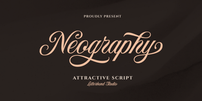 Neography - Attractive Script is a beautiful script font with unique alternates and swashes. This font is perfect to be applied especially in logos and other various formal forms such as invitations, labels, magazines, books, greeting / wedding cards, packaging, fashion, make up, stationery, novels, labels or any type of advertising purpose. Features : uppercase & lowercase numbers and punctuation multilingual ligatures alternate swashes PUA encoded We highly recommend using a program that supports OpenType features and Glyphs panels, like in Adobe apps and Corel Draw, so you can see and access all Glyph variations. Email us to letterhend@gmail.com if you need something! Happy Designing!
 - Kanote by Letterhend,
$15.00 Introducing, Kanote. A Whimsical display font. This typeface is have a playful and casual look, very suitable to use for headline, title, logo or anything especially related with fun themed design project. Features : uppercase & lowercase (alternates) numbers and punctuation multilingual PUA encoded We highly recommend using a program that supports OpenType features and Glyphs panels like many of Adobe apps and Corel Draw, so you can see and access all Glyph variations. How to activate opentype feature : https://letterhend.com/tutorials/using-opentype-feature-in-any-software/ Email us to letterhend@gmail.com if you need something! Happy Designing!
 - Merosa by Grezline Studio,
$18.00 Merosa is an experimental display serif font that I crafted for fashion design. You can also use this font for other purposes such as logos, labels, invitations, magazines, books, greeting/wedding cards, packaging, stationery, novels, labels, any type of advertising and etc. Feature : - Alternates and Ligatures - Multilingual Language - Works on PC & Mac - Simple installations - Accessible in Adobe Illustrator, Adobe Photoshop, and Adobe InDesign, and even works on Microsoft Word. We highly recommend using a program that supports OpenType features and Glyphs panels like many Adobe apps and Corel Draw, so you can see and access all Glyph variations. Thank You!
 - Tabac by Suitcase Type Foundry,
$125.00 The Tabac type system is a static typeface with modern shapes and distinct, wedge-shaped serifs. It is primarily designed for the setting of newspapers, magazines and books. Tabac boasts great variability in terms of letter weight in all of its styles. Each style works as a font of its own, featuring the full set of glyphs. The styles may be combined depending on the user; the choice of text and title face thus depends fully on the designer’s own taste, on the needs of the readers and the technologies of printing in use.
 - Alien Argonaut AOE by Astigmatic,
$19.95The Alien Argonaut typeface is an emaciated typeface made from the lettering of beings that have lived amongst us for centuries, evolving with humankind. Study your environment, all is not what it seems. Use this typeface to try and blend into their world within ours. Purchase Alien Argonaut today, for knowing the roots of others may help you learn to live in harmony with them. - Broadletter JNL by Jeff Levine,
$29.00Modern digital typography pushes many designers to try and achieve visual perfection with their lettering. In the days of wooden type, the premise was more in creating a font that "sold" the message (possibly, in part due to the lack of advanced tooling to achieve uniformity). In many styles of wood type (such as the one used as a model for Broadletter JNL), there are vast differences within the character design, weight and symmetry from letter to letter. This is now looked upon as "old fashioned" and "charming" - part of the appeal of this typeface. - Hip Flask by Comicraft,
$19.00Well, if you found this page via Google and what you're looking for is NOT a Slam Bang display and logo font (made famous by the logo of our sister company's flagship comic book title, HIP FLASK), but in fact a small metal bottle suitable for brandy, whiskey or the spirit of your choice, then we deeply apologize. If you've read this far, then we'd like to point you to eBay where you'll find a wide selection of the items you're looking for. While you're there you might also like to consider how difficult it is for HIP FLASK fans to find back issues of our comic amongst all those pewter and stainless steel christmas gifts for your golfing friends and fellow alcoholics. - Hollenbeck JNL by Jeff Levine,
$29.00Hollenbeck JNL is the Art Deco, all-caps cousin of Jeff Levine's Hallandale JNL typeface. This version utilizes the thick-and-thin stroke weights so popular during the Art Deco era, while retaining the look of hand-lettered copy. Best suited at larger point sizes, this font is a nice alternative to the over-used display faces reminiscent of that time period. - Parsnip NF by Nick's Fonts,
$10.00Will Ransom designed the exemplar for this series for Barnhart Brothers & Spindler in the early 1900s. The typeface was originally named "Parsons", after the advertising director of a Chicago department store (evidently a very BIG customer of BB&S). Both versions of this font contain the Unicode 1252 (Latin) and Unicode 1250 (Central European) character sets, with localization for Romanian and Moldovan. - Sponge Bear by Attractype,
$12.00 Sponge Bear is a playful heavy display font, this unique font is suitable for various designs that require thick text and designs with funny, cheerful, happy, spirit, adventure themes. The stylistics of the Sponge Bear font will change the vertical position of the letters randomly, this will make the series of words more unique and interesting. Have fun creating with Sponge Bear.
 - Kawara by Twinletter,
$15.00 Kawara, our newest font, is now available. We produced this display font with a Japanese theme or an Asian font to fulfill the needs of your project with a Japanese theme, but it’s impossible to use an authentic Japanese font because not everyone understands Japanese letters, therefore we present this font as an intermediate alternative. To make your project gorgeous, strong, and bold, we produced this font with the most unique shape imaginable. So, what are you waiting for? Use this font to realize your ambition of having a wonderful project. Logotypes, food banners, branding, brochure, posters, movie titles, book titles, quotes, and more may all benefit from this font. Of course, using this font in your various design projects will make them excellent and outstanding; many viewers are drawn to the striking and unusual graphic display. Start utilizing this typeface in your projects to make them stand out.
 - LT Beverage - 100% free

- Lust Sans by Positype,
$39.00 Lust Sans is the penultimate exploration of producing a high-contrast sans wholly influenced by its bracketed ancestor. The aspect of this endeavor I enjoyed the most was finding sneaky ways to infuse warmth and whimsy into the letterforms when you least expect it. The result, however, is subtle and uniquely balances against Lust and Lust Didone without becoming cold and overbearing. To accomplish this, Lust Sans has 6 weights. What I found during development was, based on any setting where Lust or Lust Didone were in the same layout, the amount of contrast shown with Lust Sans needed to be adjusted. Expanding the weight offering, produces opportunities for Lust Sans to modulate the rhythm of the layout comfortably while keeping contrast—this is even more obvious with the Italics. I love those. You will too. If you don’t, you do not have a soul. Not sorry. The Lust Collection is the culmination of 5 years of exploration and development, and I am very excited to share it with everyone. When the original Lust was first conceived in 2010 and released a year and half later, I had planned for a Script and a Sans to accompany it. The Script was released about a year later, but I paused the Sans. The primary reason was the amount of feedback and requests I was receiving for alternate versions, expansions, and ‘hey, have you considered making?’ and so on. I listen to my customers and what they are needing… and besides, I was stalling with the Sans. Like Optima and other earlier high-contrast sans, they are difficult to deliver responsibly without suffering from ill-conceived excess or timidity. The new Lust Collection aggregates all of that past customer feedback and distills it into 6 separate families, each adhering to the original Lust precept of exercises in indulgence and each based in large part on the original 2010 exemplars produced for Lust. I just hate that it took so long to deliver, but better right, than rushed, I imagine.
 - ITC Rastko by ITC,
$29.99ITC Rastko began as a series of initial letters for a book of poetry. Serbian designer Olivera Stojadinovic had been working with a small publishing house creating a special series of books under the Masterpieces" brand. Her goal was to draw a new set of initial letters for each book. ITC Rastko, named after the Serbian poet Rastko Petrovic, was a project that required initial letters for the entire alphabet. Once Stojadinovic had drawn the majority of the capital letters, she realized that a companion lowercase would make a distinctive script typeface. Sketches of the letters were drawn quickly with a pointed pen. Stojadinovic then refined these, keeping the spontaneous, hand-drawn quality. Capitals are wide and flourished, while the lowercase letters are more condensed and subdued. It's no surprise that the capitals also make great initial letters." - Fandango by Solotype,
$19.95Curlicues galore on this modern version of a mid-victorian display type. We started with the caps from a type called Cellini, altered them considerably, and added a lowercase. - Stencil Patterns JNL by Jeff Levine,
$29.00Stencil Patterns JNL collects into one digital file a number of decorative stencil patterns from decades past. These charming illustrations were re-drawn by Jeff Levine using images of vintage oilboard stencils made over fifty years ago. While these are useful as stand-alone embellishments for any print projects, they can also be scaled and printed out onto card or acetate stock for hand-cutting as new stencil templates. A special note of thanks goes to fellow type designer and author, Leslie Cabarga. He supplied the bulk of the images used in designing this font file. There are left and right pointing hands on the parenthesis keys, and a decorative ampersand on its respective key. - Agmena Paneuropean by Linotype,
$103.99Agmena™ has no historical precursor; it was designed from scratch by Jovica Veljovi? whose aim was to create a new book typeface. Although it generally has certain similarities with the group of Renaissance Antiqua fonts, it is not clearly derived from any of these. Clear and open forms, large counters and a relatively generous x-height ensure that the characters that make up Agmena are readily legible even in small point sizes. The slightly tapering serifs with their curved attachments to letter stems soften the rigidity of the typeface, bringing Agmena to life. This non-formal quality is further enhanced by numerous tiny variations to the letter shapes. For example, there are slight differences to the terminals of the b", the "d" and the "h" and minor dissimilarities in the forms and lengths of serifs of many of the letters. The tittles over the "i" and "j" and those of the German umlauts are almost circular, while the diamond shape that is more characteristic of a calligraphic script is used for the punctuation marks. Although many of these variations are only apparent on closer inspection, they are enough to give Agmena the feeling of a hand-made typeface. It is in the larger point sizes that this feature of Agmena comes particularly into play, and individual characters gain an almost sculptural quality. The italic variants of Agmena are actually real cursives. The narrower and thus markedly dynamically formed lowercase letters have a wider range of contrast in terms of line thickness and have the appearance of having been manually produced with a quill thanks to the variations in their terminals. The lowercase "a" assumes a closed form and the "f" has a descender. The italic capitals, on the other hand, have been consciously conceived to act as a stabilising element, although the way they have been inclined does not produce a simply mechanical effect. This visual convergence with the upright characters actually means that it is possible to use letters from both styles in combination. Agmena is available in four weights: Book, Regular, Semibold and Bold, and each has its matching italic variant. Veljovi? designed Book and Regular not only to provide an optical balance between various point sizes, such as between that used for the text and that used in footnotes, but also to take account of different paper forms: Regular for lined paper and Book for publishing paper. Agmena's range of characters leaves nothing to be desired. All variants include small caps and various numeral sets with oldstyle and lining figures for setting proportional text and table columns. Thanks to its pan-European language support, Agmena can be used to set texts not only in languages that use the Latin alphabet as it also features Cyrillic and Greek characters. The set of standard ligatures has been extended to include special combinations for setting Greek and Serbian. Agmena also has some initial letters, alternative glyphs and ornaments. Agmena is a poetic text font with forms and spacing that have been optimised over years of work to provide a typeface that is ideal for setting books. But its letters also cut a good figure in the larger font sizes thanks to their individual, vibrant and, in some cases, sculptural effects. Its robust forms are not merely suited to a printed environment, but are also at home among the complex conditions on terminal screens. You can thus also use Agmena as a web font when designing your internet page."Agmena has received the Certificate of Excellence in Type Design at the Type Directors Club of New York TDC2 competition in 2013.
