10,000 search results
(0.19 seconds)
- Harri by Blancoletters,
$39.00 Harri –“stone” in Basque language– is a display font based on the peculiar letter forms used in signs and fascias all over the Basque Country. This idiosyncratic lettering style, very often used as an identity signifier, evolved from ancient inscriptions carved on gravestones which can still be found in the French part of the Basque Country (Behe Nafarroa, Lapurdi and Zuberoa).Harri takes some of its more significant features from those engraved letter forms, but also from the current overemphasized shapes derived from them, while keeping in sight their antecessors: the Romanesque inscriptions and ultimately the Roman Capitals. Gerard Unger once said “the black version of a font is a caricature of the regular”. This may explain how the odd heavy shapes in use in the Basque Country today might have evolved from their engraved roots, which are already an interpretation of Romanesque and Roman letter forms. This evolution is echoed in Harri through its weights, from the clean formal Roman-inspired light to the extreme expressive Basque-style extra bold.
 - Night Light Neon by Wing's Art Studio,
$24.00 Night Light is a specially created collection of seven neon inspired fonts giving designers the power to replicate traditionally hand-made lettering from the comfort of their own computer. Choose from the selection of script, sans serif and outline fonts to set your text. Then apply our custom graphic styles for a life giving jolt of electricity! The appeal of neon lettering lives in its power to display a message in a functional, eye-catching and timelessly cool way. How many times have you stopped in the street to admire a bar sign or shop front blazing with neon colors? It's aesthetic works equally well for a Hot Dog stand or high-end fashion brand, providing a tried and tested technique for grabbing customer attention. I've designed these fonts to make the power of neon accessible to all, investing time to research real neon signs and how they are made, paying attention to their human imperfections and inherent limitations (all of which makes them). This research has been distilled into these essential styles; Script, Outline, Inline, Square and Compressed. These seven core fonts give designers a new opportunity to take advantage of realistic neon lettering in their print and online projects, perfect for music promotion, film titles, YouTube tutorials and gig posters. Ready to be moulded to any requirement, the power of neon is in your hands. Neon Graphic Style Presets Available Here The link above provides access to the graphic styles seen in the visuals with support for Adobe Photoshop, Adobe Illustrator, Adobe After Effects. Simply download and follow the instructions provided.
 - Cross Check by Absonstype,
$13.00 CROSS CHECK is the brush display typeface with simple brush textured and all caps style looks and feel nice balanced. Honestly it works perfectly for headlines, logos, posters, packaging, T-shirts and much more for branding and anything designs. Recommended to use in Adobe Illustrator or Adobe Photoshop with opentype feature. Ligatures feature is default setting in Adobe Illustrator or Adobe Photoshop in Uppercase character. So when you want not to use the ligatures. Open glyphs panel : In Adobe Photoshop choose tool Window Character and then please click fi symbol In Adobe Illustrator choose tool Window Type Open Type and then please click fi symbol If you have questions, just send me a message and I’m glad to help. Have a great day, Absonstype
 - Feeling Depressed by Absonstype,
$17.00 FEELING DEPRESSED is the brush display typeface with simple brush textured and all caps style looks and feel nice balanced. Honestly it works perfectly for headlines, logos, posters, packaging, T-shirts and much more for branding and anything designs. Recommended to use in Adobe Illustrator or Adobe Photoshop with opentype feature. Ligatures feature is default setting in Adobe Illustrator or Adobe Photoshop in Uppercase character. So when you want not to use the ligatures. Open glyphs panel : In Adobe Photoshop choose tool Window Character and then please click fi symbol In Adobe Illustrator choose tool Window Type Open Type and then please click fi symbol If you have questions, just send me a message and I’m glad to help. Have a great day, Absonstype
 - Illustrissims by Typephases,
$-76 illustrations of vintage-inspired characters, most of them drawn from imagination, in the tradition of metal stock cuts or woodtype vignettes. Illustrissims is offered as a free sampler of our illustration style. Its themes are futher developed in the Absurdies, Bizarries, Genteta, Ombres and Whimsies series, also available from MyFonts! These illustrations are ready to use at any size and in any application (their vectorial format ensures they can be scaled to any size with no loss of sharpness). They can be used out of the box, or easily customized in any graphics program, adding colour or texture, resizing, combining... The variety of suggested uses is huge, from small spot illustrations to full-page layouts. Use them to great effect in magazine spreads, advertisements, stationery, packaging, bulletins or poster creative designs. Illustrissims combines three formerly separate dingbats (the Illustries 1-2-3 series), which have been unavailable for quite a few years. - Aglaia by Wildstripe,
$19.00 Aglaia is an elegant geometric sans serif typeface that comes in three weights. Designed in part inspired by Art Deco, but with a modern minimalist approach that makes it a versatile and excellent contemporary display font for titles, editorials and short texts. Font features: Uppercase & Lowercase Numerals, Punctuation & Symbols Alternates & Ligatures Multiple Languages Support (Latin characters + Diacritics) How to access Alternate Characters: The alternate characters can be accessed via the glyphs panel in your favorite software. Or with OpenType features turned on.
 - CCS Palmore by Creative Corner Studio,
$29.00 CCS Palmore is a vintage retro condensed display typeface combined with rounded proportions letters forms. The combination of condensed glyphs with large-rounded O and C as well as the few alternates available give the font a strong rhythm, perfectly fit for headline and titles. If you're into classic/vintage letter designs, then this typeface suits best for you. Packed with 300+ glyphs , now it’s your time to go crazy and explore the uniqueness of this typeface!
 - Overthink by WTFont,
$20.00 Often it is hard to express ourselves and our emotions. Thus, the idea of emotional typography and fonts was born. This is a detailed font with many lines and shapes. It has been designed to reflect the feeling of overthinking. Overthinking, by nature, is done by logically thinking through all the different scenarios and outcomes for one particular thought or situation. Therefore the appearance of this font is one that is structured and technical. This font is great for architecture, buildings, construction, geometry or even for situations that are heavily detailed! It definitely works great as an overlay on images or photographs. Pair this overthink font with a simple sans serif font to contrast against the details in the former. We hope you enjoy this font as much as we do!
 - Newercastle by Chank,
$49.00 Newercastle is the new incarnation of a popular Chank font formerly known as "Newcastle". A consistent fan favorite since its initial release in 2005, the distressed blackletter font is new and improved. This sinister script is now bulked up with all-new capital letters, a bit of punctuation, and smattering of new crowns, griffins and other heraldic doodads. Designer Kevin Hayes opted for an assortment of gritty old icons instead of more traditional punctuation, because he felt that's just the way this type of font could perform best for you, the font enthusiast. "At-signs and percentile glyphs just aren't believable in fraktur-style fonts," says Kevin. You benefit by getting a bit of clip art with the new font instead of boring old punctuation. Use the new bats indiscriminately to add a regal air to even the most mundane newsletter. Or use layer upon layer to add a rustic richness to a poster project. Enjoy this wicked, textural type and use it with extreme force.
 - Anthony Writters by Gassstype,
$25.00 Hello Everyone, Introduce our new collection Anthony Writters is A Handwritten Script,This font Stylish Script is great for your creative projects such as watermark on photography, and perfect for logos & branding, photography, invitation, watermark, advertisements, product designs, stationery, wedding designs,label, product packaging, special events or anything that need taste. Anthony Writters is Font Authentic that is written casually and quickly. Then scanned and carefully drawn into vector format. This handmade font will make your design has a beautiful natural touch for each details. You can activate Ligature OpenType panel design more interesting.
 - Endless Revisions by Gassstype,
$25.00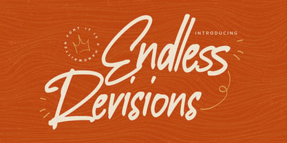 Hello Everyone, Introduce our new collection Endless Revisions It's A Handwritten Font,This font Stylish Script is great for your creative projects such as watermark on photography, and perfect for logos & branding, photography, invitation, watermark, advertisements, product designs, stationery, wedding designs,label, product packaging, special events or anything that need Signature taste. Endless Revisions is Font Authentic that is written casually and quickly. Then scanned and carefully drawn into vector format. This handmade font will make your design has a beautiful natural touch for each details. You can activate Ligature glyphs OpenType panel.
 - NoweAteny by Linotype,
$29.99Linotype Nowe Ateny is part of the Take Type Library, which features the winners of Linotype’s International Digital Type Design Contest from 1994 to 1997. Designed by Dariusz Nowak-Nova, Nowe Ateny is a frantic handwriting font whose capital letters include technical-looking grid lines and end points. These seem to anchor the letters without reducing their volatility. The font consciously lacks elements which increase legibility, sacrificing them for the sake of more design oriented ideals. Nowe Ateny is thus good for headlines in larger point sizes, especially when the look of the text is as important as its content. - Gageac by Eurotypo,
$29.00 Gageac is a classic "Didona" font, characterized by an extreme contrast in the thick and thin strokes, by the use of short serifs, and by the vertical stress of the letters. This typeface is slightly condensed, the ascenders were lowered, the thick strokes were exaggerated and enriched with a full set of OpenType features of tails, ligatures, alternates and swashes, giving them an excellent legibility and a very clear and elegant appearance. The italic version is a true "italic" so some glyphs were adjusted. Gageac Italic was carefully designed and drawn to be combined with Gageac Regular.
 - EDB Indians - Unknown license

- CrEAtOR CamPotype by Campotype,
$15.00 So far the Creator Campotype standard version known in the form of free font (published on several websites by license: free for personal use). The font takes the basic form of modern typography, but some user feedback consider it in the medieval look. Whatever it is, the inspiration of the font was originally set off from the logotype of internal student magazine where the designer had studied in the late 80s. Creator Campotype is a pure display font. This fonts do not have faces lowercase, but all caps. Nevertheless forms of different characters can be accessed by pressing the uppercase and lowercase on the keyboard. Maximum usage can be made by combining them as necessary. Some forms of characters were made more stylistic such as slash and backslash which “out of” the conventional form. In addition, the circle effects on several glyphs were created by default (as found on the free version) so that the glyph was enough to generated with the keyboard access as usual. Information for those who have access to the free version, there are significant changes in this version (2001) as described in the file “creator ct pdf” (gallery)
 - Schnorr by HiH,
$10.00 Schnorr is a family of three fonts drawn by a German designer, Peter Schnorr. Schnorr Dekorativ is one of the less frequently seen of the alphabets he designed and one of the few for which he designed as lower case. Like many of the alphabets of the period, Schnorr Dekorativ is a delicate design. To provide a little more presence, we have added a DEMIBOLD version. Included in both Schnorr Dekorativ and Schnorr Demibold are an ornament of Schnorr’s design, seven T-ligatures and an alternate lower case t. 123=Ta, 125=Te, 135=Th, 137=Ornament, 167=Ti, 172=To, 188=Tr, 190=Tu and 177=alternate t. Schnorr’s design for the lower case t is unusual and not readily recognized. The alternate may be used to improve readability. Schnorr Initialen was designed as an upper case only design and as such is quite popular. It is often seen under the name of Odessa. Our font is a fresh scan and is paired with our Schnorr Demibold to provide a compatible lower case, along with all the rest of the auxiliary characters. Schnorr Initialen includes all the extras supplied with Schnorr Dekorativ and Schnorr Demibold: 123=Ta, 125=Te, 135=Th, 137=Ornament, 167=Ti, 172=To, 188=Tr, 190=Tu and 177=alternate t. In addition, Schnorr Initialen also includes an alternate uppercase I (172) and five lotus ornaments (123, 125, 167, 188 and 190).
 - Hebrew Modern by Samtype,
$49.00 This is a classic design from the beginning of the 20th century. This font can be used in many kinds of books
 - Omed Brush by Alit Design,
$22.00 Presenting the Omed Brush Signature Script font by alitdesign. The Omed Brush Signature Script font is inspired by spontaneous and dynamic signature strokes with an ink texture that makes the Omed Brush Signature Script look real. The Omed Brush Signature Script font looks unique and charming which makes designs using the Omed Brush Signature Script look more prominent and cool. The Omed Brush Signature Script font is perfect for a collection of new fonts on your computer, tablet and smartphone for making unique designs or lettering. The Omed Brush Signature Script font is perfect for magazine cover designs, brochures, flyers. Instagram ads, Canva Design and so on with unique and modern concepts. besides that this font is very easy to use both in design and non-design programs because everything changes and glyphs are supported by Unicode (PUA). The Omed Brush Signature Script contains 804 glyphs with many unique and interesting alternative options. Language Support : Latin, Basic, Western European, Central European, South European,Vietnamese. In order to use the beautiful swashes, you need a program that supports OpenType features such as Adobe Illustrator CS, Adobe Photoshop CC, Adobe Indesign and Corel Draw. but if your software doesn't have Glyphs panel, you can install additional swashes font files. Thank You Alit
 - New Daily by URW Type Foundry,
$39.99 Marit Otto about New Daily: This typeface design has a modern but yet classic appearance. That is why she listens to the name New Daily. I took some elements from the Art Nouveau and Art Deco (type) styles. And modernized it by cultivating the beautiful curved features of both styles and playing with the stylish fluid lines and open structures. By adding a bit of the no-nonsense office look of a typeface like Nimbus Sans a new but familiar look occurs. This typeface is very readable and useful for many purposes. It has a playful distinguished character.
 - Nouveau Riche JNL by Jeff Levine,
$29.00 Within the pages of an early-1900s instructional book on show card lettering was found a marvelous example of an alphabet that typifies the Art Nouveau movement of the era and served as the inspiration for Nouveau Riche JNL. Angular, artistic and reminiscent (in some ways) of ancient Greek lettering, this design has many unusual letterforms. Check out the interpretive K and R for the best examples of this art style.
 - Abigeta Display by Adam Azura,
$14.00 Abigeta Display is sharp serif font with an elegant feel. Unique character by combining geometric shapes with organic curvy details. It is a unique typeface for your individual personality. Inspired by old-style serif and contemporary fonts. The extreme contrast between thick and thin strokes gives a harmonic and stylish look. Wide range of stylistic alternates allows versatile design options work perfectly for elegant branding, magazine design, logo design, headlines, posters, packaging, cards or your wedding invitation and more. Features: * Character set A-Z with special uppercase letters * Ligatures * Stylistic Alternates * Numerals & Punctuation * Multilingual Support This font is encoded with Unicode PUA, which allows full access to all additional characters without having special design software. Mac users can use Font Book, and Windows users can use Character Map to view and copy one of the extra characters to paste into your favorite text editor / application. We highly recommend using a program that supports OpenType features and Glyphs panels such as Adobe Illustrator, Adobe Photoshop CC, Adobe InDesign, or CorelDraw, so you can see and access all Glyph variations.
 - Disassembler by Typodermic,
$11.95 Introducing Disassembler—the ultimate simulated bitmap typeface that will transport your message straight back to the 8-bit era. With its distinctive letterforms and retro computer theme, Disassembler will add an extra level of authenticity to your designs, giving them that low-resolution voice that was so iconic of the time. The unique effects available with Disassembler mean that your text will stand out like never before. Whether you want to create a glitch effect, add a bit of distortion, or just give your letters a more vibrant color scheme, Disassembler has you covered. But it’s not just the effects that make Disassembler so special—it’s the attention to detail. To achieve the original pixel font look, kerning is limited to full pixel increments. This means that each letter is placed perfectly to give your text that authentic, vintage feel. So if you’re looking to take your design projects back to the good old days of low-res graphics and 8-bit soundtracks, Disassembler is the typeface for you. Don’t settle for ordinary—make your designs extraordinary with Disassembler. Most Latin-based European writing systems are supported, including the following languages. Afaan Oromo, Afar, Afrikaans, Albanian, Alsatian, Aromanian, Aymara, Bashkir (Latin), Basque, Belarusian (Latin), Bemba, Bikol, Bosnian, Breton, Cape Verdean, Creole, Catalan, Cebuano, Chamorro, Chavacano, Chichewa, Crimean Tatar (Latin), Croatian, Czech, Danish, Dawan, Dholuo, Dutch, English, Estonian, Faroese, Fijian, Filipino, Finnish, French, Frisian, Friulian, Gagauz (Latin), Galician, Ganda, Genoese, German, Greenlandic, Guadeloupean Creole, Haitian Creole, Hawaiian, Hiligaynon, Hungarian, Icelandic, Ilocano, Indonesian, Irish, Italian, Jamaican, Kaqchikel, Karakalpak (Latin), Kashubian, Kikongo, Kinyarwanda, Kirundi, Kurdish (Latin), Latvian, Lithuanian, Lombard, Low Saxon, Luxembourgish, Maasai, Makhuwa, Malay, Maltese, Māori, Moldovan, Montenegrin, Ndebele, Neapolitan, Norwegian, Novial, Occitan, Ossetian (Latin), Papiamento, Piedmontese, Polish, Portuguese, Quechua, Rarotongan, Romanian, Romansh, Sami, Sango, Saramaccan, Sardinian, Scottish Gaelic, Serbian (Latin), Shona, Sicilian, Silesian, Slovak, Slovenian, Somali, Sorbian, Sotho, Spanish, Swahili, Swazi, Swedish, Tagalog, Tahitian, Tetum, Tongan, Tshiluba, Tsonga, Tswana, Tumbuka, Turkish, Turkmen (Latin), Tuvaluan, Uzbek (Latin), Venetian, Vepsian, Võro, Walloon, Waray-Waray, Wayuu, Welsh, Wolof, Xhosa, Yapese, Zapotec Zulu and Zuni.
 - Pepone by Storm Type Foundry,
$43.00 This typeface is primarily optimized for the setting of belles-lettres. The regular styles are balanced to suit small text sizes and enable the reading of long portions of text. The development of the typeface was guided by the goal of creating a contemporary, discreet book serif, with modern expression and numerous functions. Letters feature reduced contrast, the lighter styles may evoke wired letters, while the heavier ones bear distinct slab serif references. The extremes thus work in harmony and fulfil the demanding requirements of advertising and magazine layout. The typeface is suitable for bottle labels, invitations, exhibition catalogs and posters, for printed and online presentations alike. The name Pepone was chosen as an homage to Josef Kroutvor. Of course, the typeface isn’t solely reserved for the setting of the works of Josef K. On the contrary – we’d like to present a universal typeface suited for literature, catalogs and magazines. It wouldn’t be the first and the last example of a typeface created with a specific purpose in mind, which later became used universally.
 - Pulse JP Arabic by jpFonts,
$29.95 النبض - the Pulse Pulse JP ME is a constructivist text and display font that differs from comparable fonts due to its special sharpness and harmonious balance. Its technical and constructed form creates a somewhat artificial impression of particular appeal. It is ideal for display on the screen and can be used in many projects. Pulse JP ME is a super family consisting of 48 fonts from compressed to expanded in six weights each. This opens up a wide designspace with the possibility of combining typefaces of the same character in a wide variety of variants and being able to adapt them to very different conditions. The details of the individual fonts are coordinated with each other with great precision and perfectly implemented in terms of craftsmanship. In all variants, this leads to a very balanced design with particular sharpness. The very extensive character set supports 120 Latin + 7 Arabic languages + Hebrew. The Arabic characters were designed in close collaboration with the Iranian designer Prof. Raafat Negarandeh. Here the constructivist approach is repeated within Arabic proportions. This leads to a very reduced and clear design with high legibility. Additional typographical adjustments can be made in the variable font, which is also available. There all variants are stored in a single font and can be continuously fine-tuned between them.
 - Rustic Setting JNL by Jeff Levine,
$29.00 Rustic Setting JNL is the solidified version of Rustic Stencil JNL. Originally modeled from lettering on the cover a children's book, the solid version of this Western-inspired typeface is reminiscent of the classic wood types of the era.
 - Classic Grotesque by Monotype,
$40.99 Classic Grotesque by Rod McDonald: a traditional font with a modern face. The growing popularity of grotesque typefaces meant that many new sans serif analogues were published in the early 20th century. Setting machines were not compatible with each other but all foundries wanted to offer up-to-date fonts, and as a result numerous different typeface families appeared that seem almost identical at first glance and yet go their separate ways with regard to details. One of the first fonts created with automatic typesetting in mind was Monotype Grotesque®. Although this typeface that was designed and published by Frank Hinman Pierpont in 1926 has since been digitalised, it has never achieved the status of other grotesque fonts of this period. But Monotype Grotesque was always one of designer Rod McDonald’s favourites, and he was overjoyed when he finally got the go-ahead from Monotype in 2008 to update this “hidden treasure”. The design process lasted four years, with regular interruptions due to the need to complete projects for other clients. In retrospect, McDonald admits that he had no idea at the beginning of just how challenging and complex a task it would be to create Classic Grotesque™. It took him considerable time before he found the right approach. In his initial drafts, he tried to develop Monotype Grotesque only to find that the result was almost identical with Arial®, a typeface that is also derived in many respects from Monotype Grotesque. It was only when he went back a stage, and incorporated elements of Bauer Font’s Venus™ and Ideal Grotesk by the Julius Klinkhardt foundry into the design process, that he found the way forward. Both these typefaces had served as the original inspiration for Monotype Grotesque. The name says it all: Classic Grotesque has all the attributes of the early grotesque fonts of the 20th century: The slightly artificial nature gives the characters a formal appearance. There are very few and only minor variations in line width. The tittles of the ‘i’ and ‘j’, the umlaut diacritic and other diacritic marks are rectangular. Interestingly, it is among the uppercase letters that certain variations from the standard pattern can be found, and it is these that enliven the typeface. Hence the horizontal bars of the “E”, “F” and “L” have bevelled terminals. The chamfered terminal of the bow of the “J” has a particular flamboyance, while the slightly curved descender of the “Q” provides for additional dynamism. The character alternatives available through the OpenType option provide the designer with a wealth of opportunities. These include a closed “a”, a double-counter “g” and an “e” in which the transverse bar deviates slightly from the horizontal. The seven different weights also extend the scope of uses of Classic Grotesque. These range from the delicate Light to the super thick Extrabold. There are genuine italic versions of each weight; these are not only slightly narrower than their counterparts, but also have variant shapes. The “a” is closed, the “f” has a semi-descender while the “e” is rounded. Its neutral appearance and excellent features mean that Classic Grotesque is suitable for use in nearly all imaginable applications. Even during the design phase, McDonald used his new font to set books and in promotional projects. However, he would be pleased to learn of possible applications that he himself has not yet considered. Classic Grotesque, which has its own individual character despite its neutral and restrained appearance, is the ideal partner for your print and web project.
 - DASEGO by Twinletter,
$15.00 DASEGO, our newest font, is now available. A display typeface with an Asia theme that we made to fulfill the needs of your project with an Asian theme that you may use for projects that can be understood by audiences all over the world. We created this typeface by paying close attention to the individuality of each letter, abstract while still prioritizing optical harmony, and your project will look stunning with it. Logotypes, food banners, branding, brochure, posters, movie titles, book titles, quotes, and more may all benefit from this font. Of course, using this font in your various design projects will make them excellent and outstanding; many viewers are drawn to the striking and unusual graphic display. Start utilizing this typeface in your projects to make them stand out.
 - Senada by Haksen,
$14.00 Senada is a lovely bouncy script font with a natural & stylish flow. Perfect for making elegant stylish statements - or adding a touch of class to your designs. This script has a multitude of lovely alternates character in its OpenType features - making the font look a beautiful Senada is perfect for many different projects such as logos & branding, invitation, stationery, wedding designs, social media posts, advertisements, product packaging, product designs, label, photography, watermark, special events or anything. What you get: Senada includes capital and lowercase letters, alternates, and Ligatures Numbers + punctuation Foreign language support I highly recommend using a program that supports OpenType features and Glyphs panels such as Adobe Illustrator, Adobe Photoshop CC, Adobe InDesign, or CorelDraw, so you can see and access all Glyph variations. Senada is encoded with Unicode PUA, which allows full access to all additional characters without having special design software. Mac users can use Font Book, and Windows users can use Character Map to view and copy one of the extra characters to paste into your favorite text editor/application. I hope you enjoy the font, please feel free to comment if you have any thoughts or feedback. Or simply send me a PM or email me.
 - Ely Rounded by Cory Maylett Design,
$30.00 Smooth and shapely without a trace of fat. A seductively handsome devil without the attitude. This typeface wears a tie at the office, but keeps a pair of sneakers and a beach volleyball in the car. Ely Rounded is a family of four weights plus matching italics (with more on the way). Each weight includes extended language support for European, Cyrillic and Greek. OpenType features include fractions, tabular and proportional figures plus a few ligatures thrown in for good measure. This is a typeface that works well from text sizes to billboards, and is equally at home in print or on the web. Future updates of purchased fonts are, of course, free. Buy the full set and receive yet-to-be-released weights at no charge — even as the price of that growing full package increases.
 - Theater District JNL by Jeff Levine,
$29.00 Theater District JNL revisits the classic lettering of the 1930s Art Deco movement with this bold headline type. While many variations of this letter form exist, each interpretation evokes the approach to modernism and streamline embraced by architects and fashion designers of the period.
 - Giza RE by Font Bureau,
$40.00 Giza brings back the colorful power and variety of the original Egyptian letterforms, a glory of the Victorian era. Designer David Berlow based the family on showings in Vincent Figgins’ specimen of 1845, the triumphant introduction of this thunderous style. This version of the family is part of the Reading Edge series of fonts specifically designed for small text onscreen, having been adjusted to provide more generous proportions and roomier spacing, and having been hinted in TrueType for optimal rendering in low resolution environments.
 - Jensen Old Style by Wooden Type Fonts,
$15.00 Based on the original design of Nicholas Jenson 1470-76, this is a revival of one of the popular wooden type fonts of the 19th century. This font was also created in a slightly different version by William Morris circa 1890. Suitable for text.
 - HWT Star Ornaments by Hamilton Wood Type Collection,
$24.95 Star Ornaments are seen as a long standing companion to many wood type poster layouts. Various manufacturers managed to derive many variations of the five pointed star motif and offered them as a ubiquitous ornament option in almost all of their catalogs. Manufacturers such as Wm. H Page, Morgans & Wilcox, Tubbs Mfg. Co. and of course, Hamilton Wood Type each had their own slight variations. This digital font features almost 100 glyphs of mostly stars, but it also features a unique star border that can create boxes just like the modular offerings of the 19th century. The twist on this digital version is the inclusion of additional connection options that become a unique lettering 'kit' that can create typography or maze-like connections using a limited set of component parts.
 - Laberintia by Rodrigo Navarro Bolado,
$30.00 "And she, Pasiphae, gave birth to Asterion, who was also known by the name of Minotaur, since he had the face of a bull and the rest of a man. Minos wanted to beware against certain oracles by locking him in a maze. It was the labyrinth, the work of Daedalus, a construction of tangled revolts that strayed from the exit.” - Apollodorus from Atenas. LABERINTIA is a font inspired by Daedalus' masterpiece, The Cretan Labyrinth, an experimental, display typeface that creates textures, plays with the mind and loses anyone who dares to take a walk inside it.
 - Zierfraktur by RMU,
$35.00 This highly stylish, engraved blackletter font was cut by Rudolf Koch between 1919 and 1921 for Klingspor in Offenbach on Main. It was then sold under the name Deutsche Zierschrift. I completely redraw and extended this font and called it Zierfraktur. To take full advantage of this fine headline blackletter font, please use it from, at least, 18 points upward. This font contains a bunch of useful ligatures, and it is recommended to activate both Standard and Discretionary Ligatures. The round s can be reached by typing the # key, and you get the numero sign by typing the combination N-o-period and activating the OT feature Ordinals.
 - Croasian by MKGD,
$13.00 The main reason I wanted to design this font was because I really didn’t like how poorly some fonts tried to mimic an Oriental appearance. Trying to make western words appear Asian with a font composed of brush strokes is almost always doomed to failure. However, I find Croasian works extremely well with one syllable words that are Asian sounding. A good font to have if you want to express an Asian name or business phonetically in a western alphabet while still retaining an Asiatic feel. Croasian has a glyph count of 397 and supports the following languages Afrikaans, Albanian, Asu, Basque, Bemba, Bena, Bosnian, Catalan, Chiga, Colognian, Cornish, Croatian, Czech, Danish, Embu, English, Esperanto, Estonian, Faroese, Filipino, Finnish, French, Friulian, Galician, German, Gusii, Hungarian, Icelandic, Indonesian, Irish, Italian, Kabuverdianu, Kalaallisut, Kalenjin, Kamba, Kikuyu, Kinyarwanda, Latvian, Lithuanian, Low German, Lower Sorbian, Luo, Luxembourgish, Luyia, Machame, Makhuwa-Meetto, Makonde, Malagasy, Malay, Maltese, Manx, Meru, Morisyen, North Ndebele, Norwegian Bokmål, Norwegian Nynorsk, Nyankole, Oromo, Polish, Portuguese, Romanian, Romansh, Rombo, Rundi, Rwa, Samburu, Sango, Sangu, Scottish Gaelic, Sena, Shambala, Shona, Slovak, Slovenian, Soga, Somali, Spanish, Swahili, Swedish, Swiss German, Taita, Teso, Turkmen, Upper Sorbian, Vunjo, Walser, Zulu
 - Milonguita by Sudtipos,
$49.00 Milonga is one of the most characteristic dances of Argentina and it is usually compared to Tango. However, couples perform shorter and more energetic movements when dancing to the beat of Milonga. In addition, while Tango evokes the idea of nostalgia and reminiscence, Milonga conjures up more light-hearted memories in people's minds. Milonguita was designed so that readers can experience the passion and spontaneity of this dancing style through words. Users can play with the upwards and downwards patterns of the letters creating different images and textures and thus, making texts flow smoothly and naturally, just as a warm piece of Milonga would. The irregularity of the strokes conveys emotions and establishes a bond between the font and the sensitivity of the writer. The result will be a typographic combination of elegance, energy and rhythm which will surely reach the heart of the reader. Milonguita comes in all font formats, including a Opentype version plenty of built-in alternates and a simulated random code. Digitized by Alejandro Paul.
 - Elisabetha by Unitype Studio,
$29.00 Introducing the "Elizabeth Font" – an exquisite typographical masterpiece that gracefully bridges the realms of modernity and classic elegance. With each letter crafted as if by the stroke of a calligrapher's quill, this font exudes an air of refined sophistication that captivates the eye and enchants the mind. This font comes with a lot of language support, this font is perfect for you. Thanks for purchase and I hope you enjoy it!
 - RM Luceat by Ray Meadows,
$19.00 With a nod to the Golden Age of children's stories, this delightful font will have many uses. 'Luceat' is the Latin for 'shine' and we arer sure you will agree that this is a shining example of the genre. Due to the modular nature of this design there may be a very slight lack of smoothness to the curves at extremely large point sizes (around 200 pt and above).
 - Lovely Valentine by Gilar Studio,
$16.00 Lovely Valentine is a was inspired by a recent trip to London, England where I happened upon a bustling pub with beautiful typographic signage. Lovely Valentine delivers a multitude of Opentype features, For a number of capital and lowercase letters, large swashes expand above and below the characters. Contextual swashes are also applied to some characters when placed at the beginning or end of a word adn mettalian font as bonus This font is made in a modern style with a very beautiful beginning and ending.elegantly,very casual and suitable for your various design needs I'ts.Perfect for logo,branding, tittle, social media posts, advertisements, product packaging, product designs, label, photography, watermark, special event,magazine,web design. The alternative characters were divided into several Open Type features such as Swash, Stylistic Sets. The Open Type features can be accessed by using Open Type savvy programs such as Adobe Illustrator, Adobe InDesign, Adobe Photoshop Corel Draw X version, And Microsoft Word. And this Font has given PUA unicode (specially coded fonts). so that all the alternate characters can easily be accessed in full by a craftsman or designer. You can mix and match with Opentype feature: More than 395 of glyphs Alternates Titl Uppercase Stylistic sets from ss01 to ss02 Multilingual Language If you don't have a program that supports OpenType features such as Adobe Illustrator and CorelDraw X Versions, you can access all the alternate glyphs using Font Book (Mac) or Character Map (Windows). To Access Alternate Characters Click The Link Below: Adobe illustrator CS https://www.youtube.com/watch?v=geL0Ye02Ryk Adobe illustrator CC https://www.youtube.com/watch?v=V25yiUh8BcE Ms Word https://www.youtube.com/watch?v=HxkhZiCuwEw Coreldraw X7 https://www.youtube.com/watch?v=UBVsufJjons Adobe Photoshop CC https://www.youtube.com/watch?v=BYKXl58AdNY Indesign CS https://www.youtube.com/watch?v=HgZTCxKG14Q Check my other Font here : https://gilarstudio.com/
