10,000 search results
(0.087 seconds)
- Tabwa by Scholtz Fonts,
$19.00The design of the Tabwa font was inspired by the font Neuland designed by Rudolf Koch in 1923. Rather than attempting to re-create his font in a digital form as so many others have done, I have tried to capture the "spirit" of his font and merge this with the spirit of Africa. As a result the characters differ markedly from Koch's original styles and have much less of an "Art Deco" look to them. To further modernize the font I have included all the characters missing in Koch's original (a full lower case, as well as all punctuation, diacritics, special characters etc). The result is a thoroughly modern re-interpretation of the original "Neuland". The numbers (0 to 9) bear no relation to Koch's originals but, I believe, are far more in keeping with the alphabetic characters in the font. The triangles that decorate the characters of this African font are typical of the patterns found in the Tabwa culture of central and west Africa (in the Congo region). - Leibniz Fraktur by RMU,
$25.00 In the middle of 18th century Leibniz Fraktur appeared in German print shops. This blackletter font with its great x-height preserved the then fashioned trunk in many of its uppercase letters. It was a cast font of Genzsch & Heyse, Hamburg. Leibniz Fraktur contains a bunch of useful ligatures, and by typing 'N', 'o' and period plus activating the Ordinals feature you get an oldstyle number-sign.
 - PR Swirlies 01 Frames by PR Fonts,
$10.15 This font is a collection of simple calligraphic ornaments suitable for invitations, gift tags, and anything that can benifit from a "spoonful of sugar" visually. The frames font uses the same calligraphic elements as PR-Swirlies-01, but has them combines in ways which form an elliptical cartouche. Many of the elements can be used in a modular way to create frames of varying length.
 - Bookshop by Gassstype,
$27.00 Hello Everyone, introduce our new product Font Bookshop This Is Cartoon Style Font.This is a Textured Natural Style and classy style with a clear style and dramatic movement. This font Bookshop is great for your next creative project such as logos, printed quotes, invitations, cards, product packaging. You can activate 5 Ligatures and 5 Alternate glyphs OpenType panel.
 - Troglen by Letterhend,
$17.00 Troglen Sans is a professional, bold sans-serif font that's perfect for grabbing attention. With a modern, casual feel and thick strokes, it's perfect for headlines and making a statement that's both bold and confident.This font perfectly made to be applied especially in logo, and the other various formal forms such as invitations, labels, logos, magazines, books, greeting / wedding cards, packaging, fashion, make up, stationery, novels, labels or any type of advertising purpose. Features : Uppercase & lowercase Numbers and punctuation Alternates & Ligatures Multilingual PUA encoded We highly recommend using a program that supports OpenType features and Glyphs panels like many of Adobe apps and Corel Draw, so you can see and access all Glyph variations.
 - Stargation by Letterhend,
$19.00 Stargation is a display script that has unique anatomy with thin and condensed glyhps which brings out a casual and playful feel. Works well to be applied to logos and the other various formal forms such as invitations, labels, magazines, books, greeting / wedding cards, packaging, fashion, make up, stationery, novels, labels or any type of advertising purpose. Features : uppercase & lowercase numbers and punctuation multi-lingual support ligatures alternates swashes PUA encoded We highly recommend using a program that supports OpenType features and Glyphs panels like many of Adobe apps and Corel Draw, so you can see and access all Glyph variations. Email us to letterhend@gmail.com if you need something! Happy Designing!
 - Novalion by Letterhend,
$17.00 Novalion s a condensed variable sans serif font with with many weight you can choose. It has 8 weight styles which you can play around to match your project, whether for a standout headline, or for a tagline, you name it. Perfect to be applied to the other various formal forms such as invitations, labels, logos, magazines, books, greeting / wedding cards, packaging, fashion, make up, stationery, novels, labels or any type of advertising purpose. Features : variable font with 8 weight style uppercase & lowercase numbers and punctuation multilingual PUA encoded We highly recommend using a program that supports OpenType features and Glyphs panels like many of Adobe apps and Corel Draw, so you can see and access all Glyph variations.
 - Vintage Bridge by Nathatype,
$29.00 Get ready to transcend to a world of magic, laughter, and butterflies. Your projects will spark delight and engage everyone who sees it! Wait no more, we will give you the best choice. Vintage Bridge-A Monoline Script Font Vintage Bridge is a handcrafted font, made to bring out a slice of retro vibes. Every hand-drawn stroke and curve will delight and add brightness and fun to wherever it’s placed. Ideal to create amazing headings, logos, menus, and social media graphics. Vintage Bridges includes Multilingual Support to make your branding reach a global audience. Features: Alternates Ligatures Stylistic Set Bonus Ornament PUA Encoded Numerals and Punctuation Thank you for downloading premium fonts from Nathatype
 - Garrigos by Underground,
$- Set of ornaments based on the decorative motifs used by the first typographic workshop in Buenos Aires: “Imprenta de Niños Expósitos”, between 1780 and 1824. This set is the product of an extensive historical research that aims to identify the type that came from Europe to the City during colonial times, and during the first years of Argentina’s independence. This group has a lot of diversity, which fluctuates between organic baroque forms and geometric neoclassical. Its characters can be used in editorial design along with Roman typefaces, they work individually or grouped to form different figures, guards or frames. It was baptized in honor to the first printer who worked in the workshop: the Spanish Agustín Garrigós.
 - Old Kharkiv by Bohdan Hdal,
$24.00 Old Kharkiv was inspired by the first half of the 20th century photo with a signage on the building of the Ivan Kotlyarevsky Kharkiv National University of Arts. During the development, the font has acquired unique features not from the original signage, for example, drops in uppercase were replaced with sharp serifs. This font contains the letters of all the main European languages, Cyrillic and basic special characters. Some uppercase letters (where allowed their form) have decorative elements (swashes) to use them as drop caps or initials. There are stylistic alternatives for some Ukrainian letters. Also, as a bonus, this font contains up to a dozen graphic elements that you can use in your layout.
 - Mayblossom by Hanoded,
$15.00 Mayblossom was named after an old French fairytale (The Princess Mayblossom),which is quite similar to the tale of Sleeping Beauty. Mayblossom font is a fairytale font. It was made with a magic wand (with a Unicorn hair core) onto centuries old parchment. The font was then blessed by 12 lovely fairies. Of course, I had the evil thirteenth one kidnapped before she could cast her spell. In other words, if your work requires a certain lightness, a pinch of fairy dust and a sprinkling of magic, then Mayblossom is your best pick.
 - Loopy BRK - Unknown license

- Loopy (BRK) - Unknown license

- Average Handwriting by Inclusive Fonts,
$9.99 From tablet to table – from freehand to font – Average Handwriting was designed originally in freehand on paper then onto a tablet with the help of an appropriate app to give it a ‘wet brush’ feel – this was transferred to paper then tweaked PS and only then imported into a font design programme – this is how we work to keep the original flourishes and a freehand feel to the font. Thus, a well-ordered handwriting with both elements of freehand and precision. It looks especially good in lower-case text situations, delivering an original look - there again you may be looking for a new display font for some large graphic projects such as posters, Average Handwriting also works well in these situations, again, delivering an original look.
 - Beynkales by Scriptorium,
$18.00Now here's a font with an unusual backstory. You may recall that a while ago we discovered that Tim Burton was using an outdated version of one of our fonts for the interior titles in his The Corpse Bride. Well, our quest to get hold of him didn't bear any immediate fruit, but in a totally unrelated event we were contacted by the graphic arts company working with the overseas distributors for The Corpse Bride and it turned out that they needed a font based on the main title of the movie so they could keep the same style when they retitled it into other languages. The original title was either hand lettered or a heavily modified font, bearing some resemblance to our Ligeia and Tuscarora fonts, so we had to create a whole font more or less from scratch and extrapolate most of the letters from the very limited sample in the original title by identifying certain consistent characteristics and building new characters around them. It was a lot of work, but the good news is that they didn't want exclusivity, so we've got the font to add to our collection. We ended up calling it Beynkales which means 'Bone Bride' in Yiddish, which makes sense given the context of the movie. So here it is, in all its tattered glory, and bound to end up in our Halloween font selection later this year as well. Beynkales Alternate is a companion font that includes a full set of alternative upper and lower case characters which can be used on their own or in combination with the characters from Beynkales to create a more varied and handwritten look. - Cesium by Hoefler & Co.,
$51.99 An inline adaptation of a distinctive slab serif, Cesium is an unusually responsive display face that maintains its high energy across a range of different moods. The Cesium typeface was designed by Jonathan Hoefler in 2020. An energetic inline adaptation of Hoefler’s broad-shouldered Vitesse Black typeface (2000), Cesium is named for the fifty-fifth member of the periodic table of the elements, a volatile liquid metal that presents as a scintillating quicksilver. From the desk of the designer, Jonathan Hoefler: I always felt that our Vitesse typeface, an unusual species of slab serif, would take well to an inline. Vitesse is based not on the circle or the ellipse, but on a less familiar shape that has no common name, a variation on the ‘stadium’ that has two opposing flat edges, and two gently rounded sides. In place of sharp corners, Vitesse uses a continuously flowing stroke to manage the transition between upright and diagonal lines, most apparent on letters like M and N. A year of making this gesture with my wrist, both when drawing letterforms and miming their intentions during design critiques, left me thinking about a reduced version of the typeface, in which letters would be defined not by inside and outside contours, but by a single, fluid raceway. Like most straightforward ideas, this one proved challenging to execute, but its puzzles were immensely satisfying to solve. Adding an inline to a typeface is the quickest way to reveal its secrets. All the furtive adjustments in weight and size that a type designer makes — relieving congestion by thinning the center arm of a bold E, or lightening the intersecting strokes of a W — are instantly exposed with the addition of a centerline. Adapting an existing alphabet to accommodate this inline called for renovating every single character (down to the capital I, the period, and even the space), in some cases making small adjustments to reallocate weight, at other times redesigning whole parts of the character set. The longer we worked on the typeface, the more we discovered opportunities to turn these constraints into advantages, solving stubbornly complex characters like € and § by redefining how an inline should behave, and using these new patterns to reshape the rest of the alphabet. The New Typeface The outcome is a typeface we’re calling Cesium. It shares many of Vitesse’s qualities, its heartbeat an energetic thrum of motorsports and industry, and it will doubtless be welcome in both hardware stores and Hollywood. But we’ve been surprised by Cesium’s more reflective moods, its ability to be alert and softspoken at the same time. Much in the way that vibrant colors can animate a typeface, we’ve found that Cesium’s sensitivity to spacing most effectively changes its voice. Tighter leading and tracking turns up the heat, heightening Cesium’s sporty, high-tech associations, but with the addition of letterspacing it achieves an almost literary repose. This range of voices recommends Cesium not only to logos, book covers, and title sequences, but to projects that regularly must adjust their volume, such as identities, packaging, and editorial design. Read more about how to use Cesium. About the Name Cesium is a chemical element, one of only five metals that’s liquid at room temperature. Resembling quicksilver, cesium is typically stored in a glass ampule, where the tension between a sturdy outer vessel and its volatile contents is scintillating. The Cesium typeface hopes to capture this quality, its bright and insistent inline restrained by a strong and sinuous container. Cesium is one of only three H&Co typefaces whose name comes from the periodic table, a distinction it shares with Mercury and Tungsten. At a time when I considered a more sci-fi name for the typeface, I learned that these three elements have an unusual connection: they’re used together in the propulsion system of nasa’s Deep Space 1, the first interplanetary spacecraft powered by an ion drive. I found the association compelling, and adopted the name at once, with the hope that designers might employ the typeface in the same spirit of discovery, optimism, and invention. —JH Featured in: Best Fonts for Logos
 - Bembo MT by Monotype,
$45.99 The origins of Bembo go back to one of the most famous printers of the Italian Renaissance, Aldus Manutius. In 1496, he used a new roman typeface to print the book de Aetna, a travelogue by the popular writer Pietro Bembo. This type was designed by Francesco Griffo, a prolific punchcutter who was one of the first to depart from the heavier pen-drawn look of humanist calligraphy to develop the more stylized look we associate with roman types today. In 1929, Stanley Morison and the design staff at the Monotype Corporation used Griffo's roman as the model for a revival type design named Bembo. They made a number of changes to the fifteenth-century letters to make the font more adaptable to machine composition. The italic is based on letters cut by the Renaissance scribe Giovanni Tagliente. Because of their quiet presence and graceful stability, the lighter weights of Bembo are popular for book typography. The heavier weights impart a look of conservative dependability to advertising and packaging projects. With 31 weights, including small caps, Old style figures, expert characters, and an alternate cap R, Bembo makes an excellent all-purpose font family.
 - Bembo Infant by Monotype,
$45.99The origins of Bembo go back to one of the most famous printers of the Italian Renaissance, Aldus Manutius. In 1496, he used a new roman typeface to print the book de Aetna, a travelogue by the popular writer Pietro Bembo. This type was designed by Francesco Griffo, a prolific punchcutter who was one of the first to depart from the heavier pen-drawn look of humanist calligraphy to develop the more stylized look we associate with roman types today. In 1929, Stanley Morison and the design staff at the Monotype Corporation used Griffo's roman as the model for a revival type design named Bembo. They made a number of changes to the fifteenth-century letters to make the font more adaptable to machine composition. The italic is based on letters cut by the Renaissance scribe Giovanni Tagliente. Because of their quiet presence and graceful stability, the lighter weights of Bembo are popular for book typography. The heavier weights impart a look of conservative dependability to advertising and packaging projects. With 31 weights, including small caps, Old style figures, expert characters, and an alternate cap R, Bembo makes an excellent all-purpose font family. - Rose Avenue by Set Sail Studios,
$26.00 Introducing Rose Avenue, an extra bold serif font with soft, charming rounded edges and curves. Rose Avenue brings chunky retro typography to the modern era, and includes 70 additional special characters with additional flair and flourishes - providing you with a variety of captivating custom text arrangements. Whether it's a fancy retro-inspired logo, or engaging bold header text - Rose Avenue is able to deliver. Accessing Alternate Characters • Many letters of this font have multiple alternate versions (see final image). In order to access each one, simply make sure 'Standard Ligatures' are enabled, and follow your letter with a number. For example, typing 'A1, A2, A3, A4, A5' will generate the 5 alternate versions shown for capital A. Accessing Ligatures • There are 10 lowercase ligatures (double letters) included. In order to access these, simply make sure 'Standard Ligatures' are enabled, and the ligatures will automatically generate as you type. All special characters can also be accessed via a Glyphs panel. Language Support • Rose Avenue supports the following languages; English, French, Italian, Spanish, Portuguese, German, Swedish, Norwegian, Danish, Dutch, Finnish, Indonesian, Malay, Hungarian, Polish, Croatian, Turkish, Romanian, Czech, Latvian, Lithuanian, Slovak, Slovenian
 - Hodgepodge by Outside the Line,
$19.00 Hodgepodge is a confused mixture of letters that somehow work together. While I know this has been done before I create fonts that I need. And I occasionally have found a need for this. And it was not there, so now it is. There is a mixture of light and dark, bold and regular, caps and lower case but not where you would expect them to be. Since this is a headline font you can set the headline and then easily go back and change a letter here or there to get the best-looking combination. Hodgepodge was in the 2011 Typodarium Page-A-Day Calendar on 7-17-2011.
 - PR-Uncial by PR Fonts,
$10.00 This is our first font, based on Peter's own personal way of writing uncials, The rounded letters of the fourth to eighth centuries. The characters in the caps position are more closely related to the classical Roman forms, and the lowercase position has letters that are the more rounded, medieval forms, at the same size, so they can be freely mixed, for a hand lettered appearance. This typeface is currently used for the titles in the TNT Television show "the Librarians". It was originally designed in 1998, and is now available in Open Type Format.
 - Anatolian by Artegra,
$29.00 Anatolian typeface was designed with inspiration from the traditional Anatolian kilim motifs and symbols that characterize Turkish culture. Motifs and design elements that has been used for centuries on carpets now found place in a typeface as serifs. It was exciting to see how these old design elements would turn into a modern font that would be applicable for modern designs.
 - Chewing Gum by Gleb Guralnyk,
$14.00 Hello! Introducing a decorative font named Chewing Gum. It's an abstract shape smooth typeface with curly elements. For the English alphabet, there are alternative characters included. It basically simplified letters that are more readable in small sizes (You can access these letters by activating a "Stylistic Alternates" on your OpenType panel). Twelve fancy ligatures will make your lettering more organic and natural.
 - Bagiqu by Twinletter,
$17.00 Bagiqu is a sporty Sans Serif font. Designed for any purpose you can use it to create a stunning design. The Bagiqu font is ready for your big projects and for the best results of your work. This font is suitable for Logo Design, Poster Design, Signature Design, Branding, and More. You can also use it on social media like a logo etc. This font has 25 alternates and 94 ligatures for all letters and 2 styles, making it a versatile tool for creating originality for your various design needs. You Can Create Professional Quality Typography With These Fonts in Your Artwork or Use It For Personal Projects! What’s Included : - All glyphs Iso Latin 1 - Alternate, Ligature - Simple installations - We highly recommend using a program that supports OpenType features and Glyphs panels like many Adobe apps and Corel Draw so that you can see and access all Glyph variations. - PUA Encoded Characters – Fully accessible without additional design software. - Fonts include Multilingual support
 - Rossi Mithori by Asd Studio,
$15.00 Rossi Mithori is a script font created with love, sincerity, and patience. can be used to make invitation writing, lettering, and all graphic design needs. This font is only equipped with 2 stylistic sets, but it will still look beautiful; and some alternative characters that will make your design look more attractive and beautiful. I highly recommend using a program that supports OpenType featuresand Glyphs panels such as Adobe Illustrator, Adobe Photoshop CC, Adobe InDesign, or CorelDraw, so you can see and access all Glyph variations. This font is encoded with Unicode PUA, which allows full access toall additional characters without having special design software. Mac users can use Font Book, and Windows users can use Character Map to view and copy one of the extra characters to paste into your favorite text editor / application. Thank you if you are interested in purchase and using my font. I hope you enjoy the font, thank you.
 - Mreyboll by Twinletter,
$17.00 The ideal display font for sporting goods is MREYBOLL. This amazing sports typeface is available in a range of styles, and the little contemporary cutouts that are highlighted at each corner give it a dynamic tilt. Perfect for games, titles, sports designs, logos, and car projects. This typeface can also be used for contemporary text or a monogram. Unlike other sports fonts, Mreyboll is superior and has a highly manly, crisp feel that gives it more force and speed effect. Check it out and purchase it soon for a distinctive design experience. It was created to be a strong, dynamic font with a little different font style. What’s Included : - File font - All glyphs Iso Latin 1 - Alternate, Ligature - Simple installations - We highly recommend using a program that supports OpenType features and Glyphs panels like many Adobe apps and Corel Draw so that you can see and access all Glyph variations. - PUA Encoded Characters – Fully accessible without additional design software. - Fonts include Multilingual support
 - Mannish by Tacikworks,
$14.00 Tacikworks Studio presents Mannish Retro Display Font, an all caps font which is inspired by retro designs. Make the classic impression of this font stand out more. This font has approximately 400+ glyphs characters including uppercase, lowercase, discretionary ligatures and standard ligatures alternatives. It is suitable for creating vintage designs such as logo posters, merchandise, clothing, brochures, business cards and others. It can be accessed by using Open Type savvy programs like Adobe Illustrator and Adobe InDesign. features can be accessed by using Open Type save programs such as Adobe Illustrator, Adobe InDesign, Adobe Photoshop. So that all the alternate and ligature characters Easily can be accessed in full by a Craftsman or designer. Features: Uppercase Lowercase Numbers Punctuations Stylistic Alternates & Ligatures Multilingual Languages Supported HOW TO ACCESS ALTERNATE CHARACTERS Open Glyphs Panel: In Adobe Photoshop go to Window – glyphs In Adobe Illustrator go to Type – glyphs Not included: Product mockup, design template and textured background.
 - Lualaba Snake by Scholtz Fonts,
$19.00Lualaba Snake is a bold display font, characterized by the snake-like decoration used in each letter. The design of the font was inspired by the legend of the Lualaba River in Central Africa. Snakes enjoy a special status in Africa, as they are reputed to be messengers of the ancestors, and are therefore good. Near the Lualaba river is a pool in which a big snake called Kabwe lives. Our ancestors are thought to communicate through this snake. - Grazia by Autographis,
$39.50 Grazia is a joining script with zero contrast. That means that I designed the line of the letters so, that they look equally thick all the time. The script is almost upright and has this 1930s look to it.
 - Hayollan by Alit Design,
$22.00 Presenting the Hayollan Signature Script font from alitdesign. The Hayollan Signature Script font is inspired by spontaneous and dynamic signature strokes with an ink texture that makes the Hayollan font look real. The Hayollan font looks unique and charming which makes designs using the Hayollan font look more prominent and cool. The Hayollan font is perfect for a collection of new fonts on your computer, tablet and smartphone for making unique designs or lettering. Hayollan Signature Script font is perfect for magazine cover designs, brochures, flyers. Instagram ads, Canva Design and so on with unique and modern concepts. besides that this font is very easy to use both in design and non-design programs because everything changes and glyphs are supported by Unicode (PUA). The Hayollan Signature Script contains 719 glyphs with many unique and interesting alternative options. Language Support : Latin, Basic, Western European, Central European, South European,Vietnamese. In order to use the beautiful swashes, you need a program that supports OpenType features such as Adobe Illustrator CS, Adobe Photoshop CC, Adobe Indesign and Corel Draw. but if your software doesn't have Glyphs panel, you can install additional swashes font files.
 - Vintage Monograms by Intellecta Design,
$16.00 A Monogram is a lettering character made up of the main letters of a name and sometimes all of them. It is a kind of design which dates from the earliest times of our history. It is a distinctive mark that everyone could have themselves, to apply to documents and many purposes. The signatures of ancient Kings were Monograms. Today this brand, for the people of taste, must have the cachet of this era or the evocative feelings of ancient times. Our predecessors knew how to create it by using the capital that preceded Gothic and the other characters. The Vintage Monograms collection contain hundreds of ready to use in alarge of shape of the letters, with styles from Victorian, to Art Nouveau and to mediaeval like in the old manuscripts. Ready to use fonts, Vintage Monograms collection is a classic that features elegant and intricate monograms perfect for branding and personalization. Its ornate designs evoke the timeless style of vintage logos and can be used to add a touch of sophistication to invitations, stationery, and packaging. Monogram brings an air of refinement and exclusivity to any project.
 - Booked by Gassstype,
$27.00 Hello Everyone, introduce our new product Font Booked This Is Rough Display Font.This is a Textured Natural Style and classy style with a clear style and dramatic movement. That is has charming, authentic and relaxed characteristic more natural look to your text. You can activate 4 Ligatures OpenType panel.
 - Gasstock by Gassstype,
$27.00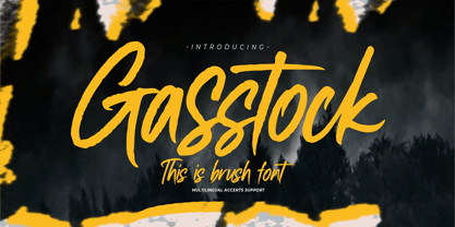 Hello Everyone, introduce our new product Font Gasstock This Is Brush Font.This is a Textured Natural Style and classy style with a clear style and dramatic movement. That is has charming, authentic and relaxed characteristic more natural look to your text. You can activate 32 Ligatures glyphs OpenType panel.
 - Fette Gotisch by Linotype,
$29.99Fette Gotisch font is an interpretation of Gothic scripts in the style of the 19th century. During this time, the individualistics handwritings of the past were used to create and define new broken letter forms. This style has heavily influenced the designs of the majority of today's broken letter fonts. The strong appearance of Fette Gotisch made it popular as a typeface for emphasizing text. - Payzant Pen NF by Nick's Fonts,
$10.00The inspiration for this exuberant exercise in penmanship was found in Frank H. Atkinson's A Show at Sho-Cards: Comprehensive, Complete, Concise, published in 1918, executed with the then-state-of-the-art Payzant Reservoir Pen. It retains its quaint charm, even after almost a century. Both versions of this font contain the complete Unicode 1252 (Latin) and Unicode 1250 (Central European) character sets, with localization for Romanian and Moldovan. - Caltons Typeface by Tacikworks,
$16.00 Proudly present Caltons Typeface. This font is inspired by vintage designs with clean and rough lines. Make the classic impression of this font stand out more. This font has approximately 600 glyph characters including uppercase, lowercase, discretionary ligatures and standard ligatures alternatives. It is suitable for creating vintage designs such as logo posters, merchandise, clothing, brochures, business cards and others. It can be accessed by using Open Type savvy programs like Adobe Illustrator and Adobe InDesign. features can be accessed by using Open Type save programs such as Adobe Illustrator, Adobe InDesign, Adobe Photoshop, Corel Draw X version and Microsoft Word. And this has given PUA unicode font (specially coded fonts). So that all the alternate characters Easily can be accessed in full by a Craftsman or designer. Features: Uppercase Lowercase Numbers Punctuations Stylistic Alternates & Ligatures Multilingual Languages Supported Format File: TTF,OTF, Web HOW TO ACCESS ALTERNATE CHARACTERS Open Glyphs Panel: In Adobe Photoshop go to Window - glyphs In Adobe Illustrator go to Type - glyphs Please contact us if you have any question!
 - Lubaline by Lián Types,
$39.00 Who haven't heard the phrase that ‘any past time was better’?. Although I sometimes find this phrase a little too pessimistic (because I try to think that the best is yet to come), it may be true regarding my passion, typography. I'm too young (29) unfortunately, and this means I did not have the pleasure of being contemporary with maybe the man who has influenced my work the most (1). The man that showed that letters are more than just letters to be read. Herb Lubalin (1918-1981), also called sometimes as ‘the rule basher’ (2), smashed the taboos and sacred rules of type design and gave it personality. He rejected the functionalist philosophy of europeans in favor of an eclectic and exuberant style. To him, letters were not merely vessels of form, they were objects of meaning. (3). Nowadays, when looking at his portfolio, who dares to deny that the term ‘typography’ and ‘beauty’ may go hand-in-hand without any problem? Ed Benguiat, one of Herb’s partners, still likes making jokes with the phrase “screw legibility, type should be beautiful” and what I understand of this is not to forget the rules, but to know and break them carefully. In an era of pure eclecticism, we, the lovers of flourishes and swashes, can't do nothing but admire all the legacy that Lubalin, this wonderful type-guru, left. My font Lubaline read as “the line of Lubalin” is my humble tribute to him. Those who know his work, may see the influences easily like in his ‘Beards’ (1976) and ‘The Sound of Music’ (1965) posters; the art-deco forms in many of his amazing logos and practically in all his creations where letters seem to be alive just like you and me. I really hope that the future finds me still learning more and more about type-design and letterforms, and like him, always willing to make innovations in my field: Because letters are not just letters to be read. NOTES (1) These are some of my fonts in which some of Lubalin’s influences can be seen (in order of creation): Reina, Aire, Erotica, String, Beatle, Heroe, Selfie, Model, Seventies, and many others that are still in progress. (2) (3) Steven Heller. Herb Lubalin: Rule Basher. U&lc (1998) http://www.printmag.com/imprint/my-favorite-lubalin/
 - Pandilla by Typozon,
$39.00 Pandilla was inspired from personal sketches and letters developed by the past of the years making graffiti art. the forms of this typeface are related with the graffiti and street scenes of the different cities around the world and takes traits and elements of the Handstyle, Classic graffiti, Brazilian Pichação and different urban letters. This font has a variety of objectives, the first is to create a legible version of the graffiti inscriptions and use this typography for different print pieces, the second objective is to give back the essence of the meaning of the word "Pandilla", this word has been transformed for the past of the decades and now is associated with negative things. The original meaning of this word is a group of people who feel a close relationship, which usually have a friend or close interaction with ideals or common philosophy among members. Pandilla is to be used in different print purposes and graphic pieces like: Posters, Brochures, Magazines, Business cards and different stuff that uses big type sizes and big display formats.
 - P22 Numismatic by IHOF,
$24.95 This set of letters and ornaments is loosely based on on a typeface that was offered by the DeVinne Press at the turn of the century. We can speculate from its name that this type was used as a display font to try to equate the look of letters on 15th and 16th century heraldic cartouches, seals, stamps, medals and other inscriptional lettering. The sample was digitized with an “antiqued” outline to further enhance this ancient inscriptional theme. The letters were then grouped in the font with the more traditional Roman letters as the capitals and the Lombardic forms as the miniscules. The original type sample contained some unusual 15th century inscriptional numbers which have been included as extras in the font so the user the has the option to create an authentic looking design.
 - Frank Flowers by Wiescher Design,
$15.00 Frank Flowers are fonts with flowery embellishments. They are useful for all kinds of celebrations, but they also have lots of impact. There are only uppercase letters even on the lowercase keys. Uppercase and lowercase look different, so you can mix them. You can even mix the two sets, it'll look great. I had a lot of fun doing these fonts and I want you to have some fun as well. That's why I sell them very, very cheap, even cheaper if you buy the pair! -Your typedesigner for unusual solutions Gert Wiescher

