4,299 search results
(0.018 seconds)
- Chimpsdale by Maculinc,
$15.00 Chimpsdale name was inspired by the Fairly Odd Parents cartoon series, which tells about the parody world of Planet Of The Apes. Chimpsdale is an alternate version of Dimsdale from the ape-dominated world created by Bippy the Monkey’s wish, after he bit into a magic muffin that allowed him one rule-free wish in Abra-Catastrophe. Chimpsdale is a font that is inspired by the theme of past kingdoms, we wrap it in such a way to make it look suitable for many jobs Especially.You can use it as a logo, badge, insignia, packaging, headline, poster, t-shirt/apparel, greeting card, business card, and wedding invitation and more. The flowing characters are ideal to make an attractive messages to your taste. mix and match with a bunch of alternative characters to fit your project.It will be more interesting if you add swash / alternative swash. The alternative characters in this font were divided into several OpenType features such as Stylistic Alternates, Ligature and Ligature Alternates. Mail support : maculinc@gmail.com Thank you! Maculinc
 - Cogsworth by Anastasia Kuznetsova,
$17.00 Get to know the natural and neat font "Cogsworth"! This beautiful neat retro font with imperfect ink edges and a little careless shading is inspired by nature. Eco-friendly fashion takes into account the health of consumers, the health of the planet. The "Cogsworth" font is perfectly combined with any stylized graphics, watercolors, and also looks great on its own as part of a minimalist design. Play with letters to get different effects. Great for branding, wedding invitation design, packaging design, quotes, label design and more. Font Features A-Z; a-z character set; 1 language (English); numbers and punctuation marks, symbols. A font containing uppercase and lowercase letters, numbers, and a wide range of punctuation marks. Fonts can be opened and used in any software that can read standard fonts, even in MS Word. No special software is required, and to get started. It is recommended to use it in Adobe Illustrator or Adobe Photoshop Made with love ♡ Thanks for checking it out, and feel free to drop me a message if you had any queries! ~ Anastasia
 - Euroscript by profonts,
$41.99 Euroscript Pro is the handwriting of Ralph M. Unger, a very talented and hard-working German type designer. Unger has redesigned a large number of beautiful ancient typefaces during the last few years. Peter Rosenfeld of profonts persuaded him to try and produce his own very beautiful handwriting. Kind of hesitant at the beginning of the design process, Unger's joy and excitement about the project was continuously growing during the design process. He designed not only the standard character complement West, but added all of the Eastern European Latin glyphs and, on top of that, even the complete Cyrillic characters. Born and grown up in Th�ringen, former East Germany, Unger has a fair knowledge of Polish and also Russian (Cyrillic). Euroscript Pro is a very beautiful, casual, informal and modern handwriting of a contemporary type designer. Even though a digitized handwriting, it keeps a very natural and pleasant look, at the same time being generous and well-readable. The individual characters combine quite easily and perfectly with no need for extra variants.Euroscript Pro is well-suited for plenty of applications, e.g. personal correspondence, invitations, greeting cards, headlines etc.Euroscript Pro is supplied in the complete Latin character set (West + East) plus Cyrillic.
 - Rational TW by René Bieder,
$39.00 Rational TW is the typewriter addition to the Rational family. It is a monospaced font building on the same principles as its proportional, neogrotesque brother, such as maximum legibility and flexibility while combining Swiss and American gothic elements with a modern aesthetic. Due to the monospaced environment, some of its letter shapes like “r”, “m”,“f”, “i” and “w” have been slightly adapted but kept the same in appearance. Rational TW comes in two version: Rational TW Display and Rational TW Text. As indicated by its name, Rational TW Text is not limited to, but works best in small font sizes because it features distinctive letter shapes like a double storey “a” or “g” in order to help differentiate similar glyphs in small sizes. Rational TW Display, on the other hand, creates a geometric uniformity by implementing round shapes in “a” and “g”, giving it a subtle friendly and open character. Unlike many other monospaced fonts, Rational TW has a large amount of opentype features like small caps, alternative glyphs, case sensitive shapes, and many more making it the perfect choice for countless scenarios. With more than 700 glpyhs per font, it performs excellently in any project from print to digital.
 - Ekko by L'île Foundry,
$30.00 Ekko is a typeface that gives you tools to be creative. Indeed, it contains more than 1300 alternate glyphs. By combining these alternate glyphs between them, you can design real vertical ligatures. The graphic possibilities are numerous and various. Ekko gives you the opportunity to play, to experiment and to discover, in order to associate the various vertical ligatures between them, in a balanced and harmonious way. Thus, Ekko makes it possible to express the musicality of each word, and to give a specific, original and unique rhythm to each composition. Following the spirit of jazz music: nothing is predefined, but everything remains open. Be creative and enjoy! We recommend that you use Ekko with a line spacing suitable to the font size with a ratio between 0,54 and 0,6. For example, if the font size is 100 pts, the best line spacing will be between 54 and 60 pts. In order to give the best flexibility to Ekko, you can also find, through other alternate glyphs, different widths for each letter (except: M, N, V and W in uppercase). Each letter, lowercase and uppercase combined, is thus available in dimensions: 3x8, 5x8 and 7x8. Ekko also contains 28 horizontal ligatures.
 - Hydrargyrum by Type Minds,
$15.00 Hydrargyrum is the Latin form of a Greek word meaning "liquid silver" - mercury. The Hydrargyrum typefaces are designed with characteristics both of a metal and a liquid. The basic shapes of the letters are generally rigid and rectangular (particularly in style C), but the forms are enhanced by fluid curves and gently rounded corners. Hydrargyrum is not recommended for use at small sizes or in lengthy passages of text. It performs best in display-sized settings. Hydrargyrum consists of three styles, each in medium and semibold weights with matching obliques. The A style features solid, standard letterforms including the two-story a and g. Style B substitutes the a, g, M, and N (and related glyphs including numero and trademark symbols) for alternate shapes. The third subfamily takes the rectangular theme to an extreme, eliminating as many slanted strokes as possible from the letterforms. This makes some C-style letters ambiguous with one another, such as the U's and V's. As such, the C style is best used carefully even at larger sizes. The Hydrargyrum fonts are style linked within each style subfamily with, for example, Hydrargyrum A Medium as the regular style, Hydrargyrum A Medium Oblique as the italic, Hydrargyrum A SemiBold as the bold option, etc.
 - Quayside by Eclectotype,
$40.00 Quayside is a deliciously thick and bulbous baseball script, with a wealth of OpenType features. Features include: Contextual alternates - I would suggest having these on by default; they make letters connect more smoothly (uppercase letters like M and H, which are normally non-connecting for all-caps purposes, connect to lowercase letters. The swash variant of J, and all o and b characters connect to any e character at a lower junction for a smoother join). Contextual alternates also make sure special end-forms of lowercase letters are used at the ends of words. Ligatures - A nice collection of useful ligatures which make the text flow smoother. Swash - Gives you more exuberant capitals. Not recommended for all-caps usage! The swash function also gives a variation of the ampersand and turns # into a nice numero symbol. Oldstyle Figures - lining figures are default but with the flick of a switch in OpenType savvy applications, you get expressive oldstyle figures. Quayside is a versatile typeface. Depending on the mood you're after, it can easily be retro or modern, fun or (fairly) serious. I'm often pleasantly surprised by the wide variety of uses my fonts get put to, and I can't wait to see what you do with this one!
 - Core Sans GS by S-Core,
$29.00 The Core Sans GS Family is a rounded version of Core Sans G and a part of the Core Sans Series such as Core Sans N, M, A, E, D. Core Sans GS is constructed of straight, circular or square shapes. These geometric shapes are inspired by classic geometric sans (Futura, Avenir, Avant Garde etc.). Every stem is a rectangle or a straight line and every letter, lowercase or uppercase, seems to be in perfect geometric form and even weighted. The small x-height makes readability clean and clear. Core Sans G can be used equally well in headings or in body copy. The Core Sans GS Family consists of 9 weights (Thin, Extra Light, Light, Regular, Medium, Bold, Extra Bold, Heavy, Black) with maching Italics. It also includes alternate characters (a,g,t) and a bunch of ligatures. The Core Sans GS provides a wide range of character sets to support (Cyrillic, Central and Eastern European characters) and advanced typographical support with features such as proportional Figures, tabular Figures, numerators, denominators, superscript, scientific Inferiors, subscript, fractions, standard ligatures, discretionary ligatures and stylistic alternates. Core Sans G is an ideal font family for use in magazines, web pages, screens, displays, and so on.
 - Zenoa by Brenners Template,
$19.00 Zenoa Display Serif Font Family - They are sharp and sensitive, but connected-oriented. That's why they're designed by incorporating hook glyphs into an elegant serif style. Somewhat high contrast between vertical and horizontal, they reveal the strong individuality of each glyph, so you can create creative layouts. The meticulous design stands out so that readability and individuality can be expressed in harmony. And, these are the special excellences of this font family: Stylish Alternates and Ligatures where calligraphic subtlety is artistically connected. These OpenType features are decorative pleasures of using this font family more functionally. Please check first if the app you are using supports these features. They are easy to use in Adobe apps such as Photoshop and Illustrator. Alternates : A, B, C, D, E, F, G, H, J, K, L, M, N, P, Q, R, S, T, U, V, W, X, Y. Standard Ligatures : ff, fi, fl Discretionary ligatures : Am, Ba, Ca, Ch, De, En, Fr, Ge, Ha, In, Lo, Mi, No, Pa, Ro, Sa, Th, Va, Wo, Yo, an, bi, ck, de, ee, gn, ha,ie, lo, mo, no, oo, pr, ro, ss, st, te, um, ve, we, yo. Supported Languages: Western Europe, Central/Eastern Europe, Baltic, Turkish, Romanian
 - Idiom by Reserves,
$39.99 Idiom is an extra-condensed, tightly spaced display face with congruent forms exuding a strong sense of rhythm and elevation. The basic stenciled geometric shapes are reminiscent of the decorative style found with P22 Albers and Futura Black. Careful consideration of each letter's construction, relative to all characters, lends Idiom a decided sense of cohesion and sophistication. The included non-traditional 'weights' (Medium and Bold) are completely blacked out, creating entirely new letterforms that exhibit a very stark, contemporary sense. Increasing the versatility of the Idiom family, a selection of OpenType features allow access to a set of contrasting linear punctuation forms, unconventional ligatures, case-sensitive punctuation and more. Features include: Basic Ligature set including 'f' ligatures (ae, oe, fi, fl, ff, fh, fj, ft, fa, ct, st, rt, ot, ta, sa, mi, si, vi, su, oc, oo, ru, ib) Alternate characters (M, W, T, ß, _, $, @, (), {}, [], /, \, |, -, –, —, +, -, ±, ≤, ≥, , «, », and more) Case forms (shifts various punctuation marks vertically to a position that works better with all-capital sequences, in this case the numerals or letters with ascenders) Slashed zero Full set of numerators/denominators and superscript/subscript Automatic fraction feature (supports any fraction combination) Extended language support (Latin-1 and Latin Extended-A) *Requires an application with OpenType and/or Unicode support.
 - Art Gothic HiH by HiH,
$10.00 Art Gothic was attributed to the Central Type Foundry of St. Louis, Missouri, USA by Henry Lewis Bullen, writing in INLAND PRINTER in 1907, with a reproduction shown in Kelly’s American Wood Type. The typeface appears on the cover of an issue of “The Superior Printer” pictured in Typology by Heller and Fili dated in the 1870s. Art Gothic was designed in 1884 by Gustav Schroeder and proved to be one of the more popular and enduring of the American-designed Victorian display faces of the period, appearing frequently in ads in various publications. The Hamilton Mfg. Co showed a very similar wood type, No. 232, with a modified and rather heavy-handed upper case in 1892. As late as 1897, it may be found in the advertising section of The Ivy of Trinity College of Hartford, Connecticut and was included in the Norwood Press 1902 Specimen Book. Our font includes a complement of five upper case and four lower case alternatives as follows: 123=C, 125=E, 135=H, 137=S, 172=c, 175=e, 215=m and 247=s. Great for period pieces. ART GOTHIC HIH is clean, readable, and surprisingly modern-looking; unlike so many overly complex Victorian display fonts, it can be used in text sizes.
 - Essence Round by kloeg architecture,
$24.00 This font is especially designed by architects for architect, urban planners, landscape architects, industrial and product designers. It is ideal for the use with line drawings. Because of it's geometric shape it blends in with your drawings. It's adjusted to fit most of the common line width types. It also contains many icons, especially for use in these professions. On top of that you can find many glyphs and icons to create legends and title blocks. More information about kloeg design.
 - P22 Hieroglyphic by P22 Type Foundry,
$24.95Hieroglyphs were a pictorial alphabet used in Ancient Egypt from 3100 BC to approximately 300 AD. This font set features over 250 different phonetic and decorative hieroglyphics, complete with an extensive translation chart. P22’s Hieroglyphic font adapts one of the world’s most ancient forms of art and communication for today’s technology. Note: This is not an automatic word translator. It is a font set. It is used just like any other font and does not require special software skills. - Essence by kloeg architecture,
$29.00 This font is especially designed by architects for architect, urban planners, landscape architects, industrial and product designers. It is ideal for the use with line drawings. Because of it's geometric shape it blends in with your drawings. It's adjusted to fit most of the common line width types. It also contains many icons, especially for use in these professions. On top of that you can find many glyphs and icons to create legends and title blocks. More information about kloeg design.
 - Eldridge by Greater Albion Typefounders,
$10.95 Eldridge is reminiscent of the sort of clear functional slab serif that was often to be seen in the 19th century. It is the plainer cousin of our Bamberforth family and the two partner together very well—Bamberforth for the eye-catching headines and Eldridge for the essential support. It is another new face, which harks straight back to Victorian times and, as such, is ideal for giving anything a 19th century feel-especially posters, book headings, dust jackets and invitations.
 - P22 Tulda by IHOF,
$24.95 Tulda is a very lively lettering font originally drawn for a German calendar. The optional symbols feature over 72 festive renderings for just about any occasion. This font is also available as an OpenType font with over 500 characters. For the OpenType version: standard Opentype features such as ligatures & oldstyle figures are available through the features menu in programs such as InDesign or other applications that support OpenType. Additional ornaments and alternate characters can be inserted through the glyph pallet.
 - Architype Tschichold by The Foundry,
$99.00 Architype Universal is a collection of avant-garde typefaces deriving mainly from the work of artists/designers of the inter-war years, whose ideals underpin the design philosophies of the modernist movement in Europe. Their ‘universal’, ‘single alphabet’ theory limits the character sets. Architype Tschichold is a faithful rendering of Jan Tschichold’s 1929 experimental alphabet which was influenced by Bayer’s single-alphabet. His design was never put into production. This re-creates his original geometrically constructed design, including some phonetic characters.
 - Pamedarsih by Mazkicibe,
$10.00 Pamedarsih, a handwritten script font inspired by handwriting with an aesthetic touch. Pamedarsih is versatile enough for both web and print and can be used in a variety of projects such as stationery, packaging, apparel, wedding stationery, prints, quotes, social media graphics, planners, greeting cards, logos, branding, and much much more. The script includes a set of uppercase characters, numerals, symbols, two lowercase letter sets. Full Set of standard alphabet and punctuation Extra set of ending stylistic set lowercase Handwritten ligatures
 - Pixel Arcade by Comicraft,
$19.00 GAME OVER, MAN, GAME OVER! Time to grab your joystick, turn to channel 3 and level up, Player One, or you'll never beat the high score on your new game cartridge. Or bring a stack of quarters and a couple of friends to the mall, and we'll play some Rick Astley and Kajagoogoo over the PA while you scope out hotties near the food court. Either way, eight bit lettering has never looked more eighties than it does in our new PIXELARCADE font!
 - Rum Silhouette by Trine Rask,
$30.00 Rum Silhouette is developed as a display face within the type family »Rum« Rum Silhouette is a decorative all caps font, with uppercase letters based on Rum Soft Sans Black and a thin companion has replaced lowercase letters. It is suitable for posters and editorial design in large sizes. Includes two sets of numbers & punctuation marks that are in betweens. The complete family consists of Sans Serif & Serif in both sharp and soft version + the display fonts Rum Plakat & Rum Silhouette.
 - Planet N by Iconian Fonts is a distinctive font that embodies a futuristic and adventurous spirit, perfect for projects seeking to convey innovation, technology, and space exploration. Created by Ico...
- Celtic Monograms by Kaer,
$24.00 Here is my next Celtic Monograms font family. I used a lot of authentic knots and curves to imitate Insular art style. The term derives from insula, the Latin term for “island” in this period Britain and Ireland shared a largely common style different from that of the rest of Europe. I've drawn sketches set, manually vectorized it and assemble the font family. In an attempt to replicate the intricate patterns found in Celtic art, I endeavored to create a design that embodied the essence of true Celtic knot work. The interweaving lines, which were prominent motifs in Celtic art prior to the arrival of Christian influence around 450, served as the foundation for my creation. Over time, these designs seamlessly integrated into early Christian manuscripts and artwork, incorporating depictions of various elements from everyday life, including animals, plants, and even human figures. In the beginning, the patterns were intricate interwoven cords, called plaits. This particular style is often linked to the Celtic regions, but it was also widely embraced in England and spread throughout Europe through the efforts of Irish and Northumbrian monks. The utilization of the Celtic knot as a tattoo design gained popularity during the 1970s and 1980s in the United States. Consequently, it has proven to be a highly advantageous font choice for various applications such as posters, banners, and sportswear. You can also create a vintage color shift effect. Please note, you should use graphic applications such as Adobe Illustrator or Photoshop, but not Microsoft Word. All you need is put Two or Three lines style initial on the top of Back style. I’m happy to present you the Rough, Two lines, Three lines, and Back styles for your design. You’ll get uppercase and numbers set. Thank you!
 - Typewriter 1950 Tech Mono by TypoGraphicDesign,
$29.00 The typeface Typewriter 1950 Tech Mono is designed for the Typo Graphic Design font foundry in 2017 by Manuel Viergutz. A display slab serif type for headlines. Based on an old typewriter machine from 1950. Plus state-of-the-art OpenType-features like contextual alternates (calt), decorative ligatures e. g. type the word “LOVE” for ❤ and the word “SMILE” for ☺ and Versal Eszett (German Capital Sharp S). For use in magazines, posters, headlines and advertisement, plus as webfont for decorative headlines. Character Set: Latin Extended (Adobe Latin 3). 1490 glyphs with 5× A–Z, 5× a–z, 5× 0–9 and 290+ extra icons like arrows, dingbats, symbols, geomatric shapes, catchwords and many alternative letters. Have fun with this font & use the DEMO-FONT (with reduced glyph-set) FOR FREE! How To Use – OpenType-Features ■ In Adobe Photoshop and Adobe InDesign, font feature controls are within the Character panel sub-menu → OpenType → Discretionary Ligatures … Checked features are applied/on. Unchecked features are off. ■ In Adobe Illustrator, font feature controls are within the OpenType panel. Icons at the bottom of the panel are button controls. Darker ‘pressed’ buttons are applied/on. ■ Additionally in Adobe InDesign and Adobe Illustrator, alternate glyphs can manually be inserted into a text frame by using the glyphs panel. The panel can be opened by selecting Window from the menu bar → Type → Glyphs. Or use sign-overview of your operating system. ■ For a overview of OpenType-Feature compatibility for common applications, follow the myfonts-help http://www.myfonts.com/help/#looks-different ■ Font Name: Typewriter 1950 Tech Mono ■ Font Weights: Regular + Negative + Black + Mono + Icons + DEMO (with reduced glyph-set) ■ Font Category: Slab Serif Display for Headline Size ■ Font Format:.otf (OpenType Font for Mac + Win) + .ttf (TrueType Font) ■ Glyph Set: 1490 glyphs ■ Language Support: 28+ for Latin Extended (Adobe Latin 3). Afrikaans, Albanian, Catalan, Croatian, Czech, Danish, Dutch, English, Estonian, Finnish, French, German, Hungarian, Icelandic, Italian, Latvian, Lithuanian, Maltese, Norwegian, Polish, Portugese, Romanian, Slovak, Slovenian, Spanisch, Swedish, Turkish, Zulu ■ Specials: 290+ decorative extras like icons for arrows, dingbats, emojis, symbols, geometric shapes, catchwords + German Capital Eszett. ■ Open Type Features: Kerning (kern), Stylistic Set 1 (ss01) … Stylistic Set 6 (ss06), Ornaments (ornm), Titling (titl), Localized Forms (locl), Subscript (subs) Superscript (sups), Ordinals (ordn), Oldstyle Figures (onum), Lining Figures (lnum), Fractions (frac), Denominators (dnom), Numerators (numr), Standard Ligatures (liga), Contextual Alternates (calt) e. g. Stylistic Set-Loop and Decorative Ligatures (dlig) e. g. type the word “LOVE” for ❤ or “SMILE” for ☺ ■ Design Date: 2017–2018 ■ Type Designer: Manuel Viergutz
 - Speechless by Gassstype,
$23.00 Hello Everyone, introduce our new product Speechless is a Playful Handwritten Font with a natural handwritten feel. This handmade font will make your design has a beautiful natural touch for each details. It is perfect for any design project as Invitation,logo, book cover, craft or any design purposes. That is why Speechless has authentic and strong characteristic more natural look. You can activate Ligatures OpenType panel.
 - P22 Parrish by P22 Type Foundry,
$24.95 Maxfield Parrish (1870-1966), whose career spanned nearly ninety years, holds a unique place in American art and culture. He was enormously accomplished and successful in both fine art and commercial endeavors. Parrish's hand-drawn letters were a significant part of his works, which bridged the familiar with a startling otherworldliness. P22 has created the Parrish font set in cooperation with the National Museum of American Illustration.
 - Maraschino by Device,
$29.00 DF Maraschino Black - A sleek, sophisticated swash capital font with elegant thick and thin weight distribution. Bold yet poised, direct yet refined. The swash capitals are intended for use at the beginnings of words only - best not to set this in ALL CAPS. Use at larger sizes. Also includes stylistic decorative alternates for certain characters that can be toggled on and off in the Opentype panel.
 - Authority by Juncreative,
$15.00 Authority i a script elegant font, handwrittien perfect for your projects. It has lots of alternate characters that you can find in the glyphs panel. This font is suited for branding projects, as well as packaging. FEATURES Alternate Characters Uppercase and Lowercase letters Numbering and Punctuations Multilingual Support Works on PC or Mac Simple Installation Support Adobe Illustrator, Adobe Photoshop, Adobe InDesign, also works on Microsoft Word
 - Glodok by Sudtipos,
$39.00 Glodok is a single-weight display typeface. It is bold, heavy and fun to play around with. It’s eye catching but also blends well when in use. It is retro-inspired and strikes a nice balance between formal and playful. The name itself comes from the oldest Chinatown in Jakarta that is also considered the biggest in Indonesia, the place from where the designer took many inspirations.
 - Thursday Afternoon by Bogstav,
$15.00 Nothing is as it really should be with Thursday Afternoon. The x-height is jumpy, letters are not in their right places, lines are crunchy, serifs are uneven...the list goes on...but in the end, Thursday Afternoon turns out as a legible and functional font. It has most of the moves from classic serif fonts, but then again it has a mind of its own!
 - Vulgary by Etewut,
$24.00 Vulgary is a script family that includes 4 fonts. They match each other but can be used separately as well. It supports all euro languages based on Latin alphabet. To use swashes you have to open glyphs panel in menu Window. The font is compatible on both Windows and Mac. You can use it in all popular apps like Adobe, Corel Draw, Microsoft, Final Cut etc.
 - Cover Charge JNL by Jeff Levine,
$29.00 Although less prevalent today, a cover charge was added to better class night clubs of the 1930s and 1940s to discourage patronage by people of questionable social graces. The general idea was that the lower strata of society (meaning the "average Joe" or "hoi polloi") would balk at paying an extra fee just for entrance to a place of good entertainment and fine dining.
 - South Pacific by Nicky Laatz,
$26.00 Say hello to South Pacific Marker , a new bold inky font with a casual handwritten feel. South Pacific includes a large selection of natural-looking ligatures and extra alternate characters ( see previews) in it's Opentype Features - make sure you have your stylistic alternates switched on to enjoy all the extras. Four handy swashes are also included in the glyphset - accessible via your glyphs panel.
 - Screen Star JNL by Jeff Levine,
$29.00 The opening credits to the original (1937) version of “A Star is Born” starring Janet Gaynor and Frederic March was hand lettered in an Art Deco style with rounded terminals that emulated the look of neon signage – alluding to the glitz and glamour of 1930s Hollywood. Screen Star JNL is the digital revival of that lettering, and is available in both regular and oblique versions.
 - Magdalene Sans by Greater Albion Typefounders,
$10.00 Magdalene is a classically designed sans-serif face for the 21st century. It's designed to offer clear and immediately legible lettering for signage and poster use which still has a touch of character and elegance about it. Magdalene is also ideal for the display of web pages and legible text on small LCD panels. Use Magdalene to combine traditional design attributes with modern technology.
 - Rhythmic by Java Pep,
$13.00 Introducing the signature font Rhythmic. This font has 96 ligatures so that the natural feeling of handwriting is more pronounced. Rhythmic is perfect for placing as the main title, for headline, logotype, personal branding in your design project. Package Included - 96 ligatures set - PUA encoded - Multilingual support Thank for using this font. If you have any question don't hesitate to comment or message me at java.indonesian@yahoo.com.
 - Silk Serif Condensed by SilkType,
$47.50 Silk Serif Condensed is the condensed version of Silk Serif, a high-contrast typeface with thin, pointy, heavily bracketed serifs, and ball terminals in the appropriate places, as well as bracketed junctions in various letterforms. The main feature of the typeface is the disconnection between the bowls and the stems. However, the bowl is very close to the stem, creating the illusion of connection.
 - Mrs Grey by Hipopotam Studio,
$20.00 Stylish and elegant typeface written with a wide, broad-edge nib. Over 40 standard ligatures and over 150 alternate and swash characters. Use OpenType features (Swash and Stylistic sets) to change the endings of lowercase letters or select most suitable characters from glyphs panel or character map. As an extra we added a free set of over 30 ornaments for even more design possibilities.
 - Lava Cookies by Letterhend,
$17.00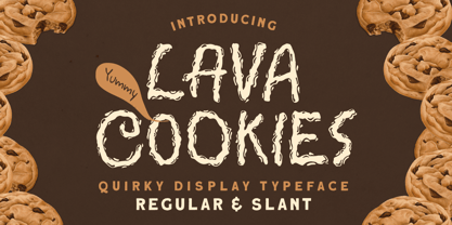 Introducing, Lava Cookies - A quirky display typeface. The unusual quirky style make this font looks great and standout for tittle, branding, logo, packaging, etc. Features : uppercase & lowercase numbers and punctuation multilingual alternates & ligatures PUA encoded We highly recommend using a program that supports OpenType features and Glyphs panels like many of Adobe apps and Corel Draw, so you can see and access all Glyph variations Thank You!
 - Japan Stamp by Pavel Boog,
$26.00 Japanese stamp - when creating this font, the author wanted to create a font unlike any other, taking inspiration from Japanese culture and history. It is one of a kind and unique font. It will immerse you in the historical era and add mystery to any of your projects. Anyone who wants to stand out among all this font will suit as out of place.
 - Satiata by Tour De Force,
$30.00 Satiata is fat, single, display font that's full of charm. Tightly spaced, Satiata is designed with condensed proportions which place the font in versatile position – it can be used for posters, titles, outdoor graphics, but equally the same for package, branding or websites. It is recognizable enough to lead every project. Satiata contains extended Latin character map with two stylistic sets and small pack of ligatures.