5,023 search results
(0.062 seconds)
- LHF Retro Ricky Doohickies by Letterhead Fonts,
$29.00 LHF Retro Ricky transports you right into the groovy retro past. These 60’s-era Doohickies set includes over 85 panels and dingbats to enhance your designs. Save time recreating vintage logos and designs. Goes perfect with the LHF Retro Ricky Fonts, only available at Letterhead Fonts.
 - Shady Characters JNL by Jeff Levine,
$29.00Shady Characters JNL places type against a simulated halftone background to produce a "ribbon" with black and white visual contrast. By typing the left bracket key, you produce a wide space for between the words. A narrower space is on the right bracket key. Limited character set. - Dormitory Decals JNL by Jeff Levine,
$29.00Dormitory Decals JNL is a set of Greek letters placed on the standard keyboard positions of A-X and a-x. The design (based on Jeff Levine's Juneway JNL) emulates the gold and black water-applied decals used by college kids in the 50s and 60s. - Extra Extra by Comicraft,
$19.00 EXCLUSIVE! Read all about it! The latest scoop from Comicraft is sure to be in all the newspapers today! The Times are a changin' -- comic book letterers everywhere can say a font farewell to typesetting the front pages of Planets and Bugles in Helvetica, Verdana or Gill Sans! Superhero's Pal, Johnny "Roshell" Olsen, was up all night writing copy for the late-night edition, making sure that your newspaper headlines and copy have a warm, pen lettered look... some might say a Rosen-glow! Put a little Extra Extra in your bylines and maybe there's a Pulitzer and an Eisner in your future! Not ready to purchase? Get ExtraExtra Engraved free with any purchase, or by subscribing to our newsletter at the bottom of this page. Features Seven fonts (Regular, Italic, Bold, Bold Italic, Heavy, Heavy Italic & Engraved) with upper and lower case alphabets.
 - Aprek Febux by Twinletter,
$15.00 "Welcome to the vibrant and bold world of typography!" Aprek Febux is a display typeface that adds sharpness, aggressiveness, and excitement to your projects. Aprek Febux, with its unequaled capacity to generate spectacular displays, is the ideal answer for your diverse variety of visual creations. Aprek Febux offers more than simply lovely letters. This font enables maximum versatility and creativity in every step of your design with excellent features such as ligature and alternate. You may quickly construct one-of-a-kind letter combinations to add a personal touch to your projects. We also recognize the significance of engaging with a worldwide audience. As a result, Aprek Febux supports numerous languages, guaranteeing that your communications are clearly received by everyone on the planet. Enhance your projects with the powerful visual appeal of Aprek Febux. Get this font right away and see how your every design becomes more impressive and stylish!
 - Motorway by K-Type,
$20.00 MOTORWAY is the companion typeface to TRANSPORT, the British road sign lettering. The Motorway alphabet was created for the route numbers on motorway signage, and is taller and narrower than the accompanying place names and distances which are printed in Transport. However, for Motorway Jock Kinneir and Margaret Calvert created only the numbers 0 to 9, the capitals A, B, E, M, N, S and W, ampersand, slash, parentheses and a comma. So, although the lettering made its first appearance on the Preston bypass in 1958, K-Type Motorway is the first complete typeface and contains all upper and lower case letters, plus a full complement of punctuation, symbols and Latin Extended-A accented characters. As with the Transport alphabet the starting point was Akzidenz Grotesk, Motorway taking inspiration from condensed versions. Changes were mainly driven by a quest for legibility, resulting in some reduced contrast between horizontal and vertical strokes, and Gill-esque straight diagonal limbs on the 6 and 9, and high vertex for the M. Kinneir and Calvert designed the limited range of characters in two weights; a SemiBold 'Permanent' weight for use as white letters on blue motorway signs, and a Bold 'Temporary' weight for heavier black letters on yellow non-permanent signage. In addition to creating full fonts in both original weights, the K-Type family adds a new Regular weight, plus a set of italics, completing a highly usable condensed typeface which, while rooted in history, is fully functional for both print and web usage. The K-Type fonts are spaced and kerned normally, simply increase the tracking to recapture the generous spacing of motorway signage.
 - Jeles by Tour De Force,
$25.00 Inheriting the beauty and style of old type classics from this genre, Jeles is blended with very elegant modern approach featuring soft corners, round slab serifs and tasty ball terminals. Jeles is designed mostly for display use and it is highly recommended to get the whole family if you want to get the best result. It is designed in two styles Condensed and Normal. The Condensed version is developed in two weights each coming with corresponding italics. While the Normal styles are three ranging from Regular, Bold and Black. The total of 7 separate fonts inside the family are quite enough if you look for diversity and flexibility at one place. You could use the uprights for more serious and strong headlines while the Italics work perfectly for more fresh and live subheads. Of course editorial design is only one of the many directions where Jeles family could be used successfully as we all know typefaces with so visible contrast between thin and thick and combined with classic elegance, could be easily used in every design of cosmetic industry, fashion, food, jewelry, etc. Try to design a stylish boutique shop signboard and you will surely discover its beauty and potential. Easy-to-read, it is good for print design, revealing its authentic letterpress-like character as well as perfect for screen use note that the thin strokes and serifs are not that thin to vanish on a low resolution monitor. Professionally designed, they are solid enough yet very elegant and even gentle making Jeles a desired family design of attractive web banners, web sites, apps and e-books.
 - Mono Spec Stencil by Halbfett,
$30.00 Mono-Spec Stencil is a monospaced family of sans-serif type. At least in default settings, all characters across the typeface share a common width, which is immediately noticeable for its condensed nature. Mono-Spec Stencil is a sibling of a non-stencil family, simply named Mono-Spec. Characters in each are just as wide, allowing Mono-Spec Stencil to be used together with Mono-Spec, as a secondary typeface. As a typeface whose characters are stencil-shaped, this design channels the spirit of resistance and street culture. When you look at the family, remember that it ships in two different formats. Depending on your preference, you can install the typeface as a single Variable Font or use the family’s five static OpenType font files instead. Those weights run from Light through Bold. While the static-format fonts offer a good intermediary-step selection, users who install the Variable Font have vastly greater control over their text’s stroke width. The Mono-Spec Stencil Variable Font’s weight axis allows users to differentiate between almost 1,000 possible font weights. That enables you to fine-tune your text’s exact appearance on-screen or in print. Whatever format you choose, the Mono-Spec Stencil fonts are equipped with several OpenType features. The most striking of these can be activated via a Stylistic Set. That will replace several letters – like “B”, “E”, “F”, “H”, and “I” with double-width alternates. Those alternates take up as much space as two characters placed next to each other otherwise word. The effect of Mono-Spec Stencil’s double-width alternates is striking, and their use strikes a strong chord in any display typography applying them.
 - La Luxes by Set Sail Studios,
$22.00 Indulge yourself in a luxurious typography pairing with La Luxes; a classic font duo consisting of an elegant Script & ligature-rich Serif. These fonts are designed to pair harmoniously, and lend themselves to high end branding, logo designs, product packaging & invitation designs. Here’s a run through the fonts in more detail; 1. La Luxes Script • A clean, elegant hand-drawn script font containing upper & lowercase characters, all punctuation and numerals. Also contains 30 ligatures to help the text flow naturally and add a custom-made feel. 2. La Luxes Serif • A stylish & modern all-caps serif containing upper & new lowercase characters, all punctuation & numerals. Also contains 38 ligatures and 11 special characters giving you a variety of layout options. Using Ligatures and Special Characters; Both fonts contain a large range of ligatures (unique double-letter pairings) to provide you with more customisation options; Most programs will automatically have Standard Ligatures switched on for you, if not you will need to enable this OpenType feature. The Serif font contains a number of raised ‘small caps’ (A, E, O, U, C) and characters with elongated tails (L, K, R,). These can be accessed by switching on ‘Stylistic Alternates’ in any OpenType capable software and typing these characters. The star icon can be accessed simply by typing the asterisk key (*) with the Serif font. All Ligatures and Special Characters can also be accessed via a Glyphs panel. This is available on most Adobe software & Affinity Designer. The stylised vertical ‘AND’ and ‘CO’ icons can only be accessed this way. Language Support; Both fonts support English, French, Italian, Spanish, Portuguese, German, Swedish, Norwegian, Danish, Dutch, Finnish, Indonesian, Malay, Hungarian, Polish, Turkish, Slovenian
 - Charpentier Sans Pro by Ingo,
$41.00 A humanistic sans serif The first version of this font was created in 1994 within the framework of the bid placed by the city of Graz to become the location for the Winter Olympics in 2006. Appropriately, its original name was ”Olympia.“ The font is intended to embody classic ideals as well as to meet modern demands. The proportions of Charpentier Sans are directly derived from Roman capitals and the humanistic book-face. The contrast between strokes and thin strokes is based on medieval uncial script. And thus, a modern serif sans was created emphasizing thick and thin strokes together. Thanks to its traditional form language, Charpentier Sans is very legible, adapts to various forms of content and expresses a kind of calmness and certainty. Details resulting from writing with the quill guarantee that the font doesn’t appear too rough and unemotional. Even the tiny, pointed mini serifs contribute to the unmistakable appearance of the font. They create an exciting contrast to the soft flowing forms of the letters and are, to a great extent, conducive to the legibility. Consequently Charpentier Sans always appears with an extremely sharp and clear outline. Charpentier Sans Italique has an even more distinct ductus derived from writing. Especially the rounded forms from a, e, f, g and y reflect the handwritten humanistic cursive. Charpentier Sans is comprised of many ligatures, including discretional ones, plus proportional medieval and capital figures for the normal type as well as disproportional tabular figures with a consistent width. Above and beyond the ”normal“ Latin typeface system, small caps are available as an especially elegant form of distinction.
 - CA Magic Hour by Cape Arcona Type Foundry,
$19.00 You remember the time when the Concorde was the fastest passenger plane on earth? When it was possible to travel from Paris to New York in 3 3/4 hours? Those were cool times. Times when cocktails tasted good and you didn’t think of an eventual headache afterwards. Times when you didn’t have to think how to dress because there was only one way. Straight from that time comes CA Magic Hour. A vintage font from a time from which we could learn a lot today. Optimistic and straight forward, it will speed up your designs.
 - Veronika Luxurious by Great Studio,
$19.00 Veronika Luxurious is a Glamour Luxury typeface. with beautiful letters and a touch of elegant appearance. plant it firmly in a modern design. It is a careful collaboration between beauty and function. Designed specifically for logo-themed projects, the font itself features many alternative and binding options, perfect for creating elegant, chic lifestyle designs, such as logos, titles, branding, web design and book designs. Veronika Luxurious displays both uppercase and lowercase letters, supports Latin-based languages. It holds two weights, Regular and Bold. each offers something different and they are all made to work together in harmony.
 - Bitterbrush by Hanoded,
$17.00I needed a name with ‘brush’ in it and most have already been taken, so I did a little digging and found out that Purshia tridentata, a flowering plant native to the mountainous areas of western North America is called bitterbrush. It is also known as antelope brush, quinine brush and buckbrush - but I settled on Bitterbrush. There’s nothing bitter about Bitterbrush. It is actually a very sweet hand brushed font. It comes with ligatures for double letter combinations and a truck load of diacritics. And (something I am very proud of): it supports the Vietnamese language! - Lunaris by Artisticandunique,
$38.00 The Lunaris font family has an elegant character with soft curved turns and includes 9 styles. If you want to try a modern or classic, elegant appearance, it can meet all your needs with its timeless structure that is ideal for your projects with capital and small letters. Lunaris is a versatile serif with a luxurious feel. You can easily use Lunaris in magazines, books, titles, websites, logos, clothing, invitations, branding, packaging, advertising, and more. CHARACTER RANGES : Basic Latin, Latin-1 Supplement, Latin Extended-A, Latin Extended-B, General Punctuation, Currency Symbols, CJK Symbols And Punctuation, Private Use Area (plane 0),
 - ND Raster by NeueDeutsche,
$20.00 Transport yourself back to the year 1994, a time when MS DOS games ignited the imagination of an impressionable young boy. Enchanted by the pixelated wonders of that era, he embarks on a journey that will shape his creative destiny. As the boy loses himself in the captivating landscapes of Commander Keen, the strategic depths of Warcraft: Orcs & Humans, and the mysterious quests of The Secret of Monkey Island, a seed is planted in his mind. The beauty of these games' typography, crafted pixel by pixel, captivates his young heart and fuels a passion for design.
 - Xaver Nature by Xaver Design Studio,
$25.00 Xaver Nature is inspired by nature. Thus, it is characterized by curves and dynamic thickness of the stroke. At the same time, all letters are anchored on the baseline, which makes the font look calm despite its organic appearance. The Schrit contains two weights: a basic weight that guarantees great legibility even in small sizes. A decorative cut that integrates plants into the typeface as decorative elements. This is particularly suitable for headlines and titles. Furthermore, it offers language support for the entire European region, the North American region, as well as for South America and Oceania.
 - Akagi by Positype,
$25.00 Akagi started as a rough sketch while on a really long plane ride to Tokyo in 2007. I wanted to develop a sans that was a complete departure from my successful Aaux Pro (now Aaux Next) sans serif family. Whereas Aaux and its siblings are rather unforgiving and stark in their presentation, I wanted this new sans serif to "smile" at you when it's on the page. When the plane landed and I realized I did not sleep through the 15 hour trip, my brain shut off, the laptop closed and I hopped in the car to the hotel—forgetting the "new sans" folder on my desktop. Fast forward a few months and I found myself seeing a lot of crisp, rigid, robot-like sans serif typefaces everywhere... I enjoy these new crop of faces but wanted to see something "friendlier" and remembered my earlier sketch work. The groundwork was there screaming at me to complete and Akagi arose from the ashes. To be truly satisfied with it personally, a great deal of time was spent trying to create a harmony between line and curve in an attempt to show that you can be crisp, clean and legible and still keep some personality. The Light and Fat weights (regular and italic) are my favorites and I hope to see them as the workhorses of the typeface.
 - Bohemian Initials by Kaer,
$24.00 I’m happy to present you the Bohemian initials font family. Regular and Colored styles (Uppercase & Numbers) based on Codex Gigas originated in medieval Bohemia. The manuscript has been dated 1230. The elaborate initials are at the beginning of the main texts and their principal divisions. The painter was aiming to achieve a plastic depiction of the trailing vines of the initials, and he painted with solid colours. He used only four of the primary colours cinnabar red, blue, green and yellow, brightly toned, as well as white accents and contours. The trailing vines of the initial letters are painted in a decorative, advanced Romanesque style, already bordering on naturalism. The plant taken as the starting point is the acanthus, a thistle-like plant which grows wild in the Mediterranean countries. The decoration of the Devil’s Bible is not the work of an amateur. Scholars have concurred: it is book illuminations created in Northeast France and Southern England in the so-called Channel style which provided the starting point for the coiled trailing-vine shapes in the initials of the Devil’s Bible. --- You can use color fonts in PS CC 2017+, AI CC 2018+, ID CC 2019+, macOS 10.14 Mojave+ Please note that the Canva & Corel & Affinity doesn't support color fonts! --- Please feel free to request any help you need: kaer.pro@gmail.com Thank you!
 - Night Scream by Ditatype,
$29.00 Night Scream is a spine-chilling display font that brings a horrifying twist to your designs. With its big letters and bold weight, this font commands attention and instills fear. The details of the letters are carefully crafted to resemble menacing plant roots, adding a nightmarish and eerie touch to the font. Each letter in this font is bold and impactful, demanding to be noticed. The large size of the letters adds to the font's imposing presence. The root-like details in Night Scream give the font an organic and otherworldly appearance, reminiscent of sinister, twisted plant life. These details add an element of the unknown and create an atmosphere of dread, immersing the viewer into a world of dark and chilling horrors. For the best legibility you can use this font in the bigger text sizes. Enjoy the available features here. Features: Multilingual Supports PUA Encoded Numerals and Punctuations Night Scream fits in headlines, logos, movie posters, flyers, invitations, branding materials, print media, editorial layouts, headers, and any project that requires a terrifying touch. Find out more ways to use this font by taking a look at the font preview. Thanks for purchasing our fonts. Hopefully, you have a great time using our font. Feel free to contact us anytime for further information or when you have trouble with the font. Thanks a lot and happy designing.
 - Tanach - Personal use only

- Kimetsu by Canden Meutuah,
$20.00 This Fonts are perfect for: logos, branding, wedding invitations, business cards, greeting cards, posters, magazines, social media, proliferate fonts, planner prints and websites. Get creative with their unique fun, and use them to brighten up any craft project! Get this font now and boost your creativity with it! If you have any questions, before or after your purchase, don't hesitate to contact us. Thank You
 - Liturgisch by Lamatas un Slazdi,
$19.00 Liturgisch was created by Otto Hupp for Klingspor foundry in 1906. The basis of this font is a publication in the magazine "Das Plakat" of October 1921. The font contains contextual alternates, ligatures, discretional ligatures for use in German, ornamental bullets and other OpenType features. It supports all the European languages using Latin alphabets (including slashed S and slashed longs used in Latvian old orthography till 1930s).
 - Kiwiberri by Melonaqua,
$10.00 Introducing Kiwiberri, a fun and playful handwritten font that you can use for your home or work projects. You can put it on shirt designs, mug designs, printable chalkboards, printable planners, websites, note-taking apps, wall art, greeting cards, and many more. The sky is the limit. This is multilingual so it is compatible with other languages. Kiwiberri is created to showcase handwritten fonts using brushes.
 - Screenwriter JNL by Jeff Levine,
$29.00 The hand lettered credits from the 1950 Humphrey Bogart film “In a Lonely Place” inspired the digital version called Screenwriter JNL, which is available in both regular and oblique versions. The font was named after the profession of the main character (Dixon Steele) who was a Hollywood screenwriter.
 - Freak Mailer by RagamKata,
$12.00 Freak Mailers is a rounded combination font duo. Sans serif typeface with crazy Script Typeface . But make this font look unique. Freak Mailers clean classic and mindful , it combine in one font, use this font for anything beauty place for your logo, headline, cover book, magazine and many more.
 - Summer Love by Komet & Flicker,
$15.00 Good Vibes Only! This hand drawn brush font gives a loose and laid-back feeling to any project. Included with are 10 common connector words like "the" "and" and "with" which can easily be accessed through Illustrator's glyphs panel. Also included are 24 hand drawn sun & surf themed icons.
 - Brussels by Solotype,
$19.95The Stephenson Blake foundry in England, made two fonts, Flemish Expanded and Flemish Condensed. In our view, one was too wide, the other too narrow; so we redrew it and renamed it Brussels. Why not? Belgium is one of the few places where you may still hear Flemish spoken. - Booked by Gassstype,
$27.00 Hello Everyone, introduce our new product Font Booked This Is Rough Display Font.This is a Textured Natural Style and classy style with a clear style and dramatic movement. That is has charming, authentic and relaxed characteristic more natural look to your text. You can activate 4 Ligatures OpenType panel.
 - Hooley by Etewut,
$20.00 Here is the party script 'Hooley'. It's created for decoration, advertisement, product design, signing cards and whatever you can imagine. The font is PUA encoded, that allows you to use special characters with glyphs panel. Hooley script has multi language support, alternative symbols, swashes and swooshes with charisma.
 - Brunetta Calligraphy by Romie Creative,
$25.00 Brulletta is a Luxury calligraphy font, Brulletta is handcrafted with copper plate stylus and features opentype with pua encode, Brulletta is a Luxury Calligraphy includes alternatives, style sets, ligatures, and swashes, Each glyph lowercase has a stylized styling, Swiss is perfect for branding, invitations wedding and cards or quotes.
 - El Paso Pro by Red Rooster Collection,
$60.00 In the 1970s, Face Photosetting in London was known as the preeminent typesetting house in London. Steve worked in the studio in Newman Street and Hanway Place. El Paso Pro is a family of typefaces based on a unique single font design from the Face Collection, called El Paso.
 - Gasstock by Gassstype,
$27.00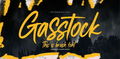 Hello Everyone, introduce our new product Font Gasstock This Is Brush Font.This is a Textured Natural Style and classy style with a clear style and dramatic movement. That is has charming, authentic and relaxed characteristic more natural look to your text. You can activate 32 Ligatures glyphs OpenType panel.
 - British Vehicle JNL by Jeff Levine,
$29.00 Auto license plates in the United Kingdom are made with a typeface originally designed by (and named for) Charles Wright and must meet strict criteria as to type height, weight and spacing. A bold sans serif design; British Vehicle JNL is available in both regular and oblique versions.
 - Dalliance by Emigre,
$125.00 Dalliance Script is based on the elegant handwriting found on a map of a horrific battle between the Habsburg Coalition and France which took place at Ostrach, in southwest Germany, in 1799. A roman style, and flourishes, were added to turn Dalliance into a fully functional typeface family.
 - Display Prominent by Gerald Gallo,
$20.00 Display Prominent is a display font not intended for text use. It was designed specifically for display, headline, logotype, branding, and similar applications. In place of a lowercase there are short caps that are centered horizontally on the tall caps. There are also short numbers, punctuation, and miscellaneous characters.
 - Shervington Engraved by Greater Albion Typefounders,
$18.00 Shervington Engraved is a re-drawing of our previous Shervington typeface, showing it as it appears hand engraved on copper-plate with a stylus, with the letter forms shaded in diagonally. It combines excellent clarity with a rustic distressed look, and is ideal for use on signage and headings.
 - Zebraw by Ingrimayne Type,
$6.95 This face was part of a continuing evolution of an almost unreadable typeface. There are two styles, one with stripes and one without. The striped style can be placed in a layer above the unstriped style to give the letters two colors. Zebraw was derived from the typeface Porker.
 - Neues Bauen by Hanoded,
$10.00 Neues Bauen is a Bauhaus inspired font with some interesting glyphs. It is slightly rounded in places, but sharp in others and it will most certainly make your designs stand out. Neues Bauen in other words, like the style that emerged in pre-war Germany, is a statement.
 - Eleckatrical Banana JNL by Jeff Levine,
$29.00 From the same page of a vintage German lettering textbook entitled “50 Alphabete fur Technikur und Fachschulen” (loosely translated to “50 Alphabets for Technicians and Specialized Schools”) that inspired Trippy Hippy JNL comes Eleckatrical Banana JNL. It’s another novelty, free form Art Nouveau hand lettered alphabet that works well in recreating 1920s period pieces or for designing a retro-inspired rock and roll concert poster reminiscent of the 1960s. The name of the typeface is from a line in the 1966 pop hit “Mellow Yellow by Donovan (Leitch), and his extended pronunciation of ‘electrical’: “…E-lec-a-tric-cal’ banana is going to be the very next craze…” Caps only Fonts. Eleckatrical Banana JNL is available in both regular and oblique versions.
 - Saveur Sans Round by Arkitype,
$10.00 Saveur Sans Round is the softer, friendlier cousin of Saveur Sans, a font family inspired by art deco and French cafes. This display family has clean, simple letterforms that feel modern but at the same time have a retro, art-deco styling. This family can add a sophistication to any layout whether it be print or online. Saveur Sans Round is a great selection for headlines, logotypes and branding. it is an all-caps display family with some neat alternatives including an alternative O and E that instantly give your copy that retro-deco look. The promos have been inspired by French food and design. This family is perfect for use in packaging and branding of food products as well as menus and restaurant or cafe branding.
