7,739 search results
(0.02 seconds)
- Sweet blink play by Sulthan Studio,
$10.00 Sweet Blink is a cute and friendly handwritten font duo that is perfect for creating charming and playful designs. Its delicate and whimsical letters feature playful curves and loops, giving it a warm and inviting personality. This font is perfect for invitations, greeting cards, and other projects that require a personal and charming touch. The font’s cute and friendly personality is sure to make viewers smile.
 - Play It Cool by PizzaDude.dk,
$17.00 Play it cool with your designs - especially if you do something handcrafted! This font has 4 different versions of each letter - enough to make it look random and handcrafted!
 - LF Plain Jane by Lo-Fi Fonts,
$5.00 Don’t go for the fonts with all that fancy flare. You want something classy and timeless. A font that tips the hat to the old school hand letterers.
 - RT Austin Plain by Estudio Calderon,
$19.00 Austin Plain is derived from the union between Melts Script and Deftone Stylus, the result is a friendly typeface that mixes old American styles with modern design concepts.
 - Jane Plain NF by Nick's Fonts,
$10.00Here's a clean, simple architectural-blueprint style, eminently suitable for subheads and text blocks. Inspired by and named for a gentlewoman who gave up a career as an architect in Bolivia to care for the elderly in the United States. All versions of this font include the Unicode 1250 Central European character set in addition to the standard Unicode 1252 Latin set. - Fun Play Arabic by FunFont,
$17.00 Fun Play Arabic is sibling of Fun Play comes with Arabic version ; Arabic, Urdu, Persian, Kurdish and Jawi. Fun Play is a Fun and Playful display typeface family with 5 wights variant; from Light to Bold. Comes with many features; Multilingual Support, Ligatures, Stylistic Alternate and more. Each character represents a child's joy. ‘Fun Play’ can be used for branding, packaging, headline and all styles of children-related design.
 - LDJ Cool Play by Illustration Ink,
$3.00 - Gleams Serif Playful by Alandya TypeFoundry,
$19.00 The Gleams serif playful display is unique, this font and is equipped with multilingual to be able to handle most typographic applications ranging. will be perfect and look luxurious for many projects such as fashion, magazines, logos, branding, photography, invitations, quotes, blog headings, posters, advertisements, postcards, etc. The Gleams serif playful include ligatures, capital letters and lowercase alternate letters. You need a program that supports OpenType features like Adobe Illustrator, Adobe Photoshop CC, Adobe Indesign and Corel Draw. and you can also access alternative flying machines via Font Book (Mac users) or Windows Character Map (Windows users). For sans style please check at https://www.myfonts.com/fonts/alandya-typefoundry/gleams-sans-display Happy Designing . . .
 - FE Planking 2020 by Egor Stremousov,
$50.00 Experimental and accidental unicase grotesque. A font in which all the letters and numbers fell down and deformed under the force of gravity. Everything that was hanging fell down. Everything that was curved horizontally straightened. The form and principle of construction of each symbol in the font is dictated not by tradition, but by physics. This makes FE Planking 2020 an excellent tool for creating phrases and statements in advertising and art projects that attract attention and make your head spin. The first free version with a minimum set of Latin and Cyrillic alphabets was released in 2019, and in 2020 the font was updated and supplemented with an expanded set of characters. Dedicated to @Serge Rachok, who invented the Planking Game before it was invented by others.
 - Printers Plant Ornaments by Gerald Gallo,
$20.00 Printers Plant Ornaments was inspired by the decorative motifs used to fill in page space that have been around since moveable type printing commenced in the 15th century. All the ornaments are representations of plants. There is an assortment of 47 ornaments located under the character set keys. Under their respective shift + character set keys are the same 47 ornaments flopped.
 - FR Warrior Plain - Personal use only

- CA Moskow has a plan by Cape Arcona Type Foundry,
$20.00 Inspired by an old Russian book about Moscow’s plan to take over the world, this font was designed to give digital prints the taste of hand lettering. It’s vivid outlines and slight differences in boldness between characters give it an accurate and realistic imperfect letterpress look. It works amazingly well as a text font in small sizes and shows it’s crippled outlines only at larger sizes. »CA Moskow has a plan« has got an extensive character-set including Russian Cyrillic, the Russian Rubel and the Turkish Lira sign. Although it includes kerning, for a full simulation of letterpress print and cold-war feeling we recommend to turn it off.
 - Intellecta Grotesca Compacta by Intellecta Design,
$25.00a bold and grotesque sans serif typeface - Wood Bonnet Grotesque No.4 by astype,
$46.00 After release of Wood Bonnet Antique No.7 some of my clients asked for a sans serif version. So I printed my second batch of old wood type. I transferred these wood type into a digital font and tried to preserve the warm vintage look. » pdf specimen « The font offers up to four glyph variations of all the Latin base letters, figures and some additional letters - It has an build in letter randomizer. Please check you have turned on contextual alternates in your application. If you prefer a more common look and need more weights or to use the font in smaller text sizes I have done clean and sharp font family called Bonnet Grotesque Nr. It’s the preferred version for all the usages on websites, apps or ebooks. Have fun!
 - Play Day - Personal Use - Personal use only

- Child's Play Trial Version - Unknown license

- Pindown X Plain BRK - Unknown license

- Face plant hollow 2 - Unknown license

- Face plant hollow 2 - Unknown license

- Bully Pulpit Plain NF by Nick's Fonts,
$10.00 This engaging headline face is based on a rather pudgy typeface named “Bullion Shadow”, which was originally released somewhere on the cusp between the hippie and disco eras, and was equally at home in both. Now available in shaded and plain. Both versions of this font support the Latin 1252, Central European 1250, Turkish 1254 and Baltic 1257 codepages.
 - Polipop Playful Display Font by Maulana Creative,
$14.00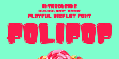 Polipop playful display font. Bold stroke, fun character with a bit of ligatures and alternates. To give you an extra creative work. Polipop playful display font support multilingual more than 100+ language. This font is good for logo design, Social media, Movie Titles, Books Titles, a short text even a long text letter and good for your secondary text font with script or serif. Make a stunning work with Polipop playful display font. Cheers, Maulana Creative
 - Two Cents Plain JNL by Jeff Levine,
$29.00 Two Cents Plain JNL is a simple sans design for titling, sign work, display ads and so forth. The name is derived from the way folks in the Northeast used to ask for a glass of seltzer water at restaurants and soda fountains decades ago: "Give me a two cents plain." It was always cheaper to order plain seltzer than to have flavored syrup added, and this was especially true in the years during the Great Depression when every penny made a difference.
 - Play Day Stencil JNL by Jeff Levine,
$29.00 The typography on a 1964 children’s activity book published by Whitman entitled “Build with Stencils” was in a bold, condensed design. The only problem was that the ‘rails’ [the parts that divide a letter into stencil pieces] were too narrow and would disappear at smaller point sizes. Widening the ‘rails’ just a bit greatly improved the appearance of the stencil characters. Play Day Stencil JNL is now available in both regular and oblique versions. In its day, the Whitman Publishing Company of Racine, Wisconsin published dozens of activity books for children, including a number of them with stencils. The company was a division of Western Publishers from the early 1900s through the 1970s, but went through a number of sales and name changes. Currently [as Whitman once again] it is owned by Anderson Press, and is known for its line of coin folders and books on coin collecting.
 - Hel Grotesk Gothiq - Personal use only

- Quadrat Grotesk New by ParaType,
$30.00 Designed for ParaType in 2004 by Vladimir Pavlikov. It is a new version of popular type Quadrat Grotesk by the same author. Letters of the new version in contradistinction to the old one are clean and have no traces of exploitation. Quardat Grotesk New due to its rectangular proportions is extremely readable in small sizes and can be successfully used in Web pages and in documents with long lists where critical aspect is a number of lines rather then length of a line.
 - Grotesk Remix Monospace by bb-bureau,
$65.00 GroteskRemix monospace is the monospaced version of the GroteskRemix - Grotesk revisited, notably used for the (Latin) communication of Typojanchi 2019. It availabe in 3 different weights: light, regular and medium. Language: latin glyphs
 - Paul Grotesk Stencil by artill,
$29.00 Paul Grotesk Stencil is a new Version of the modern, clean, minimalist grotesque typeface Paul Grotesk, with delicious detail. Created and published in collaboration by Fargus Meiser and Lukas Bischoff. It comes in 8 stylish weights and 3 are free to try. Designed with powerful opentype features in mind. Each weight includes extended language support, fractions, arrows, special numbers and more. It fits perfect for graphic design, editorial, corporate and any display use. Also check the webfont to create a nice responsive interface design!
 - Copenhagen Grotesk Nova by David Engelby Foundry,
$15.00 Copenhagen Grotesk Nova is based on its 2015 predecessor (Copenhagen Grotesk). The Nova edition is carefully designed with new details, a simpler set of glyphs and with moderate descenders and ascenders in relation to less accentuated capitals.
 - Schelter Grotesk NF by Nick's Fonts,
$10.00This forerunner of Helvetica made its debut as Breite Grotesk in the 1886 specimen book of the Schelter & Giesecke foundry in Leipzig. This classic face still retains its freshness, even after more than a century. Both versions of this font contain the complete Latin A Extended character set, as well as extended ligatures and fractions. - DXOldStandard Grotesk No2 by DXTypefoundry,
$25.00 The font DXOldStandardGroteskNo2 was developed on the basis of the Grotesk Condensed font, which was issued by Russian type foundry from the beginning of the 20th century.
 - FF Super Grotesk by FontFont,
$68.99 German type designer Svend Smital created this sans FontFont in 1999. The family has 6 weights, ranging from Regular to Bold in Condensed and Normal and is ideally suited for film and tv and editorial and publishing. FF Super Grotesk provides advanced typographical support with features such as ligatures, alternate characters, case-sensitive forms, fractions, super- and subscript characters, and stylistic alternates. It comes with a complete range of figure set options – oldstyle and lining figures, each in tabular and proportional widths.
 - Slabserif Grotesk JNL by Jeff Levine,
$29.00 Slabserif Grotesk JNL was modeled from an example of a wood type design called Antique Light Face, and is available in both regular and oblique versions. The numerals (although an odd fit to the overall design) make this vintage font quite unusual and charming.
 - Grotesk S SB by Scangraphic Digital Type Collection,
$26.00Since the release of these fonts most typefaces in the Scangraphic Type Collection appear in two versions. One is designed specifically for headline typesetting (SH: Scangraphic Headline Types) and one specifically for text typesetting (SB Scangraphic Bodytypes). The most obvious differentiation can be found in the spacing. That of the Bodytypes is adjusted for readability. That of the Headline Types is decidedly more narrow in order to do justice to the requirements of headline typesetting. The kerning tables, as well, have been individualized for each of these type varieties. In addition to the adjustment of spacing, there are also adjustments in the design. For the Bodytypes, fine spaces were created which prevented the smear effect on acute angles in small typesizes. For a number of Bodytypes, hairlines and serifs were thickened or the whole typeface was adjusted to meet the optical requirements for setting type in small sizes. For the German lower-case diacritical marks, all Headline Types complements contain alternative integrated accents which allow the compact setting of lower-case headlines. - Europa Grotesk SH by Scangraphic Digital Type Collection,
$26.00 Since the release of these fonts most typefaces in the Scangraphic Type Collection appear in two versions. One is designed specifically for headline typesetting (SH: Scangraphic Headline Types) and one specifically for text typesetting (SB Scangraphic Bodytypes). The most obvious differentiation can be found in the spacing. That of the Bodytypes is adjusted for readability. That of the Headline Types is decidedly more narrow in order to do justice to the requirements of headline typesetting. The kerning tables, as well, have been individualized for each of these type varieties. In addition to the adjustment of spacing, there are also adjustments in the design. For the Bodytypes, fine spaces were created which prevented the smear effect on acute angles in small typesizes. For a number of Bodytypes, hairlines and serifs were thickened or the whole typeface was adjusted to meet the optical requirements for setting type in small sizes. For the German lower-case diacritical marks, all Headline Types complements contain alternative integrated accents which allow the compact setting of lower-case headlines.
 - CF Arche Grotesk by Contrafonts,
$22.00 Without serifs and without exaggeration. A project that seeks simplicity, with focus on reading and coverage in many languages. Arche has 5 weights and its italics. 10 fonts ranging from Light to Black. It also has a set of styles, old and modern numbers, arrows and ornaments. Excellent alternative to standards such as Akzidenz Grotesk or Helvetica, with a contemporary look, focus on legibility and with Latin American freshness. For more information visit our website Contrafonts.cl
 - North Bay Grotesk by FoxType,
$16.00 Introducing NorthBay Grotesk new generation Typeface with 5 Weights. NorthBay Typeface created with the vision of to attract the audience to your brand . The finest details of this typeface are methodically and mathematically created. NorthBay is created with all the tasks of a corporate font and also for the usage in a variety of projects, including branding, logos, titles, headlines, servers, posters, screens, display, digital ads, and everything else. We are putting a lot of effort on this font as a long-term project. The Typeface includes Five Weights. Light, Regular, Medium, SemiBold and Bold Features: Numerals, extended punctuation & Basic Symbols(200+ Glyphs). Uppercase Letters & Lowercase Letters 24x7 Support Thank you for taking the time to look into the font.
 - Platz Groteske FJ by Frncojonastype,
$27.00 fj Platz Groteske™ is the new font from frncojonastype project that culminates after almost 5 years of learning and development. fj Platz Groteske™ is a Neo-grotesk font with slight geometrical proportions with humanistic terminations. For this occasion, this font will show the normal version, however, the entire project contemplate condensed family, extended and the development of alphabets as Cyrrilic and Greek. This proposal is to improve the legibility in the Neo-grotesk fonts with generous gaps, vertical and square counter form and ascendents that exceed slightly the capitals. Counts with old numbers, small caps, modern numbers, tabular, numerators and denominators to fraccions, reference numbers to notes and formulas to face confidant and complex different stages. Ideal to editorial projects of informative content - scientific and titular of a huge impact because of the various alternative characters, stylistic options and a optometrical version to risky designers. To exclusive licenses and to follow the develop of this project, please visit frncojonas.com (WIP) Learn about upcoming releases, work in progress and get to know us better! Instagram: @frnco.jonas
 - Grotesk S SH by Scangraphic Digital Type Collection,
$26.00Since the release of these fonts most typefaces in the Scangraphic Type Collection appear in two versions. One is designed specifically for headline typesetting (SH: Scangraphic Headline Types) and one specifically for text typesetting (SB Scangraphic Bodytypes). The most obvious differentiation can be found in the spacing. That of the Bodytypes is adjusted for readability. That of the Headline Types is decidedly more narrow in order to do justice to the requirements of headline typesetting. The kerning tables, as well, have been individualized for each of these type varieties. In addition to the adjustment of spacing, there are also adjustments in the design. For the Bodytypes, fine spaces were created which prevented the smear effect on acute angles in small typesizes. For a number of Bodytypes, hairlines and serifs were thickened or the whole typeface was adjusted to meet the optical requirements for setting type in small sizes. For the German lower-case diacritical marks, all Headline Types complements contain alternative integrated accents which allow the compact setting of lower-case headlines. - FF Bauer Grotesk by FontFont,
$50.99 FF Bauer Grotesk is a revival of the metal type Friedrich Bauer Grotesk, released between 1933 and 1934 by the foundry Trennert & Sohn in Hamburg Altona, Germany. The geometric construction of the typeface, infused with the art déco zeitgeist of that era, is closely related to such famous German designs as Futura, Erbar, Kabel and Super Grotesk that debuted a few years earlier. However, Bauer Grotesk stands out for not being so dogmatic with the geometry, lending the design a warmer, more homogenous feeling. The oval “O” is a good example of that, as well as characteristic shapes like the capital M or the unconventionally differing endings of “c” and “s” which make for a less constructed look. Watch the FF Bauer Grotesk introduction video on Vimeo
 - DIN Neuzeit Grotesk by Linotype,
$40.99 The German Standards Committee suggested the light Neuzeit-Grotesk’ font in 1970 for use in official signage, traffic directional systems, etc. The typeface had been designed by Wilhelm Pischner and appeared with the font foundry D. Stempel in 1928. The font Neuzeit Grotesk was once the standard in the print industry, as a timeless typeface with no real distinguishing features. Like other typefaces of the 1920s, DIN Neuzeit Grotesk reflects the philosophy of the times, Form is Function.’


