10,000 search results
(0.032 seconds)
- Chevin Eco by G-Type,
$39.00 Chevin Eco is a whimsical display variation on the original Chevin typeface with knocked-out circular holes producing a glitzy neon effect that saves toner when printed. Simultaneously glamorous, green and good fun.
 - Ribbonshoe by Curvature Creations,
$10.00 My font Ribbonshoe is created with Power Point shapes Block Arc and Punched Tape and they resemble ribbons and horse shoes. This font is very unique, stylish and very attractive to the eye.
 - Trainbridge by Curvature Creations,
$10.00 My font Trainbridge is created by Power Point shapes, Block Arc and flowchart. It resembles a train and bridge, which gives it a unique look that will be eye catching and out standing.
 - Argufy by Ali Hamidi,
$10.00 Argufy is a cool, vintage styled and organic display font. It will look stunning on any food menu, poster flyer or print. Use this font for your designs and explore its endless possibilities.
 - Luruh by Sebeningjingga,
$5.00 Luruh are inspired by the flow of running and melting water. Luruh is guaranteed to make your text stand out - perfect for logos, printed quotes, invitations, cards, product packaging, and headers. Publisher: Sebeningjingga
 - Lovesome by Seemly Fonts,
$14.00 Lovesome is a brand-new, brushed display font. Lovesome is perfectly suited for stationery, logos, t-shirts, paper, print designs, website headers, photo frames, flyers, music covers, posters, image sliders, and much more.
 - Spirals by Turtle Arts,
$20.00Spirals is a doodle-style font with lots of - you guessed it - spirals! This alphabet looks great printed out big or small. Use this alphabet whenever a playful approach to typography is needed. - Ingenue by Seemly Fonts,
$14.00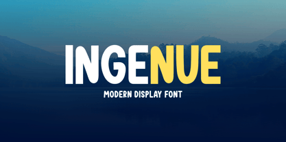 Ingenue is a friendly and simple display font. It is perfectly suited for stationery, logos, t-shirt, paper, print design, website headers, photo frames, flyers, music covers, posters, image sliders, and much more.
 - Downtown by Aboutype,
$24.99Mono-weight extra condensed display face. Lowercase sits on a floating baseline. Downtown was designed for all media and works best at 24 point and above. Downtown requires subjective display kerning and compensation. - Conscious Valentine by Seemly Fonts,
$14.00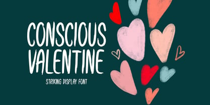 Conscious Valentine is a brushed display font. Conscious Valentine is perfectly suited for stationery, logos, t-shirt, paper, print designs, website headers, photo frames, flyers, music covers, posters, image sliders, and much more.
 - Keep Me by Seemly Fonts,
$12.00 Keep Me is a brand new display font. Keep Me is perfectly suited for stationery, t-shirt, paper, print design, website header, photo frame, flyer, music cover, poster, image slider, and much more.
 - Laviosar by Say Studio,
$12.00 Laviosar is a psychedelic inspired typeface. Unique tripped out lettering makes this font perfect for those groovy band poster, hippy logos and quotes. Laviosar mixes futurist letters with nostalgic curves to create stand out typography. Including lots of alternate letters! uppercase, alternates, numbers, punctuation Multilingual support Have a wonderful Day, Saystudio
 - Adam Kubert by Comicraft,
$49.00 Joe Kubert's son Adam has a story or two to tell as well; the AdamKubert font, based on Adam's own pen lettering in BATMAN/PREDATOR, was created by Comicraft for Marvel's ULTIMATE X-MEN series. Comicraft fonts are created BY comic book letterers FOR lettering comic books. Accept no substitutes!
 - Art Class JNL by Jeff Levine,
$29.00 Art Class JNL was re-created from the titling of a lettering booklet called "Drawlet Portfolio", published by the Esterbrook Pen Company in the 1930s. Drawlet pens were Esterbrook's answer to the popular Speedball lettering pens, and the booklet was an instructional manual on hand lettering with the pen nibs.
 - YT metaphor Latin by Yangtype,
$9.00This font is artistic. The shape of the letters was taken from the dot art that I worked on consistently. Letters are read by habit and feeling. Sometimes I also think for a moment about what this letter is. But, you soon find out. A brief pause and continuation is refreshing. - Wigwag by Parkinson,
$15.00 WigWag Bold and Wigwag Deluxe are bold, informal lettering styles inspired by mid-20th century Showcard Lettering. Especially by the work of Speedball lettering artist Ross George, and also the work of Cecil Wade and Samuel Welo. Designed around 2001 by Jim Parkinson, Wigwag has recently been refreshed and re-released.
 - Oceantide Display by Elyas Beria,
$12.00 Oceantide Display is a whimsical and highly stylized nautical-themed font suitable for display use. The main focus is on standard English capital letters, with a few stylistic alternatives included. Lower case letters, numbers, and some symbols are included but are limited and there are a few limited international letters.
 - Pukupuku japan by yamayama,
$40.00 Pukupuku-japan is a cute round font. This font is designed based on the shape of clouds and beans, which looks somewhat like handwritten letters. About 4,000 Japanese letters, including hiragana, katakana, kanji, symbols and alphanumeric letters are stored here. A Japanese keyboard is recommended to type with this font.
 - Roma Initial Caps JNL by Jeff Levine,
$29.00Roma Initial Caps JNL is a set of alphabet caps drawn from elegant lettering found in an old sign painter's manual. The upper case keys have the letters in white on black backgrounds, while the lower case has the letters in black on a white background with a black border. - Chalulai by Jipatype,
$17.00 Chalulai, a serif typeface, seamlessly merges the aesthetics of stencil letters with a meticulously crafted high-contrast letter structure. Emanating a sense of beauty and delicacy, it offers 18 styles to choose from, supporting both Latin 1 and Thai letters. Ideal for diverse publications that prioritize headlines or a distinctive tagline.
 - Scrap Caps by Illustration Ink,
$3.00Cap off your project with this all capital letter font. Bold and stylish with hand lettered appeal. Great for any paragraph or headline that demands attention. - Gold Rush by FontMesa,
$25.00This old classic font has an interesting history, it was originally cut with lowercase by the Bruce Type Foundry in 1865 and listed as Ornamented No. 1514. Around 1903 the Bruce foundry was bought by ATF, in 1933 this font was revived by ATF as Caps only and was given the Gold Rush name but was sometimes called Klondike. A similar version of this font with lowercase and radiused serifs was produced by the James Conner's Sons Type Foundry around 1888. In the past other foundries such as the Carroll foundry, Type Founders of Phoenix and the Los Angeles Type Foundry have produced an all caps version of this font. After examining several printed sources of this font from more recent books I found that the original from Bruce's 1882 book was by far the best in design quality, it was also the only printed source that included the lowercase. New open faced, ornamented and distressed versions have been added to this old classic font, there are also many extended characters for Western, Central and Eastern European countries. The Gold Rush Trail OpenType version has alternate double letter pairs included in the font and will automatically be substituted when used in Adobe CS products or other software that takes advantage of OpenType features. Also available is a spurred version of this font listed under the name Gold Spur. - The font League of Ages, crafted by the talented Jonathan Harris of Tattoo Woo, is a distinctive typeface that embodies a dynamic blend of gothic charm and contemporary flair. It's a font that seems ...
- Vinyle by Lián Types,
$37.00 Bold, rounded and super cool. Those are the attributes of my latest font “Vinyle”, french for vinyl. In this epoque where all fields of Design are giving a lot of importance and attention to Typography and Lettering, I felt it was my duty to contribute with something that could really stand alone and ‘say something else’ that just words to be read. I've found that lately in the world, regarding a finished piece of design, the role of Typography (and of letters in general) went from being secondary, (like a minor player or a supporting actor) to the most important one. People are starting to understand the beauty of a well-done letter: they want their storefronts with unique scripts, they want to drink coffee surrounded by lettered blackboards, they want to buy books with astonishing covers with swashes ‘por doquier’. I'm more than happy to be alive in a present where even the most unimaginable friends of mine, (who couldn't spot differences between comic sans and helvetica before) are now conscious of the importance of a letter, or let’s say: Of the ‘voice’ of Typography. With Vinyle I tried to make a font with power. Following the nowadays trend of, let me say, “the vintage sans renaissance”. This time I put my brushes and nibs aside and experimented with something new. It wasn't easy, if you will pardon, for me to see swashes all over the place withouth the classic calligraphic ‘thick and thins’, but with after some weeks of work I started to love them. Like I already showed you in other creations (1) let me finish with the phrase: GEOMETRY IS SEXY! TIPS Vinyle has a lot of attitude, it shouts “here I am!” it really can ‘design an entire piece’ for you with just a word or two: It was designed with a 10 degree slant on purpose so the user may rotate it (like on the posters) that amount of degrees in order to see better results. Use Vinyle with the ‘fi’ standard ligatures activates for better kerning and ligatures! NOTES (1) See my font Selfie , the ‘little sister’ of Vinyle.
 - Sightseeing Tour JNL by Jeff Levine,
$29.00 Samuel Welo was a sign painter who had published in the 1920s and again in 1960 his “Studio Handbook – Letter and Design for Artists and Advertisers”, prolifically hand lettering all of the type style examples within the pages of the publication. In 1930 Welo also published “Lettering - Practical and Foreign”. From this book comes a thick-and-thin hand lettered Art Deco alphabet – now available digitally as Sightseeing Tour JNL in both regular and oblique versions.
 - Gaufre de Bruxelles by TypeAddiction,
$10.80 TypeAddiction presents “Gaufre de Bruxelles”, a playful handmade uppercase font. Lowercase letters have filled letters (A, B, D, O etc) and the uppercase letters have unfilled letters. "Gaufre de Bruxelles" means a Brussels waffle in English. The Brussels waffle is a rectangular-shaped waffle and is a Belgian culinary speciality. The characters of the font were inspired by the waffle dough and more specifically the shape that the dough takes when it is poured into the waffle iron.
 - CoffeeMug by Ingrimayne Type,
$10.00 CoffeeMug has letters on coffee mugs. Upper-case letters have the handles to the left and lower-case characters have the handles to the right. The letters on the mugs are from the typeface InsideLetters. The typeface contains characters that will add color to letters. There are two ways to do this. One uses layers and the other a combination of characters, some with zero-width. A file in the gallery explains the ways that this can be done.
 - Pantera by Lián Types,
$39.00 ROARRR! THE STYLES -Pantera Pro is the most complete style, and although its default look is mono-rhythmic it gets really playful and crazy like the examples of the posters by just activating the Decorative Ligatures button in the Open-type Panel of Adobe Illustrator. However, I recommend using also the Glyphs Panel because there you'll find much more variants per letter. Pantera Pro is in fact, coded in a way the combination of thicknesses will always look fantastic. -Pantera Black Left, and Pantera Black Right are actually “lite” versions of Pantera Pro: They have very little Open-Type code, so what you see here is what you get. Pantera Black Left has its left strokes thick, while Pantera Black Right has its right strokes thick. -Pantera White is a lovely member in this family that looks lighter and airy, hence its name. With the feature Standard Ligatures activated (liga) the font gets very playful. -Pantera Caps is based on sign painters lettering and since it follows the same pointed brush rules as the other styles, it matches perfectly. -Pantera Claws like its name suggests, is a set of icons that were done by our dear panther. THE STORY It is said that typography can never be as expressive as calligraphy, but sometimes it can get close enough. I tend to think that calligraphic trials, in order to work well as potential fonts, need first to go through very strict filters before going digital: While calligraphy is synonym of freedom (once its rules are mastered), type-design, in the other hand, has its battlefield a little tighter and tougher. When I practice pointed brush lettering, there are so many things happening on the paper. And most of them are delicious. The ones who know my work may see that although many of my fonts are very expressive, my handmade brush trials are much more lively than them. With that in mind, this time I tried to go further and rescue more of those things that are lost in the process of thinking type when first sketches are calligraphic. I wondered if I could create something wild, hence its name Panther, by understanding the randomness that sometimes calligraphy conveys and turning it to something systemic: With Pantera, I created an ordered disorder. Like it happens a lot in many kinds of lettering styles, in order to enrich the written word the scribe mixes the thickness of the strokes and the width of the letters. Like one of my favorite mentors say (1), they make thoughtful gestures Some lively strokes go down with a thick, while some do that with a thin. Some letters are very narrow, meaning some of them will need to be very wide to compensate. Why not?. The calligrapher is always thinking on the following letters, and he/she designs in his head the combination of thicks and thins before he/she executes them. He/she knows the playful rhythm the words will have before writing them. It takes time and skill to master this and achieve graceful results. Going back to the font, in Pantera, this combination of varying thicknesses and widths of letters were Open-Type coded so the user will see satisfactory results by just enabling or disabling some buttons on the glyphs panel. I'm very pleased with the result since it’s not very easy to find fonts which play with the words' rhythm like Pantera does, following of course, a strong calligraphic base. I believe that if you were on the prowl for innovative fonts, this is your chance to go wild and get Pantera! NOTES (1) Phrase by Yves Leterme. In fact, it’s the title of a book by him. EPILOGUE Esta fuente está dedicada a mi panterita
 - Wanted Poster Caps - Unknown license

- PostIndexHand1 - Unknown license

- PostIndexHand3 - Unknown license

- PostIndexHand2 - Unknown license

- Our Generation by Seemly Fonts,
$12.00 Our Generation is a brand new handwritten font. Our Generation is perfectly suited for stationery, logos, t-shirt, paper, print design, website header, photo frame, flyer, music cover, poster, image slider, and much more.
 - Hurstmonceux by Anthony Prudente,
$20.00 Hurstmonceux is a distressed, antique Victorian-esque typeface. The eroded style is based on the aged quality of printed books from the Victorian time. Capitals are ornately decorated, with lowercase set in small caps.
 - Mess Hall JNL by Jeff Levine,
$29.00Modeled from a set of individual painting stencils, Mess Hall JNL is named for the armed services cafeteria where thousands of enlisted men endured bland, boring meals day in and day out for years. - HV Argentine by Harmonais Visual,
$15.00 l’Argentine - a display sans with beautiful contrast & a hint of nostalgia. Specially designed for vintage, retro, elegant projects, l’Argentine is perfectly suitable for creating simple, lifestyle designs such as logos, title, packaging, and more.
 - Summer Splendor by Seemly Fonts,
$14.00 Summer Splendor is a brand new handwritten font. Summer Splendor is perfectly suited for stationery, logos, t-shirt, paper, print design, website header, photo frame, flyer, music cover, poster, image slider, and much more.
 - Backstay by Ali Hamidi,
$14.00 Backstay is a casual and relaxed single line script font. It matches any branding project such as logos, t-shirt printing, creative products, and more. It will look extraordinary in a variety of contexts.
 - Fearful House by Seemly Fonts,
$14.00 Fearful House is a brand new display font. Fearful House is perfectly suited for stationery, logos, t-shirt, paper, print design, website headers, photo frames, flyers, music covers, posters, image sliders, and much more.
 - Instinct Question by Seemly Fonts,
$14.00 Instinct Question is a brand new display font. Instinct Question is perfectly suited for stationery, logos, t-shirt, paper, print design, website headers, photo frames, flyers, music covers, posters, image sliders, and much more.


