10,000 search results
(0.03 seconds)
- Daeron by Uncaving Nation,
$15.00 Daeron is a display typeface serif usefull for classic or modern look. Perfectly suitable for creating Logotype, printed quotes, invitations, cards, product packaging, headers, Letterhead, Apparel , Web design, Magazine, Book, etc.
 - Gronra by Baqoos,
$18.00 Gronra is a structural softness linear sans apt for headline, editorial, branding, packaging, printed materials and typographic applications. 200+ glyphs with ligatures and fractions provided in opentype .otf and .woff format.
 - Aberration by Mad Irishman Productions,
$22.00Aberration is a distressed display typeface with a flair for exploration. Suitable for headings where you want to convey just a hint of danger, this font includes Cyrillic and Greek characters. - Goelt by Baqoos,
$18.00 Goelt is a rigidity contrast linear sans apt for headline, editorial, branding, packaging, printed materials and typographic applications. 150+ glyphs with ligatures and fractions provided in opentype .otf and .woff format.
 - Uegor by Baqoos,
$18.00 Uegor is a roundel compact linear sans apt for headline, editorial, branding, packaging, printed materials and typographic applications. 150+ glyphs with ligatures and fractions provided in opentype .otf and .woff format.
 - Valenteena by Ingrimayne Type,
$9.95 Valenteena is in the spirit of the 19th century, but there are no other typefaces quite like it. It is geometric, using distorted hearts to form the letters. The lower-case letters are smaller versions of the upper-case letters. The overlay variant is derived by breaking ValentinaContour into its parts: the inner letter, the white inner border, and the black outer border. To use them one must have a program that allows layers of letters. Type in and format the inside variant to get the message you want. Also select the color you want this layer to have. Copy this layer twice, formatting one to the medium and and the other to outside. Color each of them in the colors you want and them combine the three layers, placing them so the letters exactly align. You will get letters with three colors.
 - Dupla by Tipo Pèpel,
$22.00 When Dupla was designed, its DNA shown the best of the typographic heritage from the XIX century types, the oldest san serif known, also named as “Grotesk”, a soft synonym for bizarre, unnatural weird. XIX century Germans' eyes were surprised, astonished by the formal strangeness that provoked the mutilation of the well known serifed types. But the skeleton and DNA are barely perceptible, an invisible part of the nature of objects. We are interested in the epidermis, the outer, the visible, which directly speak to the eyes, and Dupla tells us with overwhelming presence, that is a formal, traditional type, covered with a childlike sweetness, with slight curves, epidermic, sweetening even ink’s traps up. Frutiger said that Latin alphabet letter’s minimum skeleton is like a lock where you should fit all the letters you see, but that skeleton allows many skins. We use a different skin for every specific use. And Dupla’s skin points to how generous, how friendly it is; the sweetness of the big and good-natured. They do not feel very comfortable in low-cost airplanes company’s seats, but in the proper location with enough room, they'll fill the atmosphere with kindness. Do not ask for narrow columns, or terse captions in squalid sizes; do not ask for ridiculous “small print” in dark contracts where «The party of the first part shall be known in this contract as the party of the first part …» That’s not for Dupla. Large headlines, generous width columns to cover, rude pullquotes half-breaking columns, loud exclamations, great sizes, with black weights. It’s in the insultingly generous, almost obscene use where Dupla is felt. And if you consider this a obscene, gargantuan, typographical feast, Dupla brings you everything to demonstrate that quantity does not mean less quality. Multi-language support, Latin plus full coverage, complete sets of small caps, fractions, old numerals, modern, tabular, bonds and all the “gourmet” paraphernalia that Patau has accustomed us, after many years of work. If you want to be obscene and pass the censorship, use Dupla. Hedonism is just a venial sin.
 - Biro Script Plus by Ingo,
$50.00 An authentic script from the tip of the ball point pen. This hasn’t been seen yet: A typeface which truly looks as if it were handwritten. Calligraphy is, actually, the art of fine writing. And actually, written scripts as typeface for the computer are 100% nonsense. And yet, an obvious thought: Create a typeface which truly derives from everyday handwriting. And since we, if we write at all, utilize practically only a ball point pen anymore, then a modern cursive writing form must look like just that. As a counterpart to the artistic ”handwritings“ which have long been available as typeface, the thought of digitalizing a truly ”ugly“ handwriting is appealing. After all, time and again there is the need for a text to look ”handwritten“. Biró Script is written freehand with a ball point pen. Finally a truly individual script! Biró Script includes more than 300 authentic ligatures in addition to the customary alphabet. By the way, the most convincing effect is obtained with a font size of about 18 to 22 points, at which the thickness of the stroke is now about the same as that of a real ball point pen. There's a difference between the anglo-american forms of some characters (esp. the numerals 1 and 7, but also capitals I and F) and how it's written in the rest of the world. For those of us who aren’t used to the world-wide usual forms, Biró Script includes a US version with the appropriate characters.
 - William Jameson by Letterhanna Studio,
$19.00 William Jameson is a monoline signature handwritten font. Its distinct and well rounded letters make this font a masterpiece. Fall in love with its incredibly versatile style and use it to create spectacular designs! William Jameson is made using opentype technology which makes the connection between letters more fluid, there are 3 types of tails in each letter that will automatically change according to the letters in front of it.
 - Tent Show JNL by Jeff Levine,
$29.00 Call the lettering French Clarendon Condensed, call it circus lettering, wanted poster type or Old West letters, the style of this typeface is one of the most recognizable and evokes all of the above images and more. Tent Show JNL was re-drawn from examples of a vintage set of wood type, and contains all of the eccentricities that are present in these hand-routed classic letter forms.
 - Cyber City by Linecreative,
$14.00 Cyber City is a modern san serif font that gives a clean, minimalist and futuristic impression, this font is equipped with upper and lower case letters, but lowercase letters have holes in the letter structure and uppercase letters have slices that give a clean futuristic impression, besides the Cyber City font also equipped with fasteners and replacements, so that it can give the impression of an unlimited design,
 - Renais by Wiescher Design,
$39.50 Renais is a set of Renaissance Initials. The embellished letters are on the keys A through Z. The letters without embellishments are on the lowercase letters a through z. The embellishments without the letters are in alphabetical order on the following keys: 1234567890!§$%&/()=?,.-;:_ You can superimpose the three forms for special effects, they are designed to fit exactly over each other. Have fun! Gert Wiescher - forever discovering old fonts!
 - Zaftig Pro by Typeco,
$49.00Many current poster artists like to reference the graphic type styles that were popular in the ’60s and ’70s. Zaftig is a contemporary font that takes the geometric and blocky inspiration from that era but then steps off in a modern direction. At first glance, it may appear that the capitals of Zaftig all take up the same amount of space, but certain letters have been designed proportionally for a better flow. However, if the designer would prefer to stack the capital letters in even columns, like blocks, then one can use the Titling Alternates feature. In this feature the metrics of all the capital letters are the same, and certain letters have been designed narrower, allowing for seamless stacking. The space, bullet, asterisk have also been given the same monospaced metrics in this feature to make stacking easy. The Small Caps feature in Zaftig is designed so that the small cap glyphs are the same height as the lowercase. This allows the graphic designer not only the option of small caps, but also the ability to mix and match both kinds of letters to create a distinctive style. There are also alternate numerals in the Small Caps feature that match the height of the small caps. In Stylistic Alternates 1 you will find alternate designs for the Q, A, I, J, L, n, and u glyphs. Or you can find alternates in the Glyph Pallet of your favorite OpenType savvy application. Zaftig is more than it appears on the surface. This OpenType font contains over 1200 glyphs and language support. That makes it an international font which contains letters for most languages that use Latin, Central European, Cyrillic, and Greek scripts. - Vogan by Heinzel Std,
$9.00 Vogan Typeface is a versatile font that comes in both regular and outline versions, both of which are in all capital letters. The regular version of the Vogan typeface features solid, bold characters that are perfect for making a statement. The letters are clean and well-defined, making them highly readable and suitable for a variety of design projects. Whether used for headings, logos, headlines, magazines, posters, or other creative applications, the regular version of Vogan Typeface commands attention with its bold and impactful appearance. In contrast, the outline version of Vogan Typeface provides a different aesthetic. The characters in this version are defined by their outer contours, creating a stylish and modern look. The outline font maintains the overall shape of the letters while allowing the background to show through the center, adding a touch of sophistication and creativity to any design. This version is particularly popular for design projects where a contemporary and edgy vibe is desired.
 - Paneuropa 1931 by ROHH,
$19.00 Paneuropa 1931™ is a faithful recreation of XX-century Polish classic, made by Idzikowski foundry in Warsaw, 1931. Original Paneuropa was a renowned and highly popular typeface in XX-century Poland, and was widely used in all kinds of design, editorial use and printed materials for decades. Paneuropa is a geometric, clean and versatile font family inspired by Paul Renner's famous Futura - it is a bit narrower, with different proportions and details in drawing, completely different figures and punctuation shapes than Futura. It is an interesting and refreshing alternative to Futura with its own distinct personality and a subtle authentic vintage flavour. Paneuropa 1931 contains separate styles for display and large sizes as well as styles for small text sizes - differing in spacing and the softness of letterforms. The family features an original Paneuropa Double font - a beautiful inline style for headlines and display use. The whole family is completed with added missing inbetween styles as well as italics. The original subfamily set is available for purchase and it contains solely the original Paneuropa styles (Thin, Regular, Bold, Text Regular, Text Italic, Double). Paneuropa 1931 characteristics: letter shapes and proportions are very faithful to the original, keeping its idiosycrasies and inconsistencies spacing and kerning are carefully adjusted in order to achieve the colour of the original fonts, keeping maximum possible consistency - a compromise between authentic vintage feel and legible consistent text colour (for hardcore users: just turn off the kerning) weights precisely matching the original (Thin, Regular, Bold, Text Regular, Text Italic, Double), inbetween weights were added (Light, Demi Bold, as well as missing italic styles) italic angle faithful to the original (8 degrees) softened corners help achieving the character of old imprecise printed display styles for big sizes are sharper and have tight spacing, text styles have softer shapes (recreating small print imperfect print) and broader spacing for use in paragraph text (spacing in both display and text styles matches the original as well) original style names in Polish for devices with Polish set as their primary language The family is very versatile. The Inline style as well as bold and thin weights are perfect for headlines and display use, other styles works wonderfully as paragraph text. Paneuropa 1931 consists of 18 fonts - 5 display weights with corresponding italics + 3 text weights with corresponding italics + 2 inline styles (for big and small print sizes). It has extended support for latin languages, as well as broad number of OpenType features, such as case sensitive forms, fractions, superscript and subscript, ordinals, currencies and symbols.
 - Bradley by Oddsorts,
$29.00 Oddsorts is delighted to present Bradley Wayside and Bradley Chicopee as its début offerings. Begun in 2000 as a wedding gift for the designer’s wife and used privately for years, they’re finally available to the public. The fonts were inspired by the masterful art nouveau lettering of Will H. Bradley, whose posters for Ault & Wiborg printing inks and Victor Bicycles continue to draw collectors after more than a century. Wayside and Chicopee expand the twenty-odd characters Bradley drew into a comprehensive multiscript system that includes modern Greek and extended Cyrillic alphabets, ordinals, automatic fractions, and ornaments. Bradley Wayside and Chicopee derive much of their charm from an organic mix of shape and spacing intrinsic to hand drawings. Mimicking that spirit in type used to mean painstaking substitution and adjustment of characters. The Bradley fonts make imaginative use of OpenType’s power to achieve the same effect — minus all the work. Wayside and Chicopee contain alternate forms for every letter — up to seven for some characters. Part of what makes these Bradley types delightfully “smart” fonts is that the fonts themselves actually choose the variation best suited to a letter’s place in a word. All you need to do is turn on your software’s “Ligatures” or “Contextual Alternates” option and the Bradleys do the rest. The alternates even work in most word processors. Bradley Wayside and Chicopee are available in “Standard” and “Pro” editions. The Pro editions sport all the bells and whistles, including the alternates. They support over one hundred forty languages and include localized forms especially for setting Bulgarian, Serbian, Polish, Romanian, and Turkish. The Standard editions are geared toward casual use and are ideal for license as webfonts, where streamlined character sets mean faster load times.
 - Anisette Std by Typofonderie,
$59.00 A geometric Art Déco multi-widths type family Anisette has sprouted as a way to test some ideas of designs. It has started with a simple line construction (not outlines as usual) that can be easily expanded and condensed in its width in Illustrator. Subsequently, this principle of multiple widths and extreme weights permitted to Jean François Porchez to have a better understanding with the limitations associated with the use of MultipleMaster to create intermediate font weights. Anisette is built around the idea of two widths capitals can be described as a geometric sanserif typeface influenced by the 30s and the Art Deco movement. Its design relies on multiple sources, from Banjo through Cassandre posters, but especially lettering of Paul Iribe. In France, at that time, the Art Déco spirit is mainly capitals. Gérard Blanchard has pointed to Jean François that Art Nouveau typefaces designed by Bellery-Desfontaines was featured before the Banjo with this principle of two widths capitals. A simple sentence will be as diverse in its representations, as the number of Anisette variables available to the user. With Anisette, typography becomes a game, as to design any title page as flamboyant as if it has been specially drawn for it. Two typefaces, many possibilities The complementarity between the two typefaces are these wide capitals mixed with narrow capitals for the Anisette while the Anisette Petite – in its latest version proposes capitals on a square proportions, intermediate between the two others sets. Anisette Petite proposes capitals in a square proportion, intermediate between the two other sets, all of which are interchangeable. In addition, Anisette Petite also includes a set of lowercase letters. Its style references shop signs present in our cities throughout the twentieth century. Anisette, an Art Déco typeface Anisette: Reveal your typographic expertise Club des directeurs artistiques, 46e palmarès Bukva:raz 2001 Slanted: Contemporary Typefaces #24
 - Desk Jockey JNL by Jeff Levine,
$29.00Desk Jockey JNL features the same font found in Jeff's Levine's Mailbox Letters JNL (based on self-adhesive lettering), but without the rectangles. - Inventory JNL by Jeff Levine,
$29.00Inventory JNL is based on a "solid letter" stencil where you trace the body of the letter and fill in the top and bottom connecting lines to each character. This is another font in Jeff Levine's series of digital designs based on classic lettering stencil guides. - Hangout by PizzaDude.dk,
$20.00 Hangout has got a big mouthful of ligatures - including substitution for double letters and numbers - and on top of that, almost 200 substitutions for the most common letter combinations - almost 250 ligatures in total. Furthermore, Hangout also includes alternate version of lowercase letters! Take that and chew!!!
 - Rothe by Konstantine Studio,
$10.00 ROTHE, A luxury vintage lettering style fonts. Inspired by the branding from the vintage classic era with the full decorative feels and complex design but still get the luxury feels right away. Armed with some swash letters to expand the style like the old lettering way.
 - Kolkman by Ingrimayne Type,
$8.95 Kolkman is a nondescript, bold, sans-serif typeface. In addition to a standard version, there is a version with shattered letters and another with striped or grayed letters. The shattered and striped versions can be layered on the regular version to get letters with two colors.
 - Mocha Script by Borges Lettering,
$52.00 Created by veteran Sign Painter, Bruce Bowers and Lettering Artist, Charles Borges de Oliveira. Mocha Script boasts over 243 characters which includes alternates, ligatures and special end characters which allows the Designer to create a magnitude of variations of letters to produce unique hand lettered words. Enjoy!
 - FF Fago Monospaced by FontFont,
$67.99 FF Fago Thanks to his many years of involvement in major corporate type projects, Ole Schäfer had the necessary resources from which to construct his FF Fago™. The result is an extended family that provides comprehensive typographic support and whose qualities come to the fore in all relevant contexts ? from print to office through internet and wayfinding systems. FF Fago The sizable x-height together with the generous and open design of the characters ensure that the sans serif Fago remains clearly legible even in small point sizes or in potentially difficult situations, such as on wayfinding systems. A subtle contrast in line weight and letter forms that are reminiscent of those of an antiqua typeface provide the font with a restrained yet friendly and lively tone. Available in five weights, each with three different kerning widths and matching genuine italic variants, FF Fago is equipped for practically every situation. There are also small caps, oldstyle and lining figures, a selection of ligatures and geometric symbols. The range of potential applications of this universal font is almost inexhaustible ? it can be used in packaging design, on signs, posters and even for setting longer text sections. Fago is the ideal partner for those working on major corporate projects! FF Fago Correspondence Sans und Correspondence SerifThe Correspondence versions of Fago have been optimized for use in the business environment and in office communication. The carefully modified characters have a particularly robust feel, so that the clear, easily differentiated glyphs allow for straightforward communication even on screen. With these aims in mind, Schäfer has not only adjusted the x-height, but has provided certain letters in the sans variant ? such as the lowercase "i", the "r" and the uppercase "I" ? with serifs. Correspondence Serif, on the other hand, has been conceived as a slab serif throughout and in appearance has the look of the letters produced by the old office typewriting machines. An individual note has been added by providing a few unusual serif forms, as for example in the case of the "m", the "v" and the "y". Both Correspondence Sans and Serif are available in two weights with complementary italic versions and thus are ideally suited for use with standard office programs. This is all rounded off with a selection of office symbols. FF Fago Monospaced The use of a few typographic tricks is necessary to ensure that the letters of the alphabet appear to have the same width. Narrow letters such as "r" and "i" have been made to seem more expansive by using prominent serifs while the broader letters ? a good example is the "m" ? have the forms seen in a condensed font. And it is thanks to this design strategy that Fago Monospaced has the character of old typewriter text. What was once unavoidable because of the technology of the time is now a welcome alternative that can be used for the purposes of emphasis. As an additional supplement to the Fago superfamily, Fago Monospaced can be used, for example, to set short notes or draw attention to special text passages. There are three weights, in their original form without italic variants or small caps, but offering an alternative, technical form of the "0" with a crossbar.
 - Sweet Square by Sweet,
$39.00The Engraver’s Square Gothic—like its rounder cousin, the engraver’s sans serif, Sweet® Sans,has been one of the more widely used stationer’s lettering styles since about 1900. Its minimal forms, made without curves, were popularized long ago by bankers and others seeking a serious, established feel to their stationery. One might argue that the design is a possible precursor to Morris Fuller Benton’s Bank Gothic® typeface. Sweet® Square is based on antique engraver’s lettering templates called “masterplates.” Professional stationers use a pantograph to manually transfer letters from these masterplates to a piece of copper or steel that is then etched to serve as a plate or die. This demanding technique is rare today given that most engravers now use a photographic process to make plates, where just about any font will do. But the lettering styles engravers popularized during the first half of the twentieth century remain both familiar and appealing. Referencing various masterplates, Mark van Bronkhorst has drawn Sweet Square in nine weights. The sources offered just uppercase, small caps, and figures, yet similar, condensed examples had a lowercase, making it possible to interpret a full character set for Sweet Square. Italics were also added to give the family greater versatility. The fonts are available as basic, “Standard” character sets, and as “Pro” character sets offering special characters, a variety of typographic features, and full support for Western and Central European languages. Sweet Square gives new life to an uncommon class of typeface: an early twentieth-century commercial invention that brings a singular verve to modern design. Its unique style is as useful as it is novel. Bank Gothic is a registered trademark of Grosse Pointe Group LLC. - Die Lara by Ingo,
$27.00 A girl’s handwriting written on the iPad Writing changes – throughout history over centuries, but also from generation to generation. Each new generation of students learns to write the basic forms of the letters a little differently than their predecessors. The role model is also changing. The cursive handwriting taught in school is getting closer and closer to printed type. The children no longer learn the forms of cursive handwriting required for connected writing, but first the “block letters”, only later should they develop their own individual handwriting from this, which many of them no longer do. And the writing tool is also changing. Of course, script looks different when children no longer learn to write on paper with a fountain pen, but on a tablet computer with the “pencil”. The writing experience is completely different, and the “material properties” are different too. There is practically no writing resistance that would make it difficult to move against the direction of writing. "Die Lara" was created based on the template by Lara Mörwald from the winter of 2023. The font version "Black" corresponds to the handwritten original, all thinner variants up to the wafer-thin "Hairline" are derived from it. In the variable font, the intermediate forms can be selected steplessly. In order to preserve the handwritten character of the font, "Die Lara" contains several alternates to most letters and numerals, so that different character forms alternate in the typeface. If the "ligatures" function is activated in the app (which is the default in most programs), these alternates appear automatically as you type. There is also an alternative "swashed" variant of some letters. So you can set somewhat livelier accents at the beginning or end of a word. "Die Lara" also contains fractions and tabular figures.
 - Sweet Square Pro by Sweet,
$59.00 The Engraver’s Square Gothic—like its rounder cousin, the engraver’s sans serif, Sweet® Sans,has been one of the more widely used stationer’s lettering styles since about 1900. Its minimal forms, made without curves, were popularized long ago by bankers and others seeking a serious, established feel to their stationery. One might argue that the design is a possible precursor to Morris Fuller Benton’s Bank Gothic® typeface. Sweet® Square is based on antique engraver’s lettering templates called “masterplates.” Professional stationers use a pantograph to manually transfer letters from these masterplates to a piece of copper or steel that is then etched to serve as a plate or die. This demanding technique is rare today given that most engravers now use a photographic process to make plates, where just about any font will do. But the lettering styles engravers popularized during the first half of the twentieth century remain both familiar and appealing. Referencing various masterplates, Mark van Bronkhorst has drawn Sweet Square in nine weights. The sources offered just uppercase, small caps, and figures, yet similar, condensed examples had a lowercase, making it possible to interpret a full character set for Sweet Square. Italics were also added to give the family greater versatility. The fonts are available as basic, “/fonts/sweet/square/” character sets, and as “Pro” character sets offering special characters, a variety of typographic features, and full support for Western and Central European languages. Sweet Square gives new life to an uncommon class of typeface: an early twentieth-century commercial invention that brings a singular verve to modern design. Its unique style is as useful as it is novel. Bank Gothic is a registered trademark of Grosse Pointe Group LLC.
 - Ghost Terror by Ditatype,
$29.00 Ghost Terror is a captivating display font that will haunt your designs with an eerie allure. Designed in uppercase and bold, this typeface commands attention and exudes an aura of fear. Each letter is meticulously crafted with a rounded shape, and some have sharp edges, adding a sense of unpredictability and suspense. The haunting brush details on each letter further enhance the font's chilling theme, immersing your audience in a world of ghostly terror. With its bold weight and rounded shape, this font brings a sense of familiarity while maintaining an air of otherworldly mystery. The mix of rounded shapes and sharp edges in this font adds a dynamic contrast, giving the font an unsettling and unpredictable appearance. The letters seem to dance between the realms of the living and the undead, capturing the essence of ghostly entities that lurk in the shadows. The brush details in Ghost Terror lend a haunting and handcrafted touch, as if the letters were inscribed by spectral beings. These eerie details add a sense of craftsmanship and an element of horror, creating an atmosphere of supernatural presence. For the best legibility you can use this font in the bigger text sizes. Enjoy the available features here. Features: Alternates Multilingual Supports PUA Encoded Numerals and Punctuations Ghost Terror fits in headlines, logos, movie posters, flyers, invitations, branding materials, print media, editorial layouts, headers, and any horror-themed project. Find out more ways to use this font by taking a look at the font preview. Thanks for purchasing our fonts. Hopefully, you have a great time using our font. Feel free to contact us anytime for further information or when you have trouble with the font. Thanks a lot and happy designing.
 - Turbinado by Aerotype,
$48.00 The ten font Turbinado™ Set was designed to be clear and easy to read with a friendly personality, ideal for advertising and packaging in both text and display settings. Included are three weights of brushed casual script, each with a dry version, two condensed all caps faces, another hand printed caps face and an Elements package with 100 brushed elements that include swashes, botanicals, shells, arrows, repeatable patterns and a few other doodads that play well with the fonts. Like our most recent release Fave, all of the fonts use the OpenType standard ligature feature to automatically differentiate consecutive lowercase letters and numbers, using separate glyphs rather than a single ligature so they can be set on a curve or colored separately, etc. They also automatically differentiate like characters that are separated by another letter when standard ligatures is enabled. The script fonts have alternate characters like swash glyphs for ends of words and a few ligatures too; single crossbar to unite the At and Att letter combinations etc. The two condensed faces also have a third set of less uniform glyphs that can be used to create a more quirky, fun and bouncy effect (see the ‘she sells seashells’ graphic above) when the discretionary ligature feature is on. The script fonts have 10+ lowercase t (and double t) crossbar alternates that can be selected from the OpenType glyph table manually, or you can enable the contextual alternates feature to automatically insert a bigger crossbar as the surrounding letters allow throughout a text box or document. Hello? Are you still there? :) And for those intrepid typographers who would rather fashion their own lowercase t to custom fit a specific design, all of the lowercase t ascenders and crossbars are also available separately in the glyph table, and can be combined manually.
 - Deco Francois JNL by Jeff Levine,
$29.00 The 1930s-era French alphabet collection entitled “La Lettre Dans le Decor & La Publicite Modernes” (which somewhat translates to “The Letter in Modern Decor and Advertising”) has page after page of attractive and unusual type interpretations. One particular Art Deco design puts an entirely different spin on the classic “rounded terminals and geometric design”. Unusual character shapes add a fresh new/old take to the “Streamline Movement”. The aptly-named Deco Francois JNL is available in both regular and oblique versions.
 - Maestro by Canada Type,
$24.95 Out of a lifelong inner struggle, Philip Bouwsma unleashes a masterpiece that reconciles classic calligraphy with type in a way never before attempted. Maestro takes its cue from the Italian chancery cursive of the early sixteenth century. By this time type ruled the publishing world, but official court documents were still presented in calligraphy, in a new formal style of the high Renaissance that was integrated with Roman letters and matched the refined order of type. The copybooks of Arrighi and others, printed from engraved wood blocks, spread the Italian cancellaresca across Europe, but the medium was too clumsy and the size too small to show what was really happening in the stroke. Arrighi and others also made metal fonts that pushed type in the direction of calligraphy, but again the medium did not support the superb artistry of these masters or sustain the vitality in their work. As the elegant sensitive moving stroke of the broad pen was reduced to a static outline, the human quality, the variety and the excitement of a living act were lost. Because the high level of skill could not be reproduced, the broad pen was largely replaced by the pointed tool. The modern italic handwriting revival is based on a simplified model and does not approach the level of this formal calligraphy with its relationship to the Roman forms. Maestro is the font that Arrighi and his colleagues would have made if they had had digital technology. Like the calligraphic system of the papal chancery on which it is modelled, it was not drawn as a single finished alphabet, but evolved from a confluence of script and Roman; the script is formalized by the Roman to stand proudly in a world of type. Maestro came together on screen over the course of several years, through many versions ranging widely in style, formality, width, slant, weight and other parameters. On one end of the spectrum, looking back to tradition it embodies the formal harmony of the Roman capitals and the minuscule which became the lower case. On the other it is a flowing script letter drawing on the spirit of later pointed pen and engravers scripts. As its original designers intended, it works with simple Roman capitals and serifs or swash capitals and baroque flourishes. The broad pen supplies weight and substance to the stroke which carries energy through tension in balanced s-curves. Above all it is meant to convey the life and motion of formal calligraphy as a worthy counterbalance to the stolid gravity of metal type. The Maestro family consists of forty fonts distributed over two weights. The OpenType version compresses the family considerably down to two fonts, regular and bold, each containing the entire character set of twenty fonts, for a total of more than 3350 characters per font. These include a wide variety of stylistic alternates, ligatures, beginning and ending letters, flourishes, borders, rules, and other extras. The Pro version also includes extended linguistic support for Latin-based scripts (Western, Central and Eastern European, Baltic, Turkish, Welsh/Celtic, Maltese) as well as Greek. For more thoughts on Maestro, its background and character sets, please read the PDF accompanying the family.
 - Long Wink by Seemly Fonts,
$14.00 Long Wink is a handwritten typeface that is ideal for use on stationery, logos, t-shirts, paper, print designs, website headers, picture frames, flyers, album covers, posters, image sliders, and other things.
 - Julie Brious by Cotbada Studio,
$5.00 Julie Brious is a handwritten signature typeface. Its classy energetic look makes it the perfect fit for feminine logos, printed quotes, invitation cards, social media headers, product packaging and a lot more!
 - Bricklayers by RMU,
$30.00 Bricklayers is a gorgeous poster and headline font which allows its users to build their individual brick walls for print and web design. Heed the instruction how to build your own wall.
 - Erpos by Baqoos,
$18.00 Erpos is a dynamic soften integral tech sans= apt for headline, editorial, branding, packaging, printed materials and typographic applications. 200+ glyphs with ligatures and fractions provided in opentype .otf and .woff format.
 - Heart Mother by Yoga Letter,
$14.00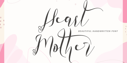 "Heart Mother" is a unique and beautiful handwritten font. This font is equipped with lowercase, uppercase, ligatures, numerals, punctuation, and multilingual support. Suitable for weddings, engagements, stickers, posters, prints, invitations, and others.
 - Blackburn by E-phemera,
$20.00Blackburn is a distressed text font designed to capture the look of old printing at small sizes. Based on a 19th century French type specimen, it contains a complete international character set. - Mstov by Baqoos,
$18.00 Mstov is an alacritous kooky tech display typeface apt for headline, editorial, branding, packaging, printed materials and typographic applications. 220+ glyphs with ligatures and fractions provided in opentype .otf and .woff format.
 - Autumnal by Seemly Fonts,
$12.00 A lovely handwritten typeface is called Autumnal. For stationery, logos, t-shirts, paper, print design, website headers, picture frames, flyers, album covers, posters, image sliders, and other things, this typeface is ideal.
 - Diashapes by Curvature Creations,
$10.00 My font Diashapes has been created by the power Point shape Diagonal Stripe and its angles act like curves. It is a unique font that stands out like a building frame work.