10,000 search results
(0.057 seconds)
- Janda Love And Rain by Kimberly Geswein,
$10.00 This swirly, twirling font was created specifically for monograms. Each letter's unique design flows beautifully.
 - Mrs Eaves XL Serif by Emigre,
$59.00 Originally designed in 1996, Mrs Eaves was Zuzana Licko’s first attempt at the design of a traditional typeface. It was styled after Baskerville, the famous transitional serif typeface designed in 1757 by John Baskerville in Birmingham, England. Mrs Eaves was named after Baskerville’s live in housekeeper, Sarah Eaves, whom he later married. One of Baskerville’s intents was to develop typefaces that pushed the contrast between thick and thin strokes, partially to show off the new printing and paper making techniques of his time. As a result his types were often criticized for being too perfect, stark, and difficult to read. Licko noticed that subsequent interpretations and revivals of Baskerville had continued along the same path of perfection, using as a model the qualities of the lead type itself, not the printed specimens. Upon studying books printed by Baskerville at the Bancroft Library in Berkeley, Licko decided to base her design on the printed samples which were heavier and had more character due to the imprint of lead type into paper and the resulting ink spread. She reduced the contrast while retaining the overall openness and lightness of Baskerville by giving the lower case characters a wider proportion. She then reduced the x-height relative to the cap height to avoid increasing the set width. There is something unique about Mrs Eaves and it’s difficult to define. Its individual characters are at times awkward looking—the W being narrow, the L uncommonly wide, the flare of the strokes leading into the serifs unusually pronounced. Taken individually, at first sight some of the characters don’t seem to fit together. The spacing is generally too loose for large bodies of text, it sort of rambles along. Yet when used in the right circumstance it imparts a very particular feel that sets it clearly apart from many likeminded types. It has an undefined quality that resonates with people. This paradox (imperfect yet pleasing) is perhaps best illustrated by design critic and historian Robin Kinross who has pointed out the limitation of the “loose” spacing that Licko employed, among other things, yet simultaneously designated the Mrs Eaves type specimen with an honorable mention in the 1999 American Center for Design competition. Proof, perhaps, that type is best judged in the context of its usage. Even with all its shortcomings, Mrs Eaves has outsold all Emigre fonts by twofold. On MyFonts, one of the largest on-line type sellers, Mrs Eaves has been among the 20 best selling types for years, listed among such classics as Helvetica, Univers, Bodoni and Franklin Gothic. Due to its commercial and popular success it has come to define the Emigre type foundry. While Licko initially set out to design a traditional text face, we never specified how Mrs Eaves could be best used. Typefaces will find their own way. But if there’s one particular common usage that stands out, it must be literary—Mrs Eaves loves to adorn book covers and relishes short blurbs on the flaps and backs of dust covers. Trips to bookstores are always a treat for us as we find our Mrs Eaves staring out at us from dozens of book covers in the most elegant compositions, each time surprising us with her many talents. And Mrs Eaves feels just as comfortable in a wide variety of other locales such as CD covers (Radiohead’s Hail to the Thief being our favorite), restaurant menus, logos, and poetry books, where it gives elegant presence to short texts. One area where Mrs Eaves seems less comfortable is in the setting of long texts, particularly in environments such as the interiors of books, magazines, and newspapers. It seems to handle long texts well only if there is ample space. A good example is the book /CD/DVD release The Band: A Musical History published by Capitol Records. Here, Mrs Eaves was given appropriate set width and generous line spacing. In such cases its wide proportions provide a luxurious feel which invites reading. Economy of space was not one of the goals behind the original Mrs Eaves design. With the introduction of Mrs Eaves XL, Licko addresses this issue. Since Mrs Eaves is one of our most popular typefaces, it’s not surprising that over the years we've received many suggestions for additions to the family. The predominant top three wishes are: greater space economy; the addition of a bold italic style; and the desire to pair it with a sans design. The XL series answers these requests with a comprehensive set of new fonts including a narrow, and a companion series of Mrs Eaves Sans styles to be released soon. The main distinguishing features of Mrs Eaves XL are its larger x-height with shorter ascenders and descenders and overall tighter spacing. These additional fonts expand the Mrs Eaves family for a larger variety of uses, specifically those requiring space economy. The larger x-height also allows a smaller point size to be used while maintaining readability. Mrs Eaves XL also has a narrow counterpart to the regular, with a set width of about 92 percent which fulfills even more compact uses. At first, this may not seem particularly narrow, but the goal was to provide an alternative to the regular that would work well as a compact text face while maintaining the full characteristics of the regular, rather than an extreme narrow which would be more suitable for headline use. Four years in the making, we're excited to finally let Mrs Eaves XL find its way into the world and see where and how it will pop up next.
 - Some's Style - Unknown license

- Eli 5.0b - Unknown license

- Silqa by Tour De Force,
$25.00 Silqa is distinctive display family inspired with art deco style. Unique family that combines cutoff letter shapes, swashes, geometry and jumpy ascender value is ideal for titles, headlines and product names – in every usage where originality is desirable.
 - Basque by Monotype,
$29.99Basque is a delicate nineteenth-century upright typeface of angular appearance, reminiscent of Black Letter scripts. The letterforms of the Basque font do not flow, but are made up of straight lines joined to form a rigid shape. - Bounce Script by Borges Lettering,
$35.00 Bounce Script is a nice hand lettered upright font. This font has an appealing “bounce” characteristic which gives it its charm. Great for headings, logos or where a brush script is needed. Bounce Script contains five alternate characters.
 - Schoolmarm JNL by Jeff Levine,
$29.00A large assortment of stencil lettering guides made in the 1940's, 1950's and 1960's have been a treasure trove of wonderful "lost" stencil type designs. Schoolmarm JNL continues this series by font designer Jeff Levine. - Qiltray by Tour De Force,
$25.00 Qiltray is a good example of how handwritten fonts can be made for use in long texts. With clear and readable letters, Qiltray may be used in any kind of publications. Includes Cyrilic and CE character set support.
 - Deco Days JNL by Jeff Levine,
$29.00 The hand lettered pre-Deco style title and songwriters' credits on the cover of the sheet music for 1929s "The Love Parade" were the models for Deco Days JNL, which is available in both regular and oblique versions.
 - Bhorgcust by FHFont,
$19.00 Bhorgcust is script font with authentic calligraphy style, with elegant swashes combination letter script form, so many opentype feature include of the font. Suitable for design, element design, wedding, event, t-shirt, logo, badges, sticker, and awesome work.
 - Sibylle by Hanoded,
$15.00 Sibylle is a handmade script font. I used a medium sized Japanese brush pen and coarse paper to create the ‘eroded’ effect. Sibylle comes with double letter ligatures and stylistic alternates for the o (plus all accented o’s).
 - Mogula by Letterena Studios,
$17.00 A serif modern and classic typeface that has its own unique style & modern look. This typeface is perfect for an elegant & luxury logo, book or movie title design, fashion brand, magazine, clothes, lettering, quotes, and so much more.
 - Evening Out JNL by Jeff Levine,
$29.00 Based on an example of [circa] 1950 Finnish embroidery lettering, Evening Out JNL is a classic Art Deco design with contrasting thick and thin lines. This elegant and stylish typeface is available in both regular and oblique versions.
 - Equinox by ITC,
$29.99Equinox is the work of British designer Vince Whitlock. This lighthearted typeface is extremely versatile due in part to its array of alternative characters. Equinox should be set with tight letter and word spacing for maximum visual impact. - True Rose by Creativemedialab,
$22.00 True Rose is a decorative serif family. It contains seven weights from thin to black. Vintage retro style combined with simple Victorian ornaments makes the lettering look neat and clean, perfect for your heading, title, or branding projects.
 - Moklan by Jadatype,
$12.00 Moklan is an all caps bold display font that has a funky and playful style. suitable for logotype, branding, social media, posters, advertisements, and so on. contains standard English letters, numbers, punctuation, and several accents that support multilingualism.
 - Golden Moment JNL by Jeff Levine,
$29.00 The hand lettered cast credits for the 1939 film “Golden Boy” (starring Barbara Stanwyck, Adolphe Menjou, William Holden and Lee J. Cobb) was the model for Golden Moment JNL, which is available in both regular and oblique versions.
 - Highman by Eko Bimantara,
$19.00 Highman is a modern condensed bold font. Its contain all caps letter yet its have a different height between the uppercase and lowercase. Its fit for brand, titling, stacking or grid layout and all kind of display usage.
 - Marcellia by Rockboys Studio,
$23.00 The Athallia is a lovely calligraphy font. It comes with amazing alternates and is a mixture from copperplate calligraphy with hand-lettering styles. It was designed to covey elegance and has an attractive, smooth, clean, feminine, sensual style.
 - Canarsie JNL by Jeff Levine,
$29.00Take a bit of Brooklyn attitude, add a dash of hand-lettered appeal and mix in a slightly Art Deco flair... Your result is Canarsie JNL; a bold sans serif face that would make any New Yorker proud! - Contentor by erzaehlzeichen,
$15.00 Contentor is a display type originated in the habour and made for long journeys. Inspired by the industrial lettering on containers, hardcases and boxes, Contentor and Contentor Stencil are a condensed and bold typeface fit for any voyage.
 - Guideline by PizzaDude.dk,
$16.00 Here is a Guideline for you: Use this font if you want fun, unpredictable, legible and handmade text with influences from both comics and graffiti. Each letter has 5 different versions, and they automatically cycles as you type!
 - Artisan Roman by Monotype,
$29.99Artisan Roman is one of 10 typefaces in the Engravers 1 volume. Artisan Roman is designed to give a three-dimensional look. The Artisan Roman font has highlights on the thick strokes giving the letters a raised appearance. - Expanse by Alfareaniy,
$500.00 Expanse is a retro futuristic typeface. The font has a bold and big vibe and mixes sharp and round corners, kind of like the very old sci-fi movie titles. Expanse includes uppercase multilingual letters, numbers and punctuation.
 - Alpengeist JF by Jukebox Collection,
$32.99 This typeface was inspired by a hand lettered sign for a German-themed attraction. A good choice when a legible blackletter face is needed, this font is useful for a variety of designs or for personalizing your Alpenhorn.
 - Markup by Philatype,
$20.00 Markup is a fresh, clean, handwriting font suitable for use in many applications. At large sizes, the letters showcase their smooth, natural curves. At text sizes, its sharp rhythm makes for a casual personality while still remaining legible.
 - Waxahachie NF by Nick's Fonts,
$10.00This unusual take on a typical woodtype typeface is based on a 1950s Stenso lettering template and, appropriately, takes its name from a small town in Texas not far from Dallas, locally noted for its grand Victorian homes. - Anise Seeds by Gleb Guralnyk,
$13.00 This vintage font set named Anise Seeds includes two versions — textured rough and smooth clean. This capital decorative typeface is perfect for label design and lettering compositions. West European languages support is available. Thank you and have fun!
 - Film Title JNL by Jeff Levine,
$29.00 A World War II training film had its opening title card “First Aid” hand lettered in a casual, Art Deco sans serif design. This is now available digitally as Film Title JNL, in both regular and oblique versions.
 - Bar Book by Lauren Ashpole,
$15.00 My take on a cocktail themed dingbat font. The lowercase and uppercase letters offer an assortment of glassware, bottles, and drinks while the numbers include accessories and garnishes that can be mixed and matched to create new combinations.
 - Gajkley by Letterena Studios,
$17.00 A serif modern and classic typeface that has its own unique style & modern look. This typeface is perfect for an elegant & luxury logo, book or movie title design, fashion brand, magazine, clothes, lettering, quotes, and so much more.
 - Chive Turkey JNL by Jeff Levine,
$29.00Chive Turkey JNL is a solid version of Jeff Levine's inline font, Toucan Tango JNL. This bold and sassy sans serif has the great retro look of hand lettering and can really add some punch to ad copy. - Newsmaker JNL by Jeff Levine,
$29.00 A WPA (Works Progress Administration) poster from the 1940s saying "Behind the Headlines" presented the title hand-lettered in a bold, condensed slab serif. This became the model for Newsmaker JNL, available in both regular and oblique versions.
 - Old Brass Stencil JNL by Jeff Levine,
$29.00 An antique barrel lid stencil spotted in an online auction for a company once located in Guttenberg, NJ provided the hand-cut sans serif lettering which inspired Old Brass Stencil JNL; available in both regular and oblique versions.
 - Losta Bonita by Creativemedialab,
$20.00 Introducing Losta Bonita A modern, vintage, and retro serif family. Consists of 9 weights from thin to black and variable format. The stylistic alternates allow many different unique shapes that give your lettering idea a well-looking look.
 - Malkana by JprintStudio,
$10.00 Introducing Malkana, Malkana is inspired by classic typography and brings its own unique style to any design project. It will take your designs to the next level! Ready to use for projects, texts, letters, or whatever you want!
 - Ticket Booth JNL by Jeff Levine,
$29.00 The opening title card for 1940's "Two Girls on Broadway" was the basis for Ticket Booth JNL. A typical Art Deco typeface, its features include a squared letter shape with rounded corners and a thin character weight.
 - FP Silly by Fontpartners,
$29.00 Silly, as the name suggest, is a somewhat silly font with uppercase letters and it is based on the characteristic expression of the stencil shape. FP Silly is available in two versions, with either rounded or angular shapes.
 - BAGISKO by Letterena Studios,
$9.00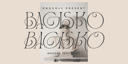 Bagisko is a serif modern and classic typeface with a unique style & modern look. This typeface is perfect for an elegant & luxury logo, book or movie title design, fashion brand, magazine, clothes, lettering, quotes, and so much more.

