10,000 search results
(0.038 seconds)
- Pre Code Movies JNL by Jeff Levine,
$29.00 The hand lettered credits from the 1931 melodrama “Safe in Hell” inspired the typeface Pre Code Movies JNL, which is available in both regular and oblique versions. The design is strongly influenced by the popular Art Deco style of thick-and-thin characters and also features rounded corners. The font’s name comes from the early era of talking pictures and the short period before the establishment of the Hays Office in 1934 when Hollywood did not self-censor itself. Many then-taboo topics were exploited on film until Will Hays cracked down on such productions. To read more about Pre-Code Hollywood, visit the Wikipedia link: https://en.wikipedia.org/wiki/Pre-Code_Hollywood
 - Maree by Ashton,
$5.00 If you want to write something sincere and genuine but not too formal then this is the font for you. It is based on real handwriting, not some artificial calligraphy made to be either too haphazard or spiky or have loads of elegant flourishes but an ordinary person's writing, and designed to look as natural and as close to the original lettering as possible. Like any person's writing it is individual and distinctive, but so easy going on the eye those differences sit comfortably with you. It is friendly and open with easy to read glyphs both as lowercase and uppercase. The letters are relatively wide with clearly shaped distinct outlines. This font may be ideal for projects where you expect a wide readership with different reading abilities from young to old. When you are using this font a slightly bigger point size usually gives a better result so for a standard letter or similar you should size up to 15 points or more. Maree has been individually crafted to the smallest detail. To create a realistic handwriting font that looks relatively simple but works in a wide variety of languages requires a complexity and attention to detail most fonts will never require. This font in any ordinary business environment would never have been made, the effort required to make it too great, the length of time too long. There have been no shortcuts in this font, no automatic scanning or tracing, no automatic generation, no class kerning. Not only is each glyph individual but the width of letters, the height, the accents and the positions of the accents are all different. Even the line weight of the letters is designed to have natural variation but yet similar enough that the font appears as though it were written effortlessly in the same pen. And in order to keep the spacing consistent even though the letters have different widths, heights, lengths of descenders and so on, there are a vast number of kerning pairs, letter to letter, number to number, letter to number... All kerning has been individually assessed with an eye to proportionality taking in character shape, size and weight. For instance if you write a telephone number the numbers all sit close together but if you write a number before a letter such as in a UK post code or before a unit of measurement an extra little bit of space has been added which makes the number more distinct and therefore readable. That space is so natural to the eye that you don’t even know it is there. However even in the spacing allowance has been made for the fact it can’t be too perfect because when you write by hand the spacing is inconsistent. There have to be some letters which are too close or far apart otherwise the font would look artificial. For similar reasons if you are going to print out this font for a letter, etc, check the print version before you make any letter spacing changes because with the zoom functions in modern applications that uneven spacing and lettering can seem more pronounced than it actually is. When this font is printed out you will find it is surprisingly neat. This font is what it is, simple clear handwriting. You will not go wow. But if you want something unique and different and looks good on the page you won’t be disappointed. This font is not a work of art but it is a work of love. This font has a soul. How many fonts can you say that about?
 - Chesterfield by ITC,
$39.00Alan Meeks designed Chesterfield in 1977. Chesterfield is a retro typeface, harkening back to decorative design from the turn of the century. There are many subtle art nouveau traits and curves in Chesterfield, and a hint to Frederic Goudy's work as well. Chesterfield is a display typeface, and should not be used in sizes below 12 point. This typeface would be a great fit for newsletter headlines, or signs for country stores. There are two styles of Chesterfield available: Chesterfield, and Chesterfield Antique. Chesterfield Antique is a more antiquated version of the typeface, and its letters appear slightly corroded. - Eckmann by Linotype,
$29.99The font Eckmann is named after its designer, Otto Eckmann, and appeared with the Klingspor font foundry in 1900. The influence of the Jugendstil is clear to see in the flowing floral contours of the letters. This font was made for larger point sizes, like on posters, and while relatively legible, it is not meant for smaller print. The font was often used in book titles and advertisements of the 19th century and today Eckmann is often used to suggest a feeling of nostalgia and is often found on the Jugendstil facades in Germany, Austria and Switzerland. - Tote Bag JNL by Jeff Levine,
$29.00Totebag JNL continues the stencil font series from Jeff Levine originally inspired by classic lettering stencils of the 1940s and 1950s. This particular design is common amongst "painting stencils", the individual letters used for marking and identification. Some characters are solid shapes while others have the more traditional "breaks" in the letters. - Grogoth by Anomali Creative,
$19.00 Broken letters[1] (German: gebrochene Schrift literally "broken writing"; English: blackletter) or Gothic letters, also known as German letters, are the typeface used in Europe West from the 12th century to the 17th century. Meanwhile, Danish spoke it until 1875 and German, Estonian and Latvian spoke it well into the 20th century. Fracture is one of the broken typefaces that is often considered to represent the entire broken typeface. Broken letters are sometimes also called Old English, but not in the Old English or Anglo-Saxon sense that was born centuries earlier. This group of letters is so named because it contains Latin letters that have breaks in the curvature of the letters, either in part or in whole designs. The fracture arises from a sudden dip when writing certain parts of the letter. In contrast, letters with perfect, unbroken curves, such as Antikua, are created from smooth, flowing writing movements. Grogoth is a font inspired by the Blackletter typeface, made with a modern impression but still looks strong and unique. In addition, Young Best font is also supported with multilingual characters that can be used in several international languages. Grogoth font is very suitable for use in making music album cover designs, tattoo logos, wishkey labels, packaging pomades and so on which are made with dark and strong concepts. Thank you, and don't forget to check out our other products.
 - Nightmark BB by Blambot,
$12.00 Nightmark BB is a roman-inspired, all-caps calligraphy typeface, hand lettered by Nate Piekos. Intended for comic book dialogue lettering, it features contextual alternates for six versions of each letter, three versions of each number, exclamation point, and question mark, serif-I correction, manga-specific characters, bouncy baselines for three or more consecutive letters, and a ton of European characters!
 - Sign Stencil JNL by Jeff Levine,
$29.00 Sign Stencil JNL was modeled from some vintage lettering stencils spotted in an online auction that were part of a store sign making kit. A variety of styles, sizes and designs were contained within a carrying case along with paints, brushes and instructions on how to paint attractive signs.
 - Japanese Brush - Unknown license

- Black Quality by Alit Design,
$14.00 Black Quality is an elegant and certainly cool Black Letter styled font family. The process of making this font from sketching to the final file takes up to 5 months. Black Quality can be used as a font layer but can also be used alone without a layer, many styles that you can combine from the outline to the Rough style. Black Quality is perfect for Victorian, Classic, Elegant and vintage designs. This font is very well used for design wine, packaging, beer logos, tattoo studios, and more. Besides you get letter fonts you also get "BONUS" ornament sets in the form of font formats. You can combine all ornament elements as in the Black Quality font display. For those of you who like to collect or have design projects that are victorian, black letter or awesome designs, you must and must have a Black Quality font on your device. Best regards Alit
 - Old English by URW Type Foundry,
$35.00 Old English Old English is related to Black Letter styles from early printed books and have a distinguished, historic look. The Old English font is used in advertising, invitations, greeting cards, and wherever a formal hand-lettered or engraved look is desired.
 - Bandung Pro by Majestype,
$34.00 Bandung Pro from Majestype was made to capture the natural movement of a brush script infused with the elegance of copperplate hand. With 6 months in the making, we want to make sure that the character set connects each other as natural and seamless as handwriting would be. We give you vast amounts of glyph options(700+) added with lots of swashes and flourishes to give you an authentic look of hand-made brush letters. Aceserif Pro is an all-caps serif font inspired by traditional serif and art deco design. Equipped with 220 Glyphs and has the current OpenType features. We made the uppercase letters slightly larger than the lowercase letters to give a good impression when used in designs that don’t require a lot of words, such as headlines or headers. You can try it like this, “HeadlineS” - Capital letters are at the beginning and end of a word. Bandung Pro & Aceserif Pro is suitable for a wine label, photography, invitation, ID card, tattoo, poster, logo, title, tees, branding, etc.
 - Dead Hardy - Personal use only

- Raven Hell by Creativemedialab,
$20.00 Raven Hell is a simple and modern gothic font. What's unique about Raven hell is that it can be sans or blackletter, depending on your choice of design theme. Raven Hell can be used in many types of modern designs ranging from product labels to tattoos, badges, logos, poster titles, and much more.
 - Oxford Press by Set Sail Studios,
$17.99 Recreate authentic letterpress typography with Oxford Press, a set of chunky uppercase Serif & Sans fonts designed using real vintage metal letterpress blocks sourced from old printing companies. The Serif & Sans fonts each have two variations, 'Clean' and 'Rough'—with the latter having real, highly detailed hand-made letterpress textures applied to each letter. Each letter of the 'Rough' fonts also has an alternate texture, which can be accessed simply by switching between upper and lowercase characters. The 'Rough' fonts can make a striking impact as bold header text for posters, adverts, prints and packaging, whereas the 'Clean' versions are more suited for smaller accompanying text, cleaner designs or for applying your own textures and styles. Language Support • English, French, Italian, Spanish, Portuguese, German, Swedish, Norwegian, Danish, Dutch, Finnish, Indonesian, Malay, Hungarian, Polish, Croatian, Turkish, Romanian, Czech, Latvian, Lithuanian, Slovak, Slovenian.
 - Staple by Ajeet Mestry,
$50.00 Staple is a Display Font. Each letter and number is made up of a clever arrangement of staples. Together, they retain the simplicity and beauty of a perfectly folded stapler pin. This creates a font that provides very good readability, solid shape and simple elegance that makes it perfect for use as a display font. To add elegance to the font, the letters and numerals are designed to retain the pin identity across all characters. Care has been taken so that the pins do not overlap. Nor are the pins bent or twisted into unnatural shapes to create the characters.
 - Square Cat by Lalelum,
$12.99 This is a blocky typeface with thick lines and no serifs. It's a modern design with a hint of vintage lettering with a thicker vertical line on one side of each letter. Most letters are square shaped. The two styles are regualar and hollow, with the hollow style having the thicker areas hollowed out.
 - Sunshine by Chank,
$49.00 Sunshine is the unlikely alphabet collision of Gobbler and Liquorstore. Chank's napkin scrawl smashed into the letters commonly found on signage at the neighborhood liquor store. Gobbler's blotchy textures fragmented Liquorstore's uniform stroke. It began as a hideous lumpy thing with random vector points everywhere. Chank came to the rescue with his Alphabetician's first aid kit. He smoothed the blunt corners with a few hammer blows. He wrapped the font in extra strokes, in a sans serif Roman style, to increase its contrast. His industrial influence helped stabilize Gobbler's gloppy qualities and his grunge aesthetic softened Liquor store's checkerboard rigidity. The end result is a font with a solid structure and a painterly wiggle that creates a dirty display or a slightly clumsy text face. Because of its many detailed strokes, it tends to look a little better in print than on the web. All organic. Earthy.
 - HT Maison by Dharma Type,
$19.99 HT Mason is bold and hand painting font. This font is retrospective and decent, but it is also funny and cute. Holiday Type Project offers retro hand drawing scripts. Inspired by retro script on shopfront lettering, wall paint advertisements in Italy around 1950s. Check out the script fonts from Holiday Type!
 - Larrikin by HeadFirst,
$17.99 The distressed letterforms hark back to early printing process using hand carved wood cut letters. The typeface is available in 6 weight with both Rough & Solid variations.
 - Kal08 by Solokarir,
$15.00 Kal08 is a Sans Serif Font, this font consists of Uppercase, Lowercase Letters & multilingual support. Kal08 is perfect for Logotype, Print Design, labels, Products, Text, and more.
 - S&S Baldwins by Spencer & Sons Co.,
$35.00 Baldwins was inspired by the beauty lettering of ephemera prints. Ideal for product names, packages, labels, old fashioned signs and everything with specific characteristics of past times.
 - Diamond Jim JNL by Jeff Levine,
$29.00Diamond Jim JNL was inspired [in part] by an image of a 1970s Letraset® dry transfer typeface made entirely of small stars. By creating his own layout using tiny diamond shapes, Jeff Levine has produced a font that takes on multiple appearances. At 24 point it resembles dot matrix printing; at 48 point the diamonds are clearly visible; and overall, the design has a distinctive 70s retro feel. Limited character set. - Vild Scapes by Typesketchbook,
$49.00 With the intention to create a family of modern calligraphy, Vild Scapes offers different feels in different effects. The Normal option cuts back the imperfections created from freehand writing, while Inkless keeps those details. There’s also the Rust option, which imitates letterpress printing effects. In addition, the family comes in three designs: Brush (big paint brush style), Script (small paint brush style), and Marker (brush tip maker style), offering you more possibilities for creativity.
 - Marconi by Linotype,
$29.99 Marconi was created by Hermann Zapf in 1973. According to Gerard Unger, it was the world's first digital typeface. Zapf’s design was developed as a text face for books and magazines. The round forms of the Marconi follow the principle of the superellipse. The lowercase letters are enlarged as the result of reading tests, while the capital letters are slightly reduced. The 8-point size — normally used for newspapers — looks more like 9 1/2 points. Marconi is a legible typeface with its large and open lowercase letters. It is ideal for long text blocks in newspaper, book, and magazine production.
 - Ephemera Kingsford by Ephemera Fonts,
$39.00 A new vintage display typeface by Ilham Herry. Started from the passion of collecting the old tin packaging with classic labels on it, the layout and composition make Ilham pretty inspired and the urge of crafting the letters is getting bigger since that day. That's what comes first as a motivation in making this Ephemera Kingsford typeface.Adapted and referencing from the real physical collectible old tins and cans to a single pack of digital fonts asset. Packed up with 9 layered fonts, 1 font as a pair, and of course ornaments and vintage panels as a vector file.Perfectly fit for display printing, handcrafted product, screen printing industry such as apparel, packaging, labels, and also sign painting, scrapbook, glass gilding, et cetera. Not every visual can go vintage but if you want to, there's no other choice, oldsport. check Ephemera Kingsford type specimen here
 - FF Hertz by FontFont,
$68.99 Low stroke contrast, generous spacing, and fine-grained weights from Light to Extra Bold make FF Hertz a workhorse text typeface which holds up well under today’s widely varying output conditions from print to screen. The quite dark Book style works well on e-ink displays which usually tend to thin out letters, as well as in print when you want to evoke the solid letter image of the hot-metal type era. Two sizes of Small Caps are included: A larger size for abbreviations and acronyms, and a smaller size matching the height of the lowercase letters. FF Hertz is a uniwidth design, that means each letter occupies the same space in all weights. This feature allows the user to switch between weights (but not between Roman and Italic styles) without text reflow. Jens Kutilek began work on FF Hertz in 2012. From a drawing exercise on a low-resolution grid (a technique proposed by Tim Ahrens to avoid fiddling with details too early), it soon evolved into a bigger project combining a multitude of influences which up until that point had only been floating around in his head, including his mother’s 1970s typewriter with its wonderful numbers, Hermann Zapf’s Melior as well as his forgotten Mergenthaler Antiqua (an interpretation of the Modern genre), and old German cartographic lettering styles. Jens likes to imagine FF Hertz used in scientific books or for an edition of Lovecraftian horror stories.
 - Argento by Librito.de,
$10.00 The design for this typeface is based upon four sheets of an old latin book I purchased in Hanover (Germany) a couple of years ago. The letters preserve the rough edges of the original printing, I just added a few missing letters and some ligatures.
 - Sassoon Infant by Sassoon-Williams,
$48.00 An upright typeface family developed to meet the demand for letters to produce pupil material for handwriting as well as for reading. Upright letters with extended ascenders and descenders are ideal on screen. They facilitate word recognition. The exit strokes link words together visually, and in handwriting they lead to spontaneous joins along the baseline leading logically to a joined-up hand. Teachers can print desk strips, charts of letter families and alphabet friezes, as well as consistent material across the curriculum. Together these typefaces provide a valuable resource for special needs teachers. When starting point and stroke direction has been learned, the arrow font (Tracker B) can be dropped and the simpler Tracker font used. Tracker B font, with its direction arrows helps pupils to start in the correct place. Motor movements can be refined by keeping inside the line. When starting and direction is no problem, the arrow can be dropped and the plain Tracker font used. When starting point and stroke direction have been learned, the arrow font (Dotted B) can be dropped and the simpler Dotted font used. Free to download resources How to access Stylistic Sets of alternative letters in these fonts Purchasers of this font package may use their Order Number to receive a free Copybook PDF by Rosemary Sassoon recommended for effective teaching
 - Steamtown by Melvastype,
$16.00 Steamtown is a sans serif type family of three weights and four styles. It is based on geometric forms, so it is a clear and straightforward typeface. It has an industrial feel and also resembles street signage. It has four styles; Clean, Rough, Print and Press. The Rough style has rough edges, Print has a subtle texture and Press has a heavy letter-press texture. Rough, Print and Press styles have two sets of upper- and lowercases. You can manually alternate the two sets of upper- and lowercases or you can enable the Contextual Alternates OpenType feature to automatically cycle these two sets of letters.
 - PM Doorbuster Script by Paper Moon Type & Graphic Supply,
$20.00 A new font inspired by vintage hand-painted paper grocery store signs. The Doorbuster Collection is based on retro hand-painted paper signs primarily seen in grocery stores from the 1920s through the 1970s. We meticulously hand-drew each font, modeling the spacing and uneven baseline found in vintage sign painting. The purposely organic ascenders and descenders, along with a huge set of ligatures/contextual alternates to avoid the same letters repeating when paired, give it a real hand-lettered look. Doorbuster Script is perfect for both vintage-inspired and contemporary marketing, branding, and packaging designs. Check out a few of the samples included in the thumbnails above.
 - Vasetters by Ingrimayne Type,
$9.00 In Vasetters the letters are cut from the shape of a tessellating vase. To get the tessellating effect, the two sets of letters (and numbers and some symbols) must alternate, and this is done automatically in applications that support the OpenType feature of Contextual Alternatives (calt). Vasetters is monospaced and comes in two weights. The regular weight is tightly spaced, which should not be a problem at large point sizes. At small point sizes adjacent letters can be colored differently or the character spacing can be increased. The lighter weight can be used alone or layered above the regular weight to create the effect of hollow lettering. Vasetters is is fun, bizarre, weird, and obviously a decorative display font.
 - Handmade Dropshadow JNL by Jeff Levine,
$29.00 Handmade Dropshadow JNL was modeled from lettering found on a vintage silk screened metal sign used for point-of-sale marketing. Before the advent of computers and modern techniques, silk screens were hand cut using material called frisket and knife tools, and the lettering reflected the human inconsistencies of cutting these lettering into the template surface for transfer.
 - Handmade Font by Ingrimayne Type,
$14.95 In Handmade Font the letters are made of hands or handprints, something children sometimes do when they are set free with paint. It is caps only but the letters on the lower-case keys differ from those on the upper-case keys. It comes with a large assortment of accented letters to support most European languages.
 - Her Song by Allouse Studio,
$16.00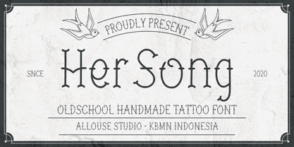 Proudly Present, Her Song a Oldschool Handmade Tattoo Font Her Song is perfect for product packaging, branding project, megazine, social media, wedding, or just used to express words above the background. Her Song also come with Multi-Lingual Support. Enjoy the font, feel free to comment or feedback, send me PM or email. Thank You!
 - Forest Ghost by Kaer,
$19.00 Forest Ghost is a font family with Regular and Textured styles. You'll get a playful font for your Scary corporate identity, Circus emblem, Halloween posters, Rock'n'roll flyer, Tattoo studio, Western-style design, and etc. Font features: All-caps, numbers, punctuation, and multilanguage support. Please feel free to request to add characters you need: kaer.pro@gmail.com
 - Arhoky by Product Type,
$17.00 If you are looking for a unique and unique gothic blackletter font that will set your project apart from the rest, look no further! ARHOKY is the perfect font for adding a touch of elegance to all kinds of creative work - including wedding invitations, tattoos, and packaging designs. Use it immediately to realize amazing projects!
 - Tombola by RMU,
$30.00 Inspired by painted letters of Otto Heim, "Tombola" reflects in a charming way the feelings of the Roaring Twenties, especially in advertisement and in the creation of posters.
 - Generous by PizzaDude.dk,
$20.00 Generous is painted with a somewhat dry brush. That's why it looks so authentic! Comes with contextual alternates (7 different versions of each letter!) and multiple language support!
 - Aisyah by Malindo Creative,
$10.00 Aisyah is a modern hand-based typography, This font is made up of irregularly flowing letters, both between top-down and with subsequent letters,which makes it suitable for Logotype, posters, businness cards, merchandise, wedding invitations, greeting cards, banners blogs, clothing, water-based paint designs / prints, correspondence, quotes and more!. Aisyah has given PUA encoded (fonts with special code). This Font Equipped: -Uppercase -Lowercase -Figures & Punctuation -Stylistic Alternatives -Ligatures -Language Support To enable the OpenType Stylistic alternates, you need a program that supports OpenType features such as, Adobe Indesign,Adobe Illustrator CS & CorelDraw X6-X7, Microsoft Word 2010 or later versions. Files include: Aisyah otf. -If you have any questions, please contact me at. malindocreative@gmail.com. -Thanks for support -Feel free to contact me if you have any questions, I am happy to help you

