10,000 search results
(0.021 seconds)
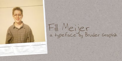
- Fill Meijer by Bruder Graphik,
$-
- Rock Pile by Putracetol,
$20.00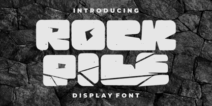 Introducing Rock Pile is a display font. bold and rock!! This tyepeface is Unique and very suitable for logos, Tshirt, apparel, quote, handwritten quotes, product packaging, tittle header, poster, merchandise, social media, labels, branding & greeting cards. To access the alternate glyphs, you need a program that supports OpenType features such as Adobe Illustrator CS, Adobe Photoshop CC, Adobe Indesign and Corel Draw.
 - Everett Mill by Aboutype,
$24.99Outline brush script originally designed for embroidery application. Everett was designed for all media and works best at 24 point and above. Everett requires subjective display kerning and compensation. - Swing Bill by Monotype,
$29.99The Swing Bill font was designed as a display face for sport material or pop music posters, but has also been seen on TV. - Onion Mill by PizzaDude.dk,
$15.00 Onion Mill is based on my own handwriting, when I want to mimic the classic letters from comics. This type of texting can be super useful when you have a massive amount of text that needs to be good looking, as well as legible! You have 4 different versions of each letter to choose from - enough to randomise the appearance of your text!
 - Murray Hill by URW Type Foundry,
$35.00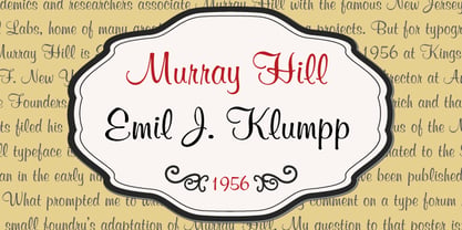
- Murray Hill by Bitstream,
$29.99An original informal script designed for ATF by Emil Klump. - The Hills by Mans Greback,
$59.00 The Hills is a script typeface, perfect for logotypes. Designed by Måns Grebäck during 2017, this high quality lettering brings you to the sunny fifties. It is well balanced and has a nice medium weight. The font contains 350 glyphs and has support for a wide range of languages.
 - Hollywood Hills by Studio K,
$45.00 Inspired by that iconic sign in the Hollywood Hills, this font is a must for film buffs, movie lovers and designers who want to bring a bit of big screen glamour to their projects. It’s a caps only face, but by using the upper and lower case keys type can be set above or below the base line, thus creating the signature stagger effect. See also Jazz Age and Tea Dance by Studio K
 - Lettown Hills by Senzana,
$8.00 Lettown Hills is inspired by urban or freestyle artworks. With casual or marker style and lot of stylistic alternates you can create realistic headers. It’s a font that can be used with vintage, simple and modern styles. Comes also with swashes font. It works beautifully for personal branding, advertising or creative headers. Looks good also with retro style typography or branding. It is very suitable for logos, posters, t shirts and more.
 - Kill Me by Octopi,
$13.00 I have terrible and messy handwriting so I thought it would be a good idea to make a twisted version into an horrific font. In that respect I think it is quite successful, plus, Hallowe'en is nigh.
 - Mill Valley by Letterhend,
$19.00 Mill Valley is a monoline script with a casual and fun theme. This type of font perfectly made to be applied especially in logo, headline, signage and the other various formal forms such as invitations, labels, logos, magazines, books, greeting / wedding cards, packaging, fashion, make up, stationery, novels, labels or any type of advertising purpose. Features : uppercase & lowercase numbers and punctuation multilingual alternates / swashes and ligatures PUA encoded We highly recommend using a program that supports OpenType features and Glyphs panels like many of Adobe apps and Corel Draw, so you can see and access all Glyph variations.
 - Gill Hebrew by Lerfu,
$55.00Near the end of his life, legendary type designer Eric Gill lived in Jerusalem, and became interested in the typesetting of the Hebrew alphabet and the challenges it entailed. He designed his own Hebrew font which has not (to my knowledge) been digitized before. It is sometimes held up as an example of how not to do a Hebrew font: Gill introduced strange serifs and shapes that were jarring to readers used to more traditional fonts. But it is quite readable, and does start to grow on you after a while; extended text in Gill Hebrew is possible. I've added a set of alternate digits that are based on the shapes of the letters (Gill's digits are pretty standard text figures). I've also made some of the Unicode Hebrew symbols that Gill didn't (e.g. New Sheqel Sign, Alef-Lamed ligature, etc.) and also included vowel-points. - Gone Hills by Twinletter,
$14.00 Gone Hills is a whimsical display typeface that’s perfect for a variety of creative projects. Your project will appear natural and attractive in the eyes of onlookers if you use this typeface. Let’s use this typeface to increase the quality of your graphics. This typeface is ideal for use in games, sporting events, branding, banners, posters, movie titles, book titles, quotations, logotypes, and other applications. Naturally, your varied design projects will be excellent and extraordinary if you use this font because it comes with a complimentary font family, which can be used for titles, subtitles, and sentence text. Start utilizing our fonts for your great projects today.
 - Media Gothic - Unknown license

- Regency Gothic - Unknown license

- Plumber's Gothic - Unknown license

- Durer Gothic - Unknown license

- Fletcher-Gothic - Unknown license

- Holitter Gothic - 100% free

- Dev Gothic - Unknown license

- Diamond Gothic - Unknown license

- Deutsch Gothic - Unknown license

- tenuki gothic - Unknown license

- Dweebo Gothic - Unknown license

- Gothic Flames - Personal use only

- Holland Gothic by URW Type Foundry,
$39.99 Blackletter fonts are timelessly beautiful and still very popular. At some point, it seems that every type designer discovers the beauty of these forms and the great pleasure in creating blackletter characters. Like also Dutch designer Coen Hofmann who, after designing Caxtonian Gothic, has designed yet another Blackletter font: Holland Gothic. Holland Gothic reminds of the 18th century »Duytsch« typefaces of Joan Michael Fleischmann and Christoffel Van Dyck. But Hofmann was mainly inspired by the Dutch calligraphers from the 17th and 18th century. Holland Gothic develops its full charm and beauty at larger sizes because of the hairlines in the upper case characters. To enable users composing texts in the style of our ancestors, Coen Hofmann added a series of pre-composed ligatures, also in combination with the long s, plus an alternate form for the lower case r which was used in combination with letters b, d, g, o, p, v, and w.
 - Tuscan Gothic by Solotype,
$19.95This is a Vanderburgh and Wells wood type cap font from 1877. We don't know if the originators made a lowercase for it, but we did. Most effective in larger sizes. - News Gothic by ParaType,
$30.00A Bitstream version of News Gothic that was created by Morris Fuller Benton for American Typefounders and first appeared in 1908. There is the standard American sanserif of the first two thirds of the twentieth century with narrow proportions and a large x-height. Despite, or perhaps because of, the font’s unconventional relationships in proportion and form, News Gothic has long been a popular typeface for almost any use. Cyrillic version developed for ParaType in 2005 by Dmitry Kirsanov. Greek extension designed by Dmitry Kirsanov in 2009. - Advertisers Gothic by HiH,
$12.00 Advertisers Gothic is bold and brash, like the city it comes from, Chicago. It was designed by the accomplished German-American matrix engraver, Robert Wiebking, for the Western Type Foundry in 1917. As its name suggests, it was designed for commercial headliner work, much as Publicity Gothic by Sidney Gaunt for BB&S the year before. See our Publicity Headline. Alternate letters ‘A’ & ‘S’ are provided. The most popular ad words “Free!”, “New!” and “Sale” (with both esses) are provided at an angle for dramatic tension. Advertisers Gothic became quite popular because it was effective. It can work equally well for a flyer advertising a non-profit event as for a magazine product ad. This font refuses to be a wimp. Use it boldly. Advertisers Gothic ML represents a major extension of the original release, with the following changes: 1. A total of 335 glyphs (compare) with added glyphs for the 1250 Central Europe, the 1252 Turkish and the 1257 Baltic Code Pages. 2. Added OpenType GSUB layout features: pnum, ornm, liga, hist & salt ˜ with total 13 lookups. 3. Added 209 kerning pairs. 4. Revised vertical metrics for improved cross-platform line spacing. 5. The most popular ad words “Free!”, “New!” and “Sale” (with both esses) are provided at an angle for dramatic tension The zip package includes two versions of the font at no extra charge. There is an OTF version which is in Open PS (Post Script Type 1) format and a TTF version which is in Open TT (True Type)format. Use whichever works best for your applications.
 - Advertising Gothic by Scriptorium,
$12.00Advertising Gothic is based on a style of fonts from the 1920s which was commonly used in advertising and poster design. The style is clearly influenced by the Art Deco movement. It combines deco style decorated initials with dramatic capital letters. The font comes in two different versions. Advertising Gothic Plain features initials which do not have the deco decorations and less fancy letter forms. Advertising Gothic Deo features deco embellishments on the initials and more elaborate versions of the main letter forms. - Dupont Gothic by Hexagon Foundry,
$19.00 Dupont Gothic is a sleek and contemporary sans-serif font that embodies elegance, clarity, and modernity. With its clean lines, balanced proportions, and distinctive character, Dupont Gothic is a versatile typeface that can be used in many ways. The simplicity of Dupont Gothic lends itself to a wide range of applications. Whether used for headlines, body text, or branding, this font possesses a quality to effortlessly adapt to different design contexts. The font comes in 10 weights with matching oblique characters, 2 widths, and 2 style sets that ensure the endless combinations and possibilities.
 - Neumatic Gothic by Arkitype,
$20.00 Nuematic Gothic is a condensed sans-serif family. It has a tall Cap Height and an x-height to balance it. Neumatic Gothic is versatile in use as a Headline font or as a text font. Neumatic Gothic has loads of options to play around with, included in the glyph set is small caps a stylistic uppercase superscript, stylistic alternates and circled numbers to name some. The typeface was designed with the graphic designer in mind to make beautiful typographic pieces with more ease with all the options you have in Neumatic Gothic.
 - Dex Gothic by Linotype,
$29.99Dex Gothic is another sort of stencil type. Instead of the "normal" routine of blocked-out horizontal or vertical areas, Dex Gothic creates its stencil appearance through the unique placement of diagonals. The result is a technical-like appearance, which bears some resemblance to 1980s technology products. Dex Gothic should be used large in headlines or logos. - Block Gothic by Red Rooster Collection,
$45.00 In 1992, Red Rooster Typefounders created Block Gothic Extra Condensed based on the TP Collection Block Gothic. In 1994, the company created and produced Block Gothic Condensed loosely based on the Extra Condensed; the weight range is markedly different than the earlier release.
 - Gothic Special by Wooden Type Fonts,
$15.00 A revival of one of the popular wooden type fonts of the 19th century, suitable for text or display, short descenders, tall ascenders, the condensed bold version, completing the family of 4 fonts in total.
 - Swank Gothic by BA Graphics,
$45.00A gothic with a contemporary look very powerful. - Animated Gothic by BA Graphics,
$45.00 A great animated fun design. Works really well for kid's stuff and children's books.
 - National Gothic by BA Graphics,
$45.00A new gothic great for books and magazines. - HG Gothic by RICOH,
$199.00 HGゴシックは、リョービの書体「ゴシック」を字母として作られたフォントです。クラシックなデザインがほどこされた正統派のゴシック体ですが、仮名は大きめに作られていて、読みやすいです。Bウェイトは、MSゴシックと同じデザインになっています。M、Bは、本文用途に向いていますが、見出しにも合います。M、Bよりも太いEは、よく目立つので、大きく使うことで魅力が発揮できるスタイルです。


