10,000 search results
(0.029 seconds)
- Square Line Icons Animals by Howcolour,
$17.00 The square icons focus on maximizing the meaning by minimizing the symbols. Let your viewers understand your data without disorientation. Use a metaphorical icon library, designed for fast, intuitive human recognition. All square icons crafted with precision and eye for quality with 32x32 grid system. The metaphors and the compositions designed with pieces from everyday life and popular culture, thus your viewers will never get lost and enjoy a unique and simplified visual style.
 - ITC Arid by ITC,
$29.99ITC Arid was designed by Rob Leuschke in 1997 as a lively calligraphy typeface which looks as though it was put to paper with a piece of charcoal. Generous capitals mix harmoniously with the more reserved lower case characters and the forward slant of both create a dynamic impression. Arid should be used in point sizes of 12 and larger and is well-suited for headlines and short to middle-length texts. - Pocomoke JNL by Jeff Levine,
$29.00 Two pieces of vintage sheet music (“Honeymoon Hotel” and “By a Waterfall”) from Warner Brothers' 1933 musical “Footlight Parade” featured a hand-lettered bold alphabet with a touch of the 1930s Art Deco influence. These song sheets served as the basis for Pocomoke JNL. As informal and casual as the design is, its strength is in the boldness of the letter forms (which showcases the era of pen-and-ink display lettering).
 - Compressed Jam by JAM Type Design,
$35.00 Introducing Compressed Jam, a revolutionary typeface that seamlessly blends elegance with efficiency. Crafted with precision and a creative touch, this compressed sans serif family has been meticulously designed to breathe new life into headlines, logos and other small pieces of text. With its sleek and condensed letterforms, Compressed Jam commands attention and exudes a sense of modernity, making it the perfect choice for those seeking a balance between style and space-saving functionality.
 - Vekta Serif by Positype,
$22.00 The Vekta Type System is part of a larger, interconnected grouping of 3 families: Neo, Sans and Serif. The goal was to develop a family designed along a common skeleton and matrix that would allow for interchangeable usage along a cohesive visual system. It's About The Personality. Interchange type families to be as expressive as you want to be. Let the piece you are designing constrain your usage and not the typeface.
 - Volare by Gatype,
$15.00 Volare latest style letters are perfect for wall displays, social media post logos, advertisements, product packaging, product designs, labels, photography, watermarks, invitations, stationery, and any project that turn creative idea into a true piece of art. These fonts include: OTF files. Displayed fonts: Uppercase, Lowercase, Numbers, Symbols, Accents, Styles, Swashes and Ligatures also Multilingual Support Enjoy the font, feel free to comment or feedback, send me a PM or email. Thank You!
 - Verilet by Azzam Ridhamalik,
$10.00 Verilet is elegant and vintage display typeface that looks stunning in just about every context. Very suitable as to make a design choice such as logos, branding, magazines, headlines, websites, packaging, wedding cards and more creative project! All-caps characters, with over 400 glyphs VERILET’s also has a lot of alternative characters. It looks really cool when elegant meet vintage to any piece. FEATURES : Uppercase Lowercase Number Punctuation Multilingual PUA Encode Opentype
 - Raccoon Coat JNL by Jeff Levine,
$29.00 A piece of hand lettered sheet music from the era of the "Roaring Twenties" served as a model for Raccoon Coat JNL. It was a time of Prohibition, bathtub gin, flappers and college boys decked out in beanies and raccoon coats. College pennants, ukuleles and "23 Skidoo" were all part of the youth culture during this period; which gave us such dances at the Charleston, the Black Bottom and the Lindy Hop.
 - Musical Arrangement JNL by Jeff Levine,
$29.00 The hand-lettered title on a piece of sheet music for 1938's "Don't Be That Way" (as recorded by Benny Goodman) featured squared letters with rounded corners, slight variants in line thickness and interesting "overhangs". Additionally, some letters closed off on one end while others were opened, giving the impression of a slight "maze" effect. This unique song title was enough of an inspiration to be turned into Musical Arrangement JNL.
 - Tall And Narrow JNL by Jeff Levine,
$29.00 Let Me Call You Sweetheart was one of the most popular songs of the early 20th Century, and a piece of vintage sheet music for this tune had its title hand lettered in a square, narrow block lettering style. With a few adjustments and adaptations, this led to the creation of Tall and Narrow JNL, a digital version of the type design which is a perfect alternate to the more conventional condensed faces.
 - Tuerca by Graviton,
$24.00 Tuerca font family has been designed for Graviton Font Foundry by Pablo Balcells in 2021. It is a slightly extended sans serif typeface with a strong technical appearence. Its squared, angular shapes provide a futuristic and robust aesthetics. It has been conceived to be most suitable for logos, headlines and display design pieces as well as short length text blocks. Tuerca consists of 8 styles, each containing small caps and glyph coverage for several languages.
 - Binaria by Graviton,
$24.00 Binaria font family has been designed for Graviton Font Foundry by Pablo Balcells in 2018. It is a sans serif typeface with a mechanic appearence. Its squared, angular shapes provide a futuristic and robust design. It has been conceived to be most suitable for logos, headlines and display design pieces as well as short length text blocks. Binaria consists of 12 styles, each containing small caps and glyph coverage for several languages.
 - Vekta Sans by Positype,
$22.00 The Vekta Type System is part of a larger, interconnected grouping of 3 families: Neo, Sans and Serif. The goal was to develop a family designed along a common skeleton and matrix that would allow for interchangeable usage along a cohesive visual system. It's About The Personality. Interchange type families to be as expressive as you want to be. Let the piece you are designing constrain your usage and not the typeface.
 - Pixter by Matt Grey Design,
$12.99 Pixter straddles the lines between the extreme forms of grid based pixel fonts, and more conventional grotesque fonts. Its array of styles create a palette of textures to work with multiple scenarios, from large format display to oversized passages of copy. Inspiration for Pixter initially grew from old computer bitmap fonts, but branched out into Swiss and Dutch graphic design, such as the graphic work of Josef Müller-Brockmann and typography of Wim Crouwel.
 - Logo Sans by Emily Lime,
$16.00 Logo Sans is a clean, geometric sans-serif created with an obvious use in mind - logos (although quite suitable for longer texts as well). It is a clear, easy to read font that comes in a variety of weights & italics ...allowing for pleasing logo design combination and marketing pieces. Its wide characters and linear lines have a very modern, luxurious appeal. The family includes 5 weights...plus italics - for a total of 10 fonts.
 - Unibody Pro by Underware,
$50.00 Unibody 8 is a cross-platform OpenType font that optimizes your screen performance at pixel point size 8. It is free to download from Underware. The Underware site also contains technical information, including how to use Unibody in Flash and Photoshop, and links to various websites where Unibody is used. Unibody comes with Underware’s infamous Latin Plus character set standard, pairing with exactly 219 languages. There’s also Arabic version existing, by Yanone.
 - Laillaland by Tigade Std,
$15.00 Lailaland is a beautiful handwritten font which was carefully created with a touch of elegance. Create a beautiful book cover, eye-catching social media posts, or even cute greeting cards. Fall in love with its undeniably clean feel font for an outstanding designs. It also features a wealth of special features including alternate glyphs and ligatures. Fall for Lailaland's authentic feel and turn your creative ideas into a true piece of art!
 - Low Def by Daniel Brokstad,
$29.00 Low Def, short for Low Definition, is inspired by fonts displayed on old CRT televisions / monitors, sometimes with quirky characteristics. From video game consoles, home computers to the dim noisy arcades. With it's lower resolution analogue signal shown through scanlines, it created a smoothened look that blended together the pixels on CRT displays. The family consist of 5 different widths, from Extra Narrow to Extra Wide. Roman, Cyrillic, Katakana & Hiragana are supported.
 - Vestigia by Rodrigo Navarro Bolado,
$32.00 Vestigio m. Ing. & Fr. vestige: a trace, mark or visible sign left by something as an ancient city in a condition or practice vanished or lost. Vestigia is born by lost pieces of other typography, being then, Garbancera's descendant. It evolved to be seen in big point sizes and compete with other fierce competitors, while retaining some features of it ancient predecessor, navigates a gothic fraktur experimental style, existing between legible and illegible reading.
 - Tulk's Victorian Banner by Greater Albion Typefounders,
$14.50 Tulk's Victorian Banner revives the tradion of 'Banner' typefaces-lettering within their own lozenge or cartouche, that made such an appealing feature in many old type foundries catalogues. Tulk's Victorian Banner makes a wonderful feature of lettering in any piece of period inspired design. It compleiments our recent Fitzgerald space especially well, but can be used alongside any typeface of your choice where you want to bring a touch of period flamboyance.
 - Isometrica by Greater Albion Typefounders,
$15.00 Isometrica is the latest in Greater Albion's line of 'Banner' typefaces. Like all of the banner faces they lend themselves to the design of mastheads and logos. Isometrica is also a meeting of architectural drawing and typeface design, given bold two coloured concertina banners with letters appearing page by page. A range of decorative end pieces are also included. Bring your designs to life with lettering that stands up off the page!
 - Nouveau Auto JNL by Jeff Levine,
$29.00 “The Auto Show” is the title of an early 1900s pieces of sheet music proving that America has had a fascination with cars since the earliest days of the automotive industry. The song sheet’s title was hand lettered in a casual Art Nouveau style which has been re-drawn digitally as Nouveau Auto JNL, and is available in both regular and oblique versions… and what’s better than a nouveau auto (a new car)?
 - Cartoon Nouveau JNL by Jeff Levine,
$29.00 Most of the lettering on a piece of sheet music for a song from the 1921 George M. Cohan musical comedy entitled “The O’Brien Girl” was hand lettered in a playful, casual Art Nouveau design with rounded ends. The characters on that page took on a look reminiscent of cartoon or comic strip wording, and the result is a digital typeface named Cartoon Nouveau JNL, which is available in both regular and oblique versions.
 - Another Shabby by Zetafonts,
$39.00 Another Shabby is a script typeface family. Its shapes are defined by rough, wide brushstrokes, slightly rounded in corners to mimic the feel of a real handwritten casual script.
 - Paula by Autographis,
$39.50 Paula is a non-joining rough brush script with traces of the brush's backstroke that give it that typical look. Paula is an open script with very good readability.
 - Sequence by Prototype Fonts,
$20.00Experimental script font. - SassyFrass ROB by TypeSETit,
$24.95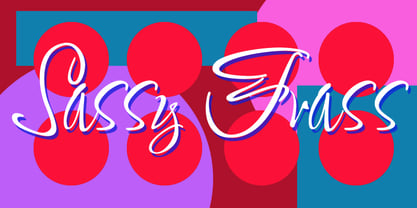 Fun, handlettered script.
 - Falcon Brushscript by TypeArt Foundry,
$45.00 A casual script.
 - FS Renaissance by Monotype,
$52.99 FS Renaissance is a display stencil typeface by the Monotype Studio. A collaboration between lettering artist and designer Craig Back and Creative Type Director Pedro Arilla, the single style font explores the intersection between art and design. With artist and designer working hand in hand, each letter was crafted as a standalone piece of art, while working harmoniously together as a functioning typeface. The typeface is inspired by the Renaissance period symbolised by flourishing progress in the arts, sciences, learning, and philosophy. The typeface is not a traditional stencil design: the cuts are not rigid but interactions that are hand crafted between each element, emphasising the idea of a typeface as a piece of art or sculpture. Pedro Arilla’s aim was to take the core DNA of Craig's lettering and apply it to a typographic base with a solid internal consistency, balanced with an external elegance. Pedro and Craig worked closely together to make sure the original concept was not compromised and this is reflected in the finished design which strikes the perfect balance between functionality and art.
 - Things by PizzaDude.dk,
$20.00 OMG! I never thought I'd finish this font! Actually, the idea came to me in the late 1990-ies, but the sketches lied at the bottom of the "fonts I will complete one day In the future" pile ... also called "fonts I most likely won't complete...EVER" pile! :) Anyway, I started up with letters for both upper and lowercase, no numbers or punctuation. I figured if people ever purchased this font, all they would need were upper- or lowercase letters. But the rest of the glyphs seemed to miss out, so I made the numbers and some punctuation. But I still found the font incomplete...therefore I redid all the punctuation (from "standard" punctuation to "picturish" punctuation) and added two additional sets of letters. Meaning that there is 4 different versions of letters to choose from: 2 different lowercase, and 2 different lowercase. I had a lot of fun drawing this font, and some fun doing the detective work finding out how the MANY lettershapes should look! I hop you too have fun using this font! :)
 - P22 Folkwang Pro by IHOF,
$29.95 Folkwang is an unusual roman type with a lowercase that resembles an upright italic. Unusual top serifs are contrasted by almost no foot serifs. Originally released by the Klingspor foundry in 1955, this face originated from Hermann Schardt while he was the director of the Folkwang Werkkunstschule in Essen Germany circa 1949. According to British book designer and printing historian John Dreyfus in the 1955 Penrose Annual: Folkwang “…is a lovingly made piece of work which could have easily have been little more than an act of awe-struck reverence for the calligraphic techniques rediscovered by Edward Johnston and spread abroad in Germany by Anna Simons. Of special interest is the serif treatment of the lower-case letters: at the feet the terminals are mostly left bare, but the ascenders and the cross-strokes of the f and t are given elaborate curving serifs which in the mass create an effect unusual in a page of letters made as movable types, resembling rather more a piece of intaglio engraving. The ligatures ch and ck are original and successful.”
 - Guilloche A by Wiescher Design,
$80.00 Guilloches were – in the old days – used to make the falsification of banknotes more difficult. The engraving of these intricate lines was done by a highly specialized mechanical machine, which was operated by an equally highly specialized engraving artist. Once the settings for a specific curve were changed back to zero it was very difficult, if not impossible to set them back to the old design. I have designed a useful set of Guilloches that join to form ribbons that create a kind of op-art 3d effect. Under the keys A-U and a-u you find joining pieces. Under the keys V-Z and v-z I placed start- and endpieces. 0-4 are different lenght straight extensions and 5-9 are not quite so straight extensions. All other keys are corner pieces that can be used as stand-alones or put in rows to make for superb decoration. With a little bit of experimentation and maybe colored overlays you can achieve super-phantastic designs. Your elegant type designer Gert Wiescher.
 - 1880 Kurrentshrift by GLC,
$38.00 This font was inspired by the old form of the so called "Kurrentschrift" German handwriting, based on late medieval cursive. It is also known as "Alte Deutsche schrift" ("Old German script"). It was taught in German schools until 1941, when Adolf Hitler decided to forbid it. As it is a little hard to read, we are proposing here two versions: the "pure" Kurrentschrift, and an adapted "Easy" one, with simplified difficult characters.
 - Moon Child by Angele Kamp,
$28.00 Introducing Moon Child, an elegant collection of two fonts that pair perfectly together. This collection will make designing Instagram quotes, websites & invitations effortless. What's Included Moon Child Script An elegant script font that includes ligatures that give you that gorgeous hand-lettered look. Moon Child Caps This is an all caps font that pairs perfectly with the script font
 - Cyber Rock by WAP Type,
$15.00 Cyber rock Brush Script bold, cool, cursive, design, editorial, grunge, handpaint, handwritten, ink, letter, logo, logotype, magazine, marker, modern, paint, ragged, ROUGH BRUSH, script, sign, style, stylish, swash, tag tagging, textured, trend, trendy, urban, vintage, written handwritten brush script dry brush cursive font with rough and dynamic look. Ideal for quotes, posters, branding, packaging, illustration, social media.
 - Stay Gladin by IM Studio,
$19.00 Stay Gladin Script Font Trio is a new modern script font with an irregular baseline. Stylish and feminine. Stay Gladin Script looks beautiful in wedding invitations, thank you cards, quotes, greeting cards, logos, business cards and more. Perfect for use in ink or watercolor. Includes start and end letters, alternatives and support for many languages. Thanks You.
 - Saverny by HKL Studio,
$21.00 Saverny Script This is a Vintage calligraphy script font that comes with beautiful alternative characters. copper plate mixed calligraphy with handttering style. Designed to convey stylish elegance. Saverny Script has a smooth, clean, feminine, sensual, glamorous, simple, and easy to read typeface. Saverny Script comes with a Clean and Aged version, beautiful upper and lower case, binding and favored by many finishes. It has Multilingual support (West European characters) and works with the following languages: English, Danish, Dutch, Estonian, Finnish, French, German, Hungarian, Icelandic, Italian, Norwegian, Polish, Portuguese, Spanish, Swedish. In my example I show how this script can be used. It's perfect for logos, wedding invitations, alcohol labels, romantic cards and more. Products include: Clean & Aged Script Version Alternative Uppercase & Lowercase Font Style Binders Recommended for use in Adobe Illustrator or Photoshop. Custom features don't work in Microsoft Word.
 - Marioline Barnard by Asd Studio,
$14.00 Introducing my Marioline Barnard Script, a passionatly crafted fancy script. Marioline Barnard script fully meets my expectations for a script that gives you luxurious vibes as much as casual vibes, elegant but simple, strong but light vibes. Marioline Barnard comes with beautiful uppercase and lowercase alternates (up to 11 level alternates, ligatures include), and swashes. Marioline Barnard has Multilingual support (Western European characters) and works with following languages: English, French, Italian, Portuguese, German, Swedish, Norweigan, Danish, Dutch, Finnish, Indonesian, Filipino, and Malay. Marioline Barnard is modern script font, every single letters has been carefully crafted to make your text looks beautiful. With modern script style this font will perfect for many different project, example: invitations, greeting cards, posters, name card, quotes, blog header, branding, logo, book cover, fashion, apparel, letter, logotypes, wedding invitations, product labels, and clothing product, stationery and more. Thank you.
 - Signamaestro by Almarkha Type,
$35.00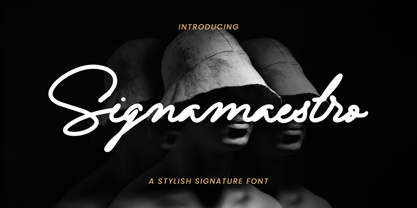 Introducing Signamaestro - Stylish Signature Script is a Quality script that is written casually and quickly Signamaestro is perfect for homeware designs,branding projects, Logo, design, Quotes, Product packaging, Photography, Watermark.
 - Carmine Tango by Monotype,
$29.99Carmine Tango is an elegant script based on a 1934 design by Lucian Bernhard. The Carmine Tango font is a good script for many situations, including invitations, menus and brochures.