10,000 search results
(0.096 seconds)
- Provisions by Surplus Type Co,
$16.00 Provisions is a retro sans serif display font that was inspired by classic, hard working blue collar businesses such as mechanics, delis, butchers, pubs and machine shops. This versatile typeface is perfect for capturing that same era in your own branding and logo design, while also working well in apparel designs, labels, packaging & more. The full version of Provisions includes both regular and oblique styles, each with a complete set of multilingual characters.
 - Dunelm by MADType,
$21.00 Dunelm is a typeface that was inspired by the type used in an English book from 1636. The typeface used in the book was unique and the goal in creating this font was to emulate the printing feel of the 17th century. The authentic ink-blotted and imperfect feel of the letter-pressed type was preserved with care. For best effect, this font should be used at text and smaller title sizes.
 - Decima Pro by TipografiaRamis,
$39.00 Decima – condensed geometric Sans Serif typeface, released back in 2009 and quite successful ever since (MyFonts Rising Star, February 2009). Decima Pro – an upgraded version of Decima, with careful refinements to glyph shapes and extension of glyph amounts, which enabled support of more Latin languages as well as support of Cyrillic. Six more alternate styles have been added to the original six styles. Typeface is released in OpenType format with some OpenType features.
 - Forecast by Type Associates,
$30.00 Designed by Russell Bean between December 2020 and August 2023 as a pandemic project, Forecast takes cues from past geometrics notably Futura, Tempo even Avant Garde. ideal for a multitude of uses – text, display, web, wayfinding. The objective of Forecast is to present a practical, swiss-army, use-everywhere design where readability is paramount. Available in 7 weights with italics a total of 14 styles all kerned to perfection. LatPro encoded, supporting 90 languages.
 - International by Yes Please,
$45.00 International is an homage to mid-century modernist trilines. Offering contemporary, well-balanced proportions and a lack of heavily dated styling affectations, International brings a uniquely modern sensibility to the triline style. International features OpenType standard ligatures, discretionary ligatures and stylistic alternates as well as a standard set of accents and symbols to provide a versatile end-user experience. International has played hard for Nike Women's Training, Nike Running, Nike Sportswear, Target, Showtime and more.
 - Black Brownies by Violatype,
$14.00 Introducing “Black Brownies,” a font that serves as a canvas for the artistry of monoline handcrafted strokes. “Black Brownies” is your key to unlocking a world of creative possibilities. Perfect for curating captivating magazine layouts, infusing quotes with an irresistible and distinctive charm, carving out a memorable and influential brand identity through logos, and embarking on a multitude of imaginative design projects. If you have any questions, don’t hesitate to contact us
 - Fabulous Sunday by Balpirick,
$15.00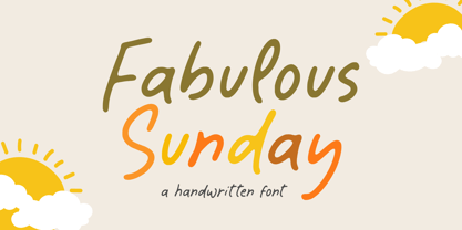 Fabulous Sunday is a Handwritten font that's perfect for adding a personal touch to your design projects! With its natural, organic feel and unique character. Crafted with care and attention to detail, this font is incredibly versatile and can be used for a range of design projects, including logos, branding, invitations, and more. Its modern, handwritten style gives it a unique character that's sure to make an impact. - also multilingual support Thank you!
 - Sagordi by Objectype,
$20.00 Sagordi is a font that displays a strong and modern style. With clean lines and bold shapes, Sagordi is perfect for use in various applications, ranging from logo design to marketing materials, digital publications, and more. This font is designed with careful details to ensure excellent readability at various sizes and resolutions. Sagordi is a great choice for designers who are looking for a flexible and adaptable font that can match various design styles.
 - Futurity by Hooper Type,
$9.00 A dystopian, CAPS only, title font used primarily for big type - so headlines in magazines, newspapers and articles. Though also amazing for posters and fdlyers where you want to grab attention. Futuristic values of a sans, which incorporate cut away elements that reflect reality - nothing's perfect - or invoke shadows when reversed out. Uppercase gives you a hard-edged version, lowercase keys will give you a rounded CAPS version, softer on the eye. Enjoy!
 - White Alchemy by Nicky Laatz,
$22.00 White Alchemy is a wildly flamboyant signature script, designed to stand out from the crowd. Inky fountain pen imperfections and an avant-garde attitude make it perfect for a completely natural and unique brand look. A large selection of Opentype ligatures and character alternates add to its natural flow and look. Make sure your Opentype features are active in whichever app you use to type with it, to see this font at it's best.
 - Decutto by Michael Rafailyk,
$15.00 Decutto is a neo-grotesque that packs the Marionette formula and some blackletter ideas into a low-contrast sans serif design. Its name plays on the phrases “off cut” and “cut to” which express the key feature – the contemporary legible letter shape is decorated with cut carved edges and counters, giving the typeface crisp and simplistic look, like that of an old minted coin. Scripts: Latin, Greek, Cyrillic, Hebrew. Hinting: Manual PostScript.
 - Tactical by Positype,
$25.00 Tactical is nothing more than a testosterone-laced typeface. Rigid, mechanical and unforgiving. Originally conceived in 2007 while I was working through the early sketches of Ginza, Tactical features hard 45-degree angles and the presence of a curve for curve’s sake is just not there. Complimenting the original is a Stencil variant (inspired by the military, marathon video game, explosion-influenced name) and matching Obliques—altogether creating a sharply coordinating family.
 - 1741 Financiere by GLC,
$38.00 This family was inspired by the Fournier's font named "Financière". It is a looking like manual font, carved in 1741 by Pierre Simon Fournier (le jeune) and published in his Manuel Typographique... in Paris (1764-1766). We offer 1741 Financière" as a rich complement to our 1786 GLC Fournier. The font is enriched by numerous ligatures and OTF specifications to make it attractive and offer a lot of various typographic possibilities in a text.
 - Milica by PeGGO Fonts,
$18.00 Milica is a display font, inspired on action movies and urban Military culture, designed with straight verticals but slanted horizontals with no curves and sharped hard strokes, in 5 sizes, ExtraLight, Light, regular, Bold & ExtraBlack, plus italic version to each weight. Recommended for use in poster, Movies, video games, TV, Animation, letterhead, magazines titles, POP & Graphic culture, young stuff, hip-hop topics, urban, big sizes prints, Volumetric 3D shapes, labels, etc. Powered by OTF technology.
 - Colcothar by Fabulous Rice,
$30.00 Colcothar is a font based on a calligraphic alphabet I ofter use for my comic books, my film title sequences, or my notebooks. It made sense to turn it into a font, especially since it looks hand-written and quality fonts that look hand-written are sometimes hard to find. It will look great as a header for an article, for a logo, the title of a film… or for anything you think appropriate!
 - 1880 Kurrentshrift by GLC,
$38.00 This font was inspired by the old form of the so called "Kurrentschrift" German handwriting, based on late medieval cursive. It is also known as "Alte Deutsche schrift" ("Old German script"). It was taught in German schools until 1941, when Adolf Hitler decided to forbid it. As it is a little hard to read, we are proposing here two versions: the "pure" Kurrentschrift, and an adapted "Easy" one, with simplified difficult characters.
 - Korto by Talbot Type,
$19.50 Korto is a highly legible, geometric text and display font. Inspired by classic sans-serifs Futura and Avant Garde, this elegantly minimal typeface is available in a comprehensive family of seven weights. It includes old style non-aligning (lower case) numbers, both proportional and tabular, as well as accented characters for Central European languages. A highly versatile, contemporary sans-serif, Korto is suitable for more-or-less any text or display purpose.
 - Black Crow by Fractal Font Factory,
$12.00 Black Crow is a display sans-serif type family includes eight weights. It is influenced by the geometric-style sans-serif faces that were popular during the 1920s and 30s. The styles are based on geometric forms that have been optically corrected for better legibility. Black Crow has a functional look with a hard touch. It is manually hinted and optimized for screens, so it will be a good choice for Websites, eBooks or Apps.
 - Funkboy by PizzaDude.dk,
$20.00 Funkboy looks like something that was made 20 years ago. You know, when Grandmaster Flash was scratching to the beat and graffiti was totally underground. Funkboy was made to look 100% oldschool, and now you can make your own bad-boy oldschool graffiti, using your computer! Comes with two hard knock alternate letters: the peace 'o' + the heart dotted 'i' You will need to use OpenType supporting applications to use the autoligatures.
 - Bottle Fork by PizzaDude.dk,
$15.00 Here is my font with carved out letters, like a really bad stamp. Each lowercase letter has 3 different versions, and that makes your text more natural, organic and handmade. Normally I kern my fonts throughout, but this time there is no kerning at all...and that's odd, when we're not talking about monospaced fonts. Anyway, Bottle Fork has its flaws and jumpy x-height...but that's exactly the charm of it all! :)
 - Grifa Slab by deFharo,
$14.00 Grifa Slab is a chunky typeface with thick rounded slab serifs in 4 styles with true italics, ideal for very legible titles and with a hard and smooth aspect at the same time. You can use this font in editorial design for headlines, also for advertising and the design of posters, signs or posters, in all cases readability is guaranteed. The typography has a set of 525 characters (Latin Extended-A) and OpenType functions.
 - Fractul by Adam Ladd,
$25.00 Fractul is a geometric sans with architectural qualities. Built from the Konnect family, this typeface introduces even more unique and display oriented design details, which you'll see in characters like a, f, g, t, y, etc. where certain strokes have been straightened for an angular and modern appearance. Also included is Fractul that takes the angular design further by styling characters like m, n, u, etc. to be rectangular and avant garde.
 - Prism by Stereotypes,
$- Prism was mainly inspired by two things, the sketches of Rudolf Koch for Prisma and the proportions of Avant Garde by Herb Lubalin. Even when the proportions and widths stay the same from ExtraLight to Black, you get the opportunity to change the weight and get a complete new look for that typeface by changing the grayscale or color. It is a modern combination for headlines, that want to have a different look.
 - GR Milesons by Garisman Studio,
$23.00 GR Milesons | Artdeco Typeface Milesons is a very interesting font, which has been inspired by Art Deco art. It is formed from very careful lines with stylistic set and ligature features. Milesons has 300+ glyphs consisting of three styles: Milesons One, Milesons Two and Milesons Three. Suitable for any graphic design projects, prints, logos, posters, t-shirts, packaging and applicable for some types of graphic design. Milesons is compatible with any software without any pain.
 - Koziupack by Sudtipos,
$45.00 Wild and free as usual, but now with a touch of sharp focus presented in curled ascenders and descenders, swashy care-free caps, and very unique figures. Koziupack is the ideal choice of font for food and drink product labels, signage, magazine advertisements. It looks particularly great when accenting any work of modern illustration, or by itself brightly knocked out of a dark background. Designed by Koziupa and digitized by Ale Paul.
 - Bertham by Ascender,
$29.99 Bertham Pro Family (4 fonts) is a revival of Frederic W. Goudy’s Bertham typeface. Steve Matteson produced this unique typeface and added bold, italic and openface styles. The fonts include a variety of OpenType features including swash capitals, small capitals and old style figures. It is unmistakably American in appearance recalling a day of quality craftsmanship and hard work. Publishing, branding and packaging materials will draw inspired attention due to its grace and distinctive appearance.
 - Morpheus Dream by Artisticandunique,
$15.00 Morpheus Dream - Serif font family - Multilingual - 12 Styles This font family help you develop your creative projects with its 12 styles and multilingual supports. It was inspiration from Greek mythology. The characters that make up its structure were influenced by the carved letters in the old stone inscriptions. Ideal for books and magazines, editorials, headlines, websites, logos, branding, advertising and more. This font family can meet your needs in all creative projects, modern and classic.
 - Conifer by Ryan Keightley,
$15.00 Conifer is a blocky geometric sans serif font that adheres to strict grid rules in order to define its corner angles. Its seemingly rigid form is tempered by the soft, rounded corners, and fine notched details present at acute angles in the glyphs. Available in a clean solid and a varied, textured rough. The result is a rugged, retro, typeface that is at home in fashion lookbooks and wood-carved park signage alike.
 - Shadow Brush by Juncreative,
$17.00 Shadow Brush is a strikingly versatile and charming brush script font, hand-brushed with care. With organically flowing letters and a real brush pen texture, Shadow Brush provides a perfect balance of casual yet captivating lettering for your design projects. It will be great for Logotypes, Posters, Digital Lettering Arts, Clean Design, Branding Design, Sign, Merchandise and Social Media Posts.This font contain of Uppercase, Lowercase, Number, Symbol, Punctuation, also already PUA encoded.
 - Raleigh by ParaType,
$30.00 Raleigh was produced in 1977 by Robert Norton based on Carl Dair’s Cartier typeface which was designed for the 1967 Montreal World's Fair. It was renamed after Dair’s death. Adrian Williams added three weights for a display series, and Robert Norton developed the text versions. A contemporary old style serif with calligraphic features. For use both in text and display typography. Cyrillic version was developed at ParaType in 2001 by Vladimir Yefimov.
 - JHC Audemars by Jehoo Creative,
$20.00 Presenting JHC Audemars, an impeccably crafted condensed serif font exuding a resolute and refined character. Distinguished by its unique inverted letter shapes, this font embraces an avant-garde aesthetic. Boasting a comprehensive range of weights from Thin to Black, along with an elegant italic style, JHC Audemars ensures versatile application in various design contexts. Ideal for sophisticated branding and editorial endeavors, this font effortlessly merges strength with sophistication, delivering a commanding and memorable typographic presence.
 - Bousni Ronde by Linotype,
$29.99The Bousni family's six faces display links unexpected by most readers of western alphabets. Inspired by both by Arabic calligraphy, and contemporary bitmap design, Bachir Soussi Chiadmi created this playful series of faces. Letters in each of the six typefaces link together, but not in the ways normally expected from script fonts. Suited for a wide array of fun functions, Bousni Carre and Bousni Ronde (each available in Light, Medium, and Bold weights) bring new a style and flavor to your collection. All six fonts in the Bousni family are included in the Take Type 5 collection from Linotype GmbH. The Bousni family espouses similar construction traits with other fonts from Linotype. Specifically, the straight lines and joints in the three Bousni Carre fonts are based off of a grid system similar to Anlinear, another member of the Take Type 5 collection from Linotype GmbH. The letter connections throughout the Bousni family are similar to Arabic kashidas, a typographic feature found recently in many non-Arabic typefaces, such as Linotype Atomatic." - Tenacious Brush by PintassilgoPrints,
$26.00 Tenacious Brush is an expressive font, provocative, free spirited and wild hearted. It's an all-caps face, with 4 alternates for each letter and 2 for each numeral — some letters also have stylistic choices. For that spontaneous hand-painted feel, you know. Turn on the contextual alternates feature to automatically cycle all these variety of glyphs. Or... pick your choices manually, which is quite a playful task now in some applications like Adobe Illustrator and Photoshop — just select a glyph and you see its alternates. The font brings yet some useful ornaments to give an extra buzz here and there. And let's not forget to mention the extended language coverage. And there are even fractions available! And ordinals! Definitely not just a rad face. This is a cool brush font with a contemporary tone, offering endless design possibilities: logos, poster art, branding, bold imagery, packaging, t-shirts, apparel and much more... With loads of attitude included. Step into it!
 - Korolev Rounded by Device,
$39.00 DF Korolev is a 72 weight geometric sans serif family based on lettering by an anonymous Soviet graphic designer from the propaganda displays at the Communist Red Square parade in 1937. It has been named in honor of Sergey Pavlovich Korolyov, or Korolev, considered by many to be the father of practical astronomics. Rational and robust, it is also elegant and refined. Tracings done in Illustrator over a photograph featuring this type pinned down some of the basic character shapes. These were then imported into FontLab, where the full glyph complement was developed. The lower-case has been designed from scratch, and adheres to the structural logic of the uppercase as closely as possible. The complete Korolev super-family includes standard, italic, condensed, and compressed versions, each in five weights. The Alternate families come with a double-story “a”. Authoritative yet friendly, Korolev Rounded is a versatile addition to the Korolev range.
 - Elipses by Lián Types,
$30.00 It all began with an ellipse. Like an artist who goes from a pictorical logic to a more abstract one, in Elipses geometry is stripped of any distractive or ornamental detail. The font is naked and it shows that it does not need complex shapes or decisions in order to be very attractive. The font is a compendium of ellipses and stems, with a didone 'pensiero'. It also gets some inspiration from the art-deco letters and architecture, due to obvious reasons. Geometry at its best. Elipses will be useful for magazines, books, ads, or any piece of design that needs elegant letters. Note about the styles The styles named "Alt" (from Alternative) have their swashes with less loops. Use them if you are more into naked geometry. Apart from many alternates and ligatures, I've included some different sized glyphs in all the styles so you can also play on the rhythm! Have fun!
 - Supertuba by Tipos Pereira,
$10.00 Supertuba is a :) geometric sans vernacular humanist :) display type family with 6 weights. There's literally dozens of ligatures in this font so It works very well for flyers, package, stickers and posters, also you can use it as a text font if you're looking for something slightly bold. Supertuba has multilingual support and useful open type features. Letter boards that used to be seen in churches, dive bars and butcher shops are the main inspiration for this typeface. The name Supertuba came from an old supermarket that no longer exists in the city of Indaiatuba , I just believe this name is super fun (at least in Portuguese) and wanted to keep it alive. I was in Indaiatuba when I get started designing this typeface so this is fair enough. Supertuba the third piece of a particular trilogy of fonts that Stubby and Stubby Rough take part, from the lazy vernacular drawing to an unusual geometry. Enjoy!
 - ITC Officina Display by ITC,
$29.99When ITC Officina was first released in 1990, as a paired family of serif and sans serif faces in two weights with italics, it was intended as a workhorse typeface for business correspondence. But the typeface proved popular in many more areas than correspondence. Erik Spiekermann, ITC Officina's designer: Once ITC Officina got picked up by the trendsetters to denote 'coolness,' it had lost its innocence. No pretending anymore that it only needed two weights for office correspondence. As a face used in magazines and advertising, it needed proper headline weights and one more weight in between the original Book and Bold."" To add the new weights and small caps, Spiekermann collaborated with Ole Schaefer, director of typography and type design at MetaDesign. The extended ITC Officina family now includes Medium, Extra Bold, and Black weights with matching italics-all in both Sans and Serif -- as well as new small caps fonts for the original Book and Bold weights. - Civane Serif by insigne,
$35.00 Civane Serif maintains the epic grandeur of Civane with a text-friendly typeface. Inspired by the great tales of old, the grandeur of Civane is refined into a serif font with sharp serifs. Civane Serif is a contemporary sans-serif typeface with a robust character set. The Civane Serif family of typefaces supports 48 Latin-based Western, Central, and Eastern European languages, as well as the Baltic States and Turkey. Ligatures, small caps, embellishments, and a wide range of numerals are all accessible in OpenType, including proportional and tabular-width numbers, old style figures, fractions, inferiors, and superiors. Civane Serif is one of the finest choices for serif text setting. The italic or bold weights, as well as the roman set in titling caps, will impart a feeling of serene dignity on posters and webpages. Civane Serif's craftsmanship shines through with its higher contrast modern design, perfect for high-end premium goods and services.
 - Goldplay by Latinotype,
$26.00 Goldplay is based on Isidora Sans design yet features rounded shapes. Its rounded, soft terminals give it a friendly and expressive look, and its modern and contemporary style as well as its classic proportions make it an excellent choice for headlines, logotypes, branding, books, magazines, motion graphics, and use on web and Tv. One of its key features is a large x-height which make it look elegant and classy. Goldplay comes in 2 versions—each in 7 weights, from Thin to Black, and matching italics, resulting in a total of 28 fonts. The standard sans serif version—fresh, clean and contemporary—is a perfect choice for editorial and corporate design, headlines, books, magazines or any other piece of graphic design. The Alt semi-serif display version—more expressive and modern—is ideal for logotypes, branding, packaging, and use on web and Tv. Goldplay contains a set of 540 characters that support over 200 Latin-based languages.
 - Alabaster Antique FJ by Frncojonastype,
$39.00 fj Alabaster Antique™ is a hybrid typefamily with a 10 styles inspired of the develop and exploration of “serif” since the first half in XIX century, envolves a special influence of the slab humanist typefaces, —with a calligraphy flavor in his Italic— with the goal to generate a contrast in to texts sheets. Has a three display versions based in the universe of “woodtypes” to deliver a “unity” in all typeset, like his versions fj Alabaster Antique™ Display, Engraved & Shaded. Include Small Caps, Swashes, Modern and OldStyles figures to decimal notation that envolve to fj Alabaster Antique™ in a ideal typeface for first and second lecture in the most of the visual communication pieces. • To exclusive licenses and to follow the develop of this project please visit frncojonas.com Learn about upcoming releases, work in progress and get to know us better! WB: frncojonas.com BE: beh.net/frncojonas TW: @frncojonas ING: @frnco.jonas