10,000 search results
(0.043 seconds)
- Coburg No2 by SoftMaker,
$10.99 Blackletter is the classic “German” printing type. Starting in the 16th century and lasting well into the 20th century, most works in Germany were printed using blackletter types. Today, blackletter fonts are mainly used decoratively. If you want to communicate a feeling of old-world quality or nostalgia, blackletter fonts are the preferred choice – use them on signs, in brochures or on invitation cards. Coburg No2 is a classic blackletter font of its epoch which inspires you to create vintage-looking designs with ease.
 - Gutenberg Textura Pro by SoftMaker,
$10.99 Blackletter is the classic “German” printing type. Starting in the 16th century and lasting well into the 20th century, most works in Germany were printed using blackletter types. Today, blackletter fonts are mainly used decoratively. If you want to communicate a feeling of old-world quality or nostalgia, blackletter fonts are the preferred choice – use them on signs, in brochures or on invitation cards. “Gutenberg Textura Pro” is a classic blackletter font of its epoch which inspires you to create vintage-looking designs with ease.
 - Butterfly Effect by PintassilgoPrints,
$24.90 A swarm of butterflies that automagically turns into stunning patterns. This font counts 65 unique glyphs easily accessed through the keyboard (numerals, upper & lowercase plus some punctuation marks), making it possible to design patterns even in simple text editors. Just make sure to set the leading the same as the font size, as some software may override font settings. Well, in fact some glyphs don't require such accuracy and let you play with leading and letterspacing, resulting in sort of chaotic patterns. Sort of... butterfly effect.
 - Wallau No2 Pro by SoftMaker,
$10.99 Blackletter is the classic “German” printing type. Starting in the 16th century and lasting well into the 20th century, most works in Germany were printed using blackletter types. Today, blackletter fonts are mainly used decoratively. If you want to communicate a feeling of old-world quality or nostalgia, blackletter fonts are the preferred choice – use them on signs, in brochures or on invitation cards. “Wallau No2 Pro” is a classic blackletter font of its epoch which inspires you to create vintage-looking designs with ease.
 - Fraktur No4 by SoftMaker,
$10.99 Blackletter is the classic “German” printing type. Starting in the 16th century and lasting well into the 20th century, most works in Germany were printed using blackletter types. Today, blackletter fonts are mainly used decoratively. If you want to communicate a feeling of old-world quality or nostalgia, blackletter fonts are the preferred choice – use them on signs, in brochures or on invitation cards. “Fraktur No4” is a classic blackletter font of its epoch which inspires you to create vintage-looking designs with ease.
 - Schwere Fraktur Pro by SoftMaker,
$10.99 Blackletter is the classic “German” printing type. Starting in the 16th century and lasting well into the 20th century, most works in Germany were printed using blackletter types. Today, blackletter fonts are mainly used decoratively. If you want to communicate a feeling of old-world quality or nostalgia, blackletter fonts are the preferred choice – use them on signs, in brochures or on invitation cards. “Schwere Fraktur Pro” is a classic blackletter font of its epoch which inspires you to create vintage-looking designs with ease.
 - Lincoln Text Pro by SoftMaker,
$10.99 Blackletter is the classic “German” printing type. Starting in the 16th century and lasting well into the 20th century, most works in Germany were printed using blackletter types. Today, blackletter fonts are mainly used decoratively. If you want to communicate a feeling of old-world quality or nostalgia, blackletter fonts are the preferred choice – use them on signs, in brochures or on invitation cards. “Lincoln Text Pro” is a classic blackletter font of its epoch which inspires you to create vintage-looking designs with ease.
 - Wilhelm Gotisch Pro by SoftMaker,
$10.99 Blackletter is the classic “German” printing type. Starting in the 16th century and lasting well into the 20th century, most works in Germany were printed using blackletter types. Today, blackletter fonts are mainly used decoratively. If you want to communicate a feeling of old-world quality or nostalgia, blackletter fonts are the preferred choice – use them on signs, in brochures or on invitation cards. “Wilhelm Gotisch Pro” is a classic blackletter font of its epoch which inspires you to create vintage-looking designs with ease.
 - Rundgotisch No2 Pro by SoftMaker,
$10.99 Blackletter is the classic “German” printing type. Starting in the 16th century and lasting well into the 20th century, most works in Germany were printed using blackletter types. Today, blackletter fonts are mainly used decoratively. If you want to communicate a feeling of old-world quality or nostalgia, blackletter fonts are the preferred choice – use them on signs, in brochures or on invitation cards. “Rundgotisch No2 Pro” is a classic blackletter font of its epoch which inspires you to create vintage-looking designs with ease.
 - Dylan by Wiescher Design,
$29.00 »Dylan« is a Sans typeface in the best American tradition. In order to keep corners open and to make the font more readable in small sizes it has deep cuts where curves join straights. I designed 7 finely tuned weights with fitting italic sets. The fonts includes full smallcaps, language support for most European languages plus Turkish, many fractions, nominator and denominators, Greek mathematical signs and many currency symbols. It is a versatile font that is well suited for many occasions, even for signage.
 - Schwarzwald Pro by SoftMaker,
$10.99 Blackletter is the classic “German” printing type. Starting in the 16th century and lasting well into the 20th century, most works in Germany were printed using blackletter types. Today, blackletter fonts are mainly used decoratively. If you want to communicate a feeling of old-world quality or nostalgia, blackletter fonts are the preferred choice – use them on signs, in brochures or on invitation cards. “Schwarzwald Pro” is a classic blackletter font of its epoch which inspires you to create vintage-looking designs with ease.
 - ITC Franklin Gothic LT by ITC,
$43.99 Franklin Gothic was designed between 1903 and 1912 by Morris Fuller Benton for the American Type Founders Company. The font serves as the American Grotesk prototype. It was named after Benjamin Franklin. Even today, Franklin Gothic remains one of the most widely used sans serif typefaces. The robust character of the font gives text a modern feel. It is widely used in newspapers and advertising and is frequently seen in posters, placards and other material where space is restricted. Featured in: Best Fonts for Tattoos
 - Berkut by Larin Type Co,
$15.00 Berkut This is a military font family inspired by the military and aviation style, including Six styles: regular, rough, printed, stencil, stencil rough, stencil printed. This font is a wide specialization, it will be an excellent option for creating projects in the military style in both modern and vintage versions. It is great for creating logos, labels, branding projects, magazines, mugs, flyers, posters and much more, and it is also perfectly readable in the text. This font is easy to use has OpenType features.
 - Fraktur No2 Pro by SoftMaker,
$10.99 Blackletter is the classic “German” printing type. Starting in the 16th century and lasting well into the 20th century, most works in Germany were printed using blackletter types. Today, blackletter fonts are mainly used decoratively. If you want to communicate a feeling of old-world quality or nostalgia, blackletter fonts are the preferred choice – use them on signs, in brochures or on invitation cards. Fraktur No2 Pro is a classic blackletter font of its epoch which inspires you to create vintage-looking designs with ease.
 - Hohenstein Gotisch Pro by SoftMaker,
$10.99 Blackletter is the classic “German” printing type. Starting in the 16th century and lasting well into the 20th century, most works in Germany were printed using blackletter types. Today, blackletter fonts are mainly used decoratively. If you want to communicate a feeling of old-world quality or nostalgia, blackletter fonts are the preferred choice – use them on signs, in brochures or on invitation cards. “Hohenstein Gotisch Pro” is a classic blackletter font of its epoch which inspires you to create vintage-looking designs with ease.
 - Walbaum Zierfraktur Pro by SoftMaker,
$10.99 Blackletter is the classic “German” printing type. Starting in the 16th century and lasting well into the 20th century, most works in Germany were printed using blackletter types. Today, blackletter fonts are mainly used decoratively. If you want to communicate a feeling of old-world quality or nostalgia, blackletter fonts are the preferred choice – use them on signs, in brochures or on invitation cards. “Walbaum Zierfraktur Pro” is a classic blackletter font of its epoch which inspires you to create vintage-looking designs with ease.
 - Peter Jessen Schrift Pro by SoftMaker,
$10.99 Blackletter is the classic “German” printing type. Starting in the 16th century and lasting well into the 20th century, most works in Germany were printed using blackletter types.Today, blackletter fonts are mainly used decoratively. If you want to communicate a feeling of old-world quality or nostalgia, blackletter fonts are the preferred choice – use them on signs, in brochures or on invitation cards. “Peter Jessen Schrift Pro” is a classic blackletter font of its epoch which inspires you to create vintage-looking designs with ease.
 - Butan by Butan,
$30.00 Butan was originally designed as a typographic project for the Specialization in Typography Design at the University of Buenos Aires, during the years 2013 and 2014. The project was conceived as a “wayfinding” font, that would be functional for bilingual signage systems. The main guideline for its design was to create a font that could be readable from great distances and it could be potentially used in signage systems. Therefore the neutral aesthetics and clean shapes were very relevant in order to create this particular font.
 - Breitkopf Fraktur Pro by SoftMaker,
$10.99 Blackletter is the classic “German” printing type. Starting in the 16th century and lasting well into the 20th century, most works in Germany were printed using blackletter types. Today, blackletter fonts are mainly used decoratively. If you want to communicate a feeling of old-world quality or nostalgia, blackletter fonts are the preferred choice – use them on signs, in brochures or on invitation cards. Breitkopf Fraktur Pro is a classic blackletter font of its epoch which inspires you to create vintage-looking designs with ease.
 - Certiveit by Ridtype,
$28.00 Certiveid is a serif display font inspired by the history of peace in the Third Crusade (1189–1192). Therefore, with a modern classic touch and combined with some serif (pointed) ornaments that signify this font is sharp, dashing, and bold, This font also has complementary ornaments such as arrows sign, enclosed alphanumerics, fractions, and ligatures, which function as a complement to text works as well as in support as a design if needed. Thanks for your support of our product, and using it in your project.
 - Hans Fraktur Pro by SoftMaker,
$10.99 Blackletter is the classic “German” printing type. Starting in the 16th century and lasting well into the 20th century, most works in Germany were printed using blackletter types. Today, blackletter fonts are mainly used decoratively. If you want to communicate a feeling of old-world quality or nostalgia, blackletter fonts are the preferred choice – use them on signs, in brochures or on invitation cards. “Hans Fraktur Pro” is a classic blackletter font of its epoch which inspires you to create vintage-looking designs with ease.
 - Coelnische Current Pro by SoftMaker,
$10.99 Blackletter is the classic “German” printing type. Starting in the 16th century and lasting well into the 20th century, most works in Germany were printed using blackletter types. Today, blackletter fonts are mainly used decoratively. If you want to communicate a feeling of old-world quality or nostalgia, blackletter fonts are the preferred choice – use them on signs, in brochures or on invitation cards. Coelnische Current Pro is a classic blackletter font of its epoch which inspires you to create vintage-looking designs with ease.
 - My Hands by Wiescher Design,
$49.50 The hands in this font are the pointing, counting, threatening, signaling, demonstrating and playing hands I use in my own design projects. I have drawn them all with a felt-tip marker, scanned and digitized for use in a font. This picture font is more user-friendly than having single ps-files. I usually convert the letter to paths once I have decided which one to use, because I might want to fill the lines or background with different colors. Yours very handy, Gert Wiescher.
 - Theuerdank Fraktur Pro by SoftMaker,
$10.99 Blackletter is the classic “German” printing type. Starting in the 16th century and lasting well into the 20th century, most works in Germany were printed using blackletter types. Today, blackletter fonts are mainly used decoratively. If you want to communicate a feeling of old-world quality or nostalgia, blackletter fonts are the preferred choice – use them on signs, in brochures or on invitation cards. “Theuerdank Fraktur Pro” is a classic blackletter font of its epoch which inspires you to create vintage-looking designs with ease.
 - Sutro Shaded by Parkinson,
$25.00 My affection for Slab Serifs began in the early 1960s in Kansas City when Rob Roy Kelly was at the Kansas City Art Institute, teaching and writing his book on American Wood Type. I got to know him just well enough to gain access to his fabulous collection of wood type and wood type catalogs. Later, in the1970s, I tried to re-create a Nebiolo Egiziano for Roger Black at New West magazine. And again for Roger, in the 1980s, I designed a Slab Serif logo for Newsweek Magazine. Finally, in 2003, designed the Sutro Family. There were things I didn't like about it, so, over time, I’ve been adding some things and dressing it up a little. Sutro Shaded has existed for a few years as a one color, outlined, drop-shadowed display font. It seemed like it was just dying for a little color. I added five more fonts: Fill, Gradient, Hatching, Rules and HiLite. These fonts can be used in different combinations to achieve various effects. There is a downloadable SUTRO SHADED USER MANUAL PDF in the Gallery section for this family.
 - Cyclic by ArtyType,
$29.00 Cyclic is a stylish and modern slab serif in three practical, highly legible weights. The name ‘cyclic’ suits this typeface in several ways. Firstly because I wanted to create an ‘all-round’ typeface (pun intended) that could adapt to most applications, but also, as the dictionary definition explains - “occurring in circles, regularly repeated”. The basis for a lot of the characters did begin with a circle or sections of one; the equally distributed, rounded forms of this font are complemented however by the vertical strokes, and further counter-balanced by angular slab serifs on the remaining glyphs. Curved alternates with a celtic vibe are also included in the fonts and feature on the default slots in the separate Cyclic Uncial set. In summary, the whole Cyclic type family comprises a combined palette of circles and straight lines; something the cubist movement would have been proud of!
 - Corporaet by Characters Font Foundry,
$25.00 CFF Corporaet is a corporate brand typeface that comes in 5 sans serif weights; Light, Regular, SemiBold, Bold & Black. Its character is warm, friendly, humane, clear and soft. The humanistic design style is rooted in the cursive style of handwriting, clearly visible in letters such as the e, f, g and y. The spurless letters round it off. Striking characters, such as the z, and small quirky details make it both a corporate and a friendly typeface. The proportions of each character are carefully constructed in such a way that they're balanced and create an even colour in text. That’s why it works extremely well with long body copy. Making it a hero for magazines and editorial design challenges. The Corporaet fonts can be applied in large sizes for print or web, bringing out the refined details that give the fonts its distinctive personality.
 - Cyclic Uncial by ArtyType,
$29.00 Cyclic is a stylish and modern slab serif in three practical, highly legible weights. The name ‘cyclic’ suits this typeface in several ways. Firstly because I wanted to create an ‘all-round’ typeface (pun intended) that could adapt to most applications, but also, as the dictionary definition explains - “occurring in circles, regularly repeated”. The basis for a lot of the characters did begin with a circle or sections of one; the equally distributed, rounded forms of this font are complemented however by the vertical strokes, and further counter-balanced by angular slab serifs on the remaining glyphs. Curved alternates with a celtic vibe are also included in the fonts and feature on the default slots in the separate Cyclic Uncial set. In summary, the whole Cyclic type family comprises a combined palette of circles and straight lines; something the cubist movement would have been proud of!
 - Monroe by Latinotype,
$39.00 Monroe was designed in 2010, but in 2013 the font’s designer stopped selling it. Eight years after its initial release, Monroe returns in a new and upgraded version—with improved drawing and spacing—which includes more weights as well as alternate glyphs. Each font style has 819 glyphs and the whole set contains 394 characters which support 207 Latin-based languages. Monroe also includes 5 stylistic sets that offer a wide range of signs, swashes and discretionary ligatures, all specially made to add aesthetic value to your designs. The family comes in 5 weights: Thin, Ultra Light, Light, Regular and Bold. Monroe was designed by Daniel Hernández with the collaboration of Alfonso García.
 - Urban Tags by Tomatstudio,
$15.00 Inspired from tagging graffiti marker in the streets and my real experiences in graffiti scenes, Urban Tags comes with iconic rounded tip marker, this style often used by several graffiti artist around the world because the style is very unique, very fun to write in markers. Perfect if you want realistic Street art style or hip hop for your designs, poster, props etc. Because this is real graffiti fonts, "urban Tags" is different like other fonts, the space letter is shorter, for perfect result the Kerning you can adjust manually, because it's impossible to setting kerning like other regular fonts. I put extra glyphs for make the fonts looks more street art, use "åß∂ƒ©˙∆˚¬Ω≈ç" you can see in the preview.
 - Estrangelo Edessa by Microsoft Corporation,
$49.00The Estrangelo Edessa was developed by The Syriac Computing Institute and Microsoft to support the Syriac script. Syriac is written from right to left, like Arabic and Hebrew. You computer system must be properly enabled with keyboard layout and text input services (IME) to use this font. The Syriac letter forms in Estrangelo Edessa were designed by Paul Nelson and George Kiraz. The design is based on types from an Ohioan press, probably designed after a 1954 Estrangelo Monotype font. The Monotype font was designed with the assistance of R. Draguet, and in turn is based on an 1851 type used in Estrangelo Talada. Some symbols, including numerical symbols are based on the monospaced Courier type design. The Estrangengelo Edessa font first appeared in Windows XP. - Aloha Script by Borges Lettering,
$49.95 Aloha! Veteran Sign Painter Pierre Tardif and Lettering Artist Charles Borges de Oliveria have teamed up to bring you these fun to use brush fonts. Aloha Script comes in two flavors: Aloha Script and Aloha Script Casual. Both fonts contain the same lowercase, alternates, and ligatures – the difference is in the capitals. By mixing both fonts you can create a variety of unique logos. Aloha Scripts Casual can be set in all caps for greater emphasis on captions. Both fonts contains over 100 alternate characters, as well as an assortment of ligatures, swashes and underlines. With over a year and a half in development, Aloha is bound to please. Great for logo design, signs, posters, culinary food packaging and so much more. Aloha!
 - Gothikka - Unknown license

- Classy Vogue by Variatype,
$25.00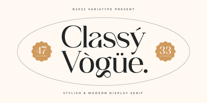 Classy Vogue is a stylish display serif with an elegant and luxury style that perfectly matches your branding project and more. FONT FEATURES Additional Accents 66 Languages Kerning Alternates Ligatures SOFTWARE RECOMMENDATION Adobe Photoshop Adobe Illustrator OS COMPATIBILITY Mac OS Windows
 - Trobus by Variatype,
$18.00 Trobus is inspired by automotive and speed, it's really suited to your branding or logotype and more design project, it's flexible to any brand name. FONT FEATURES Additional Accents 66 Languages Kerning All Caps SOFTWARE RECOMMENDATION Adobe Photoshop Adobe Illustrator
 - Hand Stamp Gothic Rough by TypoGraphicDesign,
$25.00 “Hand Stamp Gothic Rough” is based on real vintage rubber stamp letters from Germany. A classic american gothic face mixed with a modern condensed sans serif type. Rough & dirty with a authentic hand stamped look for a warm analogue vintage charm. It started analogous with only a few rubber stamps and finally it was digital 776 glyphs. With 4 × A–Z, 4 × 0–9, 4 × a–z and many other alternative glyphs like @. Plus modern OpenType Features like contextual alternates (automatic generated loop for letter variation). The different variations from the dynamic pressure by hand intended to show the hand-made nature and creates a liveliness in the display font. The font has 80 decorative extras in the form of symbols & dingbats like arrows, hearts, smileys, stars, further numbers, lines & shapes. A range of figure set options like oldstyle figures, lining figures, superiors & inferiors. Additionally standard ligatures, decorative ligatures (type the word “show” for ☛ and “love” for ❤ … ), Versal Eszett (German Capital Sharp S) and many emojis & symbols. Example of use It’s your turn … for example everywhere where it makes sense. The hand stamped font would look good at headlines. Advertising (big headlines), Corporate Design (type for logos & branding), Editorial Design (magazine or fanzine headlines), Product Design (typographical packaging) or Webdesign (headline webfont for your website), flyer, poster, music covers or web banner … How To Use – awesome magic OpenType-Features in your layout application: ■ In Adobe Photoshop and Adobe InDesign, font feature controls are within the Character panel sub-menu → OpenType → Discretionary Ligatures … Checked features are applied/on. Unchecked features are off. ■ In Adobe Illustrator, font feature controls are within the OpenType panel. Icons at the bottom of the panel are button controls. Darker ‘pressed’ buttons are applied/on. ■ Additionally in Adobe InDesign and Adobe Illustrator, alternate glyphs can manually be inserted into a text frame by using the Glyph panel. The panel can be opened by selecting Window from the menu bar → Type → Glyphs. Or use sign-overview of your operating system. For a overview of OpenType-Feature compatibility for common applications, follow the myfonts-help http://www.myfonts.com/help/#looks-different ■ It may process a little bit slowly in some applications, because the font has a lot of lovely rough details (anchor points). Technical Specifications ■ Font Name Hand Stamp Gothic Rough ■ Font Weights Regular & Dirty (Bold) ■ Font Category Display for headline size ■ Font Format.otf (OpenType Font for Mac + Win) ■ Glyph Set 776 glyphs ■ Language Support Basic Latin/English letters, Central Europe, West European diacritics, Turkish, Baltic, Romanian, OpenType Features, Dingbats & Symbols ■ Specials Alternative letters, stylistic sets, automatic contextual alternates via OpenType Feature (4× different versions of A–Z & 0–9 + a–z), Euro, kerning pairs, standard & decorative ligatures, Versal Eszett (German Capital Sharp S), 80 extras like Dingbats & Symbols, arrows, hearts, emojis/smileys, stars, further numbers, lines & shapes. ■ Design Date 2016 ■ Type Designer Manuel Viergutz ■ License Desktop license, Web license, App license, eBook license, Server license
 - Gutenberg A by Alter Littera,
$- This is a free abridged edition of the full-featured Gutenberg B and Gutenberg C fonts. Although (as the name suggests) it was originally conceived as the first release in the B42-type series, it actually represents the colophon to this series. In addition to having a narrower scope, the font differs from its full-featured predecesors in both letter and word spacing, as well as in glyph design, using exclusively straight lines for every glyph and providing a significantly rough appearance at medium to large point sizes. The font includes the usual standard characters for typesetting modern texts, as well as a few special characters, alternates and ligatures that can be used for typesetting nearly as in Johann Gutenberg’s 42-line Bible and later incunabula. Please note that the use of this free font is subject to the same terms and conditions as those for Alter Littera’s pay fonts. Specimen, detailed character map, OpenType features, and font samples available at Alter Littera’s The Oldtype “Gutenberg A” Font Page.
 - Frostbite by Comicraft,
$19.00 If you're feeling a chill in your bones and the grass is a little crunchy under your feet after looking at this font, you might like to put your feet in warm water when you get home if to stave off a little Frostbite. This remastered font family is a chip off the old block, and will help you thaw out before your skin starts to freeze and flake. We recommend you melt Frostbite cubes in the warm water too to ensure you don't stick to the ice. We also recommend you don't lick the letterforms, as we know our customers are wont to do.
 - CrEAtOR CamPotype by Campotype,
$15.00 So far the Creator Campotype standard version known in the form of free font (published on several websites by license: free for personal use). The font takes the basic form of modern typography, but some user feedback consider it in the medieval look. Whatever it is, the inspiration of the font was originally set off from the logotype of internal student magazine where the designer had studied in the late 80s. Creator Campotype is a pure display font. This fonts do not have faces lowercase, but all caps. Nevertheless forms of different characters can be accessed by pressing the uppercase and lowercase on the keyboard. Maximum usage can be made by combining them as necessary. Some forms of characters were made more stylistic such as slash and backslash which “out of” the conventional form. In addition, the circle effects on several glyphs were created by default (as found on the free version) so that the glyph was enough to generated with the keyboard access as usual. Information for those who have access to the free version, there are significant changes in this version (2001) as described in the file “creator ct pdf” (gallery)
 - Aeris by Linotype,
$29.99 Aeris™ typeface is a contemporary book face created by the American designer Tom Grace. It combines the proportions and rhythm of a sans serif font with the high contrasts and flexed strokes of script faces, while the open counters also ensure optimal legibility. Tom Grace focuses on providing subtle differentiations in his cuts and, as a consequence, this font family has its own individual structure: there are A and B variants of the basic forms regular, italic, bold and bold italic, and a display version for use in titles that also comes in A and B variants. It is advisable to use the A variant for larger font sizes, while the slightly more emphasized B variant can be recommended for smaller font sizes. Where the basic forms are to be mixed together in a work, it is important to use the corresponding A/B variants throughout as their designs have been carefully coordinated. Aeris is available in the OpenType Pro format and thus includes a wide range of different glyphs. The font family can be used in various environments, such as books, magazines, advertisements and promotional materials, but it is also the perfect choice for printed corporate documentation.
