10,000 search results
(0.048 seconds)
- Expreso by JVB Fonts,
$19.00 EXPRESO was inspired by the extinct art and craft of urban Lettering applied to buses and other kind of cars for public service of transportation. Since the mid of last century, main cities of Colombia - as Bogotá, Medellín and others - were growing in population and brought urban area expansion with it and serious traffic problems due to the lack of political will and urban planning. The problem of urban transport in Colombia's largest cities has not yet been resolved, despite adopting some examples of mass transit system in other cities in the region. Before these actions, public transport in cities such as Bogotá was quite varied, leaving space for popular culture that survived for a couple of decades, until the massive dieback of these old buses early this decade, either by practices associated with Lettering it was displaced by some technological, some expressions of art street and city that evolved or disappeared. EXPRESO can be used mainly in titles and display texts. You have a multitude of options using combination of layers from the basics of the font family to the various textures and shades. Supports East Europe languages.
 - Type Tiles JNL by Jeff Levine,
$29.00 Type Tiles JNL is based on a ‘completed’ version of ‘Alpha-Blox’ by American Type Founders, circa 1944. The capitals, lower case and numerals shown in the sample sheet put out by ATF depicted type made with five-high blocks comprised of modular units spaced two points apart. These units could be combined in varying ways to create custom type of varying heights and widths and was available for purchase in both linear (multi-line) and reverse (white on black) formats. Using the 'reverse' model shown on the sample sheet, all of the characters were re-created digitally, and missing punctuation, foreign characters and other glyphs found in a basic computer font were drawn and added. The 'J' and 'T' in the type sample had truncations, so a more complete character was created for each of those letters. For those wanting an unbroken string of words or blank end caps, there is a double column space on the vertical bar key. A single column space is located on the broken bar key for shorter end caps. Type Tiles JNL is available in both regular and oblique versions
 - Vellvé by ITC,
$29.99For over 30 years, Tomás Vellvé created beautiful graphics and distinctive typefaces in his native homeland of Spain. First drawn as a phototype display design in 1971, Vellvé’s only typeface in digital form is an uncommon solution to the problem of creating a new sans serif design. The end result, which bears his name, is a design that stands out from the crowd of other sans serif typefaces. The phototype version was only available in a single, light weight. With the release of the digital fonts, however, three additional weights as well as a companion italic for the light weight were created.The typeface designs were originally drawn for Agfa Monotype (now Monotype Imaging) in 1996 as part of the company’s “Creative Alliance” initiative. Through an exclusive licensing arrangement, the Vellvé™ family has now been added to the ITC Typeface Library.ITC Vellvé is a wide design with strong calligraphic overtones. This is no “anonymous” design like so many modern sans. Letters like the `R, `e and `s clearly show the hand of Tomás Vellvé in the design process. Vellvé provides a fresh choice between geometric sans serifs such as Helvetica® and industrial sans serifs like Futura®. - Standard CT by CastleType,
$59.00 CastleType was commissioned in 1991 by San Francisco Focus magazine to digitize three members of the Standard family. This is a Continental lineale that was popular in Switzerland in the 1950s and later in the United States. A cousin to the classic sans serifs, Standard is an alternative that is considerably warmer and a bit more idiosyncratic. In 2008, CastleType released additional members of the Standard CT family to make it a complete typographic solution with three widths (normal, condensed, extended) of four weights each (Regular, Medium, Bold, and Extra Bold). Some of the original Standard fonts, particularly Standard Regular, appear to have been hastily designed (or perhaps too closely imitated Helvetica); these have been greatly improved in the CastleType versions with more harmonious proportions and other refinements. The three lighter weights of the Extended subfamily were designed from scratch based on the new Standard CT Regular and Standard CT Extended Extra Bold. More recently, four light weights (Light, Extra Light, Ultra Light, and Hairline) have been added to each of the three widths. The entire Standard CT family includes support for most European languages, OpenType features, arbitrary fractions, and a collection of geometrics, dingbats & fleurons.
 - Chikita by Canada Type,
$24.95 Chikita greets you with big, happy eyes, and all the energy in the world. She wants to skip the talking and get to the dance floor, where she owns the beat and sways like a tongue of fire. She doesn't settle for anything less than everyone in the room fixating on her, and every pair of eyes is indeed happy to oblige. Being both the noumenon and phenomenon of the party, she remains in your mind long after closing time. And you just know the next time you see her your heart will skip a beat and a welcome wave of contentedness will wash over you. The Chikita design is rooted in the work of 1930s Dutch lettering artist Martin Meÿer, whose little-known work concerned itself with the beauty of letters mostly as individual forms, rather than part of a flowing alphabet. Chikita was reconceptualized to strike a great balance between singular and flowing beauties, resulting in a cheerful and very memorable expression. Chikita is available in all popular font formats, and the character sets cover a wide range of codepages, including Central and Eastern European languages, Esperanto, Turkish, Baltic, Celtic/Welsh and Vietnamese.
 - Visine FF by Koral Creative,
$32.00 Visine FF is a typeface that aims to question the geographical borders that in so many ways can define people's lives. It was developed with the experience of advertising and commercial use in mind. The name Visine can be translated most simply as HEIGHTS. Visine FF was developed out of the necessity to make the most of the space on the visual format. With the tall arches and narrow bodies with exceptional, easy-to-read features, Visine FF aims to complement visual languages in many linguistic regions. Visine FF was developed in the Balkans, where Cyrillic, Latin and Glagolitic were the three historical writing systems used in the former Yugoslavia to denote cultural, ethnic, religious and political identities. Today, the languages of the Western Balkans are so similar that they can easily be called dialects, although they are written in different scripts. This is the result of their coexistence and parallel evolutions, which gave a rise to the common traits. This font family celebrates all the languages and scripts of the Western Balkans and is a labour of love. Love of design, love of language and the human need to communicate across borders, cultures and identities.
 - Premium Sans by ZeeshanFoundry,
$40.00 Premium Sans is a professional typeface which is aspired to solve the major typographic challenges in editorial, print, Graphic design, Commercial designs and other form of templates and documents such as pdf or ms word. It has four weights light, regular, semi bold, bold. Each with an italic profile, so in total it has 8 typefaces. We created this typeface to have attention of reader in Graphic commercial designs and as well as on editorial designs. The X-height plays a great role in readability of a typeface, so we tried to give it a reasonably high x-height with accordance to ascenders and descenders. We've engineered it in such a way that it can easily be paired with script, slab serif and serif typefaces. Premium sans is made on minimum required character set which will be handy while typing currency symbols like cents, dollars or euro and also be very useful when typing the characters consisting of diacritic. We've designed it in such a way that either you write a long content for editorial purposes or you create a typographic or graphic/commercial design it will look nice and fine which is the uniqueness of this font.
 - Maghfirah by ARToni,
$36.00 Maghfirah is a delicate and elegant handwritten font. Its distinct and well rounded letters make this font a masterpiece. Fall in love with its incredibly versatile style and use it to create spectacular designs.
 - Neue Echo by RMU,
$30.00 Inspired by the former Schriftguss, Dresden, font Echo, this fresh-drawn und designed Neue Echo can be filled in many different ways, and makes it a great display font for labels, posters, headlines etc.
 - Burswood by Epiclinez,
$18.00 Burswood is a delicate and elegant handwritten font. Its distinct and well rounded letters make this font a masterpiece. Fall in love with its incredibly versatile style and use it to create spectacular designs!
 - Kress Titling by RMU,
$30.00 In 1923, the Schriftguss AG, Dresden, released this all-caps Art Deco font designed by Otto von Kress. From the existing basics, the now available font was completely redrawn and redesigned for modern use.
 - Virile by Monotype,
$29.99The Virile and Virile Open fonts are late nineteenth-century typefaces in a rustic style. Use the Virile fonts to add charm to book covers and posters relating to natural history and decorative arts. - Dayang by Phoenix Group,
$13.00 Dayang is a font that has a geometric shape and is directly related to traditional culture. This font is made with an organic theme and brings out a sense of "passion" in each letter.
 - Pro Sotan by Differentialtype,
$10.00 Pro sotan is a rounded sans serif font family that comes with 9 weights and matching italics. This font is ideal for typing in documents, headlines, packaging, logos, advertisements, corporate identities and much more.
 - Amellya by Sealoung,
$10.00 Amellya is a delicate and elegant handwritten font. Its distinct and well rounded letters make this font a masterpiece. Fall in love with its incredibly versatile style and use it to create spectacular designs!
 - Duase by Álvaro Thomáz Fonts,
$20.00 Duase is a geometric monoline sans-serif font developed in 2012 by Álvaro Thomáz. The amazing fact is that Duase is a display and a readable font. Duase it's amazing for logotypes and ads.
 - Satista by Letterena Studios,
$17.00 Satista is a modern and stylish serif font. Its distinct and well-balanced letters make this font a masterpiece. Fall in love with its incredibly versatile style and use it to create spectacular designs!
 - Canfield by Aestherica Studio,
$12.00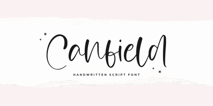 Canfiled is a delicate and elegant handwritten font. Its distinct and well balanced letters make this font a masterpiece. Fall in love with its incredibly versatile style and use it to create spectacular designs!
 - Nevins Hand by Scriptorium,
$24.00Nevins Hand is our first release of a new collection of fonts based on the designs of Peter Nevins, a San Francisco poster artist who does hand-lettered fonts in the Art Nouveau tradition. - Hyperizo by AbtoCreative,
$15.00 Hyperizo is a futuristic style font in three weights. It's the perfect font for logo, game, packaging, poster, web use, etc. The family contains a set of 231 characters, supporting multilingual and OpenType features.
 - Pixapp Inter by Okaycat,
$29.50 Pixapp Inter is a pixel font optimized for display on screen. Highly suitable for small text display in apps or on web. Pixapp Inter is a multilingual font appropriate for publishing to international environments.
 - CentreForward by The Northern Block,
$12.80 CentreForward is an 8 font family consisting of 4 weights with italics. A smooth modular font that draws on ideas observed in the 1982 Football World Cup. Influential players: Paolo Rossi, Socrates, Zico & Tardelli.
 - Madyra by Forberas Club,
$16.00 Introduce Madyra a lovely Script Handwritten Font, with attractive single line this font very ready for any crafter in making any branding product design, greeting card, invitation card, surprise gift, or some decorative craft.
 - Ratched by ARToni,
$18.00 Ratched is a delicate and elegant handwritten font. Its distinct and well balanced letters make this font a masterpiece. Fall in love with its incredibly versatile style and use it to create spectacular designs!
 - Oboe by Graviton,
$4.00 Oboe font family has been designed for Graviton Font Foundry by Pablo Balcells in 2012. It is display typeface with a geometric rounded look. Oboe consists of 6 styles, 2 of which are free.
 - P22 Vale by IHOF,
$24.95 The Vale Press was a contemporary of Willam Morris's Kelmscott Press. The types used by the Vale Press were designed by artist Charles Ricketts, who also supervised the design and printing of Vale Press books. The main type used, Vale, was based on the Jenson 15th century roman type style. The King's Fount was an experimental semi-uncial font based on the Vale type. The King's Fount was designed in 1903 for the Vale edition of the 15h century poem "The Kingis Quair". This semi-uncial font evokes old English and Anglo-Saxon lettering. P22 Vale Pro combines the two fonts P22 Vale Roman and P22 Vale King's Fount into one "Pro" font. This pro font also includes a Central European character set, old style figures, fractions, ornaments and a special faux "Middle English" feature to make "anee text appeer Olde." This feature is not known to exist in any other font.
 - Pinafore by Up Up Creative,
$10.00 Introducing Pinafore Complete, a broad, brush-style display font in four styles. Pinafore comes with upright and oblique styles as well as paper cut versions of each. It includes 363 glyphs such as small caps (see note below for more on this), multilingual support (including multiple currency symbols), an awesome ampersand, math symbols, and more. A note about small caps: There are TWO ways to access the small caps in this font family. For OpenType-savvy programs such as Adobe Illustrator and Adobe InDesign, these can be accessed from within the main font files using the character panel or the glyphs panel. For programs that do not access these OpenType features, I have also included small-caps-specific font files. In these files, the regular caps are accessed by typing capital letters and the small caps are accessed by typing lowercase letters.
 - Livory by HVD Fonts,
$50.00 Livory is a serif type family of four fonts including small caps, 25 ornaments & 50 ligatures in each style. It was designed by Hannes von Döhren & Livius F. Dietzel between 2005 and 2010. Livory is influenced by the French Renaissance Antiquas from the 16th century. It has an organic look with a warm touch and was especially developed for long texts. With its melted corners and individual serifs, Livory has also a smooth and handcrafted appearance in display sizes. With almost 780 glyphs in each font, Livory is equipped for complex, professional typographic work. The OpenType fonts have an extended character set to support Central and Eastern European as well as Western European languages. Each font includes small caps, fractions, old style-, lining-, tabular numbers, scientific superior/inferior figures, ligatures, ornaments and a set of arrows.
 - Sassafrassy by Emily Lime,
$68.00 Sassafrassy™ is a fun hand-calligraphy font family that includes 2 font styles (Simple & Swash), Map Things & a Pattern set to help you create beautiful custom designs. Written using a flexible steel nib & ink on paper. The Simple version includes an extensive character set designed for ease of use. The Swash version has all of the swash characters and gives the font a different stylistic feel. The Pro version contains all characters from both of these two fonts, over 1000 glyphs in total. Also included in this family is a fun “Map Things” set so you can create your own hand-drawn maps & a Free Pattern Set (some of which were used to create the above banners). Map Things & Patterns aren't recommended for use in Word. Language support includes your standard characters plus Eastern European & Baltic character sets. Happy creating!
 - Danizatti script by Slex Studio,
$15.00 I want to create a font, which is very elegant. So I made Danizatti Script, a kind of classic decorative script with a modern twist. This is a display font intended for vintage logos, fashion labels, custom card headers, badges, food packaging designs, especially wine labels. Actually a lot of great style was consumed when creating this type :) there are 300 fancy letter and punctuation glyphs. I also offer a number of viable stylistic alternatives for multiple letters. NOTE, that you will get full access to font options only in Open Type smart applications like InDesign or Illustrator. You can find more about how to access OpenType features in Adobe Apps here: http://fontfeed.com/archives/opentype-in-adobe-creative-suite-the-raiders-of-the-lost-glyphs-pt_1/ Check out my other elegant script fonts at the my frofile
 - Matteson by Hart Foundry,
$15.00 Hallo... Let me introduce you to Matteson font. It comes with two style, Outline and Filled typeface. Matteson comes with a set of OpenType features: Contextual Alternates and Standard Ligatures are automatically on for certain character pairs. In addition it has over 50 alternates for display initials, set in Swash, Stylistic and Titling Alternates. Combine it to find the good composition words. This font are flexible, depends on the display or the style you want, you can make it looks modern or vintage. Also this font for me are good for Logo Type, Branding or event Invitation. just like how it looks in the sample display. To use the Ligature and Alternate you need the application who support OPENTYPE features Thus the description about the font, if there any other question do not hesitate to let me know.... Thanks
 - F2F Monako Stoned by Linotype,
$29.99The Face2Face (F2F) series was inspired by the techno sound of the mid-1990s, personal computers and new font creation software. For years, Alexander Branczyk and his friends formed a unique type design collective, which churned out a substantial amount of fresh, new fonts, none of which complied with the traditional rules of typography. Many of these typefaces were used to create layouts for the leading German techno magazine of the 1990s, Frontpage. Branczyk and his fellows would even set in type at 6 points, in order to make it nearly unreadable. It was a pleasure for the kids to read and decrypt these messages! F2F Monako Stoned was inspired by the Apple system font Monaco, and is one of 41 Face2Face fonts included in the Take Type 5 collection from Linotype. Branczyk designed 16 of these himself." - Shibui by Artisticandunique,
$38.00 Shibui is a Japanese word that expresses a certain aesthetic of simple, subtle and inconspicuous beauty. Shibui - Sans serif font, character structure is simple alphabet style. It has an elegant appearance with rounded folds. It offers the best solutions in your digital projects with this font which is highly readable in the smallest dimensions. With its modern minimalist stance, this font can meet your needs in all modern or classic creative projects. Absolutely perfect for titles, websites, magazines, books, invitations, logos, packaging design, branding and more! Character Ranges: Basic Latin, Latin-1 Supplement, Latin Extended-A, Latin Extended-B, General Punctuation, Currency Symbols, CJK Symbols And Punctuation, Private Use Area (plane 0), Glyph Count: 463 With this font you can create your unique designs. If you have a question, please contact me. Have a good time.
 - Surfoid by astroluxtype,
$20.00 Surfoid is a bold, soft, hazy, lazy and sleepy font-dude that is most happy under an umbrella at the beach holding a drink with an umbrella in the glass. It’s fun, fun, fun until daddy takes the T-Bird away because of the problems that too much fun creates. It’s a rounded off, a little blurry on the lazy edges and would never want to be a serif font. Serif is not the style of Surfoid. Dressed up and sophisticated, this font never wants to be in a suit and tie. Happy is to be in tie dye t-shirt…with its feet dug deep into the cool sand. This is a display headline font best seen at sizes greater than 36 points. It is a full glyph set with upper and lowercase forms. Very Stoked.
 - Garamond Classico by Linotype,
$29.99Opinion varies regarding the role of Claude Garamond (ca. 1480–1561) in the development of the Old Face font Garamond. What is accepted is the influence this font had on other typeface developments from the time of its creation to the present. Garamond, or Garamont, is related to the alphabet of Claude Garamond (1480–1561) as well as to the work of Jean Jannon (1580–1635 or 1658), much of which was attributed to Garamond. In comparison to the earlier Italian font forms, Garamond has finer serifs and a generally more elegant image. The Garamond of Jean Jannon was introduced at the Paris World’s Fair in 1900 as Original Garamond, whereafter many font foundries began to cast similar types. Garamond Classico is based on the forms of Jean Jannon, which already displayed characteristics of the Transitional style. - Retro Checkbook JNL by Jeff Levine,
$29.00 By the 1990s, the availability of font creation software opened the door to an explosion of creativity, experimentation and exploration into the world of digital typography by amateur and professional alike. The undisputed king of the freeware fonts was Ray Larabie through his Larabie Fonts website. It seemed at the time that Ray’s output was endless, and he amassed dozens upon dozens of fonts that ranged from the ridiculous to the sublime. In fact, Ray was the driving force of encouragement and a behind-the-scenes “mentor” who helped Jeff Levine Fonts get underway in January of 2006. As Larabie’s focus changed to higher-quality commercial type design with the launch of Typodermic, Inc., many of his “less than perfect” font experiments were withdrawn and shelved. Ray eventually turned those lost (and sometimes questionable) typefaces into a bundled zip archive released into the public domain through Creative Commons. One particular design “Boron” (circa 1996) featured computer-oriented lettering as if etched onto a circuit board. Running with this idea, and with Ray's approval, the electronic elements were stripped away, the characters cleaned up and modified, and the font reworked in Retro Checkbook JNL, which is available in both regular and oblique versions.
 - DT Paperside by Dragon Tongue Foundry,
$15.00 Paperside: Neither Papyrus nor SSI Countryside. Inspired in some ways by the Papyrus form, but untextured and smoother, with the dimensions and proportions more open, like that of Countryside SSi, with its larger easily readable lowercase body, and more consistent, shorter stems. Paperside has an open scripted feel which is pleasing on the eye and easy to read. Paperside can enhance the first letter of most sentences automatically, and changes other letters to suit their position within words, and the letters they appear beside. Now comes in 5 weights plus italic. For best results, use this ‘smart font’ with Contextual Ligatures turned on. Mulitiple Stylistic Alternatives are included. Inspiration for this font came from two other fonts. Papyrus: was designed by Chris Costello and created in 1982, it is a hand-drawn textured typeface, emulating texts written in biblical times. One of the most used (and misused) fonts of all times. Owned by Letraset, and currently published by the Internation Typeface Corporating (ITC). Countryside SSi: The serif font of an unknown designer, is currently licensed by Southern Software Inc. Feel free to preview some of the Dragon Tongue fonts that are yet to be released, at https://www.dragon-tongue.com/fonts
 - Mastadoni by Eclectotype,
$40.00 Mastadoni is a bold headliner/masthead typeface, with high vertical contrast in a Didone style. That's the starting point at least. There's much more to this font than another modern clone. It is a specialized (only one weight) typeface that comes in five optical grades. Use G1 at very large sizes and G5 at smaller sizes. The grades can be combined so that the thins of type set at different point sizes appear the same thickness - a very useful feature for magazine layouts. Optical grades could also be used in circumstances where a logo needs to be size-specific; the text on your bistro sign can afford to be more delicate than that on your coffee cups. This is a typeface with a big x-height, small cap-height and stubby ascenders and descenders, which contribute to an overall appearance somewhat different from must Didones, and make for some interesting layout possibilities in tight spaces. Mastadoni features a number of useful OpenType features. All fonts include standard ligatures and automatic fractions. In the discretionary ligature feature, you'll find the esoteric "percent off" glyph. Just type '%ff' with dlig engaged and there it is! Case-sensitive forms are available in all the fonts. The contextual alternates feature performs a subtle trick that resolves an optical illusion whereby two ascenders next to each other appear to be different heights. The Roman and Italic styles have a different group of stylistic sets as follows: Roman: SS01 substitutes a less decorative 4; SS02 is a different eszett; SS03 substitues the # with an attractive numero glyph; and SS04 gives an alternate K. Italic: SS01 and SS03 are the same as in the Romans; SS02 gives you more bulbous variants of v, w, and y letters; SS04 is a single storey g; SS05 changes C, G and S to non-ball-terminal varieties; and SS06 changes the swash versions of E, L, N and Q (when the swash feature is engaged). Speaking of the swash feature, the italic fonts feature swash capitals from A to Z, and swash variations for lower case h k m n v w and z. Lastly, the discretionary ligature feature in the italic fonts has vi, wi, KA and RA ligatures. Mastadoni is a typeface that would find itself immediately at home in glossy magazines, while offering a different aesthetic palette from the more standard choices of Didones.
 - Runegrim by Beewest Studio,
$10.00 "Runegrim" Font is Base in Anchient Viking Rune Script . This font is best as Clothing , apharel and any handicraft. This font is Very useful for the the people that not familiar with Unicode format of anchient font. Thank You for use this font.
 - Joyful Juliana Pro by CheapProFonts,
$10.00 This is Kimberly Gesweins own handwriting, named for a sweet California friend of hers. Kimberly has spotted the original free version of this font in use in the far outskirts of China, and now - with the expanded language support - this Pro version can also be used in more remote parts of the western world. ALL fonts from CheapProFonts have very extensive language support: They contain some unusual diacritic letters (some of which are contained in the Latin Extended-B Unicode block) supporting: Cornish, Filipino (Tagalog), Guarani, Luxembourgian, Malagasy, Romanian, Ulithian and Welsh. They also contain all glyphs in the Latin Extended-A Unicode block (which among others cover the Central European and Baltic areas) supporting: Afrikaans, Belarusian (Lacinka), Bosnian, Catalan, Chichewa, Croatian, Czech, Dutch, Esperanto, Greenlandic, Hungarian, Kashubian, Kurdish (Kurmanji), Latvian, Lithuanian, Maltese, Maori, Polish, Saami (Inari), Saami (North), Serbian (latin), Slovak(ian), Slovene, Sorbian (Lower), Sorbian (Upper), Turkish and Turkmen. And they of course contain all the usual "western" glyphs supporting: Albanian, Basque, Breton, Chamorro, Danish, Estonian, Faroese, Finnish, French, Frisian, Galican, German, Icelandic, Indonesian, Irish (Gaelic), Italian, Northern Sotho, Norwegian, Occitan, Portuguese, Rhaeto-Romance, Sami (Lule), Sami (South), Scots (Gaelic), Spanish, Swedish, Tswana, Walloon and Yapese.