6,381 search results
(0.025 seconds)
- Santos by Gassstype,
$23.00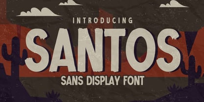 Here comes a New font, Introducing SANTOS It's Sans Display Font is a Textured Natural Style and Authentic Classy Style, this font is great for your creative projects such as watermark on photography, and perfect for logos & branding, invitation,advertisements,product designs, stationery, wedding designs,label ,product packaging, special events or anything that need handwritting taste. SANTOS is a vintage natural Hand Drawn feel. This handmade font will make your design has a beautiful natural touch for each details.
 - Wacca by One Fonty Day,
$4.00 Wacca straddles the categories of Humanist slab and Contemporary serif, and it also gives a handwriting taste especially in the italics. Its tall x-height enables them to be extremely visible, and the slightly curved strokes on some letters give them a pleasant and organic look as a whole. The Italics introduces more cursive strokes all over, so it comes across much more organic than the regulars. This unique, fun, yet simple family is good for any purpose.
 - Freezetide by Tanincreate,
$18.00 Freezetide is a handwritten font with alternates, ligatures, OpenType features which give your design a natural handwriting feel with personality. Freezetide comes with 299 glyphs including multilingual characters, standard numbers, lowercase stylistic and standard alternates, discretionary ligatures for variety. Letters have jagged edges imitating dip pen writing. Using these ligatures allows you to give a realistic somewhat quirky hand-lettered look to your typography. Write the same word differently by combining the default set, alternates, standard and discretionary ligatures.
 - Megattor by Letterhend,
$14.00 Introducing: Megattor typeface! This font is beautifully made to look like natural hand writing. As you can see, the flow of the bold and thin lines creates a realistic hand lettering just by typing on your keyboard! It has many OpenType features like ligatures, stylistic alternate, and lots of Stylistic Set, also support many languages. This typeface is based on handwriting which is very suitable for any design needs you have especially for script logotype project.
 - Autumn Love by BeckMcCormick,
$10.00Autumn Love is a new font duo, pairing a sweet, bouncy calligraphy script with a handwriting-style sans font. Let’s not forget the best features - swashes & hearts! There are so many ways to customize your text! Add left & right swashes to your text, or use the heart connector, or use the heart doodles included in the script font! This duo gives you everything you need to create beautiful designs like wedding invitations, shirt designs, social graphics, brands, & more! - Anona by Nova Type Foundry,
$29.99 Anona brings the upright italic to fruition and shows the handwriting shapes in a sans serif great to use in packaging and branding. Anona is an upright italic sans serif typeface perfect for packaging and playful identities. Explore the stylistic sets to see all the different shapes. Fruity and friendly upright italic sans serif come to brighten your projects. A warm and friendly sans serif will work for your identity. It has a complementary slanted version.
 - Primaria by PeGGO Fonts,
$18.00 Primaria is a display font, inspired on the very first basic handwrite style teaching at primary school, designed in cursive and print styles in three weights each one: light, Regular and Bold, considering stylistic and typographic needs, it also contain OpenType initial lowercase alternative forms in order to get better links in those case where pairs of letters could be look better. Recommended playful and friendly design, teaching and learning stuff, children toys projects, food & drink and soft stuff.
 - Laughs Qhuan by Namara Creative Studio,
$12.00 Decorative handwritten script font with natural touch, perfect for creating neat designs with a personal touch. It's perfect for branding projects, logo, wedding designs, social media posts, advertisements, product packaging, product designs, label, photography, watermark, invitation, stationery and any projects that need handwriting taste. Features : OTF File with Standard glyphs Alternates, Ligatures and Multilingual Support Works on PC & Mac with Simple installations PUA Encoded Characters, Fully accessible without additional design software. Hope you enjoy with our font!
 - Kustina by Youngtype,
$18.00 Kustina Script is a hand brush font made with brushes and ink. This typeface is ideal for use in thick watercolor designs or handwriting styles, such as blog titles, posters, wedding elements, t-shirts, clothing, book covers, business cards, greeting cards, branding, merchandise etc. How to access all alternative characters, using Windows Character Map with Photoshop: https://www.youtube.com/watch?v=Go9vacoYmBw How to access all alternative characters using Adobe Illustrator: https://www.youtube.com/watch?v=XzwjMkbB-wQ Thank you!
 - Captain Quill by Ascender,
$29.99Captain Quill is a lively calligraphic style script font designed by Jim Ford, based on the handwriting of a fictional pirate figure named Paul Pierce, aka Captain Quill. The Captain Quill font is an exciting font that's loaded with adventure, perfect for pirate-themed documents, scrapbooking, invitations and correspondence. Creative Professionals will find the Captain Quill font useful for everything from logos, packaging, menus & headlines, as it lends an old-worldly feel with its authentic rough texture. - Weekday Mornings by Bogstav,
$17.00 "Weekday Mornings" are the 2 first words from the song "Nancy" by Prefab Sprout. Just like the song, the font has a romantic theme and could be considered as "easy listening". Well, I've added 7 slightly different versions of each letter, enough to make the font look like the real handwriting which was the base of the font. Fun fact: I had this song on repeat when finishing the font. I still do love that song! :)
 - JP2 by Linotype,
$40.99JP2 has some special roots being inspired by the actual handwriting of Pope John Paul II. Franciszek Otto took this source material and transformed it into a high quality font. The result is a rough, but intelligent, design with letters that slightly bounce along the baseline to mimic typical writing. Their short x-height, long extenders, and unique capital letters make this a very beautiful and distinctive typeface. Try it out for greetings, invitations, or posters! - Forever Loved by Joanne Marie,
$19.99 Forever Loved is a delightful new handwriting font which is full of character and suitable for every occasion. It has OpenType features such as alternates (two sets of uppercase alternates), swashes, ligatures, terminal forms in lowercase, and a European language support. This wonderful script font is perfect for wedding stationery, engagements, and baby, family and friends orientated themes. Not only that - it can be used for logos, tattoos, delicious food and drink, mugs, clothing, the list is endless!
 - Black Stay Script by madjack.font,
$15.00 Black Stay Script is a signature collection font with natural movement creating an elegant, classy and beautiful look for your latest project. Black Stay Script is perfect for branding projects, logos, wedding designs, social media posts, advertising, product packaging, product design, labels, photography, watermarks, invitations, stationery and any project that requires a handwritten feel. Full set of standard alphabet and punctuation Additional set of brushed lowercase letter endings Handwriting binder. Thank you so much for checking out my shop!
 - Linotype Gneisenauette by Linotype,
$29.99 Linotype Gneisenauette is part of the Take Type Library, selected from the contestants of Linotype’s International Digital Type Design Contests of 1994 and 1997. The handwriting font was designed by Latvian artist Gustavs A. Grinbergs and is available in eight weights. Linotype Gneisenauette is a dynamic font which also reflects a bit of the optimistic spirit of the 1950s. The font is best used for headlines or middle length texts with a point size 12 or larger.
 - Mano by Linotype,
$29.99Linotype Mano is a fresh new font from the Swiss designer Marco Ganz. Urgent and vital, the typeface suggests swift communication or the latest trends: spontaneous and informal, personal and individual. Ganz deliberately gave the characters a marked lean to the right, similar to that of quick handwriting. But Linotype Mano is not only nimble and quick, it also retains its legibility as a text font. Linotype Mano is as dynamic, brisk and casual as modern pop music. - Maryam by Outras Fontes,
$24.00 Maryam is an Outras Fontes type family designed by Ricardo Esteves Gomes. With moderate contrast, these fonts have elegant and very legible forms even in small x-height sizes. There are more then 70 ligatures in each font, providing a lot of letterform variations that make this type family looks like a real handwriting on a page. It is currently available in two versions (Regular and Alternate) that you can combine with each other as you wish.
 - Fustier by Nathatype,
$29.00 Fustier is a script font that captures the beauty of handwriting with a mesmerizing twist. The curves and loops dance across the page, evoking the sensation of ink flowing seamlessly from a skilled hand. With an abundance of swinging details, Fustier ensuring a harmonious flow from letter to letter. The generous spacing between letters maintains readability and legibility, You can use this font in headlines, logos, posters, flyers, invitations, name cards, branding materials, and many more.
 - Philadelphian by FontMesa,
$29.00 Philadelphian is a revival of a MacKellar, Smiths & Jordan font from 1867 by the same name. The regular version with shadow outline was the only style that was offered in 1867. We've taken the original design further by creating two additional weights of medium and bold plus plain black versions. The medium and bold weights are unique because only the horizontal strokes increase in thickness while the vertical strokes remain the same in each weight. Philadelphian Nite is the plain black version of this font family, Nite is the casual spelling of the word Night meaning dark or black. In the late 1800's Philadelphian was a very popular typeface which can be seen on many billheads and letterheads through the early 1900's. If you're looking for a western style font that doesn't look like any other then Philadelphian is the right choice. While the name doesn't remind you of the cowboy genre we've kept the original name for historical reasons because this font was so popular in its day. We plan on going forward with a weathered version of Philadelphian which will be released under a southwestern style name. With Philadelphian we've decided to set the complete family price to an amount that may be considered on sale all of the time.
 - VLNL Tp Kurier by VetteLetters,
$35.00 VetteLetters is proud to bring you the TpKurier-family. It is cooked up by our German chef Martin Lorenz currently living in lovely Barcelona! Chef Lorenz about the TpKurier recipe: “TpKurier is the second redesign we did of Courier. The first redesign in 2000, although based on a five-unit grid, was drawn completely by hand. Six years later we designed another grid version of Courier, and the TpKurier family was born. This version is completely constructed up till its last detail. We didn't want to correct ‘mistakes’ deriving from the use of the grid, but instead make them visible (see “S”). TpKurier is based on a very simple grid, composed a proportion of four units high by two units wide. A series of other links between them make it possible to form a font from this grid. We felt it was important to consistently work within these limitations so that any unexpected asperities would help provide the font with its character. Even though it is a rough constructed typeface it was important to us to design real italic lower case letters and not just a sloped roman (see “a”, “g” or “s”). The first family published contained a serif and sans-serif version of the TpKurier, with italic and bold.”
 - La Coffee by Creativetacos,
$12.00 Introducing La Coffee Font, a sleek, cool and professional handmade font that is perfect for adding a unique touch to your branding, logos, or your instagram quotes. It includes uppercase, lowercase, numbers, symbols and with Latin extended character support, it is versatile for a variety of creative endeavors, while exuding a rustic charm. La Coffee will look great on invitations, packaging, slideshows, logos, headlines, lettering, posters, branding, inspirational quotes, headlines, magazine layouts, website designs, advertising, invitations, packaging designs, book covers and any other creative endeavour. What's Inside the Product? - Weight of the Font: Regular The Font Kit comes packed with: - Big Letters (Uppercase) - Small Letters (Lowercase) - Numbers & Symbols - Multilingual Support Here's a sneak peek at the characters supported: - All the letters from A-Z (uppercase and lowercase) - All the numbers from 0-9 - All these special characters - !"#$%&'()*+,-./:;=?@[]^_`{|}~ ¡¢£¤¥§¨©ª«®°±²³´¶¸¹º»¿ˆˇ˜–—‘’‚‛“”„†‡•…‰‹›⁄€™− - And a range of international characters like á â à ä å ã æ ç é ê è ë í î ì ï ı ñ ó ô ò ö õ ø œ š ß ú û ù ü ý ÿ ž  À Ä Å Ã Æ Ç É Ê È Ë Í Î Ì Ï Ñ Ó Ô Ò Ö Õ Ø Œ Š Û Ù Ü Ý Ÿ
 - Awardos by upirTYPO,
$6.00 Awardos is a complete solution for awards, badges and all kind of certificates. This font allows to mix various borders, laurels and icons to create a very unique badges. To quickly create an unique badge, type any number, any uppercase character and any lowercase character, for example 0Aa, 5Gk, 9Kl, 7Fr etc. To add starfield, start with a symbol (!"#$%&'()*+,). Glyphs included: 12x starfields - characters: ! " # $ % & ' ( ) * + , 16x borders - characters: 0 1 2 3 4 5 6 7 8 9 : ; < = > ? 36x laurels and outer elements - characters: A B C D E F G H I J K L M N O P Q R S T U V W X Y Z À Á Â Ã Ã Ä Å Ç È É Ê 12x crown icons - characters: a b c d e f g h i j k l 12x cup icons - characters: m n o p q r s t u v w x 12x number one digits - characters: y z à á â ã ã ä å ç è é ê It is not required to use a symbol from every category. For example only laurel with crown icon can be used, or only starfield with the cup icon. Awardos Inverse is an inversed version. The outline borders are still included, used symbols are: [ \ ] ^ _ { | } ~ ¢ £ ¤ ¥ ¦ § €
 - Art Gothic HiH by HiH,
$10.00 Art Gothic was attributed to the Central Type Foundry of St. Louis, Missouri, USA by Henry Lewis Bullen, writing in INLAND PRINTER in 1907, with a reproduction shown in Kelly’s American Wood Type. The typeface appears on the cover of an issue of “The Superior Printer” pictured in Typology by Heller and Fili dated in the 1870s. Art Gothic was designed in 1884 by Gustav Schroeder and proved to be one of the more popular and enduring of the American-designed Victorian display faces of the period, appearing frequently in ads in various publications. The Hamilton Mfg. Co showed a very similar wood type, No. 232, with a modified and rather heavy-handed upper case in 1892. As late as 1897, it may be found in the advertising section of The Ivy of Trinity College of Hartford, Connecticut and was included in the Norwood Press 1902 Specimen Book. Our font includes a complement of five upper case and four lower case alternatives as follows: 123=C, 125=E, 135=H, 137=S, 172=c, 175=e, 215=m and 247=s. Great for period pieces. ART GOTHIC HIH is clean, readable, and surprisingly modern-looking; unlike so many overly complex Victorian display fonts, it can be used in text sizes.
 - Spring Blush by Supfonts,
$17.00 Here's my new experiment. This font breaks the boundaries even more. And most importantly, this font fully supports Cyrillic! Now you can diversify your projects, create cards and greetings, posts and titles for blogs. The scope is huge. Plus it's fresh, not like other fonts - the ability to stand out from the crowd! --- Здравствуйте, друзья. Вот мой новый эксперимент. Этот шрифт еще больше нарушает границы.И самое главное, он полностью поддерживает кириллицу! Теперь вы можете разнообразить свои проекты, создавать открытки и поздравления, посты и заголовки для блогов. Область применения просто огромна. Плюс это свежий, не похожий на другие шрифт - возможность выделиться из общей массы! --- - Fully supports Cyrillic - Uppercase and lowercase - Numbers and punctuation - Foreign language support - Ligatures Check out my blog: - https://www.instagram.com/zloillev - pinterest.com/dmitriychirkov7 Enjoy!
 - Wild Title Sans by Caron twice,
$39.00 Wild Title Sans is ideal for projects that are intended to be leisurely and relaxed. The font deliberately destroys the principles of restrained fonts, emphasizing unbridled individuality. The distinct notches in the font are enlarged ink traps, which are used for typesetting in small sizes and usually copy the structure of the character. In this case, the ink trap becomes part of the structure of the character, giving the font a strong and original feature. The weight of individual styles is also distinct: the emphasis on the vertical breaks with traditional approaches to posture. This font literally draws attention to itself. Individual styles are suited to a variety of uses, from small-point texts to bold, distinctive headings. Specimen: http://carontwice.com/files/specimen_Wild_Title_Sans.pdf
 - Bs Monofaked by Feliciano,
$37.92Monospaced become very popular among graphic designers. Nevertheless, I’ve noticed that in most cases that designers use monospaced typefaces is not because of their particular features caused by the strict rules of design — all characters share the same advanced width — rather because of it’s ‘electronic derived’ appearance. So, I decided to create a typeface that keeps the characteristics that, in my opinion attract designers to this particular sort of types, but deliberately break the main rule: characters do not share the same width — but they they look like they do! Characters are better balanced compared to truly monospaced types, giving more even typographic color while used in text setting. One weight might enough to please electronic type lovers. Designed in 2000. - Meleo by Alexis Luengas,
$1.00 Meleo is a semiserif consisting of 10 fonts with a few original quirks but still very legible at both text and display sizes. Since its conception, the aim was a balance of uniqueness and functionality. The typeface owes its energy to the slight suggestion of calligraphic crafting and humanist structure. But it also breaks the rules: a small x-height and a whimsical uppercase with resemblance to the lowercase may render Meleo more friendly than a conventional (semi-)serif. Titles and texts of moderate length, like those found on websites, flyers and packaging, are the natural habitat of Meleo, but it may as well thrive under different settings. Meleo supports most of western-european latin languages which are included in the ISO-Adobe character set.
 - Crepe Paper JNL by Jeff Levine,
$29.00 Crepe Paper JNL is an alphabet-only novelty font that creates a wavy ribbon headline with a vintage wood type alphabet that somewhat resembles an unfurled stretch of crepe paper. The upper case A-Z keys will produce a white ribbon banner with black letters, while the lower case a-z keys are white letters on a black background. The end caps for the white banner are on the left and right parenthesis keys, while the end caps for the black banner are on the bracket keys. A blank space is located on the period key for the white banner and on the comma key for the black banner. This will allow for a continuous text banner without an open break due to using the space key.
 - Berkin by Craft Supply Co,
$20.00 Berkin – Display Font is a captivating sans-serif typeface that breaks free from monotony with its playful and eye-catching design. Its stems and letterforms carry a dynamic and non-uniform style that instantly grabs attention, making it perfect for display purposes. Berkin’s unique design adds a sense of energy and spontaneity to your projects, ensuring that they stand out in a crowd. Whether you’re creating eye-catching headlines, signage, or branding materials, Berkin injects a distinctive and lively personality. This font is like a burst of creativity in the world of typography, making it an exceptional choice for projects that demand a playful and attention-grabbing aesthetic. Berkin’s playful and non-conformist approach ensures your designs are unforgettable and exude an enthusiastic and dynamic vibe.
 - Moho Script by John Moore Type Foundry,
$24.95 Moho Script introduces a decorative modern geometric of Japanese, sometimes german flavor for an unconventional script. It breaks the mold of the usual fonts to create a new visual impact of absolute contemporaneity with a retro touch. Moho Script, as all typefaces of this extended family, comes in five weights and an inline style, and it's been provided with a complete set of glyphs for languages of the Eastern and Western Europe. With the OpenType feature Swash you can make words with letter "t" that overlap to achieve what no meet in others typefaces. Moho Script is a perfect font for headlines display, menus, deals, logos, labels, outdoor advertising and publishing design, great for architecture, fashion, music, aviation and social affairs.
 - Point Of Sale JNL by Jeff Levine,
$29.00 Point of Sale JNL is a specialty font for producing retro-style price cards, tags, stickers, labels and similar items. Within this design are a large set of numerals and two smaller sets of numerals. Both of the smaller sets are centered against the larger ones with one set also having underscores. In addition, there are a number of price card designs provided for those who want a truly nostalgic feel to their price marks. The layout of Point of Sale JNL breaks down as follows: A through J = 1 through zero in large numbers K = a decimal point L = dollar sign M = cents sign N through Z = various price cards a through j = small centered numbers k through t = small numbers with underscores
 - Barchowsky Fluent Hand by Swansbury,
$24.00Swansbury, Inc. provides handwriting instruction to all ages, accompanied by two exemplar fonts, Barchowsky Fluent Hand.otf and Barchowsky Dot.otf. The basis for the design of the characters is the italic of the Renaissance. With the advantage of contextual alternates, Barchowsky Fluent Hand automatically joins lowercase letters so it can be used in any venue where a clean and elegant appearance of handwriting is desired. The fonts allow maximum instructional flexibility. Aside from their use in lesson plans, educators can customize pages for specific student interests, studies and needs. Included are all math symbols that one typically encounters in school curricula. Nan Jay Barchowsky, designer of this font, believes that children should hone their handwriting skills as they learn all subjects, reading, math, history and foreign languages. Both fonts support all Western European languages and Turkish. Barchowsky Dot is for young children or others who need remediation. The letterforms are identical to those in Barchowsky Fluent Hand. Used at a large point size open dots appear within the lines that form the characters indicating where one should start each stroke in a letter or number. Once formations are learned Barchowsky Fluent Hand can be used with the contextual alternates turned off until students are ready to write in the joined-up manner of a true cursive. Specifications: The technology for fonts that automatically join letters, or allow them to be unjoined is relatively new. At present, both fonts work on Windows XP with Service Pack 1 or later (or Vista), using AbiWord, a free word processor (go to abisource.com). They also work well with InDesign 2. Currently there is an unknown factor in later versions of InDesign for Windows that disallows joining. Macs completely support the fonts using InDesign 2 and later, PhotoshopCS and IllustratorCS. If you do not have these applications, there is an inexpensive word processor for Macs. - Barchowsky Dot by Swansbury,
$17.00Swansbury, Inc. provides handwriting instruction to all ages, accompanied by two exemplar fonts, Barchowsky Fluent Hand.otf and Barchowsky Dot.otf. The basis for the design of the characters is the italic of the Renaissance. With the advantage of contextual alternates, Barchowsky Fluent Hand automatically joins lowercase letters so it can be used in any venue where a clean and elegant appearance of handwriting is desired. The fonts allow maximum instructional flexibility. Aside from their use in lesson plans, educators can customize pages for specific student interests, studies and needs. Included are all math symbols that one typically encounters in school curricula. Nan Jay Barchowsky, designer of this font, believes that children should hone their handwriting skills as they learn all subjects, reading, math, history and foreign languages. Both fonts support all Western European languages and Turkish. Barchowsky Dot is for young children or others who need remediation. The letterforms are identical to those in Barchowsky Fluent Hand. Used at a large point size open dots appear within the lines that form the characters indicating where one should start each stroke in a letter or number. Once formations are learned Barchowsky Fluent Hand can be used with the contextual alternates turned off until students are ready to write in the joined-up manner of a true cursive. Specifications: The technology for fonts that automatically join letters, or allow them to be unjoined is relatively new. At present, both fonts work on Windows XP with Service Pack 1 or later (or Vista), using AbiWord, a free word processor (go to abisource.com). They also work well with InDesign 2. Currently there is an unknown factor in later versions of InDesign for Windows that disallows joining. Macs completely support the fonts using InDesign 2 and later, PhotoshopCS and IllustratorCS. If you do not have these applications, there is an inexpensive word processor for Macs. - Croasian by MKGD,
$13.00 The main reason I wanted to design this font was because I really didn’t like how poorly some fonts tried to mimic an Oriental appearance. Trying to make western words appear Asian with a font composed of brush strokes is almost always doomed to failure. However, I find Croasian works extremely well with one syllable words that are Asian sounding. A good font to have if you want to express an Asian name or business phonetically in a western alphabet while still retaining an Asiatic feel. Croasian has a glyph count of 397 and supports the following languages Afrikaans, Albanian, Asu, Basque, Bemba, Bena, Bosnian, Catalan, Chiga, Colognian, Cornish, Croatian, Czech, Danish, Embu, English, Esperanto, Estonian, Faroese, Filipino, Finnish, French, Friulian, Galician, German, Gusii, Hungarian, Icelandic, Indonesian, Irish, Italian, Kabuverdianu, Kalaallisut, Kalenjin, Kamba, Kikuyu, Kinyarwanda, Latvian, Lithuanian, Low German, Lower Sorbian, Luo, Luxembourgish, Luyia, Machame, Makhuwa-Meetto, Makonde, Malagasy, Malay, Maltese, Manx, Meru, Morisyen, North Ndebele, Norwegian Bokmål, Norwegian Nynorsk, Nyankole, Oromo, Polish, Portuguese, Romanian, Romansh, Rombo, Rundi, Rwa, Samburu, Sango, Sangu, Scottish Gaelic, Sena, Shambala, Shona, Slovak, Slovenian, Soga, Somali, Spanish, Swahili, Swedish, Swiss German, Taita, Teso, Turkmen, Upper Sorbian, Vunjo, Walser, Zulu
 - Lipa Agate by TypeTogether,
$49.00 Lipa is the name of the Slovenian national tree 'Linden'. The typeface Lipa Agate by Croatian designer Ermin Međedović, is part of a bigger type collection, comprising various type groups into one coherent system which Ermin developed over the past 10 years. Lipa Agate is the first to be released; a sans serif designed and engineered to be used in the smallest text sizes, best under 10pt, and in very bad printing conditions. It is perfect for phone books, classified ads, directories or any other job requiring economy without jeopardising legibility. To achieve this, Lipa Agate employs a range of tools, such as deep ink-traps, narrow proportions and a tall x-height. Contemporary editorial design requires a high amount of flexibility to respond to various design situations in a consistent fashion. Lipa Agate — with its 3 levels of condensation, 4 weights and 2 sets of different x-heights, 'High' and 'Low', which share the same width — fulfils these requirements wonderfully. That's a total of 24 fonts! To make this clean and honest workhorse face complete, its large character set also includes small caps, arrows, info-numerals and much more.
 - FHA Condensed French by Fontry West,
$25.00 FHA Condensed French One could speculate that FHA Condensed French probably started life as wood type for displays, headlines and posters. The exaggerated sharp serifs and condensed forms were not uncommon for that period. At some point, sign painters picked up Condensed French added their own character. At the end of the nineteenth century, Frank H. Atkinson included Condensed French in his samples of lettering for his book, ”Sign Painting, A Complete Manual.” This book became one of the definitive guides for signwriting and hand lettering. In 1999, Mike Adkins digitized Condensed to add to our Atkinson collection. For its re-release, Condensed French has been updated with more language support, ligatures, and OpenType alternates. It has true vintage character but still plays well in more modern designs. A font for all seasons, the condensed forms and sharp serifs fit in every layout from wildwest days posters and creepy film credits to Christmas ads and Mother’s Day cards. While I can’t really see FHA Condensed French as the font for phone aps or video game text, it will provide impact to logos, branding, and product labeling.
 - Square Beat by Hanoded,
$15.00 After a lot of time sitting at my desk, creating fonts and trying to figure out how my new software works, I really like to work out a bit. The only thing that I do not like is the music they play at the gym; it is usually a selection of poppy tunes that appeals to a large audience. But not to me. I prefer my death metal - and eighties music, as it brings back a lot of good memories. So, I bought myself some ear buds and installed a music streaming app on my phone. Yes, I know, I am probably the last person on earth who discovered streaming... One day, during a workout session, I listened to a list of eighties music and one song that I had forgotten about started playing: Rappers Delight by The Sugarhill Gang. When I started working on the font, I had to think about the song and named it Square Beat. Square Beat font, other than the name implies, is a rounded, handmade font, ideally suited for books and magazines aimed at a young audience, toy packaging or posters. It comes with great language support, including Vietnamese.
 - PTx Flowers by Pedro Teixeira,
$15.00 PTx Flowers Font Family 2 fonts: regular and silhouette each font - 6 glyphs TTF format Bear in mind that each glyph of the font PTx Flowers Regular is close to the maximum limit of points possible in ttf, which means that despite being tested in several programs, illustrator, photoshop, among others including word, some bugs may occur, depending on the rendering capability of the program you are working on. I found however that most of the time, that by the way the bugs, when tested, were only verified in word, that changing the size of the letter/glyph or even the zoom of the document, the letter/glyph was rendered correctly. These fonts have a very limited number of glyphs because, due to the glyphs having too many points, it can take some time to render. This will depend on the capacity of the machine's graphics card (computer, tablet, mobile phone). Hence a low number to take as little time as possible. See at work in word: https://youtu.be/PIMBlja2I5k See ar work in illustrator: https://youtu.be/RJp9X9TQ4so See at work in photoshop: https://youtu.be/yvrBmCJ80pc
 - Wonderhand by Martina Flor,
$27.00 Wonderhand is a new extensive family of scripts designed in seven widths and three weights. It also introduces a third design axis, the slant, presenting an upright 0° cut, a 20° cut and a 40° cut for each. Like written by different hands, each cut has a unique appearance and character. Wonderhand contains two sets of alternate characters and automatic features that imitate the natural flow of handwriting. It is loaded with icons and decorative elements that allow multiple possibilities in layout design.
 - Quick Sketching by Gassstype,
$25.00 Hello Everyone, introduce our new product Quick Sketching is a Freehand Written Font with a Authentic Style and classy style, this font is great for your creative projects such as watermark on photography, and perfect for logos & branding, photography, invitation, watermark,advertisements,product designs, stationery, wedding designs,label ,product packaging, special events or anything that need handwritting taste. That is why Quick Sketching has authentic and strong characteristic more natural look. You can activate Ligature OpenType panel and alternate glypsh.