10,000 search results
(0.051 seconds)
- OK Corral by FontMesa,
$20.00 OK Corral is a revival of a very old Italian font that you may have seen in the past under the original name of Italian Print. The Lined version of this font has never been known to have a lower case set of letters until now.
 - Margate JNL by Jeff Levine,
$29.00 A set of water-applied decals manufactured in 1962 by the American Decalcomania Company for Goodyear serves as the basis for Margate JNL. This block-style letter (with a hint of the Art Deco era) is bold, uniform in weight and commands attention in any titling application.
 - Fashion Statement JNL by Jeff Levine,
$29.00 An example of hand lettering from a vintage instructional book was the basis for Fashion Statement JNL; available in both regular and oblique versions. This extra-wide "thick and thin" design is perfect for replicating the classic signage and print work of the Art Deco era.
 - Hoodoo U NF by Nick's Fonts,
$10.00This roly-poly romp through the alphabet is based on Jürgen Riebling's irrepressible Mr. Big from the 1970s. Big, bold, bubbly and a little brash, it's a natural choice for happy headlines. Both versions contain the complete Latin 1252, Central European 1250 and Turkish 1254 character sets. - Olystar by NicolassFonts,
$35.00 Unleash the power of modern typography with Olystar, a captivating font family meticulously crafted on the foundation of the beloved Olyford font. Olystar boasts 5 exquisite weights and more than 400 glyphs in each style. This family is perfect for logotypes, advertising, packaging, corporate identities, and more.
 - Reveler JNL by Jeff Levine,
$29.00 The sheet music for "Good Night Angel" from the 1937 motion picture "Radio City Revels", had the movie's title hand lettered in a free form Art Deco sans serif design. This has been recreated digitally as Reveler JNL, which is available in both regular and oblique versions.
 - Nostagila by Forberas Club,
$16.00 This font is made based on memories from the past. Where is writing in a diary that tells about everyday stories. Are you ready to write a story with this font? or did you want to make a crafty item, this font will do it too.
 - Bill of Fare JNL by Jeff Levine,
$29.00 A 1942 menu cover for the restaurant at the Biltmore Hotel in Los Angeles features its name in a stylized Art Deco serif design. This is has been turned into the digital typeface Bill of Fare JNL, and is available in both regular and oblique versions.
 - Comic World by Fox7,
$12.00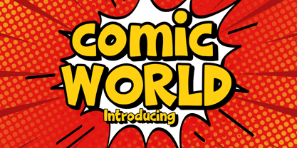 Comic World is a cool, vintage styled display font. It is the perfect font for titles or words needing a more dramatic emphasis. Whatever the topic, this font will be a wonderful asset to your font library, as it has the potential to enhance any creation.
 - Millrich Grange NF by Nick's Fonts,
$10.00 Here's a refined version of Grange, released by Edinburgh's Miller & Richards foundry just around the turn of the twentieth century. A bit quirky with a lot of warmth. Both flavors of this font feature the 1252 Latin, 1250 Central European, 1254 Turkish and 1257 Baltic character sets.
 - P22 BlancoNeg by IHOF,
$24.95 BlancoNeg was inspired by the lettering of Saul Bass with some thoughts of Op-Art. Each character relies on the positive and negative spaces of its neighboring letters to help define its own shape. This font is casual with the look of cut out paper forms.
 - Assay by Solotype,
$19.95This is our name for Antique Tuscan, of which there were many variations. This font came from a large lot purchased around 1970 from an east coast newspaper shop. Subsequently, we acquired several more versions of the face, but this one had lowercase so we used it. - Wenzel by FaceType,
$15.00 This work is the result of an assignment to digitize and complete a typeface that was used for the intertitles of Kleider machen Leute from 1921. We only had a basic alphabet with some glyphs missing. Sure, Wenzel is not a beaut, but ... what the heck!
 - Show Card Elite JNL by Jeff Levine,
$29.00 One example in the 1919 instructional book “One Hundred Alphabets for the Show Card Writer” was for an elegant sans serif with a subtle Art Nouveau style to the letter forms. This is now available digitally as Show Card Elite JNL in both regular and oblique versions.
 - Vivala Old by Johannes Hoffmann,
$11.00 The Vivala old black letter font family is characterized by its hard-cut lines. This gives the typeface a special woodcut-like character. The typeface family offers a wide range of possibilities for design. It works well for posters, packaging, and corporate design for restaurants or breweries.
 - Affair by Sudtipos,
$99.00 Type designers are crazy people. Not crazy in the sense that they think we are Napoleon, but in the sense that the sky can be falling, wars tearing the world apart, disasters splitting the very ground we walk on, plagues circling continents to pick victims randomly, yet we will still perform our ever optimistic task of making some little spot of the world more appealing to the human eye. We ought to be proud of ourselves, I believe. Optimism is hard to come by these days. Regardless of our own personal reasons for doing what we do, the very thing we do is in itself an act of optimism and belief in the inherent beauty that exists within humanity. As recently as ten years ago, I wouldn't have been able to choose the amazing obscure profession I now have, wouldn't have been able to be humbled by the history that falls into my hands and slides in front of my eyes every day, wouldn't have been able to live and work across previously impenetrable cultural lines as I do now, and wouldn't have been able to raise my glass of Malbeck wine to toast every type designer who was before me, is with me, and will be after me. As recently as ten years ago, I wouldn't have been able to mean these words as I wrote them: It’s a small world. Yes, it is a small world, and a wonderfully complex one too. With so much information drowning our senses by the minute, it has become difficult to find clear meaning in almost anything. Something throughout the day is bound to make us feel even smaller in this small world. Most of us find comfort in a routine. Some of us find extended families. But in the end we are all Eleanor Rigbys, lonely on the inside and waiting for a miracle to come. If a miracle can make the world small, another one can perhaps give us meaning. And sometimes a miracle happens for a split second, then gets buried until a crazy type designer finds it. I was on my honeymoon in New York City when I first stumbled upon the letters that eventually started this Affair. A simple, content tourist walking down the streets formerly unknown to me except through pop music and film references. Browsing the shops of the city that made Bob Dylan, Lou Reed, and a thousand other artists. Trying to chase away the tourist mentality, wondering what it would be like to actually live in the city of a billion tiny lights. Tourists don't go to libraries in foreign cities. So I walked into one. Two hours later I wasn't in New York anymore. I wasn't anywhere substantial. I was the crazy type designer at the apex of insanity. La La Land, alphabet heaven, curves and twirls and loops and swashes, ribbons and bows and naked letters. I'm probably not the very first person on this planet to be seduced into starting an Affair while on his honeymoon, but it is something to tease my better half about once in a while. To this day I can't decide if I actually found the worn book, or if the book itself called for me. Its spine was nothing special, sitting on a shelf, tightly flanked by similar spines on either side. Yet it was the only one I picked off that shelf. And I looked at only one page in it before walking to the photocopier and cheating it with an Argentine coin, since I didn't have the American quarter it wanted. That was the beginning. I am now writing this after the Affair is over. And it was an Affair to remember, to pull a phrase. Right now, long after I have drawn and digitized and tested this alphabet, and long after I saw what some of this generation’s type designers saw in it, I have the luxury to speculate on what Affair really is, what made me begin and finish it, what cultural expressions it has, and so on. But in all honesty it wasn't like that. Much like in my Ministry Script experience, I was a driven man, a lover walking the ledge, an infatuated student following the instructions of his teacher while seeing her as a perfect angel. I am not exaggerating when I say that the letters themselves told me how to extend them. I was exploited by an alphabet, and it felt great. Unlike my experience with Ministry Script, where the objective was to push the technology to its limits, this Affair felt like the most natural and casual sequence of processions in the world – my hand following the grid, the grid following what my hand had already done – a circle of creation contained in one square computer cell, then doing it all over again. By contrast, it was the lousiest feeling in the world when I finally reached the conclusion that the Affair was done. What would I do now? Would any commitment I make from now on constitute a betrayal of these past precious months? I'm largely over all that now, of course. I like to think I'm a better man now because of the experience. Affair is an enormous, intricately calligraphic OpenType font based on a 9x9 photocopy of a page from a 1950s lettering book. In any calligraphic font, the global parameters for developing the characters are usually quite volatile and hard to pin down, but in this case it was particularly difficult because the photocopy was too gray and the letters were of different sizes, very intertwined and scan-impossible. So finishing the first few characters in order to establish the global rhythm was quite a long process, after which the work became a unique soothing, numbing routine by which I will always remember this Affair. The result of all the work, at least to the eyes of this crazy designer, is 1950s American lettering with a very Argentine wrapper. My Affair is infused with the spirit of filete, dulce de leche, yerba mate, and Carlos Gardel. Upon finishing the font I was fortunate enough that a few of my colleagues, great type designers and probably much saner than I am, agreed to show me how they envision my Affair in action. The beauty they showed me makes me feel small and yearn for the world to be even smaller now – at least small enough so that my international colleagues and I can meet and exchange stories over a good parrilla. These people, whose kindness is very deserving of my gratitude, and whose beautiful art is very deserving of your appreciation, are in no particular order: Corey Holms, Mariano Lopez Hiriart, Xavier Dupré, Alejandro Ros, Rebecca Alaccari, Laura Meseguer, Neil Summerour, Eduardo Manso, and the Doma group. You can see how they envisioned using Affair in the section of this booklet entitled A Foreign Affair. The rest of this booklet contains all the obligatory technical details that should come with a font this massive. I hope this Affair can bring you as much peace and satisfaction as it brought me, and I hope it can help your imagination soar like mine did when I was doing my duty for beauty.
 - Beast Energy by Ditatype,
$29.00 Beast Energy is a brush-copying-script font in letter designs having uneven edges as its artistic and organic characteristics. This brush script font can express dramatic, fun impressions through its capital letters making the brush wipe details clearer. The edges will look wider and thicker on certain parts of the letters. The color applications in this brush script font will also give amazing, artistic effects. For example, brighter colors will live up the letters, while darker ones will have dramatic and mysterious effects. Above all, you need to make sure the letters remain legible even in bigger text sizes. Furthermore, you can enjoy the available features here. Features: Multilingual Supports PUA Encoded Numerals and Punctuations Beast Energy fits best for various design projects, such as brandings, quotes, printed products, merchandise, social media, etc. Find out more ways to use this font by taking a look at the font preview. Thanks for purchasing our fonts. Hopefully, you have a great time using our font. Feel free to contact us anytime for further information or when you have trouble with the font. Thanks a lot and happy designing.
 - Aviano Copper Variable by insigne,
$199.99 The retro-inspired design of Aviano Copper Variable echos the bold style of America’s Gilded Age. Inspired by the copper-inscribed intaglio printing designs of the early 20th century, the powerful, wide character shape of this font walks softly across your page while carrying a big stick. To create the right balance, small wedge serifs were added onto Aviano Sans, giving you a sophisticated style that looks and acts like it belongs nowhere short of Boardwalk. Developed to a new level of excellence, this design offers a wide range of weights from thin to black. There's full multilingual support of all Latin-based languages and five stylistic sets, swash designs, and 1000 glyphs per weight, including some unique ligatures. Number options include old style figures, tabular figures, and superscripts. Unique median spur alternates, swashes, and ligatures will help you customize every single design. The feel of last century’s personal and business correspondence is waiting for you in this member of the Aviano family. While ideal for headings, displays, logos, and short texts, Aviano Copper’s use for everything from letterhead to wine labels may just give you the monopoly you’re looking for.
 - Standbyte by Din Studio,
$29.00 Standbyte is an exquisite script font that beautifully captures the essence of cursive handwriting with delicate brush details. This typeface combines the fluidity of handwritten script with the artistic touch of brush strokes, resulting in a captivating and elegant design. Standbyte's flowing letterforms emulate the natural movement of cursive handwriting, giving it a sense of authenticity and warmth. The brush details add a touch of artistic flair, creating subtle variations in stroke width that infuse the font with a handcrafted charm. Its flowing, interconnected letters lend themselves well to creating seamless and eye-catching appearance. Because of its legibility you can use this font in a variation of text sizes. Enjoy the available features here. Features: Multilingual Supports PUA Encoded Numerals and Punctuations Standbyte fits in headlines, logos, posters, flyers, invitations, greeting cards, branding materials, print media, editorial layouts, website headers, and many more. Find out more ways to use this font by taking a look at the font preview. Thanks for purchasing our fonts. Hopefully, you have a great time using our font. Feel free to contact us anytime for further information or when you have trouble with the font. Thanks a lot and happy designing.
 - Ballon Hands by Create Big Supply,
$15.00 Welcome to MyFont, where creativity and expression meet with the enchanting Ballon Hands font. This unique handwriting script font adds a touch of authenticity and charm to all your craft projects. Whether you're designing websites, SVG designs, home decor items, branding materials, blogs, logos, or invitations, Ballon Hands is a perfect choice. The Ballon Hands font features a natural and flowing script style, capturing the essence of hand-drawn lettering. With both uppercase and lowercase letters, numbers, and punctuations, this font provides versatility in your designs. Additionally, it offers multilingual support, allowing you to create captivating text in various languages. Explore the ligatures included in the Ballon Hands font, enhancing the fluidity and visual appeal of your typography. The font is PUA encoded, enabling easy access and compatibility across different platforms and software. Character Set: The Ballon Hands font offers an extensive character set, including a wide range of symbols, accents, and special characters, allowing you to express your ideas without limitations. Discover the magic of Ballon Hands and unlock your creative potential. Get inspired and elevate your craft projects with this delightful handwriting font.
 - Long Vacation by Din Studio,
$27.00 Do you want something prominent yet legible? This is Long Vacation, our new handwritten font, ideal for all of your design needs. Long Vacation is a visually interesting handwritten font showing a unique handwriting style giving the natural, lovely nuances on your designs. The flowing letters are interconnected and the scratches that connect the letters make the font look more natural. Details on each letter and curves on the edges show high contrasts. Due to its great legibility, you can apply this font to both big and small text sizes. Additionally, enjoy the features available here. Features: Stylistic Sets Multilingual Supports PUA Encoded Numerals and Punctuations Long Vacation fits best for various design projects, such as brandings, posters, banners, invitations, greeting cards, magazine covers, quotes, printed products, merchandise, logos, social media, etc. Find out more ways to use this font by taking a look at the font preview. Thanks for purchasing our fonts. Hopefully, you have a great time using our font. Feel free to contact us anytime for further information or when you have trouble with the font. Thanks a lot and happy designing.
 - Aviano Copper by insigne,
$29.99 The retro-inspired design of Aviano Copper echos the bold style of America’s Gilded Age. Inspired by the copper-inscribed intaglio printing designs of the early 20th century, the powerful, wide character shape of this font walks softly across your page while carrying a big stick. To create the right balance, small wedge serifs were added onto Aviano Sans, giving you a sophisticated style that looks and acts like it belongs nowhere short of Boardwalk. Developed to a new level of excellence, this design offers a wide range of weights from thin to black. There's full multilingual support of all Latin-based languages and five stylistic sets, swash designs, and 1000 glyphs per weight, including some unique ligatures. Number options include old style figures, tabular figures, and superscripts. Unique median spur alternates, swashes, and ligatures will help you customize every single design. The feel of last century’s personal and business correspondence is waiting for you in this member of the Aviano family. While ideal for headings, displays, logos, and short texts, Aviano Copper’s use for everything from letterhead to wine labels may just give you the monopoly you’re looking for.
 - Namaqua by Krafted,
$10.00 Escape to the bliss of the Namaqualand. A landscape carpeted in wildflowers and magical star-studded nights. Where visitors come from all over the world to experience the cacophony of nature in its purest form. Introducing Namaqua - A Modern Calligraphy Font. This gorgeous font can be used for a host of different content needs and projects. Use it for your headings, logos, business cards, printed quotes, invitations, packaging, resumes, and even your website or social media branding. Enchant your audience, clients or guests with this versatile, elegant font. What you’ll get: Multilingual & Ligature Support Full sets of Punctuation and Numerals Compatible with: Adobe Suite Microsoft Office KeyNote Pages Software Requirements: The fonts that you’ll receive in the pack are widely supported by most software. In order to get the full functionality of the selection of standard ligatures (custom created letters) in the script font, any software that can read OpenType fonts will work. We hope you enjoy this font and that it makes your branding sparkle! Feel free to reach out to us if you’d like more information or if you have any concerns.
 - Links by HouseOfBurvo,
$36.00 Links was built adhering to a strict grid of 'linked' squares; and comes with special "Grid Glyphs" that line up perfectly with all characters. These Grid Glyphs can be used to create an invisible grid for your layout or as a background to enhance your design. Perfect for posters, logos and headlines, this font is available in four styles; Round and Square with accompanying obliques. This font was inspired by much of the lettering from the Dutch movement, or Functionalism which in turn was a descendant of the International Style pioneered by the Swiss. In keeping with these traditions, Links was build adhering to a strict grid of linked squares, taking a clear scientific approach to construct each character. One of the main features of International Style is the implementation of a Grid. This font has built in special characters that I call 'Grid Glyphs'; these Grid Glyphs line up perfectly with every character, enabling you to construct your own grid that echoes the form of the characters. These glyphs can also be used to create a background for your layout, as can be seen in the gallery pictures.
 - Kis Classico by Linotype,
$29.99Kis Classico™ is named after the Hungarian monk Miklós Kis who traveled to Amsterdam at the end of the seventeenth century to learn the art of printing. Amsterdam was a center of printing and punchcutting, and Kis cut his own type there in about 1685. For centuries, Kis's type was wrongly attributed to Anton Janson, a Dutch punchcutter who worked in Leipzig in the seventeenth century. Most versions of this type still go by the name Janson. In 1993, the Italian/Swedish type designer Franko Luin completed Kis Classico, his own contemporary interpretation of the Kis types. About the Kis/Janson story, Luin says: If you understand Hungarian I recommend you read the monograph, 'Tótfalusi Kis Miklós' by György Haiman, published in 1972 by Magyar Helikon. It has hundreds of reproductions from his Amsterdam period and from the time when he was an established printer in Kolozsvár (today's Cluj in Romania)." Kis Classico has five weights, and is an admirable version of this classic type. - Geogrotesque Condensed Series by Emtype Foundry,
$69.00 The popular Geogrotesque family becomes an extended system with the inclusion of three new members to the family; Geogrotesque Condensed, Geogrotesque Compressed and Geogrotesque Extra Compressed. The condensed series keep the spirit of the original one, and give way to a superfamily up to 56 styles. This new system fluidly varies between widths, ranging from the original width to a 55% of it in the narrower one. As their original partner, the new fonts are great headline families for publications, but will also work in text of intermediate length and point size. The Geogrotesque superfamily offers now one font for each design need. It is available in Open Type format and includes Ligatures, Tabular Figures, Fractions, Numerators, Denominators, Superiors and Inferiors. All of them with support for Central and Eastern European languages. This type family consists of 42 styles, 7 weights plus italics in 3 widths. For more details see the PDF.
 - Only You Sexy by LeType,
$49.90 Is the real romanticism over? This is not the intention achieved on a creation of the new version of Only You Pro. Develop a font that reflects the perfect union of sensuality and romanticism: Only You Sexy. It has a soft trait and delicated curves that evokes contemporary and musicality while has erotic and sensual references. The icons are a piece of show. They make reference to hipsters concept a recurring nostalgia and a recovery of an almost forgotten romanticism. Bring all that romance back. Bring the sensuality in your work and graphic texts. This font brings back everything that the true romanticism deserves: a font that allows you to write using beauty, sensuality and the sounds from the hearts. Only You Sexy is handmade, stylish, modern and multilingual. With more than 800 glyphs it is possible to get an infinity of combinations at your disposal. The font doesn't have PDF and works better in softwares that support the complete OpenType function.
 - Biscotti by Letritas,
$30.00 The concept of Biscotti rised from a personal research into a system of styles that we commonly consider “vintage”. One above all, the Victorian typography that has been rediscovered and widely re-studied during the 70s. Today, thanks to the technology innovation in digital typography fields, Biscotti is certainly an interesting subject which expresses an appassionate and nostalgic homage to a vintage font, seen from the perspective of a technical inspiration. Biscotti is composed of two styles: the “default” and the alternative one. The first is of course more conservative and formal, while the alternative formally chooses a change of the diagonal lines into curves, so it creates a much more friendlier reading. Biscotti consists of 4 styles that can be combined by layers in order to form different ways of reading. This renewed effect increases exponentially the potential use range of this typography. Biscotti has 517 characters; and are composed for 220 latin languages.
 - Vogan by Heinzel Std,
$9.00 Vogan Typeface is a versatile font that comes in both regular and outline versions, both of which are in all capital letters. The regular version of the Vogan typeface features solid, bold characters that are perfect for making a statement. The letters are clean and well-defined, making them highly readable and suitable for a variety of design projects. Whether used for headings, logos, headlines, magazines, posters, or other creative applications, the regular version of Vogan Typeface commands attention with its bold and impactful appearance. In contrast, the outline version of Vogan Typeface provides a different aesthetic. The characters in this version are defined by their outer contours, creating a stylish and modern look. The outline font maintains the overall shape of the letters while allowing the background to show through the center, adding a touch of sophistication and creativity to any design. This version is particularly popular for design projects where a contemporary and edgy vibe is desired.
 - Distillery by Sudtipos,
$39.00 The Distillery Set is a collection of 5 fonts: Display, Strong, Script, Caps, and Icons. The fonts' influences are in lettering from different eras and styles. They reflect forms from the Arts & Crafts movement, the Roman majuscules, artistic printing, traditional tattoo lettering, sing painting and showcards from the early XX century and some typography trends started from 1970s America and being used today like chalkboard art or handmade labels in packaging. This is collection of fonts that strongly hints of the spontaneous ways of pencil on paper, the dynamic rebellion and simultaneous imperfection and elegance of DIY. This set contains a wide range of characters, including alternates, ligatures, variations on ascenders and descenders, initials and terminals, icons and ornaments, providing endless application possibilities. The different fonts can be used individually, but of course it is their combination in use that creates the magic. The Distillery Set was designed by young talent Carolina Marando. Alejandro Paul produced and expanded the digital work.
 - Aviano Silk by insigne,
$22.00 A premier product from insigne, the powerful Aviano redefines its classic lines for the contemporary elegance of Aviano Silk. This modern development of a timeless font, part of insigne's annual tradition in adding to the Aviano family, was elected the clear leader in a poll of insigne design's social media followers. Aviano Silk refers to the smooth flowing feel that the negative space gives the font. This particular example is sort of a hybrid between the stencil and a centerline. It has a certain amount of velocity to it. Extended characters lend formality and a sense of wealth and power. Due to the modifications required for the new look, the Silk family cannot work as an overlay for Aviano, though it pairs nicely with it. There are also 12 Aviano families that work well with Silk. Aviano Silk is particularly suited to high-end luxury applications and especially branding projects. Use Aviano Silk to lend refinement and luxurious elegance to your design.
 - Isabel by Letritas,
$30.00 Isabel was made out of necessity to create a new font for children and teenagers, that could be enough friendly and versatile for text in words or even easy-to- read long texts. The purpose of Isabel is to combine all the nice and friendly features of the simple letters that the teachers teach to the pupils at primary school, as they starting to learn to read, together with the normal editorial fonts we read every day. In this way it generates a very joyful serif font, or even friendly font, with some conservative aspects. In other words, Isabel is a font that, despite of being a “classic features” typography, is proud to show its innocent and ingenuous elements, this gives to the font a new point of view. The family is composed of 3 parts: the regular version, the italic version and the unicase version. Each one of them has 5 weights, 551 characters and is composed of 208 languages.
 - Bilcase by Ilham Herry,
$20.00 The Bilcase font family is a layered condensed font family that comes from vintage logos, labels, packages, and signage. This collection of styles has 5 type layers and vintage scrolls, panels, and ornaments. Combine these to create label designs, headlines, logotypes, signage, posters, greeting cards, letterheads, T-shirts... the applications are endless. This font family is available in 2 styles. Bilcase has font layers with contextual, stylistic alternates and ligatures. You will get special capital letters when you activate the contextual alternate feature. Bilcase Extras is the expanded version of the main font with panels, ribbons, and ornaments. You can access the ornaments by activating the ligature feature. Type the letter “p” for the panel, “r” for ribbon and “o” for ornament and add numbers to each code, e.g. “p1, p2, p11, r2, o2”. Complete information is in the pdf file. http://bit.ly/2OClGjY. You can also try it in the font tester below.
 - Alnajdi 01 by Hasan Alnajdi,
$150.00 Immerse yourself in the beauty of Arabic calligraphy with our new and modern font, inspired by the Kufic script, distinguished by its boldness and contemporary flair. This font is characterized by intricate details that highlight its elegance and strength, making it perfect for prominent headlines and verses from the Holy Quran. A masterpiece that seamlessly blends the rich heritage of Kufic script with the spirit of modern design, showcasing bold characteristics that emphasize the power of the letters and convey simplicity and sophistication. These designs offer a perfect balance between tradition and innovation, where the beauty of traditional fonts harmonizes with the boldness of modernity. This distinctive font highlights the unique details of each letter, making it ideal for emphasizing the beauty of Quranic texts and shedding light on verses with strength and elegance. Enjoy a fresh and modern experience with Alnajdi 01 font, adding a touch of allure and sophistication to your artistic and design projects.
 - Hipster Script Pro by Sudtipos,
$79.00 Hipster Script is another of my habitual attempts at trying to reduce the divide between manual and digital. In this case, I try to articulate brush lettering, try to get the computer to emulate continuous painting. The process wasn't that different from my work with Feel Script's shot at computerized commercial lettering, though here we have a more casual contrast, rather than the high seriousness of the Copperplate script. Swashes, alternates, ligatures — too many of them, all trying to make the interplay between the tool’s two extreme widths remain faithful to hand movement subtleties. I also toyed with ligatures containing apostrophes, something I've never seen before. With this typeface I think I've become more balanced in uniting the spontaneity of post-war ad lettering with the current trends in illustration and design. Hipster Script received a Judge’s choice Certificate of Excellence at the Type Directors of New York and was selected to be part of the Bienal Tipos Latinos 2012.
 - Mc Lemore by Galapagos,
$39.00Back when OpenType hadn't yet opened and Apple was developing the Line Layout Manager called GX Typography I created a test font that I name after my stepdaughter, Kristen (now ITC Kristen). Not wanting to offend my wife I started on a font project and gave her name to this new set of glyphs, Roberta. Unfortunately, the name was already in use so I needed to find another name for the fonts. After September 11th I decided that there were people I'd met during my life who were truly cut from the cloth of the hero. Master Sargent McLemore of the 75th Ranger Battalion was one of these people. I met the Sarge when I was in basic training at Fort Gordon. I saw him 2 weeks before he died in 1970. All of the heroes we see on the silver screen pale in comparison to this man. John Wayne and Clint Eastwood both have played the type well, both could have taken lessons from the Sarge. - Carrigallen Display by Tony Fahy Font Foundry,
$20.00 The Carrigallen family of fonts has roots in Megalithic and Celtic Ireland. It has six weights—Light, Regular and Bold and their corresponding italics. The distinctiveness of the Carrigallen family, is in it's sculpted, spiral nature, inspired by the graphics at the entrance stones and kerbstones at the Newgrange passage graves in Ireland. This is where it derives it’s decorative nature and suitability, as a very distinct Display font. Exceptionally suited for Logos and Headlines, it can increase the corporate presentation of a company as its main identifying feature—and with high memorability! The three separately designed letterforms—differing in line weight—are held in place by the white space within and without the character giving a distinctive twenty first century flavour! It is this dynamic that makes the font unique! Carrigallen Display is a modern font. It draws from its nomadic influences allowing it to be culturally representative of all languages.
 - Linotype Projekt by Linotype,
$29.99Linotype Projekt was created by German type designer Andreas Koch with both a well-defined inspiration and goal. It occurred to me that typefaces like Helvetica and Univers seemed to have a higher quality in hot-metal composition as with modern digital typesetting. They are stronger and livelier. This is in part due to the printing process, which presses the characters onto paper, and in part to the forms of the letters, which differ from the PostScript version of the same typeface. An important aspect of printing is the slight increase in character width resulting from the pressure which also serves as an optical correction to the forms. (True exact squares appear slightly barrel-formed to the eye.) I wanted to revive this peculiarity, not because of a nostalgic feeling, rather just because it is more attractive." The result is Linotype Projekt, a text font which is harmonious, clear and extremely legible. Koch lives in Bielefeld, Germany, and is a freelance book and type designer." - Visine FF by Koral Creative,
$32.00 Visine FF is a typeface that aims to question the geographical borders that in so many ways can define people's lives. It was developed with the experience of advertising and commercial use in mind. The name Visine can be translated most simply as HEIGHTS. Visine FF was developed out of the necessity to make the most of the space on the visual format. With the tall arches and narrow bodies with exceptional, easy-to-read features, Visine FF aims to complement visual languages in many linguistic regions. Visine FF was developed in the Balkans, where Cyrillic, Latin and Glagolitic were the three historical writing systems used in the former Yugoslavia to denote cultural, ethnic, religious and political identities. Today, the languages of the Western Balkans are so similar that they can easily be called dialects, although they are written in different scripts. This is the result of their coexistence and parallel evolutions, which gave a rise to the common traits. This font family celebrates all the languages and scripts of the Western Balkans and is a labour of love. Love of design, love of language and the human need to communicate across borders, cultures and identities.
 - National Nouveau JNL by Jeff Levine,
$29.00 The hand lettered title on the cover for the (ca. 1917) sheet music for “After the War is Over” provided the design inspiration for National Nouveau JNL, which is available in both regular and oblique versions. A precursor to the Art Deco movement which would arrive within the next decade, this bold thick-and-thin design embraces the elements of both Art Nouveau and Art Deco in one type design and gets its name from the patriotic spirit of America during “The Great War”.