2,101 search results
(0.01 seconds)
- Deep Dope by Creativemedialab,
$18.00 Introducing Deep Dope, another fun retro psychedelic-inspired typeface from creativemedialab. Its unique and consists of 2 styles Regular & Liquify. Perfect for summer theme design concept, branding, logo, and many more.
 - 02-Sep by Device,
$39.00 An update and extension to the popular September family. An authoritative and robust design for headline and shorter texts in the lighter weights, this modern family has all the necessary weight and presence for corporate and academic use, company brochures, branding, sport packaging, television idents, posters, packaging and film titles. This all-new version includes: Six extra weights in both upright and italic, bringing the full family to nine weights Extended character set Old style numbers Numerators and denominators Superior and inferior numbers Alternate glyphs
 - Deep Fried by Fatchair,
$4.95Designed to be layered, DeepFried is a multi-weight geometric sans-serif with a 70's pop feel. - Dez Boulder by Dezcom,
$39.00 A Bold Display Family in Three Personalities: ego, id, and alter. Dez Boulder works like a character actor, presenting the author’s lines but not with the deadpan delivery of a news reporter. Boulder develops the role, adding meaning through facial expression, gesture, and body language. The Dez Boulder family of display faces acts in a supporting role to give meaning to message and context to content. It is a very bold face, not understated. Each of its three personalities (and their sub-personalities) have a different timbre to speak the nuance of your message in a bold voice. Dez Boulder averages more than 800 glyphs per style with uppercase, lowercase, small caps, proportional lining figures, small cap figures, superiors, inferiors, fractions, stylistic sets, alternates, ordinals, case specific punctuation, and more. It has a full range of diacritics and covers all European languages using the Latin script.
 - Dea Githa by Gatype,
$12.00 Dea Githa is sweet calligraphy font, including Regular. This font is casual and pretty with swashes. Can used for various purposes. such as logo, product packaging, wedding invitations, branding, headlines, signage, labels, signature, book covers, posters, quotes and more. Thanks & Happy Designing!
 - Eixample Dip by Type-Ø-Tones,
$55.00 The Eixample project is inspired by modernist signage of various examples found in the Eixample neighbourhood in Barcelona. The name of each subfamily is related to its location or to specific elements of the original sign. Dip is the abbreviation for Carrer Diputació (Diputació Street), where the original sign spells Farmacia Específicos Diputación. The reference taken from the pharmacy sign is a curious model, where sans-serif lowercase letters coexist with script uppercase. This fundamentals create the system that we have introduced in Eixample Dip. The capitals are built with contained decoration to achieve maximum compatibility between letters. The script capitals are the default uppercase but we have also included alternative capitals, a slab style that can be combined with the scripts. The narrow influence of the original sign is correlated with the Narrow styles of the Dip family. But for more versatility, Eixample Dip explores normal widths and weights as well. Furthermore an Inline version was added to the suite.
 - Deep Mind by Ben Hodosi,
$19.00 Deep Mind font is a special appearance display type. You can easily create text, frames, and seamless patterns embedded in illusory type optical patterns in a variety of layouts. In addition to repeating and intertwining lines, the unique optical effect is provided by the use of variable line widths. Deep Mind basically uses two line widths. The base style pattern appears with a thicker line thickness. The other style is the opposite. The characters embedded in the pattern are rendered as a secondary image using a thinner thickness, which is provided by the use of a variable line width. This gives it a modern and unique look. All characters are the same width and height for easy and simpler use. The glyphs connect perfectly on both sides, also below and above each other. This guarantees the continuity and smoothness of the pattern. The basic pattern can also be selected and used with the thinner line thickness for variability and completeness of the optical illusion (by typing "z"). There are also tiles that provide a smooth transition from thin to thick or from thick to thin line thickness. Of course, in all four directions. You can access these tiles by typing the characters: “lmno and p". The negative version provides additional opportunities for versatile use. Type the same letter several times and the pattern will repeat. Type in: “zzzzzz". You can create a frame using the closing elements as follows: Type in: “abcdefgh and ijk" The font has a separate option for placing your own logo, in square and circular forms. Type in: “rs and tuvw and xy" The font contains 119 glyphs, which include uppercase, numbers, punctuation, symbols, patterns, frames, closing elements, and tiles that provide a continuous transition between different line widths. Deep Mind font is ideal for any use that has an innovative and modernist purpose, adaptable to display decorations, running borders or repeating patterns. It can be used in larger sizes as display fonts, as headers, and for attention-grabbing use. Small sizes are ideal for use in Security Printers as microtext and background printing system.
 - Chip Dip by PizzaDude.dk,
$10.00 A simple and uneven handmade brush seriffed font. Great for that extra dip your handmade looking designs need! ;)
 - Honey Dew by Hanoded,
$15.00 Right now it is melon time: the supermarkets are full of them: Galia, Honey Dew, Piel de Sapo… Back in Casa Hanoded we're quite happy with the abundance of melons! So, when I created this cute little font, naming it was easy. Honey Dew is a shaky all caps font with different upper and lower case glyphs. I created alternate letters for both upper and lower case closed glyphs (like a, b, d, o, etc.) - including their accented brethren (aacute, abreve, acircumflex), etc. There is an alternate & and @, plus the Æ, Œ, Ø, æ, œ, ø, þ and Þ. You should have guessed by now that Honey Dew comes with a whole stack of diacritics.
 - Lions Den by Jesse Tilley,
$19.95 A font inspired by 40s movie posters. Enjoy!
 - Deep Rising by BA Graphics,
$45.00A very black letter packs a lot of punch, great for paperbacks, posters and most powerful headlines - Deep Inside by Alexander Sharkov,
$9.00 Our new font is versatile. DEEP INSIDE is suitable for completely different needs and areas of your activity and business. But most interestingly, it will be seen in the composition of logos, slogans, various titles and headlines. We are currently developing various typefaces for the DEEP INSIDE font family. Keep for updates. We will be glad if our font complements and improves your project and leads you to success!
 - Low Def by Daniel Brokstad,
$29.00 Low Def, short for Low Definition, is inspired by fonts displayed on old CRT televisions / monitors, sometimes with quirky characteristics. From video game consoles, home computers to the dim noisy arcades. With it's lower resolution analogue signal shown through scanlines, it created a smoothened look that blended together the pixels on CRT displays. The family consist of 5 different widths, from Extra Narrow to Extra Wide. Roman, Cyrillic, Katakana & Hiragana are supported.
 - Dex Gothic by URW Type Foundry,
$35.00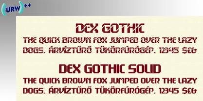
- Deep Space by URW Type Foundry,
$39.99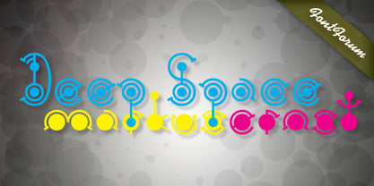
- DNP Shueitai by DNP,
$225.00 Shueitai is a typeface that has been undergoing development for more than a century, starting from the days when Dai Nippon Printing Co., Ltd. (DNP) was still known as Shueisha. As Japan underwent rapid modernization during the early years of the Meiji era, Shueisha, believing that printing was a business befitting a modern civilized society, began operations with a focus on letterpress. Before long the company expanded into developing its own typefaces. In 1912 it completed a full range of Mincho type, in sizes from Sho-go (#0 size, 42pt) through Hachi-go (#8, 4pt), which it called "Shueitai" a new style that came to form one of the two mainstreams of Japanese typefaces and continues to have a significant influence on font design even today. The Shueitai typeface is distinguished by abundant variations matching the size of type and the changing demands of the times. Whether it is the spirited and powerful Sho-go, the delicate and flowing San-go (#3, 16pt), or the bright and solidly reassuring Shuei-Mincho L, all Shueitai typefaces share a vibrant brushwork that adds an expression of eloquence and a burst of brilliance to every printed word. Currently, Shueitai is composed of 17 kinds of fonts useful for various purposes. The world has witnessed vast changes in the environment surrounding the printed world, with the tran-sition first from letterpress to Desktop Publishing, and most recently to e-books. But no matter how this environment might evolve, the written word remains the basis of communication, and the importance of beautiful and readable typefaces stays unchanged. In preparation for the changes that will inevitably come during the future, DNP will continue to evolve the Shueitai designs from now on. Through its continual reinvention, Shueitai, a typeface consistently adopted at the vanguard of the industry, perhaps represents Japanese innovation at its very best.
 - Del Norte by Scriptorium,
$12.00 - Dez Petranian by Dezcom,
$40.00 Dez Petranian is a story-telling fantasy friendly family of fonts. It is a warm face that looks like the spoken word, perfect for tall tails, fantasy-world adventure books, creative writing, and poetry. Dez Petranian includes multiple language support, nearly 1,200 glyphs, stylistic sets, and many alternates. Think of it as a warm souvenir of real story writing.
 - Flagellum Dei by Hanoded,
$20.00 Flagellum Dei is Latin for ‘The Scourge of God’. It is a title given by later generations to Attila the Hun (406-453 C.E.). Flagellum Dei is also a rather scary font, which I made with the use of a stiff brush and some China ink. Of course you could use this quite versatile font to scare the bejesus out of your friends, but I’d much rather see it used on book covers, posters and album artwork. Flagellum Dei comes with a horde of diacritics.
 - Chintzy CPU BRK - Unknown license

- Binary CHR BRK - Unknown license

- Chintzy CPU (BRK) - Unknown license

- Quoi Chou NF by Nick's Fonts,
$10.00The letterforms of Lucien Bernhard's stylish, if somewhat anorexic, Bernhard Fashion were beefed up and complemented with thick-and-thin stroke variation to create this elegant family, available in normal and bold weights. Additionally, Bernhard's variant forms have replaced several of the letters which commonly appear in other revivals. The Postscript and Truetype versions contain a complete Latin language character set (Unicode 1252); in addition, the Opentype version supports Unicode 1250 (Central European) languages as well. - Chi Town NF by Nick's Fonts,
$10.00A 1931 poster for the film The Man from Chicago provided the pattern for this quirky Deco delight. Although the fonts is all uppercase, tasty variants have been added in the lowercase positions, and all possible letter combinations have been kerned, so you can mix the forms freely. This font contains the complete Latin language character set (Unicode 1252) plus support for Central European (Unicode 1250) languages as well. - P22 Tai Chi by IHOF,
$24.95 Experimental lettering Stephen Rapp created in 1999 became the spark that Stephen's imagination transformed into the Tai Chi design. Tai Chi is a display face but it could also be used as a textured calligraphic script. Its delightful sense of movement distinguishes it from other scripts. Individual characters stand poised in a vertical Zen-like balance while at the same time displaying an inner rhythm that makes them appear to dance along the line. Rich in texture and variation, Tai Chi works very well at medium and large point sizes. The font contains several alternate letters that help maintain a hand-lettered look. Tai Chi includes both upper and lowercase letters but works well in all uppercase settings.
 - HU Milksherbet by Heummdesign,
$15.00 This typeface was inspired by milk sherbet, which is enjoyed cold on a hot summer day. Rounded shapes and soft stroke endings make the typeface look cute. Heavy works great for headlines with its extra-heavy stroke weight and size, while Regular and Light are best for body text.
 - HU Cookie by Heummdesign,
$15.00 English HU Cookie is a cute handwritten typeface that can be used to express any lively or active moment. The alphabets are not aligned or evenly written but are crooked like scribble, which gives you funny and informal vibe. There are 2 weights of HU Cookie : light, semi bold Greek Το HU Cookie είναι μια χαριτωμένη χειρόγραφη γραμματοσειρά που μπορεί να χρησιμοποιηθεί για να εκφράσει οποιαδήποτε ζωντανή ή ενεργή στιγμή. Τα αλφάβητα δεν είναι ευθυγραμμισμένα ή ομοιόμορφα γραμμένα, αλλά είναι στραμμένα σαν σκαρίφημα, κάτι που σας δίνει αστεία και ανεπίσημη ατμόσφαιρα. Υπάρχουν 2 βάρη του HU Cookie: light, semi bold Cyrillic HU Cookie - это симпатичный рукописный шрифт, которым можно обозначить любой живой или активный момент. Алфавиты не выровнены и написаны неравномерно, они изогнуты, как каракули, что создает забавную и неформальную атмосферу. HU Cookie имеет 2 толщины: light, semi bold
 - HU Handwrite by Heummdesign,
$15.00 It is a handwriting-style font for body text that emphasizes gentleness and solidity by using less curvature and making use of a straight feel. The handwriting feeling is emphasized through the style that makes use of the natural bending and stroke order. Softness was added in the shape of a gentle curve, and perspective was applied by setting a vanishing point in the lower left corner.
 - HU Blackout by Heummdesign,
$15.00 HU Blackout is a typeface for titles that feels like letters are trapped in a square and has a constant and very narrow inner space. It is composed of three types of family typeface to increase usability.
 - HU Roundsans by Heummdesign,
$280.00 HURoundsans is a geometric sans serif variable typeface with matching italics. It has a variable width that adapts to your needs, pushing for maximum readability. Useful for any quirky display uses. Variable is very versatile and can be used in print or on-screen environments. It's perfect for logos, posters, titling, UI/UX design, visual identity, social media, music cover art etc. * Specifications : Files included : Variable including italics Multi-language support
 - HU Suryeo by Heummdesign,
$15.00 HU Suryeo is a new typeface of Heumm's calligraphy that takes the motif from carefully written calligraphy. It follows the calligraphic shape of Korean classics and can be used for titles and body text without distinction. The stroke thickness, strength, and degree of bending were set differently for each style. The thinner it is, the sharper it is, and the thicker it is, the blunt and round it is.
 - HU Malrang by Heummdesign,
$30.00 'HU Malrang' is a font that gives a round and soft feel to its tightly packed modules. This font has a variable function, allowing users to fine-tune the thickness they want. (Available only in Adobe programs.) Six basic weights are provided so that they can be used even in programs that do not apply the variable function.
 - HU Makingfilm by Heummdesign,
$15.00 HU Makingfilm gives a solid feeling of a full module, and it is a font that adds softness by rolling the angled part.
 - HU Geulwoll by Heummdesign,
$15.00 Geulwoll is a Korean word for letters. HU Geulwoll is a handwritten font that conveys a calm feeling by creating a lyrical and old atmosphere. In order to emphasize the feeling of writing with a marker, each end was made to fall diagonally, a characteristic of the marker. It is a highly readable font with a curve applied to the bent part to save the stroke order. There is 1 weight of HU Geulwoll : Medium
 - HU Cheonggye by Heummdesign,
$15.00 HU Cheonggye is a typeface for titles with thick strokes and wide flats, mainly produced with a retro feel. In order to bring out the characteristics of the retro typeface, a difference in thickness between horizontal and vertical strokes was applied, and obtuse right-angled serifs were applied.
 - HU Ketchup by Heummdesign,
$15.00 HU Ketchup is special headline font that has waving strokes like script font. It can be used to stress out something important, and for any artwork that has retro vibe. It also looks good with food packaging, so it has diverse usage. HU Ketchup - это особый шрифт заголовка, который имеет волнистые штрихи, как шрифт скрипта. Его можно использовать, чтобы подчеркнуть что-то важное, а также для любых произведений искусства в стиле ретро. Он также хорошо смотрится с пищевой упаковкой, поэтому имеет разнообразное применение. Το HU Ketchup είναι μια ειδική γραμματοσειρά επικεφαλίδας που έχει κυματοειδείς πινελιές όπως γραμματοσειρά σεναρίου. Μπορεί να χρησιμοποιηθεί για να τονίσει κάτι σημαντικό και για οποιοδήποτε έργο τέχνης έχει ρετρό ατμόσφαιρα. Φαίνεται επίσης καλό με τη συσκευασία τροφίμων, επομένως έχει διαφορετική χρήση.
 - HU Hikiki by Heummdesign,
$15.00 English HU Hikiki is a unique typeface with a tilted initial consonant, giving it a feeling of lying down and a sense of rhythm due to its large height. The combination of long vowels compared to small consonants adds to the feeling of handwriting. There are 1 weights of HU Hikiki : Medium Greek Το HU Hikiki είναι μια μοναδική γραμματοσειρά με ένα κεκλιμένο αρχικό σύμφωνο, δίνοντάς του μια αίσθηση ξαπλωμένης και μια αίσθηση ρυθμού λόγω του μεγάλου ύψους της. Ο συνδυασμός μακριών φωνητέρων σε σύγκριση με μικρά σύμφωνα προσθέτει στην αίσθηση του γραφικού χαρακτήρα. Υπάρχουν 1 βάρη hu Hikiki: Μέσο Cyrillic HU Hikiki – уникальный шрифт с наклоненным первоначальным согласоном, дающий ему ощущение лежания и ритма благодаря своей большой высоте. Сочетание длинных гласных по сравнению с небольшими согласные добавляет чувство почерка. Есть 1 вес HU Hikiki : Средний
 - HU Noodles by Heummdesign,
$15.00 HU Noodles is a latin alphabet font. This is a stencil-type font designed by drawing with one brush and following the stroke order. It is characterized by rounded strokes and a tight square shape. It is recommended to use it for characteristic titles.
 - HU Storyserif by Heummdesign,
$15.00 HU Storyserif is a textual font in the form of a slab serif and contains a concise and neat feeling through the round conclusion of straight lines and lines. It is a typeface designed to contain a distinctive feeling by adding a round topknot, not a typical square topknot of slab serif, and a gothic solidity through a straight straight line. There is 1 weight of HU Storyserif : Regular Features : Uppercase & Lowercase Numbers & Puncuatuion Multilanguage 882 Glyphs
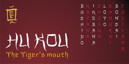
 - Hu Kou by Corradine Fonts,
$29.95