10,000 search results
(0.052 seconds)
- Throrian Commonface - 100% free

- Letters - Unknown license

- MachineScript - Unknown license

- TagettesPlus - Personal use only

- Héloïse - Unknown license

- Porcelain - 100% free

- Easter Parade - Unknown license

- Tristan - Unknown license

- Ringbearer - Unknown license

- RoboKoz - Unknown license

- Paulinho Pedra Azul - Unknown license

- Tips by Linotype,
$29.00The symbol family Tips, (which stands for “Type-Image-Piktogramm-Schrift” in German, or type-image-pictogram-font in English) contains six different fonts of pictograms and stylized icons. Tips Active is full of sports pictograms, which are similar to those that were designed for the 1972 Olympic Games in Munich. Tips Astro contains astrological signs. Tips BCom depicts icons for use in business communication or web design. Tips Count is a font featuring numbers inside of various circles. Tips This Way and Tips Travel are both collections of pictograms for use in navigation and other signage systems. - Medieval Sorcerer Ornamental - Unknown license

- Rasgos Escritura Nuevos by Intellecta Design,
$16.00 a sort of decorative fleurons
 - Overline Stencil by WAP Type,
$15.00 Overline Stencil font is perfect for your up coming projects. Such as logo branding, editorial design, fashion, stationery design, sport design, blog design, modern advertising design, card invitation, art quote, home decor, book/cover title, special events and any more.
 - Esquina by Green Type,
$37.00 Esquina is a family of octagonal slab serif fonts. Designed for use in outdoor advertising, branding, packaging. Esquina is also ideal for sports related materials such as team logos, flyers, posters and more. Esquina contains Latin, Cyrillic and Greek glyphs.
 - Ft Thyson by Fateh.Lab,
$30.00 FT Thyson is a powerful and elegant display typeface. can be used to present your ideas in sports/fitness or editorials, Its weight is superior in posters, social media, headlines, titles, large format print - and wherever you want to be noticed.
 - Stencil Army by WAP Type,
$15.00 stencil army font is perfect for your up coming projects. Such as logo branding, editorial design, fashion, stationery design, sport design, blog design, modern advertising design, card invitation, art quote, home decor, book/cover title, special events and any more.
 - Protonema by Tigade Std,
$25.00 Protonema is inspired by a strong and sharp motivational spirit to always look positively for achieving goals. It is suitable for any sports and related theme for widely range of usage. Such as logos, branding, magazine, label and many more
 - LCS Amsterdam by Mevstory Studio,
$25.00 LCS Amsterdam is a condensed sans-serif typeface, inspired by college sports and football (soccer) jerseys. Features both outline and regular solid fill versions. Perfect for titles and headlines, included are uppercase and lowercase letters, numbers, symbols and European language support.
 - Ravenda by Typehand Studio,
$14.00 Ravenda is a modern, all caps display font. Made for giving titles an extra punch, ravenda packs a full set of capitals, number and punctuation. Be it gigs, sport events, logo design or etc. Ravenda was made to bring impact.
 - Beginner by VladB,
$14.00 Beginner is a modern sans serif geometric font, includes upper and lower case characters, Latin and Cyrillic. Graphically, the characters have uniform thickness. Rounded corners give visual softness to fonts Intended use - infographics, design in technical areas, architecture, industry, sport.
 - Western Bevel JNL by Jeff Levine,
$29.00Western Bevel JNL smooths out the ornate design of Stablehand JNL to offer a cleaner slab serif font that retains its Western wood type feel. Aside from Western themes, it can be applied to sports team promotions and other nostalgic projects. - Logik by Monotype,
$25.00 Logik is a futuristic square sans serif typeface. Its personality is defined by squared-off corners that you would normally expect to be rounded, this sharpness gives the glyphs an eccentricity that the eye quickly adjusts to. Sharp, incised/stylised ink traps along with slightly tapered/curved horizontals and verticals add to the character of each letterform. These subtleties combine to give Logik a distinctively futuristic aura. Logik’s main use would be for headlines, short runs of text, branding and display purposes – ideally suited for film and book titles, Logik could be widely used for sports, media and recreation purposes also. Logik comes in 7 weights (from Thin to Black) across 3 widths – Regular, Wide, and Extended. Each font covers all European Latin-based languages and includes Old Style Figures, Small Caps, and some Case-Sensitive Forms. Key features: 7 Weights in Roman and Oblique 3 Widths – Regular, Wide, Extended Small Caps Old Style Figures European Language Support (Latin) 550+ glyphs per font.
 - Whiplash by 38-lineart,
$16.00 Whiplash is a natural handwritten font with firm strokes as the main character. All-caps and mixed-match are the main concepts of this font, where the uppercase and lowercase can be pair according to your taste. This font has a very strong and very prominent character that will distract the eyes. This is a great choice when used as a title on banners, posters, book titles and even magazine covers. Modern lifestyle brands such as fashion, cosmetics, and outdoor sports are also a trend to use this font style. You who like travelling can also try to write a caption or quote, people are increasingly curious about the mystery of your adventure and short notes. Besides being equipped with multi-language, we also equip ligature such as ee, ll, gg, oo, ss, tt, pp, rr. Enjoy our fonts, and make sure your brand will stand out and invite people to take a closer look.
 - Leophard by Arterfak Project,
$16.00 Create a great combination design with this font family! Leophard font family is a modern slab serif that is inspired by sporty design and vintage style. There are 6 different styles that you can apply in your design projects. This font is made with tenacious basic shapes, the visuality of strength, old school movement, and modern minimalist style. - Regular style - good for your titles, sub-headlines or body text for readability. - Bold style - recommended for your titles, naming, labels or logos. - Bold inline style - is cool for your big typographic designs that are showing the precision of the shapes. - Outline style - good for your additional text, or minimalism design purposes. - Shadow style - suitable for vintage logos, minimalist effects, and titles. - Stencil style - inspired by street art and letterpress design. Recommended for design project which visualizes strength and movement. Make a great combination on your label designs, brand, poster headlines, movie titles, storefront, monograms, sport designs and merchandise design.
 - Vialog Signs by Linotype,
$29.99The 14 symbol and arrow fonts in Vialog Signs were designed to accompany Vialog, a specially developed font family for the transportation industry and information systems typography. These functional and clever signs harmonize with the Vialog alphabets perfectly and they can also be used on their own or with other fonts. The extensive sets have not only the symbols for common transportation industry requirements, but also symbols for the numerous electronic and sporting devices of modern life. Included are four weights of arrows (to match the weights of the Vialog fonts), Sport Signs, Conduct Signs, Communication Signs, Community Signs, Direction Signs, and Transport Signs. - Daytona by Monotype,
$50.99 The Daytona™ typeface family grew out of a desire to provide improved fonts for use in televised sporting events. Jim Wasco drew the design as sturdy squared letters based on humanist shapes and proportions. Letters were kept narrow for economy of space, and inter-character spacing was established for easy reading. While televised sporting events may have initially been his target, the design considerations he incorporated into the Daytona family also enabled it to perform well in a variety of other video and on screen environments. Daytona Variables are font files which are featuring two width axes and have a preset instance from Thin to Fat.
 - Display Prominent by Gerald Gallo,
$20.00 Display Prominent is a display font not intended for text use. It was designed specifically for display, headline, logotype, branding, and similar applications. In place of a lowercase there are short caps that are centered horizontally on the tall caps. There are also short numbers, punctuation, and miscellaneous characters.
 - Chilada by Image Club,
$29.99Chilada is an outrageous display family by designer Patricia Lillie for Image Club. Across four versions, the decorate treatment inside Chilada's letters becomes more intense. Chilada characters exude an energy of their own. Their design could be described as a cross between Bank Gothic and Neuland, with a spoonful of funk mixed in. Big and chunky, Chilada's forms are made up of straight lines only. There are no curved elements. The resulting design is angular and cuts a good figure on the page. Of the Chilada family's four members, the basic font is named Chilada Uno. Uno is Spanish for one!" The forms of Chilada Uno's letter are solid black-or whatever color you choose to set them in! Chilada Dos, Tres, and Quatro each offer their own decorative treatments: Chilada Dos's letters sport a zigzag inline, Chilada Tres is decorated or an ornamented leaving leaves more black from the letters than white, while Chilada Quatro's level of decoration is just crazy. Its letters are made up more more from white space than from black marks. Chilada Quatro is almost an outline font!" - Mirabel by Canada Type,
$24.95 Mirabel is based on the handwriting of Beverly Bouwsma (Philip's mother), which she developed in the 1930s in, as she puts it, an act of teenage rebellion. In the 1960s, Philip gave her a broad-edged Osmiroid fountain pen which she took to immediately and has used ever since, along with the computer fonts he made from her script. Since Beverly Bouwsma mixed loops and straight ascenders, two interchangeable fonts have emerged, a formal package that sacrifices some flamboyance for classical balance and legibility, but retains the quality of the writing and celebrates the personality of its creator. The Mirabel fonts are available in all popular font formats, and the character sets cover a wide range of codepages, including Central and Eastern European languages, Esperanto, Turkish, Baltic, Celtic/Welsh.
 - Tire Swing BB by Blambot,
$6.00 Tire Swing BB is lighthearted without being silly. It's whimsical without being cliche. It's a body copy font, or great for headers, and includes lots of European characters.
 - Saskya by Dear Alison,
$29.00 While I was in Boston in 2014, I visited the Museum of Fine Arts and to my good fortune there was an exhibit of etchings by Rembrandt, one of my favorite artists. As to be expected, many were simply gorgeous, but one especially caught my eye. It was an etching of a priest (Jan Cornelis Sylvius, Preacher) with an extensive amount of writing in Latin. While I'm not certain that it was Rembrandt's own hand, the script was beautiful and I was fascinated by it because it had to be written on the etching plate in reverse. I snapped a few photos using my phone and later found other editions on line. I was so taken by the script that it begged me to create a modern typeface from it. The result is Saskya, named after Rembrandt's wife Saskia. There were many ligatures and glyph variants in the print, of which I captured many of them and made them accessible via OpenType features. The complete alphabet was not present in the sample, however, I discovered some other source material to sensitively fill in those gaps, with a remaining last few that I created myself. A truly romantic hand, Saskya will work well for invitations of many sorts, and when you're looking for that 'old thyme' scripty feeling in your graphics.
 - ITC Flora by ITC,
$40.99ITC Flora is the work of Dutch designer Gerard Unger, and is named for his daughter. He started by doing calligraphy experiments with felt-tip and ballpoint pens, and developed these drawings into a formalized script typeface. Swiss typographer Max Caflisch advised the Dr.-Ing Rudolf Hell GmbH technology firm to add a new round-nibbed script face to their Digiset type library, and in 1984, Flora was released by Hell. Unger used a chancery cursive skeleton in this design, which imparts grace and movement. Flora was also intentionally designed to be simple and sturdy, and with its minimal variation in thick/thin stroke ratio, it worked well on the early digital typesetting machines. In 1989, the International Typeface Corporation released the font. ITC Flora continues to work well on current printers and typesetters, and it has an enduring popularity for uses that range from short text passages to display headlines. - Scribal by Loaded Fonts,
$15.00Designed with help and inspiration from legendary tattoo artist Dustin Horan. This beautiful time saver was designed specifically for skin application. Short words and initials can instantly be turned into seamless tribal style tattoos. Each glyph links with the next allowing letters to flow endlessly around limbs and in circles. Respecting the rhythm and geometry principles laid forth by American pioneering tribal artist Leo Zulueta, Scribal makes flowing text shapes that disguise themselves as design. When mirrored back to back and rotated vertically, Scribal becomes well-crafted tribal pattern. Typeface wise, Scribal breaks the mold. While a script font, Scribal was designed to be written in all capitals. Each capital is a mono-spaced glyph, providing even spacing. The shape influences are also vast, ranging from scripts, to blackletters, to romans. Making Scribal a very "Americanized" font, reflective of this "Americanized" style of Tribal Tattooing. - KG Change This Heart by Kimberly Geswein,
$5.00 Short, wide thin-stroked writing. Although handwritten, it is a very clean style.
 - Easy Ornaments by Intellecta Design,
$17.50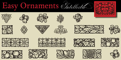 a sort of classic typographical ornaments
 - Zombie Drip by Adita Fonts,
$11.00 Zombie Drip is a hauntingly bold font that will send shivers down your spine. This spine-chilling typeface features a unique dripping effect on each letter, giving it an eerie and macabre appearance. With its thick and powerful strokes, Zombie Drip commands attention and creates an atmosphere of suspense and horror. Perfect for Halloween designs, horror-themed projects, or anything that needs a touch of creepy allure, Zombie Drip adds a bone-chilling twist to your typography. Let the letters drip with fear!
 - Bordonaro Spur by Estudio Calderon,
$35.00 Bordonaro Spur - Bordonaro Script’s partner - is a typography strongly influenced by old beer labels and includes some serifs based on Frederic W. Goudy’s Copperplate, but with some softened spurs adding an elegant and soft texture to the text. It is ideal to be used on large bodies and has a set of special ligatures ideal to be used in branding. Psss...Check out the NEW Bordonaro Spur with Rounded corners , same version but soft! FEATURES Co = company1 Co = company2 Estd = established Inc = incorporated Ltd = limited Mc = mac Rd = Road St = street And also from Adobe CC you can activate Style Sets (SS) and get ideal ligatures for ordinal numbers: 1st = st 2nd = nd 3rd = rd 4th = th Bordonaro Script and Bordonaro Spur are two typographic styles that were designed under the same characteristic features with the idea of combining them to obtain better results, for that reason, we recommend merging them in a creative way and you will realize everything you can design with them. The banners designs are based on old brands of beer labels, coffee packaging, sports logos and in some cases we use Copperplate Gothic but only as a complementary font in order to harmonize the layout of the elements in each banner.
 - Matcha by Los Andes,
$59.00 We decided to explore the concept of fitness, but from a more natural perspective. With so many people drinking detox drinks and eating raw food, we were inspired to create a font that mixes the ‘strength’ of sports and the organic nature of natural products. The result is ‘Matcha’: a strong and energetic typeface that also flows at the same time. Matcha consists of a stable, very friendly Slab face and a calligraphy Script with a handmade style: spontaneous and fickle with some reverse-contrast alternative characters. Can you guess who is the designer behind each style? The duo contains OpenType features and is perfect for labeling natural products, cookbooks, magazine photography, fashion & beauty magazines covers, health & fitness publications, and more. For both print and digital communication. Matcha: the new black coffee!


