10,000 search results
(0.061 seconds)
- Phantom Gas by Hatftype,
$17.00 Is a spooky comic display font with all caps format and distinctive handwritten characters perfect for branding projects, logos, wedding designs, media posts, advertisements, product packaging, product designs, labels, photography, watermarks, invitations, stationery, and any project who need handwritten dishes. Features : Uppercase & Lowercase Multilingual support Number Symbol Punctuation Support in Mac and Windows OS -Support in design applications (photoshop, illustrator, and more) I really hope you enjoy it.
 - Tinman Pro by No Bodoni,
$35.00 TinmanPro is a mildly stressed humanist sans serif type based on the University of California Oldstyle type designed by Frederick Goudy. The design captures the warmth and friendly character of Goudy�s original in a monotone sans. Broad Latin support along with small caps, fraction support and other typographic niceties are included in the ten font family. Weight range includes Regular, Medium, DemiBold, Bold and ExtraBold with matching italics for each.
 - Luckiest Guy Pro by Stiggy & Sands,
$29.00 Our Luckiest Guy Pro was inspired by hand-lettering by vintage 1950’s advertisements. The uber-bold unicase letterforms exude charm and light-heartedness, while the SmallCaps and extensive figure sets expand the range of usability and appeal. Opentype features include: - SmallCaps. - Full set of Inferiors and Superiors for limitless fractions. - Tabular, Proportional, and Oldstyle figure sets (along with SmallCaps versions of the figures). - Stylistic Alternates for Caps to SmallCaps conversion.
 - VeraCruz BT by Bitstream,
$50.99Introducing VeraCruz BT, a fanciful display typeface by Ray Cruz. A tasteful, flair serif design, VeraCruz BT is available as an OpenType font. By selecting the Contextual Alternates feature in OT savvy applications, many of the cap and lowercase characters will change automatically as you type to give the text an informal, animated look. There are also tabular and proportional figure sets, and the extended glyph set supports Central Europe. - Cogenta Text by SRS Type,
$25.00 Cogenta Text is a geometric sans-serif typefaces. It showcases reduced contrast and a more neutral appearance compared to the lowercase joint of Cogenta. Its low cap height makes it an ideal choice for mobile and web applications. Precise kerning enhances readability, ensuring a satisfying user experience. Cogenta Text effortlessly complements diverse design applications, including logos, branding, posters, editorial design, websites, and more, consistently delivering exceptional quality results.
 - Brushine Collection by Trustha,
$17.00 Brushine Collection is a solid and complementary pair consisting of a serif all caps, with contrasting letter thickness and sharp edges making it more elegant and classy. As well as a handwritten script that look natural because they are made with marker by hand. All together your text will be beautiful, elegant and classy. Suitable for all creative projects, especially on, branding, advertising, product design, social media, and more.
 - Aeris by Linotype,
$29.99 Aeris™ typeface is a contemporary book face created by the American designer Tom Grace. It combines the proportions and rhythm of a sans serif font with the high contrasts and flexed strokes of script faces, while the open counters also ensure optimal legibility. Tom Grace focuses on providing subtle differentiations in his cuts and, as a consequence, this font family has its own individual structure: there are A and B variants of the basic forms regular, italic, bold and bold italic, and a display version for use in titles that also comes in A and B variants. It is advisable to use the A variant for larger font sizes, while the slightly more emphasized B variant can be recommended for smaller font sizes. Where the basic forms are to be mixed together in a work, it is important to use the corresponding A/B variants throughout as their designs have been carefully coordinated. Aeris is available in the OpenType Pro format and thus includes a wide range of different glyphs. The font family can be used in various environments, such as books, magazines, advertisements and promotional materials, but it is also the perfect choice for printed corporate documentation.
 - Maiandra by Galapagos,
$39.00The Maiandra family of typefaces were inspired by an early example of Oswald Cooper's hand-lettering, as seen in an advertisement for a book on home furnishing, circa 1909. Although many of Oz Cooper's letterform designs were cast in metal type, this particular one was not. Cooper's design itself was inspired by examples of letterforms he had admired in his study of Greek epigraphy (inscriptions). Cooper combined those ancient forms with the flair characteristic of design styles of his time. The result was an attractive design possessing subtle, purposeful irregularities, or "meanders" in his skilled brushwork. The Cooper design exhibits a unique warmth and harmony in text, while presenting a compelling rhythm, color and texture on the page. "Realizing the presence of this uniform warmth and readability," notes Dennis, "I decided to expand the design into a family of three weights with companion italics." The weights for the Maiandra family were selected for their versatility in usage over a broad range of output device resolutions. Indeed, "the consideration of eventual display resolutions, be they for screen or printer, provided the greatest challenge in the design of this typeface family," explains Dennis. Creating shapes that conform to the rigors of digital letterforms and modern rendering environments, without losing the unique characteristics of Oz Cooper's original design, is what Dennis has accomplished with his tribute to this great designer of the past. Maiandra, whose name derives from the Greek 'maiandros', meaning 'meander,' is intended for extended text use, as well as for informal subject matter, such as business correspondence, brochures and broadsides. "An example of a good use for Maiandra," notes Dennis, "is in printed matter relating to the turn-of-the-century art period known as the Arts and Crafts Movement. It can stand alone or be used with designs that complement its shape and color." - Beauty Swing by Din Studio,
$29.00 Hi, Everyone! Want a font to make your branding bold? Are you trying to make a stylish statement with your projects? We've got what you want. Introducing Beauty Swing- A Serif Font A fabulous, elegant, and modern serif font that’ll engage your audience and make your branding stand out. This stylish font can be used for a host of different content needs and projects. Perfect for social media branding projects, fashion designs, printed quotes, or even as a stylish text overlay to any background image and many more! Beauty Swing includes Multilingual option to make your branding reach a global audience. Features: Standard Ligatures Stylistic Sets Multilingual Support PUA Encoded Numerals and Punctuation Thank you for downloading premium fonts from Din Studio
 - Comic Tantrum by David Engelby Foundry,
$25.00 Comic Tantrum is a versatile font – you can use it for headline posters, for infographics, for web pages or other media, when you need an expressive comic font. And you can skew it and squeeze it. It also has many special designed alternates, swash versions and ligatures. Have fun!
 - Qilla by Herlan Nawwi,
$10.00 Qilla is a simple and elegant font for your projects. Can be used for various purposes such as headings, logos, wedding invitation, t-shirt, letterhead, signage, labels, posters, badges etc. Qilla comes with two styles, upright and slanted version can be an alternative choice to suit your needs.
 - Aryaka by Letterafandi Studio,
$14.00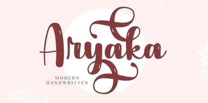 Aryaka is a modern handwritten font. It can be used for various purposes such as logos, wedding invitations, headings, t-shirts, letterhead, signage, labels, news, posters, badges and so much more. Aryaka is PUA encoded which means you can access all of the glyphs and swashes with ease!
 - Comfort by Jehansyah,
$9.00 short and bold font, cute and looks professional and a nuanced logo font that you can customize with the elegant look you want there are several alternatives that you can use and combine, and there are italics to make it easier for you to work on your design project
 - Bogitha by Letterafandi Studio,
$14.00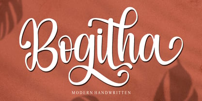 Bogitha is a modern handwritten font. It can be used for various purposes such as logos, wedding invitations, headings, t-shirts, letterhead, signage, labels, news, posters, badges and so much more. Bogitha is PUA encoded which means you can access all of the glyphs and swashes with ease!
 - Wulf Utility by Device,
$29.00 Wulf Utility is a heavily degraded font that evokes information in a utilitarian manner without any pretence to elegance, fuss or refinement. Gruff and direct, it is about as basic as a font can be. The Dirty version can be layered over the Rough version for two-tone effects.
 - Jassime by Nian Keun Studio,
$12.00 Jassime is an elegant serif font with beautifully crafted characters following the trend so you can use them very well. You can use Jassime in graphic designs, magazines, logos, identity branding, fashion brands, clothes, and many others. Thank you for coming to my shop and enjoying other fonts.
 - Shinigami by Hoperative Design,
$19.00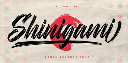 Shinigami is modern brush script font. It has a classy, elegant and modern look that can be used for T-Shirt, branding, invitations, Poster, wedding designs, social media posts, and much more! Shinigami Features : Ligature Stylistic Alternates Swash PUA encoded which means you can access all glyphs Multilingual Support
 - Lavana by Nirmalagraphics,
$12.00 Lavana is made with a style brush. If you like natural fonts in a bold and handwriting style, you must have it. You can use Lavana for any needs, can be for logos, flyers, magazines, clothes, business card brochures and others. Lavana is also equipped with multi-lingual support.
 - Kaminari-Kun by Julmeme,
$25.00 Kaminari-Kun is a typeface that has a very strong and unique impact. With its iconic saw-toothed design, characters can fit into each other and can be associated to create an modern and electric design. Applicable for any type of graphic design, especially for posters and logotypes.
 - Densmore by Typodermic,
$11.95 “Break on through to the other side” of design with Densmore, the typeface inspired by The Doors. Created with geometric shapes and a hand-drawn touch, this font pays homage to the band’s iconic logo. Featuring three styles, including the regular, blue, and pink, Densmore is perfect for any creative project. Take your design to the next level and experiment with layer effects by offsetting and changing colors. And with ligatures that automatically replace double lowercase “o” combinations with a mirrored “oo” combo, you can add a touch of cool to any project. “Light my fire” and download Densmore today! Most Latin-based European writing systems are supported, including the following languages. Afaan Oromo, Afar, Afrikaans, Albanian, Alsatian, Aromanian, Aymara, Bashkir (Latin), Basque, Belarusian (Latin), Bemba, Bikol, Bosnian, Breton, Cape Verdean, Creole, Catalan, Cebuano, Chamorro, Chavacano, Chichewa, Crimean Tatar (Latin), Croatian, Czech, Danish, Dawan, Dholuo, Dutch, English, Estonian, Faroese, Fijian, Filipino, Finnish, French, Frisian, Friulian, Gagauz (Latin), Galician, Ganda, Genoese, German, Greenlandic, Guadeloupean Creole, Haitian Creole, Hawaiian, Hiligaynon, Hungarian, Icelandic, Ilocano, Indonesian, Irish, Italian, Jamaican, Kaqchikel, Karakalpak (Latin), Kashubian, Kikongo, Kinyarwanda, Kirundi, Kurdish (Latin), Latvian, Lithuanian, Lombard, Low Saxon, Luxembourgish, Maasai, Makhuwa, Malay, Maltese, Māori, Moldovan, Montenegrin, Ndebele, Neapolitan, Norwegian, Novial, Occitan, Ossetian (Latin), Papiamento, Piedmontese, Polish, Portuguese, Quechua, Rarotongan, Romanian, Romansh, Sami, Sango, Saramaccan, Sardinian, Scottish Gaelic, Serbian (Latin), Shona, Sicilian, Silesian, Slovak, Slovenian, Somali, Sorbian, Sotho, Spanish, Swahili, Swazi, Swedish, Tagalog, Tahitian, Tetum, Tongan, Tshiluba, Tsonga, Tswana, Tumbuka, Turkish, Turkmen (Latin), Tuvaluan, Uzbek (Latin), Venetian, Vepsian, Võro, Walloon, Waray-Waray, Wayuu, Welsh, Wolof, Xhosa, Yapese, Zapotec Zulu and Zuni.
 - Floral Decay by Mircea Boboc,
$22.00 This is Floral Decay, your seasonal autumn font with jaded, weathered, and earthy contours of rustic lettering. As they blend into words, the characters evoke floral arrangements of a decaying beauty. It is versatile, playful, and perfect for Graphic Design decorations! This font is unique because, in order to create it, I had to answer some tricky questions: What makes autumn… autumn? Capturing the essence of the other seasons into your letters comes easier. For instance, in order to suggest summer, you only need to draw a few flowers. How about autumn? You could garnish your letters with a few grapes, you might think, but it would only result in a grape-themed font. The notion that is more directly associated with autumn is the image of falling and withering leaves, which brought me to the second question. How exactly are you going to create something beautiful out of a somewhat morbid premise, like wilted leaves? Well, I soon realized that by creating a handwritten font and preserving the right imperfections, you can actually portray collateral beauty. In this context, asymmetry is important because it suggests decay. Further on, the design concept required the letters to come very close together, so that every typed word can be regarded as a floral arrangement. How close together, though? As much as possible without confusing one with the other, risking a lack of legibility. Therefore, in contrast with the demo version of this font, this actual version provides the ideal kerning.
 - XRoomingHouse by Ingrimayne Type,
$9.95 XRoomingHouse is a typeface of pictures that I did many years ago. Most of the pictures are border elements, and within a set they can be combined to make borders or frames. There is no real style consistency in the font—it is an eclectic collection of elements. (Minor corrections and additions were made in 2018 to improve sets that can form frames. For a more ambitious attempt at a font that can form frames, see Framealot). As for the name, boarders stay in a rooming house.
 - Abrakadabra by Tolya Doodko,
$18.00 Abakadabra is a headline typeface inspired by sans-serifs of the first half of the twentieth century, as well as by the tricks of fakirs, illusionists and charmers. The gently playful manner of the font can be exaggerated to a more pretentious and grimacing one, or can alternatively be calmed to a neutral appearance. Abrakadabra supports most European languages and has thematic emoji symbols. The text can be customized by using stylistic sets or the Swashes and the Stylistic Alternates buttons in the OpenType panel.
 - Hurtmore by Invasi Studio,
$19.00 Do you want your visuals to be louder? Hurtmore typeface can make your visuals more powerful. A fun handwritten design with a realistic scribble style. It can add a sense of loudness and boldness to your visuals. Hurtmore also features a unique stylistic alternating character. You can mix and match it however you like! It is perfect for packaging, posters, quotes, editorial, and branding projects that need a bold impact. Features: - Total 232 Glyph - Uppercase - Alternates & Ligature - Numerals & Punctuation - Multilanguage Supports 60+ Latin based languages
 - Copperplate Wide by Wiescher Design,
$39.50 Copperplate Wide is remotely based on the traditional Copperplate typeface that can be seen on many business cards. I have completely redrawn the typeface in a much wider version and without those stubby little serifs. In the place of the lowercase letters I put a very slim version of the font to give you more options. You can either use the wide letters or the narrow ones – or – you can mix both to get something completely new. It works great! Your forever inventive type designer - Gert Wiescher
 - Diaper Money by Fonthead Design,
$19.00On October 15, 2006 we became proud parents of three babies. To commemorate (and help pay for diapers) I decided to release this baby-themed dingbat set. All proceeds for the next few years goes to pay for lots and lots of diapers. - Supertuba by Tipos Pereira,
$10.00 Supertuba is a :) geometric sans vernacular humanist :) display type family with 6 weights. There's literally dozens of ligatures in this font so It works very well for flyers, package, stickers and posters, also you can use it as a text font if you're looking for something slightly bold. Supertuba has multilingual support and useful open type features. Letter boards that used to be seen in churches, dive bars and butcher shops are the main inspiration for this typeface. The name Supertuba came from an old supermarket that no longer exists in the city of Indaiatuba , I just believe this name is super fun (at least in Portuguese) and wanted to keep it alive. I was in Indaiatuba when I get started designing this typeface so this is fair enough. Supertuba the third piece of a particular trilogy of fonts that Stubby and Stubby Rough take part, from the lazy vernacular drawing to an unusual geometry. Enjoy!
 - Lindraki by Twinletter,
$18.00 The Lindraki Groovy font is a very geometric and crooked font with high contrast between thin and bold lines and shapes. This font has an elegant and distinct style that makes it visually different from many other fonts. It makes your design stand out from the rest. This font will give a unique touch to your design. Never put off using this cool font, as it will help you give extra zest to all kinds of work. This fun font has precisely defined Curves and the subtle strokes of the typeface make this font very pleasing to the eye. So what are you waiting for? Stop procrastinating and incorporate it into your designs right away! What’s Included : Standard glyphs Iso Latin 1 Simple installations We highly recommend using a program that supports OpenType features and Glyphs panels like many Adobe apps and Corel Draw, so you can see and access all Glyph variations. PUA Encoded Characters – Fully accessible without additional design software. Fonts include Multilingual support
 - Our Infinity Love by Putracetol,
$28.00 Our Infinity Love - Monoline Wedding Font. Our Infinity Love wedding script fresh & modern script with handmade calligraphy style. This font is inspired by monoline the character's style which shows the romance of a relationship through hand strokes with the added "love" symbol at the end of the line. This font is perfect for a professional touch making this font more elegant and suitable for all types of projects you are working on, especially for romantic-themed work. But this font is also suitable for logos, branding, greeting cards, invitation cards, advertisements, titles, healines, book titles, stickers, packaging, quotes, posters, t-shirts/apparel, billboards and others. The alternative characters were divided into several Open Type features such as Swash, Stylistic Sets, Stylistic Alternates, Contextual Alternates, and Ligature. The Open Type features can be accessed by using Open Type savvy programs such as Adobe Illustrator, Adobe InDesign, Adobe Photoshop Corel Draw X version, And Microsoft Word. This font is also support multi language.
 - Belleson by Haksen,
$14.00 Hello Font Lovers! Introducing my script font called Belleson! Belleson is a luxury script that contains many characters and ligatures that will show elegant taste when you use this font. Belleson has many functions - logos, blogs, websites, and all everything that related to letters! How to use this font if I can’t operation of many software like as Photoshop, illustrator and anything? Please don’t worry about it :) You can use this font in all of software in your computer! With more than 40 glyphs of ligatures in this font, you will fall in love with this font. Belleson provides a handwritten look - natural but elegant in taste. Ligatures contain of : al ah at att ett ott itt ff ll tt il it am an ul th ch nt nl oi ct cl ot ol rr om on oo or ck gh of el ell et st sl ss sh op ee nn ant all ull oll
 - Hebrewish by JAB,
$18.00I decided to create Hebrewish because the only Hebrew Latino font I have ever seen didn't really live-up to my expectations. Each Roman letter and Arabic numeral in this font is based directly on one or more of the Hebrew characters. Originally I was tempted to create an upper case only - since there is no lower case in Hebrew that I know of. But, as this would have limited it's usefulness, I changed my mind and added a lower case also. Nevertheless, those who want to create very Hebrew looking text, need only use the upper case. I've also added some typical Judaic symbols for the artistic minded, e.g. David's star *, the Menorah ^(Jewish candelabrum) and brackets{ } based on this, as well as brackets [] which, used together, produce a 'Ten commandments' stone-tablet symbol(use this [~] for another version). In short, you can either have some fun with this font or use it for serious work - the choice is yours. - American Spirit STF by Altered Ego,
$30.00American Spirit STF is a glorious collection of contemporary patriotic symbols: US Flags (traditional and contemporary), a variety of stars, eagles, torches, and combinations of them all. Designed for print and web, this collection is useful for embellishing your designs with a subtle (or not-so-subtle) patriotic touch. The flags have been designed for easy ungrouping in a drawing program, in order to colorize the union and stripes. And as a special feature, American Spirit™ splits the flags into two characters (the union and the stripes) that can be separately colored and will kern together based on the character chosen. Suggestions for doing this are included in every package. This versatile collection also contains a special contemporary version of the US Flag, with rounded corners on the union and stripes, and a five-pointed asterisk-like shape as the stars. (This allows the stars to appear as stars at smaller sizes.) Show your American Spirit! Sign up today for this contemporary collection of patriotic symbols! - Teenage Dreams by Indieground Design,
$10.00 This handwritten font is ideal for bringing back 90s nostalgic atmospheres. With its indie nature, this grungy font will add a touch of spontaneity and style to any creative project. This font recreates the atmospheres of our teenage years in the 90s, when we listened to Smashing Pumpkins, wore Chucks, and went to indie gigs. We love thinking about that time of wonder, discovery and imagination, and Teenage Dreams is perfect for bringing them back into our creative projects. Achieve a realistic handwritten effect by mixing the 4 different versions in titles and covers, instantly creating typographic artwork with an alternative, intimate attitude. On top of that, we also added a 5th bonus version of this dreamy font, with scribbles and drawings you can add to your compositions. This way, you will get a grungy scrapbook effect while adding intensity and style to any project. It is awesome when used on dark, noisy backgrounds, or used on top of images and photographs!
 - Tekrot by Twinletter,
$17.00 Tekrot is a sporty, powerful, and elegant font, with a sporty style. Inspired by design styles that are currently popular, this is the answer to every need for ideas that you will pour in this modern era with a thick and sturdy style in each letter as if this font has a soul in it. Let your brand be as bold as you are with the Tekrot font. This font brings the quality of a sports team and athletic spirit to your designs, so whether you’re designing for all sports, or another message that calls for strength, this is the face for you. What’s Included : - All glyphs Iso Latin 1 - Alternate, Ligature - Simple installations - We highly recommend using a program that supports OpenType features and Glyphs panels like many Adobe apps and Corel Draw so that you can see and access all Glyph variations. - PUA Encoded Characters – Fully accessible without additional design software. - Fonts include Multilingual support
 - Rough Sketch by Java Pep,
$13.00 Introducing Rough Sketch fonts duo. This font has character like the name "rough" but yet elegant. Rough Sketch is suitable use for stand out and contradiction themes. This font also elegant for logo, web titles, poster, quote, book or magazine cover, poster and more. Benefit of Rough Sketch Packages Perfect collaboration of Rough Sketch and Roug Duo. You can get two fonts that always well-suited to collaborate in your design or project so this font complete each other. Multilingual Support and ligature set. This font is already for multilingual support for Italian, French, Spain, Danish, Czech, Portuguese, Hungarian, Irish, English, Finnish, Norwegian, Polish etc or contact me if you need to add your language. Ligatures is two or more of letters are joined as a single font like or, sr, pr, and etc. I hope you enjoy using Rough Sketch - fonts duo, if you have anything question about this font please let me know with your comments. Thanks for reading and have a nice day:)
 - Bardamu by Groteskly Yours,
$25.00 Bardamu is a variable slab serif font family designed by Eugene Tantsurin and Anna Remm, and released by Groteskly Yours Studio. Bardamu is a type family that is open to interpretation and experimentation, yet this ambiguity does little to hide its inherent friendliness and good vides. Bardamu can easily be used in a variety of projects and feel at home both in graphic design, branding, web design or editorial design. Thanks to its unique letterforms and eye-catching design choices, it can be that final touch that makes your brand pop! One of the standout qualities of Bardamu is its remarkable versatility. Bardamu comes in 25 styles, allowing users to choose a style that best fits their needs. In addition to that, it offers a wide range of styles, from sleek backward-slanted italics at -20° to elegant upright styles, as well as regular 20° italics. For static fonts, there are two extra subfamilies available (10° Half Italic and 10° Half Reverse) that can be used for creating more complex hierarchy in any text. With a total of 25 static fonts and 1 Variable font, Bardamu is the perfect workhorse display slab serif with unlimited typesetting capabilities. Each font in the Bardamu family boasts an extensive 700+ character set, encompassing all major Latin-based languages, punctuation marks, symbols, and even supplementary characters. Bardamu takes flexibility to a whole new level with its incredible OpenType features that further enhance its versatility. With features such as Case-Sensitive Punctuation, Stylistic Alternates, Sub- and Superscript, Tabular Figures, and Localised Forms, you can fine-tune every detail of your design to perfection. Moreover, the multiple stylistic sets available in Bardamu allow you to switch between various versions of the same glyph effortlessly. Bardamu type family includes 25 static styles as well as a variable font. All styles can be purchased separately or as a full family package. Two styles can be downloaded free of charge. If you'd like to explore Bardamu further, we also offer free trials upon request.
 - Extreme by BA Graphics,
$45.00A wild extreme-looking font that can also be used as chalk writing. - The Great Wall by Gie Studio,
$9.00 The Great Wall, as the name of this font is created and inspired by a legendary world masterpiece, with a special uniqueness in a style that is very firm but looks elegant, so it is suitable for you to use for a variety of designs that accentuate the professional and charming. Various advantages of this font : This font consists of four (4) very interesting styles, please choose ! With a rather thick but consistent style line, accentuating the firmness and professionalism of the users of this font. This font is complete with Uppercase, Lowercase, Numeral, Punctuation, Multilingual support and ligature letters in each style. Can be applied in various software, such as Ms.office, Photoshop, Coreldraw, Adobe Illustrator, Inkscape and others. There are many purposes that are very suitable to use this font, among others: writing the name of a professional profession, for book covers, fashion branding, watches, jewelry, marketing products, magazines and more. With you using this font for any purpose, I hope your business will be more successful and known to the world as the name of this font. Thank you, I say for your visit and purchase.
 - Brewery No 2 Paneuropean by Linotype,
$103.99An entry in the Second Linotype Design Contest, Linotype Brewery, designed by Gustavs Andrejs Grinbergs, became part of the TakeType Collection in 1997. Brewery No 2 represents a significantly improved version of its precursor, and the typeface has been both extended and enhanced. When asked about prototypes, Grinbergs cites German typefaces of the early 20th century. It is thus not surprising that the characters of Brewery™ No 2 are based on geometrical forms. However, this is no mere synthetic Grotesque-derived typeface. It has significant contrasts in line thickness and triangular line terminals that are not unlike serifs, placing it in the middle ground somewhere between a Grotesque and serif font. The contrast between the features of a synthetic Grotesque and an Antiqua gives the characters of Brewery No 2 their distinctive charm and is the distinguishing attribute of this contemporary typeface. Additional vibrancy is provided by bevelled line endings (as in the case of the 'E' and the 'F'), the circular punctuation marks and the slight curve of the descending bar of the 'k'. Thanks to a generous x-height and its open counters, Brewery No 2 is also highly legible in small point sizes. Only in its bolder versions is another aspect of Brewery No 2 apparent; Grinbergs has here made the linking elements more rectangular and has emphasized the counters, so that the Bold variants of Brewery No 2 exhibit elements typical of a broken typeface. Brewery No 2 is available in seven finely graduated weights, ranging from Light to Black. Every variant has a corresponding, slightly narrower Italic version. In addition, the lowercase 'a' is given a closed form, the 'e' is more rounded and the 'f' has a descender. The character sets of Brewery No 2 leave nothing to be desired. In addition to small caps and ligatures, there are various numeral sets with old style and lining figures for setting proportional text and table columns. In its most extensive form (the Pan-European variant), Brewery No 2 can be used to set texts in many languages that employ the Latin alphabet and also texts in international languages that use Cyrillic or monotonic Greek orthography. Although some of the features of Brewery No 2, such as the tiny serifs, are only evident in the larger point sizes, this typeface is not just at home when used to set headlines. Brewery No 2 also cuts a good figure in short or medium length texts. This contemporary typeface with its formally elegant quality looks good, for example, on posters, in newspapers and promotional material. It can also be used for websites as it is also available as a web font. - Brewery No 2 by Linotype,
$40.99 An entry in the Second Linotype Design Contest, Linotype Brewery, designed by Gustavs Andrejs Grinbergs, became part of the TakeType Collection in 1997. Brewery No 2 represents a significantly improved version of its precursor, and the typeface has been both extended and enhanced. When asked about prototypes, Grinbergs cites German typefaces of the early 20th century. It is thus not surprising that the characters of Brewery™ No 2 are based on geometrical forms. However, this is no mere synthetic Grotesque-derived typeface. It has significant contrasts in line thickness and triangular line terminals that are not unlike serifs, placing it in the middle ground somewhere between a Grotesque and serif font. The contrast between the features of a synthetic Grotesque and an Antiqua gives the characters of Brewery No 2 their distinctive charm and is the distinguishing attribute of this contemporary typeface. Additional vibrancy is provided by bevelled line endings (as in the case of the 'E' and the 'F'), the circular punctuation marks and the slight curve of the descending bar of the 'k'. Thanks to a generous x-height and its open counters, Brewery No 2 is also highly legible in small point sizes. Only in its bolder versions is another aspect of Brewery No 2 apparent; Grinbergs has here made the linking elements more rectangular and has emphasized the counters, so that the Bold variants of Brewery No 2 exhibit elements typical of a broken typeface. Brewery No 2 is available in seven finely graduated weights, ranging from Light to Black. Every variant has a corresponding, slightly narrower Italic version. In addition, the lowercase 'a' is given a closed form, the 'e' is more rounded and the 'f' has a descender. The character sets of Brewery No 2 leave nothing to be desired. In addition to small caps and ligatures, there are various numeral sets with old style and lining figures for setting proportional text and table columns. In its most extensive form (the Pan-European variant), Brewery No 2 can be used to set texts in many languages that employ the Latin alphabet and also texts in international languages that use Cyrillic or monotonic Greek orthography. Although some of the features of Brewery No 2, such as the tiny serifs, are only evident in the larger point sizes, this typeface is not just at home when used to set headlines. Brewery No 2 also cuts a good figure in short or medium length texts. This contemporary typeface with its formally elegant quality looks good, for example, on posters, in newspapers and promotional material. It can also be used for websites as it is also available as a web font.