10,000 search results
(0.028 seconds)
- Lando by Illunatic,
$13.99 Introducing Lando - a handmade uppercase type family with a natural character. Lando comes in two styles with two weights each. Its characters have been drawn by hand to give them a warm and authentic look. Lando's appearance is enhanced by two contextual alternates for each Latin character and all numbers. In addition, all fonts contain several open type functions such as swashes and initials, a selection of ligatures and support of open type fractions. It is rounded up by many handy extras, such as shapes and icons, catch words, bullets and much more. Lando is intended to work best in logos, posters, magazine headlines and on packaging and apparel. But it also feels comfortable with short texts, due to its support of many latin languages.
 - Luke by The Northern Block,
$49.50 Luke is a contemporary adaptation of historic English Blackletter, inspired by the creativity of leading English type-creator: Caslon Foundry. Their highly unique 19th century Blackletter typeface provided the core elements of Luke, with the name paying tribute to the Caslon family tomb in the churchyard of St Luke Old Street in London. This modern and versatile type family offers a wide range of styles — from thin to thick contours, and with half-filling to complete — allowing it to work best for headlines, short text and branding. Details include twelve styles and 641 glyphs. Opentype features include superscript, denominators, numerators, scientific inferiors, ordinals, stylistic alternatives, case-sensitive forms, fractions, contextual alternates and discretionary ligatures. Luke supports 37 languages, covering South, East and Western Europe.
 - Extragraph Display by duestype,
$35.00 Extragraph Display is a contemporary geometric mono typeface in five weights (xtra slim, slim, medium, large, xtra large). Originally based on a circle and a square, Extragraph Display shifts from ordinary into extravagant letter forms. For each character, numerous alternates come in nine steps, pushing the idea of common and unconventional shapes with each set further. The key feature of Extragraph Display is a massive variety of alternates. Choose from a wide range of 9 Stylistic Sets, multi-language support, geometric symbols, arrows or get the full expression of Extragraph Display with a exclusive customised font randomizer (OTF). Purposefully used, Extragraph Display allows the user to create unique typographic compositions with a huge amount of options to combine and play with.
 - Monday Routines by Walkeren,
$21.00 Say hello to Monday! The day when your spirit is reborn. Monday Routines Font comes to complement your warm spirit to start all your fun activities. Monday Routines Font is a simple and bold signature font style designed with decisive and strong lines, provides an authoritative impression. You can use Monday Routines Font for any purposes such as branding, signatures, product packaging, titles of books or novels, or just on social media posts. Monday Routines Font includes some alternates, ligatures, and a complete set of uppercase and lowercase letters, as well as multi-language support, numbers, punctuation and comes with various swashes. Thanks so much for looking and please let me know if you have any questions. Just contact us
 - FF Fago by FontFont,
$79.99 German type designer Ole Schäfer created this sans FontFont in 2000. The family has 30 weights, ranging from Regular to Black in Condensed, Normal, and Extended (including italics) and is ideally suited for advertising and packaging, editorial and publishing, logo, branding and creative industries, small text as well as wayfinding and signage. FF Fago provides advanced typographical support with features such as ligatures, small capitals, alternate characters, case-sensitive forms, fractions, and super- and subscript characters. It comes with a complete range of figure set options – oldstyle and lining figures, each in tabular and proportional widths. This FontFont is a member of the FF Fago super family, which also includes FF Fago Correspondence Sans, FF Fago Correspondence Serif, and FF Fago Monospaced.
 - FHA Tuscan Roman by Fontry West,
$20.00 The first Tuscan lettering was penned in the mid-fourth century by the calligrapher Furius Dionysius Filocalus. The style was still in common usage as calligraphy when Vincent Figgins designed the first Antique Tuscan for print in 1817. Antique and Gothic Tuscan woodtype fonts appeared in the 1830’s. By the 1850’s, Tuscan fonts had become popular in America. These styles continued in print use into the twentieth century. Tuscan Antique and Gothic styles, borrowed from print and calligraphy, were perfect for signs, posters, handbills and other large format advertising. Sign painter, Frank Atkinson demonstrated several Tuscan forms in his book Sign Painting, A Complete Manual. Modified & Spurred Tuscan Romans were inspired by this and other works of the same period.
 - Sina by Hoftype,
$- Sina is a strong, sturdy and self-confident serif accented face. Distinct ascenders and descenders in classical proportions ensure pleasant reading. Robust but assertively warm, it recalls and references the virtues of early classical printing types but presents a distinctly contemporary look. With its even text flow it works very well for long texts. It is also great for headlines and in larger styles. An extended, fine-tuned range of weights renders it suitable for almost every application. Sina comes in 12 styles and in OpenType format. All styles contain standard and discretionary ligatures, small caps, proportional lining figures, tabular lining figures, proportional old style figures, lining old style figures, matching currency symbols, fractions, and scientific numerals. Sina supports West European, Central and East European languages.
 - Tribunus SG by Spiece Graphics,
$39.00 Warren Chappell was the original designer of this handsome pen-formed roman typeface introduced by the Stempel Foundry in 1939. It was cast in Germany as Trajanus and named after the Roman emperor whose accomplishments are preserved on the Trajan Column in Rome. This version, Tribunus, retains the same rugged but handsome quality of the oldstyle original. A set of italic oldstyle figures are included with the italic roman. Tribunus is also available in the OpenType Std format. Some new characters have been added to this OpenType version. Advanced features currently work in Adobe Creative Suite InDesign, Creative Suite Illustrator, and Quark XPress 7. Check for OpenType advanced feature support in other applications as it gradually becomes available with upgrades.
 - FF Karbid by FontFont,
$58.99 German type designer Verena Gerlach created this display and sans FontFont between 1999 and 2011. The family has 10 weights, ranging from Light to Black (including italics) and is ideally suited for advertising and packaging, editorial and publishing, logo, branding and creative industries, small text as well as web and screen design. FF Karbid provides advanced typographical support with features such as ligatures, alternate characters, case-sensitive forms, fractions, super- and subscript characters, and stylistic alternates. It comes with a complete range of figure set options – oldstyle and lining figures, each in tabular and proportional widths. This FontFont is a member of the FF Karbid super family, which also includes FF Karbid Display, FF Karbid Slab, and FF Karbid Text.
 - Codeline Mono by VP Type,
$29.00 Codeline Mono is a friendly monospaced typeface designed to appear more modern, softer and less formal than the usually robotic and strict mono fonts. Unique and highly versatile, this family includes over 400 glyphs in each of its twelve styles (six weights and six obliques). While great at all the typical mono use cases where a technical look is needed, Codeline also creates an ease of reading not commonly found in mono typefaces. This duality makes it a perfect fit for other uses in the role of a uniquely technical yet remarkably breathable display font. The character set implemented in Codeline Mono ensures full support for over 100 languages by including an extensive list of localized forms, precomposed accented letters and modifiers.
 - FF Tisa Paneuropean by FontFont,
$69.00 Slovenian type designer Mitja Miklavcic created this serif FontFont between 2008 and 2010. The family has 14 weights, ranging from Thin to Black (including italics) and is ideally suited for advertising and packaging, book text, editorial and publishing, logo, branding and creative industries, poster and billboards, small text as well as web and screen design. FF Tisa provides advanced typographical support with features such as ligatures, small capitals, alternate characters, case-sensitive forms, fractions, and super- and subscript characters. It comes with a complete range of figure set options – oldstyle and lining figures, each in tabular and proportional widths. In 2007, FF Tisa received the TDC2 award. This FontFont is a member of the FF Tisa super family, which also includes FF Tisa Sans.
 - ITC Coconino by ITC,
$29.99ITC Coconino is the work of Serbian designer Slobodan Miladinov. His original inspiration for this monostroked typeface was the idea of translating certain auditory impressions into type, in this case, the surprising and confusing music of the Serbian hip hop musician Voodoo Popeye." Miladinov is an art director in Belgrade and created Coconino using a "freemouse" technique with Adobe Illustrator and sees his work as "computer calligraphy which allows for a specific directness and immediacy in notation." The strokes of this font are simple and abrupt with a studied irregularity. The forms can look either cheerful and lighthearted or chaotic and subtly disturbing. Coconino was named for the home of hte Krazy KAt comics and even includes a few additional characters from the strip." - PF DaVinci Script Pro by Parachute,
$79.00 PF DaVinci Script Pro is based on DaVinci’s own handwriting. He is considered to be one of the greatest painters of all time and perhaps the most diversely talented person ever to have lived. This great Italian artist left us with a unique writing (used to write from right to left), which we attempted to decode and simplify with PF Da Vinci Script Pro. Many of these letters are free interpretations and do not stick to the original forms. This typeface comes in 2 different styles: Regular and a more informal style called Inked. The all new “Pro” version supports all European languages including Latin, Greek, Greek Polytonic and Cyrillic. It comes loaded with many stylistic alternates in all languages.
 - Breve Display by DSType,
$50.00 Breve was designed for use in editorial projects. Simple but with enough personality to stand by is own, in a quest for a more forceful and contemporary appearance. All the fonts in Breve superfamily, share the same exact structure, both in terms of anatomy and functionality. The Text versions provide a softer and warm feel to the typographic palette and is intended for use in much longer passages of text, while the Title versions are distinguished by non-descending letterforms, making the titles and headlines much more uniform and interesting. The News version is more classic, with ball terminals and classic proportions, while the Display is, somehow, the set of fonts we had to design: extra-black, ultra-contrasted, proud-display fonts.
 - Stimul by Ivan Petrov,
$39.00 Stimul is a singular monoline sans serif font family. The type idea is based on experiments with the grapheme of the letters. Sitmul contains a huge amount of alternative glyph forms which vary from fairly conventional to very whimsical. Mix them to enrich your text set by a myriad of unpredictable combinations. The font family consists of four typefaces with two different styles in each: uppercase and lowercase. Each typeface also has 5 stylistic sets and an alternative set of figures. The font provides multilingual support: Western Latin, Central European, Turkish, Baltic and Cyrillic. Sitmul is perfect for short texts, headlines, posters, logotypes and so on. Using Stimul you can always expect the unexpected which will definitely stimulate your creativity!
 - Mrs Bathhurst by Nick's Fonts,
$10.00One in the series of fonts celebrating the halcyon days of handlettering. Mrs. Bathhurst is based on an alphabet from 1916, prepared by Fred G. Cooper. Warm, endearing, and a little quirky, Mrs. B will brighten up any occasion. Both versions of this font contain the complete Unicode Latin A character complement, with support for the Afrikaans, Albanian, Basque, Bosnian, Breton, Catalan, Croatian, Czech, Danish, Dutch, English, Esperanto, Estonian, Faroese, Fijian, Finnish, Flemish, French, Frisian, German, Greenlandic, Hawaiian, Hungarian, Icelandic, Indonesian, Irish, Italian, Latin, Latvian, Lithuanian, Malay, Maltese, Maori, Moldavan, Norwegian, Polish, Portuguese, Provençal, Rhaeto-Romanic, Romanian, Romany, Sámi, Samoan, Scottish Gaelic, Serbian, Slovak, Slovenian, Spanish, Swahili, Swedish, Tagalog, Turkish and Welsh languages, as well as discretionary ligatures and extended fractions. - Linotype Gotharda by Linotype,
$29.99Linotype Gotharda is part of the Take Type Library, chosen from contestants of Linotype’s International Digital Type Design Contests of 1994 and 1997. This display font started as an experiment of the Croatian-German designer Milo Dominik Ivir. He wanted to design a font with characteristics of both sans serif and Gothic faces. From the Gothic he took the heavy strokes, the narrow letters, the exaggerated overmatter and the high x-height. The modern standard forms of the letters s, a, x and z, the clear capitals and the lack of serifs are the characteristics taken from sans serif faces. The result is a font with a constructed, old German feel. Linotype Gotharda is intended exclusivley for headlines in large point sizes. - Wittenberger Fraktur by Monotype,
$29.99One of the earliest Monotype faces, issued about 1906 in two weights, normal and semibold. Based on Schelter & Giesecke's School Fraktur which was in turn based on type favored by early 16th century printers in Wittenberg. It was the door of the Schlosskirche in Wittenberg on which Luther nailed his 95 theses. For this reason, types similar to Wittenberger Fraktur are particularly associated with Lutheran theology. There are two s versions in the DFR-layout. They enable you to typeset the old way, where the long s with the form like an f is used in the beginning and middle of a syllable or word and the typical round s, also called final s, is used at the end of syllable and end of words. - Linka by Vanarchiv,
$41.00 This font family is display sans-serif with different stylistic layers available as open type font. The main characters are geometric and neutral but when we change the contextual alternates open type feature the letterforms activate the cursive stylish set. The word composition is divided by initial, medial and final forms, available for all uppercase and lowercase, the diacritics for Latin encodings (Western and central Europe and Baltic countries) are available. However the contextual alternate features (cursive mode) can only work on Adobe CS Indesign and Illustrator softwares. This typeface also has uppercase swash and stylish alternates. A large group of discretionary ligatures are also available to improve better legibility and readability on specific characters combinations, giving a natural and simple solution.
 - Zona Pro by Intelligent Design,
$10.00 Zona Pro is a geometric sans-serif type family of 8 styles plus matching italics, designed by Kostas Bartsokas in 2013/14. It draws inspiration from 1920’s geometric style faces, having clean and highly readable shapes, and mixes it up in the heavier weights with a slight variance in the stroke widths, lending it a grotesque-ish unique and distinctive look. Zona Pro is multifunctional and versatile. With its modern yet elegant form it performs amazingly in display sizes and headlines. At the same time its really tall x-height makes Zona Pro equally suited for editorials and shorter lines of text in smaller sizes (magazines, newspapers). Zona Pro supports Greek, Western, Central and Eastern European languages, ligatures and special characters.
 - Supra by Wiescher Design,
$29.00 »Supra« – designed by Gert Wiescher in 2012/13 – is a new sans typeface family of eight weights with matching italics. Supra is influenced by current and past sans typefaces, but has a completely new look. The pleasant flow and warm touch combined with great legibility makes Supra unique. The light and normal weights and the dominant x-height with its high ascenders make for easy reading of long copy. The heavy and x-light weights are great for elegant headlines. Supra is an OpenType family for professional typography with an extended character set of over 700 glyphs. It supports more than 40 Central- and Eastern-European as well as many Western languages. Ligatures, different figures, fractions, currency symbols and smallcaps can be found in all cuts.
 - Letraset Romic by ITC,
$40.99Typeface designer and Letraset type director Colin Brignall created the font Romic. The character of the strokes as well as the serif forms give the font its calligraphic look. The placement of the serifs, on the upper left and lower right of a character, also distinguishes this typeface and allows the figures to be set very close to one another. The dots on the i and j do not hang in the air, rather, they are connected to the rest of the letter with a light, serif-like stroke. The elegant and lively Romic font is legible even in smaller point sizes. It is best used in middle length texts and headlines and wherever an individual and sophisticated image is the goal. - Ample by Soneri Type,
$50.00 Ample is a display type family, optical mono linear and a bit squarish in nature. It has a smooth curve instead of sharp angles formed by the junction of two strokes, which is a prominent feature of its design. It is designed to be a little eye-catching yet legible. It has clear and distinguishable letterforms, which helps to elaborate and emphasise the message. It is graphically strong and commands viewer’s attention. The overall appearance of type is suitable in setting it as heading, title, headline, etc. The type family consists of six weights viz. Thin, ExLight, Light, Regular, Medium and Bold. Considering the nature of this type family, italics have been excluded. Ample is designed by Aakash Soneri in a period between 2013 and 2014.
 - Breve Slab Title by DSType,
$50.00 Breve was designed for use in editorial projects. Simple but with enough personality to stand by is own, in a quest for a more forceful and contemporary appearance. All the fonts in Breve superfamily, share the same exact structure, both in terms of anatomy and functionality. The Text versions provide a softer and warm feel to the typographic palette and is intended for use in much longer passages of text, while the Title versions are distinguished by non-descending letterforms, making the titles and headlines much more uniform and interesting. The News version is more classic, with ball terminals and classic proportions, while the Display is, somehow, the set of fonts we had to design: extra-black, ultra-contrasted, proud-display fonts.
 - Open-Dyslexic - Personal use only

- FS Conrad by Fontsmith,
$50.00 Art into type In 2008, Fontsmith were approached by their friend, Jon Scott, to investigate whether a typeface could assume the aesthetic of one artist’s body of work. Jon’s not-for-profit charity, Measure, was organising an event for the artist, Conrad Shawcross, whose giant mechanical installation, entitled Chord, was going on public display in the long-disused Kingsway tram tunnel in Holborn. Chord explores the way we perceive time, as either a line or a cycle. Two enormous machines with dozens of rotating arms and moving in opposite directions, weave rope with almost infinite slowness. An unusual brief Phil Garnham visited Conrad in his Hackney studio to get a feel for his work and ideas. “Conrad is a very clever and philosophical guy. He struggled to see how typeface design had any relevance to him and his art. This was going to be a challenge.” The artist presented the type designer with a pile of rope and a huge diagram of sketches and mathematical workings. “This was, in essence, my brief.” Phil developed three concepts, the simplest of which ticked all the boxes. “The idea of the strokes in the letterforms appearing and ending at peaks or points of origin fitted perfectly with Conrad’s idea of time occurring and ending at two ends of the sculpture.” Two versions Phil planned modules for two versions of the typeface: one with five lines in the letterforms and one with seven. He then drew the modules on-screen and twisted and turned them to build the machine that is FS Conrad. “This is not a simple headline typeface,” says Phil. “It’s not a rigid structure. It has varying character widths, and it’s informed by real typographic insight and proportions so that it actually works as piece of functioning, harmonious type.”
 - Ebony by TypeTogether,
$35.00 Some typefaces need time to ripen; Burian and Scaglione made the first sketches for Ebony back in 2008, but it took a few years of maturing in a drawer to be developed into a multi-functional type family. While keeping in tune with TypeTogether’s focus on complex typographic structures needed for magazine, newspapers and books —whether printed or digital—, Ebony goes far beyond editorial use and promises great performance in branding and advertising. The range of dark weights with taut and powerful curves can boost any headline, while the lighter styles create an approachable and clean feel in blocks of continuous text. Ebony does not fall short on aiding legibility either; letterforms have a distinct direction of ductus and features like the top serif on ‘l’ help making them clearly distinguishable from each other. It is a type family that cleverly seeks a balance between the openness and legibility of humanist sans serifs and the striking and more regularised character of grotesques. The letter-shapes feature generous counters and open terminals with crisp angles, and daringly grow both in colour and width as the fonts get bolder. Infused with this strength, Ebony also shows a quirky side in some of her shapes; the vertical fractions, the at-symbol, the old-style numbers, … The predominantly slanted style of the italics is broken up in some letterforms, such as ‘a e f l’, that are more in line with a classic cursive appearance. This, together with a forceful italic angle, ensure a change in texture within a block of text, despite sharing the same letter weight and width with the uprights. With 18 styles, tending towards the heavier part of the weight-spectrum, this face has a powerful quality!
 - Charmelade by Bogstav,
$17.00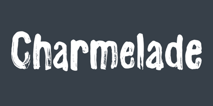 Another handmade brush font with that lovely green and organic feeling! :)
 - Cyne by Typotheticals,
$8.00A plain sans serif that would be good for everyday use. - Period Piece JNL by Jeff Levine,
$29.00 A period piece is something of or pertaining to a specific era or time. Anything evoking a knowledge or feeling of an era can be labeled as such. The aptly named type font Period Piece JNL reflects the hand lettering found on the cover of early 20th century vintage sheet music entitled "My Baby's Arms" (from the stage production of "Ziegfeld Follies of 1919"). Although strongly akin to the coming Art Deco movement in its lettering style, Period Piece JNL still contains a strong influence of the Art Nouveau era of the 1900s through the 1920s.
 - Alianza by Corradine Fonts,
$24.95 This is a complex typographic system which includes three different but complementary styles so far: Slab, italic and script, with nine weights each one; plus three sets of ornamental fonts: labels, negative labels and ornaments. The soul of the family is a slab feeling applied judiciously to the italic and script styles to make it coherent with the whole system. Each style has three sets of figures: Proportional lining, tabular lining and old style. You can mix the three styles in a single piece to obtain more expressive results without worring about the uniformity and complementing the design by using the ornamental sets.
 - Deco Nights JNL by Jeff Levine,
$29.00 Sheet music for the tune "Put Your Arms Around Me Honey" (from the 1937 film "Coney Island" starring Betty Grable, George Montgomery and Cesar Romero) has the song title hand lettered in a condensed Art Deco sans serif design. This became the basis for Deco Nights JNL, which is available in both regular and oblique versions. For trivia buffs, the song was written by Junie McCree and Albert Von Tilzer and was first featured in the Broadway show "Madame Sherry" in 1910 and was revived for a second time in the 1949 Judy Garland -Van Johnson film "In the Good Old Summertime".
 - Calgera by TRF,
$20.00 Calgera, is a typeface designed by Teuku Riski Firmana. Calgera is a contemporary serif typeface with a distinctive look. Calgera creates an unique character, with different stylistic sets you can change the feel of your design from more organic to more standard. with 9 weights ranging from Thin to Black. This is an elegant font, with beautiful and harmonious alternate, which makes it ideal for use in magazines, in the fashion industry, branding, logo design, dynamic packaging and countless other projects. When starting this project, we wanted to try to draw a modern serif with the precisely verified shapes and detailed elaboration of each character, making your text look great both on paper and on the screens. Calgera in numbers: • 108 styles and 1 variable fonts • 843 glyphs and 441 characters in each style • Support for more than 48+ languages • 27 OpenType features in each style • Amazing Manual TrueType Hinting • 4 variable exes (Weight, Width, Slant, Contrast) Useful OpenType features: Access All Alternates, Historical Forms, Stylistic Alternates, Stylistic Set 1, Stylistic Set 2, Stylistic Set 3, Stylistic Set 4, Stylistic Set 5, Stylistic Set 6, Stylistic Set 7, Stylistic Set 8, Fractions, Oldstyle Figures, Ordinals, Numerators, Small Capitals, Discretionary Ligatures, Standard Ligatures, Small Capitals From Capitals, Case-Sensitive Forms, Denominators, Scientific Inferiors, Subscript, Superscript, Kerning. Calgera language support: Acehnese, Afrikaans, Albanian, Basque, Bosnian, Catalan, Croatian, Czech, Danish, Dutch, English, Estonian, Faroese, Filipino, Finnish, French, Galician, German, Hungarian, Icelandic, Indonesian, Irish, Italian, Latvian, Lithuanian, Malay, Norwegian Bokmål, Polish, Portuguese, Romanian, Slovak, Slovenian, Spanish, Swahili, Swedish, Turkish, Welsh, Zulu, Tagalog, Serbian, Zazaki, West Frisian, Breton, Gagauz, Scottish Gaelic, Northern Sami, Esperanto, Latin.
 - Aure Jane by Aure Font Design,
$23.00 Aure Jane defines grace under fire. These clean, sans-serif forms engage the reader with a subtext of trust. Jane’s excellent legibility will stand up under almost any typographic challenge, bringing confidence to text and titles, and clarity to astrological expressions and chartwheels. Jane is an original design developed by Aurora Isaac. After more than a decade in development, 2018 marks the first release of the CJ and KB glyphsets in regular, italic, bold, and bold-italic. The CJ glyphset is a full text font supporting a variety of European languages. A matching set of small-caps complements the extended lowercase and uppercase glyphsets. Supporting glyphs include standard ligatures, four variations of the ampersand, and check-mark and happy-face with their companions x-mark and grumpy-face. Numbers are available in lining, oldstyle, and small versions, with numerators and denominators for forming fractions. Companion glyphs include Roman numerals, specialized glyphs for indicating ordinals, and a variety of mathematical symbols and operators. The CJ glyphset also includes an extended set of glyphs for typesetting Western Astrology. These glyphs are also available separately in the KB glyphset: a symbol font re-coded to allow easy keyboard access for the most commonly used glyphs. In addition to Aure Jane’s versatility as a text font, Jane can enhance the message of other designs. Aure Jane pairs well as an innocuous foil to any decorative font; Aure Sable, for example, will shine all the more beside Jane’s sensible utility. The witty highlights of Aure Brash will sparkle against Jane’s practicality. Give Aure Jane a trial run! You may discover a permanent place for this font family in your typographic palette. AureFontDesign.com
 - YAKSOM by Twinletter,
$17.00 Yaksom is a classic serif font that exudes timeless beauty and a captivating modern style. The perfect solution for projects that require an elegant classic modernism theme. With a proportional and elegant serif design, Yaksom conveys timeless elegance in every letter. Every detail is exquisitely detailed, creating a look that embodies the refinement and elegance of an irreplaceable classic era. Yaksom is also equipped with stunning features. Beautiful ligatures add a creative touch and enrich the look of a font, while alternative variations provide unique styling options. Extensive multilingual support also ensures that Yaksom can be used fluently in multiple languages. Are you looking for a font that combines classic elegance with a dazzling modern twist? Yaksom is a perfect choice. With a stunning classic serif style, creative features such as alternate ligatures and variations, and the ability to support multiple languages, this font will quickly grab the attention of your prospects and create a stunning aesthetic impression in the blink of an eye. What’s Included : File font All glyphs Iso Latin 1 Alternate, Ligature Simple installations We highly recommend using a program that supports OpenType features and Glyphs panels like many Adobe apps and Corel Draw so that you can see and access all Glyph variations. PUA Encoded Characters – Fully accessible without additional design software. Fonts include Multilingual support
 - Ruth Script by Estudio Calderon,
$68.99 Ruth Script is perfect for neon signs, we took as referents some of these signs found in the street, especially those hanging in bars, billiard halls, motels and night clubs, we also took into consideration the Photo-lettering One Line manual to solve ligatures and alternatives (We want to thank Ed Ronthaler for that treasure to study and learn). The scripts can be considered as a compendium of connections, aesthetic and functional alternatives, where all the possible word combination is a universe depending on the language and the user's creativity. We have developed a project that offers to our customers a bridge that connects the brush with the digital typography through a partial vowels and consonants control and ligatures with opentype programming. We know that the scripts make typography users, fall in love. That is why we have created a type font that achieves all the demands and requests for any project where our font can be applied. Ruth Script was designed with patience and love, with the purpose of recovering the work done by those people who have been working as letterer during decades and that have left us hundreds of guides, books and videos. A great legacy! We want to invite you to use Ruth Script in your projects and fall in love with ESTUDIO CALDERÓN's new daughter. ENJOY IT!
 - Tokyo Olive by Dharma Type,
$14.99 Tokyo Olive was designed as an homage to nostalgic display types and advertisements in the mid-late 80s. The mid-late 80s was the era of the post-modernism and fancy-decorative design especially in Japan In other words, it was the mixture of superficial form-operation and girly taste. This curious design movement vanished without a trace in the 90s, but it had its moments. Tokyo Olive has voluminous and simple geometric skeleton (for post-modern) with rounded and craft-style stencil joints (for fancy decoration). We added a classic open style as a little spice. The mixture of those essences makes new impression we have never seen before. Tokyo Olive family consists of 5 styles for stacking color font. Please use Photoshop or Illustrator, or your favorite graphic design apps that can handle layers. Layers are the printing plates of wood type. You should be able to change text color for each layer. Tokyo Olive "Standard" style is the base of this font family. You can add open effect by stacking "Fill" layers over the Standard layer. Instruction 1. Type your text as you like. 2. Set font-name "Tokyo Olive" and font-style "Standard". 3. Set color of "Standard" layer. 4. Duplicate the "Standard" layer to make "Fill" layer. 5. Set font-style "Half Fill" or "Full Fill" and new color of upper layer. Tokyo Olive Standard, Half Open, and Full Open style can be used solely.
 - Kitsch by Zetafonts,
$39.00 Designed by Francesco Canovaro with help from Andrea Tartarelli and Maria Chiara Fantini, Kitsch is a typeface happily living at the crossroads between classical latin and medieval gothic letterforms. But, rather than referencing historical models like the italian Rotunda or the french Bastarda scripts, Kitsch tries to renew both its inspirations, finding a contemporary vibe in the dynamic texture of the calligraphic broad-nib pen applied to the proportions of the classical roman skeleton. The resulting high contrast and spiky details make Kitsch excel in display uses, while a fine-tuned text version manages to keep at small sizes the dynamic expressivity of the design without sacrificing legibility. Both variants are designed in a wide range of weights (from the almost monolinear thin to the dense black), and are fully equipped with a extended character sets covering over two hundred languages that use latin, cyrillic and greek alphabets. Special care has been put in designing Kitsch italic letterforms, with the broad-nib movements referencing classical italian letterforms to add even more shades to your typographic palette. The resulting alternate letter shapes have also been included in the roman weights as Stylistic Alternates - part to the wide range of Open Type features (Standard and Discretionary Ligatures, Positional Numerals, Small Caps and Case Sensitive Forms) provided with all the 32 weights of Kitsch. Born for editorial and branding use, Kitsch is fashionable but solid, self-confident enough to look classic while ironic enough to be contemporary.
 - The Cartel by Say Studio,
$12.00 About the Product The Cartel is a elegant serif font . This typeface has been made carefully to make sure its premium quality and luxury feel. The ligatures makes this typeface unique and stands out rather than the regular serif font. Very suitable for logo, headline, tittle, and the other various formal forms such as invitations, labels, logos, magazines, books, greeting / wedding cards, packaging, fashion, make up, stationery, novels, labels or any type of advertising purpose. Features : numbers and punctuation multilingual ligatures alternates PUA encoded FAQ's : Where are the TTF's? They are included in a download link( in a text file) in your main download file. 1 user 2 computers installation (Desktop License) You may NOT use for broadcast or Cinema/Motion Picture. You may NOT resell this font in any platform without further permission from designer. Do NOT embed font files in app/game/e-pub (for desktop license) You may NOT use the fonts in templates for sale/free. ( web/print/app ) For other license use please contact us. SOFTWARE REQUIREMENTS : Fonts and alternate : No special software required they may be used in any basic program /website apps that allows standard fonts That's it folks! You can go ahead and get cracking :) Follow My Shop For Upcoming Updates Including Additional Glyphs And Language Support. And Please Message Me If You Want Your Language Included or If There Are Any Features or Glyph Requests, Feel Free to Send me A Message. Have a Good Day !
 - Technique BRK Pro by CheapProFonts,
$10.00 I noticed this font for its versatile techno look - it makes wonderful logotype word images. Every letter combination is perfectly kerned so that the letters fit together nicely... Also includes some alternate letterforms, but only in their basic forms (not made in combinations with diacritics). These alternates are available via your programs' glyph palette or using the OpenType functions "Stylistic Alternates"/"ss02" and "Swash"/"ss01". Technique BRK Pro is the perfect companion for Technique Outline BRK Pro (it exactly fills the "holes") but also a nice techno font in its own right. ALL fonts from CheapProFonts have very extensive language support: They contain some unusual diacritic letters (some of which are contained in the Latin Extended-B Unicode block) supporting: Cornish, Filipino (Tagalog), Guarani, Luxembourgian, Malagasy, Romanian, Ulithian and Welsh. They also contain all glyphs in the Latin Extended-A Unicode block (which among others cover the Central European and Baltic areas) supporting: Afrikaans, Belarusian (Lacinka), Bosnian, Catalan, Chichewa, Croatian, Czech, Dutch, Esperanto, Greenlandic, Hungarian, Kashubian, Kurdish (Kurmanji), Latvian, Lithuanian, Maltese, Maori, Polish, Saami (Inari), Saami (North), Serbian (latin), Slovak(ian), Slovene, Sorbian (Lower), Sorbian (Upper), Turkish and Turkmen. And they of course contain all the usual "western" glyphs supporting: Albanian, Basque, Breton, Chamorro, Danish, Estonian, Faroese, Finnish, French, Frisian, Galican, German, Icelandic, Indonesian, Irish (Gaelic), Italian, Northern Sotho, Norwegian, Occitan, Portuguese, Rhaeto-Romance, Sami (Lule), Sami (South), Scots (Gaelic), Spanish, Swedish, Tswana, Walloon and Yapese.
