10,000 search results
(0.214 seconds)
- Linotype Sicula by Linotype,
$29.99Linotype Sicula, from German designer Roberto Manella, is part of the TakeType Library, chosen from the entries of the Linotype-sponsored International Digital Type Design Contest 1999 for inclusion on the TakeType 3 CD. It is available in two weights, regular and oblique. Linotype Sicula will quickly win over any nostalgic spirits. Ornamental and sweeping, the figures line up on the paper, their contrasting strokes and playfully irregular forms giving them an exuberant, decorative character. The careful details of each figure come to light best when used in larger point sizes. Linotype Sicula is therefore best for headlines and can easily inspire typographic experiments and its capitals can serve as initials combined with other typefaces, especially sans serif. - Arnetalia by Artisan Studio,
$16.00 Arnetalia is Modern Calligraphy. This font was designed by handwriting, and it has a modern and unique forms of calligraphy, the writing style is very natural. Can be used for various purposes.such as headings, logos, wedding invitation, t-shirt, letterhead, signage, lable, news, posters, badges etc. To enable the OpenType Stylistic alternates The Features of this fonts is; Standart ligatures Stylistic Alternates Contextual Alternates Stylistic sets File font Arnetalia Include ; Arnetalia PUA Unicode (Private Use Areas) The OpenType features can be very easily accessed by using OpenType-savvy programs such as Adobe Photo Shop, Adobe Illustrator, Adobe InDesign and CorelDraw X6-X7, You can also access most most of these awesome features in Microsoft Word and other similar programs
 - Sparhawk by Albatross,
$19.00 Sparhawk in its obvious form is a 3D layered display font, but it's packed with over 300 swashes, extremely rare in the 3D font world. Every single swash is hand-drawn for extreme organic realism. The lowercase are small caps and the swashes are designed to be used mostly with the lowercase letters (top and drop swashes), but the drop (bottom) swashes also work well with all caps. Sparhawk’s large character set and plethora of alternates makes it perfect for logo type, birthdays, weddings, bands… the list goes on. All features include: 8 Awesome Layer Styles, 15 sets of Stylistic Alternates (over 300+ Individually Drawn Swashes), Double-Letter Ligatures for upper and lowercase, and Contextual Alternates.
 - Waters Titling by Adobe,
$35.00Waters Titling is the work of lettering artist Julian Waters, a multiple master typeface of classical calligraphic roman capitals. This broad-tipped pen design is related to other historically-based titling alphabets but offers a wider range of weights and widths, making it extremely versatile for movie titles, book jackets, posters, banners, calendars, etc. Waters Titling is based on the timeless Roman monumental inscription forms of almost 2000 years ago, but also has a touch of contemporary vigor and flair. The design displays a strong calligraphic thick/thin stroke weight contrast and flowing, subtly bracketed serifs. In lighter weights, Waters Titling is elegant and delicate, while the bolder weights offer a more substantial sparkle. - Architype Renner by The Foundry,
$99.00 The geometry of Paul Renner’s sans letterforms was tempered by optical correction to follow earlier typeface proportions, with capitals close to old-style forms, yet still retaining the spirit of the New Typography. His early experimental characters were included as alternatives in the sans which was to become the Futura released by Bauer in 1927–30. Unusually, old style figures also appeared in his early versions but they too were soon discarded. Foundry Architype Renner as a new four weight family has been developed from the original Renner Regular and Bold, created by The Foundry for the first Architype Collections in the early 1990s. This new family features the old style figures and the experimental elements.
 - Zeta by Roy Cole,
$34.00 Zeta was developed by Roy Cole, the British typographer and book designer. It is his second typeface family, completed in 2006, and comprises six fonts. As with his other typeface families - Lina, Colophon and Coleface - Zeta is a sans-serif typeface, particularly notable for its fluidity and strong legibility. Whilst the proportions of Zeta are derived from classical models, the letter forms themselves are totally modern in concept. For example, when used for blocks of text little line spacing is needed to achieve good readability. Zeta is conceived as an easy reading typeface presenting an up-to-date impression wherever it is utilized. Due to its origins it really comes into its own when used for book design.
 - Florida Rose by Yahya Type,
$16.00 Florida Rose is a Sharped version of "Peroba Rosa" Font. It is a modern sans serif type family featuring a blend of modern, classical, and playful characteristics. The simple, clean forms and classically inspired proportions give it a timeless quality and interesting visual rhythm. Florida Rosa is perfect for logo design, magazine headers, product packaging, branding projects, clothing or simply as a stylish text overlay to any images or websites. WHAT’S INCLUDED? • Comes with regular, thin, light, italic, bold, thin italic, light italic, bold italic and bold italic font styles. • Uppercase & lowercase letters, numbers, punctuation Ligature & Huge Stylistic alternate, Multilingual support. Still got a question? Send me a message and I’ll be happy to answer! qura.yahya@gmail.com
 - YLab by Par Défaut,
$30.00 yLab is geometric typeface compose of 10 fonts (5 weights and oblique declination) Perfect for titles and text, yLab supports many languages (Latin pro..). 11 OpenType Features (Alternative; Fraction; Numerator; Denominator; Superior; Inferior; Tabular figure; Ordinals; Discretionary Ligature; Stylistic Set; Case Sensitive Forms). • Ordinal feature includes the Latin alphabet (Uppercase & Lowercase). • Five Stylistic set for “a”, “g”, "i" and "l", includes accents. • Discretionary Ligature includes “AE”, “IJ”, “OE”, available in lowercase. • Contextual Alternate includes ligatures for arrows : <- -> ^| v| <-> v^| Add parentheses around period, numbers or arrows, add n or d for numerator, denominator. Add n, d or +, for numerator, denominator or case arrows. All Case sensitive characters become after the uppercase and number.
 - Linka Stencil by Vanarchiv,
$42.00 This font family is display stencil sans-serif with different stylistic layers available as open type font. The main characters are geometric and neutral but when we change the contextual alternates open type feature the letterforms activate the cursive stylish set. The word composition is divided by initial, medial and final forms, available for all uppercase and lowercase, the diacritics for Latin encodings (Western and central Europe and Baltic countries) are available. However the contextual alternate features (cursive mode) can only work on Adobe CS Indesign and Illustrator softwares. This typeface also has uppercase swash and stylish alternates. A large group of discretionary ligatures are also available to improve better legibility and readability on specific characters combinations.
 - Guadalupana by JVB Fonts,
$30.00 On October 12th 1976 a new basilica was inaugurated in honor and in gratitude to the Patron Saint, the Virgin of Guadalupe, loved by the Mexican people. This basilica was designed by the Mexican architect Pedro Ramírez Vázquez (died on April 16th 2012). It stands out by its hug spacious interior, generously decorated with bronze elements. The aesthetic value of these items even includes many signs and text inscriptions in a particular typeface and style, of which this font is a reinterpretation. The purpose of this project is to revival this eclesiastical written letter forms in bronze and taking them to digital format. I was inspired to this on my last trip to Mexico in September of 2012.
 - FF More by FontFont,
$72.99 Polish type designer Lukasz Dziedzic created this serif FontFont in 2010. The family has 30 weights, ranging from Light to Black in Condensed, Normal and Wide (including italics) and is ideally suited for advertising and packaging, book text, editorial and publishing, logo, branding and creative industries as well as small text. FF More provides advanced typographical support with features such as ligatures, small capitals, alternate characters, case-sensitive forms, fractions, and super- and subscript characters. It comes with a complete range of figure set options – oldstyle and lining figures, each in tabular and proportional widths. As well as Latin-based languages, the typeface family also supports the Cyrillic writing system. In 2011, FF More received the CommArts award.
 - Sabryne by Subectype,
$15.00 Sabryne is a beautiful and lovely script font. It has a great readability and will add a fun and lovely touch to any design. Sabryne is versatile and can be used on cards, posters, merchandise, book covers, websites, packaging, and basically anywhere you like. The overall feel of the font is warm, elegant and informal and it is perfect if you want to convey a sense of friendliness and style. The script has 250+ lovely glyphs with lots of stylistic variations, ligatures and swashes, which you can mix and match for a more interesting effect. The dancing baseline makes it very casual and full of personality, thus a great addition to every design project.
 - Loew by The Northern Block,
$39.00 Loew is a geometric sans serif font influenced by the methods of the early industrial designers. Pure mechanical shapes are carefully adjusted to give the characters the right form, function and usability. These subtle human touches combined with the technical detail provide great readability at both large and small point sizes. Loew is a versatile sans serif font with simple and honest geometry aimed at a wide range of modern applications. Details include over 800 characters with alternative lowercase a, e and g. Seven variations of numerals, true small caps with accents, manually edited kerning and Opentype features. For additional non-latin language support in Cyrillic, Greek and Arabic, visit Loew Next and Loew Next Arabic.
 - Simple by Winnie Tan,
$69.00 Simple - The Bilingual Font. The process of Simple began with the usual alphabets followed by a series of icons and soon it was an avalanche of Chinese characters. The pool of proposed Chinese characters were loosely determined by the needs of a lunar calender. In a nutshell, Simple is a single-weight, minimal, grid-based Sans-serif display. Prudent with details and sturdy in form, the geometrically-driven structure marks the foundation of a cross-cultural assortment of Latin alphabets, Chinese characters and thematic icons. After months of extensive typesetting, Simple is also realized to be well-catered for use in graphical information design in games and tournaments, logotypes, advertisements and headlines. http://www.behance.net/gallery/Simple/847905
 - Tendria by Linotype,
$29.99Patricia Pothin-Roesch's Tendria typeface bases its letterforms on the logo for the French “Tendriade” mark. Clearly inspired by writing and hand lettering, Patricia Pothin-Roesch began her work on Tendria in Adobe Illustrator. After a few letters, she went back to designing the old-fashioned way: drawing by hand on layers of tracing paper. Tendria is a sturdy upright script face with a warm, childlike feeling. Its letters are like the typefaces often used in primary schools; the counterforms are large and open. The name Tendria is reminiscent of the French word for tender, “tendre.” Designers who set Tendria lovingly will reap rewards; this is an excellent addition to a display heading toolkit. - Acustica by Andinistas,
$49.67 Acústica is a display font family designed by Carlos Fabian Camargo G. Its styles were designed to form words and phrases related to delicate and feminine contexts. Acústica Caps, Italic, Swashes and Ornaments are drawn investigations with flexible tip pen inspired by Didot capitals. All ideal for mixing with Acústica Script whose idea represents the volatile sound of a fine tip brush against rapid tracing paper. Its script path in width condensed lowercase and uppercase letters in loose horizontal proportions are generous between letters laced with long, agile and thin connecting strokes. Its script sensitivity is in Italian calligraphy with uninterrupted lines of cursive English. Acústica was selected at the Bienal Tipos Latinos 2014. Photos by http://www.desdeesteladodemimundo.blogspot.com
 - Blacklist by Great Studio,
$18.00 Blacklist is a high-contrast typography inspired by transitional and contemporary typography. Fonts extend their use by giving weights ranging from thin to black. The natural curve, a swollen and sloping stem, grows in character as the font gains weight. While the thinner weight has lowered contrast and optical correction to create a warm and soft look. Featuring beautiful italics, excellent weight and extensive language support. Blacklist excels in display settings such as headlines, titles, branding projects, Logo design, packaging, magazine headings, advertising, short or long text. Blacklist also comes with two versions of Variable Regular and Italic to make it easier for designers to explore and perfect beautiful designs, unearthing lots of visual tones and hidden secrets.
 - ITC New Baskerville by ITC,
$34.99 ITC New Baskerville is one of many contemporary type families based on the work of John Baskerville (1706-1775), a writing master and printer from Birmingham, England, whose types were cut by the punchcutter John Handy. Baskerville produced a masterpiece folio Bible for Cambridge University, and today, his types are considered to be fine representations of eighteenth-century rationalism and neoclassicism. ITC New Baskerville is a late 20th-century interpretation of Baskerville’s style, designed by John Quaranda. It makes an excellent and very readable text face; its sharp, high-contrast forms make it suitable for elegant advertising settings as well. ITC New Baskerville® font field guide including best practices, font pairings and alternatives.
 - FF Milo by FontFont,
$83.99 American type designer Michael Abbink created this sans FontFont between 2006 and 2008. The family has 9 weights, ranging from Thin to Black (including italics) and is ideally suited for advertising, packaging, book text, editorial, publishing, logo, branding, small text as well as wayfinding and signage. FF Milo provides advanced typographical support with features such as ligatures, small capitals, alternate characters, case-sensitive forms, fractions, and super- and subscript characters.It comes with a complete range of figure set options – oldstyle and lining figures, each in tabular and proportional widths. In 2011, FF Milo received the Letter.2 award. This FontFont is a member of the FF Milo super family, which also includes FF Milo Serif.
 - FF Amman Serif by FontFont,
$79.99 German type designer Yanone created this serif FontFont in 2010. The family has 8 weights, ranging from Regular to Extra Bold (including italics) and is ideally suited for advertising and packaging, editorial and publishing as well as logo, branding and creative industries. FF Amman Serif provides advanced typographical support with features such as ligatures, small capitals, alternate characters, case-sensitive forms, fractions, and super- and subscript characters. It comes with a complete range of figure set options – oldstyle and lining figures, each in tabular and proportional widths. As well as Latin-based languages, the typeface family also supports the Arabic writing system. This FontFont is a member of the FF Amman super family, which also includes FF Amman Sans.
 - Glimp Variable by OneSevenPointFive,
$60.00 Variable version of 'Glimp' font family Glimp Variable supports 3 axis flexibility across width, weight and italic in a single font. It also comes with the static styles available as options in the font style selection menu. It features rich set of opentype features such as stylistic sets, contextual alternates, case sensitive forms, superscripts, subscripts, fractions, and more. Glimp Variable is made to be your go-to choice for a wide range of projects, whether you're working on branding, web design, print materials, or presentations. It elevates your designs or brand effortlessly, embracing your creative vision. Variable Axis Ranges: Width - wdth - 75 to 100 Weight - wght - 100 to 900 Italic - ital - 0 to 1
 - FF Signa Serif by FontFont,
$68.99 Danish type designer Ole Søndergaard created this serif FontFont in 2005. The family has 10 weights, ranging from Light to Black (including italics) and is ideally suited for advertising and packaging, film and tv, editorial and publishing as well as logo, branding and creative industries. FF Signa Serif provides advanced typographical support with features such as ligatures, small capitals, alternate characters, case-sensitive forms, fractions, and super- and subscript characters. It comes with a complete range of figure set options – oldstyle and lining figures, each in tabular and proportional widths. This FontFont is a member of the FF Signa super family, which also includes FF Signa, FF Signa Correspondence, FF Signa Serif Stencil, and FF Signa Stencil.
 - Sports World - Unknown license

- Designosaur - 100% free

- Web Serveroff - 100% free

- Petrarka by HiH,
$12.00 Petrarka may be described as a Condensed, Sans-Serif, Semi-Fatface Roman. Huh? Bear with me on this. The Fatface is a name given to the popular nineteenth-century romans that where characterized by an extremity of contrast between the thick and thin stroke. The earliest example that is generally familiar is Thorowgood, believed to have been designed by Robert Thorne and released by Thorowgood Foundry in 1820 as "Five-line Pica No. 5." Copied by many foundries, it became one of the more popular advertising types of the day. Later, in the period from about 1890 to 1950, you find a number of typeface designs with the thin stroke beefed up a bit, not quite so extreme. What you might call Semi-Fatfaced Romans begin to replace the extreme Fatfaces. Serifed designs like Bauer’s Bernard Roman Extra Bold and ATF’s Bold Antique appear. In addition, we see the development of semi-fatface lineals or Sans-Serif Semi-Fatfaces. Examples include Britannic (Stephenson Blake), Chambord Bold (Olive), Koloss (Ludwig & Mayer), Matthews (ATF) and Radiant Heavy (Ludlow). Petrarka has much in common with this latter group, but is distinguished by two salient features: it is condensed and it shows a strong blackletter influence, as seen in the ‘H’ particularly. Petrark was released about 1900 by the German foundry of Schelter & Giesecke of Leipzig and is one of the designs of the period that attempts to reconcile roman and blackletter traditions. Making a cameo appearance in this Multi-Lingual font is the Anglo-Saxon letter yogh (#729), which, along with the thorn and the eth, is always useful for preparing flyers in Old English. There are still pockets of resistance to the Norman French influence that washed up on England’s shores in 1066. This font stands with King Canute, seeking to hold back the tide (ignoring the fact that Canute was a Dane). Support the fight to preserve Anglo-Saxon culture. Buy Petrarka ML today. Petrarka Initials brings together the Petrarka upper case letters with a very sympatico Art Nouveau rendering of a female face.
 - Jukebox Hero by Grype,
$19.00 As one of the most popular rock bands of the world, Foreigner has rocked the charts with 10 multi-platinum albums and sixteen top 30 hits in the last 40 years. But one might ask what a band this successful has been missing all these years? No head games here...a consistent typeface based on their logo is the answer. As fans of Foreigner, we've taken the essence of their iconic logotype and expanded it out into a full typeface in regular and bold weights to celebrate their 40th anniversary tour. The Jukebox Hero Family celebrates the typographic stylings of Foreigner, with the soft rounded terminals and an open geometric feel, including the unique stencil flavor of the original logo. It inherited the friendly stylings of the all Capitals logo that inspired it, and goes on to include a full standard character set with expansive international support of latin based languages, and two weights jumping from regular to a beefy bold. This family is ready to rock the charts for your designs towards that of a modern, comfortable appeal. Here's what's included with Jukebox Hero Family bundle: 413 glyphs - including Capitals, Lowercase, Numerals, Punctuation and an extensive character set that covers multilingual support of latin based languages. (see the 3rd graphic for a preview of the characters included) 2 weights: Regular & Bold. Fonts are provided in TTF & OTF formats. The TTF format is the standard go to for most users, although the OTF and TTF function exactly the same. Here's why Jukebox Hero Family bundle is for you: You're a die-hard Foreigner fan, and have a case of "Double Vision" and need both font weights. You're looking for a stylish and sophisticated soft sans-serif stencil typeface family. You've been waiting for fonts like these. You're looking for a Sci-fi vibe typeface that has a look that feels familiar. You just like to collect quality fonts to add to your design arsenal
 - Lievin by Mofr24,
$11.00 Lievin is an exceptional slab serif font that stands out for its simplicity, clean lines, and captivating elegance. What sets it apart is its unique ability to effortlessly adapt to diverse design needs, making it a versatile choice for any project. With an impressive range of 50 variable styles, ranging from delicate thin to bold and massive black, Lievin caters to a wide array of typographic demands. Its versatility makes it perfect for various applications such as posters, marketing materials, logotypes, headlines, books, magazines, and more. One of the defining features of Lievin is its impeccable balance of classic charm and contemporary appeal. Its sleek and refined aesthetic adds a touch of sophistication to any design. The font's exceptional legibility ensures that the message is conveyed with clarity and impact. Lievin pairs harmoniously with a range of typefaces, making it an ideal choice for combination and layering. It complements sans-serif fonts, such as Helvetica or Futura, creating a visually dynamic and engaging typographic composition. Beyond its visual appeal, Lievin boasts an extensive character set, providing support for multiple languages and typographic features. This allows designers to express their creativity and accommodate different linguistic requirements. The design concept of Lievin is rooted in the desire to create a timeless and versatile slab serif font that would seamlessly integrate into modern design practices. Its clean lines and balanced proportions ensure legibility across various media and sizes, while its elegant charm adds a touch of sophistication. Lievin is the result of a meticulous creative process aimed at delivering a font that captures attention and makes a lasting impression. It combines the best of traditional and contemporary design elements, offering a fresh take on slab serif typography. As a modern typeface, Lievin is an original creation, not based on any historical design or revival. It embodies a contemporary interpretation of slab serif fonts while incorporating functional aspects that cater to the needs of today's designers.
 - Posh by Lián Types,
$49.00 I've always been in love with fat didones. That’s the reason of Posh. In search of something unique, I started this family back in 2013 with the aim of creating the fattest yet readable bodonian typeface in the market: It was a challenge, because roman fonts need generous counters (or what some call white spaces) and taking them to the extreme of inexistence attempted against the construction of many glyphs. Ears, dots, terminals and serifs always need some extra space so I had to find the exact point of boldness to make characters which have those attributes work well in the middle of those which haven't. (1) After a while, I felt I was again ‘in my element’: Big contrasted letters, sexy and elegant curves, and that Lubalinesque feeling that characterise my fonts. (2) Words written with Posh are a explosion of elegance and sensuality due to the fact that its didone attributes were exaggerated. Since it’s full of alternate glyphs, one can change and choose them until a nice block of ‘‘black’’ is achieved. (3) To accompany the regular style, I designed Posh Inline, a font with the same quantity of glyphs than the regular one; an all caps style called Posh Capitals, and also a really playful Italic version. I hope you find this one delicious like I do! This font is dedicated to all who understand letters are not just meant to be read, but also to be appreciated in group and individually. Enjoy it. NOTES (1) In example, it can be easy to design a fat letter ‘n’ with almost no counter, but really tough to make a satisfactory letter ‘s’ with serifs to match that ‘n’. (2) Also, it wasn't my first attempt in fat didones. Take a look at my font Reina, made in 2012. (3) Posters above show many words with ball terminals that seem to dance above and below the words in order to fill those “undesired” blank spaces.
 - Mardi Gras by BA Graphics,
$45.00A Festive look creates that happy feeling! - Ye Benjamin by Yinon Ezra,
$30.00 Ye Benjamin is a smooth italic typeface, that will spread style and good vibes everywhere you put him. The crystallization of the letters shape was through seeking an iconic look, that would be a useful branding tool.
 - Alexandra Gistela by Typebae,
$15.00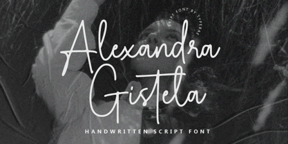 Alexandra Gistela is a stunning handwritten signature script font that exudes beauty and elegance. Alexandra Gistela is perfect for creating luxurious branding materials, wedding invitations, greeting cards, and other projects that demand a touch of refined beauty.
 - Belmont by Rook Supply,
$15.00 Looking for an elegant font to class up the place? Maybe you have some wedding invitations that you've been putting off for a month. Belmont is an elegant, modern script font that is perfect for contemporary occasions.
 - Cypheral by Volcano Type,
$19.00 A type between letter and number. Cypherals' fresh typeface is a mix-up of number parts and lines that reveal to be letters. So who is to say that numbers and letters don't have much in common?
 - Shockproof by Haiku Monkey,
$19.00 Shockproof takes its inspiration from 1940s hand lettering. It's a display font that mixes elegance with a touch of informality. Great for use in identity, signage, posters, and anywhere that tall, cool typographic drink would be refreshing.
 - Boffin by Evolutionfonts,
$- A simple little typeface for all things technical. A faux monospaced, semi-serif with rounded corners that you will never forget. The name comes from a British slang word that means "tech-savy person". Or simply "nerd".
 - Aethuisty by Typebae,
$15.00Alexandra Gistela is a stunning handwritten signature script font that exudes beauty and elegance. Alexandra Gistela is perfect for creating luxurious branding materials, wedding invitations, greeting cards, and other projects that demand a touch of refined beauty. - Nikki by Galapagos,
$39.00This typeface was named for one of George's daughters, at her request, after she discovered that another of George's designs, ITC Kristen, bore an appellation strikingly similar to that of her sister. And then there was peace... - Quirky by PizzaDude.dk,
$20.00 Quirky is so unpredictable and full of weirdness that you don't know what’s coming at you! The font has more than 250 different ligatures, that should be enough to boost your text into something funky and wild!
 - Moonshadow by Curvature Creations,
$10.00 My font Shadowmoon was created with the PowerPoint shape moon and just like the real moon, my font has amazing curves that brightly standout. The curves take on a flowing action that visibly attracts an amazing style.


