10,000 search results
(0.025 seconds)
- Calendula by ParaType,
$30.00Calendula is a humanistic font with low contrast and one-sided serifs. There are eight styles: four regular of different weights from Light to Bold and corresponding italics. The main set of regular styles is close to upright italics, so the font is percieved as informal and friendly. However, Calendula allows you to combine business with pleasure by switching the stylistic set, and turns into a calm text font with traditional upright forms. The font was designed by Natalia Vasilyeva and released by Paratype in 2017. - Osande TXT by XdCreative,
$29.00About Osande-TXT Neo-Grotesques Sans Osande TXT was created and inspired by Osande Pro (by. faldykudo), which carries a modern sans style with a touch of neo-grotesques / neo-gothic These include a large x-height, simpler forms and more static, low contrast, and often a condensed width. Osande TXT comes with enhancements characters and more complete language support, so you will be more flexible to use this font family for your various design, both for body text or displays. Thank you in advance _xdCreative - FF Balance by FontFont,
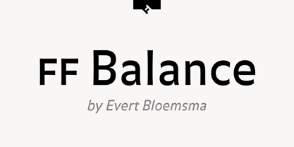
$65.99Dutch type designer Evert Bloemsma created this sans FontFont in 1993. The family has 8 weights, ranging from Light to Black (including italics) and is ideally suited for editorial and publishing, logo, branding and creative industries as well as small text. FF Balance provides advanced typographical support with features such as ligatures, small capitals, alternate characters, case-sensitive forms, fractions, and super- and subscript characters. It comes with a complete range of figure set options – oldstyle and lining figures, each in tabular and proportional widths. - Linotype Araby Rafique by Linotype,
$29.99Araby Rafique is a part of the Take Type Library, winners of Linotype’s International Digital Type Design Contest. This font was designed by the British artist Tehmina Rafique. The forms lean sometimes left, sometimes right, which, combined with the stroke contrast, gives the font a dynamic character. Other distinguishing characteristics are the mix of teardrop and fine hair strokes and the handwritten style. This font is good for very short texts and headlines, especially when the look of the text is as important as its meaning. - Open Sans Soft by Matteson Typographics,
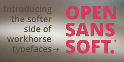
$9.95Open Sans Soft is the warm and friendly cousin of the web’s 2nd-most viewed font family – Open Sans designed by Steve Matteson. Open Sans Soft tones down your communications by adding organic-looking curvature to the corners of letters. A similar effect is found in such popular fonts as Microsoft’s Calibri and Linotype’s DIN Next. Open Sans Soft approximates the same, proven letterforms and letter spacing as Open Sans making it a wonderful companion for any application – correspondence, headlines, branding, packaging or interface design. - Monly by WildOnes,
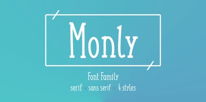
$10.00The main idea behind creating Monly typeface was to combine playfulness with a strong letter construction backbone, so all the letters would stand tall and firm, but not to lose the playfulness. Like people, who grow up but try to save their inner child. By doing so and combining all this, the typeface achieves a great readability and appealing look. Monly font suits best for logos, headlines and small text blocks, but can also be used for big text blocks if the style suits the purpose. - Dulcinea Serif by JVB Fonts,
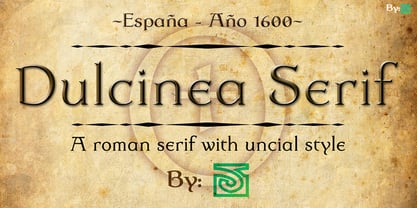
$29.50The aim of this typeface is to merge two historical moments in the form and style of writing, on the one hand calligraphy uncial, and on the other Roman serif was established as a universal standard for type fonts continuous text at the time. Is intended in terms of their functionality as a font for titles. The family includes some extended range glyphs as several Caps swashes and stylish alternatives for upper and lower case, standard and discretional ligatures, old numerals and other OpenType features. - Remontoire by MAC Rhino Fonts,
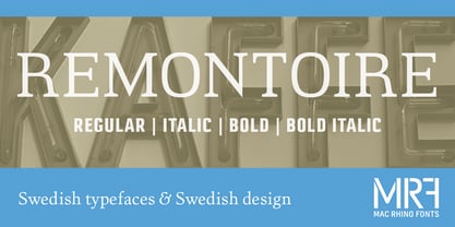
$36.00The original sketches who formed the base for Remontoire is known as one of the first typefaces drawn by Karl-Erik Forsberg . It was a result of a competition set up by various typographic organizations in the early 1930. The typeface was never completed and sketches are only to be found on paper. Made only as a single font but some the character can later on be found in other of examples of his work; Carolus and Ericus. MRF developed and expanded the family into 5 weights. - FF Oneleigh by FontFont,
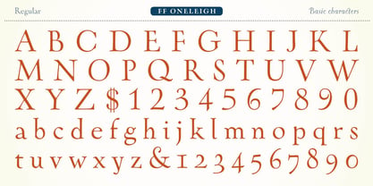
$51.99Canadian type designer Nick Shinn created this serif FontFont in 1999. The family has 6 weights, ranging from Regular to Black (including italics) and is ideally suited for advertising and packaging, book text, festive occasions, film and tv as well as poster and billboards. FF Oneleigh provides advanced typographical support with features such as swashes, ligatures, small capitals, alternate characters, case-sensitive forms, and fractions. It comes with a complete range of figure set options – oldstyle and lining figures, each in tabular and proportional widths. - Fiesole by Eurotypo,
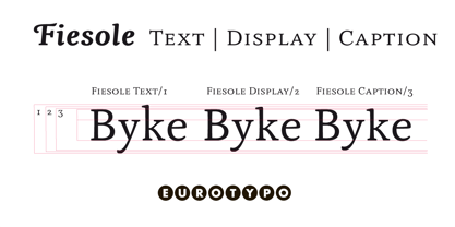
$22.00Fiesole was inspired by calligraphic models; it is a bookface font family to be used for text, display and caption. Fiesole has three different lengths of items (ascenders-descenders). Old style figures have been included in the fonts. Spacing of Small Caps has been adjusted to obtain good legibility and integrity with Capitals and lower cases. Fiesole Text: Two weights. Fiesole Display: Two weights. Fiesole Caption: Five weights. They include also CE languages, swashes, small caps, ligatures, discretionary ligatures, alternates, old style figures and case sensitive forms. - Rozelle by Asenbayu,
$12.00Rozelle Fonts are serif fonts with rounded edges. These fonts are formed as a unique multipurpose font, you can use them in vintage, retro, and modern designs. These fonts are perfect for a variety of projects, such as branding, poster displays, logo designs, magazine covers, and more. These fonts are perfect for you who need unique serif fonts! Rozelle fonts feature opentype, kerning, and alternates packed in 4 fonts: Regular, Italic, Bold, Bold-italic. Rozelle fonts include uppercase letters, lowercase letters, numeral, punctuation and multilingual support. - AM Godina by Errea Type,
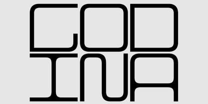
$10.00Godina was born from the interest in learning and deepening in the basic forms and how they are combined to compose a typographic system. The name, a tribute to the town of La Almunia de Doña Godina, the town for which the author of the typography connects. La Almunia is a crossroads in the typography designer's travels, a link between his family and friends. It combines the scent of a straight and modular typeface with sinuous and curved shapes, which make it a fun and playful typeface. - Sessions by Afrojet,
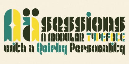
$19.00Afrojet Type Foundry presents Sessions, a heavyweight modular typeface with a quirky personality. The design is a fresh reimagination of Joseph Albers' classic Kombinationsschrift alphabet. It utilizes modular, repeating stylized forms to bring dimensionality and personality to the page. Sessions takes advantage of OpenType’s Stylistic Alternates feature with: two numeral options (cap-height and x-height), the option to ‘turn off’ the splayed bottoms of certain glyphs, and numerous alternate characters. All together, these options allow you the designer to create unique and custom designs. - P22 FLW Terracotta by P22 Type Foundry,
$29.95The lettering and 100 extras for this font set, the third in P22’s Frank Lloyd Wright series, are derived from letterforms and decorative embellishments found in Wright’s early work (1893–1910) and in his book, The House Beautiful (1896–97). Wright based his delicate graphic designs on stylized natural plant forms. Users go this font can adorn their graphics with these beautiful motifs. Terracotta Regular and Terracotta Alt have been remastered and now contain almost 400 characters including support for Western and Central European languages. - ITC Spirit by ITC,
$29.99While designing ITC Spirit, Patty King was influenced by classic typeface styles. The letter forms are clearly based on those of the Unziale, which, like ITC Spirit, is also composed of only capital letters. Hints of the Asian brush script style also show in this font. The irregular outer contours are best highlighted in larger point sizes and give the font the look of handwriting. ITC Spirit with its calligraphic style is best used for headlines and short texts in point sizes of 12 and larger. - Modern Royale by Bluestype Studio,
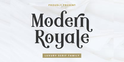
$15.00Modern Royale is a chic and quirky lettered serif font. Trendy and stylish, this font will elevate each of your creations. Modern Royale is PUA encoded which means you can access all of the glyphs and swashes with ease! Very suitable for logo, headline, tittle, and the other various formal forms such as invitations, labels, logos, magazines, books, greeting / wedding cards, packaging, fashion, make up, stationery, novels, labels or any type of advertising purpose. Features : - Stylistic Alternates & Ligature - Number & Punctuation - Support Multilingual Languange Thank You. - Sierra by Linotype,
$29.99Sierra is an antiqua with a high x-height and generous, open counters. Many curves of the letters are almost right angles, which was particularly suited to the Digiset machines from Dr. Ing. Rudolf Hell, Kiel. The forms of Sierra with their flowing stroke contrast and half serifs have a calligraphic touch, which is especially highlighted in the italic weights. This is a graceful text type and its bold weights look almost like woodcuts. Sierra is an excellent choice for both texts and headlines. - Neology by Shinntype,
$49.00To see the “auto-mix” effect, go to the Webfont page. This typeface has been designed to demonstrate a hypothesis: consistency in letter form and style is not essential to fluent reading. The Neology fonts also include both plain constituents, Neology Deco (1920s-style minimalist geometric) and Neology Grotesque (similar to Helvetica etc., but with a small x-height). All fonts have both three-quarter and full cap-height lining figures. The plain fonts have stylistic alternates (“a” for Deco and “g” and “l” for Grotesque). - SK Mutka by Shriftovik,
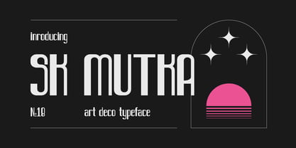
$32.00SK Mutka is a geometric sans serif made in the style of Art Deco. Its graceful forms are emphasized by the arched structure typical for the style and spirit of Art Deco. The typeface is suitable both for decorative work and for typing because it includes uppercase and lowercase. Moreover, it supports a wide language range. SK Mutka typeface supports extended Cyrillic, Latin, as well as an extensive character set. SK Mutka is perfect for bold and classic designs, for print and web works. - Silent Dreams by RagamKata,
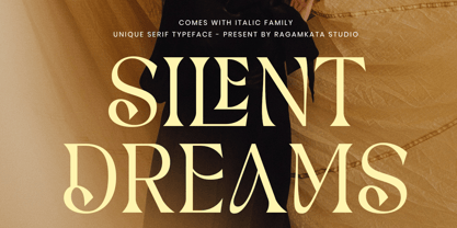
$14.00Present to you for New Modern Unique Serif, Silent Dreams! Silent Dreams is a sophisticated ligature serif from us. This typeface has been made carefully to make sure its premium quality and luxury feel. The ligatures makes this typeface unique and stands out rather than the regular serif font. This font is very suitable for logo, headline, tittle, and the other various formal forms such as invitations, labels, logos, magazines, books, greeting / wedding cards, packaging, fashion, make up, stationery, novels, labels or any type of advertising purpose. - FF Engine by FontFont,
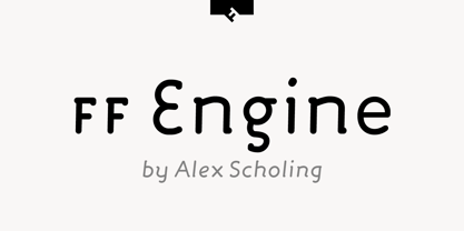
$47.99Dutch type designer Alex Scholing created this display and sans FontFont in 1995. The family has 6 weights, ranging from Light to Bold (including italics) and is ideally suited for book text, editorial and publishing as well as software and gaming. FF Engine provides advanced typographical support with features such as small capitals, alternate characters, case-sensitive forms, fractions, super- and subscript characters, and stylistic alternates. It comes with a complete range of figure set options – oldstyle and lining figures, each in tabular and proportional widths. - HandXpression by SullivanStudio,
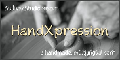
$9.95HandXpression was created with a stylus, imitating the experience of writing on a whiteboard with a marker. Its 646 glyphs cover from the Western to a wide part of Eastern European (Latin) alphabets. It also has all Greek letters for Math usage: yes, HandXpression makes formulas, and they look great, especially with LaTeX/XeTeX systems. The font has true italics, as well as some useful OpenType features: fractions, capital spacing, scientific superiors/inferiors, old style numbers, as well as standard ligatures and localized forms. Enjoy! - Linotype Zootype by Linotype,
$29.99Zootype –the first original single font– was designed in 1997 by Victor Garcia of Argentina and as a winner of Linotype's Second International Type Design Contest is included in the TakeType Library. The three additional family styles –Zootype Air, Zootype Land, Zootype Water– were added in 1999. In the words of the designer, the design concept is meant to display the funny, happy joy of animal nature.’ Animal heads peek into the block forms of the letters, giving the font a unique whimsical character. - Reigo by Digitype Studio,
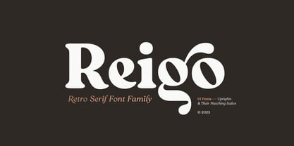
$20.00Reigo is a serif font with gentle curves giving it a soft, warm, classy, organic. Reigo comes with 7 Uprights & 7 Matching italics with OpenType features such as Ligatures, Discretionary Ligatures, Stylistic Alternates, and More OpenType Features and is equipped with PUA encoded. With a large selection of advanced & classic styles, we hope to give users flexibility and creativity in terms of style and appearance of text and help realize effective and engaging communications. If you have further questions, we'd be happy to help. Regards - 112 Hours by Device,
$9.00Rian Hughes’ 15th collection of fonts, “112 Hours”, is entirely dedicated to numbers. Culled from a myriad of sources – clock faces, tickets, watches house numbers – it is an eclectic and wide-ranging set. Each font contains only numerals and related punctuation – no letters. A new book has been designed by Hughes to show the collection, and includes sample settings, complete character sets, source material and an introduction. This is available print-to-order on Blurb in paperback and hardback: http://www.blurb.com/b/5539073-112-hours-hardback http://www.blurb.com/b/5539045-112-hours-paperback From the introduction: The idea for this, the fifteenth Device Fonts collection, began when I came across an online auction site dedicated to antique clocks. I was mesmerized by the inventive and bizarre numerals on their faces. Shorn of the need to extend the internal logic of a typeface through the entire alphabet, the designers of these treasures were free to explore interesting forms and shapes that would otherwise be denied them. Given this horological starting point, I decided to produce 12 fonts, each featuring just the numbers from 1 to 12 and, where appropriate, a small set of supporting characters — in most cases, the international currency symbols, a colon, full stop, hyphen, slash and the number sign. 10, 11 and 12 I opted to place in the capital A, B and C slots. Each font is shown in its entirety here. I soon passed 12, so the next logical finish line was 24. Like a typographic Jack Bauer, I soon passed that too -— the more I researched, the more I came across interesting and unique examples that insisted on digitization, or that inspired me to explore some new design direction. The sources broadened to include tickets, numbering machines, ecclesiastical brass plates and more. Though not derived from clock faces, I opted to keep the 1-12 conceit for consistency, which allowed me to design what are effectively numerical ligatures. I finally concluded one hundred fonts over my original estimate at 112. Even though it’s not strictly divisible by 12, the number has a certain symmetry, I reasoned, and was as good a place as any to round off the project. An overview reveals a broad range that nonetheless fall into several loose categories. There are fairly faithful revivals, only diverging from their source material to even out inconsistencies and regularize weighting or shape to make them more functional in a modern context; designs taken directly from the source material, preserving all the inky grit and character of the original; designs that are loosely based on a couple of numbers from the source material but diverge dramatically for reasons of improved aesthetics or mere whim; and entirely new designs with no historical precedent. As projects like this evolve (and, to be frank, get out of hand), they can take you in directions and to places you didn’t envisage when you first set out. Along the way, I corresponded with experts in railway livery, and now know about the history of cab side and smokebox plates; I travelled to the Musée de l’imprimerie in Nantes, France, to examine their numbering machines; I photographed house numbers in Paris, Florence, Venice, Amsterdam and here in the UK; I delved into my collection of tickets, passes and printed ephemera; I visited the Science Museum in London, the Royal Signals Museum in Dorset, and the Museum of London to source early adding machines, war-time telegraphs and post-war ration books. I photographed watches at Worthing Museum, weighing scales large enough to stand on in a Brick Lane pub, and digital station clocks at Baker Street tube station. I went to the London Under-ground archive at Acton Depot, where you can see all manner of vintage enamel signs and woodblock type; I photographed grocer’s stalls in East End street markets; I dug out old clocks I recalled from childhood at my parents’ place, examined old manual typewriters and cash tills, and crouched down with a torch to look at my electricity meter. I found out that Jane Fonda kicked a policeman, and unusually for someone with a lifelong aversion to sport, picked up some horse-racing jargon. I share some of that research here. In many cases I have not been slavish about staying close to the source material if I didn’t think it warranted it, so a close comparison will reveal differences. These changes could be made for aesthetic reasons, functional reasons (the originals didn’t need to be set in any combination, for example), or just reasons of personal taste. Where reference for the additional characters were not available — which was always the case with fonts derived from clock faces — I have endeavored to design them in a sympathetic style. I may even extend some of these to the full alphabet in the future. If I do, these number-only fonts could be considered as experimental design exercises: forays into form to probe interesting new graphic possibilities. - Kis Antiqua Now TB Pro by Elsner+Flake,
$99.00In the course of the re-vitalization of its Typoart typeface inventory, Elsner+Flake decided in 2006 to offer the “Kis Antiqua” by Hildegard Korger, in a re-worked form and with an extended sortiment, as an OpenType Pro-version. After consultation with Hildegard Korger, Elsner+Flake tasked the Leipzig type designer Erhard Kaiser with the execution of the re-design and expansion of the sortiment. Detlef Schäfer writes in “Fotosatzschriften Type-Design+Schrifthersteller”, VEB Fachbuchverlag Leipzig, 1989: No other printing type has ever generated as far-reaching a controversy as this typeface which Jan Tschichold called the most beautiful of all the old Antiqua types. For a long time, it was thought to have been designed by Anton Janson. In 1720 a large number of the original types were displayed in the catalog of the „Ehrhardische Gycery“ (Ehrhardt Typefoundry) in Leipzig. Recently, thanks to the research performed by Beatrice Warde and especially György Haimann, it has been proven unambiguously that the originator of this typeface was Miklós (Nicholas) Tótfalusi Kis (pronounced „Kisch“) who was born in 1650 in the Hungarian town of Tótfal. His calvinistic church had sent him to the Netherlands to oversee the printing of a Hungarian language bible. He studied printing and punch cutting and earned special recognition for his Armenian and Hebrew types. Upon his return to Hungary, an emergency situation forced him to sell several of his matrice sets to the Ehrhardt Typefoundry in Leipzig. In Hungary he printed from his own typefaces, but religious tensions arose between him and one of his church elders. He died at an early age in 1702. The significant characteristics of the “Dutch Antiqua” by Kis are the larger body size, relatively small lower case letters and strong upper case letters, which show clearly defined contrasts in the stroke widths. The “Kis Antiqua” is less elegant than the Garamond, rather somewhat austere in a calvinistic way, but its expression is unique and full of tension. The upper and lower case serifs are only slightly concave, and the upper case O as well as the lower case o have, for the first time, a vertical axis. In the replica, sensitively and respectfully (responsibly) drawn by Hildegard Korger, these characteristics of this pleasantly readable and beautiful face have been well met. For Typoart it was clear that this typeface has to appear under its only true name “Kis Antiqua.” It will be used primarily in book design. Elsner+Flake added two headline weights, which are available as a separate font family Kis Antiqua Now TH Pro Designer: Miklós (Nicholas) Tótfalusi Kis, 1686 Hildegard Korger, 1986-1988 Erhard Kaiser, 2008 - Malaga by Emigre,
$59.00Why do we need another typeface? This is a prickly question often asked of typeface designers. Depending on who you ask, the answer in simplified form is usually one of two: 1. As the basis of written communication, type design carries social responsibility, so we must continue to improve legibility. 2. Type design is a form of artistic expression. Without art, life is not worth living. The best work, of course, accomplishes both. Xavier Dupré, the designer of the Malaga typeface family, has at least one leg securely planted in the latter notion. He believes, like others, that within typeface design most legibility needs have been worked out and that today we are satisfying aesthetic desires. We design typefaces to differentiate our communications. Type design is primarily a formal exercise reflecting our personal quirks, technological obsessions, and cultural heritage. In case of Dupré’s work, issues of cultural heritage and personal quirks are of particular consequence. An incessant traveler, he visited the following countries during the development of the Malaga type family: Thailand, Malaysia, Indonesia, Myanmar, Cambodia, Vietnam, France, Belgium, and finally, Spain, where his choice for the name Malaga originates (Malaga is a port city in southern Spain). Dupré’s home is where his laptop is. He travels with a 12- or 15 inch PowerBook, without a printer, and with sporadic access to his reference books and other historical documents. All he needs is a table and chair. He even learned to design without a mouse since hotel and cafe tables are often too small to also fit a mousepad. Dupré is the new global designer who can take disparate influences and fluidly process the information into a coherent whole. Malaga is a case in point. It is inspired by ideas ranging from blackletter to Latin fonts, and from the Quattrocento’s first Venetian antiquas to brush stroke types. This makes Malaga a richly animated font saturated with unorthodox detail. Its black and bold weights are particularly suited for headlines and short texts, while the subtle modulation and moderate contrast in the regular and medium weights makes it perfectly readable in extended text settings. While Malaga doesn’t claim to resolve any particular legibility issues, it is nonetheless perfectly readable and will impart any design with a healthy dose of visual character. - Sanserata by TypeTogether,
$49.00Dr. Gerard Unger expands the concept of Sanserata to a sans type family with Sanserata, adding specific characteristics which improve reading. Sanserata’s originality does not overtly present itself at text sizes. Rather, at those sizes, it draws upon its enormous x-height, short extenders, and articulated terminals to improve readability, especially on screens. Having articulated terminals means characters flare as they near their end, but readers likely won’t notice. What they would notice is that their ability to take in more content in a line of text is improved because the lettershapes are more defined. Articulation also makes clearer text from digital sources, where rectangular endings tend to get rounded by the emission of light from the screen. Lately there seems a whispered discontent with the lack of progress in the sans serif category. Designs can either stretch too far beyond what is accepted or be too bland to be considered new. Sanserata’s strength is in being vivid and unique without being off-putting. This bodes well for designers of paragraphs and of branding schemes since, with Sanserata’s two flavors, it is well able to capture attention or simply set the tone. Sanserata’s first voice is a generous, friendly, and even cheerful sans serif. But when using the alternate letterforms its voice becomes more businesslike, though still with nice curves, generous proportions, and a pleasant character. Sanserata comes in seven weights with matching italics, covers the Latin Extended character set, and is loaded with extras. Its OpenType features allow for the implementation of typographic niceties such as small caps, both tabular and proportional lining and oldstyle figures, ligatures, alternate characters, case-sensitive variants, and fractions. The complete Sanserata family, along with our entire catalogue, has been optimised for today’s varied screen uses. Dr Unger worked with Tom Grace on the production of Sanserata. For extended branding use with Sanserata, check out Sanserata, the contemporary, eclectic typeface drawn from roots in Romanesque Europe. - FS Clerkenwell by Fontsmith,
$80.00A creative context 2003. Fontsmith was sharing a small, cold, whitewashed studio space in Northburgh Street, Clerkenwell. But things were on the up following prestigious custom type commissions for The Post Office and E4. “Slab serifs were on the brink of another revival, we could feel it,” says Jason Smith. “All we wanted to do was have a play with these slabs, go as far as we could within what was acceptable and readable.” “It wasn’t initially clear what was happening,” recalls Phil Garnham. “We were becoming very influenced by our surroundings, outside the studio space. We absorbed the essence and the designer grime of where we were.” Process Jason began by drawing stems on-screen. “The key aspect of the font is the upward bend of the leading shoulder serif, the way it kind of ramps up and then plummets back down the stem. “The regular and light characters are quite narrow – great for text but the bold is quite wide and chunky – better for headlines. I think ‘y’ is quite different for a slab design. We call it the Fontsmith ‘y’.” Promotion Fontsmith were determined to get FS Clerkenwell noticed. To launch the font, Ian Whalley, a designer friend of Fontsmith, captured words heard on the streets of Clerkenwell, set them in the new font and crafted a small book of typographic conversations. It was a first for Fontsmith. “I think that’s part of why this font has been so successful,” says Phil. “It really does embody the spirit of the area, as a special place for design, arts and crafts. And designers love that.” Contemporary twist FS Clerkenwell, based on influences in and around this part of London with a rich tradition of printing and design, mixes tradition with creation. Old-fashioned values meet new-school trends. Its quirky, contemporary character lends an edge to headlines, logotypes and any large-size text. - Moon Child by Angele Kamp,
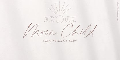
$28.00Introducing Moon Child, an elegant collection of two fonts that pair perfectly together. This collection will make designing Instagram quotes, websites & invitations effortless. What's Included Moon Child Script An elegant script font that includes ligatures that give you that gorgeous hand-lettered look. Moon Child Caps This is an all caps font that pairs perfectly with the script font - Trumania EEN - 100% free
- Fino by TypeTogether,
$35.00Tall, stately, and refined, with a showy contrast between thick and thin, a certain kind of titling Didone has become synonymous with fashion. Ermin Međedović’s latest type system amplifies the most theatrical aspects of this genre while bringing an uncommon flexibility of style and variation to any type palette — particularly those required for editorial design. Fino is a Rational (or Modern) display serif with sharp details. Its fairly Title proportions produce a regular beat of bold stems at frequent intervals. One can add an unexpected twist to this plot line by introducing the alternate ‘C, D, G, O, and Q’ (found in the uppercase); these replace the standard, Title oval shapes with big, full, show-stopping round ones. Other alternate forms, along with a grand ensemble cast of ligatures, lets the director continually flip the script. This stage is set in three acts: Fino, Fino, and Fino Stencil. Each of these offer six weights and italics, and each actor is comfortable speaking any Latin-based language, from standard Hollywood English to the many accents of Eastern Europe. Finally, every style comes in two optical sizes, with Title having the finest hairlines for the biggest parts. This lets you put Fino to work in a variety of productions, from short texts (24pt–48pt settings) to epic titles. The complete Fino family, along with our entire catalogue, has been optimised for today’s varied screen uses. All these talents let Fino perform a range of roles far broader than your typical Bodoni or Didot. - Fino Sans by TypeTogether,
$35.00Tall, stately, and refined, with a showy contrast between thick and thin, a certain kind of titling Didone has become synonymous with fashion. Ermin Međedović’s latest type system amplifies the most theatrical aspects of this genre while bringing an uncommon flexibility of style and variation to any type palette — particularly those required for editorial design. Fino Sans is a Rational (or Modern) display serif with sharp details. Its fairly Title proportions produce a regular beat of bold stems at frequent intervals. One can add an unexpected twist to this plot line by introducing the alternate ‘C, D, G, O, and Q’ (found in the uppercase); these replace the standard, Title oval shapes with big, full, show-stopping round ones. Other alternate forms, along with a grand ensemble cast of ligatures, lets the director continually flip the script. This stage is set in three acts: Fino Sans, Fino Sans, and Fino Sans Stencil. Each of these offer six weights and italics, and each actor is comfortable speaking any Latin-based language, from standard Hollywood English to the many accents of Eastern Europe. Finally, every style comes in two optical sizes, with Title having the finest hairlines for the biggest parts. This lets you put Fino Sans to work in a variety of productions, from short texts (24pt–48pt settings) to epic titles. The complete Fino Sans family, along with our entire catalogue, has been optimised for today’s varied screen uses. All these talents let Fino Sans perform a range of roles far broader than your typical Bodoni or Didot. - Fino Stencil by TypeTogether,
$35.00Tall, stately, and refined, with a showy contrast between thick and thin, a certain kind of titling Didone has become synonymous with fashion. Ermin Međedović’s latest type system amplifies the most theatrical aspects of this genre while bringing an uncommon flexibility of style and variation to any type palette — particularly those required for editorial design. Fino Stencil is a Rational (or Modern) display serif with sharp details. Its fairly Title proportions produce a regular beat of bold stems at frequent intervals. One can add an unexpected twist to this plot line by introducing the alternate ‘C, D, G, O, and Q’ (found in the uppercase); these replace the standard, Title oval shapes with big, full, show-stopping round ones. Other alternate forms, along with a grand ensemble cast of ligatures, lets the director continually flip the script. This stage is set in three acts: Fino Stencil, Fino Stencil, and Fino Stencil Stencil. Each of these offer six weights and italics, and each actor is comfortable speaking any Latin-based language, from standard Hollywood English to the many accents of Eastern Europe. Finally, every style comes in two optical sizes, with Title having the finest hairlines for the biggest parts. This lets you put Fino Stencil to work in a variety of productions, from short texts (24pt–48pt settings) to epic titles. The complete Fino Stencil family, along with our entire catalogue, has been optimized for today’s varied screen uses. All these talents let Fino Stencil perform a range of roles far broader than your typical Bodoni or Didot. - PR Scrolls 04 by PR Fonts,
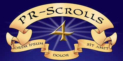
$15.50Inspired by food labels, signs and coats of arms, PR-Scrolls is a collection of images which can be used for framing text in contexts where antiquity, craftsmanship, or traditional quality are conveyed. There are several sets of glyphs which work together to make a variety of shapes, or banners of custom length. Most of the glyphs are presented in a range of four or more widths. - PR Scrolls 02 by PR Fonts,
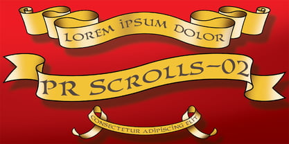
$10.00Inspired by food labels, signs and coats of arms, PR-Scrolls is a collection of images which can be used for framing text in contexts where antiquity, craftsmanship, or traditional quality are conveyed. There are several sets of glyphs which work together to make a variety of shapes, or banners of custom length. Most of the glyphs are presented in a range of three or more widths. - Osgard by Anthony James,
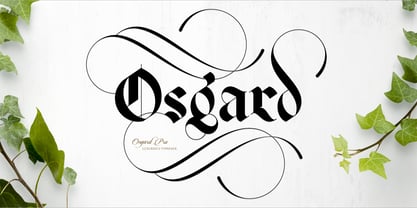
$25.00Osgard is a powerful luxurious Typeface, adopting the fluid curvaceous elements of Romanesque typography and combining them with the Gothic style of Blackletter. Forging the two creates a far softer, more versatile, fashion-based typeface; with beautifully distinct qualities. 1000 swashes, pre-made Conjunction Ligatures, Stylistic Alternates, Discretionary Ligatures, Contextual Alternates and all the OpenType features you need, make it perfect for any application. - Scary Scrimshaw NF by Nick's Fonts,
$10.00Fire up the incense and break out the love beads! A 1968 poster for a Doors concert by legendary artist Gary Grimshaw provided the inspiration for this wild, far-out and funky romp through the alphabet. Use it liberally to add a little trippy hippie charm to your next project. Both versions of the font include 1252 Latin, 1250 CE (with localization for Romanian and Moldovan). - Affair by Sudtipos,
$99.00Type designers are crazy people. Not crazy in the sense that they think we are Napoleon, but in the sense that the sky can be falling, wars tearing the world apart, disasters splitting the very ground we walk on, plagues circling continents to pick victims randomly, yet we will still perform our ever optimistic task of making some little spot of the world more appealing to the human eye. We ought to be proud of ourselves, I believe. Optimism is hard to come by these days. Regardless of our own personal reasons for doing what we do, the very thing we do is in itself an act of optimism and belief in the inherent beauty that exists within humanity. As recently as ten years ago, I wouldn't have been able to choose the amazing obscure profession I now have, wouldn't have been able to be humbled by the history that falls into my hands and slides in front of my eyes every day, wouldn't have been able to live and work across previously impenetrable cultural lines as I do now, and wouldn't have been able to raise my glass of Malbeck wine to toast every type designer who was before me, is with me, and will be after me. As recently as ten years ago, I wouldn't have been able to mean these words as I wrote them: It’s a small world. Yes, it is a small world, and a wonderfully complex one too. With so much information drowning our senses by the minute, it has become difficult to find clear meaning in almost anything. Something throughout the day is bound to make us feel even smaller in this small world. Most of us find comfort in a routine. Some of us find extended families. But in the end we are all Eleanor Rigbys, lonely on the inside and waiting for a miracle to come. If a miracle can make the world small, another one can perhaps give us meaning. And sometimes a miracle happens for a split second, then gets buried until a crazy type designer finds it. I was on my honeymoon in New York City when I first stumbled upon the letters that eventually started this Affair. A simple, content tourist walking down the streets formerly unknown to me except through pop music and film references. Browsing the shops of the city that made Bob Dylan, Lou Reed, and a thousand other artists. Trying to chase away the tourist mentality, wondering what it would be like to actually live in the city of a billion tiny lights. Tourists don't go to libraries in foreign cities. So I walked into one. Two hours later I wasn't in New York anymore. I wasn't anywhere substantial. I was the crazy type designer at the apex of insanity. La La Land, alphabet heaven, curves and twirls and loops and swashes, ribbons and bows and naked letters. I'm probably not the very first person on this planet to be seduced into starting an Affair while on his honeymoon, but it is something to tease my better half about once in a while. To this day I can't decide if I actually found the worn book, or if the book itself called for me. Its spine was nothing special, sitting on a shelf, tightly flanked by similar spines on either side. Yet it was the only one I picked off that shelf. And I looked at only one page in it before walking to the photocopier and cheating it with an Argentine coin, since I didn't have the American quarter it wanted. That was the beginning. I am now writing this after the Affair is over. And it was an Affair to remember, to pull a phrase. Right now, long after I have drawn and digitized and tested this alphabet, and long after I saw what some of this generation’s type designers saw in it, I have the luxury to speculate on what Affair really is, what made me begin and finish it, what cultural expressions it has, and so on. But in all honesty it wasn't like that. Much like in my Ministry Script experience, I was a driven man, a lover walking the ledge, an infatuated student following the instructions of his teacher while seeing her as a perfect angel. I am not exaggerating when I say that the letters themselves told me how to extend them. I was exploited by an alphabet, and it felt great. Unlike my experience with Ministry Script, where the objective was to push the technology to its limits, this Affair felt like the most natural and casual sequence of processions in the world – my hand following the grid, the grid following what my hand had already done – a circle of creation contained in one square computer cell, then doing it all over again. By contrast, it was the lousiest feeling in the world when I finally reached the conclusion that the Affair was done. What would I do now? Would any commitment I make from now on constitute a betrayal of these past precious months? I'm largely over all that now, of course. I like to think I'm a better man now because of the experience. Affair is an enormous, intricately calligraphic OpenType font based on a 9x9 photocopy of a page from a 1950s lettering book. In any calligraphic font, the global parameters for developing the characters are usually quite volatile and hard to pin down, but in this case it was particularly difficult because the photocopy was too gray and the letters were of different sizes, very intertwined and scan-impossible. So finishing the first few characters in order to establish the global rhythm was quite a long process, after which the work became a unique soothing, numbing routine by which I will always remember this Affair. The result of all the work, at least to the eyes of this crazy designer, is 1950s American lettering with a very Argentine wrapper. My Affair is infused with the spirit of filete, dulce de leche, yerba mate, and Carlos Gardel. Upon finishing the font I was fortunate enough that a few of my colleagues, great type designers and probably much saner than I am, agreed to show me how they envision my Affair in action. The beauty they showed me makes me feel small and yearn for the world to be even smaller now – at least small enough so that my international colleagues and I can meet and exchange stories over a good parrilla. These people, whose kindness is very deserving of my gratitude, and whose beautiful art is very deserving of your appreciation, are in no particular order: Corey Holms, Mariano Lopez Hiriart, Xavier Dupré, Alejandro Ros, Rebecca Alaccari, Laura Meseguer, Neil Summerour, Eduardo Manso, and the Doma group. You can see how they envisioned using Affair in the section of this booklet entitled A Foreign Affair. The rest of this booklet contains all the obligatory technical details that should come with a font this massive. I hope this Affair can bring you as much peace and satisfaction as it brought me, and I hope it can help your imagination soar like mine did when I was doing my duty for beauty. - Tex Mex by FontMesa,
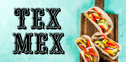
$25.00Tex Mex is simply a spurred version of our Saloon Girl font family. When you think of a classic western font you think of spurs in the letters, with Tex Mex we set out to create a font that stands out and says Western. Whether you're making a new steakhouse menu or a new logo for your cowboy boot and hat company Tex Mex is the font you're looking for. If you're a pioneer in the culinary scene Tex Mex is perfect for you're next cookbook cover, chili cook off or barbecue competition. Just like our Saloon Girl font Tex Mex also works in layers, to make a layered font image you'll need an application that works in layers such as Illustrator or Photoshop.


