10,000 search results
(0.048 seconds)
- Mirthful Charlie by Letterhend,
$18.00 Mirthful Charlie is a quirky bold font that is perfect for adding a touch of fun and whimsy to any design project. The font features a bold and quirky form that exudes a sense of cheerfulness and lightheartedness. This font makes it ideal for a variety of design projects, including posters, invitations, greeting cards, logos, and more. Whether you're creating a children's book or designing a playful brand identity, this font is sure to bring a smile to your audience's face. Features : Uppercase & lowercase Numbers and punctuation Ligatures Multilingual PUA encoded We highly recommend using a program that supports OpenType features and Glyphs panels like many of Adobe apps and Corel Draw, so you can see and access all Glyph variations.
 - Lucaria by Jehoo Creative,
$19.00 Lucaria is a modern serif typeface that combines classic design with contemporary details. The most distinctive feature of Lucaria is its strong shape on the edges, which gives the font a bold and commanding presence. This design element is complemented by the wide characters, which provide ample space for legibility and readability. The combination of these features makes Lucaria a great choice for displays and headlines. This versatile font family is available in seven weights, including Light, Regular, Medium, Semibold, Bold, Extrabold, and Black, as well as a variable font for added flexibility. The variable font option allows designers to customize the weight makes Lucaria an ideal choice for a range of design projects, including branding, packaging, and editorial layouts.
 - Dubbo by Factory738,
$15.00 I present to you Dubbo, a new retro serif! Dubbo is a fashionable font that is both retro and bold. Its thick curves give it a 70s groovy vibe, while the serifs bring it back to traditional. Dubbo fits right in with those retro mood boards and vintage logos. It includes a distinct lower and uppercase, as well as numbers, punctuation, and multilingual letters. The Ligature and Alternate fonts are sure to come in handy for whatever your imagination can conjure up! 5 Weights (Light, Regular, Semibold, Bold, Black) Basic Latin A-Z and a-z Numerals & Punctuation Stylistic Alternates & Ligatures Multilingual Support for ä ö ü Ä Ö Ü ... Free updates and feature additions Thanks for looking, and I hope you enjoy it.
 - Retro Couture by Putracetol,
$20.00 Retro Couture - Vintage Bold Font. Retro Couture inspired by vintage poster design, Retro Couture is a family script font designed with carefully handcrafted, Retro Couture is a bold font perfect for your home decor and craft designs Retro Couture is a vintage font that is perfect for story books, illustrations, comic books, t-shirts, posters, greeting cards, logos, branding, stickers, svg, crafting and all for display purposes. The alternative characters were divided into several Open Type features such as Swash, Stylistic Sets, Stylistic Alternates, Contextual Alternates, and Ligature. The Open Type features can be accessed by using Open Type savvy programs such as Adobe Illustrator, Adobe InDesign, Adobe Photoshop Corel Draw X version, And Microsoft Word. Retro Couture is also support multi language.
 - Bropella by Martype co,
$20.00 Introducing, Bropella. A bold sans with unique alternates and swashes! Comes with classic style and modern design with strong bold feels, of course this font perfect for headline, logotype, apparel, branding, packaging, editorial and etc. --- What's Include ? - Alternates - Ligatures - Swashes - And Many More! --- Support for 66 languages Afrikaans, Albanian, ,Basque, Bemba, Bena, Breton, Catalan, Chiga, Cornish, Danish, Dutch, English, Estonian, Faroese, Filipino, Finnish, French, Friulian, Galician, German, Gusii, Indonesian, Irish, Italian, Kabuverdianu, Kalenjin, Kinyarwanda, Luo, Luxembourgish, Luyia, Machame, Makhuwa, Meetto, Makonde, Malagasy, Manx, Morisyen, North, Ndebele, Norwegian, Bokmål, Norwegian, Nynorsk, Nyankole, Oromo, Portuguese, Quechua, Romansh, Rombo, Rundi, Rwa, Samburu, Sango, Sangu, Scottish, Gaelic, Sena, Shambala, Shona, Soga, Somali, Spanish, Swahili, Swedish, Swiss, ,German, Taita, Teso, Uzbek (Latin), Volapük, VunjoZulu, --- Thanks! Happy Desigining :) Umar
 - MartiniThai Neue Slab V2 by Deltatype,
$39.00 Award winning 2017 font from Demark (Thailand) and G-Mark (Japan) in Graphic Design, MartiniThai Neue Slab is now available with better taste. Deltatype created a better version of MartiniThai Neue Slab V2: refined for better outline, we fine-tuned all outlines for better letterforms. Proportion were adjusted for better consistent. Metrics got new values for increased readability. Kerning, fine-tuned kerning pair for better spacing between the letters. MartiniThai Neue Slab V2 comes in six weights: Thin, Light, Regular, Bold, Extra Bold, Black. Thai Language is included in this package. MartiniThai Neue Slab is a unique slab serif in Thai Script that creates a sense of timeless and contemporary feel and is used by a media provider and nationwide in Thailand.
 - Noland by Flavortype,
$14.00 Noland, A new carefully crafted Variable Geometric Typeface. The Ideas of this fonts are from retro poster, music, movie poster, theater, science fiction from the 70s and early 80s. Adding the elements from the reference above to be represented as Noland. It’s Versatile, Fun, Sharp and Retro-ish feel that you get in Noland Typefaces. Noland Available with 3 Weights: Regular, Semibold and Bold. Also Available in Variable, so the weights are more flexible between Regular and Bold. Just Play with slider weight. Our creation on the display to give you a reference what it looks like on your project. such as Branding, Header, Logotype, Poster, Magazine, Packaging, and etc. It shows that Noland clearly can accommodate Retro Vintage style.
 - Figgins Brute by Intellecta Design,
$14.90"A capital titling face with numerals, erroneously labelled in Figgins specimen book of 1817 as an 'antique' or roman. With a very bold, nearly monoline construction and squared serifs as thick as the main stroke, this type surpassed even the fat face style in blackness, it was popularised by the advent of handbills and early advertising posters, which needed bold type styles to project commercial messages from a distance. A sign-writer friend of mine theorises that the Egyptian style originated with the North African campaigns (hence Egyptian) of Napoleon Bonaparte, and the type historian Ruari McLean also suggests that the Egyptian style originated with signwriters 'block' letters, just like the prototypical (and contemporary) sans serif of Caslon IV." (Ben Archer) - Isle Headline by Mans Greback,
$19.00 Isle Headline is a high-quality serif typeface family, drawn by Måns Grebäck during 2018 and 2019. It is a sharp font with a clear and attentive look, adapted for headlines, titles and large type settings. It comes in four weights, each one as italic, totaling in eight styles: Light and Light Italic, Medium and Medium Italic, Bold and Bold Italic, Black and Black Italic. The font family can be used in a combination with a font of a different style, or together with its sister font Isle Body, also a serif font, which has the same basic structure but with a softer look and adapted for body text and smaller type. Each style contains ligatures and support for a wide range of languages.
 - Astaire Pro by Hackberry Font Foundry,
$24.95 This is a deco-style text OpenType Pro font loosely based on Koch's Locarno as seen in KochAltschrift a recent free German tribute to Koch's work. I was familiar with Meek's Letraset presstype version called Locarno, but I never liked the proportions used by either Meeks or Koch. So I radically revised ascender, descender, and x-height to make them more usable and brought the shapes within my sense of design. Mine is probably closer to Meeks than Koch, but hopefully it is a tribute to both. Astaire looks much more modern and it is much more usable. I added oldstyle figures, small cap figures, small caps, several ligatures, and more. There are an italic, bold, and bold italic also in this family
 - Mirantz by insigne,
$32.00 Y’all ready for this? Now starting for Insigne: the new serif Mirantz. This rookie all-star plays a precise game every game, cutting at all the right angles to leave your reader impressed and ready to see more. You can always count on Mirantz to lead with solid mechanics and a clean style, but don’t be surprised when the face keeps it real with a little individual flare and creativity. This personal touch is nothing short of elegance in every appearance. So what makes us love this rookie above the other great players in the field? Contrast, for one. Mirantz brings more contrast to the game than most serifs out there. The serifs on this face have a crisp, sharp wedge that naturally draws the reader’s eye. You can’t help but fall in love with its clean, natural style. Mirantz also features a tall x-height and regular proportions that can play a number of positions on the page and still stay strong through the last half of the copy or even the final period. Mirantz is a solid powerhouse player, containing a complete set of small capitals and nine weights from thin to bold. It can play well both down low and up top with its subscripts and superscripts and can move your reader’s eye easily across the copy with its titling capitals, condensed and extended variants, and open style figures. With its options covering more than 72 Latin-based languages, look for this newcomer to have international success in the near future. It you haven’t set your draft picks for this next round of projects, think hard before passing up Mirantz. A capable serif like this one is a guaranteed asset to any team of fonts. Production assistance from Lucas Azevedo.
 - Terfens Gothic by insigne,
$29.00 Terfens Gothic is the perfect choice for your next project! With its medium contrast and approachable design, this calligraphic sans serif has a classic feel that will never go out of style. Terfens Gothic is the perfect typeface for anyone looking to add a touch of uniqueness to their designs. With its generous x-height and rounded terminals, it's perfect for creating one-of-a-kind designs that are sure to impress. Its large x-height gives it a welcoming, but not too casual vibe. With forty-eight different typefaces, it has the versatility and aesthetic options you need to make your project stand out. Choose from regular, condensed, and extended styles, each with nine different weights and italics. Terfens Gothic has the look you need to make a powerful impression. Terfens is the ideal typeface for any project that has to stand out, thanks to its towering verticality. Terfens may be utilized for a variety of purposes because of its adaptable design. Terfens is a sans unlike any other- it starts with a beautiful calligraphic chancery script and then adds movement and personality. This sans is guaranteed to make your next project more exciting! The Terfens Type System's third typeface, Terfens Gothic, is an amazing addition to any type collection. The Terfens Type System's adaptability is unrivaled, with its vast choice of styles, widths, and weights. This font family has everything you need to create unique, customized designs that will suit your individual needs. Whether you need a narrow or wide font, or a hairline or bold weight, the Terfens Type System has you covered! And, with its Opentype features, the Terfens Type System is perfect for anyone who wants to add a personal touch to their projects.
 - RQND Pro V.2 by Tondi Republk,
$25.00 Introducing RQND Pro 2 - The Futuristic and Industrial Sans Serif Font Welcome to the world of RQND Pro 2, a cutting-edge sans serif font designed to elevate your designs to new heights. With its industrial aesthetic and futuristic appeal, this font is the perfect choice for projects seeking a bold and contemporary look. Key Features: 1,201 Glyphs: RQND Pro 2 boasts an extensive character set, offering you a vast array of design possibilities. Supports 123 Languages: No matter where your audience is, this font ensures that your message is conveyed clearly and effectively. 20 Font Styles: With 5 font weights and 5 font widths, RQND Pro 2 offers 20 unique styles to suit every creative vision. Expanded to Extra Condensed: Whether you need a spacious layout or a compact design, this font delivers unmatched versatility. 18 OpenType Features: Unlock the full potential of RQND Pro 2 with various OpenType features, including small caps, alternate characters, standard numerals, circled numerals, fractions, and more. All Caps Font: Embrace the power of uppercase letters with this font, enhancing the impact of your message. Full Character Set: From standard numerals to punctuation marks, mathematical symbols to special characters, RQND Pro 2 has everything you need for seamless communication. Latin and Cyrillic Support: Perfect for international projects, this font provides complete support for both Latin and Cyrillic languages. RQND Pro 2 empowers designers, creatives, and typographers to explore new design territories. Its sleek and modern appearance makes it ideal for tech branding, UI design, editorial projects, advertisements, web design, and more. Discover a font that combines sophistication with contemporary flair. Elevate your designs with RQND Pro 2 and leave a lasting impression on your audience. Explore the full range of styles and unleash your creativity today.
 - Drum Komputer - 100% free

- Kyboshed - 100% free

- Mottek - Personal use only

- Last Ninja - Unknown license

- Duralith - Unknown license

- Drive-Thru - 100% free

- Lyra by Canada Type,
$39.95 Lyra is an Italian Renaissance script that might have developed if metal type had not broken the evolution of broad pen calligraphy. It lies in the area between the humanist bookhand and the chancery cursive, combining the fullness and articulation of the Roman letters with a moderate italic slant and condensation. A steep pen-angle allows use of a broader pen relative to the x-height, giving the letters more contrast with light verticals and heavy curves. Lyra embodies the Renaissance spirit of refining technical advances of the late middle ages with reintroduction of ancient classical principles. Based on the moving penstroke with constantly changing pen-angle, it brings the vitality of handwriting to the ordered legibility of type. Lyra is a formal italic, too slow for copying books. By eliminating the element of speed, digital technology opens up a new level of calligraphy, bringing it into the sphere of typography as would naturally have happened if metalworkers had not controlled the process. If classical Western traditions are respected, digital calligraphy has the potential to recapture the work of the past and restart its stalled evolution. There is of course no substitute for the charm of actual writing, with each letter made for its space; but the tradeoff is for the formal harmony of classical calligraphy as every curve resonates in tune with every other. This three-weight font family marks Philip Bouwsma's much-requested return from a three year hiatus. It also reminds us of his solid vision in regards to how calligraphy, typography and technology can interact to produce digital beauty and vesatility. Each of the three Lyra fonts contains almost three character sets in a single file. Aside from the usual wealth of alternates normally built into Bouwsma's work, Lyra offers two unique features for the user who appreciates the availability of handy solutions to subtle design space issues: At least three (and as many as six) length variations on ascending and descending forms, and 65 snap-on swashes which can be attached to either end of the majuscules or minuscules. The series also offers 24 dividers and ornaments built into each weight, and a stand-alone font containing 90 stars/snowflakes/flowers, symmetric contstructs for building frames or separators, masking, watermarking, or just good old psychedelia.
 - Scandinavia Brush by Mans Greback,
$69.00 Scandinavia Brush is a wild calligraphy font by Mans Greback, inspired by the untamed beauty of Nordic nature. It captures a rugged essence, with each stroke reflecting the raw energy and grace of natural environments. This brush-painted typeface is perfect for logos, handwritten designs, and tattoo art with its active and streetwise feel. Designed with a professional touch and high-quality craftsmanship, Scandinavia Brush comes in six versatile styles: Regular, Upright, Bold, Italic, and the combinations Bold Italic and Bold Upright. The range of styles allows you to create unique, expressive designs that capture the spirit of adventure, speed, and beauty. Use underscores _ anywhere in a word to make an underline swash. Example: Nord___ic Bru_sh Ideal for designer and art projects, or high-end handcrafted products, Scandinavia Brush brings a bold, authentic, and captivating touch to your creative endeavors. The font is built with advanced OpenType functionality and has a guaranteed top-notch quality, containing stylistic and contextual alternates, ligatures, and more features; all to give you full control and customizability. It has extensive lingual support, covering all Latin-based languages, from Northern Europe to South Africa, from America to South-East Asia. It contains all characters and symbols you'll ever need, including all punctuation and numbers. Mans Greback is a Swedish typeface designer with a passion for creating unique and versatile fonts. With an extensive background in design and typography, Mans has built a reputation for his meticulous attention to detail and prolific craftsmanship. His many fonts are widely used by designers around the world, making his work synonymous with creativity and innovation.
 - Austerity by Heyfonts,
$15.00 Austerity Retro Script font is a vintage-inspired typeface that is perfect for creating classic design projects. Its elegant and curvy handwritten style makes it ideal for conveying a sense of nostalgia and timeless sophistication. This font is available in both regular and bold weights and includes uppercase and lowercase letters, numbers and punctuation symbols. Some of its features include: -Vintage Style: Austerity Retro Script font captures the essence of the golden age of typography with its retro-style design. It is perfect for creating vintage posters, product packaging, branding, and more. -Handwritten Appearance: The font has a unique and playful handwritten appearance, with smooth curves and a natural flow. It captures the essence of calligraphy and is perfect for conveying a sense of personal touch. -Bold and Regular Weights: Austerity font is available in both bold and regular weights, giving designers flexibility to mix and match them to achieve a wide range of styles. -Uppercase and Lowercase Letters: The font includes both uppercase and lowercase letters, making it easy to create a variety of typographic combinations for your designs. -Punctuation Symbols and Numbers: Austerity font also includes a range of punctuation symbols and numbers, making it a versatile typeface for a wide range of projects. -Multilingual Support: The font supports multiple languages, including English, French, German, Portuguese, Spanish and more. Overall, Austerity font is a perfect choice for designers who want to create a vintage feel in their design projects. Its handwritten style, bold and regular weights, and range of symbols and numbers make it a versatile and reliable font for any design project.
 - Flirt by Canada Type,
$25.00It's a very happy day when we stumble upon beautiful alphabets that were never digitized. It is even a happier day when the beautiful alphabet finds its way to us through friends and people who like our work. Some two months ago, the forms of this gorgeous font were pointed to us by a friend who saw it in an old Dover Publications specimen book showcasing historical alphabets. It was there under the name Vanessa, with nothing else to go by. We looked and researched for further information but found nothing else. So this gem comes to you like a coal that winked its way out of the ashes because it wanted to shine again. Flirt is very authentic art deco with a noticeable element of artistic pride, swashy delicate majuscules and very aristocratic, fashionable and flirty minuscules. The majuscules can be used as every other capitals usually are, or as initial caps. The minuscules can very nicely stand on their own quite independently from the caps whenever desired. These letters are quite similar to the hand lettering used on of the kind of theater posters, specifically burlesque and opera entertainment, which are now considered very retro-chic and fashionable to see hanging on walls in home or office. The initial specimen we worked from showed a single basic art deco alphabet with numerals which seemed as they belonged to another font. That alphabet became the base Flirt font, the numerals were redrawn to fit much better with the minuscules, and the character set was greatly expanded to include punctuation, accented characters, and many many alternates, especially for the majuscules. Majuscules with a descending right vertical stroke were a common artistic touch in the high days of theater posters, so we thought they would be great additions to the character set. These alternates can be found all over the font. So to maximize the design fun, have a character map or glyphs palette handy when you use Flirt. After the base font was finished, we thought it would be a good idea to give it a bold treatment unlike anything seen out there, and the farthest thing from the mechanical bolds seen everywhere now. This bolding treatment consisted of thickening the lowercase's vertical strokes inwards, but leaving the horizontal stroke weight as is, and thickening only the thicker vertical strokes of the uppercase. The result is quite the visual feat. We encourage you to test both the regular and bold weights and see for yourself. - Martie by Canada Type,
$25.00From the heart of the Blue Ridge Mountains, by way of Toronto, comes Martie's handwriting. Martie Byrd is a school teacher in Roanoke, Virginia, and a friend of Canada Type's Rebecca Alaccari. After years of admiring the cheer and clarity of Martie's handwriting, we asked her to write out full alphabets for some cool font treatment. The intent was to do three different versions of her writing in two different pens, then use the auto-magic of OpenType to determine letter sequences and rotate character sets on the fly when the fonts are in use. A successful endeavor it was. Take a look at the images in the MyFonts gallery to see the character rotation in action, along with a visual explanation of why Martie is not just another handwriting font. Unlike other available felt tip and ballpoint handwriting fonts, the regular and bold variations are style-based, not weight-based. They are the handwritten expressions of two different Sharpie pens: The fine point one (Martie Bold), and the ultrafine one (Martie Regular). The style-based variation considerably helps the realism needed in design pieces that take advantage of the contrast of two different handwriting fonts. Weight thickening in handwriting is an obvious mechanical effect that only happens with computers. Weight changing by replacing pens is what happens in the real world. Martie Pro and Martie Pro Bold each contain three different character sets in a single font. Language support includes Western, Central and Eastern European languages for all three sets. This translates into each Pro font containing over 750 characters. Add OpenType code and stir, and you have true handwriting fonts with versatility unavailable out there in anything else of the genre. A software program that supports OpenType features is needed to use the randomization coded in Martie Pro and Martie Pro Bold. Current versions of QuarkXpress and Adobe applications (Photoshop, Illlustrator, InDesign) do contain support for the randomization feature. But if you don't have one of these apps, you can still use the interchangeable Type 1 or True Type fonts and change the characters manually to achieve the appearance of true handwriting. The Martie fonts come in a variety of price packages, from the affordable single fonts to value-laden complete sets. All the proceeds from these fonts received by Canada Type will be donated 50/50 to two primary schools: One in Roanoke (where Martie teaches), and one in Toronto (where the 10-year old, real Canada Type boss goes). So next time a design project needs a handwriting font, do the write thing and use Martie to keep it real. - Paneuropa 1931 by ROHH,
$19.00 Paneuropa 1931™ is a faithful recreation of XX-century Polish classic, made by Idzikowski foundry in Warsaw, 1931. Original Paneuropa was a renowned and highly popular typeface in XX-century Poland, and was widely used in all kinds of design, editorial use and printed materials for decades. Paneuropa is a geometric, clean and versatile font family inspired by Paul Renner's famous Futura - it is a bit narrower, with different proportions and details in drawing, completely different figures and punctuation shapes than Futura. It is an interesting and refreshing alternative to Futura with its own distinct personality and a subtle authentic vintage flavour. Paneuropa 1931 contains separate styles for display and large sizes as well as styles for small text sizes - differing in spacing and the softness of letterforms. The family features an original Paneuropa Double font - a beautiful inline style for headlines and display use. The whole family is completed with added missing inbetween styles as well as italics. The original subfamily set is available for purchase and it contains solely the original Paneuropa styles (Thin, Regular, Bold, Text Regular, Text Italic, Double). Paneuropa 1931 characteristics: letter shapes and proportions are very faithful to the original, keeping its idiosycrasies and inconsistencies spacing and kerning are carefully adjusted in order to achieve the colour of the original fonts, keeping maximum possible consistency - a compromise between authentic vintage feel and legible consistent text colour (for hardcore users: just turn off the kerning) weights precisely matching the original (Thin, Regular, Bold, Text Regular, Text Italic, Double), inbetween weights were added (Light, Demi Bold, as well as missing italic styles) italic angle faithful to the original (8 degrees) softened corners help achieving the character of old imprecise printed display styles for big sizes are sharper and have tight spacing, text styles have softer shapes (recreating small print imperfect print) and broader spacing for use in paragraph text (spacing in both display and text styles matches the original as well) original style names in Polish for devices with Polish set as their primary language The family is very versatile. The Inline style as well as bold and thin weights are perfect for headlines and display use, other styles works wonderfully as paragraph text. Paneuropa 1931 consists of 18 fonts - 5 display weights with corresponding italics + 3 text weights with corresponding italics + 2 inline styles (for big and small print sizes). It has extended support for latin languages, as well as broad number of OpenType features, such as case sensitive forms, fractions, superscript and subscript, ordinals, currencies and symbols.
 - Nihilism by RagamKata,
$14.00 Introducing Nihilism, a meticulously crafted script font that strikes the perfect balance between graceful curves and distinctive personality. Ideal for crafting logotypes that leave a lasting impression, designing captivating posters, and so much more. Let Nihilism infuse your designs with a touch of charm and style.
 - Glossily Enigmatic by Ali Hamidi,
$12.00 Glossily Enigmatic is a modern and natural handwritten font. It has has a elegant expression, with a charming and chic impression. Glossily Enigmatic brings a warm feeling and cozy style to your design such as wedding, stationery, logos, social media quotes, branding identity, and many more.
 - Domingo by Sudtipos,
$25.00 The smooth curves and big wondrous eyes of the Tango dancer in all her charm. Domingo expresses the sensual mysteries of South America like no other typeface ever could. Fragile yet firm, loving yet proud, Domingo conveys an eternal sense of care and beauty, depth and poetry.
 - Ski Alpin NF by Nick's Fonts,
$10.00 A Swiss travel poster from 1927 offered the pattern for this idiosyncratic Art Deco face. Use it and add a little personality and charm to your next project. Both versions of this font support the Latin 1262, Central European 1250, Turkish 1254 and Baltic 1257 codepages.
 - Hubby Bunny by Almarkha Type,
$22.00 Hubby Bunny is a quirky and fun sans full of charm . It will take any DIY-project to the next level! Hubby Bunny is perfect for Craft , product packaging, product designs, label, branding projects, logo, wedding designs, social media posts, advertisements, watermark, invitation, stationery and any projects
 - Sindentosca by Aminmario Studio,
$20.00 Sindentosca Font Sindentosca is a handwritten font. Its modern charm makes it appear wonderfully, readable, and, ultimately, incredibly versatile. This font will look outstanding in any context, whether it’s being used on busy backgrounds or as a standalone headline! Thank you for the purchase. Happy creating design :)
 - Calligraphic Ornaments by ITC,
$29.99English designer Richard Bradley created the Calligraphic Ornaments symbol font for ITC in the 1990s. Drawn in a lively traditional style similar to fine calligraphy, this font's characters set the perfect holiday spirit with little teddy bears, a Santa Claus, ringing bells, holly leaves, and other charms. - Fourteen64 by Grummedia,
$24.00Inspired by 15th century Venetian italic book texts and based on examples from volumes on the history of type. Fourteen64 has a rugged charm and lots of character featuring 'Roman' capitals with italic lowercase. Includes alternate characters, extra ligatures and a small selection of medieval ornaments. - My Sallome by RahagitaType,
$15.00 My Sallome is a beautiful script in a natural handwritten style. Its casual charm makes it appear wonderfully down-to-earth, readable and - ultimately - incredibly versatile. My Sallome will look outstanding in any context, whether it’s being used on busy backgrounds or as a standalone headline.
 - Socialist by Balpirick,
$15.00 Socialist is a gorgeous handwritten font, carefully handcrafted to become a true favorite. Its casual charm makes it appear wonderfully down-to-earth, readable and, ultimately, incredibly versatile. Socialist will look outstanding in any context, whether it’s being used on busy backgrounds or as a standalone headline!
 - Hightide by Atlantic Fonts,
$26.00 Hightide is a rough, hand-lettered script font inspired by brush calligraphy of the 50’s and 60’s. It’s a cinch to use, and adds a welcome splash of salty vintage charm wherever it goes. Shown in posters with other Atlantic Fonts including Began and Reading.
 - Hardbones by Krntype Studio,
$16.00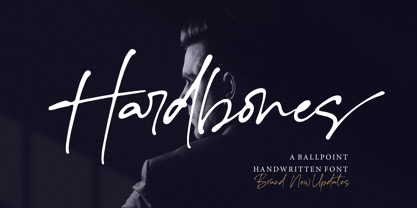 Hardbones is a stunning ballpoint signature font. font with unique natural flow and feminine style, made using a unique gel ballpoint ink. Each letter is deliberately imperfect to make it look more natural and charming. Hardbones comes with multilingual support, ligature, and ending swash from a-z.
 - Setyaki by Aisyah,
$12.00 Setyaki is a Script handwritten font, carefully handcrafted to become a true favorite. Its casual charm makes it appear wonderfully down-to-earth, readable and, ultimately, incredibly versatile. Setyaki will look outstanding in any context, whether it’s being used on busy backgrounds or as a standalone headline!
 - Delninoys by Almarkha Type,
$23.00 Delninoys is a cute display font, carefully created to become a true favorite. Its casual charm makes it appear wonderfully down-to-earth, readable and, ultimately, incredibly versatile. Delninoys will look outstanding in any context, whether it’s being used on busy backgrounds or as a standalone headline!
 - Mixbox by Sabrcreative,
$20.00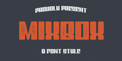 Evoke the spirit of a bygone era in your designs with the enchanting Mixbox Vintage Retro Display Font. This typeface seamlessly merges vintage charm with modern versatility, making it an ideal choice for designers seeking to infuse their projects with a touch of nostalgia and sophistication.


