10,000 search results
(0.052 seconds)
- Slammer by Sensatype Studio,
$15.00 Slammer is a Popular Bold Sport Font that created special for Branding, Title and more stand out typography for sport and action. It's so perfect to add your style and headline overview for sport, technology, actions, and fighting theme. And specially for this font, we crafted for bold action style and modern feels so enjoy to create any project that will show your main idea out. Slammer Popular Bold Sport Font ready with: Creative characters prepared to get best results Preview as a inspirations that you can do with Slammer font Ready with All Uppercase characters Wish you enjoy our font. :)
 - Slenderz by CozyFonts,
$25.00 Slenderz is a handwritten font designed by Tom Nikosey, an American Graphic Designer specializing in Typographic Design and Illustration. Slenderz is available in Light, Medium & Bold weights. CozyFonts Foundry is Tom's intro into the world of font design. Slenderz is a casual, handwritten font that gives a reserved yet firm and legible personality to any headline or copy. Each of the 3 weights has it’s own personality yet like 3 brothers they represent the and belong to the same family. Intermixing Light & Bold or Medium & Bold won’t ruin the flow but will enhance it. Slenderz is the 9th font family from CozyFonts Foundry.
 - Horse Pro by Studio Fat Cat,
$14.00 Horse Pro is another popular sans-serif typeface. Horse Pro was designed by Atok Khoirudin and released through the Studio Fat Cat Type foundry. It is characterized by its bold and uppercase letters, giving it a strong and impactful appearance. Horse Pro is perfectly used in various design contexts, such as headlines, posters, logos, and banners, where a bold and modern look is desired. The font family includes different weights and styles, allowing for flexibility in design projects and have become go-to choices for many designers looking for a bold and stylish sans-serif font for their projects.
 - Badge Robo 3d Display Graffiti by Sipanji21,
$15.00 "Badge Robo" is a 3D display graffiti font with very bold and impactful characters. Fonts like this are often used in designs where you want to create a bold, attention-grabbing, and three-dimensional text effect. This style can be seen in various design applications, including street art, posters, or any project where you want your text to stand out prominently. With "Badge Robo," you can create designs that feature powerful and visually striking typography. The bold and 3D nature of this font can make your text appear dynamic and attention-grabbing, helping your design make a strong impact.
 - Porchlight by Ana's Fonts,
$15.00 Porchlight is a soft serif font inspired by vintage French typography. It includes three weights: regular, semi bold and bold, with matching italics. It also includes bonus ornaments that complement the font beautifully, for elegant and easy designs. Included in this trendy font family: 6 fonts: regular, semibold and bold, plus italics, with over 300 glyps each, including small caps and lots of ligatures. ornaments font with 52 ornaments (13 different designs, mirrorred horizontally and vertically). borders font, with borders with different thickness. Use Porchlight in print layouts, logotype design, social media posts, branding and packaging.
 - Sundash by Jehoo Creative,
$16.00 Sundash versatile typeface with wide allternate allcaps. This bold modern font explores the style of Allcaps, we add a wide character to make it look more flexible. based on forms inspired by free urban culture, Sundash has a modern and vibrant spirit. Sundash explores how the shapes and curves of letters change their Focus. This font has a variable weight of 5 Light, regular, medium, bold, extrabold to make the sundash more solid. Sundash has 247 glypghs with a unique and bold character perfectly suited for a wide variety of applications from editorial design to branding, advertising, publications and digital.
 - Aladdin by CozyFonts,
$20.00 Aladdin Black is the 3rd member of our Aladdin Bold Font Family. This new style is extra bold and slightly rounded on the outsides of the glyphs. It is fat, fancy, fearless, forward, devilish, heavy, and stylized. Aladdin Bold was my first font introduced in 2012. I've always felt there were possibilities of adding styles to this family and something triggered the decision, so...here it is. I took much time deliberating over many of the finer details in this version of Aladdin and I hope the 'devil is in the details' for whoever decides to try on Aladdin Black.
 - Blooming Heart by Lunas Type,
$19.00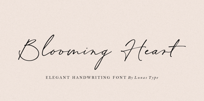 Introducing, Blooming Heart! Blooming Heart has a natural expression, with a charming and elegant impression. A modern and luxurious handwritten font comes with handwritten swashes and ligatures. Blooming Heart brings a charm feeling, clean style and timeless to your design such as wedding, stationery, logos, social media quotes, branding identity, and many more.
 - Home Run by Doyald Young,
$50.00Home Run Script has the formality of 18th-century English roundhands, narrow, tightly fitted and drawn in a very bold weight and inspired by my ITC Eclat font. The x-height is large, and the caps are simply drawn with minimal swashes. Its companion font Home Run Sanscript, sold separately also, has sans serif caps that enable the user to combine script and sanserif caps with the same slope. It has the same lowercase as Home Run Script with a few alternate characters and sans serif lining and Oldstyle figures. Both Young Finesse and Home Run include Richard Isbell’s “interrabang,” appropriately used for statements that are both interrogative and exclamatory. - Apothecary Serif by Pixel Colours,
$26.00 Apothecary Serif is a font collection inspired in vintage and antique prints. Great for texts or headings and perfect as a pairing font. Design quotes, packaging, wedding invites or labels and branding with a vintage style. Lovingly designed to match my original Apothecary Script (sold separately) Includes: - Apothecary Serif: a serif font with an antique print press texture. - Apothecary Serif Spaced: beautifully spaced for texts or as a pairing font. - Apothecary Serif Caps: rich bold and tall textured capitals font that includes the lowercases as a secondary uppercase font, slightly smaller. Great for headings or as drop caps. - Apothecary Serif Caps Spaced: beautifully spaced for texts or as pairing font.
 - Smarty Pants by Burghal Design,
$29.00Remember that kid in your class who always knew the right answer, who always had their hand raised? The first kid to finish the test, the kid who LIKED the pop quiz, the kid who did the homework five seconds after the teacher wrote the assignment on the board and was guaranteed to get an an A+, even though they NEVER studied? THAT kid? Burghal Design has a font that both remembers and salutes that kid, that teacher's pet, that know-it-all: SmartyPants. SmartyPants comes in regular, bold, and because bold just isn't bold enough for SmartyPants, super bold. There's also SmartyPants Doodles, with 90 pictures of SmartyPants stuff (such as a safety pin, a doghouse, an inkwell, and even a couple of cooties), and SmartyPants Snowflakes, with a whopping 182 dingbats to choose from. - Pentathlon Pro by DBSV,
$80.00 Strait passages second part… I tried in this fifth (that's why she took the name "Pentathlon Pro”) consecutive font family to give her a character style with again a strait way of writing. Walking on the same considerations as the previous series (Khamai, Aeolus, Corset & Artios) I tried to give some sense of diversity for the strait passages of character: those fourteen style are the result. And in this family, the “Bold” with "Inlier" and “Bold Italic” with "Inlier Italic” engage in the same way as did the “Layered font families” in the previous series. Also I added a design statement for the twelve zodiac signs, only presented in the Bold, Inlier, Bold Italic and Inlier Italic style. This series is composed of fourteen styles with 628 glyphs each, with true italics and supports Latin, Greek and Cyrillic.
 - Oxona - Personal use only

- Castelan Hispane by Ixipcalli,
$35.00 La tipografía Castelan Hispane es una tipografía inspirada en documentos y textos antiguos históricos españoles del siglo XVI. Los trazos semi-medievales - cursivos, le dan una apariencia antigua pero también moderna para los proyectos en los que se desee utilizar la tipografía. Cuenta con seis estilos y tres pesos, ligera, regular y negrita. Cada peso contiene también su forma “itálica”. The Castelan Hispane typeface is a typeface inspired by ancient Spanish historical documents and texts from the 16th century. The semi-medieval - cursive strokes give it an ancient but also modern appearance for projects in which you want to use typography. It has six styles and three weights, light, regular and bold. Each weight also contains its “italic” form.
 - FS Clerkenwell by Fontsmith,
$80.00 A creative context 2003. Fontsmith was sharing a small, cold, whitewashed studio space in Northburgh Street, Clerkenwell. But things were on the up following prestigious custom type commissions for The Post Office and E4. “Slab serifs were on the brink of another revival, we could feel it,” says Jason Smith. “All we wanted to do was have a play with these slabs, go as far as we could within what was acceptable and readable.” “It wasn’t initially clear what was happening,” recalls Phil Garnham. “We were becoming very influenced by our surroundings, outside the studio space. We absorbed the essence and the designer grime of where we were.” Process Jason began by drawing stems on-screen. “The key aspect of the font is the upward bend of the leading shoulder serif, the way it kind of ramps up and then plummets back down the stem. “The regular and light characters are quite narrow – great for text but the bold is quite wide and chunky – better for headlines. I think ‘y’ is quite different for a slab design. We call it the Fontsmith ‘y’.” Promotion Fontsmith were determined to get FS Clerkenwell noticed. To launch the font, Ian Whalley, a designer friend of Fontsmith, captured words heard on the streets of Clerkenwell, set them in the new font and crafted a small book of typographic conversations. It was a first for Fontsmith. “I think that’s part of why this font has been so successful,” says Phil. “It really does embody the spirit of the area, as a special place for design, arts and crafts. And designers love that.” Contemporary twist FS Clerkenwell, based on influences in and around this part of London with a rich tradition of printing and design, mixes tradition with creation. Old-fashioned values meet new-school trends. Its quirky, contemporary character lends an edge to headlines, logotypes and any large-size text.
 - Turntablz BB - Personal use only

- Anime Ace - Personal use only

- CIRCLINEcrazyjumped - Unknown license

- Manga Temple - Personal use only

- Zud Juice - Personal use only

- SF Foxboro Script - Unknown license

- Keelhauled BB - Personal use only

- A.C.M.E. Explosive - Personal use only

- SF Cartoonist Hand - Unknown license

- Mainframe BB - Personal use only

- WebLetterer BB - Personal use only

- BottleRocket BB - Personal use only

- Planetary Orbiter Outline - Unknown license

- CrimeFighter BB - Personal use only

- Mighty Zeo 2.0 - Personal use only

- Waimea by BA Graphics,
$45.00A bold powerful design with a bit of Latin flare, great for headlines yet suitable for text. - Blockade by Monotype,
$29.99Hans Bacher created a comic styled caps only font with the movement of his bold lettering stylus. - Bindle by Elemeno,
$25.00Rounded, tapered and bold, Bindle was designed as an alternative to overused or outdated informal sans serifs. - Columbian Slab by Wooden Type Fonts,
$20.00 One of the classic display types of the 19th century, an Egyptian with slab serifs. Quite bold.
 - News Gothic by Wooden Type Fonts,
$15.00 A revival of one of the popular of the early 20th century fonts, suitable for bold text.
 - Shore Bodoni by BA Graphics,
$45.00A Bold new re cut of Bodoni, designed with a more contemporary look. Also has matching Italic. - Brutal by bb-bureau,
$65.00 Brutal is a not stencil calligraphic typeface designed in light, regular and bold. language: all latin glyphs
 - Columbian by Wooden Type Fonts,
$20.00 One of the classic display types of the 19th century, an Egyptian with bracketed serifs. Quite bold.
 - Orliet Pro by Arttype7,
$15.00 Elevate Your Designs with Elegant Luxury Orliet Pro is a meticulously crafted serif font designed to add a touch of elegance and luxury to your visual creations, especially ideal for enhancing the sophistication of logos. This font stands out for its uniqueness, boasting over 50 ligatures and alternative characters with artistic flair. Its well-designed script optimizes your designs, ensuring a seamless integration into your projects. Key Features: Versatile Ligatures and Alternatives: With over 50 ligatures and alternative characters, Orliet Pro provides a wide range of design possibilities. Each character exudes a unique artistic charm, allowing you to customize your text in a myriad of ways. Elegance in Every Detail: The design of Orliet Pro aims for elegance. The serif style adds a touch of class to your projects, making it perfect for creating logos that exude luxury and simplicity simultaneously. Seamless Font Families: Each member of the Orliet Pro font family complements one another effortlessly. Whether you choose the Orliet Pro script or Orliet Pro icons, they work harmoniously to enhance your overall design. Enhanced Design Flexibility: Orliet Pro script and Orliet Pro icons contribute to the ease of design integration. The script is thoughtfully designed to optimize your creative process, while the icons provide additional elements for a professional touch. Cyrillic Alphabet Inclusion: For an added layer of versatility, Orliet Pro includes the Cyrillic alphabet in regular, italic, bold, and bold italic styles. This ensures that your designs can reach a broader audience with diverse language preferences. Optional Details: Design Concept: Orliet Pro was conceptualized to bring an air of sophistication to your designs, with a focus on creating an elegant and timeless serif font. Creation Inspiration: The font draws inspiration from classic design elements, aiming to provide a timeless aesthetic that resonates with a modern audience. Historical Context: While not a revival, Orliet Pro pays homage to the timeless elegance of serif fonts, adding a contemporary twist to meet the demands of today's design trends. Elevate your designs with the timeless elegance of Orliet Pro. Explore the possibilities of serif and script styles, accompanied by convenient font icons, all seamlessly integrated into one versatile font family. Embrace luxury and simplicity in every character.
 - FS Kim by Fontsmith,
$80.00 Unconventional beauty FS Kim is bold and intriguing – exuberant and unmissable, but playing a supporting role when needed. This typeface shines brightest as a display font, and is perfect for applications across fashion, theatre, cultural projects and pretty much any brand that wants to make a statement. While FS Kim is dramatic, it’s incredibly versatile, too, and works to showcase content in a stylish, striking way. This font makes you look, and makes you curious – perfect for brands and publishers that relish unconventional beauty. A playful text version While FS Kim’s text version is more constrained than the display, the strength and playfulness remain. Modifications for the text version include larger x-heights, longer ascenders and descenders, wider proportions and spacing, longer and more defined serifs and a lower contrast. “The overall idea is that it’s not an optical size,” Radoeva explains. Text and display maintain a strong connection that mean they can be used together. A display with a twist The calligraphic starting point helped to create familiar forms, while a contemporary display feel is achieved through short wedge serifs, with bold touches added through the font’s exaggerated forms and details. FS Kim’s narrow proportions, short ascenders and descenders, and tighter spacing make the font suitably compact for display use. The overall aesthetic feels bold and sharp, but closer inspection reveals that all the corners are softened. Decorative inlines In an unusual twist, FS Kim’s display version was first drawn using a broad-nib pen to create familiar forms and elegance while still breaking from serif traditions and making it all about standout character. There are also two additional styles, based on the Regular and Black with inlines – in uppercase, figures and symbols. The inline brings an extra option for an even stronger, more decorative display use.


