10,000 search results
(0.047 seconds)
- Midpoint Pro by Mint Type,
$- Midpoint Pro is a soft sans-serif typeface with a modern technical look. Its spurless design creates a perfect balance between static rigid verticals and softened endings. The interplay of open and closed forms suggests increased legibility in small sizes and results in a vivid texture. The typeface will serve for a number of purposes, including posters, corporate branding or screen design of any kind like web or UI layouts. Midpoint Pro comes in 9 weights + oblique styles, each supporting numerous Latin-based languages as well as major Cyrillic languages. It is packed with OpenType features like ligatures, small caps, 4 sets of digits, 2 stylistic sets, superiors and inferiors, fractions, ordinals, respective punctuation varieties including all-cap punctuation, as well as language-specific alternates.
 - The British Telegraph by Vintage Voyage Design Supply,
$14.00 The British Telegraph font family was inspired by classic headers of Britain newspapers from the middle of XX century. Classic look with three width – Light, Regular and Bold. Great for headers, signs or logos. Also, working well for text blocks. - The British Telegraph Light: Use it for text blocks, or for gently light header typographic. Try to make more wide tracking with capitals, it looks good. - The British Telegraph Regular: Great for simple message, quotes, subheaders (If the header is Bold) or advert slogans. - The British Telegraph Bold: Is a killing title buddy. Massive, strong, bold and in the same time – very gentle. Perfectly for main words, headers, signs or logo's. The British Telegraph has full glyph set with standard and discretionary ligatures (Open Type Features).
 - 19-PRA by ILOTT-TYPE,
$29.00 Inspired by the elegance of Herman Zapf’s designs crossed with the readability of early 20th century Gothic fonts by Morris Fuller Benton, 19-PRA is a sans-serif with a visible stroke contrast and a humanist tone of voice. The large x-height seen in fonts like News Gothic and Palatino increases legibility and condensed proportions give excellent readability making it perfect for newspaper and magazine publishing. A typeface that can serve for both body text and titling the uppercase excels for headlines and renders beautiful brand names when tracked out. It sets well with both a serif or sans serif and has various open type features including: 12 standard ligatures, 3 discretionary ligatures, tabular figures, old stye figures as well as European accents.
 - Clean Fragile by Nathatype,
$29.00 Have you been looking for a sans serif font? Do you dream of creating headings that stand out and inspire modern and artistic? Wait no more, we will give you the best choice. Clean Fragile-A Sans Serif Font Clean Fragile is a gorgeous sans serif font, designed with the modern vibe. This font is perfect for anything adventurous, and direct. Every stroke, and curve was created to entice happiness and elegance. A real head-turner for your presentation, designs, website illustrations, and much more. Clean Fragile includes Multilingual Support to make your branding reach a global audience. Inspire your audience, clients, or guests with this beautiful, statement font. Features: Ligatures Stylistic Sets Swashes PUA Encoded Numerals and Punctuation Thank you for downloading premium fonts from Nathatype
 - Fontwax by Kustomtype,
$25.00 The Fontwax font is inspired by sign painters in sixties advertisings with a touch of Arts & Crafts. This style of type is instantly associated with advertising and design for high-end products. Fontwax is meticulously drawn for quality and readability. Fontwax is great for display, logos, branding, packaging, advertising, food, sports, titles, film, tv, and much more. Fontwax comes in 4 styles which perfectly match together. Fontwax is a great display family with roots in the advertising and sign painting industry of the 20th century. It is smoothly polished with all the features a good designer needs. For the best price, I recommend you grab the whole pack! Fontwax is designed by Coert De Decker in 2018 and published by Kustomtype Font Foundry.
 - JWX Western by Janworx,
$19.95 The term Old West conjures up memories of vintage movies and TV shows featuring saloons and dancehall girls. Old wanted posters and cowboys. Rowdy prospectors in the Goldrush, mountains and lots of wide open space. Many of the lettering styles of those days are still in use, reflecting the past, present, and probably the future here. Western style fonts appear in the signage of bars, restaurants, casinos and ski areas. It's a style that speaks of the way it once was in a nostalgic way. This family of three fonts pays tribute to the Old West and its colorful history, with a semi-plain style, a decorated style, and a really lively rendition of our gaudy and raucous history from a century or more ago.
 - Alfina by Eurotypo,
$39.00 Alfina is a chancery typeface that shows a modern temperament, but is inspired by the eponymous town of Torre Alfina, one of the most beautiful medieval villages of Italy, situated on the edge of the plateau Alfina, a few miles from of Orvieto. The place where is the castle is steeped in history. Its roots date back to the Lombard kingdom (seventh century); later it was under the rule of Monaldeschi (1200-1700) and more recently (1880) the property of the rich French banker Count Edoardo Cahen of Antwerp, who was responsible for the present aspect of the Castle. Alfina has soft lines, very slender upper cases and thin overlapping strokes; The stylistic alternates are particularly important, and the type is enriched by many, different OpenType features.
 - Liebfraumilch by Yanone,
$25.00 Liebfraumilch is a vivid handwriting script that relies on the OpenType features Contextual Alternates, Discretionary Ligatures and Stylistic Alternates, which are available only in OpenType-aware applications such as the Adobe Creative Suite or Quark Xpress. Liebfraumilch or Liebfrau(en)milch is a style of semi-sweet white German wine which may be produced in the regions Rheinhessen, Palatinate, Rheingau and Nahe. The name is a German word literally meaning "Beloved lady's milk". The original German spelling of the word is Liebfrauenmilch, given to the wine produced from the vineyards of the Liebfrauenkirche or Church of Our Lady in the Rhineland-Palatinate city of Worms since the 18th century. The spelling Liebfraumilch is more common on labels of exported wine. (Wikipedia)
 - Nobella by Mans Greback,
$59.00 Nobella is a flowing, mid-century script typeface, perfect for logos and sport-style graphics. With its curly style and decorative swashes, this font could be considered a baseball classic and is guaranteed to give any logotype a creative, vivid appearance. Its thin parts and its large capital letters makes for a typeface that combines lightness with expressiveness. Use underscore _ to make a swash. Example: Yankees_ Use multiple underscores to make swashes of different lengths. Example: New York________ (Download required.) The font contains all characters you'll ever need, including all punctuation and numbers. It contains contextual and stylistic alternates and many other OpenType features. It supports all Latin based languages: North, East, West and Central European; North and South American; Southeast, North, Central Asian.
 - Kokoschka by PintassilgoPrints,
$25.00 Dense and strong, this family is inspired by the lettering on the poster of a short expressionist play by the astonishing and highly skilled Austrian painter, printmaker and writer Oskar Kokoschka in 1909. If the typeface itself is already deeply vigorous, the font programming makes it shine, making great use of OpenType features. Contextual Alternates will cycle alternate glyphs, providing a more realistic handlettered feel. Ligatures will not only trigger special glyphs, but also build new combinations through a smart kerning adjustment. And yet there are also some stylistic alternates to add that extra-twist. The family counts with a nice textured version, also an oblique and a very handy assortment of extras, making this family an impressive toolbox for expressive designs.
 - Bygonest by Edignwn Type,
$15.00 The font is called “Bygonest”, it is inspired by a realistic old typewriter. The font comes with 2 styles (clean and rustic) and 3 weights (thin, regular and bold). This font includes 1 sets alternates with different stamp texture, so you can combine the same 2 letters and not be boring. The font is unique because it has splash rustic in detail of glyph characters. Bygonest matches apply in some designs such as the newspaper, magazine, quotes, logotype, poster, label, packaging, branding, and more custom design. Bygonest includes : 2 style typefaces (clean and rustic) 3 weights (thin, regular and bold) Uppercase, lowercase, numeral, symbol and punctuation Alternate feature Standard ligature Multilingual PUA Encoded Thank you for your support and choosing us.
 - New Old English by K-Type,
$20.00 New Old English was prompted by two Victorian coins, the mid nineteenth century gothic crown and gothic florin, which featured a gothic script lowercase with quite modern looking, short ascenders and descenders enabling it to fit snugly around the queen’s head or heraldic motif. With thicker hairline strokes than normal Old English, a less sharp, warmer feel than lettering scripted with a pen, and circular instead of rhombic punctuation, this font is an attempt to capture the round-cornered softness of the die-struck lowercase blackletter. To increase harmony and homogeneity between the cases, the uppercase is narrower and simpler than is customary, without the excessive width or antiquated flamboyance of the traditional blackletter. It might even allow text set in capitals to look acceptable.
 - Arquitecta Standard by Latinotype,
$16.00 Arquitecta Standard. The humanist typography as a rational project. Since the experimentation from the Bauhaus through modern sans history we looked for a new mix to construct a rational geometric typeface with humanist proportions suitable for text layout and continuous reading. Inspired by American & European hand lettering from the first half of the past century, Arquitecta finds his own space as a great alternative for paragraphs in front of classics like Futura, Kabel or Avant Garde. The family contains 8 upright romans and 8 italics with the following features: - European accents. - Ink traps to avoid press impressing spots & hinting optimized. - Small X-height with accentuated ascenders and descenders. Arquitecta Standar update: Improvements of proportions and drawing. The set was extended to the current one of Latinotype.
 - GS Candy Melt by GalaStudio,
$15.00 Our intention was to create a font with rounded melted-like shapes, like sucking candy, to make it "tasty" and playful. The CANDY MELT font is rather bold. This feature lets the graphic designer play with the letters, filling them with a variety of textures and patterns. The CANDY MELT is ideal for children' books titles, textbooks, notebooks, different brochures and advertising. We hope that GalaStudio fonts will add attractiveness and efficiency to your product. INCLUDED: GS_CandyMelt.otf GS_CandyMelt.ttf Numbers, additional glyphs & basic punctuation are included. PERFECT FOR: using in branding projects, children' books titles, textbooks, notebooks, different brochures and advertising, homeware design, packaging design; magazines, posters and flyers titles; logos design, books design, fashion design, slogans etc. Multilingual support included for the languages based on Latin alphabet.
 - Hokagata Brush by Fargun Studio,
$12.00 Hokagata is a casually and quickly written brush script. Letters are made with brush pen on a paper. Then scanned and carefully drawn into vector format. There is just a right amount of texture left so it looks good in small and big sizes. These elements gives Hokagata its organic, authentic and laid-back characteristics. The Hokagata Family includes 2 font files: 1. Hokagata • A handwritten script font containing upper & lowercase characters, numerals and a large range of punctuation. 2. Hokagata Swashes • A set of 64 hand-drawn swashes, the perfect finishing touch to underline your Hokagata text. Simply install this as a separate font, select it from your font menu and type any A-U character to create a swash.
 - Brode by Storictype,
$10.00 Brode is a display slab serif font with 2 style clean and rough ,looks bold and wide also comes with alternative characters that created for adding a altivative uppercase decor of the letters. and it looks right on every character's we've made. Stylistic alternates allows versatile design options and works. Perfect for headline, logo, branding, emblem, enamel, for a adventure tone, posters, packaging, t shirt, presentationn and much more Features: - Uppercase & lowercase - Numerals & Punctuation - Stylistic Alternate Characters uppercase - Multilingual Supports Find out more ways to use this font by taking a look at the font preview. Hopefully you enjoy your experience in using our font. Feel free to contact us for further product information or trouble complaints. Thank you and happy designing.
 - Luke by The Northern Block,
$49.50 Luke is a contemporary adaptation of historic English Blackletter, inspired by the creativity of leading English type-creator: Caslon Foundry. Their highly unique 19th century Blackletter typeface provided the core elements of Luke, with the name paying tribute to the Caslon family tomb in the churchyard of St Luke Old Street in London. This modern and versatile type family offers a wide range of styles — from thin to thick contours, and with half-filling to complete — allowing it to work best for headlines, short text and branding. Details include twelve styles and 641 glyphs. Opentype features include superscript, denominators, numerators, scientific inferiors, ordinals, stylistic alternatives, case-sensitive forms, fractions, contextual alternates and discretionary ligatures. Luke supports 37 languages, covering South, East and Western Europe.
 - Trico Script by FlehaType,
$33.00 Trico Script is an attempt to create a script using a cut-out technique. Every basic glyph is made of three forms which gives the script a unique personality and a very distinctive appearance. In order to maintain an even script texture and to keep its character numerous advanced typographic features were created: contextual lowercase alternates, finial lowercase forms, two sets of uppercases, standard and discretionary ligatures etc. Trico Script can either be used as a regular script or as a typeface in three layers. Although the regular version is surprisingly legible in small sizes it’s distinctive character is suitable for the projects where a powerful wordmark is needed. This typically includes cases such as packaging, editorial design, digital use, social media and branding.
 - Arboria by Type-Ø-Tones,
$60.00 Arboria has been a long-term project. Starting with the commission of a custom ‘architect’ font, this typeface has been changing over the years to its current form, which is its public debut. The source is named after the capital of planet Mongo, a futuristic city with art decó influences in their buildings. Arboria maintains that tension but is influenced by all elements of concern to his author. The result is a hybrid Grotesque with nods to the XXII century. Arboria family consists of six weights and matching italics, aside from many characters (it covers Latin and CE languages), the wide range OpenType features allows Arboria to perform great as a text and as a display typeface. Please check the ‘Read me’ file for more specifications.
 - Magreb by 38-lineart,
$19.00 Magreb is a classic serif font inspired by Garamond and Venetian Serif Styles, accentuating softness and conveying luxury. This family of four weights and their corresponding italics is an old style construction and bridges the glory of the past with the elegance of the present. The process of making this fonts starting with an ellipse brush with a certain slope so that it resembles calligraphy pen strokes. followed by creating the basic serif elements, refining the vectors and softening each joint so that it looks natural. Next, develop it from regular weight to weight bold. Magreb has expanded the latin character set to support 200+ latin based languages. We added opentype features suchs superscript and subscript; Numeretor and Denominator; Old Style figures and lining figures.
 - Passiflora by Compañía Tipográfica de Chile,
$30.00 Passiflora is a unicase display font with elegant shapes and swashes, imitating the handraw in a friendly and llamative aesthetic. This font inspires the facade inscriptions and rotulations of the buildings in the XX century of Santiago, as the fresh features of rounded brushes. Passiflora counts with 7 variants: Regular, Shadows, Outline, and Decorative version. Every variable contains more than 800 glyphs and a wide support of languages from Occidental, Central and Oriental Europe and Vietnamitese. This font is perfect to decorate book covers, showcases, packagings, posters, titles , among other uses. Passiflora counts with OpenType Alternates, Swashes, Titling alternatives, Stylistic sets, Discretionary Ligatures, Ornament sets and modern numbers, denominators and numerators, customized and become unique, allowing dinamism to the design.
 - Winden by Latinotype,
$26.00 Winden is a geometric slab serif typeface based on the bestselling font Isidora https://www.myfonts.com/fonts/latinotype/isidora/ and inspired by early 20th century famous classic slab-serif typefaces. Characteristic features such as trapezoid shape serifs give Winden a modern, contemporary touch and the rounded edges of the Alt version make it look unique and special. This font consists of two subfamilies: Winden —classic, simple and functional— and Winden Alt (playful and contemporary), ideal for display use. Each version comes in 7 weights, ranging from Thin to Black, and includes matching italics— 28 fonts in all. Winden is the perfect choice for headlines, logos, branding, packaging, publications and websites. The full set contains 615 characters that support over 200 Latin-based languages.
 - Speedy Space Goat Oddity by LomoHiber,
$12.00 Speedy Space Goat Oddity is the font with really interesting mood. My purpose was to transfer freedom, immediacy, and a bit of insanity with it. I've painted it with self-made paint and brush in a trippy environment. You can use Speedy Space Goat Oddity almost everywhere (not for body text). It's great for posters, clothes design, package design, music album covers. Also, with the right approach, you can use it as horror font. Speedy Space Goat Oddity Features: Pant texture 2 ligatures for tt and ff 14 contextual alternates for most common double letters Carefully tuned kerning (preview above doesn't show it for some reason) If you have some issues or questions, please let me know: lhfonts@gmail.com Hope you'll enjoy using Speedy Space Goat Oddity!
 - Analogia by George Tulloch,
$21.00 Analogia is a digital interpretation of types used in the mid-18th century in books printed at Leuven by Martin van Overbeke. It is intended primarily for use in running text. The roman is businesslike, yet with a distinct personality; it has a generous x-height and is slightly condensed, though without appearing cramped. It is complemented by a more lively italic, which retains some irregularities in the angle of slant that are characteristic of the original. Analogia provides wide support for west, central, and east European languages that use the roman alphabet. Among its OpenType features are ligatures, small caps, several sets of numerals, contextual alternates, intelligent implementation of long ‘s’, and fractions. For more detail, please see the pdf available in the Gallery.
 - Apothicaire by Sudtipos,
$49.00 Apothicaire is a new font designed by Ale Paul and the Sudtipos team that is inspired in, but not limited to, an antique style casted by a German type foundry during the late XIX century. With the addition of a contemporary design approach, Apothicaire comes in three widths —from condensed to expanded— and five weights —from light to extra bold—, offering a wide range of combinations to explore. As a bonus the font family is also available in a single variable format. An elegant small caps set, a variety of ball terminals and delicate swashes, as well as the possibility to choose from many alternates are also included in the OpenType features. Apothicaire supports a wide range of Latin alphabet-based languages.
 - TT Tsars by TypeType,
$39.00 TT Tsars useful links: Specimen | Graphic presentation | Customization options The TT Tsars font family is a collection of serif display titling fonts that are stylized to resemble the fonts of the beginning, the middle and the end of the XVIII century. The project is based on title fonts, that is, the fonts that were used to design book title pages. The idea for the project TT Tsars was born after a small study of the historical development of the Cyrillic type and is also based on Abram Shchitsgal’s book "Russian Civil Type". At the very beginning of the project, we had developed a basic universal skeleton for the forms of all characters in all subfamilies of the family, and later on, we added styles, visual features, artifacts and other nuances typical of the given period onto the skeleton. Yes, from the historical accuracy point of view it might be that such an approach is not always justified, but we have achieved our goal and as a result, we have created perfectly combinable serifs that can be used to style an inscription for a certain time period. The TT Tsars font family consists of 20 fonts: 5 separate subfamilies, each of which consists of 4 fonts. Each font contains 580 glyphs, except for the TT Tsars E subfamily, in which each font consists of 464 characters. Instead of lowercase characters in the typeface, small capitals are used, which also suggests that the typeface is rather a display than text one. In TT Tsars you can find a large number of ligatures (for Latin and Cyrillic alphabets), arrows and many useful OpenType features, such as: frac, ordn, sinf, sups, numr, dnom, case, onum, tnum, pnum, lnum, salt (ss01), dlig. Time-related characteristics of the subfamilies are distributed as follows: • TT Tsars A—the beginning of the 18th century (Latin and Cyrillic) • TT Tsars B—the beginning of the 18th century (Latin and Cyrillic) • TT Tsars C—the middle of the 18th century (Latin and Cyrillic) • TT Tsars D—the end of the 18th century (Latin and Cyrillic) • TT Tsars E—conditionally the beginning of the 18th century (only Latin) TT Tsars A and TT Tsars B families (both the beginning of the 18th century) have different starting points: for TT Tsars A it is Latin, for TT Tsars B it is Cyrillic. The development of the TT Tsars A family began in Latin, the font is based on the royal serif Romain du Roi. The Cyrillic alphabet is harmoniously matched to the Latin. The development of the TT Tsars B family began in Cyrillic, which is based on a Russian civil type. Characteristic elements are the curved one-sided serifs of triangular characters (A, X, Y), drops appear in the letter ?, the middle strokes ? and P are adjacent to the main stroke. Latin was drawn to pair with Cyrillic. It is still based on the royal serif, but somewhat changed: the letters B and P are closed and the upper bar of the letter A rose. This was done for the visual combination of Cyrillic and Latin and at the same time to make a distinction between TT Tsars A and TT Tsars B. TT Tsars C is now the middle of the 18th century. Cyrillic alphabet itself did not stand still and evolved, and by the middle of the 18th century, its forms have changed and become to look the way they are shown in this font family. Latin forms are following the Cyrillic. The figures are also slightly modified and adapted to the type design. In TT Tsars C, Cyrillic and Latin characters are created in parallel. A distinctive feature of the Cyrillic alphabet in TT Tsars C is the residual influence of the flat pen. This is noticeable in such signs as ?, ?, K. The shape of the letters ?, ?, ?, ? is very characteristic of the period. In the Latin alphabet, a characteristic leg appears at the letter R. For both languages, there is a typical C characterized by an upper serif and the appearance of large, even somewhat bolding serifs on horizontals (T, E, ?, L). TT Tsars D is already the end of the 18th century when with the development of printing, the forms of some Cyrillic characters had changed and turned into new skeletons of letters that we transposed into Latin. The figures were also stylized. In this font, both Cyrillic and Latin are stylistically executed with different serifs and are thus logically separated. The end of the century is characterized by the reduction of decorative elements. Straight, blueprint-like legs of the letters ?, R, K, ?. Serifs are very pronounced and triangular. E and ? are one-sided on the middle horizontal line. A very characteristic C with two serifs appears in the Latin alphabet. TT Tsars E is a steampunk fantasy typeface, its theme is a Latinized Russian ?ivil type (also referred to as Grazhdansky type which emerged after Peter the Great’s language reform), which includes only the Latin alphabet. There is no historical analog to this typeface, it is exclusively our reflections on the topic of what would have happened if the civil font had developed further and received a Latin counterpart. We imagined such a situation in which the civil type was exported to Europe and began to live its own life.
 - The Stegris by Letterhend,
$20.00 Introducing, The Stegris - Modern Serif Family. A pack of serif typeface with 5 weights : Light, Regular, Semi bold, Bold Black ready to choose according to your needs. This typeface also has special feature with its ligatures which make it unique even more. This type of font perfectly made to be applied especially in logo, and the other various formal forms such as invitations, labels, logos, magazines, books, greeting / wedding cards, packaging, fashion, make up, stationery, novels, labels or any type of advertising purpose. Features : uppercase & lowercase numbers and punctuation multilingual ligatures alternates PUA encoded We highly recommend using a program that supports OpenType features and Glyphs panels like many of Adobe apps and Corel Draw, so you can see and access all Glyph variations. How to access opentype feature : letterhend.com/tutorials/using-opentype-feature-in-any-software/ Email us to letterhend@gmail.com if you need something! Happy Designing!
 - River Stone by Yumna Type,
$16.00 It may be difficult to find a font with characters and legibility rates when creating impactful visual designs. Amid the abundance of ordinary font options, the branding and marketing processes can remain stagnant because the absence of unique fonts will increase the risk of your visual designs getting blended with other people’s designs and be left forgotten. For that reason, we would be glad to introduce you to River Stone, a font to give you assistance to create prominent visual designs quickly and easily. River Stone is an uppercased display font in textured letter shapes with which it shows firm, eye-catchy impressions. The font’s textures can add dimensions to the letters’ displays and live up the design nuances. With the use of uppercases, this font is capable of protruding the desired messages and make the design displays more attractive. Its unique shapes will affect the legibility rate of the font, therefore, you need to use this font for big text sizes for a better legibility reason. In addition, this font provides you a clipart as a bonus and you can make use of the available features here as well. Features: Multilingual Supports PUA Encoded Numerals and Punctuations River Stone fits best for various design projects, such as brandings, posters, banners, headings, magazine covers, quotes, printed products, merchandise, social media, etc. Find out more ways to use this font by taking a look at the font preview. Thanks for purchasing our fonts. Hopefully, you have a great time using our font. Feel free to contact us anytime for further information or when you have trouble with the font. Thanks a lot and happy designing.
 - Keitaro by Agny Hasya Studio,
$9.00 Keitaro is a Japanese Font Style Featured with Uppercase and Lowercase, Numerals, Punctuation, and OpenType Features. Perfect for your design projects like logos, branding, advertising, product designs, stationery, magazine designs, book/cover title designs, photography, art quotes, Special events, labels, product packaging, and more.
 - Retroactive by profonts,
$51.99 profonts Retroactive Pro is an all-caps texture font with four variations for each letter. This enables the user to create letter graphics that seem to have a unique handmade texture. Ideal for applications which are supposed to have a vintage or distressed look.
 - Melts Script Rough by Estudio Calderon,
$20.00 Melts Script Rough by Estudio Calderón is the textured version of Melts Script. It has a texture design in high definition that runs very good in any size and concepts. Good news! It includes a free version of “Melts Script Rough Sanscript One”. Specimen
 - Naori by Eotype,
$16.00 Naori is a stylish serif font characterized by contrast between thick and thin lines. This font has a serif style that features a modern-classic blend design. This font has alternate and ligature features that give you access to a unique collection of letters.
 - Ramadanish by Agny Hasya Studio,
$9.00 Ramadanish is an Arabic Font Style Featured with Uppercase and Lowercase, Numerals, Punctuation, and OpenType Features. Perfect for your design projects like logos, branding, advertising, product designs, stationery, magazine designs, book/cover title designs, photography, art quotes, Islamic events, labels, product packaging, and more.
 - Marisco by estudioCrop,
$19.90 Marisco is Portuguese for shellfish. The font arose from the forms of classic tattoo types, especially those of mid-twentieth-century sailors, but it also has something of a nineteenth-century poster type flavor to it. Its main application is display type and poster design.
 - Merhaba by Agny Hasya Studio,
$9.00 Merhaba is an Arabic Font Style Featured with Uppercase and Lowercase, Numerals, Punctuation, and OpenType Features. Perfect for your design projects like logos, branding, advertising, product designs, stationery, magazine designs, book/cover title designs, photography, art quotes, Islamic events, labels, product packaging, and more.
 - Moderrat by Din Studio,
$25.00 Moderrat Sans Serif Font Family. Features with 7 fonts. The Modern design of typeface will make your design more powerful. The font is suitable for any project like web, signage, corporate as well as for editorial design and many others. Featured : Multilingual Support PUA encoded
 - Stepbuzz by Agny Hasya Studio,
$9.00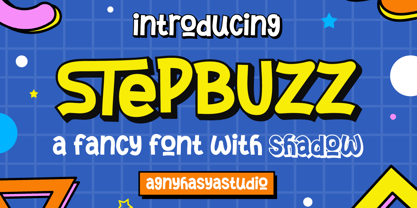 StepBuzz is a Playful Font Style Featured with Uppercase and Lowercase, Numerals, Punctuation, and OpenType Features. Perfect for your design projects like logos, branding, advertising, product designs, stationery, magazine designs, book/cover title designs, photography, art quotes, Special events, labels, product packaging, and more.
 - Syukron by Agny Hasya Studio,
$9.00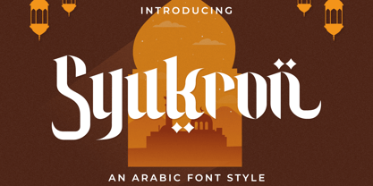 Syukron is an Arabic Font Style Featured with Uppercase and Lowercase, Numerals, Punctuation, and OpenType Features. Perfect for your design projects like logos, branding, advertising, product designs, stationery, magazine designs, book/cover title designs, photography, art quotes, Islamic events, labels, product packaging, and more.
 - Lawson Vintage by Okaycat,
$29.00 Okaycat Font Foundry proudly presents “Lawson Vintage”! A retro classic style font, perhaps futuristic, with vintage textured edges. containing European accents. Beautifully connected cursive with high legibility and style for your design, great for web, print and publication. See original Lawson without texture. Salon
 - P22 Founders by IHOF,
$24.95 Based on turn-of-the-century advertising type. A condensed, fat-faced display font with a touch of the medieval. The influence of art nouveau is also present in the high-waisted caps and flowing lines, putting the face into the early 20th century.