10,000 search results
(0.037 seconds)
- FarHat-Acordes - Unknown license

- FarHat-Acordes b y # - Unknown license

- Buttmunch - Unknown license

- Xpress Rounded by Wiescher Design,
$12.00 »XPress-Rounded« is my new addition to »XPress«, my Sans-Serif that impresses – especially in small sizes – with its outstanding readability. »XPress-Rounded« looks very different, almost like a completely new font. But the rounded version has the same seven precisely calibrated weights from »Thin« to »Heavy« and its corresponding italics make this font-family universally usable. The »XPress« fonts got their bearings from the fabulous American »Gothic« fonts of the twenties of last century. Modern, present day elements, high lowercase letters and infinitesimal elegant slight curves in start- and end strokes make the font family not only great for body copy, but also very useful in advertising. Enjoy! »XPress-Rounded« ist meine neue Erweiterung zur »XPress« Familie, die durch aussergewöhnliche Lesbarkeit auffällt. »XPress-Rounded« sieht jedoch vollkommen anders aus als sein älterer Bruder. »XPress-Rounded« hat jedoch die selben sieben präzise aufeinander abgestimmten Schnitte von »Thin« bis »Heavy« und die dazu passenden Kursiven. Das macht die Schriftfamilie vielseitig einsatzfähig. Die »XPress« Schriften basieren auf der Formensprache der grossen amerikanischen Groteskschriften der zwanziger Jahre des letzten Jahrhunderts. Durch moderne Formelemente, große Mittellängen und unendlich leichte, elegante An- und Abstriche ist die Schrift jedoch nicht nur als Textschrift, sondern auch im gesamten Bereich der Werbung vielseitig einsetzbar. Viel Erfolg!
 - Anubis by DSType,
$19.00Anubis, the first DSType font at MyFonts is back in an improved Pro version. AnubisPro, a slab serif font with a contemporary feel, with Central Europe diacritics, swashes and ligatures, available in OpenType format. - Zedou by Kvant,
$59.00 Zedou was inspired by old Art Deco flavoured signage from the former French colony of Madagascar. It has a mechanical yet organic feel to it, and consists of four display weights covering Latin Pro.
 - Dinosaur by Daniel Uzquiano,
$30.00Dinosaur is a very grotesk and extremely condensed display font. Only useful for very big and short texts. The font comes with three regular weights and three italic weights. With 448 glyphs, Dinosaur font supports over 200 Latin-based languages. - Qritticaly by Maulana Creative,
$14.00 Qritticaly is a Marker Script font. With regular marker stroke, fun character with a bit of ligatures and has a to files lowercase alternates. To give you an extra creative work. Qritticaly font support multilingual more than 100+ language. This font is good for logo design, Social media, Movie Titles, Books Titles, a short text even a long text letter and good for your secondary text font with sans or serif. Make a stunning work with Qritticaly font. Have some fun enjoy the products :) Cheers, MaulanaCreative
 - Zelmud Script by Maulana Creative,
$14.00 Zelmud Authentic Script Font is an expressive signature script font. With regular felt-tip stroke, fun character with some of ligatures and extra swash. To give you an extra creative work. Zelmud Authentic Script Font support multilingual more than 100+ language. This font is good for logo design, Social media, Movie Titles, Books Titles, a short text even a long text letter and good for your secondary text font with sans or serif. Make a stunning work with Zelmud Authentic Script Font. Cheers, MaulanaCreative
 - Gillfloys by Maulana Creative,
$12.00 Gillfloys is a simply casual signature script font. With regular mono-line stroke, slant and fun character with a bit of ligatures and a bit much ligatures in Gillfloys Alt. To give you an extra creative work. Gillfloys font support multilingual more than 100+ language. This font is good for logo design, Social media, Movie Titles, Books Titles, a short text even a long text letter and good for your secondary text font with Script. Make a stunning work with Gillfloys font. Cheers, MaulanaCreative
 - Olds Murray by Maulana Creative,
$15.00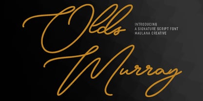 Olds Murray is an expressive casual signature script font. With regular consist mono-line contrast stroke, fun character with a bit of ligatures and alternates. To give you an extra creative work. Olds Murray font support multilingual more than 100+ language. This font is good for logo design, Social media, Movie Titles, Books Titles, a short text even a long text letter and good for your secondary text font with sans or serif. Make a stunning work with Olds Murray font. Cheers, Maulana Creative
 - Hinterlands by Maulana Creative,
$14.00 Hinterlands is a signature brush script font. With regular rough brush stroke, fun character with a bit of ligatures extra swash and alternates. To give you an extra creative work. Hinterlands font support multilingual more than 100+ language. This font is good for logo design, Social media, Movie Titles, Books Titles, a short text even a long text letter and good for your secondary text font with sans or serif. Make a stunning work with Hinterlands font. What you get: - Hinterlands - Hinterlands Swash Cheers, MaulanaCreative
 - Hiyida Script by Creative Lafont,
$12.00 Introducing Hiyida Script! Hiyida Script is modern script font, every single letters has been carefully crafted to make your text looks beautiful. With modern script style this font will perfect for many different project, example: weddings, invitations, greeting cards, posters, name card, quotes, blog header, branding, logo, fashion, apparel, letter, stationery, etc. Hiyida Script allows you to create custom dynamic text. you can access by turning on; Stylistic Alternates, Stylistic Set, Initial Forms, Terminal Forms as well as ligatures in Photoshop, Adobe Illustrator, Adobe InDesign or through a panel of glyphs such as Adobe Illustrator, Photoshop CC, Let's swirl from the reguler character into character alternative to get the text with the layout of your dreams. Hiyida Script features 801 glyphs and has given “Private Use Areas” PUA Encoded (specially coded fonts), with tons of alternate characters. The pack can be accessed in full by any crafter or designer, without the requirement for extra design software, Compatible With Silhouette Studio & Cricut Design Space. Files Include: - Hiyida Script Features: - Basic Latin A-Z and a-z - Numbers & Symbols - Stylistic Set & Ligatures - PUA Encode (specially coded fonts) - Latin Pro Support Character In order to use the beautiful swashes, you need a program that supports OpenType features such as Adobe Illustrator CS, Adobe Photoshop CC, Adobe Indesign and Corel Draw. Thanks for your visit :-)
 - Muisca by JVB Fonts,
$25.00 Muisca, that in its early edition was named as «Muisca Sans», was developed in mid-1997 and based on the graphic concept of pre-Columbian characteristics figures within some of the very few visual elements recovered from the Muisca culture. This ancient pre-Columbian tribe disappeared since the arrival of the Spanish 500 years ago, in what is now the center of Colombia. In fact, the name of the capital Bogotá goes back to Bacatá as primary or village downtown of what was once the imperial capital of the Muisca tribe. This typographic project was submitted as my work for the degree in Graphic Design, obtained in September of that year (at the Universidad Nacional de Colombia), under the creative concept of vindicating the ancient culture and identity through a functional typeface, into a fact without precedent in the country. Muisca was recently edited, arranged and completed, including multilingual diacritic glyphs to be versatile in several languages. Related and inspired by Latin America, Ethnic, Native, Tribal, Mysthical, Handmade, Aboriginal, Pre-Hispanic, Pre-Columbian, Textured, Fantasy. Ideal to be used in logos, display text & titles, games and other design applications that reminds of the Pre-Hispanic art.
 - Delicate by Cubo Fonts,
$29.00La plupart des fontes “script” tentent de reproduire l’écriture humaine et se heurtent au problème suivant: la lettre tracée à la main n’a pas la méme forme suivant la lettre qui la précède ou celle qui la suit, ou suivant sa position au début ou à la fin du mot. La fonte “delicate” résoud ce problème grâce à la récente technologie OpenType, et propose de nombreuses ligatures - des groupes de lettres pré-dessinés - qui permettent toutes les combinaisons fondamentales. Ainsi, “delicate” n’est-elle pas seulement élégante et calligraphique, mais également fluide et énergique. Pour profiter au maximum de cette police, veuillez activer les fonctions OpenType de votre logiciel. - Pexico by Setup,
$- Pexico is a pixel typeface that uses 10 by 14 grid (capital letter) in 8 styles: 4 basic styles for text setting — Regular, Bold, Narrow, and Mono and 4 stylistic variations of the Regular style for display setting — Outline, Dots, Round, and Inverse. It fits the display's pixel grid when used at 20pt size or its multiples. Pexico supports Latin, Cyrillic, and Greek Monotonic scripts, all with thoroughly designed diacritics. Moreover, Pexico makes use of advanced OpenType features, just as any other modern text typeface. Each style also has 9 sets of numbers, small capitals and is properly kerned. For more information go to Urtd.
 - Pilfnof by Eksign,
$13.58 Pilfnof contains: - 394 glyphs which include: Basic Latin, Latin Extended - A, Latin 1 - Supplement and General Punctuation. - 4 weights: Light, Regular, Bold and Black Pilfnof is a reverse contrast serif font family. Purpose of the project was to design a standing out modern serif which revolves around reverse contrast. Width of strokes is fully reversed. Weight, width and contrast are regular while x-height is high. It contains uppercase and lowercase letters and lining figures. Pilfnof is perfect for use in Branding and Publications. It can be used both for text as well as headings and titles. Heavy weights are ideal for headlines while light weights are suitable for body text.
 - Musk by Eko Bimantara,
$21.00 Taking the name from substance of the best quality perfumery, Musk present an elegant form of high contrast sans serif combine with an expressive connected script. The sans serif contain three weight; regular, medium and bold within it’s quality for display and also text. Each glyphs shown an unique variation of forms, especially the terminals in regards to achieve legibility and readability. The sans serif contain three weight; regular, medium and bold within it’s quality for display and legible for body text. With over than 240 glyphs. Some open type features contain in Musk sans; old style figures and standard ligature and the Musk script contain swash.
 - Musika by Lurinzu Studios,
$12.75 Musika" is a serene and elegant display typeface that is inspired by the vibe of soft jazz. Serene, elegant, soothing, somewhat sensual and at the same time feels like a warm hug. This typeface is made with the intention to be used in both titles and body text. The bold weight (even the light weight could also be used as a title card) holds really well as a title while the lighter weights (regular and light) can be used in body text. *This font includes letters, numbers, multi-language, and all essential marks needed. * Three (3) weights are currently available. (Light, Regular and Bold)
 - The Poisoned Heart by Din Studio,
$29.00 The Poisoned Heart is a beautiful retro script. It's made with a naturally handwritten style. This font will make your design more beautiful and powerful, and is suitable for any design such as branding, quotes, wedding invitations, lettering projects and more. Features: - 76 Alternates - Accents (Multilingual Characters) - 10 Ligatures - PUA encoded - Numerals and Punctuation (OpenType Standard) I hope you enjoy it! Thanks for visiting and purchasing my font! Regards Donis M Din Studio
 - March by Din Studio,
$25.00 March is a modern and clean display (Serif) font create from our talented font designer. The design of March will make your design more beautiful and inspiring. This font will suitable for any project, like branding, print template, logo and etc. The font also available in a rough version. Features: Accents (Multilingual characters) 66 Alternates PUA encoded Numerals and Punctuation (OpenType Standard) Thanks for visiting and purchasing my font! Donis M Din Studio
 - Tractatus by Kaer,
$24.00 These initials set I collected from “Tractatus sacerdotalis de sacramentis”, published in the city of Lugrun, printed by Arnaldum Guillermum de Brocario in 1503. Tractatus font family has Regular and Colored styles. It's all you need to precisely imitate medieval style text. Use this font as a decorative element at the beginning of a paragraph or section, other part of the paragraph should be in regular black letter font. You’ll get Drop Caps & Numbers set. --- *You can use color fonts in PS CC 2017+, AI CC 2018+, ID CC 2019+, macOS 10.14 Mojave+ * *Please note that the Canva & Corel & Affinity doesn't support color fonts!* *Please download this test file with only A letter ( https://www.dropbox.com/s/1lr7fify0n520ms/Tractatus-Test.otf?dl=0 ) to check your app & system.* --- Best, Roman. Thank you!
 - Smoke Signals by Ana's Fonts,
$18.00 Smoke Signals is a calligraphy font handmade using a real dip pen and ink with lots of bonus goodies. Smoke Signals includes: tons of ligatures for a smother text small caps that act as an all caps font a bonus set of ornaments a bonus set of grunge elements, such as splatters, ink blots, scratches Smoke Signals is perfect for any design that needs a vintage calligraphy look. Use it in signatures and logos, notes and quotes, social media posts, and branding and packaging.
 - Latinaires by Sudtipos,
$39.00Latinaires Pro is a new version of one of the first published Sudtipos typefaces. Now covering more latin languages and extended to 9 fonts, Latinaires is specially designed for modern brand communication and editorial use. - Neue Reman Gt by Propertype,
$49.00 Neue Reman Grotesk It has 70 font styles in total family + 1 Variable. This typeface is designed to be used very practically. Each style can be changed easily. Has a variety of alternative letters that can be selected to make typography designs more attractive. The family comes in 7 weights with matching italics + Variable Font File and includes multilingual latin pro characters. 1. Extra Light - Condensed - Expanded - Slanted Italic 2. Light - Condensed - Expanded - Slanted Italic 3. Regular - Condensed - Expanded - Slanted Italic 4. Medium - Condensed - Expanded - Slanted Italic 5. Semi Bold - Condensed - Expanded - Slanted Italic 6. Bold - Condensed - Expanded - Slanted Italic 7. Heavy - Condensed - Expanded - Slanted Italic Neue Reman Grotesk contains 750 glyphs, a Latin Pro Fonts. This is the second version of Neue Reman Family. Complete with Stylistic Alternates, Stylistic Set, Caps Swashes Letter, Standard Ligatures, Discretionary Ligatures, Tabular Figures, Proportional Figures, Superscript, Subscript, Scientific Inferiors, Fractions, Ordinals, Arrows and a variety of figures and fractions. Neue Reman typeface suitable to use in multipurpose projects such as on websites, systems, printing, embedding, servers, screens, display, digital-ads, branding, logos, titles, headlines, teks, and everything else. Need something else? Get in touch with us on propertype.foundry@gmail.com Thank you
 - Harmonics by Deniart Systems,
$20.00 ADD A LITTLE ZIG AND ZAG with Harmonics - a bold and angular font great for short texts and headlines. Create different affects by toggling between lowercase and uppercase letters - use lowercase for top-heavy triangular text, use uppercase for bottom-heavy triangular text, or mix upper & lower for a zig-zag affect. A great addition to any library.
 - Marista by Zephyris,
$- Marista is a bit of an unusual design, a cursive monospaced font inspired by the classic cursive typewriter fonts used in the 1960s-70s. It is designed to feel 'real', and captures some of the light irregularities in line weight which characterise real typewritten text rather than their computer equivalents. Marista is distinctive but easily readable, even in block text where some monospaced fonts suffer. Marista is best used at small to medium sizes, and at a uniform size throughout a document or design to capture the typewritten feel. The italic is more similar to authentic typewriter cursive fonts. Try it for your next letter or invitation!
 - ITC Static by ITC,
$29.99Static looks almost like it was stamped on paper: the black color is not evenly distributed and the background comes through the letters and consciously irregular forms reinforce the effect. The characters do not all have the same height, nor do they stand straight and regularly on the base line. Static is a robust font with bold, rounded serifs and is best used for headlines and short texts in point sizes of 12 and larger. - Fletcher Typewriter by Ana's Fonts,
$15.00 Fletcher Typewriter font and extras is an authentic vintage typewriter font, perfect to add an extra retro look to your designs. Use it in long or short texts, in digital collages, branding and packaging, social media posts, logotypes, etc. What you’ll get: 1 font family with 3 weights (regular, bold, black - each weight drawn individually), 2 styles (regular and jumpy); an extra set of stamps, misprints, underlines and overlines.
 - Smart Cookie by PizzaDude.dk,
$15.00 Smart Cookie is a happy and handmade font, ideal for packaging, posters or books (especially children's books!) It's highly legible and comes int 3 versions: Regular, Shine and Layer. Mix the Regular and Shine layer (using different colours) to make a cool shiny effect, or use the Shine version where the colours rely on the fore- and background colours...also a nice way of making your text stand out!
 - P22 Casual Script by IHOF,
$39.95 P22 Casual Script Pro is a flexible OpenType font based on mid-20th Century hand drawn advertising lettering scripts. As an alternate to thicker casual script styles, this free-flowing thin brush style is evocative of vintage product advertisements and packaging lettering and is highly suitable for a retro flavor. The Pro font includes over 500 glyphs with at least 2 of all upper and lower case characters with OpenType scripting and ligatures for a more natural and random effect. There is also a unique feature not found in other script fonts: Small Caps! While it may seem unnatural for a script font to have small caps, these work well as an authentic variation of brush script lettering for advertising. Also included in the Pro version is a full Central European character set, swash characters and more. OpenType features include: Small Caps, ligatures, discretionary ligatures, swashes, contextual alternates, stylistic alternates, Old Style/Lining Figures
 - Saral Devanagari by Linotype,
$187.99Saral, meaning simple in Hindi, is a monolinear design supporting most Devanagari based languages. Derived from the older Linotype typeface Rohini, it has been greatly expanded into three weights and a wide character set. Saral Light, Regular, and Bold are made to coordinate with the respective weights of Helvetica. This design works well in many environments, such as corporate designs, advertising, packaging, signage, and especially for bi-lingual texts. The OpenType font format accommodates hundreds of pre-composed conjuncts, accurate placement of vowel signs, and supports varying length matras. Saral's Unicode encoding guarantees your text is rendered correctly and is compatible across different software and computer platforms. Please note that due to current operating system and application limitations the OpenType features in complex scripts such as Davanagari are not universally supported. Saral is designed to be rendered correctly in Microsoft Word on Windows running the latest version of Uniscribe. If using a Mac or Adobe products such as InDesign then many features may not function as expected. This is including glyph reordering, substitutions, and mark positioning. In the case of small passages of text, alternate input methods can be employed. Apple's character palette and Adobe's glyph palettes are two readily available options that can be used to manually insert glyphs as needed." - CA Kometo by Cape Arcona Type Foundry,
$19.00 CA Kometo is an oblique headline typeface that consists of two styles, “Regular” (the Shadow) and “Fill”. Kometo has come to save the world. A superhero typeface featuring the super powers “shadow” and “imperfection”. It comes to save you from a world of boredom. Join Kometo and experience the fun of stacking fonts! Write something with “Fill”, copy paste it to another layer and switch to “Regular“. Maybe you will want to give it a little offset? Or you can also try to use the “Fill” style for body text, but do so at your own risk, spacing and kerning is optimized for the use with the “Regular“ style, so don't be too harsh if the results looks more vivid than text normally does. The character set is well built, supporting Western and Central European languages.
 - Jenson Classico by Linotype,
$29.99In 1458, Charles VII sent the Frenchman Nicolas Jenson to learn the craft of movable type in Mainz, the city where Gutenberg was working. Jenson was supposed to return to France with his newly learned skills, but instead he traveled to Italy, as did other itinerant printers of the time. From 1468 on, he was in Venice, where he flourished as a punchcutter, printer and publisher. He was probably the first non-German printer of movable type, and he produced about 150 editions. Though his punches have vanished, his books have not, and those produced from about 1470 until his death in 1480 have served as a source of inspiration for type designers over centuries. His Roman type is often called the first true Roman." Notable in almost all Jensonian Romans is the angled crossbar on the lowercase e, which is known as the "Venetian Oldstyle e." In the 1990s, Robert Slimbach designed his contemporary interpretation, Adobe Jenson™. It was first released by Adobe in 1996, and re-released in 2000 as a full-featured OpenType font with extended language support and many typographic refinements. A remarkable tour de force, Adobe Jenson provides flexibility for a complete range of text and display composition; it has huge character sets in specially designed optical sizes for captions, text, subheads, and display. The weight range includes light, regular, semibold, and bold. Jenson did not design an italic type to accompany his roman, so Slimbach used the italic types cut by Ludovico degli Arrighi in 1524-27 as his models for the italics in Adobe Jenson. Use this family for book and magazine composition, or for display work when the design calls for a sense of graciousness and dignity. - Drunken Hour by PizzaDude.dk,
$20.00Drunken Hour is not your everyday-ransom-note font! It has autoligatures for both double numbers and letters, and a good handful of the most common letter combinations...even the accented characters has got their own unique look! Well, that means you can make your next punk-grunge project look like YOU actually did all the cutting of letters! :) You will need to use OpenType supporting applications to use the autoligatures. - Floz by Dominik Krotscheck,
$6.50 Floz is a simple and clean condensed all-caps sans serif font. It comes in two weights: regular (which is already pretty bold) and bold (which is even bolder). It works well for logos, headlines and other short texts. It's also quite cheap.
 - Aphrodite Slim by Typesenses,
$57.00 Aphrodite Slim Pro is not just a lighter version of its sister Aphrodite Pro. Aphrodite Slim Pro has duplicated the quantity of characters of its partner, and that means more than 500 new glyphs, reaching a total of more than 1000. More delicate and meticulous, Aphrodite Slim Pro is once more a new typography with deep calligraphic ideals: We immersed ourselves into the world of each calligraphy ductus and each calligraphy masters by studying from decoration to lettering books. This was the key for the logic of Aphrodite Slim’s behavior. The new concept of Aphrodite Slim Pro was to join diverse styles of calligraphy in one in order to achieve an autonomous expressiveness, in fact, this is what calligraphy aims to, and we agreed to bring those ideals to the world of typography: It is justifiable to be inspired in hundred-year-old calligraphies, but it is even better if the results you obtain have a plus. A personal plus. During the creation process we were wondering whether it was possible to mix certain strokes of such rigid styles as uncial, (Li·n’s favourite style), with strokes of the copperplate, (Sav’s favourite style), and also to take and mix cualities of cancelleresca cursiva, formata and moderna; finally giving our creation a roman-transition italic look. So Aphrodite Slim takes ideals and aspects from those formal styles, following its own logic though, and emphasizing the fact of being a decorative typography. Calligraphy masters of our past are who we are in debt with. They are the cause we have lovely letters now. They have been spontaneous at the moment of creation, what differs from the type-designers of nowadays, whose spontaneity is more limited. Digital faces that we are used to see these days are a result of long hours of optical adjustments, grids, macros and inspirations of other existing typography, but without personal contributions. Aphrodite Slim wants to refute this. Its mission is to rescue de spontaneity of the artesanal lettering in order to obtain unique words; those which only calligraphy masters of our past or lettering artists of our present could give us. We have worked hard to achieve this, making Aphrodite the most universal font we could: It was necessary to study the most common words, focalizing more in the ones referring to “sensitivity”, of four of the most spoken languages in the world. Aphrodite Slim has an enormous quantity of decorative characters and special ligatures for phrases and words in English, French, Spanish and German. (See English, Français, Español, Deutsch PDF in the gallery section). We promise there is no existing type that decorates/ligates glyphs and words like Aphrodite Slim does: It is the first time a font like this really considers its purpose. -The way glyphs are ligated is insane- : Aphrodite Slim rescues some ideals of persons like Jan van den Velde (Italian cancilleresca writing of XVI Century) who understands ascenders and descenders as possibilities to beautify the lines of writing with curved strokes that seem to be dancing above and below of the words. This master also creates ascenders and descenders even where they are not necessary, on letters that do not actually need them: Aphrodite Slim takes this ideal. The font counts with a wide range of glyphs that seem not to be satisfied with its more primitive form and prefer to extreme their parts to be decorative. It also existed masters of calligraphy like José de Casanova of XVII Century, who, with a magnificant skill and a really personal mark, had the particularity of ligating words that were actually separated with spaces. This is another innovative feature in Aphrodite Slim. An investigation of the most common beginnings and endings words of the English language was done. Having that feature activated (discretionary ligatures), common words will start to ligate or to be decorated even when they are separated by spaces. Impossible to forget Francesco Periccioli of XVII Century and our experience us designers to face with works of him: His letters, that today are included in the group of cancellerescas modernas, have been a direct inspiration to the oldstyle figures and historical forms variables in Aphrodite Slim. Giovanni Antonio Tagliente (XVI Century) and his particular way of making tails and diagonals longer than usual, qualities that our creation reflects too. Finally, our adventures in Biblioteca Nacional and Barrio San Telmo, Buenos Aires, were essential for us to make Aphrodite Slim more complete and interesting: Sav did an excellent work when studying how the decorative miscellanea and swirls of early XX century were. She also investigated what particularities made those roman titling characters look antique so she could rescue some ideals for the oldstyle figures and historical forms variables. This also leaded her to create the ornaments variable in Aphrodite Slim. We are really proud of presenting Aphrodite Slim Pro, a typography that was the result of days and nights of working hard, because we do love what we do; and we are glad we are living in a present that gives us the possibility to spread this kind of art, because that is the way we consider our job: Aphrodite Slim Pro is Art. Hope you can appreciate the enormous work this type has. Features. Aphrodite Slim Pro is the most complete variable. It includes more than 1000 glyphs. Thanks to the Open-Type programming, it counts with a easy way to change/alternate glyphs if the application in which the font is used supports this. The variables contained in Aphrodite Slim Pro are also offered separately. Aphrodite Slim Text: It is the variable for lines and paragraphs. Thus it is the least ornamental and the most accurate to achieve a satisfying legibility. It has the Standard Ligatures feature in order to improve the possible conflicts some glyphs could have by others. Aphrodite Slim Contextual: It is the one that makes emphasis in decorating. It has the particularity of ligating/decorating words of common use in English, French, Spanish and German. It also has the quality of ligating common beginnings and endings of the common words in English. Aphrodite Slim Stylistic: With similar features of Slim Contextual. It includes a set of decorative numbers for a display use. Aphrodite Slim Swash: This one has special beginnings and endings to decorate words. Aphrodite Slim Endings: It makes words look as a signature. Aphrodite Slim Historical: It adds an antique look to the written word. It also has the special historical ligature function. Aphrodite Slim Titling: This one is the most decorative. Its copperplate inspired ornaments give words a special color, in order to handle the quantity of decoration, it comes with the standard ligature feature, which has the most common ligatures plus others that make decorative swirls not to be conflictive. Aphrodite Slim Ornaments: A set of 52 ornaments. Aphrodite Slim Pro includes all this features plus the Stylistic Set 1; Stylistic Set 2 and the possibility of Slashed Zero. We recommend you to check out the gallery in order to see all these features in action.
 - Bambina by Ivan Rosenberg,
$16.00 Bambina is a stylish retro font inspired by 19th century architecture and decoration. It looks amazing at display sizes and is easily readable in text size. There are two versions of this font : REGULAR and OUTLINE. Bambina Font is a display font made mainly for headlines, titles, and other short texts and is well-suited for advertising, vintage mood board, branding, logotypes, packaging, titles, editorial design and modern and vintage design.
 - Foundry Dat by The Foundry,
$50.00 Foundry Dat is created with a common horizontal dash grid structure for accurate layering when characters are superimposed. Foundry Dat’s integrated background aligns vertically and horizontally, when set solid, forming a continuous pattern. Foundry Dat’s companion family Foundry Dit functions as a legible correspondence font, with a ‘typewriter’ feel. Each family contains: light, regular, medium and bold weights. Foundry Dat comes with a series of dashes to extend the background grid. Characters can also be offset to make different patterns – in the process becoming images – a graphic language with total integration of form and function.
 - Classroom Stencil JNL by Jeff Levine,
$29.00 Roman-style stencil fonts have been around for much longer than most people realize - from the interlocking brass stencils of the 1880s to the laser-cut plastic stencils of today. A 1 inch Roman lettering guide [die-cut from oil board with spacing holes for correct alignment] made by the now-defunct Zipatone Corporation in the 1970s was a clone of an existing design of another company; but with variations in certain character shapes. This then became the working model for Classroom Stencil JNL, which is available in both regular and oblique versions.


