10,000 search results
(0.054 seconds)
- Metropolitan by Alias Collection,
$60.00
- Malberg by Eko Bimantara,
$24.00
- Scary Hours by Seemly Fonts,
$12.00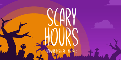
- Dauphine by Device,
$39.00
- 612KosheyLinePL is not a font that's widely recognized in mainstream typography circles as of the last update in early 2023, and thus, detailed information about it might not exist in the public doma...
- PAG Etiketa by Prop-a-ganda,
$19.99 - PAG Ministero by Prop-a-ganda,
$19.99 - Pigeon Post by Hanoded,
$15.00
- PAG Bankas by Prop-a-ganda,
$19.99 - Tellural - Personal use only

- MANHATTAN - 100% free

- Afisha - 100% free

- Sangkuriang - Unknown license

- Kingthings Trypewriter 2 - 100% free

- Am Sans light - Unknown license

- Qlassik Medium - Unknown license

- Kameleon - Unknown license

- Abiscuos - Unknown license

- Bold Metal Stencil JNL by Jeff Levine,
$29.00
- Schema by Fonthead Design,
$19.00 - Western Sans JNL by Jeff Levine,
$29.00
- Noyram by Patria Ari,
$15.00
- Fair Play JNL by Jeff Levine,
$29.00
- Lumberyard Stencil JNL by Jeff Levine,
$29.00
- Peronel by Tanincreate,
$16.00
- Show Card Roman JNL by Jeff Levine,
$29.00
- Alfrine by Greater Albion Typefounders,
$12.00
- Revelry Deco JNL by Jeff Levine,
$29.00
- Rearview Mirror by Hanoded,
$15.00
- Refinery Stencil JNL by Jeff Levine,
$29.00
- Luedickital by URW Type Foundry,
$39.99
- Second Song by Supfonts,
$16.00
- Headline Nouveau JNL by Jeff Levine,
$29.00
- Resiliency by Alphabet Agency,
$15.00
- Seventeen Winter by Sipanji21,
$9.99
- Foda Slab by Fo Da,
$20.00
- Lancashire Stencil JNL by Jeff Levine,
$29.00
- Slab Compact JNL by Jeff Levine,
$29.00
- Family Deco JNL by Jeff Levine,
$29.00
- Road Repair JNL by Jeff Levine,
$29.00


