10,000 search results
(0.053 seconds)
- JH Amira by JH Fonts,
$50.00 JH Amira is a display modern typeface; it is designed based on Art Deco style, typical for fashion magazines headlines, logos & titles.
 - Chat Love by Sakha Design,
$9.00 Chat Love is a cute and adorable display font. Fall in love with it and bring your projects to the highest levels!
 - Mr Alex by Hipopotam Studio,
$24.00 Clean and elegant display sans-serif uppercase family with three weights and rounded corners. Excellent for headers, posters, t-shirts and websites.
 - Cavalero BT by Bitstream,
$50.99 A handsome, square sanserif, the ultra extended Cavalero is strictly a display design. The typeface was inspired by the Chevy Cavalier logotype.
 - Morgy by Creativemedialab,
$16.00 Morgy is a unique font that displays a cheerful and dynamic impression, suitable for all modern design concepts from posters to branding
 - Wah Wah Narrow by Font&Co.,
$29.00 Wah Wah Narrow is a compact, eye-catching, flat-sided display font that will tightly pack the empty space in your layout!
 - Zero_G by fontkingz,
$19.00Type/Usage: Technoid Display Font for spacecraft visual identification in high and low gravitation. Mixes well with all other kinds of GROTESKES. - SuperBlack by Scannerlicker,
$22.00 SuperBlack is a saucy counterless typeface, ideal for display purposes. Whenever you need impact with a playful feel, SuperBlack will pop out.
 - GHEA Narek Serif by Edik Ghabuzyan,
$65.00 This font family can be used as Display as well as text font. The font family includes Armenian, Cyrillic and Latin alphabets.
 - SG Briscy by Studio Gulden,
$20.00 SG - BRISCY is a display typeface. It's bold, fun, and playful. Perfect for you who need a pop style in your design.
 - Merchant by Aboutype,
$24.99A black weight decorative typeface with an engraved flare. Merchant was designed for all media and requires subjective display kerning and compensation. - Jaggard by Intellecta Design,
$23.90 Jaggard is a classical renaissance penmanship inspired font which works great when used for display reasons only. Contains only uppercase alphabet designs.
 - Minado Rough by RodrigoTypo,
$25.00 Minado Rough is a display sans, stencil and dingbat font family. This typeface has sixteen styles and was published by Rodrigo Typo.
 - Rushline by Illushvara,
$14.00 Rushline is a fun display font. Add this font to your favorite creative ideas and notice how it makes them come alive!
 - Soft Fleurons by Intellecta Design,
$21.95 Soft Fleurons is a dingbats/decorative display font featuring many different styles of flourishes and ornaments. Great for a vintage antique feel.
 - Splashed by Trustha,
$15.00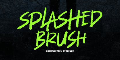 Splashed is a handwritten brush font with dynamic movement. Comes in 400+ glyphs. Splashed perfect for display, branding, advertising, and many more.
 - Capuche by Eko Bimantara,
$18.00 Capuche is eccentric, bold, bloating, retro display font. Designed to be fit for various design purposes such as logo, branding, titling e.t.c
 - Crash by ParaType,
$25.00 Developed at ParaType in 1995 by Alexander Tarbeev, based on Pragmatica, 1989, by Vladimir Yefimov. For use in advertising and display typography.
 - Copperplate New by Caron twice,
$39.00 Imagine America in the 1930s. A gangster flick with Al Capone, a crime novel featuring Philip Marlowe. Our hero in a fedora sits in a classy bar, orders a double bourbon, lights a cigar and eyes the evening paper. He turns the pages, reading about a bank heist over on Third Avenue, a scandal involving a baseball player, a small ad for a general practitioner and a large spread about a famous law firm. What do the bottle of booze and the majestic facade of the bank have in common? The elegant baseball uniform and trustworthy attorneys? - Copperplate Gothic - When Frederick William Goudy created his legendary typeface in 1901, it went on to literally become the symbol of early 20th century America. Tiny serifs, characteristically broad letterforms, and particularly bold titles decorated calling cards at 6-point size, enormous bronze-cast logos, newspaper headlines, restaurant menus and more. This was the golden age of Copperplate, lasting up until the arrival of die neue Typografie and monospaced grotesques in the 1960s. Then the typeface almost completely disappeared. It made a partial comeback with the advent of the personal computer; digitizations of varying quality appeared, and one version even became a standard font in Adobe programs. This may have played a role in Copperplate later being used in DIY projects and amateur designs, which harmed its reputation. Copperplate New has been created to revive the faded glory of the original design. Formally, the new typeface expands the existing weight and proportional extremes. The slight serifs are reduced even further, making the typeface sans-like at smaller point sizes and improving readability. In contrast, at large point sizes it retains all of its original character. Decorative inline & shadow styles have been added and both have been created in all five proportions, making it easy to adapt the typesetting to the format you need. Despite these changes and innovations, Copperplate New remains true to Goudy’s original design and represents a snazzy way to evoke a golden era in American culture. Specimen: http://carontwice.com/files/specimen_Copperplate_New.pdf
 - Blog Script by Sudtipos,
$39.00 Technology is making it so that we’re all connected without the need for the physical-presence kind of being connected. That is strange, fascinating, and has a certain magnetism that is very difficult to resist. What’s at stake is no less than the transformation of centuries of human behaviour, and that’s part of the fascination. But while our existence morphs and we rush headlong into our socially minimalist future, we use our present culture to helplessly signal our nostalgia about our past. We know what our future will be missing, and we’re already full of nostalgia about it, but we know that what little we can do about isn’t going to affect the outcome that much. So, almost in full hindsight now, the DIY implosion of the past few years must have really been a reaction to our technological dis/connection. In typography, the minimalist future is already here, with something as austere as the sans serif having become the preferred expression of progress and fortune, both part of the connected isolation we are undergoing. But when physical interaction must take place, like coffee shops and gin joints, our organic alphabets ride high and mighty. That sense of human heritage — elegance and exuberance in our writing, the use of flaws to charmingly brand our own individualism — keeps turning up in all kinds of places, most unexpected of which is the digital world. The overall message seems to be that we’re still creative, imaginative, and unique. In the digital world, on blogs where we write about our puny music and fashion preferences, we’re just articulating this individualism of ours, this third domain of existence our future seems eager to dismiss. These were the thoughts behind Blog Script, the second collaboration between Carolina Marando and Alejandro Paul, after their successful stint with the Distillery set of fonts. This typeface comes in two weights, alternates for most letters, and a strong aesthetic rooted in individuality and freedom of spirit. Use it to be alone together, to tell the world that we’re still human, for now.
 - Jogan by Wahyu and Sani Co.,
$15.00 Inspired by the early days of video games where the graphics were made of squares (pixels), Wahyu Wibowo comes up with pixel based typeface design, Jogan, but instead of having medium width, he decided to make it narrow which is rarely exist in pixel style font. The style were expanding in the development process, so the family have 4 subfamilies: Jogan (regular, bold and monospace) Jogan Soft (regular, bold and monospace) Jogan Round (regular and monospace) Jogan Slab (regular and bold) Each Jogan font style contains 280+ glyphs which covers Western Europe languages: Afrikaans, Albanian, Asu, Basque, Bemba, Bena, Breton, Catalan, Chiga, Cornish, Danish, Dutch, English, Filipino, French, Friulian, Galician, German, Gusii, Indonesian, Irish, Italian, Kabuverdianu, Kalenjin, Kinyarwanda, Luo, Luxembourgish, Luyia, Machame, Makhuwa-Meetto, Makonde, Malagasy, Manx, Morisyen, North Ndebele, Norwegian Bokmål, Norwegian Nynorsk, Nyankole, Oromo, Portuguese, Quechua, Romansh, Rombo, Rundi, Rwa, Samburu, Sango, Sangu, Scottish Gaelic, Sena, Shambala, Shona, Soga, Somali, Spanish, Swahili, Swedish, Swiss German, Taita, Teso, Uzbek (Latin), Volapük, Vunjo, Zulu. Retro, retro-futuristic, futuristic, modern, techno theme projects fit perfectly with this typeface, any works from logo, poster, video, headlines, titles, and more!
 - The Stack Stone by Putracetol,
$18.00 The Stack Stone - Display Font a bold, quirky display font with a fun, trendy street style vibe. The Stack Stone is a versatile, stacking typeface perfect for retro or modern design aesthetic. The Stack Stone was hand-drawn, making its outlines somewhat irregular and quirky. It has an almost hand-lettered look; the characters jump around the baseline giving it a charming but urban look and feel. The Stack Stone suitables from posters designs to t-shirts and packaging, Stacked Letter will give your designs that alternative look and make your creative work look amazing. With a The Stack Stone , it will be very suitable for your project, which is related to fun, trendy street style vibe. Such as story books, illustrations, comic books, t-shirts, posters, greeting cards, logos, branding, stickers, svg, crafting. The alternative characters were divided into several Open Type features such as Swash, Stylistic Sets, Stylistic Alternates, Contextual Alternates, and Ligature. The Open Type features can be accessed by using Open Type savvy programs such as Adobe Illustrator, Adobe InDesign, Adobe Photoshop Corel Draw X version, And Microsoft Word. The Stack Stone is also support multi language.
 - Adlanta - Unknown license

- Jacks Font - Unknown license

- Sansation - Unknown license

- Peake Doubled - Unknown license

- Caduceus - Unknown license

- Titan Text OT by DSType,
$19.00Originally designed in 2003, TitanText now becomes TitanTextOT and it's available in Regular, Italic, Bold and Bold Italic. Includes plenty of OpenType features, like SmallCaps, Alternates, Ligatures and Swashes. - Show Tune JNL by Jeff Levine,
$29.00 Hand lettering used in the trailer for the 1943 movie musical “Broadway Rhythm” was the inspiration for Show Tune JNL, which is available in both regular and oblique versions.
 - Fincastle Sans JNL by Jeff Levine,
$29.00 Fincastle Sans JNL is an all-caps titling font in both regular and oblique versions. It's clean, legible monoline design complements any layout from ad copy to personal stationery.
 - Surface Stencil JNL by Jeff Levine,
$29.00 A hand-cut antique brass stencil for marking barrel tops of dill pickles was the source of inspiration for Surface Stencil JNL, available in both regular and oblique versions.
 - Bargo by Look Minus Today,
$10.00 Introducing Bargo - Sans Serif 3 Styles by Look Minus Today. Behind these 3 styles, we want to combine a typeface that can provide a different perspective. Regular which gives
 - Late Hours JNL by Jeff Levine,
$29.00 The free form hand lettered titles for the 1961 film “The Children's Hour” inspired the digital typeface Late Hours JNL, which is available in both regular and oblique versions.
 - Mauer by Klaudia Krynicka,
$19.00 Mauer is a proportional, block, geometric font inspired by the advertisement in the polish weekly from 1937 "Tygodnik powszechny". This typeface family contains 3 styles: Regular, Black and Italics.
 - Bounches by Trustha,
$16.00 Bounches is a fun handwritten font, it's dynamic handwriting. Comes with two font styles, regular and slant. Bounches are suitable for branding, advertising, headlines, packaging design, and many more.
 - Table Wood JNL by Jeff Levine,
$29.00 Concave Tuscan Extra Condensed is a classic wood type sans serif design that is the basis for Table Wood JNL, which is available in both regular and oblique versions.
 - Convicted JNL by Jeff Levine,
$29.00 Convicted JNL is a condensed, chamfered sans serif type design inspired by opening credits from the 1940 film of the same name – available in both regular and oblique versions.
 - Pantra by Nicolas Deslé,
$19.90 Pantra is a minimal and clear geometric sans. Pantra is clear, approachable, and effective in both headings and paragraphs and comes in 4 weights: light, regular, medium and bold.
 - Obscure Stencil JNL by Jeff Levine,
$29.00 A bold, handmade stencil alphabet from the book “Lettering” by Harry B. Wright (1950) served as the model for Obscure Stencil JNL – available in both regular and oblique versions.
 - Titan OT by DSType,
$19.00Originally designed in 2003, Titan now becomes TitanOT and it's available in Regular, Italic, Bold and Bold Italic. Includes plenty of OpenType features, like SmallCaps, Alternates, Ligatures and Swashes.


