10,000 search results
(0.051 seconds)
- Cirkulus by ITC,
$29.99Cirkulus is an experimental display face, constructed using combinations of hairline circles and straight lines. The typeface was designed by Michael Neugebauer in 1970. The letters exude a constructivist aura, reminiscent of both the revolutionary 1920s, and the digital experiments of the 1990s. Cirkulus is a unicase alphabet, with a very lightweight appearance, and should be used solely in large display sizes. - Privé by TEKNIKE,
$39.00 Privé is a display handwriting font. The typeface is a distinct uppercased style hand drawn font and designed to be easy to read. Privé name is Old French for “private” or “participating in secret”. Privé is great for display work, invitations, writing, architecture, posters and headings. Privé is designed by Thoma Kikis and is currently available with Latin, Cyrillic and Greek character sets.
 - Blue On Blue by Gerald Gallo,
$20.00 Blue On Blue is a display font not intended for text use. It was designed specifically for display, headline, logotype, branding, and similar applications. Blue On Blue has an uppercase alphabet, numbers, and punctuation. For convenience, the uppercase alphabet is repeated under the lowercase keys. Only the portions of the characters that are outlined by the 3D-simulated depth are visible.
 - Eccentric by Monotype,
$29.99Eccentric was designed in 1881 by Gustav F. Schroeder. It is an all-capital, narrow-bodied, monoline display face that could be described as high waisted. With cross-bars and main junctures more than halfway up the letterforms, every letter - except the W - has a long-legged appearance. Eccentric has a wide range of display uses, from playbills to fashion advertisements. - Vantagram by TEKNIKE,
$69.00 Vantagram is a modern display font. The typeface is made from basic square geometry. It is inspired by blackletter typefaces of the medieval period in Europe. The Vantagram name is a combination of two words derived from “vanta” French for boast and “gram” Greek for letter or that which is drawn. Vantagram is great for display work, quotes, titles, headings and posters.
 - Eugello by Asenbayu,
$15.00 Eugello is a multipurpose display font with a unique shape. You can use this font in retro, vintage and hipster designs. This font is perfect for a variety of projects, such as branding, poster displays, logo designs, magazine, headline, sticker and more. Eugello font feature opentype, kerning and ligature. Eugello include uppercase letters, lowercase letters, numeral, punctuation and multilingual support.
 - Muraba Arabic by NamelaType,
$29.00 Muraba Arabic is the sibling font of Muraba, with the addition of Arabic glyphs; Arabic, Persian, Urdu, Kurdish, and Jawi (Pegon). Muraba Arabic font is a one-of-a-kind, bold vintage serif display typeface, defined by its distinctively thick, squared-off serifs that offer decorative flair. This versatile typeface is ideal for various applications, including logos, headers, and display text
 - Amina Reska by Pandanwangi,
$15.00 Amina Reska is a cute, colorful, and friendly display font. Get inspired by its authentic feel and use it to make beautiful wedding invitations, beautiful stationery art, eye-catching social media posts, and cute greeting cards. Add this beautiful display font to your every creative idea and watch how it makes it stand out! The only limit is your imagination!
 - Bellinzo by Zealab Fonts Division,
$9.00 Bellinzo sans serif font is a set of 3 weights and it is good for making creative displays and it has urban / street wear touch. It’s a lovely and unique sans serif font, allowing you to make each word look completely stylish! Bellinzo is the unique typeface for creating elegant headlines, fashion magazine covers, book covers, templates and creative displays and logo designs.
 - Magicline by Balpirick,
$15.00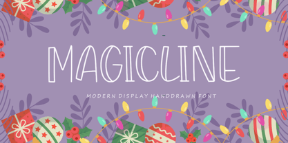 MAGICLINE is a Modern Display Handdrawn Font. Magicline is a trendy display font, described by an unique touch, perfect for your favorite projects. Fall in love with its incredibly distinct and timeless style and use it to create spectacular designs! MAGICLINE also multilingual support. Enjoy the font, feel free to comment or feedback, send me PM or email. Thank you!
 - Gio by Fenotype,
$20.00 Gio is a wedge serif with robust geometric features and subtle details. Available in two widths and seven styles each, Gio boasts a generous x-height and straight endings, maintaining generally consistent proportions. This creates an elegant ensemble, ideal for captivating display purposes. Gio excels in magazine layouts, headlines, as a logotype, or in any display use, imparting a sophisticated modern feel.
 - Green On Green by Gerald Gallo,
$20.00 Green On Green is a display font not intended for text use. It was designed specifically for display, headline, logotype, branding, and similar applications. Green On Green has an uppercase alphabet, numbers, and punctuation. For convenience, the uppercase alphabet is repeated under the lowercase keys. Only the portions of the characters that are outlined by the 3D-simulated depth are visible.
 - Tamaran by Gholib Tammami,
$14.00 This super bold display font created by Gholib Tammami , Tamarin Font perfect for your display content with heavy titles and headlines. This font has a unique style with uppercase, lowercase, number, punctuation and ofcourse with multilingual support. Tamaran Features : Mulitilinguange Support If you have any questions, before or after purchase, please feel free to get in touch. Thankyou for coming!
 - Qipao by TEKNIKE,
$39.00 Qipao is a display monospace handwriting font. The typeface is a distinct hand drawn font using a felt marker. The Qipao name is derived from the traditional Chinese dress that Manchu women wore in China in the 17th century and became known as the qipao (旗袍), meaning “banner gown”. Qipao is great for display work, invitations, writing, architecture, posters, logos and headings.
 - Rottely by Din Studio,
$29.00 Say hello to Rottely Display Font, Rottely is a beautiful display font (Uppercase letters), designed with a modern and bold style. It's suitable for branding,logo,t-shirt printing and many other designs. Included: Rottely (otf) Features: Accents (Multilingual Characters) 12 Ligatures 97 Alternates PUA encoded Numerals and Punctuation (OpenType Standard) Bonus ornament (EPS) Thanks for visiting and purchasing my font!
 - Watchmaker by Ingrimayne Type,
$5.95 Watchmaker was designed with the limitations imposed by a simple LCD that is meant only to display numbers. Most LCD typefaces use some diagonals to make the letters look better. This one does not and from it you can see why a few diagonals are needed to display letters on a LCD. Watchmaker is monospaced and comes in plain and bold weights.
 - Paradelica by Invasi Studio,
$17.00 It is the holiday season, so let's get a bit fancy. So, we present the Paradelica Display font with a playful and elegant design. A festive and stylish font with a vintage vibe, this is perfect for creating display pieces like logos, posters, and greeting cards. Available in Caps only. Comes with alternates, ligatures, multi-language support, and optional decorative symbols.
 - SG Wristan by Studio Gulden,
$20.00 SG - WRISTAN font is a display font with bold style. This font has uppercase and lowercase letters. It’s perfect for display design that needs pop, fun, and playful vibes on it. You can try to combine with other fonts and gain more experience in graphic design. Features: Uppercase & Lowercase Number Multilingual Support Punctuation Stay pop and inspiring! Regards, Studio Gulden.
 - Playthings by Fikryal,
$23.00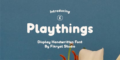 Playthings Handwritten Display Font is a type of font designed by hand to provide a unique and personal touch to your design projects. With its cheerful and gentle handwriting style, this font brings about a relaxed yet captivating ambiance, making it suitable for various creative endeavors. With its soft line details and natural characteristics, the Playthings Handwritten Display Font exudes warmth and familiarity.
 - White On White by Gerald Gallo,
$20.00 White On White is a display font not intended for text use. It was designed specifically for display, headline, logotype, branding, and similar applications. White On White has an uppercase alphabet, numbers, and punctuation. For convenience, the uppercase alphabet is repeated under the lowercase keys. Only the portions of the characters that are outlined by the 3D-simulated depth are visible.
 - Liquorstore by Chank,
$99.00 Inspired by hand-painted liquor store signage in Minneapolis, as well as constructivist propaganda posters and old magazine logos, Chank created Liquorstore as a simple yet elegant exercise in font creation based on basic geometric forms with subtle, humanist sensibilities. Works great for display usage for headlines, labels and prohibitive signage. A simple and versatile, must-have display poster font!
 - Orange On Orange by Gerald Gallo,
$20.00 Orange On Orange is a display font not intended for text use. It was designed specifically for display, headline, logotype, branding, and similar applications. Orange On Orange has an uppercase alphabet, numbers, and punctuation. For convenience, the uppercase alphabet is repeated under the lowercase keys. Only the portions of the characters that are outlined by the 3D-simulated depth are visible.
 - Helma by Yukita Creative,
$13.00 Helma is a display serif typeface that has been expressly designed for high-resolution displays such as digital and print media. With its elegant appearance and perfectly balanced proportions, it is perfect for the title text, corporate branding, and other design applications where a touch of refinement is needed. - Affordable and versatile - Renowned for its excellent legibility - Get one font for every occasion
 - Pebl by Formation Type Foundry,
$25.00 Pebl is inspired by the naturally simplified and smoothed shapes of beach pebbles. The result is a bold, super-rounded display typeface. It's pared back to just the most basic, smooth outlines without counters, for a friendly and organic look. It’s ideal for logos, branding, headlines or just abstract type shapes in print, in displays, on the web, on T-shirts, wherever. Enjoy.
 - Neverland by Mirror Types,
$30.00 Neverland is my attemp of a lettering font. I was inspired by the letters in displays of retaurants. It will work great in posters, shirts, magazines and displays because it has a charming feel. I received a lot of help from my good friend Maximiliano Sproviero (Lián Types). The name is based on the tale of Peter Pan from James Matthew Barrie.
 - Blandit by Webhance,
$18.00 Blandit - Display & Logo Font family Blandit is a Display font family for design of minimalistic logos. The fonts are very much suitable for creating wordmarks, titles, taglines,Film Posters, headlines, Block letter, Subheading, Logo Designs, Big Banners. Classic & Decorative Typography Web Designs. Upper / lowercase glyphs Multilingual Support Webfonts included Free updates and feature additions Font Designed and Crafted by Webhance Studio.
 - Quantour by TEKNIKE,
$129.00 Quantour is a geometric monospaced display sans typeface which has a distinct style and is inspired by the Mid-Century Modern era. The Quantour name is a combination of the Latin 'quantum' meaning "unit of something" and the French 'tour' which means "to turn". Quantour is recommended for luxury brands, logos, fashion, cinema, architecture, invitations, display work, posters and headings.
 - Midfield by Kreuk Type Foundry,
$12.00 Introducing MIDFIELD DISPLAY. Midfield Family is All Caps display typeface with solid, masculine, urban, sporty, & bold character. Each glyph is very well suited to make an interesting quote, headline & striking poster design. This font is perfect for logos, badges, clothing, signage, posters, and much more! This font includes standard and extended Latin characters as well as numbers and symbols. Multi-language support.
 - Nura by Sabrcreative,
$12.00 Introducing the Nura Font Family is the modern Display sans serif family. The Nura Font family comes in various sizes from Thin to Black, giving you the freedom to get creative with this font. With strong characters in the size of Black, it is very suitable for use for sign displays. and other sizes you can use as needed for your project
 - Zatiyan by Azzam Ridhamalik,
$14.00 Introducing Zatiyan Display Typeface! A bold, modern mixed with some classic letter styles. Zatiyan typeface great for all aspects of graphic design from logos to layouts. Equipped with ink traps for increased legibility and a unique style to help your design stand out amongst the rest! Check the display images for the list of included glyphs. Download now and go get creative!
 - Arum Sans by Australian Type Foundry,
$40.00 A humanist sans-serif family which displays subtle influences of the edged writing tool. Inspired by modern faces such as Chaparral and Enigma, Arum Sans is versatile enough to be used for high-end text setting as well as display purposes. A full international glyph set, extended for European use, allows Arum Sans to play on the field with the big boys.
 - Bodoni Classico by Linotype,
$40.99Giambattista Bodoni (1740–1813) was called the King of Printers and the Bodoni font owes its creation in 1767 to his masterful cutting techniques. Predecessors in a similar style were the typefaces of Pierre Simon Fournier (1712–1768) and the Didot family (1689–1836). The Bodoni font distinguishes itself through the strength of its characters and embodies the rational thinking of the Enlightenment. The new typefaces displaced the Old Face and Transitional styles and was the most popular typeface until the mid-19th century. Bodoni’s influence on typography was dominant until the end of the 19th century and, even today, inspires new creations. The Bodoni Classico of Franco Luin displays less stroke contrast than the original and is therefore also appropriate for smaller point sizes. - New Wishes - Personal use only

- Conrad Veidt - 100% free

- Autobahn Stencil - Personal use only

- Cantebriggia - 100% free

- Day Roman - Unknown license

- Charterwell - 100% free

- trashco - Unknown license

- CrappyGothic - Unknown license


