10,000 search results
(0.02 seconds)
- Cataloger by The Arborie,
$11.00 A truly organized storage section is only complete with properly and neatly organized labels. This font is perfect for that. It is legible and professional enough to use in an office setting. It is also perfect for use in the home for example organizing a home or a pantry.
 - Ballpoint Catalog by Double Z Studio,
$19.00 Ballpoint Catalog is a handwriting typeface, based on my dad's real handwriting, he was a teacher. I'm amaze by its smoothness and elegant, not fully follow the rules of penmanship handwriting but he has his own style of script which make it more human, natural handwriting rather that 'generic' handwriting typeface style. This typeface contain several ligatures to make it more natural in the writing. Suitable for any uses from branding, book cover, menu, quotes, invitation, wedding cards, advertising, blog, etc. Features Latin A-Z and a-z Numbers Symbols Ligature To enable the OpenType Stylistic alternates, you need a program that supports OpenType features such as Adobe Illustrator CS, Adobe Indesign & CorelDraw X6-X7. There are additional ways to access alternates/swashes, using Character Map (Windows), Nexus Font (Windows), Font Book (Mac) or a software program such as PopChar (for Windows and Mac).
 - Catalog JNL by Jeff Levine,
$29.00 Catalog JNL is based on a set of vintage wood type. Its uniform, block-style appearance is perfect for projects where bold, readable titling will apply. Available in regular and oblique styles.
 - Catalpa by TypeTogether,
$35.00 The Catalpa font family is José Scaglione and Veronika Burian’s wood type inspired design for an overwhelming headline presence. It has no regular weights, only four slender and four hulking weights. Catalpa wasn’t made to be normal; it was made to overwhelm, to stand out, to bellow. Catalpa is the first font family within a trilogy that will be released through 2020. Each of the three have a distinct purpose and their own look, but they serve a common goal: to act as a complete family covering an editorial’s wide array of needs. As the first of the three, Catalpa is the bookend font family with a headlining purpose. What requirements are there for a great headline typeface? Distinction, weight, and cohesiveness are a good start. Its distinctiveness must catch attention, it must have a range of weights applicable to its purpose, and its internal consistency and external look must create a cohesive family. Catalpa is a distinct and unified family whose weights are attuned to its single-minded purpose — headlines and large text. Catalpa has only eight styles that are divided into two ranges of weights — four very light weights (Hairline, Thin, Extralight, and Light ) and four very bold ones (Extrabold, Heavy, Black, and Extrablack). The thin and heavy ends of the spectrum also have their own variable fonts, each with one axis of weight so designers can fine-tune their work. The geometric influence of the design is more obvious in the light range, with their line thickness increasing in the classical manner. The bold weights increase more in width and substance to serve well in websites, mobile apps, posters, advertisements, and magazines that aim for impact more than spreading information. As a family, Catalpa gels in big headlines, short sentences, and isolated words. The family has many recognizable features, in the bolder weights especially, like the reversed contrast ‘S, s’ or the angular design of ‘Q, M, W, w, a, f, 2, 3’. Catalpa’s headlining mixture of geometry and quirkiness leaves an impression that is so characteristic of wood type, but designed for substrates and screens.
 - Goudy Catalogue by URW Type Foundry,
$35.99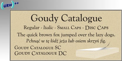
- TPG Katalog by Tolstrup Pryds Graphics,
$15.00
- Goudy Catalogue by Bitstream,
$29.99Goudy Catalogue was designed by Morris F. Benton in 1919. A medium weight adaptation of the of the original Goudy design, it is about 15 percent heavier than the Oldstyle. - analog - Unknown license

- Analogy by Jafar07,
$10.00 Analogy is a bold typeface that is strong, geometric, and confident. Manifolds will give your design alternatives a modern look and make your creative work stand out with lots of unique ligatures. highly recommended and those who are planning a poster design, logo, headline, t-shirt, etc.
 - Catalog Serif JNL by Jeff Levine,
$29.00 Based on text used as sub-headings within a reproduction of a sales catalog for stencil punch dies manufactured by S.M. Spencer & Co. (originally of Brattleboro, VT), circa 1868. Catalog Serif JNL is available in regular, oblique, condensed, condensed oblique, extra condensed, extra condensed oblique, ultra condensed, ultra condensed oblique, compressed and compressed oblique versions.
 - Type Catalog JNL by Jeff Levine,
$29.00 Type Catalog JNL was originally a design drawn by Jeff Levine around 2006. Type Catalog JNL has a distinctively retro look for many applications.
 - Catalog Sheet JNL by Jeff Levine,
$29.00 Catalog Sheet JNL is the digital version of an extra condensed serif typeface from the 1892 MacKellar, Smiths & Jordan type foundry specimen book. The font is available in both regular and oblique versions.
 - PF Signskript by Parachute,
$75.00 Sitting inside our offline vault and print catalogs for several years but still available for purchase, PF Signskript is part of a valuable triad of typographic gems which are finally re-released, fully updated and upgraded. Designed by Vladimir Radibratović, a foremost calligrapher, type designer and illustrator, this trilogy of script typefaces was recently revamped by our design team with full support for Latin, Greek and Cyrillic. Initially released between 2000 and 2003 these typefaces manifest a human, hand-crafted feel. Designed to excel particularly within casual and natural contexts, their names reveal their exact identity. The nostalgic charm of PF Signskript, the unique vintage and rough appeal of PF Rafskript or the organic Mediterranean essence of PF Mediterra have all attracted attention to these popular typefaces for brands on the supermarket shelves, wine labels, packaging, quotes, stationery and vintage lettering.
 - PF Occula by Parachute,
$33.00 Occula on Behance. Occula: Specimen Manual PDF. Occula is an exploration into high-legibility type although it’s not an effort to design the ultimate typeface in terms of economy and legibility. Instead, the goal has been to strike a balance between modern curves and lively old-style rhythm – using a rational design approach without becoming monotone. Or from another point of view: being humanistic and lively without looking old-fashioned and quirky.
 - PF Eef by Parachute,
$35.00 First conceived as the upper-and lowercase “e” for the logotype of independent publishers Elemental Editions, the letterforms were so well received that they were extended to an entire typeface and formed the basis for a bespoke font – Eef. The type design draws inspiration from the basic elements, the periodic table, functionalist vintage lettering and influences from other classic geometric typefaces with condensed cuts such as Futura and Trade Gothic. The extended set is now developed into a family consisting of three weights – Regular, Medium and Bold. While developing Eef it has been crucial to maintain the integrity of the geometrical shape in each glyph as much as possible, but also add subtle optical adjustments to make the forms more balanced and harmonic. Due to its detailed balance of simplicity, aesthetics and playfulness Eef works perfectly well in a corporate context as it does in editorial use or poster design. Eef feels most comfortable with text ranging from display to medium size.
 - PF Mellon by Parachute,
$35.00 PF Mellon is a modernist variable grotesque with mixed roots. Its unconventional aesthetic is the product of an exploration into the art of emphasizing titles, headlines and text in captivating and unpredictable ways. Contrary to conventional practices of highlighting text with heavier weights, PF Mellon proposes an intriguing new scheme based on striking and attention-grabbing compositions of narrow and extended letterforms- even when set in lowercase. Part geometric and part grotesque, PF Mellon’s expressionist alphabet and extravagant style challenge conventions of visual culture in an Art Deco-like manner. PF Mellon’s rebellious idiosyncrasy takes its cues from the eccentric personality of our popular PF Venue, an earlier geometric sans serif characterized by its daring combinations of non-uniform structures. PF Mellon’s basic design skeleton was influenced by nineteenth and early twentieth century condensed sans serif typefaces such as Stephenson Blake's Grotesque No.77 and ATF’s Alternate Gothic, adding an extra contrast to the thickness of strokes. PF Mellon is also available as a variable font format which you may request it free of charge from Parachute® once you purchase the whole type family.
 - PF Rafskript by Parachute,
$75.00 Sitting inside our offline vault and print catalogs for several years but still available for purchase, PF Rafskript is part of a valuable triad of typographic gems which are finally re-released, fully updated and upgraded. Designed by Vladimir Radibratović, a foremost calligrapher, type designer and illustrator, this trilogy of script typefaces was recently revamped by our design team with full support for Latin, Greek and Cyrillic. Initially released between 2000 and 2003 these typefaces manifest a human, hand-crafted feel. Designed to excel particularly within casual and natural contexts, their names reveal their exact identity. The nostalgic charm of PF Signskript, the unique vintage and rough appeal of PF Rafskript or the organic Mediterranean essence of PF Mediterra have all attracted attention to these popular typefaces for brands on the supermarket shelves, wine labels, packaging, quotes, stationery and vintage lettering.
 - PF Press by Parachute,
$45.00 Press combines aesthetic and functional attributes which make written text highly readable. It was originally designed for a newspaper with medium contrast to withstand harsh printing conditions. Its structure is quite narrow which makes this typeface ideal for body text and headlines where space is at premium. Supports Latin and Greek. This is a modern serif typeface which may be the right choice for newspapers, magazines and corporate communications.
 - PF Mediterra by Parachute,
$75.00 Sitting inside our offline vault and print catalogs for several years but still available for purchase, PF Mediterra is part of a valuable triad of typographic gems which are finally re-released, fully updated and upgraded. Designed by Vladimir Radibratović, a foremost calligrapher, type designer and illustrator, this trilogy of script typefaces was recently revamped by our design team with full support for Latin, Greek and Cyrillic. Initially released between 2000 and 2003 these typefaces manifest a human, hand-crafted feel. Designed to excel particularly within casual and natural contexts, their names reveal their exact identity. The nostalgic charm of PF Signskript, the unique vintage and rough appeal of PF Rafskript or the organic Mediterranean essence of PF Mediterra have all attracted attention to these popular typefaces for brands on the supermarket shelves, wine labels, packaging, quotes, stationery and vintage lettering.
 - Font - Unknown license

- Tagalog Stylized - Unknown license

- Cataline Script by Cooldesignlab,
$13.00 Cataline Script a new fresh & modern script with a handmade calligraphy style, decorative characters and a dancing baseline! So beautiful on invitation like greeting cards, branding materials, business cards, quotes, posters, and more. Cataline Script including alternate glyph and beautiful swirl in a font including stylistic sets, Ligatures etc. The Open Type features can be accessed by using Open Type savvy programs such as Adobe Illustrator CS, Adobe Indesign & CorelDraw X6-X7 and Microsoft Word. And this Font has given PUA unicode (specially coded fonts). so that all the alternate characters can easily be accessed in full by a craftsman or designer. If you don't have a program that supports OpenType features such as Adobe Illustrator and CorelDraw X Versions, you can access all the alternate glyphs using Font Book (Mac) or Character Map (Windows). by using Windows Character Map with Adobe Photoshop (PS) https://www.youtube.com/watch?v=BScPsiubM1k by using Adobe Illustrator (AI) https://www.youtube.com/watch?v=y5XTaWYwWA4 How to access all alternative characters: http://youtu.be/iptSFA7feQ0nn http://cuttingforbusiness.com/2016/01/28/how-to-use-opentype-fonts-in-silhouette-studio-or-cricut- design-space/ https://www.youtube.com/watch?v=Go9vacoYmBw If you have any question, don't hesitate to contact me by Gmail: Cooldesignlab@gmail.com. Thanks and happy designing :-)
 - P22 Catalan by IHOF,
$24.95 Catalan is inspired by such influential artists as Antonio Gaudi, Joan Miro, and Salvador Dali with glimmers of the work of Jean Arp and Pablo Picasso. Surrealist shapes and motifs dance in this highly creative alphabet. This new design has a fresh immediacy that makes it perfect for festive occasions.
 - Catesoge PS by pentagonistudio,
$19.00 Catesoge Is A Bold Slab Serif Typeface Inspired By Retro and Vintage Style. SOFTWARE REQUIREMENTS : Fonts and alternate : No special software required they may be used in any basic program /website apps that allows standard fonts That's it folks! You can go ahead and get cracking :) Follow My Shop For Upcoming Updates Including Additional Glyphs And Language Support. And Please Message Me If You Want Your Language Included or If There Are Any Features or Glyph Requests, Feel Free to Send me A Message. Have a Good Day !
 - Architype Catalogue Outline by The Foundry,
$99.00 Architype Crouwel is a collection of typefaces created in collaboration with Wim Crouwel, following his agreement with The Foundry, to recreate his experimental alphabets as digital fonts. Crouwel's most recognized work was for the Van Abbe and Stedelijk museums (1954 –72) where he established his reputation for radical, grid-based design. Architype Catalogue originates from Wim Crouwel’s Stedelijk Museum exhibition catalogue for sculptor Claes Oldenburg, 1970. The cover’s soft ‘padded’ letterforms evoke the artist’s work. Oldenburg was so taken with the design, that he asked Crouwel to complete the alphabet.
 - Goudy Catalogue SH by Scangraphic Digital Type Collection,
$26.00Since the release of these fonts most typefaces in the Scangraphic Type Collection appear in two versions. One is designed specifically for headline typesetting (SH: Scangraphic Headline Types) and one specifically for text typesetting (SB Scangraphic Bodytypes). The most obvious differentiation can be found in the spacing. That of the Bodytypes is adjusted for readability. That of the Headline Types is decidedly more narrow in order to do justice to the requirements of headline typesetting. The kerning tables, as well, have been individualized for each of these type varieties. In addition to the adjustment of spacing, there are also adjustments in the design. For the Bodytypes, fine spaces were created which prevented the smear effect on acute angles in small typesizes. For a number of Bodytypes, hairlines and serifs were thickened or the whole typeface was adjusted to meet the optical requirements for setting type in small sizes. For the German lower-case diacritical marks, all Headline Types complements contain alternative integrated accents which allow the compact setting of lower-case headlines. - Goudy Catalogue SB by Scangraphic Digital Type Collection,
$26.00Since the release of these fonts most typefaces in the Scangraphic Type Collection appear in two versions. One is designed specifically for headline typesetting (SH: Scangraphic Headline Types) and one specifically for text typesetting (SB Scangraphic Bodytypes). The most obvious differentiation can be found in the spacing. That of the Bodytypes is adjusted for readability. That of the Headline Types is decidedly more narrow in order to do justice to the requirements of headline typesetting. The kerning tables, as well, have been individualized for each of these type varieties. In addition to the adjustment of spacing, there are also adjustments in the design. For the Bodytypes, fine spaces were created which prevented the smear effect on acute angles in small typesizes. For a number of Bodytypes, hairlines and serifs were thickened or the whole typeface was adjusted to meet the optical requirements for setting type in small sizes. For the German lower-case diacritical marks, all Headline Types complements contain alternative integrated accents which allow the compact setting of lower-case headlines. - Monotype Goudy Catalogue by Monotype,
$29.99Originally designed for American Type Founders, Goudy drew inspiration from the classical old style faces for Goudy Old Style. Round characters have a strong diagonal stress, ascenders are fairly long but descenders are very short. Goudy bold was introduced in 1920; this was designed by Morris Fuller Benton. This typeface has been particularly popular in America where it is extensively used in advertising, book jackets, for labels and packaging. - Architype Catalogue Solid by The Foundry,
$50.00 Architype Crouwel is a collection of typefaces created in collaboration with Wim Crouwel, following his agreement with The Foundry, to recreate his experimental alphabets as digital fonts. Crouwel's most recognized work was for the Van Abbe and Stedelijk museums (1954 –72) where he established his reputation for radical, grid-based design. Architype Catalogue’s soft ‘padded’ letterforms were originally created by Wim Crouwel for the Stedelijk museum’s 1970 exhibition of sculptor Claes Oldenburg.. Crouwel said, ‘When you look at Oldenburg’s work, with all those soft objects, it gets into your system, so you try to integrate that feeling in the design. Claes was very taken with the catalogue's typeface, and asked me if I would do the whole alphabet for him, so I did. I cut it all out in pink paper and pasted it together’.
 - Goudy Catalogue EF by Elsner+Flake,
$35.00 - Analog Script by Mans Greback,
$69.00 Drawn and created by Mans Greback in 2022, this lettering has a distinct style and a strong personality. Use underscore _ anywhere in a word to make a swash under the word. Example: Wonder_woman Use multiple underscores for different swashes. Example: Love______letter Write # or ¤ after any letter to make a swash version. (Download required.)
 - Atalon Pro by Afkari Studio,
$17.00 Atalon Pro Is A Scratch Handwritten font made with the natural scratch typeface. Written loosely and with a special balanced look as authentic handwriting font. Atalon A Scratch is Perfect to use in all your projects that call for a natural handwritten, easy legible hand-drawn font. Features: Uppercase Lowercase Numerals & basic punctuations Regular style Multilingual Support Works on PC & Mac Simple installations Accessible in Adobe Illustrator, Adobe Photoshop, Adobe InDesign, and even work on Microsoft Word PUA Encoded Characters Fully accessible without additional design software.
 - Analogous Script by OldStudioo,
$17.00 Introducing Analogous Script is elegant calligraphy font with a classic style and a touch of elegance, inspired by the handwriting and ancient manuscripts. Carefully designed to work together in harmony that makes it very suitable for wedding media, book covers, greeting cards, logos, branding, business cards and certificates, even for any design work that requires a classic, formal or luxurious. Analogous script, an elegant, full-featured script font with tons of alternate characters and OpenType features. Hand-lettered with a heavy right slant. Specific OpenType features include contextual alternates, stylistic alternates, initial and final forms, multiple alternate glyphs for many letters (accessed through the glyphs panel), multilingual support (including multiple currency symbols), ligatures, standard numbers, and six ampersand styles. What's Included: Analogous script .OTF Alternate Character Map for swashes, alternates, etc. PUA Support Thanks!
 - PF Tempesta Five - Unknown license

- PF Westa Seven - Unknown license

- PF Ronda Seven - Unknown license

- PF Tempesta Five - Unknown license

- PF Arma Five - 100% free

- PF Ronda Seven - Unknown license

- PF Tempesta Seven - Unknown license


Page 1 of 250Next page