10,000 search results
(0.194 seconds)
- Sticky Bold by WAP Type,
$15.00 Sticky Bold is a great display font. Its casual charm makes it appear wonderfully down-to-earth, readable and, ultimately, incredibly versatile. Sticky Bold will look outstanding in any context, whether it’s being used on busy backgrounds or as a standalone headline!
 - Waterloo Bold by ITC,
$29.99The slab serif Waterloo Bold was designed by Alan Meeks. He chose unique and individual forms to give this alphabet its unmistakable character. The cross strokes of the capitals are not in the optical center, the serifs have light furrows, and the figures have a slight slant tot he right, giving this font a dynamic, flowing look. Waterloo Bold is reminiscent of cigars, whiskey and the 1930s and should be used only in headlines in large point sizes. - Butter Bold by Jackson's Lettering,
$19.95 Use your imagination. Butter Bold Brush Script is a fun universal font that will work with almost anything you want it to do!
 - Bold Groove by Wasabib Type Foundry,
$17.00 Is a typeface that carries powerfull message in a modern graphic style with ease. it uniquely combines simplicity and sophistication. BOLD GROOVE has everything you need to add creativity and personality to your design while being easy to read. Let Bold Groove impress your viewers and help deliver your message with strong impact.
 - Bold Loop by Kaer,
$19.00 Here is my new font family Bold Loop. The symbols are made of overlapping lines in a childish style. Ideal for colorful applications, children's design, bright advertising, mosaic packaging, multimedia identity. --- *You can use color fonts in PS CC 2017+, AI CC 2018+, ID CC 2019+, macOS 10.14 Mojave+ * *Please note that the Canva & Corel doesn't support color fonts!* *Please download this test file with only ABC letters ( https://www.dropbox.com/s/vvxws9jffocet5t/BoldLoop-Test.otf?dl=0 ) to check your app & system.* --- If you have any questions or issues, please contact me: kaer.pro@gmail.com Best, Roman.
 - Blood Bold by Stringlabs Creative Studio,
$25.00 Blood Bold is a bold display font, bloody perfect for all things Halloween! The Blood Bold font is a great choice to increase the prominence in your project. Although the typography is traditional, the basic elements are great.
 - Bold Galde by Sipanji21,
$15.00 "Bolde Galde" is a cute display font characterized by thick and rounded letterforms, making it a great choice for design projects aimed at children, such as children's games, book covers, and any projects related to schools. With its playful and friendly appearance, this font adds a touch of whimsy and charm to your designs, making them more engaging and enjoyable for young audiences. The simplicity and clarity of "Bolde Galde" make it easy to read and understand, making it an excellent choice for educational materials and other projects aimed at young learners.
 - Martin Bold by Wooden Type Fonts,
$15.00 Unusual sans serif with some rounded portions.
 - Bold Living by Seemly Fonts,
$12.00 Bold Living is a remarkable display font that brings an unmatched style that seamlessly complements a vast range of projects, amplifying their distinctiveness and leaving a lasting impression on your creative works.
 - Manifesto Bold by Solotype,
$19.95In digitizing this old font, we took great liberties with the design, removing some jarring elements. The result reads much more smoothly than the original, retaining the overall character of the original. Hope you don't mind, Mr. Beeler. - Caslon Bold by Bitstream,
$29.99The Bitstream version of Caslon 3 of the American Type Founders, 1905. - Gallatin Bold by Wooden Type Fonts,
$45.00 Slab serif in 3 weights
 - Bold Pen by Authentic,
$39.50 BoldPen is based on an ancestor of the German DIN-Schrift. The font was traced with a plastic template on transparent paper, scanned and worked over carefully to keep the handmade, authentic touch.
 - Bold Marker by Timurtype,
$14.00 Introducing by Timur type Proudly Present, Bold Marker Bold Marker A Handwritten Font Bold Marker is perfect for product packaging, branding project, megazine, social media, wedding, or just used to express words above the background. This Bold Marker font includes: -Full Set of standard alphabet and punctuation & symbol -multilingual support. Embelish your designs with our original fonts.Enjoy the font,Thank you!
 - Teiqulato Bold by Doeltype,
$19.00 Hello All!! Introducing!! Teiqulato is a calligraphy script with a perfection style of the letters you want to use, modern handwriting with many alternatives. Now this is an opentype! It's smart and in line with your wishes! You are welcome to use it, suitable for various purposes: logo, corporate symbol, wedding invitation, title, creative, t-shirt, business card, letterhead, nameplate, label, poster, news, badge, quotation, etc. Teiqulato Features 458 glyphs and alternative characters. Includes the initial letter to terminal, alternative, ligature and multiple language support. Thanks...
 - Cheltenham Old Style Pro by SoftMaker,
$15.99
- Canterbury Old Style Pro by Red Rooster Collection,
$79.00 Canterbury Old Style Pro is a two-weight serif font family with a small x-height. In 1920, Morris F. Benton designed the original weight for American Type Founders (ATF). Raymond Vatter and Steve Jackaman produced the digital version in 1992 and added a new “Bold” weight, and a full set of swash capitals were designed and released in 2003. Jackaman redrew and remastered the family in 2017, engineering the complete family into OpenType Pro format. Our OpenType fonts have extended character sets that support Western, Central, and Eastern European languages. Canterbury OS Pro has a whimsical, old-time feel, and handsomely distinguishes itself at all sizes. Canterbury Sans, its sans serif sister font, complements the family with its flowing forms.
 - Iwata Mincho Old Pro by IWATA,
$199.00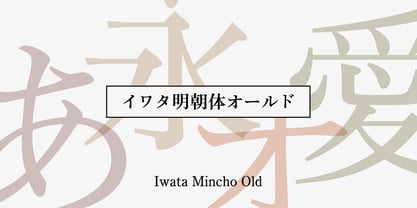 ?????????????????????????????????????????????????????????????????????????????????????
 - Pickworth Old Style Pro by Red Rooster Collection,
$60.00 Steve Jackaman & Ashley Muir. An antique, rustic or even mystical design that will grow on you the more you use it. Pickworth contains all the high-end features expected in a quality OpenType Pro font.
 - Iwata Gothic Old Pro by IWATA,
$199.00 ?????????????????????????????????? ???????????????????????????????????????????????
 - Century Old Style Pro by SoftMaker,
$14.99 Century Old Style Pro is one of the fonts of the SoftMaker font library.
 - Slamming - Unknown license

- Clab by Eko Bimantara,
$19.00 Clab is meant for branding. The initial characters were build in bold and chunky personality, yet the thin strokes and flowy italics gives it a versatile and unique set of family. The glyphs crafted in low contrast strokes, short ascenders and descenders and low caps. Clab consist of 9 weight from Hairline to Black with each matching italics. Contain more than 400 glyphs with some OpenType features e.g, standard and discretionary ligature, fraction, e.t.c.
 - YLab by Par Défaut,
$30.00 yLab is geometric typeface compose of 10 fonts (5 weights and oblique declination) Perfect for titles and text, yLab supports many languages (Latin pro..). 11 OpenType Features (Alternative; Fraction; Numerator; Denominator; Superior; Inferior; Tabular figure; Ordinals; Discretionary Ligature; Stylistic Set; Case Sensitive Forms). • Ordinal feature includes the Latin alphabet (Uppercase & Lowercase). • Five Stylistic set for “a”, “g”, "i" and "l", includes accents. • Discretionary Ligature includes “AE”, “IJ”, “OE”, available in lowercase. • Contextual Alternate includes ligatures for arrows : <- -> ^| v| <-> v^| Add parentheses around period, numbers or arrows, add n or d for numerator, denominator. Add n, d or +, for numerator, denominator or case arrows. All Case sensitive characters become after the uppercase and number.
 - PF Tempesta Five - Unknown license

- PF Westa Seven - Unknown license

- PF Ronda Seven - Unknown license

- PF Tempesta Five - Unknown license

- PF Arma Five - 100% free

- PF Ronda Seven - Unknown license

- PF Tempesta Seven - Unknown license

- PF Tempesta Seven - Unknown license

- PF DIN Mono by Parachute,
$45.00 PF DIN Mono is the latest addition to the ever-growing set of DIN super-families by Parachute. It was based on its proportional counterpart DIN Text Pro but was completely redesigned to reflect its new identity. DIN Mono is a monospace typeface which is comprised of characters with fixed width. Traditionally, monospaced fonts have been used to create forms, tables and documents that require exact text line lengths and precise character alignment. DIN Mono, on the other hand, can prove to be more than a useful typeface for technical applications. In the world of proportionality, DIN Mono stands out as a fresh new alternative to the popular standard, particularly for publishing and branding applications. Additional care was given to the aesthetic form and its pleasing characteristics. The spacing attributes of the glyphs were redefined and legibility was further improved by revising or changing the shape of the letterforms. Furthermore, kerning was not included in order to preserve the monospace nature of this typeface. The family consists of 12 weights including true-italics. Currently, it supports Latin, Eastern European, Turkish and Baltic.
 - PF Diplomat Sans by Parachute,
$45.00 A clean humanistic sans-serif typeface which complements its serif version Diplomat Serif. It has preserved several of its original characteristics and comes complete with true-italics with a distinct flowing structure. Supports Latin and Greek.
 - PF DIN Stencil by Parachute,
$39.00 DIN Stencil on Behance. DIN Stencil: Specimen Manual PDF. Despite the fact that over the years several designers have manually created stencil lettering based on DIN for various projects, there has never been a professional digital stencil version of a DIN-based typeface. After the successful introduction of DIN Monospace a few months earlier, PF DIN Stencil now completes Parachute’s extensive library of DIN superfamilies. It was based on its original counterpart DIN Text Pro and was particularly designed to address contemporary projects, by incorporating elements and weights which are akin to industries such as fashion, music, video, architecture, sports and communications. Traditionally, stencils have been used extensively for military equipment, goods packaging, transportation, shop signs, seed sacks and prison uniforms. In the old days, stencilled markings of ownership were printed on personal possessions, while stencilled signatures on shirts were typical of 19th century stencilling. Two companies dominated the market in the mid-twentieth century: the Marsh Stencil Machine Company in the United States and the Sächsische Metall Schablonen Fabrik in Germany. Ever since the late 1930s, it was the German Sächsische Metall Schablonen Fabrik which used heavily the new DIN 1451 standard font (introduced in 1936), attempting to overthrow the reign of the Didot-style modern roman which was at the time the most common stencil letter in Germany. These letters were manufactured mainly as individual zinc stencils which could be ordered in sizes between 10 and 100mm. The DIN Stencil family manages to preserve several traditional stencil features, but introduces additional modernities which enhance its pleasing characteristics and make it an ideal choice for a large number of contemporary projects. Furthermore, the spacing attributes of the glyphs were redefined and legibility was improved by revising the shape of the letterforms. The DIN Stencil family consists of 8 diverse weights from the elegant Hairline to the muscular Black. Currently, it supports Latin, Eastern European, Turkish and Baltic.
 - PF Nuyork Arabic by Parachute,
$79.00 Nuyork Arabic was designed to emphasize on the individual Arabic letter visual traditional characteristics. Including 5 weights, it was designed with both text and display applications in mind. This font is intended to produce virtually cursive texts without eliminating the clarity or look-and-feel of the individual Arabic letters. Offering glyphs for the full Extended Arabic Unicode Standards 6.1, including the latest Arabic Supplement and Extended-A Unicode blocks, Nuyork Arabic incorporates comprehensive support for Quranic texts and other Arabetic scripts, including African sub-Saharan scripts. Careful design considerations were given to make sure that composed Arabetic text is visually prominent and stands well next to Latin. To insure legibility in all sizes, vertical strokes are emphasized when possible, while utilizing multiple x-heights to give a traditional Arabic feel. The design of this font follows the general guidelines of the Mutamathil type style developed by the designer, a decade ago, to enrich and diversify user typographic options, and to address the Arabetic scripts challenges of literacy, education, economics, and technology. Based on this style, it uses one glyph for every basic Arabic Unicode character or letter, as defined by the latest Unicode Standards, and one additional final form glyph, for each freely-connecting letter in the traditional Arabic cursive text. Nuyork Arabic includes the required Lam-Alif ligatures in addition to all vowel diacritic ligatures. Soft-vowel diacritic marks (harakat) are selectively positioned, with most of them appearing on similar high and low levels to clearly distinguish them from the letters. Tatweel, or Kashidah, is a zero-width glyph. Arabetics Latte includes both Arabic and Arabic-Indic numerals. Available in Open Type format, the Nuyork Arabic font family includes regular, light, bold, extra bold, and black.
 - PF Lindemann Sans by Parachute,
$49.00 Lindemann Sans is an immediately-inviting typeface with a pleasing distinct visual voice grounded by geometry and golden proportions. This modern geometric san serif typeface serves the interpretive needs of modern design through its legibility. This legibility is achieved through proportional balance of each letter based on the golden ratio, open counters, high x-height and wider individual shapes. In addition, a high level of legibility is arrived through distinctive glyphs like a, e, @, and f, which are engaging and add to Lindemann Sans visual voice. Being a modern, spirited, tech-savvy typeface, Lindemann Sans has many of the features demanded by today's designers. These features include 800 characters within each font, many ligatures, full numbers sets, small caps, alternative characters and other niceties found in opentype fonts. Due to Lindemann Sans high legibility, geometric sans tradition, and a large feature set list, it is a very versatile typeface and can be used in replacement of the more commonly used sans. Specifically, Lindemann Sans can be used by technology corporations, architectural firms in their supporting materials, in magazines as headers and key-points, as the typeface for professional keynotes, for the package design industry as a whole, in automotive concept projects, and for cosmetic branding for high class hair products. With its inviting nature it may also be used for liberal arts promotional materials. In addition, this typeface can be used by green industries because of its nature derived proportions. Each style and weight of Lindemann Sans adheres to the same geometric and golden proportions, however, each weight is innately noteworthy. For example, there is a charm that is found in the ultralight weight's elegant geometry and lights impressive use as oversized headlines. It shines with true clarity of vision with the book weight and the versatility of the medium. One cannot overlook the power and pacing of the bold and extra bold weights with its clear counters and restrained letter forms. Within Lindemann Sans family each weight has a distinctive role to play but stays true to its purpose.
 - PF Diplomat Serif by Parachute,
$45.00 Diplomat Serif is a modern serif typeface with Didone characteristics, quite useful for intense editorial jobs. Its open character shapes, low contrast and discreet serifs enhance legibility and provide a fresh, clean and contemporary look. Its matching sans-serif version Diplomat Sans was designed to complement it for demanding publishing and corporate applications. Supports Latin and Greek.
 - PF DIN Serif by Parachute,
$36.00 DIN Serif: Specimen Manual PDF The DIN Type System: A Comparison Table This is the first ever release of a true serif companion for the popular DIN typeface. DIN Serif originated in a custom project for a watchmaking journal which required a modern serif to work in unison and match the inherent simplicity of DIN. As a result, a solid, confident and well-balanced typeface was developed which is simple and neutral enough when set at small sizes, but sturdy and powerful when set at heavier weights and bigger sizes. It utilizes the skeleton of the original DIN and retains its basic proportions such as x-height, caps height and descenders, whereas ascenders were slightly increased. DIN Serif makes no attempt to impress with ephemeral nifty details on individual letters, but instead it concentrates on a few modern, functional and everlasting novelties which express an overall distinct quality on the page and set it apart from most classic romans. This is a low contrast typeface with vertical axis and squarish form which brings out a balance between simplicity and legibility. Its narrow proportions offer economy of space which is critical for newspaper body text and headlines. At small sizes the text has an even texture, it is comfortable and highly readable. The serifs are narrow at heavy weights and when tight typesetting is applied at large sizes, the heavier weights become ideal for headlines. DIN Serif was inspired by late 19th century Egyptian and earlier transitional roman faces. Bracketed serifs were placed on the upper part of the letterforms (this is where we mostly concentrate our attention when we read) whereas small clean square serifs were placed on and under the baseline to simplify the letterforms. In order to reduce visual tension at the joins and make reading smooth and comfortable, a slight hint of bracketed serif was added at the joins in the form of a subtle angular tapered serif, which softens the harsh angularity. These angular tapered serifs tend to disappear at smaller sizes (or smooth out the joins) but stand out at bigger sizes exuding a strong, modern and energetic personality. What started out as a custom 2 weight family, it has developed into a full scale superfamily with 10 styles from Regular to ExtraBlack along with their italics. Additional features were added such as small caps, alternate letters and numbers as well as numerous symbols for branding, signage and publishing. All weights were meticulously hinted for excellent display performance on the web. Finally, DIN Serif supports more that 100 languages such as those based on the Latin, Greek and Cyrillic alphabet.
 - PF DIN Text by Parachute,
$79.00 The purpose of the original DIN 1451 standard was to lay down a style of lettering which is timeless and easily legible. Unfortunately, these early letters lacked elegance and were not properly designed for typographic applications. Ever since its first publication in the 1930’s, several type foundries adopted the original designs for digital photocomposition. By early 2000, it became apparent that the existing DIN-based fonts did not fulfil the ever-increasing demand for a diverse set of weights and additional support for non-Latin languages. Parachute® was set out to fill this gap by introducing the PF DIN series which has become ever since the most comprehensive and sophisticated set of DIN typefaces. It was based on the original standards but was specifically designed to fit typographic requirements. Its letterforms divert from the stiff geometric structure of the original and introduce instead elements which are familiar, softer and easier to read. The first set of fonts was completed in 2002 as a group of 3 families which included condensed and compressed versions. With its vast array of weights, the extended language support, but most of all its meticulous and elaborate design, it has proved itself valuable to numerous design agencies around the world. Ever since its first release, it has been used in diverse editorials, packaging, branding and advertising campaigns as well as a great number of websites. It was quoted by Publish magazine as being “an overkill series for complex corporate identity projects”. The whole PF DIN Text type system (with normal, condensed and compressed styles) includes 45 weights from Hairline to Extra Black including true-italics. Additionally, every font in the Pro series is powered by 270 very useful symbols for packaging, environmental graphics, signage, transportation, computing, fabric care. There are 2 versions to choose from: The PRO version is the most powerful. All weights support Latin, Cyrillic, Greek, Central/Eastern European, Romanian, Baltic and Turkish, with 20 advanced opentype features including small caps. The standard STD version is more economic. All weights support Latin, Central/Eastern European, Romanian, Baltic and Turkish, with 18 advanced opentype features including small caps. In 2010 Parachute® released 4 new families DIN Monospace, DIN Stencil, DIN Text Arabic and DIN Text Universal. All these are complemented by the popular DIN Display version. Altogether the Parachute DIN series is a set of 8 superfamilies with a total of 96 weights.


