10,000 search results
(0.017 seconds)
- PF Bague Slab Pro by Parachute,
$79.00 PF Bague Slab Pro draws its inspiration from early 20th century slabs and was designed as a companion to Bague Sans, a versatile monoline typeface with a distinct and eye-catching personality. Following its predecessor’s design guidelines, it overcomes the monotonous and mechanical rigidity of early geometrics by introducing subtle variations in stroke width and semi-wedge serifs rather than square slabs. These striking serifs, along with a mixture of attractive letterforms, exude a strong, modern and energetic personality at display sizes. On the other hand, at small sizes these distinct characteristics become subtle and the simplistic geometric personality of the typeface comes in place to offer a highly readable text. Bague Slab Pro is a very clean and legible typeface with a warm and well-balanced texture which is ideal for editorial design, branding and corporate identity. This superfamily includes 18 weights from Hairline to Ultra Black with a consistent and well-refined structure. The italics are slightly narrower than the romans with cursive characteristics. Each style consists of 718 glyphs with 13 opentype features and an extended set of characters which supports simultaneously Latin, Cyrillic and Greek. PDF Specimen Bague Slab Pro on Behance
 - PF Centro Slab Pro by Parachute,
$79.00 Centro Slab Pro is an award-winning typeface. It received a Gold Award from the European Design Awards 2008 and an Excellence Award from the International Type Design Competition 2009 as part of the Centro Pro type system. This large series of 40 fonts with 1519 glyphs each is composed of three superfamilies (serif, sans and slab), includes true italics and supports Latin, Greek and Cyrillic. According to the jury of the European Design Awards “...Centro Pro is an almost ‘invisible’ typeface with distinct personality, it has legibility as its main attribute and is ideal for a wide range of design works. It does not attract any unnecessary attention, but rather serves its purpose. A rare case of contemporary type family working across three alphabets. Centro Pro meets an ever-growing demand for such typefaces among pan-European companies and institutions”. Centro Pro has become very popular among printed media and is ideal choice for newspapers, magazines and corporate applications. Furthermore every font in this series has been completed with 270 copyright-free symbols, some of which have been proposed by several international organizations for packaging, public areas, environment, transportation, computers, fabric care and urban life.
 - Lab Slab Pro by Vanarchiv,
$50.00 Lab Slab Pro is a geometric slab typeface with a technological and minimalist look and is suitable for use in large sizes. It has eight versatile weights, (from Thin to Black) including true italics for each one, and a wide range of stylish alternate characters to improve its use in different graphic contexts. The name of this typeface was inspired by an experiment, mixing a structure with calligraphic influences and completely geometrical and structured drawings. Lab Slab Pro has a wide range of OpenType® features such as: small caps, old style/titling and small caps figures, fractions, superior and inferior scripts, scientific components and ligatures. Lab Slab Pro is Lab's best and most powerful mutation designed by Tiponautas.
 - PF Fusion Slab by Parachute,
$40.00 Fusion Slab was developed based on Fusion Sans Pro, as an amalgamation of traditional early nineteenth-century letters. Fusion Slab is a family of 3 weights with very tall x-height which is suitable for long headlines. On the other hand, its ascenders and descenders are extremely short so text lines can be set with a very low leading value. It provides support for Latin and Greek.
 - Amora by Jen Wagner Co.,
$19.00 Amora is a messy, feminine, carefree script that is perfect for logos, posters, signage, and more! Fonts I paired with in the samples are Adobe Caslon, Proxima Nova (both available through www.typekit.com) and Bebas Neue. Comes with 79 ligatures for a totally unique hand-written feel! Includes: Upper + Lowercase Letters w/ alternates Non-English support 79 Ligatures Best for: Logos Branding Large format writing Feminine look + feel Paired with sans serifs (Proxima Nova, Bebas) and classic serifs (Adobe Caslon, Baskerville) Web headers Signage Wedding invitations and decor (table numbers, signage, balloons, etc.) Not best for: Small printing Long quotes (generally flows better with just a few words) Patterned backgrounds
 - Agoda by Rezastudio,
$9.00 Agoda is a stylish, classy and delicate script font. It has a clean, thin and smooth vibe and it will be a hit for any design that you want to add it to. Agoda is PUA encoded which means you can access all of the glyphs and swashes with ease!
 - Arora by Bosstypestudio,
$14.00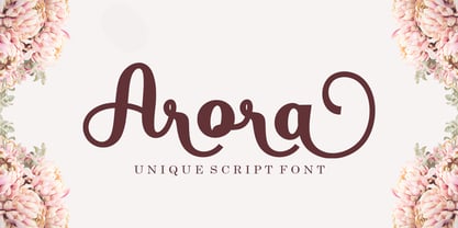 Introducing Arora Arora with a smooth handwriting style and very pretty and lovely. Arora is perfect for branding projects, home appliance design, product packaging, use in business cards, invitation cards, etc. Just like a stylish text overlay to a wallpaper or anything that needs a touch of love. Thanks for checking! I really hope you enjoy
 - Zagora by CastleType,
$19.00 Based on an art deco design, with alternate characters and numerals. Named for a little town in Morocco on the border of the Sahara desert, with a billboard at the edge of a great expanse of sand that points the way to Timbuktu (several days by camel).
 - Alora by VP Creative Shop,
$14.00 Introducing Alora - serif typeface - 4 fonts Alora is elegant and fragile typeface loaded with 4 fonts and multilingual support. It's a very versatile font that works great in large and small sizes. Alora is perfect for branding projects, home-ware designs, product packaging, magazine headers - or simply as a stylish text overlay to any background image. FEATURES Uppercase, lowercase, numeral, punctuation & Symbol Regular Style 1 and 2 Italic Multilingual support No special software is required to type out the standard characters of the Typeface. Canva friendly Feel free to contact me if you have any questions! Mock ups and backgrounds used are not included. Thank you! Enjoy!
 - Angora by Omotu,
$18.00 Angora! A handwrittent signature font. Angora font is suitable for branding, logotype, apparel, T-shirt, Hoodie, product packaging, quotes, flyer, poster, advertising, etc. Whats Include? Uppercase and lowercase characters Supports international languages Opentype feature: ligatures Accessible in the Adobe Illustrator Glyphs panel, or under Stylistic Alternates in the Adobe Photoshop OpenType menu, Adobe InDesign, Corel Draw, even work on Microsoft Word Please message me if you’re unsure of any language support. Thanks for looking, and I hope you enjoy it! Please don’t hesitate to drop me a message if you have any issues or queries.
 - Adora Normal PRO by preussTYPE,
$53.90 German type designer Ingo Preuss created this sans Super-family between 2010 and 2015. The family has 84 weights, ranging from Light to Ultra in Normal, Compact, Condensed and Compressed (including italics). It comes in OpenType format with extended language support. All weights contain ligatures, superior characters, proportional lining figures, tabular lining figures, proportional old style figures, lining old style figures, matching currency symbols, fraction- and scientific numerals and matching arrows. The “Adora PRO family” is ideally suited for advertising and packaging, editorial and publishing, logo, branding and creative industries, poster and billboards, small text, wayfinding and signage as well as web and screen design.
 - Adora Compressed PRO by preussTYPE,
$53.90 German type designer Ingo Preuss created this sans Super-family between 2010 and 2015. The family has 84 weights, ranging from Light to Ultra in Normal, Compact, Condensed and Compressed (including italics). It comes in OpenType format with extended language support. All weights contain ligatures, superior characters, proportional lining figures, tabular lining figures, proportional old style figures, lining old style figures, matching currency symbols, fraction- and scientific numerals and matching arrows. The “Adora PRO family” is ideally suited for advertising and packaging, editorial and publishing, logo, branding and creative industries, poster and billboards, small text, wayfinding and signage as well as web and screen design.
 - Adora Compact PRO by preussTYPE,
$53.90 German type designer Ingo Preuss created this sans Super-family between 2010 and 2015. The family has 84 weights, ranging from Light to Ultra in Normal, Compact, Condensed and Compressed (including italics). It comes in OpenType format with extended language support. All weights contain ligatures, superior characters, proportional lining figures, tabular lining figures, proportional old style figures, lining old style figures, matching currency symbols, fraction- and scientific numerals and matching arrows. The “Adora PRO family” is ideally suited for advertising and packaging, editorial and publishing, logo, branding and creative industries, poster and billboards, small text, wayfinding and signage as well as web and screen design.
 - Adora Condensed PRO by preussTYPE,
$53.90 German type designer Ingo Preuss created this sans Super-family between 2010 and 2015. The family has 84 weights, ranging from Light to Ultra in Normal, Compact, Condensed and Compressed (including italics). It comes in OpenType format with extended language support. All weights contain ligatures, superior characters, proportional lining figures, tabular lining figures, proportional old style figures, lining old style figures, matching currency symbols, fraction- and scientific numerals and matching arrows. The "Adora PRO family" is ideally suited for advertising and packaging, editorial and publishing, logo, branding and creative industries, poster and billboards, small text, wayfinding and signage as well as web and screen design.
 - Caribantu Agora by Lamatype,
$24.00 Caribantu Agora is an update of the Caribantu Grotesque typeface, with a new, more consistent and refined design. Being a 100% Latin Plus typeface, it features a wide range of characters for all Latin languages, making it a versatile option for designers worldwide. The kerning has been adjusted to ensure readability and text cohesion, providing a pleasant and professional reading experience. Additionally, Caribantu Agora includes all braille characters, making it accessible, inclusive, and ready for complex signage and packaging projects. With four stylistic sets, this typeface allows users to further customize their designs. Alternative glyphs allow you to change the look to a more modern and tech form, giving even more dynamism to web pages, packaging, and signage. Check out some of the features present in Caribantu Agora: 7 weights and a variable option; 100% Latin Plus; 15 OpenType features; 4 stylistic sets; Monetary symbols for all circulating currencies; Braille character sets; Math symbols; Arrows pointing in all directions.
 - PF Scandal Pro by Parachute,
$79.00 “A couple of years ago, when I was designing a package for a marmalade range, I started having a go at creating a typeface that would suit the package I had in mind. The whole process was intensely appealing to me: from merely using typefaces as an intricate part of my work as an art director, I started exploring the function of each and every element that a typeface consists of. The two things on my mind in designing a typeface for a marmalade brand were firstly, that I wanted it to have a hand-written feel, so as to exude that old-fashioned, homemade quality, and secondly, that it ought to have a certain sweetness and gentleness that would match the product. However, PF Scandal managed to outgrow its original inspiration. As I continued working on it, I toned down some of its elements to make it more versatile. And so, PF Scandal evolved into a typeface that has a contemporary, and yet handwritten look, which makes it suitable for a wide range of uses. The ‘Pro’ version comes with the full array of European characters including Latin, Greek and Cyrillic as well as 120 matching pictograms". -A.S.
 - PF Adamant Pro by Parachute,
$59.00 The Adamant family is a serif typeface that comes in six weights, from Light to ExtraBold, each with italic and small caps versions. It has received an original typeface award from Granshan Awards 2010. Every font in this family includes ligatures, lining and oldstyle figures in proportional and tabular widths, fractions, alternate characters, and other typographic features. The weights are finely balanced so that they can be easily combined, depending on type of paper and print conditions. Its proportions, sturdy serifs, high x-height and wide apertures make it very readable at small sizes. It is suitable for setting books, magazines and newspapers, but is also appropriate for use in large sizes like in poster design.
 - PF Cosmonut Pro by Parachute,
$69.00 Spaced out and a bit nutty. This typeface revisits the futuristic atmosphere of the 50s and 60s cartoons and is complemented with an amazing, wacky and super cool series of 50 pictograms, designed by the master designer Dimitris Foussekis. This is a very popular informal typeface which was expanded recently into a ‘Pro’ version that includes Latin, Greek and Cyrillic.
 - PF Baseline Pro by Parachute,
$79.00 An ultra modern typeface which combined with the proper text font can revive any dull-looking document. The wide simple forms combined with the selective application of a few distinct characteristics has resulted a stylish typeface which shines in the top 10 of our most wanted list. The powerful new “Pro” version comes complete with Greek and Cyrillic and includes a number of stylistic alternates as well as 2 groups of stylistic alternate sets, the last group being unicase characters.
 - PF Reminder Pro by Parachute,
$59.00 Use Reminder to add a homey and personal touch to your notes and messages. Whether it is a note to your loved ones or a colleague at the office, this is the typeface to use. But don't take our word for it. The applications of this typeface are endless. Since its first release back in 2003, we have seen it being used for anything from banking to automobiles. And now, with this "Pro" version you can communicate with a big part of this world in a way you always wanted. PF Reminder Pro comes loaded with 555 glyphs which support all European languages including Greek and Cyrillic.
 - PF Fuel Pro by Parachute,
$79.00 This typeface was inspired by the rough surroundings of a modern city and reflects the contradicting nature of an emerging global youth culture. Ever since its first release—back in late 1999— it is constantly on our ‘most wanted’ list and has been part of numerous product campaigns. Music, mobile telephony, food and beverages, politics, you name it. Coca-Cola used it, José Cuervo used it for about 3 years. The new ‘Pro’ version goes one step ahead. You may now capture the essence of the younger generation in every major European language. PF Fuel has been extended with the full array of Cyrillic characters as well as matching frames for this extra stamped look. Furthermore there more alternate characters than ever. Create a custom look, when same characters sit close, or one next to the other. You may find these useful—alternate characters either in the lowercase positions, or access them through the ‘stylistic alternates’ OpenType Pro feature. If you need some extra fuel, this is where to get it!
 - PF Stamps Pro by Parachute,
$79.00 PF Stamps covers a wide range of applications which require the stamp effect. This is a form of lettering which was very popular in the mid-twentieth century for product labeling. Special machinery was developed by mainly two companies, one in the United States and the other in Germany. This machinery produced paper die cuts which were later used as a base for the marking with a paintbrush. PF Stamps Paint was developed to simulate this type of lettering. Two other styles, Metal and Flex, have been very popular since its original release. The first one was developed from a metallic stamp imprint, whereas the second one with its slight 3-D look simulates letters stamped on plastic. To insure realistic results, uppercase letters are different from lowercase. This is very useful when two similar letters sit next to each other. There 3 more styles: Solid (the stencil in its regular clean form), Rough and the very interesting Blur. The all new “Pro” version comes to complete this series with what was missing: 93 matching frames and frames parts which will satisfy the most demanding designer. This is a bonus font which is available only with the purchase of the whole family. Use these frames “as is” at any size, or connect the frame parts to each other to create longer frames. Finally, this series supports more than hundred languages which are based on the Latin, Greek or Cyrillic scripts.
 - PF Libera Pro by Parachute,
$79.00 PF Libera was designed at a time of leisure with no particular intention for commercial use. In fact it was offered in the beginning as a freeware. In 2001, designer Charis Tsevis was convinced that it may have some commercial value, so Parachute obtained the rights to sell this typeface. At that time, we did not even imagine what would follow. Since then, PF Libera is one of our most successful typefaces. We have seen it being used in very diverse applications. From publishing to advertising to banking, to transportation, to retail applications. Food, beverages, fashion, automobiles, tourism, the list goes on and on. In any way, this typeface is very personal, modern and provocative. It stays with you and definitely it brings along the message. PF Libera comes in 3 styles. One of them, 'Liberissima', was added later and is more loose than the other two. The new 'Pro' version is powered with 7 OpenType features and is carefully designed to include all languages that are based on Latin, Greek and Cyrillic.
 - PF Playskool Pro by Parachute,
$69.00 A great fun typeface with a straightforward childlike simplicity. It really hits home with kids, but if you want to add this extra playful personality to your designs this is the one to use. It has a strong, easy to read structure, which makes it ideal for children’s books, toys and other fun applications. Designer Alexandros Papalexis has discover the kid within. You can too!
 - PF Handbook Pro by Parachute,
$79.00 This typeface incorporates round smooth corners and distinct design elements in several characters like 'a, g, k, m', without compromising legibility. In order to retain its sharpness, inner corners as well as junction points were left steep. This is a balanced typeface which works very well in long texts at small point sizes. Since its first release it has been used in numerous magazines, advertising campaigns and corporate applications. Handbook Pro comes loaded with a number of special features. The family consists of 14 fonts -from black to extra thin- including true italics. It supports 21 special OpenType features like small caps, fractions, ordinals, etc. and offers multilingual support for all European languages including Greek and Cyrillic. There is also a set of very interesting stylistic alternates which can be used to add a refreshing flair to your designs. Finally, every font in this family has been completed with 270 copyright-free symbols, some of which have been proposed by several international organizations for packaging, public areas, environment, transportation, computers, fabric care and urban life.
 - PF Kids Pro by Parachute,
$79.00 This is not just a typeface inspired by a kid’s first attempts to write. This is in fact how exactly a kid writes. Alexandros Papalexis was born again kid when he became a father. This series came about while designing his daughter’s birthday invitations. Since its first release, it has been constantly on our most wanted list. You step into a supermarket, a bookstore or a clothing store and you see tens of products using this typeface. Anything from baby products, food, clothing, children’s books and magazines, print and TV campaigns, you name it. But don't just stick to the name. Every single weight serves the right purpose. This is why this typeface has also been used extensively for grown-up market. Recently, it was upgraded to include Latin, Greek and Cyrillic. Furthermore, the accompanied series of pictograms was completed and loaded with 125 western and eastern European pieces.
 - PF Synch Pro by Parachute,
$79.00 An industrial strength slab-serif typeface which performs equally well with headlines as well as longer text. It differs from the stiff almost mechanical structure of other slabs, by introducing distinct letterforms in characters like ‘f’, ‘r’ and managing at the same time to combine effectively the typeface’s round parts with deep cuts and sharp inner corners, which add an interesting character to this otherwise contemporary series. PF Synch Pro consists of 4 fonts from black to regular. It is loaded with 3 special OpenType features and offers multilingual support for all European languages including Greek and Cyrillic.
 - PF Monumenta Pro by Parachute,
$69.00 Royal, majestic, elegant. These letters are based on Roman and Greek characters carved on stone. They come in 3 different styles. Normal and Shaded are designed to have serifs with a finer thinning. On the other hand, Metallic is bolder and simulates in the most realistic way three-dimensional metallic lettering. There are some alternate characters placed at lowercase positions as well as a few stylistic alternates which are accessed through the OpenType features. Pay attention to letters like Greek Omega (lowercase position) and Greek Xi (lowercase position) as well as B, R, K (lowercase position). Monumenta Pro was recently upgraded to support Latin, Greek and Cyrillic.
 - PF Isotext Pro by Parachute,
$79.00 This typeface is based on ISO 3098, a technical documentation issued in 1974 by ISO (International Organization for Standardization), which proposed a set of characters for use on technical drawings and associated documents. Isotext is based on the original standards but is completely redesigned to fit typographic requirements. This new ‘Pro’ version is further improved and now comes with a complete set of redesigned true-italics. Furthermore, the width of the glyphs has increased in order to establish a more balanced and readable text. The result is a contemporary font which works well in small sentences as well as long texts. Isotext Pro is loaded with all the good stuff a designer needs to create documents with attitude. It supports 19 special OpenType features like small caps, fractions, ordinals, etc. and offers multilingual support for all European languages including Greek and Cyrillic. Finally, every font in this family has been completed with 270 copyright-free symbols, some of which have been proposed by several international organizations for packaging, public areas, environment, transportation, computers, fabric care and urban life.
 - PF Hellenica Pro by Parachute,
$69.00 The Golden Age of the Greek Civilization. The world’s history carved on stone. Hellenica Pro was created based on numerous photos from archaeological sites and several other historical references dating back to 1100 B.C. In order to capture the essence of this writing, there are a few alternate forms used at lowercase, uppercase and/or accented positions. These alternates come from different regions in Greece. For instance, uppercase Theta was used by the Cretans and the Korinthians, whereas uppercase Delta by the Ionians. PF Hellenica Pro comes in 3 versions: Light, regular and bold. The new ‘Pro’ version has been expanded to include 3 major scripts: Latin, Greek and Cyrillic.
 - PF Wonderland Pro by Parachute,
$79.00 Alice in Wonderland. Innocent, emotional, almost childish, looks like it just came out of a fairy tale. The long stems, quirky serifs and loose characters, as well its youthful energy, establish an emotional attachment to this typeface. So perfect for children's books. Designer Dimitris Foussekis completed this font with a matching series of 62 pictograms the so-called ‘Wonderbats’. Now, the brand new ‘Pro’ version has been expanded to include all European languages by supporting simultaneously Latin, Greek and Cyrillic scripts.
 - PF Benchmark Pro by Parachute,
$79.00 Benchmark Pro is a carefully structured geometric typeface which works amazingly well in body text due to its simplistic nature and large x-height. The design of Benchmark Pro started out as an attempt to convert the minimalistic structure of a technical and purely geometric design into a readable modern and friendly sans serif. This was achieved by selectively changing and turning the straight lines of the initial drawings into curves and applying legibility techniques to the transformed letterforms. These letterforms have a distinct personality which is bolstered by its angular curves and open counter terminals. The result is a contemporary text typeface that looks quite fashionable. Benchmark Pro gets away from the ultra modern and mechanical structure but keeps its display nature, it gets away from the classical but still remains legible. This robust san serif type family offers an extended character set which supports simultaneously Latin, Cyrillic and Greek. All Benchmark Pro font variants have a companion italic, rounding the total family members at 14 fonts. Each font includes more than 750 glyphs and is powered with 17 opentype features. PDF Specimen Benchmark on Behance
 - PF Centro Slab Press by Parachute,
$75.00 Centro Slab Press: Specimen Manual PDF Ever since its first release, Centro Slab has been particularly popular with corporate applications, branding and print media. The new Centro Slab Press version was redesigned with narrower proportions which are better suited for publications such as magazines and newspapers as well as web applications. Centro Slab Press is a very clean and legible typeface even at heavier weights, a characteristic which is not often seen among slab typefaces. This is part due to the fact that Centro Slab Press is not overpowered by clumsy serifs. Instead it incorporates semi-slabs which provide comfortable reading without compromising its modern profile. The italics are narrower than the romans and incorporate beautiful cursive characteristics. Each style consists of 659 glyphs with several opentype features and an extended set of characters which support more that 100 languages such as those based on the Latin, Greek and Cyrillic alphabet. The family is composed of 16 styles from ExtraThin to UltraBlack along with their italics. All weights were meticulously hinted for excellent display performance on the web.
 - Schnebel Slab Pro by URW Type Foundry,
$35.99 The refreshingly clear Antiqua Schnebel Slab is a refreshingly clear and strong interpretation of a contemporary Antiqua with subtle contrast and firm serifs, which offer excellent readability at very small size, and, at the same time, provide a lot of expression for use in headlines. The italics, drawn specifically for this purpose, contribute to a harmonious picture, which never loses creative tension, thanks to its aesthetics. The careful addition of ligatures, small caps, and proportional and old-style figures allows for well-proportioned typesetting. The condensed and expanded variants, which also come in 6 weights each, offer plenty of freedom to design with numerous combinations. Schnebel Slab Pro combines especially well with Schnebel Sans Pro.
 - Schuss Slab Pro by typic schuss,
$42.56 I was working about 10 years exclusively for a type company. Based on my experiences, I built this superfamily. Schuss™ Sans PCG is a humanistic sans-serif with a little contrast. Small Caps, greek and cyrillic are included. Also tab, prop, lining, old style and small cap figures. It's a typeface with clear and open characters. All complicated shapes are cleaned and simplified with a bit elegance. Schuss™ Slab Pro is a slab serif, based on the Schuss™ Sans. Schuss™ News Pro is the modeled style between Schuss™ Slab Pro and Schuss™ Serif Pro. Schuss™ Serif Pro is the antiqua shape. Additionally all serifs are cleaned up. There is just one-side-serif in the "n" for example. Tab figures (except small caps), mathematical signs and currency symbols have a width system accross all styles and weights.
 - Graublau Slab Pro by FDI,
$49.00 Graublau Slab is the latest addition to the popular Graublau type family designed by the Berlin-based type designer Georg Seifert. Since its release in 2008, the Graublau Sans Pro typeface has been a popular choice for corporate designs, books, magazines, websites and much more. With Graublau Slab Pro, the type family becomes even more versatile. With its contemporary and expressive design, it’s perfect for editorial design, web headlines or any other text use, that should really draw the reader’s attention. And since Graublau Slab Pro comes in the exact same 7 weights as Graublau Sans Pro, both typefaces work together perfectly.
 - Vianova Slab Pro by Elsner+Flake,
$59.00 The font superfamily Vianova contains each 12 weights of Sans and Slab and 8 weights of the Serif style. The design from Jürgen Adolph dates back into the 1990s, when he studied Communication Design with Werner Schneider as a professor at the Fachhochschule Stuttgart. Adolph started his carrier 1995 at Michael Conrad & Leo Burnett. He was responsible for trade marks as Adidas, BMW, Germanwings and Merz. He has been honored as a member of the Art Directors Club (ADC) with more than 100 awards. On February 26, 2014, Jürgen Adolph wrote the following: “I was already interested in typography, even when I could not yet read. Letterforms, for instance, above storefronts downtown, had an irresistible appeal for me. Therefore, it is probably not a coincidence that, after finishing high school, I began an apprenticeship with a provider of signage and neon-advertising in Saarbrücken, and – in the late 1980s – I placed highest in my field in my state. When I continued my studies in communications design in Wiesbaden, I was introduced to the highest standards in calligraphy and type design. “Typography begins with writing” my revered teacher, Professor Werner Schneider, taught me. Indefatigably, he supported me during the development of my typeface “Vianova” – which began as part of a studies program – and accompanied me on my journey even when its more austere letterforms did not necessarily conform to his own aesthetic ideals. The completely analogue development of the types – designed entirely with ink and opaque white on cardboard – covered several academic semesters. In order to find its appropriate form, writing with a flat nib was used. Once, when I showed some intermediate designs to Günter Gerhard Lange, who occasionally honored our school with a visit, he commented in his own inimitable manner: “Not bad what you are doing there. But if you want to make a living with this, you might as well order your coffin now.” At that time, I was concentrating mainly on the serif version. But things reached a different level of complexity when, during a meeting with Günther Flake which had been arranged by Professor Schneider, he suggested that I enlarge the offering with a sans and slab version of the typeface. So – a few more months went by, but at the same time, Elsner+Flake already began with the digitilization process. In order to avoid the fate predicted by Günter Gerhard Lange, I went into “servitude” in the advertising industry (Michael Conrad & Leo Burnett) and design field (Rempen& Partner, SchömanCorporate, Claus Koch) and worked for several years as the Creative Director at KW43 in Düsseldorf concerned with corporate design development and expansion (among others for A. Lange & Söhne, Deichmann, Germanwings, Langenscheidt, Montblanc.”
 - Cyntho Slab Pro by Mint Type,
$- Cyntho Slab Pro is the slab serif companion to Cyntho Pro. It’s a modern geometric slab serif with extensive language support including Cyrillic and Greek scripts, rich with OpenType features, perfect for magazines, posters, advertising, corporate identity, and much more. It offers optional upright and real italic forms, wrapped in OpenType ‘stylistic alternates’ features, or stylistic set #02, where sets can be applied separately. Small caps are included as well.
 - Arventa Slab Pro by preussTYPE,
$59.00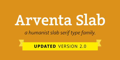
- Metronic Slab Pro by Mostardesign,
$26.00 Metronic Slab Pro is a slab serif typeface with a technological and minimalist look for text and headlines. It has six versatile weights from Air to Black with an alternative glyph set to improve its use in different graphic contexts. Metronic Pro has a wide range of OpenType features such as: old style and proportional figures, ligatures, case sensitive forms, fractions, stylistic alternates, arrows and an icons/ornaments set. This set of 60 icons, directly inspired from the typeface improves the OpenType features and can be quickly and easily use in your web design, GUI design, graphic design or any other graphic work.
Page 1 of 250Next page