3,545 search results
(0.021 seconds)
- Villain by Clint English,
$25.00 Villain is a new handwritten, multi-alternate glyph font. This font was created with a natural flow in mind. Since it's meant to look handwritten, Villain comes with 3 different glyphs per letter and number and even a few alternate symbols, as well. Pro Tip: Play with the baseline shift of each character to get an even more realistic, organic result. *Note: Grunge overlay texture is for previews only. Villain Font is completely clean and free of texture.
 - Hotel Suite JNL by Jeff Levine,
$29.00 This is a digital reinterpretation of Walter Huxley's 1935 evergreen "Huxley Vertical", which was originally cast for American Type Founders. A timeless classic which has been in use since the Art Deco era, this version is known as Hotel Suite JNL. As in the original metal type, alternates for A,K,M,R,W and Y are available and can be found on their respective lower case keys. Hotel Suite JNL is available in both regular and oblique versions.
 - Salve by Ahmet Altun,
$9.00 Salve is a monoline font family with scripts, sans and serif versions that work great together or alone. Salve Fonts would be a perfect choice to create wonderful designs in your works such as textile, signboards, posters, invitation cards, logos and more. Extras include very stylish and useful ornaments which are eye-pleasing when used together with the fonts, and you can easily reach them with the basic keys on your keyboard. Enjoy Salve Font Family!
 - Cake Bake by wearecolt,
$18.00 There's always time for Cake! Check out my latest display font - Cake Bake. It's a fun bubble font full of character, with 70's retro vibes. An all uppercase type (alternate uppers on the lowercase keys) hand drawn for a natural flow and feel. Use this for logos, headings, book titles, quotes, or whatever you want to add a splash of cheeky fun. For good measure, I added an outline version... you're welcome. More Colt Type Co. fonts
 - Venio by Craft Supply Co,
$20.00 Venio – Double Line Font: Display Typography with Art Deco Flair Deco-inspired Elegance Infused with Art Deco sophistication, Venio, a double-line sans-serif font, brings timeless elegance to your designs. Distinctive Display Presence Venio ensures a bold yet refined aesthetic for logos and headlines, making your display stand out with its distinctive double-line design. Artful Symmetry Paying homage to Art Deco’s geometric precision, Venio’s symmetrical lines provide a visually pleasing experience, adding a touch of artistic flair.
 - Orbitens by Maulana Creative,
$11.00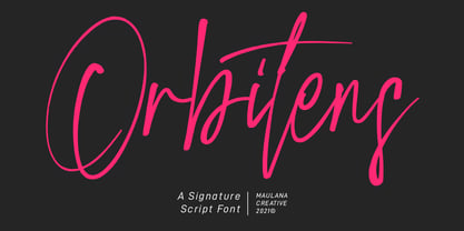 Orbitens is a fancy signature script font. With gel pen stroke, slanted and Unique Upper and lower characters with a bit of ligatures. To give you an extra creative work. Orbitens font support multilingual more than 100+ language. This font is good for logo design, Social media, Movie Titles, Books Titles, a short text even a long text letter and good for your secondary text font with sans or serif. Make a stunning work with Orbitens font. Cheers, MaulanaCreative
 - Shababa by Okaycat,
$24.50 Shababa is a hand-drawn 3-D font. The linework is fairly relaxed, mostly smooth with some distressed edges. There is lots of texturing from the pen strokes which becomes more evident at larger point sizes. This looseness enhances the smooth technicality of the properly extruded forms. With extended codepages for Cyrillic, Romanian, Turkish, Baltic & Central Europe, Shababa is suitable for multilingual environments & publications. It also features West European diacritics, ligatures & a sprinkling of dingbats for extra fun!
 - Carrot Juice by Hanoded,
$15.00 I like Carrot Juice a lot. I don’t drink it that often (and I should, really), but nothing beats a freshly squeezed glass of cold carrot juice!! Carrot Juice font is a lovely script font: handmade with love (and a rather cheap Chinese brush pen which I bought online). Carrot Juice will come in handy when you need that handmade look - cookbooks, websites and product packaging spring to mind. Comes with a abundant harvest of diacritics.
 - Nordic Folk by Kaer,
$19.00 Hey there! I'm happy to introduce to you my new ethnic-based font. Hurray! It was long and hard work because every glyph is unique. I sketched each letter of the font. Each letter is uniquely designed and has nordic folk art in the background. What you will get: Filled and Regular styles Icons and patterns font Uppercase (lowercase glyphs are same) Numbers and symbols Multilingual support Please feel free to request to add characters you need: kaer.pro@gmail.com
 - Komorebi by LiffeyType,
$9.00 Komorebi consists of handmade letters made with just a Stabilo pen. It is perfect for large scale texts and headlines. This font is suitable for posters, flyers, business cards or just a beautiful visual with a signature word. The family consists of three styles with both lower and upper case letters, accent characters and special characters. Though I personally recommend using all caps to give your words that bold touch, lower case works just as well!
 - Astomia Duslons by Maulana Creative,
$12.00 Astomia Duslons is a fancy casual handwritten script font. With light pen contrast stroke, fun character with a bit of ligatures. To give you an extra creative work. Astomia Duslons font support multilingual more than 100+ language. This font is good for logo design, Social media, Movie Titles, Books Titles, a short text even a long text letter and good for your secondary text font with sans or serif. Make a stunning work with Astomia Duslons. Cheers, Maulana Creative
 - Cicero by Présence Typo,
$36.00Cicero was the first typeface designed by Thierry Puyfoulhoux in 94. It is what could be called a semi-serif. Only the serifs which occur naturally when drawing letters with a flat nib pen have been retained. The absence of certain serifs allows for much tighter spacing. The remaining serifs still stabilize the baseline, although less effectively than a "full-serif" typeface. By borrowing features from both the sans and serif styles, Cicero truly stands at their crossroads. - Crowd Funded by Hanoded,
$15.00 Crowd Funded fonts wasn’t really crowd funded… In fact, all of the funding came from me, as I had to buy paper and a new pen to get this font going! Crowd Funded is an all caps display font, which I based on a recent font of mine called Longreach. Crowd Funded is narrower and rounder than Longreach and, in a way, more delicate. It comes with a generous amount of diacritics and basic Cyrillic as well!
 - Near Myth by Comicraft,
$19.00 The Norse Gods of Asgard, the Titans of Olympus and the Elders of Middle Earth have spoken! Their pronouncements have been carved in the solid rock across the mountains of Midgard and their Legend will now be known to many... 'cause JG --- our very own Mr Fontastic -- signed a license for comicbookfonts.com to make the typestyles of the gods commercially available. No really, he made a deal with Loki. Dipped his pen in his own blood and everything.
 - Bassy by ErlosDesign,
$15.00 Bassy is an incredibly stylish script font which will look stunning in a wide variety of contexts. Created with the help of an outstanding brush pen, this font will elevate your projects to the highest level. This font is PUA encoded which means you can access all of the glyphs and swashes with ease! The file you will get is: • Works on PC & Mac • Simple installation • Encoded PUA Character - Can be accessed completely without additional design software. Enjoy!
 - NorB Sketch by NorFonts,
$30.00 NorB Sketch is inspired from my NorB Felt Pen font, so trying a new technique of lettering. It is a handwritten text font witch can be used with any word processing program for text and display use, print and web projects, apps and ePub, comic books, graphic identities, branding, editorial, advertising, scrapbooking, cards and invitations and any casual lettering purpose… or even just for fun! It comes with 6 weights, Normal, Bold and Heavy each with their Italics.
 - Winooski by Oddsorts,
$29.00 A little goofy, a little nerdy, Winooski mixes loose pen-drawn gestures with legible forms to deliver a playful workhorse. It’s packed with goodies like small caps, ligatures, case-sensitive alternates, and broad linguistic support. It also sports extras like two styles of catchwords that can be fired up by flanking the desired word with either asterisks or underscores and discretionary ligatures for pricing. There are even easter eggs in the OpenType features for the scavenger hunters among us.
 - Auzhera by Floves Type,
$39.99 Looking to take your design game to the next level? Look no further than Auzhera Brush Font! Handmade from a real analog fude brush pen, this stunning handwritten font boasts a unique brushed texture that adds a natural, hand-written feel to any project. From bold headlines to understated designs, Auzhera Brush Font’s versatility is unmatched. Crafted with meticulous attention to detail, this font is perfect for creatives looking to add a touch of personality to their work.
 - Dear Rae, Love Dad by Outside the Line,
$19.00 Dear Rae, Love Dad is a modern calligraphy font drawn by hand using ink and a folded nib dip pen on rough watercolor paper. Best used in Open Type apps, it has automatically changing alternates. It is upright, dramatic, and personal. It is named Dear Rae, Love Dad because who wouldn't like to get a letter signed, Love Dad. There is also a freebie font of several blobs and some hearts. Because it just seems right.
 - Oblonga by Eurotypo,
$28.00 Oblonga shows thin, elegant lines. The continuity of the trace is only suggested through the curves of the letters, a soft effect of bonding that maintains the identity of each character. Oblonga is an Art-Déco font proposed in a modern key, a revival performed without aggression. More than three hundred glyphs (regular and Italic) that ensure legibility in Central-European and Slavic languages, enriched by some appropriate discretionary ligatures that enhance the charme of a time gone away.
 - Salto by Linotype,
$29.99 Salto was developed by Karlgeorg Hoefer and introduced in 1952 by the foundry Gebr. Klingspor in Offenbach. The capital letters were drawn with a brush, the lower case with a broad-tipped pen developed by Hoefer especially for the task. Salto reflects the Zeitgeist of the 1950s, appearing frequently in advertisements during the years of the Wirtschaftswunder. The font’s extravagance and dynamic quality arise from the contrast between the strong, zestful capitals and the more reserved lower case letters.
 - Lyra by Canada Type,
$39.95 Lyra is an Italian Renaissance script that might have developed if metal type had not broken the evolution of broad pen calligraphy. It lies in the area between the humanist bookhand and the chancery cursive, combining the fullness and articulation of the Roman letters with a moderate italic slant and condensation. A steep pen-angle allows use of a broader pen relative to the x-height, giving the letters more contrast with light verticals and heavy curves. Lyra embodies the Renaissance spirit of refining technical advances of the late middle ages with reintroduction of ancient classical principles. Based on the moving penstroke with constantly changing pen-angle, it brings the vitality of handwriting to the ordered legibility of type. Lyra is a formal italic, too slow for copying books. By eliminating the element of speed, digital technology opens up a new level of calligraphy, bringing it into the sphere of typography as would naturally have happened if metalworkers had not controlled the process. If classical Western traditions are respected, digital calligraphy has the potential to recapture the work of the past and restart its stalled evolution. There is of course no substitute for the charm of actual writing, with each letter made for its space; but the tradeoff is for the formal harmony of classical calligraphy as every curve resonates in tune with every other. This three-weight font family marks Philip Bouwsma's much-requested return from a three year hiatus. It also reminds us of his solid vision in regards to how calligraphy, typography and technology can interact to produce digital beauty and vesatility. Each of the three Lyra fonts contains almost three character sets in a single file. Aside from the usual wealth of alternates normally built into Bouwsma's work, Lyra offers two unique features for the user who appreciates the availability of handy solutions to subtle design space issues: At least three (and as many as six) length variations on ascending and descending forms, and 65 snap-on swashes which can be attached to either end of the majuscules or minuscules. The series also offers 24 dividers and ornaments built into each weight, and a stand-alone font containing 90 stars/snowflakes/flowers, symmetric contstructs for building frames or separators, masking, watermarking, or just good old psychedelia.
 - The font "Pea Neffer," created by Fonts For Peas, captures a unique essence of casual, yet distinctly personal handwriting. As part of the Fonts For Peas collection, which is known for converting sub...
- RAN by URW Type Foundry,
$35.99 RAN Reformed Typeface for Beginners by Georg Salden - a headstrong and courageous approach to an improved handling of handwriting. Diverse and sometimes irreconcilable theories exist about how beginners are supposed to learn writing and reading. This has led to fierce discussions among experts already. We don’t want to pour more oil on the fire, but hope to create a new awareness for this topic, which is important to everyone of us. For beginners the combination of single characters (sounds) to whole words is essential during the acquirement of reading and writing. In this process they develop the skill to recall entire terms from memory. Therefore, after current practice, every word shall be written in a single stroke without lifting the pen in between. Georg Salden contradicts this postulate and warns, that coercively holding the pen down within a word can easily lead to exaggerated loop formations and a general meandering of the written text. The intellectual process in connecting single sounds to words while writing would happen anyway and the prohibition to lift the pen would often lead to tensions. To still support the necessary connections in general and to simplify the connecting, he teaches to write all round letters like a, e, g, o with inclusion of the connecting stroke, so that the spacing and combining with the next character arise by themselves. By settling the stroke at certain points and with a clear and logical writing method, a conscious and careful contact with the various strokes arises. All this automatically leads, together with a certain deceleration, to an increase of beauty and readability in the handwriting. The repeatedly discussed topic »connected or unconnected« appears to be solved in the most comfortable way as, depending on the particular character combination, both solutions are possible.
 - ITC Aram by ITC,
$29.99Jana Nikolic was finishing her degree program at the Faculty of Applied Arts, in Belgrade, with a final project that would combine her two majors: type and book design. Three stories from William Saroyan's My Name Is Aram would provide the text for the book, to be set in a typeface that Nikolic would design. Nikolic knew something special was happening the moment she put pen to paper. The letters just emerged," she recalls. "I started to explore a few new pens and found one I loved. I was able to make its tip bend with pressure." Like the family Saroyan writes about, the design flowing from Nikolic's pen would be simple but a little quirky. "When there were a whole bunch of little black letters around me," continues Nikolic, "I saw that this was going to be a very interesting typeface family." Nikolic drew Latin and Cyrillic letters, lowercase and capital letters, wide letters and narrow letters. She was surprised at how quickly and easily the design came. "There were no badly written letters," she says. "I hardly had to rework them and they fit together remarkably well." ITC Aram's standard character complement consists of one set of lowercase letters and two sets of capitals: one narrow and the other wide. The wide caps can be used with the standard lowercase, or mixed with the narrow caps for a variation on "cap and small cap" copy. The ITC Aram create the opportunity to mix and combine the letters into playful typographic expressions. Words and sentences that twinkle; text that seems light and alive - one runs the risk of creating work that is both delightful and charming when setting copy in ITC Aram." - The Matrix font, inspired by the iconic science fiction movie "The Matrix," echoes the digital rain imagery synonymous with the film's unique visual style. Picture those cascading green characters, r...
- FF Holmen by FontFont,
$41.99 Danish type designer Per Jørgensen created this serif FontFont in 2007. The family has 5 weights, ranging from Regular to Bold (including italics) and is ideally suited for book text, festive occasions as well as editorial and publishing. FF Holmen provides advanced typographical support with features such as ligatures, small capitals, case-sensitive forms, fractions, and super- and subscript characters. It comes with a complete range of figure set options – oldstyle and lining figures, each in tabular and proportional widths.
 - Jean Paul Fraktur by RMU,
$25.00A typographic treasure, originated at the end of the 18th and the beginning of the 19th century, had been brought back to life. With its charming touch it makes a wonderful font for poems, bookcovers, reprints and other historically relevant projects. To get access to all ligatures, it is recommended to activate both Standard and Discretionary Ligatures; the round s you find on the # key, and typing the combination N-o-period and activating the OT feature Ordinals gets you the numero sign. - Kloi BT by Bitstream,
$50.99Boris Mahovac has adapted a friend’s handwriting in this new font called Kloi (pronounced Chlo – ee). It has a very casual feel and includes alternative swash glyphs of some key characters as well as some extra ligatures. Taking advantage of the ligature and contextual swash features in OpenType, the alternate glyphs automatically replace the standard glyphs when appropriate, creating a very unique look. Available in PostScript OpenType format, Kloi’s extended glyph set covers the Western and Central European, Baltic and Turkish languages. - Frollyness by Maulana Creative,
$16.00 Frollyness is a casual signature script font. With a gel pen line stroke, slant and fun character with a bit of ligature and bit lower alternate. To give you an extra creative work. Frollyness font support multilingual more than 100+ language. This font is good for logo design, Social media, Movie Titles, Books Titles, a short text even a long text letter and good for your secondary text font with sans or serif. Make a stunning work with Frollyness font. Cheers, Maulana Creative
 - Fluid by Paulo Goode,
$20.00 This frivolous 6-font typeface was inspired by playing with my food one evening. I began to wonder what it would be like to draw a typeface with a pipette and liquid... the result is Fluid. A key feature are the contextual alternates that substitute an alternate second glyph when typing double letters, this gives a more natural feel to the resulting text. It’s a fun typeface from my back catalogue that was originally released in June 2018. Enjoy playing!
 - Noble Line Caps by URW Type Foundry,
$28.00 The basic idea for this headline typeface is to create strictly geometric letters, similar to a script typeface, as far as possible in a single sweep, without setting them down. And similar to a typeface written with a quill, there is a thin and a thicker stroke. The uppercase letters can also be used with the lowercase keys. The varied and unusual variety of forms in this typeface gives headlines, keywords and even short texts the attention they are looking for.
 - Czesko by Sharkshock,
$125.00 Tall, dark, and handsome; Czesko is a fancy display serif with a timeless, yet elegant look. The repetition of key features ensures contrast in line weight to provide high visibility at smaller sizes. Vertical emphasis and tight spacing make it a good choice for areas with limited workspace. Try all caps for a luxury logo or branding in the fashion industry. Other suggested uses include magazines or movie posters. Basic Latin, extended Latin, diacritics, Cyrillic, punctuation, fractions, ligatures, and kerning are all included.
 - ITC Bradley Hand by ITC,
$40.99 ITC Bradley Hand is a calligraphy font from Richard Bradley, designed in 1995. The contours make it look as though it were written by hand with a felt tip pen on rough paper and it has all the details which give it a handwritten character. The font has a balanced, harmonious look and lends correspondence a personal touch. Bradley Hand is legible in point sizes as small as 8 and is good for headlines and short to middle length texts.
 - Cerulean Love by Studio Indigo,
$15.00 Cerulean Love is a soft and clean sans serif font with a strong handwritten feeling. The letter shapes are based on letters written with a brush pen. Its rounded shapes, soft terminals and easy-to read letters adds a friendly look to it which makes it useful for many different kinds of purposes such as products for children, menus, posters, logos etc. It comes with dicritic letters for all European languages. It has quite tall uppercase letters and quite long ascenders and descenders.
 - Dexa Pro Variable by Artegra,
$79.00 Dexa Pro is now available on variable version. The family was designed by Ceyhun Birinci in 2020 with an inspiration to create a contemporary super family with inspiration from classic sans serif families. It's a workhorse family consisting of condensed, narrow, normal and expanded widths. Each width has a wide weight range from thin to black, along with their true italic counterparts. With more than 770 glyphs per font, It offers a ton of language support from all the Latin languages to Cyrillic.
 - Barking Frenzy by PizzaDude.dk,
$18.00 Barking Frenzy may look as if it was cut out of paper or cardboard, but it's not! It was drawn with a rugged pen, leaving rough edges here and there. It's great for children's books and toys or maybe handcraft or other handcrafted activities. I've added 5 different versions of each lowercase letter and these appear randomly as you type. That way your text looks really natural and organic, because the letters rarely repeat themselves. Also the font has multilingual support!
 - Tasty Chat by PizzaDude.dk,
$17.00 Something tasty for your design! Tasty Chat is designed to be super legible and with a natural and organic feeling to it. Besides multilingual support, the font has 4 different versions of each lowercase letter. These "contextual alternates" cycles as you type which makes the font more random and handmade looking. Add some of the doodles to your design to make it more spectacular - they were made with the same pen as the actual font, so they fit perfectly together!
 - Eckhardt Brushletter JNL by Jeff Levine,
$29.00 The wealth of vintage hand-lettering styles found in a 1941 edition of the Speedball® Lettering Pen instruction book has allowed Jeff Levine to re-draw a number of them in digital format for today's designers. As with other fonts in the Eckhardt Series of sign painter-inspired styles, this font is named in honor of Jeff's good friend Albert Eckhardt, Jr. Al was quite the talented sign writer, and ran Allied Signs in Miami, Florida from 1959 until his passing.
 - KG What The Teacher Wants by Kimberly Geswein,
$5.00 I've worked together with the fabulous Rachelle Smith of What the Teacher Wants to come up with a new kid-friendly, teacher-friendly font. Rachelle's highly-popular teaching blog, What the Teacher Wants (http://whattheteacherwants.blogspot.com/) is a great resource for elementary teachers. She also sells educational products at Teachers Pay Teachers: http://www.teacherspayteachers.com/Store/Rachelle-Smith This font is exactly "What the Teacher Wants"- it is neat, legible, friendly, and contains enough glyphs to cover 86 languages and little extras like math symbols!