10,000 search results
(0.022 seconds)
- Drafbink by Twinletter,
$17.00 Say hello to classic elegance with the Draftbink font. With a compelling classic serif theme, this font is the perfect choice for creating projects with an elegant touch of classic modernism. Draftbink brings powerful features to give you unlimited flexibility and creativity. The ligature and alternate features allow you to combine interesting characters and create unique and attractive typography compositions. Not only that, Draftbink also supports multilingualism, so you can easily adapt this font to various languages. This opens up the opportunity to reach a wider audience and increase the attractiveness of your project. With its distinctive classic serif characteristics, Draftbink gives your design an elegant and bold impression. Each letter is carefully designed to display stunning beauty and sharpness. Make Draftbink your best choice to present an unforgettable classic modernism feel. Get this font now and show elegance in every detail of your project. What’s Included : File font All glyphs Iso Latin 1 Alternate, Ligature Simple installations We highly recommend using a program that supports OpenType features and Glyphs panels like many Adobe apps and Corel Draw so that you can see and access all Glyph variations. PUA Encoded Characters – Fully accessible without additional design software. Fonts include Multilingual support
 - Litza by Marianna Orsho,
$35.00 Litza is a layered, condensed, all-caps cross stitch display type family. It is made up of 10 layers that show different stages of stitching and can be stacked, moved around, and coloured separately in order to create interesting effects. The ten layers come in 3 weights; Light, Medium, and Bold. The 3 weights can also be mixed with one another to create a vast range of combinations when stacking the layers. Litza has multilingual support and includes glyphs for a wide range of Latin and Cyrillic languages. The family also contains a set of ornamental borders and over 80 decorative symbols in the shape of various animals and objects. Combining the various Litza layers allows you to create eye-popping, intricate, experimental typographic compositions that are rich in detail - with ease. The condensed, geometrics sans-serif letterforms and playful nature of the Litza layering system give a contemporary feel - while at the same time retaining a nostalgic and tactile quality due to its reference to traditional needlework techniques and patterns. Ideal for use at larger point sizes where the unique, stylish effects can be best expressed - Litza will add a touch of intrigue and work best in headings and emphasised text for poster design, editorial design, packaging design, and motion design.
 - Poppy Spoor by Yumna Type,
$15.00 Would you like a legible, professional, prominent font? Well, if that is what you want, you will probably have trouble finding one as it is a time-wasting process and is a hard challenge. Let us introduce you to a perfect font for any project, the Poppy Spoor. Poppy Spoor, unlike the other display fonts, is a display font with rather square letters to show you fun, soft, modern impressions due to the thin line designs in low contrasts. This font type, giving you a clipart as a bonus, is legible and is better applied for big text sizes. You can maximize your designs with Poppy Spoor’s features to remain the best in every design at any time. Features: Alternates Ligatures Multilingual Supports PUA Encoded Numerals and Punctuations Poopy Spoor fits best for various design projects, such as brandings, posters, banners, headings, magazine covers, quotes, invitations, name cards, printed products, merchandise, social media, etc. Find out more ways to use this font by taking a look at the font preview. Thanks for purchasing our fonts. Hopefully, you have a great time using our font. Feel free to contact us anytime for further information or when you have trouble with the font. Thanks a lot and happy designing.
 - Bunday Slab by Buntype,
$22.50 The new Bunday™ Slab Font Family consist of three main states with different moods: the crisp and distinctive slab serif, the cute script styled italic and the matching upright italic. All states of Bunday™ Slab share the same contemporary, clear and open base forms and create a space-saving and pretty homogeneous text colour with good legibility. The font was manually hinted and contains extensive handcrafted kerning tables to ensure perfect appearance in all media. Bunday™ Slab ships with 9 standard, 9 upright italic and 8 italic styles from a considerable thin “Hair” to a pretty fat “Heavy” weight. It supports at least 99 languages and provides OpenType® features for ligatures, alternative glyphs, localised forms and more. Please take a look at the other members of the Bunday superfamily: Bunday™ Clean Bunday™ Slab Further information: Bunday Slab Specimen PDF Feature Summary: 9 weights: Hair, Light, Thin, SemiLight, Regular, SemiBold, Bold, ExtraBold and Heavy 3 Moods: Sans, Upright and Upright Italic Overall width: Narrow or Space-Saving Advanced “f” ligature set* “s” and “c” ligatures* Alternates Characters: a, ç, e, f, g, l, t, y and more* Capital German Esszett* Supports at least 99 Languages * Only available applications with advanced OpenType® support
 - Religan by Dora Typefoundry,
$17.00 The new Religan serif font is luxurious and elegant which will bring a unique style and trendy look to your designs. This modern serif relogan has several on-trend ligature binders and special characters to make it look more unique in all design projects and work perfectly to pair with other fonts. It's perfect for logotypes, branding, wedding monograms and invitations, blog headlines and more. Here we prepare some fasteners: ab ar an am ah ara ap ti tr st tu tt ct et ff ty ffi fu ft fj fy th tm tn in im ir it ta ri er eh em en ch cr ra ng li eb cb fr ck fb fh fk jj gi and more.. Religan also includes the full set: Uppercase and lowercase Multilingual symbol Number Punctuation This type of family has become a work of true love, making it as easy and enjoyable as possible. I really hope you enjoy it! I can't wait to see what you do with Religan! Feel free to use the #Dora Typefoundry tag and # Religan Modern Serif Font to show what you've done. If you have any questions, you can contact us by email: doratypefoundry@gmail.com Thank You!
 - Staylucky by Nathatype,
$29.00 It can be a tough challenge to find a perfect font for your aesthetic projects to create an everlasting nuance. Handwriting fonts have prominent displays and nuances, but they often rely on old-fashioned script fonts. Therefore, Staylucky is here to give you the best. Staylucky is a script font created to be a visually attractive handwriting which is perfect to express modern, elegant nuances with personalized designs to amaze readers and to protrude your messages. It is made in cursive styles in which the letters are interconnected. Details on each letter show high contrast and curvy wipes on each edge. Its complicated forms made it more suitable to apply for big, short texts. You can also enjoy the available features here as well. Features: Ligatures Stylistic Sets Multilingual Supports PUA Encoded Numerals and Punctuations Staylucky fits best for various design projects, such as brandings, invitations, greeting cards, name cards, quotes, printed products, merchandise, social media, etc. Find out more ways to use this font by taking a look at the font preview. Thanks for purchasing our fonts. Hopefully, you have a great time using our font. Feel free to contact us anytime for further information or when you have trouble with the font. Thanks a lot and happy designing.
 - Six Pounder by Crumphand,
$20.00 Introducing, Sixpounder Fonts. inspired by indonesian Tribes, Tatto and Poster band. easy to read, easy access to opentype. What's Included The Fonts ? Uppercase Lowercase Symbols Numbers Stylistic Set 1 Stylistic Set 2 Stylistic Set 3 Stylistic Set 4 European Multilingual Thank You, Regards!
 - Bunny Daydream by Hanoded,
$15.00 My niece has two bunny rabbits: Skye and Pippi. She really loves them, so I named this font after her pets. Bunny Daydream is a rounded, handmade kids’ font. It comes with cute swashes and all the diacritics you need.
 - Make Tracks by Gerald Gallo,
$20.00 The character set contains 47 left foot animal track designs. The shift+character set contains the 47 right foot animal track designs corresponding to the character set.
 - Imagine a font that captures the spirit of creativity and rebellion, all while paying homage to one of the most iconic bands in music history. That's where AbbeyRoad by Flop Design steps into the spo...
- Faible by Identity Letters,
$29.00 An open-hearted humanist sans-serif. Playful and friendly. Faible is everybody’s darling. You cannot not like this good-natured humanist typeface. Sure, it’s a typeface for serious work—but all serious work is better when you put a smile on your face and a whistle on your lips. The typeface itself isn’t rooted in calligraphy, but there are quite some details in Faible that reference handwriting and add a friendly, humanist facet to its appearance. Take the bowls of B, P, and R: they are merrily bulged, like balloons about to take off. The curved leg of the R adds to this joyful mood. Faible’s italics are rendered playfully, too: they’re not merely sloped Roman styles. Rather, they were designed independently with an internal dynamic that sets them apart on the page. With its trademark glyphs, the swooshin’ K and k, and its friendly details, Faible will radiate optimism in display sizes, titles, and headlines. That makes it a great choice for book covers, posters, editorial design, branding, corporate design, advertising, and packaging. Nontheless, it’s carefully spaced and equipped with plenty OpenType features—a reliable tool for short texts and body copy, too. The font family consists of six weights (ranging from Thin to Black), each with its corresponding italic style. Faible’s glyph set contains more than 600 characters, allowing you to enhance your layouts with ligatures, different sets of figures, case sensitive forms, arrows, and other necessities for the ambitious typographer. Faible is the typeface that puts “fun” back into “functional”.
 - Olyford Variable by NicolassFonts,
$148.99 Olyford Variable font is a contemporary sans serif typeface that is derived from the Olyford font family. It features a range of weights and italics. OpenType features: Access All Alternates, Stylistic Alternates (Alternative n, m, p, q, r, u), Stylistic Set 1 (Alternative K, k), Stylistic Set 2 (Alternative W), Stylistic Set 3 (Alternative t), Stylistic Set 4 (Alternative w), Stylistic Set 5 (Alternative 5), Stylistic Set 6 (Alternative ¢, $, €, ₽, ¥), Stylistic Set 7 (Alternative Đ, Ħ, Ð, ≠, ∫), Standard Ligatures, Discretionary Ligatures, Proportional Figures, Tabular Figures, Case-Sensitive Forms, Fractions, Kerning, Denominators, Numerators, Scientific Inferiors, Subscript, Superscript, Ordinals, Localized Forms.
 - Upton by Halbfett,
$30.00Upton is a modern and condensed sans serif. The initial inspiration for its design came from lettering Wim Crouwel created for a poster design. It also takes some cues from neutral grotesks like Helvetica and Akzidenz. Because of its narrow letterforms, Upton is best applied to headlines and poster-sized typography. Upton’s italics were designed with high-quality compensation for all circles and strokes. Upton ships in two different formats. Depending on your preference, you can install the typeface as two Variable Fonts or use the family’s 14 static OpenType font files instead. Those weights run from Extralight to Extrabold. While the static-format fonts offer a good intermediary-step selection, users who install the Variable Font have vastly greater control over their text’s stroke width. The weight axes in Upton’s Variable Fonts allow users to differentiate between almost 1,000 possible font weights. That enables you to fine-tune your text’s exact appearance on-screen or in print. In its fonts, Upton has several ligatures. That includes optional “discretionary ligatures,” which bring a unique tone to display usage. For instance, the fonts include optional ligatures for the letter combinations “E-T”, “F-l”, “L-E-T-T-E”, “L-E-T-T”, “L-E-T”, “L-E-L-O”, “L-U”, “i-j”. and “m-m”. There are also many alternate glyphs. Stylistic Set 1 substitutes in new forms for “G”, “R”, “a”, “f”, “g”, “i”, “r”, “t”, and “y”. Six more Stylistic Sets have alternates for the “æ”, “g”, “k”, “o”, “K”, “O”, and “Q”. Additional OpenType features activate other useful features, such as fractions, numbers in circles, or symbols. - Mayfair by Canada Type,
$24.95The long awaited and much requested revival of Robert Hunter Middleton's very popular classic is finally here. Mayfair Cursive was an instant hit for Middleton in 1932, and it went on being used widely until late into the 1970s, in spite of it never having crossed over to film type technology. Like a few of its contemporary designs, most notably the work of Lucien Bernhard, Mayfair is a formal script that is somewhat based on traditional italic forms with swash uppercase, but also employs subsidiary hairline strokes in some of its lowercase as an emphasis to the script's cursive traits. Why these gorgeous letters never made the leap into photo typesetting is a mystery to us. But here they are now in digital form, almost three quarters of a century since they first saw the light in metal. Mayfair was redrawn from original 48 pt specimen. It also underwent a major expansion of character set. Plenty of swash characters and ligatures were added. An alternate set of lowercase was also made, in order to give the user a choice between connected and disconnected variations of the same elegant script. Mayfair ships in all popular font formats. While the Postscript Type 1 and True Type versions come in two fonts (Mayfair and Mayfair Alt), the OpenType version is a single font containing all the extra characters in conveniently programmed features that are easily accessible by OpenType-supporting software applications. We are quite sure today's graphic designers will be appreciative of having access to the face that all but defined menus, romance covers, wine and liquor labels and chocolate boxes for almost two 20th century generations. - Mono Spec Stencil by Halbfett,
$30.00 Mono-Spec Stencil is a monospaced family of sans-serif type. At least in default settings, all characters across the typeface share a common width, which is immediately noticeable for its condensed nature. Mono-Spec Stencil is a sibling of a non-stencil family, simply named Mono-Spec. Characters in each are just as wide, allowing Mono-Spec Stencil to be used together with Mono-Spec, as a secondary typeface. As a typeface whose characters are stencil-shaped, this design channels the spirit of resistance and street culture. When you look at the family, remember that it ships in two different formats. Depending on your preference, you can install the typeface as a single Variable Font or use the family’s five static OpenType font files instead. Those weights run from Light through Bold. While the static-format fonts offer a good intermediary-step selection, users who install the Variable Font have vastly greater control over their text’s stroke width. The Mono-Spec Stencil Variable Font’s weight axis allows users to differentiate between almost 1,000 possible font weights. That enables you to fine-tune your text’s exact appearance on-screen or in print. Whatever format you choose, the Mono-Spec Stencil fonts are equipped with several OpenType features. The most striking of these can be activated via a Stylistic Set. That will replace several letters – like “B”, “E”, “F”, “H”, and “I” with double-width alternates. Those alternates take up as much space as two characters placed next to each other otherwise word. The effect of Mono-Spec Stencil’s double-width alternates is striking, and their use strikes a strong chord in any display typography applying them.
 - Glarestha by Mevstory Studio,
$25.00 Glarestha is a modern high-contrast display font with bright positive character. Clean forms and a bit curly letter ends creates a friendly mood in any designs. It comes with Regular version, Opentype features (stylistic alternates and standard ligatures). The easiest way to get alternate is to add number after character (for example A2, A3) or add Underscore after end character (for example a r). The full set of alternates you can find in font presentation. Faery Dream font is perfect for headlines, magazines, logotypes, food package, advertising and many others. Multilingual Support
 - Zaatar Arabic by Boharat Cairo,
$20.00 Zaatar is a dynamic Arabic typeface abstracted from a mixture of Arabic Ruq’ah and Nastaliq, the slanted baseline with a geometrical contemporary touch, manifest a strong contrast between thick and thin strokes, present a retro-futuristic impression yet an Arabic calligraphic seriousness. and it comes with five stylistic sets giving it a variety of typographic possibilities. Zaatar means thyme, which was first cultivated in Mediterranean Levant, then used by ancient Egyptians for embalming. That's why we found it a perfect name for the first collaboration between Boharat (Cairo) and Hey Porter! (Jordan).
 - Bergsland Display by Hackberry Font Foundry,
$24.95 This is a display version of a stylized sans serif font family that is very high-waisted and sleek called Bergsland Fashion. This four-font set has a Regular and a Black plus the italics. The stroke is only slightly modulated. The letterforms are higher, with a more open aperture, and sprinkled with breaks to add light and sparkle. This an attempt at a readable sans serif for text. It has many OpenType features and 465 characters per font: Caps, lower case, small caps, old style figures, numerators, denominators, accents characters and so on.
 - Konsider by Konstantine Studio,
$18.00 Get ready to channel your inner (cute) fear with KONSIDER—spooky yet playful fonts. It was inspired by the vintage Halloween visual campaign, with a touch of happiness and cheerful vibes. To amplify the font itself so it can be a "no-doubt" choice for your branding campaign. Packed up with Ligatures and Stylistic Alternates to double up the joy of your visual statement. Perfectly fit for logo, branding, mood board, campaign, events, poster, game, esport, fashion, snack, packaging, streaming overlay design, graphic design, toys, and many more.
 - Husein Script by Ferry Ardana Putra,
$10.00 Husein Script is natural handwritten Ramadan themed script font, which support OpenType features and includes, numeral, punctuation ligatures, and it also supports multi-languages. This typeface is very catchy and natural because it was made using brush pen. This font also include additional extruded style. This font is perfect for branding projects, wedding designs, advertisements, product packaging, product designs, label, photography, invitation, quotes, religious design, ramadan design etc. Husein Script features: A full set of upper & lowercase characters Numbers & punctuations Multilingual language support PUA Encoded Characters Ligatures Layered Style
 - Mr Brown by Hipopotam Studio,
$20.00 Mr Brown is a typeface based on hand drawn letters to our new book for children. It has up to four alternate glyphs for each character. You can switch them manually or use OpenType Contextual Alternates feature. It will automatically set alternate glyphs de-pending on frequency of appearance of the same character. The script doesn’t throw random glyphs. For example in the word “HIPPOPOTAMUS” you will automatically get three different “P” glyphs and two “O” glyphs. It really works great but of course you can always fine tune it by hand.
 - Teorema Sans by FSdesign-Salmina,
$39.00 Teorema. Well balanced Reading. Looking for a geometric yet flexible character? Teorema typeface combines different geometric shapes, according to a pragmatic approach that favors flexibility and ease of use. The font is distinguished by the contrast between perfectly circular shapes, and other, more angular ones in search of a formal balance aimed at optimizing the recognizability of the characters and finally the legibility of the text. Worthy of a geometric “theorem”? Try Teorema for free. Download a free version of Teorema Regular and Bold with a reduced character set. Check it out!
 - Demagogue by Hanoded,
$15.00 I was listening to the radio and a song caught my attention. It was ‘Demagogue’ by a band called the Urban Dance Squad. That song brought back memories from when I was a student, so I decided to name this font after it. Demagogue was made using a Sharpie pen and a piece of expensive paper. The result is a very legible, very neat and very bold font. Demagogue is ideal for when you want to get your message across, but hopefully not in a demagogue-ish way! ;-)
 - Al Mangsi by Aluyeah Studio,
$120.00 Mangsi in Javanese means ink. We want to create a modern display typeface with an inked-like feel by combining clean modern serif strokes, brush strokes and the curved line made by the ink tank. Mangsi is a modern inked display typeface that unites the beauty of the old lines with the clean modern lines. A simple, yet distinctive, elegant font that can be applied to many areas of design. Coming with 170+ stunning and super easy to use alternates and ligatures. To get results like the preview just type M.3A.NGS.3I
 - Smiley by Dear Alison,
$24.00Ever think that supermarkets are becoming less personal and more clinical and cold? What will cost you less than a trip to the supermarket and put a smile on your face? Smiley was inspired by the hand-brush lettered signage at country grocery stores. There's something about the feeling you get when you visit a small town and stroll on over to the corner market. Everyone is pleasant, courteous, and they all have a smile on their face. You can have that local small town grocery store charm for yourself when you buy Smiley today. - Moritat by Comicraft,
$39.00 It's unpredictable! It's enigmatic! It has a winning smile and a devil-may-care personality. It can be charming and obliging and yet also elusive and impractical. It is the doer of deadly deeds, it is the dextrous hand of ELEPHANTMEN artist Justin Norman. It is swift and decisive, hesitant but packed with Talent. Ladies and... uh, More Ladies... Moritat has entered the building. Whoops, actually Moritat has LEFT the building. Moritat is the alias of Justin Norman, comic book artist and illustrator. The font is based on his pen lettering.
 - Atrium by Alex Jacque,
$20.00 Atrium, designed by Alex Jacque, is a strong, linear, geometric sans-serif display typeface based off century-old pen art by W.E. Dennis. Atrium's stubbornly geometric letterforms are set off with a few softening flourishes on a few glyphs. It's sharp corners, straight verticals and horizontals make Atrium pack some punch when used in headlines, pull quotes, and logotypes. Atrium was released in 2012 in OpenType format and comes in three different weights: light, regular, and bold, with a regular and oblique version of each for a total of 6 styles in the family.
 - Sandtrey by Hikhcreative,
$19.00 Sandtrey is a modern chic Calligraphy font with magical pressure. i hope this font perfect for creating signature logos and watermarks for photography studio or wedding invitation, best for initial or branding logo signature . I made-fully with love and unique!! Sandtrey includes full set of beautiful hand lettered uppercase and lowercase letters, numerals, a large range of punctuation and ligatures. You will get : In order to use the beautiful ligature, you need a program that supports OpenType features such as Adobe Illustrator CS, Adobe Photoshop CC, Adobe Indesign and Corel Draw.
 - Lanoline Script by Letterhend,
$16.00 Please meet Lanoline, a playful script typeface. As you can see, this typeface has a casual look yet still looks bold and stands out from the crowd. The swashes make the font looks even more unique. You can play around and mix and match the swashes, combining into a great logotype! Lanoline works perfect for you who needs a typeface for headline, logotype, apparel, invitation, branding, packaging, advertising and more. This typeface comes in uppercase, lowercase, with punctuation, symbols, numerals, stylistic set alternate, ligatures, and also support multilingual.
 - Dranskof by PintassilgoPrints,
$29.00 Dranskof is a light-hearted, cheery font. It is inspired by a page from an extraordinary serbian publication for children by the writer, poet and journalist Duško Radović. Dranskof whimsical letterforms are full of joie de vivre, consisting of different glyphs on upper and lower case slots for added flexibility.The contextual alternates feature will instantly alternate glyphs. To literally add a twist here and there, Dranskof is equipped with a spirited set of stylistic alternates, easily accessible through stylistic alternates feature or by the glyphs palette. This is definitely a 'make feel good' font. Enjoy!
 - Baisteach by Fontdation,
$15.00 Introducing Baisteach, our latest all-caps vintage serif. Inspired from early 1900's typography that often used in sign paintings, packaging labels, and advertisements. This typeface is made of sharp serifs, clean edges and strong form, give you a simple yet impactful feels. Suits best for headline, logo/logotype, and many more. If you're a fan of classic typography, make sure you add this font to your design toolbox. Last but not least, don't forget to activate its OpenType Feature to get the wider selection of letter combinations.
 - Clocks by Pen Culture,
$15.00 Introducing Clocks Typeface Clocks is modern and elegant serif font with lovely ligature. this font has authentic shape which is very suitable for various design projects such as branding, logo, fashion design and many others. What inside and what will you get: Uppercase letter Number and punctuation Lovely ligature PUA Encoded I really hope you enjoy it – please do let me know what you think, comments & likes are always hugely welcomed and appreciated. More importantly, please don’t hesitate to drop me a message if you have any issues or queries. Thank you
 - Roag by The Northern Block,
$27.95 Roag is an industrial geometric sans paying homage to mechanical designs of the 1930s. A precise balance of modern geometrics, with a functional yet sparing style that effectively communicates without distraction. Roag is a straightforward, unadorned type family with efficient construction. Details include seven weights with matching italics and over 950 characters per style. Opentype features consist of eight variations of numerals, including inferiors, superiors, fractions, case figures and circled figures. Additional features include small caps, case-sensitive forms, stylistic alternates, ligatures, game symbols, arrows and language support covering Western, South, Central Europe and Vietnamese.
 - Rogelio Script by Joelmaker,
$15.00 Rogelio Script is a stylish modern calligraphy font with casual chic flair. It is perfect for branding, wedding invites and cards, signature and maybe for red wine label. Rogelio Script includes full set of gorgeous uppercase and lowercase letters, numerals, a large range of punctuation and variation ligatures. All lowercase letters include beginning and ending swashes, giving realistic hand-lettered style. What you get, darling? In order to use the beautiful swashes, you need a program that supports OpenType features such as Adobe Illustrator CS, Adobe Photoshop CC, Adobe Indesign and Corel Draw.
 - Personalization by Jeff Levine,
$29.00 In the 1960s it was a popular trend to personalize one’s possessions with your initials. From wallets and handbags to eyeglasses; from luggage to even cars, initial personalization was the fad of the time. The British division of Gulf Oil offered for sale a set of gold metallic stick-on initials for 25 pence, complete with two Gulf logos so the company could get some extra advertising mileage out of the promotion. These extra-wide, bold initials served as the idea model for Personalization JNL, which is available in both regular and oblique versions.
 - Chunk by Fenotype,
$25.00 Inspired by the more than hundred years old classic Cooper Black, Chunk Black features a hefty character with rounded serifs and a soft yet sturdy overall appearance. Chunk Black provides a timeless and friendly feel and it’s very suitable for product and packaging design and any kind of display purposes from music business to restaurant menus and from t-shirts to band logos. Both Chunk Black and Chunk Black Italic are equipped with several OpenType -features and a total number of 87 alternate characters, set in Swash, Stylistic and Titling Alternates and Discretionary Ligatures.
 - Palmbell by Letterhend,
$13.00 Palmbell is a pair of fonts that bring a classy yet casual feel at the same time. The classic sans combined with the natural hand-writing script are the perfect match for you who needs a typeface for headlines, logotype, apparel, invitations, branding, packaging, advertising, and more. This typeface is comes in uppercase, lowercase, punctuation, symbols, numerals, stylistic set alternate, ligatures, etc also support multilingual. We hope you enjoy the font, please feel free to comment if you have any thoughts or feedback. Or simply send me a PM or email me at letterhend@gmail.com
 - Southland Letter by Hanzel Space,
$25.00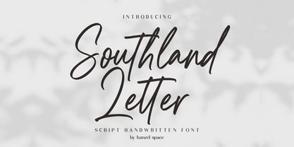 Southland Script Handwritten Font with contemporary, sophisticated accents. It is perfect for branding, wedding invites, tagline, cards, maybe for label and logo. Southland includes full set of gorgeous uppercase and lowercase letters, numerals, a large range of punctuation and ligatures. It expresses beauty of handwriting. What you get, darling? In order to use the beautiful ligatures, you need a program that supports OpenType features such as Adobe Illustrator CS, Adobe Photoshop CC, Adobe Indesign and Corel Draw. Feel free to give me a message if you have a problem or question.
 - Gadiani by Queenop Studio,
$12.00 Gadiani font is made into a nice and elegant font. Perfect for all your design projects, such as invitation cards, product logos, food brand logos, thank you cards, business card logos and more. Many alternatives will help you create whatever design you need like cute and girly handwritten letters and any other designs that require a beautiful handwritten touch! Enjoy :) Contains full set: -Uppercase -Lowercase -Alternative -Ligatures -Punctuation -Number -Multilingual support. Need help or have questions let me know. I'm happy to help. Thanks & Congratulations on the Design.
 - Santa Fe Spring by Haksen,
$21.00 Santa Fe Spring is a chic casual modern calligraphy script font. It is perfect for branding, signature, wedding invitation, promotion, product packaging, and other needs. You will get full set of lowercase and uppercase letters, numerals and punctuation, multilingual symbols, lowercase beginning and ending swashes, ligatures and extra swashes that giving realistic hand-lettered style. In order to use the beautiful swashes, you need a program that supports OpenType features such as Adobe Illustrator, Adobe Photoshop, Adobe Indesign and Corel Draw. Thanks and have a wonderful day, Haksen