10,000 search results
(0.022 seconds)
- Eckhardt Informal JNL by Jeff Levine,
$29.00 Eckhardt Informal JNL was found in a Dan Solo alphabets book under the name "Circus Wagon". This hand-lettered design with a playful inline is reminiscent of the show cards of the 1940s and 1950s. The Eckhardt series of typefaces is named in honor of the late Al Eckhardt, Jr. - a good friend of type designer Jeff Levine whose talents in hand-crafting attractive lettering was appreciated by many. His work, like the others before him is fast become a lost art in today's technology-driven world. Eckhardt Informal JNL is available in it's regular (inline) version and also as a solid version.
 - Belong Sans by Brenners Template,
$19.00 The features of Belong Sans are that it has both readability and uniqueness. It touches to achieve uniqueness while conforming to the structure of the Sans Serif system. These harmonious intersections of the acclimations and deviations were applied to these fonts. As a result, these fonts can be used beautifully in any body and text area, not just the logo or title. In addition, circled glyphs will show originality in various emphasis and bullet areas. Convenience and creativity for professional designers will be shown up in various fields such as the editorial or APP design business.
 - Hub by ParaType,
$25.00Designed by Gennady Fridman and released by ParaType in 2008. Hub represents so called block letter handwriting style, which becomes more and more usual and nowadays replaces traditional cursive handwriting. One of the reasons for these changes is an often requirement in official forms to write in block letters. Some forms contain even stricter rule – to write in capital letters. Hub was designed to meet these requirements and includes small caps instead of lower case letters. It’s recommended for use in advertising and display typography and especially when you need to show a sample of properly filled bureaucratic form. - Nuga by 38-lineart,
$24.00 The Nuga typeface embodies a commanding presence with its slab serif design, offering a versatile range across 9 distinct weights from thin to black. This extensive variety is further enriched by both regular and italic styles, totaling 18 distinct fonts. Its robust nature makes it an ideal choice for titles, headers, and subheaders, lending an authoritative air to any text. However, it doesn't stop there; Nuga's versatility extends to paragraphs, making it suitable for both display and body text. This font stands out effortlessly in branding, print materials, and logos, its powerful characteristics leaving a lasting impression on any design it graces.
 - Parmesan Revolution by RM&WD,
$30.00 This font take inspiration by the Parmesan ( Parmesan means "born in the city of Parma" like Me, and not the chees of course) famous typographer Giambattista Bodoni from 1700s. Is a font designed to perform better when used in high dimension like Headline in Ad, Titles in Magazines or Blogs, Logos, Naming, Packaging... Is easy to have great result using contextual & stilistic alternatives, ligatures and other SS alternatives, as show in the posters. Is highly raccomended graphic applications with OpenType tab, such Adobe Illustrator or Photoshop or Quark Xpress InDesign, for the use of OpenType Features.
 - Cosmo Sheep by Sipanji21,
$18.00 "Cosmo Sheep" is a display font with a Racing and futuristic theme, perfect for design projects such as sports jerseys, athletic shoes, helmets, and other sports-related products. With its dynamic appearance, this font brings a sense of energy and movement to your designs. The clean lines and modern feel of "Cosmo Sheep" make it an excellent choice for projects that require a sleek and contemporary look. Whether you're designing for a sports team or creating an athletic product, "Cosmo Sheep" will help you create a strong and memorable brand identity that embodies the spirit of sports and the future.
 - Brisa Pro by Sudtipos,
$59.00 The dynamic design duo of Koziupa drawing and Paul digitizing strikes again. This time they cover the space from light nonchalance to eerie darkness, and everything in between. Quicker than lightning and just as poignant, Brisa Pro shows unprecedented determination, presence of spirit, and finality of confidence. Brisa Pro is the teenager leaving home, the lover leaving one last note on the refrigerator door, the prophet announcing the imminence of doom, the rebel scratching anger on the wall, the bereaved clawing torment into life, and the bogeyman dropping a line to keep your eyes wide open through the night.
 - Empira by Hoftype,
$49.00 Empira is a new high-contrasted face. While its principal structure shows some reference to transitional faces, the pronounced graphic shape of its elements are definitely of contemporary origin. It appears crisp, sharp and even somewhat fancy. Empira supports up to 80 languages and its OpenType format allows a wide range of typographic applications. 20 styles offer a fine gradation of the weights. All weights contain small caps, ligatures, superior characters, proportional lining figures, tabular lining figures, proportional old style figures, lining old style figures, matching currency symbols, fraction- and scientific numerals, matching arrows and alternate characters.
 - Speed Impact by Sipanji21,
$17.00 "Speed Impact " is a display font with a sporty and futuristic theme, perfect for design projects such as sports jerseys, athletic shoes, helmets, and other sports-related products. With its dynamic appearance, this font brings a sense of energy and movement to your designs. The clean lines and modern feel of "Speed Impact " make it an excellent choice for projects that require a sleek and contemporary look. Whether you're designing for a sports team or creating an athletic product, "Speed Impact" will help you create a strong and memorable brand identity that embodies the spirit of sports and the future.
 - Drumbeat by EdyType,
$60.00 DRUMBEAT, a brand new face from Edy Type, coming to help resolve the necessities of loose scripts in Packaging and Editorial Design. Its' very particular thicks and thins and ups and down, makes it very suitable whenever informalities is required. Used with tiny little characters, enlarged to mammoth sizes or filling a large page with it, would show it’s perfect balance and color, almost as if where hand writen. In fact, a truly different script, a graphologist would declare that is written by a person very sure of what he wants, and besides and best of all, it’s pretty.
 - Andove by Locomotype,
$20.00 Andove is a narrow sans font with very tight compression. With a slim character and a fairly large x-height, Andove looks great for very large and eye-catching typesettings. The one-sided serif in ascenders makes this font very unique and stands out to show it is sporty and strong enough. What's even more interesting is Andove has a true italic on each weight so it can be an option for really big headlines and poster title. Andove consists of 10 styles in six weights — Thin to Bold — Upright and True Italics and comes with extended language support including Cyrillic.
 - Redaktor by Spinefonts,
$10.00 My friends didn't use capitals when sending me text messages, e-mails and using all their digital toys. At the beginning, I was feeling ignored. But after time I thought, that... I can do something for them. And so, I've made Redaktor. Redaktor is a cute monospaced family of four fonts, which has only lowercase characters and large x-height. If you want to write an uppercase character, you can't do it. (OK, to be fair, there will be small underline, just to show you, what you have done...) You may find Redaktor useful for posters, titling, info-graphics or websites.
 - Qifila by Khoir,
$15.00 Qifila is a serif font with a retro feel with the characteristic slopes and angles of the Victorian era, has a unique letter shape for each letter and has alternative fonts and ligatures that can make your work even more attractive. This font is perfect for your creative projects like packaging, logotype, printed quotes, cards, invitations, letterheads, clothing, magazines, covers, etc. Qifila Uppercase Lowercase 75+ Language Alternates & Ligature So what are you waiting for? immediately purchase this font, feel free to comment, or send me my PM or email at khoirtypework@gmail.com Thank you for seeing Show Less
 - Tabulamore Script by Tabular Type Foundry,
$25.00 Tabulamore is a monospaced script typeface with two goals: to make a script face that looks as natural as possible within the limitation of monospace, and to offer better all-cap solution where many script typefaces fail to address. The typeface style is generally a loosely spaced casual script, whose spacing allows big letters like M W m to fit comfortably. The automatic small cap part is based on so-called Architect�s Casual style, and shows up automatically depending on the context. As the name suggests, it is perfect for someone who likes to express their love in monospace format.
 - Sing Along by Hanoded,
$15.00 We just had the Eurovision Song Contest here in Holland. I quite like to watch it, as it is usually a freak show of kitsch, political incorrectness and often really bad music. But it is a laugh and this year was no different. It inspired me to create this particular font with this particular name. Sing Along is a happy, wobbly, kitschy font that comes with a bit of ‘over-the-topness’, a few personality issues and an unsteady gait. Needless to say, it is politically incorrect, but that, my friends, is not necessarily a bad thing.
 - KillSwitch by Comicraft,
$19.00 Not all our font releases come with an emergency full stop triggered by a BIG RED BUTTON. And not all font releases come with a Caution: NEVER TOUCH THAT SWITCH! Even if you really want to. You're going to touch it, aren't you? Be advised: even an untrained user with impaired executive function can operate KILLSWITCH, so we've hidden the BIG RED BUTTON where it can NEVER BE FOUND. This Comicraft mechanism may cause injury or death; please study all literature regarding the safe handling of Comicraft fonts posted in your workplace or adjacent cyberspace. KillSwitch
 - Mackaly by Sensatype Studio,
$15.00 Mackaly is A Headline Vintage font that special created to show a Retro and Display style A Serif Vintage font that we created special for classy branding needs, with extra ligature in unique and vintage shape add value of your brand. It's so nice to leverage designer or product owner that need solutions to make their design look more vintage and unique. Mackaly Headline Vintage font ready with: Lowercase and Uppercase characters Numbers and Punctuations 5 weights of alternative Ready of Ligature Preview as a inspirations that you can do with Mackaly font Available for PC and Mac Wish you enjoy our font.
 - Bacterio by Wiescher Design,
$39.50 Bacterio is a typeface I designed for this hulk of a friend of mine who is a kitchen designer. He is huge but has a very delicate feeling for form. One day he said he was trying out something new and if I couldn't make a font for him. Then he showed me the surface design, a hard-plastic covered multilayered wood. The surface design was called "Bacteria" and it looked just like that, only in multicolors. Well here is "Bacterio" the font that looks just like that surface of my hulky friend. Yours very design infected Gert Wiescher
 - Klang MT by Monotype,
$29.99Will Carter, well known in connection with his private press in Cambridge, has combined the skills of a calligrapher with a practical knowledge of printing. His mastery of pen-drawn letterforms was put to practical use in the design of Klang. Klang is a slightly inclined and calligraphically shaped sans serif with short ascenders and descenders. The Klang font is useful for informal applications, such as invitations, greetings cards and posters, but can also be used in advertising. - Cine Miroir NF by Nick's Fonts,
$10.00This bold yet elegant script is patterned after the logotype lettering from a 1927 issue of the French film magazine named, not surprisingly, Ciné Miroir. Ornate without being fussy, this font’s large x-height gives it a strong color, a commanding presence and a remarkably contemporary feel, even after more than three-quarters of a century. Both versions of this font contain the Unicode 1252 Latin and Unicode 1250 Central European character sets, with localization for Romanian and Moldovan. - Another Monday by Hanoded,
$15.00 I started this font on a Monday and I finished it the Monday after, so I guess the name is right! Another Monday started off as a bit of doodling (with a Sharpie pen) on a piece of paper. Before I knew it, I had a complete glyph set and it looked nice. Another Monday is a bit messy, uneven and maybe even a little weird, but it will look good on postcards, packaging and labels.
 - Roelandt BT by Bitstream,
$50.99Roelandt BT is another beautiful script font drawn by calligrapher Rob Leuschke. Perfect for informal invitations and documents, the standard semi-connecting glyphs are simple, yet elegant. An OpenType font, Roelandt also contains a set of Swash characters. Using the OT Swash feature to access these alternate glyphs, you can quickly transform your text into a stylish and more formal presentation complete with generously sized uppercase swashes. Basic and alternative glyphs in the font support Central Europe. - Moret by The Northern Block,
$49.50 Moret is a serif display type family inspired by 20th century European sign painting. It blends several calligraphic concepts to create a unique, dynamic and emphatic typeface. Available in 5 weights and 2 styles (upright and oblique), Moret is well equipped to provide clear solutions for a variety of situations and settings such as editorials and headlines. With 466 glyphs per font, Moret supports 94 different languages. Opentype features include inferiors, superiors, fractions, tabular figures, and ligatures.
 - Physe by Typotheticals,
$5.00 Physe. Physe is a basic set of fonts, designed for scrapbooking and general use. It comes in a variety of versions, with a light version, expanding up to bold. Many hurdles were taken to finalize this version, both physical and electronic. Like all of us, as I grow older, my glaucoma keeps pace with my arthritis, while I look on in amusement, hedging my bets on which will be the one to finally complete my retirement.
 - Antikka by Okaycat,
$9.50Antikka draws some inspiration from the style of the Art Deco movement of the 1920s and 30s. The vision behind making Antikka was to revitalize the style of this bygone era -- making it funky and relevant to our 21st century times. Antikka is a minimal font, clear and geometric, yet highly stylized. Comfortable in a business setting - or just about anywhere. Antikka arrives as the business casual of fonts - giving it a wide range of use. - Dia De Los Muertos by Intellecta Design,
$21.90 Dia de los Muertos is a colorful collection of skulls based on the lively Mexican fiesta celebration where skulls are used as humorous epitaphs of people still alive, besides being a symbol of celebration. A work of Iza W that can be used for children in arts, arts crafts, among other applications. Buying "Dia de los Muertos" you get FREE a amazing set of eps vectors : 39 naive, intrincated and colored funny skulls, ready to use."
 - The Happiest Cruise In Anaheim by Megami Studios,
$7.50 Inspired by the signage of one of the greatest theme park rides in the world (you know, the one with the song that you can't really get out of your head), The Happiest Cruise in Anaheim is sure to bring your small world of fonts closer. Whether a world of wonder or a world of cheer, the playful, quirky and childlike joy of the curves and lines will hopefully set your work on a journey through imagination!
 - Kalli Sketch by Posterizer KG,
$19.00 Basicly, Kalli Sketch is humanistic cursive drawn with pen. Inside the font you'll find a host of Opentype features, alternate characters, including a full set of alternate ampersand characters (stylistic alternates), standard ligatures that automatically connect as you type and discretionary ligatures. Also, font contains basic and alternative Cyrillic characters, and more than 50 floral ornaments. Because of lightness and transparency, Kalli Sketch is looking good in combination with serif and sans serif (particularly bold) fonts.
 - Daliya Abigen by Bungletter,
$10.00 Daliya Abigen is a beautiful script perfect for branding, wedding invitations, and other romantic projects. This love centered look makes it perfect for use in all your design projects be it logos, labels, packaging designs, blog titles, posters, wedding designs, social media posts, Instagram designs, etc. You will get : Contains full set: -Uppercase -Lowercase -Alternative -Ligatures -Punctuation -Number -Multilingual support. I hope you enjoy this font. If you have any questions, feel free to message me :)
 - Aesop by Fine Fonts,
$29.00 Aesop was developed from some book jacket lettering drawn by Michael Harvey for an edition of Aesop’s Fables by a master Japanese Artist. It is based upon a pen-drawn script, and is characterised by a lively sense of movement and grace. Aesop Plus, being an OpenType font, contains many alternative characters and additional ligatures which can be automatically substituted to enhance the liveliness of set text, where the application in which it is used, permits.
 - Blenda Darling by Bungletter,
$12.00 Blenda Darling is a beautiful script that's perfect for branding, wedding invitations, and other romantic projects. This love-centered look makes it perfect for use in all your design projects be it logos, labels, packaging designs, blog titles, posters, wedding designs, social media posts, Instagram designs, etc. You will get : Contains full set: -Uppercase -Lowercase -Alternative -Ligature -Punctuation -Number -Multilingual support. I hope you enjoy this font. If you have any questions, feel free to message me.
 - BAQ Rounded by Thinkdust,
$10.00 BAQ Rounded sets itself up as a simplistic and blocky font, but it hides a deeper form. With indents in all the right places, this font creates a double image in our mind, of the form we see and the form we know, letters that bulge into blobs and letters that are easy to follow. This double image results in a casual, over the top yet easy to read font designed for relaxing and carefree messages.
 - Alchimia by Bordet Type,
$22.00 Alchimia is an all caps serif font with a strong focus on ligatures. It captures the medieval aesthetic of the ancient roman serif fonts and remixes it with a modern approach. Imbricated letters gives to the font a playful yet clean and eerie look. It is designed mainly to be used as a display typeface, and it's perfect for striking headlines or unique logo designs. FEATURES : — Total Glyph set: 724 — Uppercase — Base Latin — Diacritics — Numbers — Symbols — 579 contextual ligatures
 - Kairo by Scratch Design,
$14.00 Introducing Kairo! Kairo is a geometric font based on simple geometric shapes that has bold and modern character. This font also has a retro, nostalgic yet modern style that will bring nostalgic memories. This font will be perfect for logo, eye-catching headlines, posters, brandings, and other design that has a sense of dynamic and positive vibes. What you'll get: Uppercase and lowercase Numbers and punctuation Multilingual support Alternates for lowercase Hope you enjoy our font!
 - Breattogis by Hanzel Space,
$25.00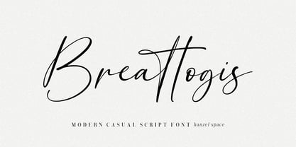 Breattogis modern calligraphy font with contemporary, sophisticated accents. It is perfect for branding, wedding invites, tagline, cards, maybe for label and logo. Breattogis includes full set of gorgeous uppercase and lowercase letters, numerals, a large range of punctuation and ligatures. It expresses beauty of handwriting. What you get, darling? In order to use the beautiful ligatures, you need a program that supports OpenType features such as Adobe Illustrator CS, Adobe Photoshop CC, Adobe Indesign and Corel Draw.
 - strokeWeight by Schriftlabor,
$29.00 strokeWeight is inspired by the aesthetics of computer vector graphics. strokeWeight is the name of a processing programming function to set the thickness of a stroke. The single bezier curve that describes a stem as a centerline with a particular stem thickness represents the basic idea of this typeface. The unconventional corners and stem endings derive from the concept. If you buy the complete strokeWeight family you will get a strokeWeight variable font file for free!
 - Dreamy Brush by Gatype,
$14.00 Dreamy Brush is textured brush font, contemporary approach to design, handmade natural with an irregular baseline. Suitable for use in title design. Such as apparel, invitations, books tittle, stationery design, quotes, branding, logos, greeting card, t-shirt, packaging design, poster and more. Dreamy Brush includes a complete set of uppercase and lowercase letters, as well as multi-language support, numbers, punctuation, ligatures. Thanks so much for looking and please let me know if you have any questions.
 - Interbellum by Punch,
$22.00 Interbellum is an Art Deco inspired font family which contains 3 display fonts, 2 modern-looking text fonts and 4 AllCaps fonts. In combination, you can easily give your designs a bold, yet elegant look. And by using the many different style sets, it is able to stand tall in all sorts of designs. Although it was inspired by the roaring 20s, we still think of Interbellum as an everlasting time traveller that will definitely impress your clients.
 - Freezetide by Tanincreate,
$18.00 Freezetide is a handwritten font with alternates, ligatures, OpenType features which give your design a natural handwriting feel with personality. Freezetide comes with 299 glyphs including multilingual characters, standard numbers, lowercase stylistic and standard alternates, discretionary ligatures for variety. Letters have jagged edges imitating dip pen writing. Using these ligatures allows you to give a realistic somewhat quirky hand-lettered look to your typography. Write the same word differently by combining the default set, alternates, standard and discretionary ligatures.
 - Villain by Clint English,
$25.00 Villain is a new handwritten, multi-alternate glyph font. This font was created with a natural flow in mind. Since it's meant to look handwritten, Villain comes with 3 different glyphs per letter and number and even a few alternate symbols, as well. Pro Tip: Play with the baseline shift of each character to get an even more realistic, organic result. *Note: Grunge overlay texture is for previews only. Villain Font is completely clean and free of texture.