10,000 search results
(0.035 seconds)
- Swing Bill by Monotype,
$29.99The Swing Bill font was designed as a display face for sport material or pop music posters, but has also been seen on TV. - Onion Mill by PizzaDude.dk,
$15.00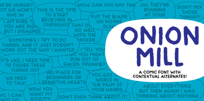 Onion Mill is based on my own handwriting, when I want to mimic the classic letters from comics. This type of texting can be super useful when you have a massive amount of text that needs to be good looking, as well as legible! You have 4 different versions of each letter to choose from - enough to randomise the appearance of your text!
 - Abdo Title by Abdo Fonts,
$49.50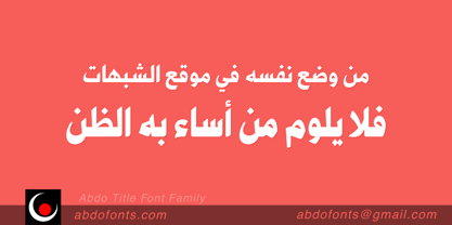 Abdo Title is a simple Naskh font for newspaper and magazines discriminate accurately design and clarity of reading. Abdo Title is compatible with the various operation systems and modern software. We will later add the rest of the weights. This font also suitable for books titles and advertisement.
 - Astoria Titling by Nick's Fonts,
$10.00Somewhat of a mongrel, this font combines uppercase letters from an oriental font designed by Paul Carlyle and Guy Oring in 1938, and lowercase letters based on yet another variant of Joan Truchut-Blanchard’s Super Veloz system. As its name implies, it’s quite suitable for titles of all kinds. The Opentype version of this font supports Unicode 1250 (Central European) languages, as well as Unicode 1252 (Latin) languages. - BOXDON Titling by TYDTYP,
$15.00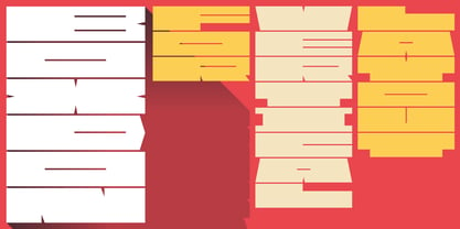 BOXDON is an extra heavy expanded typeface which was especially designed for VERTICAL layout. Each shape looks like a box and has minimum graphical treatment to distinguish each character. It means that the counter space is not enough to use this typeface for small font sizes, however, for titles this typeface should give incredible effects. I highly recommend using it with software that is compatible with vertical layout. (e.g. Adobe illustrator)
 - Rocinante Titling by XO Type Co,
$40.00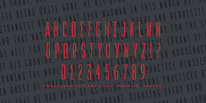 Rocinante Titling is a study in interior and exterior tension, with tightly-packed interiors and unexpected lightwells contrasting generous letterspacing. 5 weights and obliques on the same weight range as Havelock Titling, the family is a contrasting partner meant for combination. It’s made for creating contrast and tension in your work. Here’s a downloadable PDF specimen, and here's more about the process of getting from Havelock to Rocinante.
 - Murray Hill by URW Type Foundry,
$35.00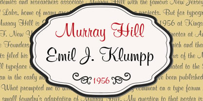
- Murray Hill by Bitstream,
$29.99An original informal script designed for ATF by Emil Klump. - Havelock Titling by XO Type Co,
$40.00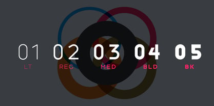 Havelock Titling builds upon the essential geometry of Havelock , adding new weights for spacious, authoritative text. Made to combine with Havelock’s display capabilities for more traditional reading scenarios. Built on the same weight range as Rocinante Titling , which broadens your design options. Light matches Light, Bold matches Bold, and so on. Both Havelock and Havelock Titling collections are included in Havelock Complete for a lower price.
 - Tall Tales by Comicraft,
$39.00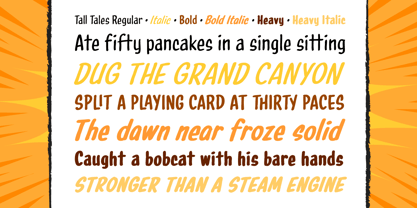 In a World where no stories are small stories... In a Land where words need to be Bold, Meaningful and maybe even Italic... Comes a font worthy of telling Marvelous Tales some thought Too Tall, Too Astonishing to be told... And when those Untold Stories, those Astounding Tall Tales, are finally told... THAT WORLD WILL NEVER BE THE SAME AGAIN! From Visionary Font Director John Roshell and the Studio that brought you BlahBlahBlah, you must not miss TALL TALES! In theaters and Streaming now.
 - The Hills by Mans Greback,
$59.00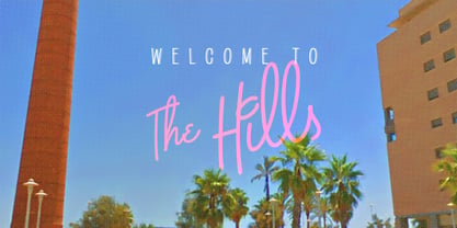 The Hills is a script typeface, perfect for logotypes. Designed by Måns Grebäck during 2017, this high quality lettering brings you to the sunny fifties. It is well balanced and has a nice medium weight. The font contains 350 glyphs and has support for a wide range of languages.
 - Hollywood Hills by Studio K,
$45.00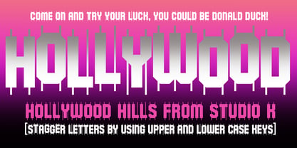 Inspired by that iconic sign in the Hollywood Hills, this font is a must for film buffs, movie lovers and designers who want to bring a bit of big screen glamour to their projects. It’s a caps only face, but by using the upper and lower case keys type can be set above or below the base line, thus creating the signature stagger effect. See also Jazz Age and Tea Dance by Studio K
 - Boncaire Titling by insigne,
$22.00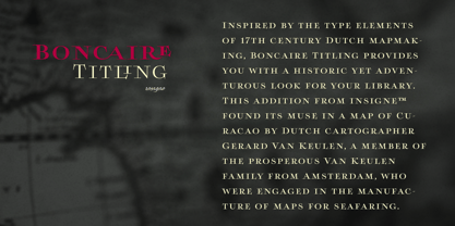 Inspired by the type elements of 17th century Dutch mapmaking, Boncaire Titling provides you with a historic yet adventurous look for your library. This addition from insigne found its muse in a map of Curacao by Dutch cartographer Gerard Van Keulen, a member of the prosperous Van Keulen family from Amsterdam, who were engaged in the manufacture of maps for seafaring. Much thanks on this project goes to The Norman B. Leventhal Map Center, housed at the Boston Public Library. Through the centers kindness, I was able to view a number of period maps in person and to meet with curators, who explained more about the Van Keulen family and the way maps of the period were created. While I studied the maps, I narrowed in on some of the original types unique idiosyncrasies. For instance, the long, exaggerated serifs, which give the forms a sense of stability, aid in the faces legibility--largely a byproduct of the engraving method that was used to create the metal plates for manufacturing these maps. In creating Boncaire Titling, I decided to capture these unique idiosyncrasies, embracing the character of the engravings rather than removing them entirely through over-refining the forms. The result is an elegant family with far more than seafaring potential. This font has a full range of six weights, from thin to black. It also includes a wide variety of OpenType alternates. All insigne fonts are fully loaded with OpenType features. Boncaire Titling is also equipped for complex professional typography, including alternates, smaller titling caps and plenty of alts, including normalized capitals and lowercase letters. There are over 30 autoreplacing ligatures, and the face includes a number of numeral sets, including fractions, old-style and lining figures with superiors and inferiors. OpenType capable applications such as Quark or the Adobe suite can take full advantage of automatically replacing ligatures and alternates. You can find these features demonstrated in the .pdf brochure. Boncaire Titling also includes the glyphs to support a wide range of languages, including Central, Eastern and Western European languages. In all, Boncaire Titling supports over 40 languages that use the extended Latin script, making the new addition a great choice for multi-lingual publications and packaging. Maps are fascinating; they come with the promise of treasure to be uncovered. Examining the map itself, too, you can find great wealth in the details so artfully condensed to that single piece of paper--details carried over into this new insigne font. For your next project, explore the imagination potential in Boncaire Titling.
 - Lettown Hills by Senzana,
$8.00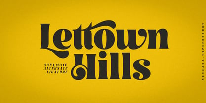 Lettown Hills is inspired by urban or freestyle artworks. With casual or marker style and lot of stylistic alternates you can create realistic headers. It’s a font that can be used with vintage, simple and modern styles. Comes also with swashes font. It works beautifully for personal branding, advertising or creative headers. Looks good also with retro style typography or branding. It is very suitable for logos, posters, t shirts and more.
 - Still Love by Creaditive Design,
$10.00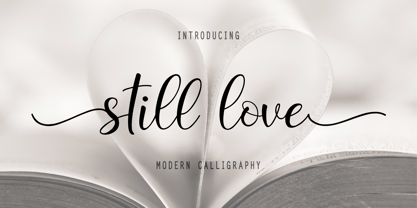 Still Love is an exquisite handwritten font, masterfully designed to become a true favorite. Smooth, modern and strong characters at the same time looks stunning on wedding invitations, cards, books, quotes, logos, and business. Special Characters are available for lowercase letters with added beginning & end swashes, also Ligatures that can make your design more smooth and looks natural.
 - Grafton Titling by Tetradtype,
$35.00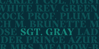 Grafton Titling was designed for dramatic impact. It contemporizes old style proportions, bracketed serifs and a left-leaning stress angle with striking contrast and modern angular joins. The solid style has a timeless feel, while a flared through-line variation provides textural interest. Small caps, a complement of OpenType features, and support for diacritics and accented characters make it a robust and distinctive choice for headlines that demand attention. Through-line characters are accessible using the Stylistic Set or Stylistic Alternate OpenType feature.
 - Kill Me by Octopi,
$13.00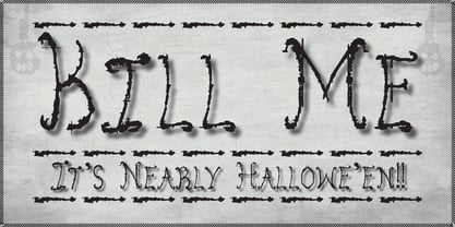 I have terrible and messy handwriting so I thought it would be a good idea to make a twisted version into an horrific font. In that respect I think it is quite successful, plus, Hallowe'en is nigh.
 - Mill Valley by Letterhend,
$19.00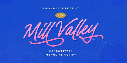 Mill Valley is a monoline script with a casual and fun theme. This type of font perfectly made to be applied especially in logo, headline, signage and the other various formal forms such as invitations, labels, logos, magazines, books, greeting / wedding cards, packaging, fashion, make up, stationery, novels, labels or any type of advertising purpose. Features : uppercase & lowercase numbers and punctuation multilingual alternates / swashes and ligatures PUA encoded We highly recommend using a program that supports OpenType features and Glyphs panels like many of Adobe apps and Corel Draw, so you can see and access all Glyph variations.
 - Gill Hebrew by Lerfu,
$55.00Near the end of his life, legendary type designer Eric Gill lived in Jerusalem, and became interested in the typesetting of the Hebrew alphabet and the challenges it entailed. He designed his own Hebrew font which has not (to my knowledge) been digitized before. It is sometimes held up as an example of how not to do a Hebrew font: Gill introduced strange serifs and shapes that were jarring to readers used to more traditional fonts. But it is quite readable, and does start to grow on you after a while; extended text in Gill Hebrew is possible. I've added a set of alternate digits that are based on the shapes of the letters (Gill's digits are pretty standard text figures). I've also made some of the Unicode Hebrew symbols that Gill didn't (e.g. New Sheqel Sign, Alef-Lamed ligature, etc.) and also included vowel-points. - Gone Hills by Twinletter,
$14.00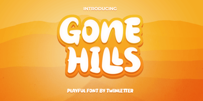 Gone Hills is a whimsical display typeface that’s perfect for a variety of creative projects. Your project will appear natural and attractive in the eyes of onlookers if you use this typeface. Let’s use this typeface to increase the quality of your graphics. This typeface is ideal for use in games, sporting events, branding, banners, posters, movie titles, book titles, quotations, logotypes, and other applications. Naturally, your varied design projects will be excellent and extraordinary if you use this font because it comes with a complimentary font family, which can be used for titles, subtitles, and sentence text. Start utilizing our fonts for your great projects today.
 - ILL oCtoBer - Unknown license

- ILL oMen - Unknown license

- Still Time Cyr - Unknown license

- Ubuntu Titling Rg - 100% free

- oakland hills 1991 - Personal use only

- Savia Filled Shadow - Personal use only

- I Still Know - Unknown license

- Boneribbon Tall Outline - Unknown license

- MAWNS' Graffiti Filled - Personal use only

- Block Tilt BRK - Unknown license

- Silent Hill Nightmares - Unknown license

- Political Graft Fill - Unknown license

- Boneribbon Tall Bolder - Unknown license

- Block Tilt (BRK) - Unknown license

- MND Pinballer Fill - Unknown license

- Kill your darlings - Unknown license

- pills are good - Unknown license

- Pneumatics Tall BRK - Unknown license

- Dennis Hill Speeding - Unknown license

- They Killed Kenny! - Unknown license


