10,000 search results
(0.026 seconds)
- Nombre Sans by Estudio Calderon,
$29.00 Nombre Sans was created mainly under the concept of «Splendid» which means: Magnificent, Gorgeous or Sumptuous. A typeface with a handcrafted concept with abundant things and accentuated shapes. The design of Franela has a particular personality in the ecosystem of typefaces where each character draws attention due to its organic shapes. Is equipped for complex, professional typography. The OpenType fonts have an extended character set to support Central and Eastern European as well as Western European languages. More about Nombre Sans www.estudiocalderon.com
 - Clair De Lune by Hanoded,
$20.00 Clair De Lune is part of the famous Suite Bergamasque, written by Claude Debussy in 1890, and published in 1905. It means Moonlight in French, a kind of romantic name. The name is exactly what I had in mind for this übercute font. Clair De Lune can be used to design postcards and posters, liven up websites and give your designs an overall happy feel. Clair De Lune was handmade using a 0.5 pen, eco friendly Italian paper and a wooden kitchen table.
 - Menina Carinhosa by Intellecta Design,
$25.00 Meninas are the new comprehensive collection of innovative craft alphabets researched in rare cross-stitch booklets from 1850 to 1930. This alphabet series was entirely designed by hand, without use of auto-tracing, by Iza W, from Intellecta Design. Keep your eyes wide-open, because we will launch more amazing alphabets in this collection. "Menina" means "Girl" in Portuguese. Menina Carinhosa is a Loving Girl. See too her sister fonts: Menina Formosa, Menina Poderosa Ornaments, Menina Espinhosa, Menina Graciosa Ornaments.
 - Achispado by Linotype,
$29.99Achispado which means tipsy or slightly drunk in Spanish is the name of a crazy funk font that was designed by Richard Yeend in 2003. Full of comic almost architectural elements bit and pieces of the entire history of lettering come together to create the letterforms of this typeface. Text set in Achispado will look just plain fun if a little tipsy at the same time! Achispado could be used in large display settings, in fashion or on jewelry items. - Menina Poderosa Ornaments by Intellecta Design,
$27.00 Meninas are the new comprehensive collection of innovative craft alphabets and ornaments researched in rare cross-stitch booklets from 1850 to 1930. This alphabet and ornaments series was entirely designed by hand, without use of auto-tracing, by Iza W, from Intellecta Design. Keep your eyes wide-open, because we will launch more amazing alphabets in this collection. “Menina” means “Girl” in Portuguese. Menina Poderosa is a Powerful Girl. See too her sister fonts: Menina Formosa , Menina Carinhosa , Menina Espinhosa , Menina Graciosa Ornaments .
 - Moscovium by Throndsen,
$29.99 Moscovium is a radioactive, synthetic element about which little is known. It is classified as a metal and is expected to be solid at room temperature. It decays quickly into other elements, including nihonium. The element had previously been designated ununpentium, a placeholder name that means one-one-five in Latin. Element 115
 - Hagane by Saiffont,
$20.00 This typeface was created during the process of logo making. Simple and stylish design which can be used in pretty much any projects, especially in action themed projects. The sharp terminals in this typeface resemble the tip of "Katana", a Japanese weapon. Hagane means "steel" in Japanese, which is used to make Katana.
 - Futura ND Display by Neufville Digital,
$45.25 Futura Display was designed by Paul Renner in 1932. Its original German name was Futura Schlagzeile, which means “headline”, alluding to its suitability for display use. Its forcefulness and robustness have made it a widely used typeface in film posters, advertising, logos, and music covers. Futura is a Trademark of BauerTypes SL
 - Segnieur Serif Display by Paavola Type Studio,
$30.00 Segnieur Serif is a high-contrast serif typeface leaning to the strong dutch typography tradition. Segnieur is family of 5 weights with italics suitable for a wide range of application. Segnieurs' OpenType features includes variety of ligatures, upright numerals and more. Segnieur supports over 200 latin based languages spoken in 212 different countries.
 - Nautis by TEKNIKE,
$39.00 Nautis is a distinct display monospace typeface. The Nautis name is derived from the Greek nautikos meaning “naval”. Nautis is great for fashion, events, branding, military, navy, nautical, shipping and suited for display work, invitations, writing, architecture, posters, logos and headings. Nautis is currently available with Latin, Cyrillic, Hebrew and Greek character sets.
 - Andralis ND by Neufville Digital,
$45.25 Andralis was designed by Ruben Fontana in tribute to the designer Juan Andralis. Its handcrafted, strong and robust appearance, maintains at the same time a friendly and human tone. It was specifically designed to perform well in long texts, also offering excellent results in headlines. Andralis is a Trademark of BauerTypes SL
 - Linotype Sallwey Script by Linotype,
$29.99Linotype Sallwey Script was designed by Friedrich K. Sallwey in 1980. This typeface has a handwritten character due in part to its slight lean to the right. Sallwey Script is both lively and harmonious and lends texts a private, personal touch. Sallwey Script is best suited to middle length texts and headlines. - Calling Card JNL by Jeff Levine,
$29.00In today's day and age, the term "calling card" refers to a prepaid means of making long distance phone calls. In a more gentler time, the calling card (similar to a business card) was what a gentleman presented to a housekeeper or butler when visiting (calling) on a friend or business contact. - Lichtspiele by Typocalypse,
$29.00 Cinemas from the early 20th century are called “Lichtspiele” in Germany. “Lichtspiele” transports you back to a time where neon lights and marquee letters decorated cinema façades. Of the five styles, three have two versions of italics — the left-leaning italic evokes looking up from lower-left, the right-leaning italic is as if we are looking from lower-right. Display is the basic style, while Neon is inspired by the old neon letters found outside cinemas. Try placing Neon Outline on top of Display or Neon to add another layer to your artwork. Neon 3D is a extruded version of Neon. The Screen Credits style is based on the notes — producers, cast, crew and so on — on movie posters. Get more out of life, go out to a movie.
 - FF Kaytek Sans by FontFont,
$50.99 Kaytek™ Sans is a fresh take on the correspondence typefaces of the 90s - which were originally designed for the demands of office environments. Just like its predecessors, this text typeface is robust and hard-working - meaning it works well in challenging design or printing environments - but it’s not without personality. Look closer at the lowercase g and a, especially in the italic, and you can see some unexpected elements of subversiveness within the design. This blend of sturdiness and quirkiness means it’s just as relevant for information-heavy projects, such as annual reports, as it is in more expressive environments. Although first and foremost designed for text, Kaytek Sans’ details shine through in its heavier weights and larger sizes, meaning it also has display potential. Every style of the typeface takes up exactly the same amount of space, thanks to the way Radek Łukasiewicz created the design. He based the entire typeface on a single, master set of proportions. This means designers can switch between styles without the text being reflowed, making it particularly useful in magazines, where space might be limited, and also on the internet, where hover links appear in a different style. As well as its roots in the office, Kaytek Sans draws on a little bit more 90s nostalgia. It’s named for the first and only Polish walkman, and embodies the same solid, no-nonsense shapes that made the analogue technology of the era so charming. Just like these early personal music devices, Kaytek Sans is practical, but not clinical, able to work hard while still exuding warmth and personality. It pairs effortlessly with Kaytek Slab, which is a sturdier and more expressive take on the design. Kaytek Sans comes in 12 weights, from Thin to Black Italic, and offers multi-language support. Kaytek Slab, Kaytek Headline and Kaytek Rounded are also available.
 - Minomisse by Gassstype,
$23.00 Hello Everyone, introduce our new product Font Minomisse is Playful Handwritten Font is a Authentic Style and classy style, this font is great for your creative projects such as watermark on photography, and perfect for logos & branding, invitation,advertisements,product designs, stationery, wedding designs,label ,product packaging, special events or anything that need handwritting taste. Minomisse a natural handwritten feel. This handmade font will make your design has a beautiful natural touch for each details. It is perfect for any design project as Invitation,logo, book cover, craft or any design purposes. photos, photography overlays, signs, window art, scrapbooking, tags and so much more! This font is PUA encoded which means you can access all of ligatures.
 - Brassens by Typorium,
$53.00 Le Typorium présente une nouvelle famille de caractères calligraphiques basés sur une écriture étudiée à travers les manuscrits et autographes de Georges Brassens, poète et musicien (1921-1981). Son tracé, rigoureux et appliqué, souvent minutieux, est à l’image d’une œuvre unique et singulière, immédiatement reconnaissable. Le script Brassens offre des fonctionnalités OpenType telles que des caractères alternatifs pour les majuscules et les minuscules afin de renforcer la fluidité d’une écriture manuelle, des chiffres alternatifs, des fractions et un jeu de caractères accentués étendu pour prendre en charge de nombreuses langues étrangères. Trois graisses ont été créées afin d’offrir une large palette de possibilités graphiques. 60 images d’un poète qui a cassé sa pipe à l’âge de 60 ans., classées en trois séries de vignettes (pictogrammes, symboles, portraits), elles illustrent l’univers imagé et la richesse symbolique de la poésie de Georges Brassens où les représentations mythologiques et allégoriques y tiennent une part importante. Georges Brassens est un poète, auteur-compositeur-interprète né à Sète le 22 octobre 1921, mort à Saint-Gély-du-Fesc le 29 octobre 1981 et enterré au cimetière Le Py de Sète. Auteur de plus de deux cents chansons populaires, il met en musique et interprète ses poèmes en s’accompagnant à la guitare. Outre ses propres textes, il met également en musique des poèmes de François Villon, Victor Hugo, Paul Verlaine, Paul Fort, Antoine Pol, ou encore Louis Aragon. Il reçoit le Grand Prix de Poésie de l’Académie Française e 1967. Un grand nombre d’écoles, salles de spectacle, voies, parcs et jardins portent également son nom, dont à Paris le parc Georges-Brassens, tout proche de l’impasse Florimont où il vécut ses premières années parisiennes, de sa maison de la rue Santos-Dumont et du café Les Sportifs Réunis – Chez Walczak – rue Brancion qui lui inspira « Le Bistrot ». À Sète, l’Espace Georges Brassens ainsi que de nombreux festivals et associations redonnent vie au poète et à son œuvre. The Typorium presents a new calligraphic typeface family based on a writing studied through the manuscripts and autographs of Georges Brassens, poet and musician (1921-1981). Its layout, rigorous and applied, often meticulous, is in the image of a unique and singular work, immediately recognizable. Brassens script offers OpenType features such as alternate characters for upper and lower case to enhance the fluency of handwriting, alternate numbers, fractions and an extended accented character set to support many foreign languages. Three weights have been created to offer a wide range of graphic possibilities. 60 images of a poet who broke his pipe (French expression for passing away) at the age of 60, classified into three series of vignettes (pictograms, symbols, portraits), they illustrate the imagery world and the symbolic richness of Georges Brassens poetry where mythological and allegorical representations hold an important part. Georges Brassens is a poet, singer-songwriter born in Sète on October 22, 1921, died in Saint-Gély-du-Fesc on October 29, 1981 and buried in Le Py cemetery of Sète. Author of more than two hundred popular songs, he sets to music and performs his poems, accompanying himself on the guitar. In addition to his own texts, he also sets to music poems by François Villon, Victor Hugo, Paul Verlaine, Paul Fort, Antoine Pol, or Louis Aragon. He received the Grand Prix of Poetry from the Académie Française in 1967. A large number of schools, theaters, streets, parks and gardens also bear his name, including in Paris the Georges-Brassens park, very close to the impasse Florimont where he lived his first years in Paris, his house in the rue Santos-Dumont and the café Les Sportifs Réunis - Chez Walczak - rue Brancion which inspired "Le Bistrot". In Sète, the Espace Georges Brassens as well as numerous festivals and associations bring the poet and his work back to life.
 - Sabre by Alias,
$60.00 I generally refer to our typefaces as ‘graphic’ rather than typographic. By that I mean their starting points are usually ways of constructing shapes and systems of shapes. As with other Alias typefaces, Sabre has stone and wood cut letterforms as a starting point. What is interesting about lettercutting is the connection between shape and material. These beautifully crafted letterforms have a particular sharpness which reflects, of course, how they were made. The idea of constructing letters from a kit of parts we first explored in early fonts Elephant and Factory. These are different in that they were very much grid-based, with a geometric structure. For Sabre I also had Fred Smeijers’ stencil construction drawings in mind. These show how a set of components can be the basis for a crafted, elegant typeface. Sabre is quite a loose interpretation of this idea. Sabre’s graphic shape means it works well at large sizes, with a dramatic, angular impact. Its aim is to be typographic enough to function for blocks of small-size text too.
 - Pandilla by Typozon,
$39.00 Pandilla was inspired from personal sketches and letters developed by the past of the years making graffiti art. the forms of this typeface are related with the graffiti and street scenes of the different cities around the world and takes traits and elements of the Handstyle, Classic graffiti, Brazilian Pichação and different urban letters. This font has a variety of objectives, the first is to create a legible version of the graffiti inscriptions and use this typography for different print pieces, the second objective is to give back the essence of the meaning of the word "Pandilla", this word has been transformed for the past of the decades and now is associated with negative things. The original meaning of this word is a group of people who feel a close relationship, which usually have a friend or close interaction with ideals or common philosophy among members. Pandilla is to be used in different print purposes and graphic pieces like: Posters, Brochures, Magazines, Business cards and different stuff that uses big type sizes and big display formats.
 - Jali Latin by Foundry5,
$19.00 Jali is a humanist sans serif typeface ideal for wayfinding, supporting Arabic, Greek, and Latin. 'Jali' means clear in Arabic, its design embodies this with low-contrast strokes, distinct marks, and a warm, readable style. Jali excels in demanding typographic spaces. Awards: TDC Certificate in Typographic Excellence, Granshan’s 1st Prize, Arabic & Latin Category, 2019.
 - Belle Epoque Stencil JNL by Jeff Levine,
$29.00 An old ad for Cointreau Triple Sec Liquor featured a bolder variant of the lettering style found in a set of vintage tin stencils that were the model for French Stencil JNL. This is now available as Belle Epoque Stencil JNL, in both regular and oblique versions. “Belle Epoque” means “beautiful era” in French.
 - Anzeigen Grotesk by Linotype,
$40.99Anzeigen Grotesk is a heavy, condensed sans serif face drawn in the style of typefaces popular during the early 20th Century. It was originally intended for use in advertising design, a field for which it is still well suited. Anzeigen Grotesk (which means “advertising sans serif” in German) is best used in larger point sizes. - Chub by Chank,
$39.95Chub was inspired by and dedicated to: Jimmy Dean Pork Sausage, J Otto, Ben & Jerry, Spunk, Chuck Jones, Run DMC, those teenage kids with their big baggy pants, French Market coffee, George Clinton, Bill Clinton, Chistina Ricci, Sesame Street and the letter C. God bless all those big, fat, fun things that make life grand. - P22 Gothic Gothic by IHOF,
$24.95 The name says it all. Gothic from the old literary style and/or current subculture genre. And Gothic meaning a block or sans serif style of lettering. The concept was to take the classic German style lettering and create a contemporary extended block letter typeface. The result is a fusion of old and new.
 - Kaos by Wiescher Design,
$39.50 On a huge garbage bin in Lisbon I saw the sentence, “Perdidos no kaos”, which means lost in chaos and I really liked the rough stenciled lettering. Back home I designed a typeface that wasn't quite as chaotic as the lettering on the garbage container. Yours – always on the lookout for great typefaces – Gert Wiescher
 - Ork Glyphs - Unknown license

- Dwarven Runes - Unknown license

- Eldar Runes - Unknown license

- Helina by Balevgraph Studio,
$12.00 The Helina font pack comes with 9 versions, there are 6 elegant handwritten font styles, 2 sans serif fonts and ornaments. You can use and combine as you like according to your project type. There are open type features such as alternate styles, swash and ligatures. We designed this font to look elegant, classy, easy to read, stylish, attractive and easy to use. Helina Font is a great choice for the design of signature logos, quotes, album covers, business cards and many other design projects. This font is PUA encoded which means you can access all of the glyphs with ease! What's Included? 9 OTF font files Uppercase & Lowercase Numbers & Punctuation Ligature, Swashes & Alternate Ornaments Multilingual Support Regular & Italic PUA Encoded
 - Diversa by DSType,
$40.00 Diversa is a typeface that takes a very different path from the most fonts, both in terms of appearance and usability. Diversa is a single typeface with 9 fonts within, containing 2760 glyphs*, divide in 9 stylistic sets, but the main difference is that all the glyphs are kerned with each other, which means you can swap glyphs between stylistic sets and keep them properly kerned - unbracketed serifs, bracketed serifs, engraved, stencil, sans, slab, baroque, stencil sans, stencil slab and a stylistic set that mixes them all in a rotative feature. Diversa: Because uniformity sucks! *requires applications which have Open Type access/features.
 - Bandleader JNL by Jeff Levine,
$29.00 How does one arrive at a font name? With the thousands of digital typefaces available, it's not an easy process. Bandleader JNL was modeled from the hand-lettered title on a piece of sheet music called "Largo", which means "slow tempo". Since the names "Largo" and "Tempo" were already taken, what other musical theme would fit? The lettering is in an Art Deco style, and Big Band was all the rage of the Art Deco period; therefore "Bandleader". Sometimes the road to naming a font takes on many twists and turns but the end result is always gratifying.
 - Avris by Miosis,
$30.00 This is Avris, an exceptional and feminine stencil font. The base was designed in 2015. The word ‘avris’ derives from the latin rara avis, which means “rare bird”. Stencil fonts were initially designed for mass production and transportation companies. Unlike this one, Avris’ curvy and minimalistic design feels and looks like the wings of birds, flying above the quiet ocean. It also has a roman, calligraphic and cryptographic touch to it. It can be used for editorial (fashion) magazines and poster designs. Looks great in headlines! Also the numerals are a must see when you put it in use.
 - Harlane by HandletterYean,
$14.00 Winter with all its activities always has a special meaning for us, that's why there are lots of sweet memories during this season. To help you make it into unforgettable memories we present to you Harlane, which is a font specially made to cherish your holiday and make it more meaningful. Features in Harlane are alternates, titling, swashes, and underlines that will make your idea looks more beautiful. Feel free to use this font for your craft-work, book, cover, name card, poster, logo, magazine, cover, banner, T-shirt, or even artwork on a large scale.
 - Old Linoleum by Gassstype,
$23.00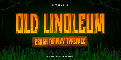 Hello Everyone, introduce our new product Old Linoleum is Brush Display Typeface with a natural feel. This handmade font will make your design has a beautiful natural touch for each details. It is perfect for any design project as Invitation,logo, book cover, craft or any design purposes. Old Linoleum is Inspired by Logo style and combination with Unique Craft style. that will fulfill your design needs for quotes,sporty theme, logotype, wordmark, etc. This has many opentype features and support multi language. This font is PUA encoded which means you can access all of the magical glyphs with ease!
 - Lunacrypt by Gassstype,
$23.00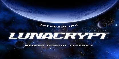 Hello Everyone, introduce our new product Lunacrypt is Modern Display Typeface with a natural feel. This handmade font will make your design has a beautiful natural touch for each details. It is perfect for any design project as Invitation,logo, book cover, craft or any design purposes. Lunacrypt is Inspired by Food Logo style and combination with Unique Craft style. that will fulfill your design needs for quotes,sporty theme, logotype, wordmark, etc. This has many opentype features and support multi language. This font is PUA encoded which means you can access all of the magical glyphs with ease!
 - Paula Matilda by Grezline Studio,
$12.00 Paula Matilda is an elegant and flowing script font. It is PUA encoded which means you can access all of the glyphs and swashes with ease! It features a varying baseline, smooth lines, gorgeous glyphs and stunning alternates. It maintains its classy calligraphic influences while feeling contemporary and fresh. Fall in love with this script font and bring your projects to the highest levels! Feature : - A lot of Alternates ( With a Total of 480+ Glyphs ) - Multilingual Language - Works on PC & Mac - Simple installations - Accessible in the Adobe Illustrator, Adobe Photoshop, Adobe InDesign, even works on Microsoft Word.
 - Summer Flower by Letterara,
$12.00 Summer flower is a dazzling script font with a lovely atmosphere and spotless form, inspired by a timeless classic calligraphy. Not too thin and not too thick, balanced and varied, summer flower was designed to enhance the beauty of your projects. summer flower will turn any design project into a true stand-out. Add it to your most creative ideas and notice how it makes them come alive! This font is PUA encoded which means you can access all of the amazing glyphs and swashes with ease! It also features a wealth of special features including alternate glyphs and ligatures.
 - Parmesan Revolution by RM&WD,
$30.00 This font take inspiration by the Parmesan ( Parmesan means "born in the city of Parma" like Me, and not the chees of course) famous typographer Giambattista Bodoni from 1700s. Is a font designed to perform better when used in high dimension like Headline in Ad, Titles in Magazines or Blogs, Logos, Naming, Packaging... Is easy to have great result using contextual & stilistic alternatives, ligatures and other SS alternatives, as show in the posters. Is highly raccomended graphic applications with OpenType tab, such Adobe Illustrator or Photoshop or Quark Xpress InDesign, for the use of OpenType Features.
 - Heartsome by Hanoded,
$15.00 Heartsome is a ‘forgotten’ word. It was mostly used in Scotland and it means: ‘giving cheer, spirit or courage’. I had never heard of it, but I thought it deserved a second chance, so I named this font Heartsome! Heartsome is a handmade Didone; I used a brand new bottle of Chinese ink and a brand new synthetic pencil to paint the glyphs. Brand new, because all of my drawing materials seem to have evaporated when we moved into our new house… A synthetic brush, because I don’t want animals to suffer because I feel the need to create fonts.
 - Mellyna by HandletterYean,
$16.00 Mellyna is an elegant and flowing handwritten font. It is PUA encoded which means you can access all of the glyphs and swashes with ease! It features a varying baseline, smooth lines, gorgeous glyphs and stunning alternates. It maintains its classy calligraphic influences while feeling contemporary and fresh. Fall in love with this font and bring your projects to the highest levels! To access the alternate glyphs, you need a program that supports OpenType features such as Adobe Illustrator CS, Adobe Photoshop CC, Adobe Indesign, and CorelDraw. More information about how to access alternate glyphs, check out this link: http://goo.gl/ZT7PqK


