5,644 search results
(0.024 seconds)
- Citix by Eurotypo,
$58.00 From the mid -17th century, new commercial writing styles emerged which clear showed the influence of pen-crafted calligraphy. A traditional pen-formed flowing script as the “Citix” font, may be suitable for commemorative letters, invitations cards and the most elegant visual communications projects. This font comes with three different kinds of capitals, regular and swashes to choose from, a full set of stylistic alternates, standard and discretional ligatures. Old style numerals, ornaments and tails.
 - Perfume by Fenotype,
$25.00 Perfume - a luxurious display pack. Perfume is a display combo pack of three styles and eight fonts. Perfume fonts are soft and clean and they have a distinguishable character. Perfume Pen is a monoline script with three weights and large x-height. Perfume Pen is equipped with automatic Contextual Alternates that keep the connections smooth. In addition Perfume Pen has Swash, Stylistic and Titling Alternates, boasting over 500 glyphs in total. Perfume Brush is a bold brush script with two weights. Perfume Brush is also equipped with Contextual Alternates to keep connections smooth and Swasha lternates for more imposing character forms. Perfume Sans is a sturdy all caps Sans with three weights. For the best price purchase the whole pack!
 - Gainsborough by Fenotype,
$30.00 Gainsborough - a clean-cut display pack. Gainsborough is a display combo pack of three styles and extra swooshes. Gainsborough fonts are straightforward with characteristic clarity. All the three fonts are designed to play together. Gainsborough is very easy to use. Gainsborough Pen is a clear script inspired by handwriting with pigment pen but polished clean to be legible and inviting. It’s equipped with Contextual Alternates and Standard Ligatures for smooth flow and connections between letters. In addition there’s Stylistic and Swash Alternates for standard characters. Gainsborough Sans is a sturdy street-sans ready for action. It’s has zero contrast and angular geometric shapes. It’s great for bold headlines. Gainsborough Serif follows pretty much the same proportions but with the serifs and a little bit of contrast and round shapes. Try combining Gainsborough Swooshes with Gainsborough Pen - type one character with Swooshes in the end of a word typed with Pen and you’ll have an ending swash reaching below the word. There’s different shapes and length swooshes + a couple of center balanced ornaments.
 - Haakke by Dawnland,
$13.00 Haakke (or Håkke) - a casual, hand drawn (Stabilo OH pen, Fine) font with 4 alternates to all upper and lower case letters (a-z + å ä ö) as well as numbers for a realistic hand written look and feel! “Ligatures” have been created for double letters (TT, tt, ff, ll & LL (open type version of the font and open type compatible layout application required). Of course it holds all(?) the special characters that you will ever need. 451 glyphs... Haakke also includes symbols. Zodiak signs (letter a-l, upper case A-L write the corresponding name of the sign), planet signs (m-z, upper case M-Z write the corresponding name of the planet) triangles, squares and stars (from pentagrams (5 pointed) to Dodecagrams (12 pointed). (Write a 4, or shift-4 ("euro-sign", european keyboard, or "dollar sign", american keyboard) before your star or triangle and you will get a circle around it).
 - Utroligt by Hanoded,
$15.00 I am (trying to) learn Danish using an app on my phone. The grammar and vocabulary are not that difficult, as the Danish language is very close to the Dutch language. The pronunciation, however, is quite tricky. Words look simple when written down, but when pronounced, they sound very different. Take ‘pige’ (‘girl’) - it reads ‘pee-guh’, right? Well, it is pronounced ‘pee-uh’. Or how about ‘brød’ (meaning bread)? If you keep in mind that the o-slash is pronounced as the ‘i’ in bird - almost like ‘uh’, it should be br-uh-d, right? Wrong again. It is pronounced br-uh-l. Aaargghh! I will succeed, hopefully! Utroligt is a Danish word meaning ‘incredible’. It is a nice, uncomplicated all caps font. I made it with a cheap rollerball pen and some nice French paper. Comes with double letter ligatures and all the diacritics you’d like - including the danish ones.
 - Architec by Monotype,
$29.99This caps only hand lettering could have come from an architect. Speedy written on a 45 degree slope with a bold felt pen or brush. - Rosie by AVP,
$29.00 Rosie is a chunky but elegant pen script with useful OpenType features. In non OpenType-savvy applications it still works beautifully as a fully joined script.
 - iMark by Jonahfonts,
$35.00 IMark is a “drying” marker hand written, felt tip pen font. Usage recommendations include captions, packaging, invitations, cards, posters, ads, greeting cards, book jackets and covers.
 - Leonel Px by Letradora,
$12.00 Based on aa architect friend's handwriting with a calligraphic pen, this cool all-caps font comes with lots of alternates and a very complete character set.
 - Lilybud by Balpirick,
$15.00 Lilybud is a sweet and flowing handwritten font. Created with the help of a beautiful brush pen, Lilybud is masterfully designed to become a true favorite.
 - Ragtime Gal JNL by Jeff Levine,
$29.00 Amongst a batch of antique sheet musical instruction booklets offered for sale online was a piece with Art Nouveau hand lettering on the cover entitled “Seven Musical Travelogues for Piano”. This design served as the inspiration and model for Ragtime Gal JNL, which is available in both regular and oblique versions. The font’s name comes from the line ‘Hello my baby, hello my honey, hello my ragtime gal…’ from the 1899 song “Hello Ma Baby”; a tune that found a new burst of popularity in an odd way within a 1955 Warner Brother’s cartoon [“One Froggy Evening”].
 - Etoxina by FSdesign-Salmina,
$39.00 Etoxina is designed especially for the burgeoning market of starships and other space cruisers. Etoxina has been developed with the contribution of experts in navigation through space and time. The fonts are ideal for internal and external use (including zero-g and occasional bursts of cosmic rays), and with their simplified forms are expected to survive well in non-linear galaxies. With their unusual diagonal half-pixels the fonts are striking as abstract designs at astronomical sizes, where small text may be placed within the black holes formed inside the letters. On explicit suggestion of Mr. Spock true capital letters have been added.
 - Itoxina by FSdesign-Salmina,
$39.00 Itoxina is designed especially for the burgeoning market of starships and other space cruisers. Itoxina has been developed with the contribution of experts in navigation through space and time. The fonts are ideal for internal and external use (including zero-g and occasional bursts of cosmic rays), and with their simplified forms are expected to survive well in non-linear galaxies. With their unusual diagonal half-pixels the fonts are striking as abstract designs at astronomical sizes, where small text may be placed within the black holes formed inside the letters. On explicit suggestion of Mr. Spock true capital letters have been added.
 - P22 Tuscaloosa by IHOF,
$29.95 Tuscaloosa is a hybrid script that includes Tuscan (bifurcated) serif treatments. The design of Tuscaloosa began as a set of organically-formed initials, the Tuscan serifs being reminiscent of shoots and leaves bursting forth. Tuscaloosa also derives inspiration from the late Victorian era, when the development of newspaper and poster advertising led to extremes of weight in the main strokes. The font is intended to convey an aura of excitement and fun that characterized those times! The name 'Tuscaloosa' was chosen because of the appropriate combination of 'Tuscan' and 'looseness,' and because of its essentially American character.
 - Cocana by Craft Supply Co,
$20.00 Cocana - The Bubble Font is a playful and bubbly typeface that brings a cheerful and light-hearted vibe to your designs. With its rounded and bulbous letterforms, Cocana exudes a sense of fun and whimsy. This font is perfect for projects that aim to convey a sense of joy and youthful energy. Whether you're working on invitations, posters, or any creative endeavor, Cocana adds a touch of playfulness and charm. Cocana is like a burst of happiness in the world of typography, making it an excellent choice for projects that want to radiate positivity and a carefree spirit.
 - Fresh Peach by Flawlessandco,
$9.00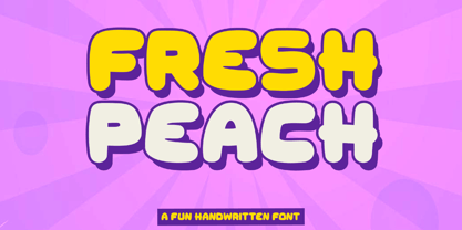 Introducing "Fresh Peach" - a fun and bold handwritten font that brings a burst of energy and playfulness to your designs. With its vibrant and lively letterforms, Fresh Peach adds a delightful touch of creativity and excitement. There's some connected letters and some alternates that suitable for any graphic designs such as branding materials, t-shirt, print, business cards, logo, poster, t-shirt, photography, quotes .etc This font support for some multilingual. Also contains uppercase A-Z and lowercase a-z, alternate character, numbers 0-9, and some punctuation. If you need help, just write me! Thanks so much for checking out my shop!
 - Sandy Toes by Putracetol,
$22.00 Sandy Toes - Quirky Summer Theme Font is a delightful typeface that transports you to the sunny shores of summer. This font features playful, rounded, and bold letterforms that capture the essence of fun and the warmth of the season. It's versatile and can be used on its own or combined with any of its eight vibrant variations. With eight distinctive variations inspired by summer, including palms, suns, beaches, pineapples, waves, starfish, and more, Sandy Toes is the perfect choice for children's themes, crafting projects, and designs that radiate fun, playfulness, and a burst of colorful energy.
 - P22 Pooper Black Pro by IHOF,
$39.95 Pooper Black Pro is based on a brush ethic and has an extreme axis that lends a certain amount of speed to the font while the lack of connectors slows it down. The pro version expands on the original and popular Pooper Black with the addition of full Central and Eastern European character sets and plenty of alternate characters for those who have applications that support Opentype features. Almost all of the lower case characters now include an in stroke and out stroke version for greater design flexibility. A wonderful face for packaging, titling, and short bursts of text.
 - ITC Peter's Miro by ITC,
$29.99ITC Peter's Miro is the work of New York designer John Peter. It was inspired by the letters used by Joan Miro in his paintings. No one used letterforms more frequently in his work than Joan Miro," says Peter. For his typeface, however, "considerable liberty has been taken with his [Miro's] original letters and missing characters have been added." The letters are a simple script, irregularly and almost crudely written, but bursting with energy. To give designers free rein with their creativity, Peter designed two complete versions of the alphabet in both upper- and lowercase, Peter's Miro and Peter's Miro Too." - Marginal Notes SRF by Stella Roberts Fonts,
$25.00 Marginal Notes SRF is from the creative pen of Ray Larabie whose Typodermic foundry graces MyFonts.com. Designed to emulate the look of handwritten words using a felt tip pen, this font can be perfectly applied to any project where notations, subtext, memos or other forms of personalization with a human touch is required. The net profits from my font sales help defer medical expenses for my siblings, who both suffer with Cystic Fibrosis and diabetes. Thank you.
 - Full Blast by Hanoded,
$15.00 I was cleaning out my pencil box and found an old marker pen. I wanted to throw it away, because it was leaking all over my stuff, but decided I could use it one more time. The result is Full Blast font: a ‘brush’ font (made with that leaking old marker pen). Use if for your fireworks packaging, fiery pepper sauce bottles and whoopee cushions (and just about anything else as well). Comes with an explosive amount of diacritics.
 - Ravenna by Aboutype,
$24.99A mechanically drawn felt tip pen styled font with matching common cap styles suitable for greeting cards, posters, and announcements. Ravenna requires subjective display kerning and compensation. - Novela by Jonahfonts,
$42.00 Novela is a chisel flat pen style written with overtones of Uncial, from century old scribes. Very suitable for greeting cards, headlines, packaging and many other applications.
 - Olga by ParaType,
$30.00 Based on informal pen handwriting. A set of Western and Central European characters was added in 2011 by Gennady Fridman. For use in advertising and display typography.
 - Akoyster by Koval TF,
$19.00 Akoyster is a fusion of cyberpunk visual culture & contemporary calligraphy with broad nib pen. It's ideal for eyecatching bald statements. Enjoy wiered shapes and create new future.
 - ITC Cyberkugel by ITC,
$29.99ITC Cyberkugel is the work of British designer Timothy Donaldson, who occasionally likes to write with an extra-fine ballpoint pen. I like the spindly scrawny forms that it gives me when I follow all the usual 'italic' writing conventions", he says. And there lie the origins of ITC Cyberkugel, although the creative process was moved from pen and paper to software and a Wacom tablet. "I like the fact that people will be buying it to give them a 'human', 'organic', 'non-digital' look, and yet no ink has soiled paper. Although the movements of the hand are still the essence, the whole thing was created in cyberspace." The name comes from combining cyberspace and Kugelschreiber, the German word for ballpoint pen. ITC Cyberkugel is a fresh interpretation of traditional calligraphy." - Teacup by Hanoded,
$15.00 I remember a tea ceremony I attended in Fukuoka, Japan. The teahouse was set in a small, but beautiful garden and the whole idea of the ceremony was to appreciate the view from the porch. I thought the tea was quite bitter, but the view was unsurpassed. From time to time these memories pop up and I have to use them - that is why I named this font Teacup. Teacup is a slightly eroded all caps font, made entirely by hand with a Japanese marker pen and some high quality textured paper. It comes in a romantic open style and a more solid closed style. Teacup is filled to the brim with diacritics.
 - ALS Gross Kunst by Art. Lebedev Studio,
$63.00 Gross Kunst is a humanist sans-serif with an open aperture, sharp outlines, and eye-catching details that make this full of character typeface very recognizable. The type family has three fonts based on wide pen strokes. Depending on its purpose the styles differ in expressiveness and the level of ornamentation. Regular style—low-contrast and neutral—is the most natural choice for body-text. The display face is more dynamic and gets higher contrast. It's very legible from a distance and would do its best on navigational and warning signage, plates, and such. Eloquent straight italics will adorn titles, announcements, and pages with ads. This typeface was acknowledged at the international type design competition Modern Cyrillic '99.
 - Ford's Folly by Ascender,
$50.99Ford's Folly is a lively yet sophisticated handwriting font designed by Ascender's Jim Ford. It captures the look and spirit of the designer's handwriting using a using a Sharpie™ Extra Fine felt pen. This casual script font evokes an energetic feeling, and has very legible letterforms without quirky distractions. Jim Ford took his hand global by creating a massive multilingual character set. The font features the WGL Pan-European character set (Eastern Europe, Cyrillic, Greek and Turkish) and advanced typographic features for use with OpenType-savvy applications. The font is a fun and attractive handwriting font that is great for greeting cards, menus, advertisements, scrapbooking and many other projects that can benefit a personal appearance. - Schlub by Typadelic,
$19.00Schlub is just plain weird. It looks like it was drawn with the left hand of a right-handed person using a gloppy pen yet remains very legible. - Master Flo by ParaType,
$25.00 Master Flo is a freestyle script based on handwriting. The face inspired by flat-nib felted pen or brush calligraphy. For use in short texts and informal headlines.
 - Nina by ParaType,
$25.00 Based on informal pen handwriting. A set of Western characters and two bold weights were added in 2011 by Gennady Fridman. For use in advertising and display typography.
 - Karlo by The Northern Block,
$28.95 Karlo is a super family of several branches, originating in the same lightweight skeleton. The lightweights are based on a pen of an even stroke-width. Inspired by the writings of calligrapher Edward Johnston, the family moves on in two directions in the heavier weights. Johnston demonstrated that the broad nib pen can produce different writing styles. Following this, one heavy weight has a humanistic low stroke contrast (KarloSerifBold and KarloSansBold), and another has a high stroke contrast of vertical axis with references to the 19th century jobbing typefaces (KarloOpen). The latter is inspired by Johnston’s demonstration of the broad nib pen, where he suggested fastening two pencils together. With each pencil representing an edge of the pen, it becomes more evident how the pen works in writing. The friendly informal look makes KarloSans and KarloSerif usable for both running text and for display sizes. KarloOpen, on the other hand, is solely designed for display purpose showing few words at a time. In Denmark, a guy named Karlo would typically be an old fellow with a slick hairstyle that makes an effort with his appearance. He is a handyman who can do a bit of this and that when needed. He is a happy go lucky kind of guy that takes one day at a time. To me, the typeface family has some of the same qualities. Check out Pyke which is a great pair for Karlo.
 - Messaline by Gatype,
$12.00 Messaline is a brush script written in a relaxed and fast way. Letters made with brush pen on paper. It is then carefully scanned and drawn into vector format. That's why Messaline has organic, authentic and relaxed characteristics. Suitable for use on title designs such as book titles, stationery designs, quotes, branding, logos, clothing, invitations, greeting cards, t-shirts, packaging designs, posters, and more. Messaline has a dry brush pen texture and Solid is a slightly cleaner version. Thank You!
 - Gloss And Bloom by StereoType Fonts,
$39.00 Gloss & Bloom is rough script font made with a brush pen. This font is made from the awesome work of Sean Delloro. Enjoy this natural brush pen script font to create cool logotypes, posters or invitations. The full commercial version comes with a complete set of alternate glyphes and a wide selection of underlining styles and splaters. This font contains: Uppercase & Lowercase font Stylistic Alternates Lowercase and uppercase alternates A set of 14 underlining styles 8 Ligatures 6 splatters OpenType Features
 - Dragonflight Pro by Fontforecast,
$29.00 Dragonflight Pro is a script collection of four modern calligraphy fonts. Each glyph was hand-drawn with a brass folded pen dipped in ink. The tip of the folded pen resembles the shape of a dragonfly’s wing, hence the name. By tilting the pen variations in line width are made. This produces fun, expressive letters with a spontaneous personality. The regular and rough version of Dragonflight Pro have alternate glyphs that can either be accessed by the swashes feature, stylistic set 1, or the glyphs panel, depending on the application you are using. There are lots of discretionary ligatures that offer even more variation. By typing _1 to _10 you can access bonus swashes that are part of Dragonflight Pro Regular and Rough. Both fonts have 567 glyphs. Dragonflight Pro Sans is an all caps font with 402 glyphs, also hand-drawn with the folded pen, that compliments the other styles perfectly. Dragonflight Pro Extra offers an additional 117 swashes, doodles and ink splatters. With Discretionary Ligatures activated you can type an underscore in front of a letter and (when available) this gives you the rough version of the glyph.
 - Nautilus Text by Linotype,
$29.99Hellmut G. Bomm first released his Linotype Nautilus typeface in 1999. Ten years later, he updated and expanded the design. Now users have two additional families at their disposal: Nautilus Text and Nautilus Monoline. Nautilus Text bears more similarities to the original Linotype Nautilus. The letters shows a high degree of contrast in their stroke modulation. Bomm's intention was to create a clear, highly legible face. While the even strokes of most sans serif types eventually tire the eyes in long texts, the marked stroke contrast of Nautilus Text lends the face its legibility. The characters were drawn with a broad tipped pen. Like serif typefaces, the forms of Nautilus Text display a variety of elements. Its characters are narrow, with relatively large spaces between them. This helps create an overall open appearance, and allows a large quantity of text to fit into a small space. Nautilus Monoline's letters share the same overall proportions as Nautilus Text's. But as their name implies, they are monolinear. Their strokes do not have the calligraphic modulation that Nautilus Text features. This allows them to set another sort of headline, making Nautilus Monoline a refreshing display type choice to pair with body text set in Nautilus Text. - Nautilus Monoline by Linotype,
$29.99Hellmut G. Bomm first released his Linotype Nautilus typeface in 1999. Ten years later, he updated and expanded the design. Now users have two additional families at their disposal: Nautilus Text and Nautilus Monoline. Nautilus Text bears more similarities to the original Linotype Nautilus. The letters shows a high degree of contrast in their stroke modulation. Bomm's intention was to create a clear, highly legible face. While the even strokes of most sans serif types eventually tire the eyes in long texts, the marked stroke contrast of Nautilus Text lends the face its legibility. The characters were drawn with a broad tipped pen. Like serif typefaces, the forms of Nautilus Text display a variety of elements. Its characters are narrow, with relatively large spaces between them. This helps create an overall open appearance, and allows a large quantity of text to fit into a small space. Nautilus Monoline's letters share the same overall proportions as Nautilus Text's. But as their name implies, they are monolinear. Their strokes do not have the calligraphic modulation that Nautilus Text features. This allows them to set another sort of headline, making Nautilus Monoline a refreshing display type choice to pair with body text set in Nautilus Text. - Cul De Sac by Hanoded,
$25.00 Cul De Sac is a beautiful cartoon-like font. It was hand drawn, using an old fashioned pen and India ink. Use it for your ads, posters and websites.
 - P22 Kaz by IHOF,
$24.95 Kaz is a casual yet sturdy hand lettering font somewhere between architectural hand lettering and "comic sans". Kaz Thin offers a variation for the look of a thinner pen.