10,000 search results
(0.046 seconds)
- Blossoms by Fenotype,
$35.00 Blossoms is a fresh connected script family of four weights and a pack of Extras. It’s packed with Contextual Alternates and Standard Ligatures that will keep the flow natural and for extra impact there’s Swash and Titling Alternates, and even more alternates to choose from in the Glyph Palette. You can also combine it with Blossoms Extras to add swashy beginnings and endings. Blossoms is a radiant display font choice for any project from branding to packaging and from websites to greeting cards.
 - Mauritius by Canada Type,
$29.95 Ten years or so after his unique treatment of Garalde design with Trump Mediaeval, Georg Trump took on the transitional genre with Mauritius, which was to be his last typeface. He started working on it in 1965. The Stuttgart-based Weber foundry published a pamphlet previewing it under the name Barock-Antiqua in 1967, then announced the availability of the metal types (a roman, a bold and an italic) a year later. The global printing industry was already in third gear with cold type technology, so there weren't that many takers, and Weber closed its doors after more than 140 years in business. Subsequently, Trump’s swan song was unfairly overlooked by typography historians and practitioners. It never made it to film technology or scalable fonts. Thus, one of the most original text faces ever made, done by one of the most influential German type designers of the 20th century, was buried under decades of multiple technology shifts and fading records. The metal cuts of Mauritius seem to have been rushed in Weber’s desperation to stay afloat. So the only impressions left of the metal type, the sole records remaining of this design, show substantial problems. Some can be attributed to technological limitations, but some issues in colour, precision and fitting are also quite apparent, particularly in Mauritius Kursiv, the italic metal cut. This digital version is the result of obsessing over a great designer’s final type design effort, and trying to understand the reasons behind its vanishing from typography’s collective mind. While that understanding remains for the most part elusive, the creative and technical work done on these fonts produced very concrete results. All the apparent issues in the metal types were resolved, the design was expanded into a larger family of three weights and two widths, and plenty of 21st century bells and whistles were added. For the full background story, design analysis, details, features, specimens and print tests, consult the PDF available in the Gallery section of this page.
 - Bolívar by César Puertas,
$39.95 Bolívar is a contemporary display typeface inspired in the handwriting of one of the most prominent personalities of the Latin American 19th century: Simón Bolívar, “the liberator". The typeface intends to capture the passion of handwritten letterforms and to translate it into type. Among the characteristics that best contribute to its strong personality, are the impressive length of ascenders and descenders as well as the more than 45 degrees of slant. Bolívar mimics certain aspects of handwriting such as the slightly different baseline for each letter and ink clogs in the counters of some letters. Use Bolívar whenever you need to add passion to a piece of text, from logos or single words to sentences and captions.
 - Catchy Mager by Sensatype Studio,
$19.00 Catchy Mager is a unique and very elegant font for brand and logo design. Based on our experience as a graphic designer who works for a lot of companies, we often are requested to design a logo in a unique style but with an elegant shape. So, we try to brainstorming and create this font to make the idea is going out. This is perfect for BRANDING and LOGO DESIGN. You will get classy, elegant, and certainly unique logos with this font. To make it look more unique, here we prepared some ligatures: ab ah am an ar ap at cb ch cm cn cr eb eh em en ep er ub uh um un up ur fl fi ff ft ga gi it ai Include Fancy Style on Every Uppercase and Some Lowercase
 - Neo Sans Cyrillic by Monotype,
$103.99The branding agency's client wanted an ultra modern"" typeface that was ""futuristic without being gimmicky or ephemeral,"" according to the design brief. Designer Sebastian Lester took on this intriguing custom font assignment, but soon, a bureaucratic decision cancelled the project. ""I was left with a sketchbook full of ideas and thought it would be a shame not to see what came of them,"" says Lester. He decided to finish the design on his own. Lester's research confirmed that the principal ingredient of an ""ultra modern"" typeface was simplicity of character structure: a carefully drawn, monoline form, open letter shapes and smooth, strong curves. To conceive a typeface that crossed the line from modern to futuristic, Lester decided to amplify these qualities. About a year after Lester's initial conceptual work, two highly functional and versatile typefaces emerged. These are Neo Sans and Neo Tech, designs Lester describes as ""legible without being neutral, nuanced without being fussy, and expressive without being distracting."" Both the Neo Sans and the more-minimalist Neo Tech families are available in six weights, ranging from Light to Ultra. Each has a companion italic, and Neo Tech offers a suite of alternate characters. While engineered to look modern as tomorrow, Neo Sans and Neo Tech display the functional and aesthetic excellence that earns them a place in the list of classic designs from the Monotype typeface library. - Neo Sans Paneuropean by Monotype,
$114.99The branding agency's client wanted an ultra modern"" typeface that was ""futuristic without being gimmicky or ephemeral,"" according to the design brief. Designer Sebastian Lester took on this intriguing custom font assignment, but soon, a bureaucratic decision cancelled the project. ""I was left with a sketchbook full of ideas and thought it would be a shame not to see what came of them,"" says Lester. He decided to finish the design on his own. Lester's research confirmed that the principal ingredient of an ""ultra modern"" typeface was simplicity of character structure: a carefully drawn, monoline form, open letter shapes and smooth, strong curves. To conceive a typeface that crossed the line from modern to futuristic, Lester decided to amplify these qualities. About a year after Lester's initial conceptual work, two highly functional and versatile typefaces emerged. These are Neo Sans and Neo Tech, designs Lester describes as ""legible without being neutral, nuanced without being fussy, and expressive without being distracting."" Both the Neo Sans and the more-minimalist Neo Tech families are available in six weights, ranging from Light to Ultra. Each has a companion italic, and Neo Tech offers a suite of alternate characters. While engineered to look modern as tomorrow, Neo Sans and Neo Tech display the functional and aesthetic excellence that earns them a place in the list of classic designs from the Monotype typeface library. - Hardbones by Krntype Studio,
$16.00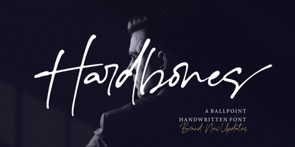 Hardbones is a stunning ballpoint signature font. font with unique natural flow and feminine style, made using a unique gel ballpoint ink. Each letter is deliberately imperfect to make it look more natural and charming. Hardbones comes with multilingual support, ligature, and ending swash from a-z.
 - Barberry by FontaZY,
$35.00 Barberry is a hand-made brush script typeface equipped with some decorative OTF features, made by Zakhar Yaschin (FontaZY). Barberry font contains stylistic alternates, initial and final alternates (which is duplicated by contextual alternates in the case when ini & fina are not supported), ligatures, titling alternates, small caps and large collection of swashes (additional variants - in Stylistic Set). The Barberry font is essential for hand-made lettering and design. The Barberry family also includes Barberry Vigniette font with over 200 icons and vigniettes in it. Barberry Letters supports most of Western languages (including Central Europian, Baltic and Eastern European languages) and also Cyrillic. Each lowercase letter has three positional versions of the design – basic (if the letter is in the middle of a word), initial (if the word starts with it) and the final (in the end of the word) that makes the set look more alive and expressive. Working with Barberry Letters you can enable and disable if needed such typographic tools as swashes, ligatures, small caps, titling alternates, stylistic alternates, additional swashes and the already mentioned initial and final alternates. If your design software does not support the use of the initial and final alternatives, they can be duplicated by contextual substitutions. There are more than 20 Latin and Cyrillic ligatures in the Barberry Letters. It works by default as the standard ligatures, but you can switch it off for design reasons or to select the more appropriate typographic solution in any particular case. Ornamental font Barberry Vigniette has more than 200 pictograms and vignettes that can decorate your typographic layout. All icons are drawn with a brush in the same style as the Barberry Letters. You can use them inside the text lines, or make the ornamental decoration for text, or use separately, without any letters. OpenType extensions of the Barberry Letters significantly expand the choice of typographical tools to design a better, more expressive layout. Choosing the optimal variant of certain letters in each case, you can receive a unique composition. Whether it is lettering for packaging or magazine headline, logotype or the name in the invitation – just one Barberry font-family gives you the very wide typographic possibilities.
 - Hells Kittchen Devil God by TypoGraphicDesign,
$19.00 CHARACTERISTICS The font name is a pun on the German word "Kittchen" (English prison/jail) and the English "Hell’s Kitchen". The character of the font looks as though the scum here — the guilty and innocent prisoners carved/scratched their signs and messages at the prison walls of their jail cell. The cold, creepy and scratchy character of the handwritten typeface is a very unique gloomy atmosphere. APPLICATION AREA The scary, dark, horror, trash, handwritten script font "Hells Kittchen Devil God" with many symbols/dingbats would look creepy good at rusty display size for headlines. Magazines or websites, movie posters, music covers or webbanner. TECHNICAL SPECIFICATIONS Headline Font / Display Font / Trash Script "Hells Kittchen Devil God" OpenType Font with 375 glyphs — many symbols/dingbats, alternative letters and ligatures (with accents &€) & 2 style (regular, bold)
 - Electrum by Tower of Babel,
$9.00 Electrum is an all-caps layered font that presents a plethora of permutations for any use. Inspired by handlettered signage of the 1950's and 60's, Electrum has one foot in the past and one in the present. Use a single weight, or mix and match weights to create a number of interesting and eye-catching combinations. The "lightning" weight is especially interesting and adds a bit of electricity to any design. Perfect for logos, packaging designs, or poster designs. Whatever the usage, Electrum can add some spark to your project!
 - PF Nuyork Arabic by Parachute,
$79.00 Nuyork Arabic was designed to emphasize on the individual Arabic letter visual traditional characteristics. Including 5 weights, it was designed with both text and display applications in mind. This font is intended to produce virtually cursive texts without eliminating the clarity or look-and-feel of the individual Arabic letters. Offering glyphs for the full Extended Arabic Unicode Standards 6.1, including the latest Arabic Supplement and Extended-A Unicode blocks, Nuyork Arabic incorporates comprehensive support for Quranic texts and other Arabetic scripts, including African sub-Saharan scripts. Careful design considerations were given to make sure that composed Arabetic text is visually prominent and stands well next to Latin. To insure legibility in all sizes, vertical strokes are emphasized when possible, while utilizing multiple x-heights to give a traditional Arabic feel. The design of this font follows the general guidelines of the Mutamathil type style developed by the designer, a decade ago, to enrich and diversify user typographic options, and to address the Arabetic scripts challenges of literacy, education, economics, and technology. Based on this style, it uses one glyph for every basic Arabic Unicode character or letter, as defined by the latest Unicode Standards, and one additional final form glyph, for each freely-connecting letter in the traditional Arabic cursive text. Nuyork Arabic includes the required Lam-Alif ligatures in addition to all vowel diacritic ligatures. Soft-vowel diacritic marks (harakat) are selectively positioned, with most of them appearing on similar high and low levels to clearly distinguish them from the letters. Tatweel, or Kashidah, is a zero-width glyph. Arabetics Latte includes both Arabic and Arabic-Indic numerals. Available in Open Type format, the Nuyork Arabic font family includes regular, light, bold, extra bold, and black.
 - Short Films by Dharma Type,
$19.99 Short Films is an all-new-styled family, which kind of looks like Art Deco Style. Wide opened counters and softly rounded bowls create a new feeling – Retro but futuristic, geometric but humanistic. Exquisite contrast between thin and bold parts of glyphs make mixed feeling – Pop and feminine, formal and casual, strong and soft. The most distinctive feature is a coexistence of decorativeness and Readability. This coexistence expands the range of font usage. You can use this font for not only titling but also body-text. Short Films consists of 6 weights and their matching Italics for a wide range of usages. Further, Short Films supports international Latin languages and basic Cyrillic languages including Basic Latin, Western Europe, Central and South-Eastern Europe. Also, Short Films covers Mac Roman, Windows1252, Adobe1 to 3. This wide range of international characters expands the capability of your works.
 - Vintage Stencil Borders JNL by Jeff Levine,
$29.00 Vintage Stencil Borders JNL collects twenty-six decorative vintage and antique stencil border motifs for embellishing word copy set in stencil type or for any other decorative purpose. Please note: Commercial reproduction of these designs as stencils, stickers, decals, transfers, ink stamps or other decorative stand-alone products for resale requires a separate license. Contact Jeff Levine through the email address located in the PDF file provided with the font or from the online EULA text.
 - Coroner by Storm Type Foundry,
$39.00 I never needed to digitize this early design from 1988. I found it in a drawer underneath layers of dozens of other type designs. The drawings were made with ink on paper, about 15 cm high, meticulously executed and retouched separate glyphs for a primitive photo-lettering. I used a photographic magnifier to set words and lines in my darkroom. In 2018 I decided to make a font out of it just for fun...
 - Typewriter 1950 Tech Mono by TypoGraphicDesign,
$29.00 The typeface Typewriter 1950 Tech Mono is designed for the Typo Graphic Design font foundry in 2017 by Manuel Viergutz. A display slab serif type for headlines. Based on an old typewriter machine from 1950. Plus state-of-the-art OpenType-features like contextual alternates (calt), decorative ligatures e. g. type the word “LOVE” for ❤ and the word “SMILE” for ☺ and Versal Eszett (German Capital Sharp S). For use in magazines, posters, headlines and advertisement, plus as webfont for decorative headlines. Character Set: Latin Extended (Adobe Latin 3). 1490 glyphs with 5× A–Z, 5× a–z, 5× 0–9 and 290+ extra icons like arrows, dingbats, symbols, geomatric shapes, catchwords and many alternative letters. Have fun with this font & use the DEMO-FONT (with reduced glyph-set) FOR FREE! How To Use – OpenType-Features ■ In Adobe Photoshop and Adobe InDesign, font feature controls are within the Character panel sub-menu → OpenType → Discretionary Ligatures … Checked features are applied/on. Unchecked features are off. ■ In Adobe Illustrator, font feature controls are within the OpenType panel. Icons at the bottom of the panel are button controls. Darker ‘pressed’ buttons are applied/on. ■ Additionally in Adobe InDesign and Adobe Illustrator, alternate glyphs can manually be inserted into a text frame by using the glyphs panel. The panel can be opened by selecting Window from the menu bar → Type → Glyphs. Or use sign-overview of your operating system. ■ For a overview of OpenType-Feature compatibility for common applications, follow the myfonts-help http://www.myfonts.com/help/#looks-different ■ Font Name: Typewriter 1950 Tech Mono ■ Font Weights: Regular + Negative + Black + Mono + Icons + DEMO (with reduced glyph-set) ■ Font Category: Slab Serif Display for Headline Size ■ Font Format:.otf (OpenType Font for Mac + Win) + .ttf (TrueType Font) ■ Glyph Set: 1490 glyphs ■ Language Support: 28+ for Latin Extended (Adobe Latin 3). Afrikaans, Albanian, Catalan, Croatian, Czech, Danish, Dutch, English, Estonian, Finnish, French, German, Hungarian, Icelandic, Italian, Latvian, Lithuanian, Maltese, Norwegian, Polish, Portugese, Romanian, Slovak, Slovenian, Spanisch, Swedish, Turkish, Zulu ■ Specials: 290+ decorative extras like icons for arrows, dingbats, emojis, symbols, geometric shapes, catchwords + German Capital Eszett. ■ Open Type Features: Kerning (kern), Stylistic Set 1 (ss01) … Stylistic Set 6 (ss06), Ornaments (ornm), Titling (titl), Localized Forms (locl), Subscript (subs) Superscript (sups), Ordinals (ordn), Oldstyle Figures (onum), Lining Figures (lnum), Fractions (frac), Denominators (dnom), Numerators (numr), Standard Ligatures (liga), Contextual Alternates (calt) e. g. Stylistic Set-Loop and Decorative Ligatures (dlig) e. g. type the word “LOVE” for ❤ or “SMILE” for ☺ ■ Design Date: 2017–2018 ■ Type Designer: Manuel Viergutz
 - Sweater School by Typodermic,
$11.95 Introducing Sweater School, a typeface that feels like the friendly embrace of a warm sweater on a chilly day. With its casual pen strokes and relaxed letterforms, this inviting teacher’s typeface is perfect for anyone who wants to convey a sense of approachability and warmth. Sweater School is a unique typeface that draws inspiration from the print style preferred by elementary school teachers, but with significant improvements that make it easier to read and more pleasant to look at. We know how important it is to get your message across clearly, and that’s why we’ve created Sweater School with readability in mind. One of the standout features of Sweater School is its alternate characters, including a charming “J”, “I”, and “q”, as well as nut fractions (vertical fractions). These variations can be easily accessed through your application’s OpenType “stylistic alternates” capability, allowing you to add a touch of whimsy to your designs and make them stand out from the crowd. Sweater School is available in four weights and italics, making it a versatile choice for a variety of projects. Whether you’re designing a logo, creating a presentation, or crafting a social media post, Sweater School is sure to help you make a statement with its friendly, approachable style. So why not cozy up to Sweater School today? Let its inviting warmth and casual charm elevate your designs and connect with your audience in a whole new way. Most Latin-based European writing systems are supported, including the following languages. Afaan Oromo, Afar, Afrikaans, Albanian, Alsatian, Aromanian, Aymara, Bashkir (Latin), Basque, Belarusian (Latin), Bemba, Bikol, Bosnian, Breton, Cape Verdean, Creole, Catalan, Cebuano, Chamorro, Chavacano, Chichewa, Crimean Tatar (Latin), Croatian, Czech, Danish, Dawan, Dholuo, Dutch, English, Estonian, Faroese, Fijian, Filipino, Finnish, French, Frisian, Friulian, Gagauz (Latin), Galician, Ganda, Genoese, German, Greenlandic, Guadeloupean Creole, Haitian Creole, Hawaiian, Hiligaynon, Hungarian, Icelandic, Ilocano, Indonesian, Irish, Italian, Jamaican, Kaqchikel, Karakalpak (Latin), Kashubian, Kikongo, Kinyarwanda, Kirundi, Kurdish (Latin), Latvian, Lithuanian, Lombard, Low Saxon, Luxembourgish, Maasai, Makhuwa, Malay, Maltese, Māori, Moldovan, Montenegrin, Ndebele, Neapolitan, Norwegian, Novial, Occitan, Ossetian (Latin), Papiamento, Piedmontese, Polish, Portuguese, Quechua, Rarotongan, Romanian, Romansh, Sami, Sango, Saramaccan, Sardinian, Scottish Gaelic, Serbian (Latin), Shona, Sicilian, Silesian, Slovak, Slovenian, Somali, Sorbian, Sotho, Spanish, Swahili, Swazi, Swedish, Tagalog, Tahitian, Tetum, Tongan, Tshiluba, Tsonga, Tswana, Tumbuka, Turkish, Turkmen (Latin), Tuvaluan, Uzbek (Latin), Venetian, Vepsian, Võro, Walloon, Waray-Waray, Wayuu, Welsh, Wolof, Xhosa, Yapese, Zapotec Zulu and Zuni.
 - Mimeograph Template JNL by Jeff Levine,
$29.00 Before ink jet and laser printers; before copy machines, the main way to make multiples of anything not provided by printing press was by a mimeograph machine or spirit duplicator. The mimeograph utilized a porous drum which inked the backside of a waxed stencil sheet. Unlike traditional stencils which have cut out areas that are directly inked or painted, a mimeo stencil has the area to be printed scratched away by removing the wax coating with a stylus. The resulting image allows the ink from the drum to seep through the sheet and transfer to the blank paper. Based on a plastic lettering guide once manufactured by the A.B. Dick Company of Chicago, Mimeograph Template JNL is available in regular and oblique versions. Albert Blake Dick, the company’s founder, coined the term ‘mimeography’. The font’s character shapes follow the routed letters of the template, complete with rounded terminals. An earlier font release [designed with flat terminals and some alternate characters] is available as Interoffice Memo JNL.
 - ROBO - Personal use only

- Emoticons - Personal use only

- Cyberspace - Personal use only

- Lamp Post JNL by Jeff Levine,
$29.00 Lamp Post JNL is a digital interpretation of a design popular in the early 1900s called Post Old Style; no doubt inspired by a certain Saturday periodical with a similar name. There is an intrinsic charm to lettering that evokes a hand-made look, and this design is a perfect example of the genre. Available in both regular and oblique versions, it will add the nostalgia of simpler times to any print or web project.
 - KR Heartalicious - Unknown license

- Dead Hardy - Personal use only

- BattleLines - Personal use only

- Port Vintage by Onrepeat,
$25.00 Guided tour available here. Port Vintage is a new typeface expanded upon the original Port typeface, released in 2013, and being an experimental Didone typeface with a modern twist, inspired by the well known forms of typography masters such as Bodoni and Didot and the exuberance and elegance of calligraphy typefaces. A lot of changes were made, the whole typeface is now softer and has less rough edges, the time it took to mature made it possible to achieve an entirelly new and distinct flavour from the original Port, giving away the rough edges from Port and giving place to the soft transitions and curved connections between the stems and serifs of Port Vintage. Port Vintage melts the straight lines and strong contrasts of the Didone typefaces with the elegant lines of calligraphy in a geometric way, resulting in exuberant characters with geometric swashes that can be combined in countless ways. The result of this experiment is Port Vintage, an unique and rich display typeface meant to be used on big sizes and it’s main perk is the amount of alternative characters it features. Port Vintage is Open-Type programmed and includes hundreds of alternates, from swashes to titling alternates, ligatures and stylistic sets with each character having a thin version of itself, giving complete freedom to all your creative needs. Port Vintage is available in 10 different styles: Port Vintage Regular, being the base version and featuring the whole base character set; Port Vintage Regular Decorated, featuring richer forms and containing more ornamentated and more extravagant characters; Port Vintage Medium and Port Vintage Medium Decorated, designed for the occasions you need a bit more thickness and the decoration variants: Port Vintage Ornaments, containing a wide set of elements meant for the creation of fillets, vignettes and fleurons, resulting in an almost infinite number of possible combinations to embellish your designs and Port Vintage Words, a set of some of the most common words used in English, Spanish, French, German, Italian and Portuguese. All styles, except Port Vintage Ornaments and Port Vintage Words, include italic styles. For a better understanding of all the uses of Port Vintage and the full character list the reading of the manual is recommended.
 - Alghera Pro by Red Rooster Collection,
$60.00 Alghera Pro is a casual script font family. It was digitally engineered in 1996 by Pat Hickson of P+P Hickson and Steve Jackaman of International TypeFounders, Inc. (ITF). Jackaman revamped the family in 2017 and added wider language support to include Western, Central, and Eastern European languages. Alghera Pro has a hand-written, antique feel, and was inspired by an old label on a bottle of Portuguese wine. As with all the Red Rooster “Pro” versions, the family contains a 40% larger glyph set and improved designs.
 - Foreign Tourist JNL by Jeff Levine,
$29.00 A 1929 German travel poster had the caption “Wer schlafwagen reist spart zdeit und geld” (“Whoever travels in a sleeping car saves time and money”) hand lettered in an Art Deco sans serif style. This is now available as Foreign Tourist JNL, in both regular and oblique versions.
 - PG Grotesque by Paulo Goode,
$30.00 This is my interpretation of Edel Grotesk – a “lost typeface” from circa 1914 produced by Johannes Wagner GmbH of Ingolstadt, Germany. PG Grotesque is definitely not a revival, or even a faithful reproduction of that typeface as I was unable to source enough accurate references. What I have done is take the essence and unique characteristics of that typeface and brought this forgotten gem right into the 21st century. The full family features 99 fonts spread across 9 weights and 6 widths. PG Grotesque is also available as a single variable font so that you can fine tune the width, weight, and italic angle to your exact preference. Distinctive features include high-waisted capitals, a straight-legged capital ‘R’, and flattened arches in the ‘a’ and ‘g’ glyphs. Using PG Grotesque will give your typography a distinctly retro feel with its vintage heritage inherent in every character. You will find this is an incredibly versatile typeface with added value from its extensive language coverage along with small caps availability at the click of a button. PG Grotesque will prove to be a valuable asset in your type arsenal. Test drive PG Grotesque today – both the Regular and Italic fonts are offered as a free download. See full details and hi-res images at https://paulogoode.com/pg-grotesque Key features: 9 Weights 6 Widths 99 Fonts Small Caps Old Style Figures European Language Support (Latin) 550+ Glyphs per font
 - Spitzkant by Julien Fincker,
$29.00 About the design Spitzkant is a serif typeface family that is characterized by strong contrasts. Pointed, sharp serifs and edges contrast with round and fine forms, making it very individual and expressive. This makes it particularly suitable for branding, editorial, packaging and advertising. The high-contrast display version has been complemented by a lower-contrast text version, making Spitzkant in combination suitable for both strong headlines and extensive body text. An allrounder that can be used for many purposes. Features The Spitzkant Head and Text family has a total of 2 optical sizes, 5 weights and 20 styles, from thin to bold and matching italics. With over 850 characters, it covers over 200 Latin-based languages. It also has an extended set of currency symbols and a whole range of open type features. For example, there are alternative characters as Stylistic Sets, Small Caps, automatic fractions and many other features. Ligatures Especially the extensive selection of ligatures (standard and optional) is a special feature which was an important part during the design process. With over 95 different ligatures there are many possibilities to give headlines and logos an individual touch. Get the Variable Font here: https://www.myfonts.com/fonts/julien-fincker/spitzkant-variable/
 - Backbone by 38-lineart,
$17.00 Backbone is a unique blackletter font. It’s suitable for use in various projects such as gothic letters, tattoos, headlines, posters, magazines, newspapers, t-shirts, labels, and any other designs that you wish to create. Get inspired by Black metal and It will add an edgy feel to any crafting project! Bold and spooky, Ideal for any October project or Halloween party, this font will become your top choice in no time!
 - Pickey Pop by Nathatype,
$29.00 Pickey Pop is a delightful display font that combines a thick weight, low contrast letters, and charming swinging endings. With its playful and bold design, this typeface brings a sense of joy and vibrancy to any creative project. The thick weight of this font adds a strong and confident presence to each letter. The boldness of the strokes creates visual impact and ensures legibility even at smaller sizes. This display font demands attention and stands out effortlessly in any design composition. In contrast to its bold weight, Pickey Pop features low contrast letters. This design choice gives the font a sense of solidity and consistency. The uniform strokes contribute to a clean and contemporary appearance, making it a versatile choice for a wide range of design applications. What makes this font truly special are the swinging endings found in select letters. These whimsical details add a touch of playful movement and uniqueness to the font. The swinging letter endings bring a sense of rhythm and energy, infusing your designs with a joyful and dynamic quality. For the best legibility you can use it in the bigger text. Enjoy the available features here. Features: Stylistic Sets Ligatures Multilingual Supports PUA Encoded Numerals and Punctuations Pickey Pop fits in headlines, logos, attention-grabbing titles, product packaging, branding materials, editorial layouts and website headers. Find out more ways to use this font by taking a look at the font preview. Thanks for purchasing our fonts. Hopefully, you have a great time using our font. Feel free to contact us anytime for further information or when you have trouble with the font. Thanks a lot and happy designing.
 - Libertinas & co by deFharo,
$28.00 Libertinas & co. is a handwritten typeface, with a casual, elegant and sensual style, with many possibilities to compose different titles, flyers, publications or typographic posters for example. The font has an extra set of capital letters and another one of decorative lowercase for word end, also 3 stylistic set with more alternative letters and many other Open Type functions. Includes the Bitcoin symbol. The Commercial version includes - 734 glyphs. Latin Extended-A • OTF & TTF - Libertinas & co. can be used unlimited for both Commercial and Personal projects. - The download file includes a PDF with the specimen sheet of typography. - OpenType features compatible with: Photoshop, Illustrator, QuarkXpress, Indesign. - OpenType Functions: Scientific Inferiors, Swash, Terminal Forms, Titling alternates, Extended Fractions, Inferiors, All Alternates, Superiors, Contextual Ligatures, Denominators, Contextual Alternates, Contextual Swash, Discretionary Ligatures, Capital Spacing, Superscript, Additional languages, Superior letters, Oldstyle Figures, Historical Forms, Historical Ligatures, Kerning, Localized Forms, Numbers Small Caps, Numerators, Ordinals, Subscript, Ornaments, Slashed Zero, Standard Ligatures, Stylistic Alternates, Stylistic Set, Fractions. - Bitcoin symbol (ligatures): b#
 - Wasatch Brush by Areatype,
$13.00 Wasatch Brush! Can used for various purpose such as titles, brands, logos, product packaging, posters, invitations, greeting cards, news, blogs, everything including personal charm etc. Wasatch brush features Open type feature, including initial and terminal letters, ligatures and International support for most Western Languages is included. To enable the OpenType Stylistic alternates, you need a program that supports OpenType features such as Adobe Illustrator CS, Adobe Indesign & CorelDraw X6-X7, Microsoft Word 2010 or later versions. How to access all alternative characters, using Windows Character Map with Photoshop: https://www.youtube.com/watch?v=Go9vacoYmBw How to access all alternative characters using Adobe Illustrator: http://youtu.be/iptSFA7feQ0nn Wasatch brush is coded with PUA Unicode, which allows full access to all the extra characters without having special designing software. Mac users can use Font Book , and Windows users can use Character Map to view and copy any of the extra characters to paste into your favorite text editor/app.
 - Darling Harbour by Areatype,
$15.00 Darling Harbour! Can used for various purpose such as titles, brands, logos, product packaging, posters, invitations, greeting cards, news, blogs, everything including personal charm etc. Darling Harbour features Open type feature, including initial and terminal letters, ligatures and International support for most Western Languages is included. To enable the OpenType Stylistic alternates, you need a program that supports OpenType features such as Adobe Illustrator CS, Adobe Indesign & CorelDraw X6-X7, Microsoft Word 2010 or later versions. How to access all alternative characters, using Windows Character Map with Photoshop: https://www.youtube.com/watch?v=Go9vacoYmBw How to access all alternative characters using Adobe Illustrator: http://youtu.be/iptSFA7feQ0nn Darling Harbour is coded with PUA Unicode, which allows full access to all the extra characters without having special designing software. Mac users can use Font Book , and Windows users can use Character Map to view and copy any of the extra characters to paste into your favorite text editor/app.
 - Tavern by FontMesa,
$25.00 Tavern is a super font family based on our Algerian Mesa design, with Tavern we've greatly expanded the usability by creating light and bold weights plus all new for 2020 with the introduction of extra bold and black weights Tavern is now a five weight family. The addition of the bold weight made it possible to go further with the design by adding open faced shadowed, outline and fill versions. Please note, the fill fonts are aligned to go with the open faced versions, they may work with the outline versions, however you will have to apply them one letter at a time. The Tavern Fill fonts may also be used a stand alone font, however, the spacing is much wider than the regular solid black weights of Tavern. In the old days of printing, fill fonts rarely lined up perfect with the open or outline font, this created a misprinted look that's much in style today. To create that misprinted look using two different colors, try layering the outline fonts offset over the top of the solid black versions. Next we come to the small caps and X versions, for a font that's mostly seen used in all caps we felt a small caps would come in handy. The X in Tavern X stands for higher X-height, we've taken our standard lowercase and raised it for greater visibility in small text and for signage where you want the look of a lowercase but it needs to be readable from the street. In August of 2016 I started the project of expanding this font into more weights after seeing the font in use where someone tried creating a bold version by adding a stroke fill around the letters. The result didn't look very good, the stroke fill also caused the shadow line to merge with the serifs on some letters. This lead me to experiment to see if a new bold weight was possible for this font and I'm pleased to say that it was. After the bold weight was finished I decided to type the regular and bold weights together in a first word thin second word bold combination, however the weight difference between the two wasn't enough contrast. This lead me to wonder if a lighter weight was possible for this font, as you can see yes it was, so now for the first time in the history of this old 1908 type design you can type a first word thin second word bold combination. So why the name change from Algerian to Tavern? Since the original font was designed in England by the Stephenson Blake type foundry I decided to give this font a name that reminded you of the country it came from, however, there were other more technical reasons. During the creation of the bold weight the engraved shadow line was sticking out too far horizontally on the bottom right of the serifs dramatically throwing the whole font off balance. The original font encountered this problem on the uppercase E, L and Z, their solution was a diagonal cut corner which was now needed across any glyph in the new bold weight with a serif on the bottom right side. In order to make the light and regular weights blend well with the bold weight diagonal cut offs were needed and added as well. This changed the look of the font from the original and why I decided to change the name, additional concerns were, if you're designing a period piece where the font needs to be authentic then this font would be too new. Regular vs. Alt version? The alternate version came about after seeing the regular version used as a logo and secondary text on a major product label. I felt that some of the features of the regular version didn't look good as smaller secondary text, this gave me the idea to create an alternate version that would work well for secondary text in an advertising layout. But don't stop there, the alternate version can be used as a logo too and feel free to exchange letters between both regular and alternate versions. Where are the original alternates from Algerian? Original alternates from Algerian are built into the regular versions of Tavern plus new alternates have been created. We're excited to introduce, for the first time, all new swash capitals for this classic font, you're going to love the way they look in your ad layout, sign or logo. The best way to access alternate letters in Tavern is with the glyph map in Adobe Illustrator and Adobe InDesign products, from Adobe Illustrator you can copy and paste into Photoshop as a smart object and take advantage of all the text layer style features Photoshop has to offer. There may be third party character maps available for accessing alternate glyphs but we can't advise you in that area. I know what you're thinking, will there be a Tavern Condensed? It takes a lot of hours to produce a large font family such as this, a future condensed version will depend on how popular this standard version is. If you love Tavern we're happy to introduce the first weathered edge version of this font called Bay Tavern available in February 2020.
 - Tabaquera - Personal use only

- Sabrva by Nirmana Visual,
$7.00 Sabrva by Nirmana Visual is designed to work as perfect companions or simply as strong standalone typefaces. Give your typography design with a touch of Classic style with Sabrva. You can pick the alternate for substitution up to 7 variant per-letter. We really hope you enjoy it! Thank You!
 - The Buchen by Larin Type Co,
$15.00 The Buchen is an excellent combination of smooth shapes and medium weight. It will fit perfectly into any project, both in a modern style and in a vintage style. It can also be classic and more expressive and playful thanks to the alternatives and ligatures that are harmoniously combined in this font and add charm to your project. Making it more versatile to use. This font is easy to use has OpenType features.
 - Art Materials JNL by Jeff Levine,
$29.00 The cover of the 1930s-era “Catalog of Artists’ Materials” from Ernst H. Friedrichs, Inc. (New York) has the words “Artists’ Materials” hand lettered in a stylized Art Deco sans serif type style. This unique design is now the digital font Art Materials JNL, which is available in both regular and oblique versions.
 - Delish Pro by Fontforecast,
$29.00 Delish Pro is a bouncy brush font family. Hand lettered with lots of character. This delicious family contains 7 fonts in various styles, especially designed to make sure there's always one that fits your design needs. There's an Upright and an Italic version, and both come in a condensed edition, perfect if you're looking for a more efficient use of space. Alternate characters and double letter ligatures give you the ability to fine-tune your design as you please. To compliment the range Delish Pro Sketch and Delish Narrow Pro Sketch were added. A sturdy Caps font with a dry marker effect. To make this family even more flexible an extra treat of 64 swashes and ink splatters are included. Enjoy!


