10,000 search results
(0.119 seconds)
- Probity by VP Creative Shop,
$29.00 Introducing Probity creative serif font (latin and Cyrillic) Probity is casual and creative font loaded with 95 languages support, alternate and ligature glyphs to make you typography truly unique! Language Support : Belarusian, Bosnian, Bulgarian, Chechen, Macedonian, Russian, Serbian, Afrikaans, Albanian, Asu, Basque, Bemba, Bena, Breton, Chiga, Colognian, Cornish, Czech, Danish, Dutch, Embu, English, Estronian, Faroese, Filipino, Finnish, French, Friulian, Galician, Ganda, German, Gusii, Hungarian, Indonesian, Irish, Italian, Jola-Fonyi, Kabuverdianu, Kalenjin, Kamba, Kikuyu, Kinyarwadna, Litvian, Lithuanian, Lower Sorbian, Luo, Luxembourish, Luyia, Machame, Makhuwa-Meetoo, Makonde, Malagasy, Maltese, Manx, Meru, Morisyen, North Ndebele, Norwegian Bokm ål, Norwegian Nynorsk, Nyankole, Ormo, Polish, Portuguese, Quechua, Romanian, Romansh, Rombo, Rundi, Rwa, Samburu, Sango, Sangu, Scottish Gaelic, Sena, Shambala, Shona, Slovak, Soga, Somali, Spanish, Swahili, Swedish, Swiss German, Taita, Teso, Turkish, Ukrainian, Upper Sorbian, Uzbek (Latin), Volap ük, Vunjo, Walser, Welsh, Western Frisian, Zulu FEATURES Uppercase, numeral, punctuation & Symbol ligature glyphs alternates Multilingual support - 95 languages Cyrillic support No special software is required to type out the standard characters of the Typeface. How to access alternate glyphs? To access alternate glyphs in Adobe InDesign or Illustrator, choose Window Type & Tables Glyphs In Photoshop, choose Window Glyphs. In the panel that opens, click the Show menu and choose Alternates for Selection. Double-click an alternate's thumbnail to swap them out. Feel free to contact me if you have any questions! Mock ups and backgrounds used are not included. Thank you! Enjoy!
 - Malinger VP by VP Creative Shop,
$40.00 Introducing Malinger - Stylish Serif font - latin and cyrillic Malinger is stylish and creative font loaded with 95 languages support, alternate and ligature glyphs to make you typography truly unique! Language Support : Belarusian, Bosnian, Bulgarian, Chechen, Macedonian, Russian, Serbian, Afrikaans, Albanian, Asu, Basque, Bemba, Bena, Breton, Chiga, Colognian, Cornish, Czech, Danish, Dutch, Embu, English, Estronian, Faroese, Filipino, Finnish, French, Friulian, Galician, Ganda, German, Gusii, Hungarian, Indonesian, Irish, Italian, Jola-Fonyi, Kabuverdianu, Kalenjin, Kamba, Kikuyu, Kinyarwadna, Litvian, Lithuanian, Lower Sorbian, Luo, Luxembourish, Luyia, Machame, Makhuwa-Meetoo, Makonde, Malagasy, Maltese, Manx, Meru, Morisyen, North Ndebele, Norwegian Bokm ål, Norwegian Nynorsk, Nyankole, Ormo, Polish, Portuguese, Quechua, Romanian, Romansh, Rombo, Rundi, Rwa, Samburu, Sango, Sangu, Scottish Gaelic, Sena, Shambala, Shona, Slovak, Soga, Somali, Spanish, Swahili, Swedish, Swiss German, Taita, Teso, Turkish, Ukrainian, Upper Sorbian, Uzbek (Latin), Volap ük, Vunjo, Walser, Welsh, Western Frisian, Zulu FEATURES Uppercase, lowercase, numeral, punctuation & Symbol ligature glyphs alternates Multilingual support - 95 languages Cyrillic support No special software is required to type out the standard characters of the Typeface. How to access alternate glyphs? To access alternate glyphs in Adobe InDesign or Illustrator, choose Window Type & Tables Glyphs In Photoshop, choose Window Glyphs. In the panel that opens, click the Show menu and choose Alternates for Selection. Double-click an alternate's thumbnail to swap them out. Feel free to contact me if you have any questions! Mock ups and backgrounds used are not included. Thank you! Enjoy!
 - Eskapade by TypeTogether,
$53.50 The Eskapade font family is the result of Alisa Nowak’s research into Roman and German blackletter forms, mainly Fraktur letters. The idea was to adapt these broken forms into a contemporary family instead of creating a faithful revival of a historical typeface. On one hand, the ten normal Eskapade styles are conceived for continuous text in books and magazines with good legibility in smaller sizes. On the other hand, the six angled Eskapade Fraktur styles capture the reader’s attention in headlines with its mixture of round and straight forms as seen in ‘e’, ‘g’, and ‘o’. Eskapade works exceptionally well for branding, logotypes, and visual identities, for editorials like magazines, fanzines, or posters, and for packaging. Eskapade roman adopts a humanist structure, but is more condensed than other oldstyle serifs. The reason behind this stems from the goal of closely resembling the Fraktur style to create harmony in mixed text settings. Legibility is enhanced by its low contrast between thick and thin strokes and its tall x-height. Eskapade offers an airy and light typographic colour with its smooth design. Eskapade italic is based on the Cancellaresca script and shows some particularities in its condensed and round forms. This structure also provided the base for Eskapade Fraktur italic. Eskapade Fraktur is more contrasted and slightly bolder than the usual darkness of a regular weight. The innovative Eskapade Fraktur italic, equally based on the Cancellaresca script previously mentioned, is secondarily influenced by the Sütterlin forms — an unique script practiced in Germany in the vanishingly short period between 1915 and 1941. The new ornaments are also hybrid Sütterlin forms to fit with the smooth roman styles. Although there are many Fraktur-style typefaces available today, they usually lack italics, and their italics are usually slanted uprights rather than proper italics. This motivated extensive experimentation with the italic Fraktur shapes and resulted in Eskapade Fraktur’s unusual and interesting solutions. In addition to standard capitals, it offers a second set of more decorative capitals with double-stroke lines to intensify creative application and encourage experimental use. The Thin and Black Fraktur styles are meant for display sizes (headlines, posters, branding, and signage). A typeface with this much tension needs to keep a good harmony between strokes and counters, so Eskapade Black has amplified inktraps and a more dynamic structure seen in the contrast between straight and round forms. These qualities make the family bolder and more enticing, especially with the included uppercase alternates. The Fraktur’s black weights are strident, refusing to let the white of the paper win the tug-of-war. It also won’t give away its secrets: Is it modern or historic, edgy or amicable, beguiling ornamentation or brutish presentation? That all depends on how the radically expanded Eskapade family is used, but its 16 fonts certainly aren’t tame.
 - Aspire by Grype,
$18.00 Geometric/Technical style logotypes have been developed for car chrome labels since the early 1980’s. The styles are loaded with inspiration for great font families, but surprisingly, many of these sleek logotypes are lacking an expansive family to enhance and express their brand in a richer sense, becoming true brand workhorses. The Aspire family finds its origin of inspiration in the ACURA automotive company logo, and from there expands to an 6 font family of weights & oblique styles. Aspire pays homage the techno display styling of the inspiration logotype, further evolving beyond its brand inspired origin to give birth to a font family that pulls on modern and historical styles. It adopts a sturdy yet approachable style with its uniform stroke forms and curves, and goes on to include a lowercase, numerals, and a comprehensive range of weights, creating a straightforward, uncompromising collection of typefaces that lend a solid foundation and a broad range of expression for designers. Here’s what’s included with the Aspire Family bundle: 477 glyphs per style - including Capitals, Lowercase, Numerals, Punctuation and an extensive character set that covers multilingual support of latin based languages. (see the 6th graphic for a preview of the characters included) Stylistic Alternates - alternate characters that remove the angled stencil cuts for a more standardized text look. 3 weights in the family: Light, Regular, & Black. 3 obliques in the family, one for each weight: Light, Regular, & Black. Fonts are available in TTF & OTF formats. The TTF format is the standard go to for most users, although the OTF and TTF function exactly the same. Here’s why the Aspire Family is for you: - You’re in need of automotive sans font family with a range of weights and obliques. - You’re love that ACURA letter styling, and want to design anything within that genre. - You’re looking for an alternative to Eurostile with more stylized letterforms. - You’re looking for a clean techno typeface for your starship console labelling. - You just like to collect quality fonts to add to your design arsenal.
 - Engel New by The Northern Block,
$30.36 EngelNewSans is sans serif family of 12 weights and an upgrade of the typeface Engel also published by Die Gestalten Verlag. The project began with an extension to the original Engel character set and freshening up the typeface to suit the OpenType format. EngelNewSerif came about as a sibling to EngelNewSans as a corresponding serif family also of 12 weights, matching those of EngelNewSans. Both families are designed for a wide usage in running text and headlines. EngelNewSans is an evolved version of the original Engel typeface, which undergone improvements to the individual letterforms and the overall look which resulted in this sans serif type family with a more mature confident character and with softer, rounder and more harmonious shapes. The characteristics between the two could perhaps, very fittingly, be compared to a person showing different sides to their personality at different stages in life. With EngelNewSans portraying the more mature role while the original Engel shows traits of a cool teenager with rough edges, not yet fully developed. To make the light weights function with serifs attached for EngelNewSerif, the same low stroke contrast as seen in EngelNewSans was applied. Further discovery found that the serifs and the stem width had to be optically similar for the light weights not to appear too fragile. In the heavy weights however, the stroke contrast was higher than in the Sans versions, this was done to open up the counters and make room for the serifs to breathe. The intention of the families is to motivate an element of play and give the designer a larger selection to work with.
 - Apresia Script by Asritype,
$42.00 Inspired by various shapes such as leaves, flowers, hearts etc., Apresia Script is harmonically crafted. My first intention is only for standard design, but, later added simpler characters for normal(standard) typings. Apresia Script is rich with capital letter variants and ornaments. There are also lowercase variants in lesser numbers. I assume that many or perhaps most people want to have their name or the other of their important designs to be written with some letters that are in various shapes harmoniously. Apresia Script with more then 4000 glyphs support this aim, also support many latin based languages. However, because of many variations, except the standard characters, the full marked capitals are only set in two variants; in ss01 and ss02, which is also some marked lowercases included here. Swash variants (swsh) consist only one variant of every uppercase and lowercase characters, but no marked characters. All the others capital and lowercase variants are put in stlystic alternatives (salt). There are tens of unmarked caps and fewer for unmarked lowercase in salt (see Apresia Script opentype features(1) poster for some). The ornaments can be accessed via opentype ornaments(ornm), using less() characters for easier access. There are also beginning small letter(lowercase) ornaments, end word(lowercase) ornaments and insertion ornaments to make your typing/design more flourish, using ornm via “[“ (bracketleft), “]” (bracketright) and “\” (backslash), respectively. For marks; marks via combining marks and mkmk was set for many characters variants, however, it seem most applications not yet support this features. Alternatively, you can add non standard unicode combining marks via ornaments for the language supported: asterisk “*” list for uppercase marks above letters; ASCIIcircum “^” list for lowercase marks above letters; underscore “_” for uppercase and lowercase marks below the letters; numbersign “#” for slashing characters, horn, caron alternate and reversed comma for g, (see Apresia Script opentype features(2) poster and save it if you download the font). Thus, it is recommended to have the application which are support these opentype features such as: Adobe in Design, Adobe Illustrator, CorelDRAW or others for easier accessing the glyphs. Still, for non supported applications, you can insert these glyphs via Character maps, insert symbols or other similar tools. Apresia Script will go for most typing/design such as invitation, wedding card, greeting card, banners, logos and many others. Use it for whatever you intended to, Apresia script will give an amazing end design, though you are not a designer. As intended to be able to be used by many, this font is set in an affordable price. Thank you very much for downloading this font.
 - Aviano Future Variable by insigne,
$99.99 Because you demanded it, the Aviano series is back with a variable version of the futuristic sans serif Aviano Future. Aviano Future’s strong letterforms will make you look like a rock star. Aviano Future Variable is a medium-contrast sans serif titling face that has a bold and futuristic look. It has a bowed square shape which gives it an interesting appearance that is both unique and eye-catching. Given that it has a variable axis any weight can be selected with no loss of clarity or legibility. Aviano Future's expanded forms give the letterforms heft and intensity. Aviano Future is a powerful yet adaptable title face that builds on the award-winning traits of Aviano and elevates them. Aviano Future Variable contains a ton of OpenType capabilities and comes in ten different defined weight instances with "fast" italic forms for emphasis. Want to use more traditional rounded forms? Need swash forms? Art Deco alternates? Aviano Future includes 400 alternate characters. Twelve style sets are available, two sets of art deco inspired alternates, small forms, tough swash, constructivist titling and traditional stylistic alternates. Aviano Future also includes 40 discretionary ligatures for artistic typographic compositions. Additionally, there are glyphs in this family to accommodate a variety of languages, and Cyrillic support was added in 2022. An extensive selection of sans serif typographic systems can be found in the Aviano family. The typefaces can be used alone or in combination to suit the needs of any project. The family's fonts have all been meticulously designed to assist ensure maximum impact and usability at any size. Aviano, Aviano Serif, Aviano Sans, Aviano Didone, Aviano Flare, Aviano Copper, and Aviano Slab are presently part of the Aviano collection. A skilled designer who wishes to create a technological, futuristic, or epic design should consider Aviano Future. Aviano Future Variable will make your design stand out from the competition, regardless of whether you are designing a logo, poster, flyer, website header, or banner ad. Why wait? With the exciting and versatile Aviano Future Variable at your disposal, reach new heights and create a brand that stands out from the rest.
 - Porte by Groteskly Yours,
$18.00 - Unique Modernist Look - 590+ characters per font - Standard & Discretionary Ligatures - Multiple Stylistic Sets - Old Style Figures - Case-Sensitive Punctuation - Multilingual - Cyrillic Included - Uppercase + Lowercase Porte is an elegant sans serif font inspired by stone carving and modernist typefaces of early 20th century. While at its core Porte is a display font, it can also be used for larger bodies of text and in a variety of projects. Thanks to its unique proportions and feel Porte is reminiscent of early 20th century type, wherein aesthetic qualities often overweighed matters of practicality and applicability. Porte is at once delicate and sturdy, subtle and unyielding. Porte is very OpenType friendly, boasting an awesome selection of useful OpenType features, precise and exhaustive kerning (around 1000 pairs) and lots of discretionary ligatures to make your designs look amazing. A selection of wider and narrower alternate glyphs allow the designer to modify the rhythm of the typeface, extending its application and impact. With 590+ characters on board, Porte supports all major Latin based languages as well as a number of Cyrillic languages. Porte received its first major update in fall 2022. Not only was the character set expanded considerably, but also some glyphs were re-drawn to fix visual inconsistencies, and a large number of stylistic alternates was added. The kerning, too, was re-done to accommodate new letterforms. Trials available upon request.
 - John Sans by Storm Type Foundry,
$49.00 The idea of a brand-new grotesk is certainly rather foolish – there are already lots of these typefaces in the world and, quite simply, nothing is more beautiful than the original Gill. The sans-serif chapter of typography is now closed by hundreds of technically perfect imitations of Syntax and Frutiger, which are, however, for the most part based on the cool din-aesthetics. The only chance, when looking for inspiration, is to go very far... A grotesk does not afford such a variety as a serif typeface, it is dull and can soon tire the eye. This is why books are not set in sans serif faces. A grotesk is, however, always welcome for expressing different degrees of emphasis, for headings, marginal notes, captions, registers, in short for any service accompaniment of a book, including its titlings. We also often come across a text in which we want to distinguish the individual speaking or writing persons by the use of different typefaces. The condition is that such grotesk should blend in perfectly with the proportions, colour and above all with the expression of the basic, serif typeface. In the area of non-fiction typography, what we appreciate in sans-serif typefaces is that they are clamorous in inscriptions and economic in the setting. John Sans is to be a modest servant and at the same time an original loudspeaker; it wishes to inhabit libraries of educated persons and to shout from billboards. A year ago we completed the transcription of the typefaces of John Baskerville, whose heritage still stands out vividly in our memory. Baskerville cleverly incorporated certain constructional elements in the design of the individual letters of his typeface. These elements include above all the alternation of softand sharp stroke endings. The frequency of these endings in the text and their rhythm produce a balanced impression. The anchoring of the letters on the surface varies and they do not look monotonous when they are read. We attempted to use these tricks also in the creation of a sans-serif typeface. Except that, if we wished to create a genuine “Baroque grotesk”, all the decorativeness of the original would have to be repeated, which would result in a parody. On the contrary, to achieve a mere contrast with the soft Baskerville it is sufficient to choose any other hard grotesk and not to take a great deal of time over designing a new one. Between these two extremes, we chose a path starting with the construction of an almost monolinear skeleton, to which the elements of Baskerville were carefully attached. After many tests of the text, however, some of the flourishes had to be removed again. Anything that is superfluous or ornamental is against the substance of a grotesk typeface. The monolinear character can be impinged upon in those places where any consistency would become a burden. The fine shading and softening is for the benefit of both legibility and aesthetics. The more marked incisions of all crotches are a characteristic feature of this typeface, especially in the bold designs. The colour of the Text, Medium and Bold designs is commensurate with their serif counterparts. The White and X-Black designs already exceed the framework of book graphics and are suitable for use in advertisements and magazines. The original concept of the italics copying faithfully Baskerville’s morphology turned out to be a blind alley. This design would restrict the independent use of the grotesk typeface. We, therefore, began to model the new italics only after the completion of the upright designs. The features which these new italics and Baskerville have in common are the angle of the slope and the softened sloped strokes of the lower case letters. There are also certain reminiscences in the details (K, k). More complicated are the signs & and @, in the case of which regard is paid to distinguishing, in the design, the upright, sloped @ small caps forms. The one-storey lower-case g and the absence of a descender in the lower-case f contributes to the open and simple expression of the design. Also the inclusion of non-aligning figures in the basic designs and of aligning figures in small caps serves the purpose of harmonization of the sans-serif families with the serif families. Non-aligning figures link up better with lower-case letters in the text. If John Sans looks like many other modern typefaces, it is just as well. It certainly is not to the detriment of a Latin typeface as a means of communication, if different typographers in different places of the world arrive in different ways at a similar result.
 - Unigeo by Zetafonts,
$39.00 Designed by Cosimo Lorenzo Pancini with the help of Francesco Canovaro, Unigeo is an eulogy to the design style of vintage computing, with its obsession for geometric modularity, ultra-tight tracking and striped rainbow overload. It aims at giving a new perspective to the ever-useful geometric sans genre, by adding a vintage flair to selected letters while keeping optical adjustments to the minimum, to prioritize the modular, constructed look aspect of the typeface. Furthermore, like every vintage gaming system, Unigeo has been developed with different "memory versions":32, 64 and 128. The main family, Unigeo 64, is display and logo-design oriented, featuring tight tracking and iconic signature letterforms, and referencing vintage design and typefaces from the photo-lettering era. These letterforms are substituted in the Unigeo 32 variant with more contemporary shapes, resulting in a workhorse geometric sans, highly optimized for text use but still suited for logo design and display use thanks to its wide weight range. Last but not least, the Unigeo 128 subfamily gives the same skeleton a striped treatment reminescent of optical art and modernist computer logos. All Unigeo families are developed in eight weights, ranging from Thin to Extrabold, for a total of 40 styles, each provided with an extended character set covering languages using latin, cyrillic and greek glyphs. Full Open Type Features are provided, including positional numbers, legatures and alternate glyphs, as well as a variable font version for each subfamily.
 - Reika by Andrey Sharonov,
$20.00 Reika is a super soft and positive script inspired by the summer funny mood, simple street food and fresh drinks. It’s all about smiles, delicious, not too serious time spending with family or friends. Reika looking smooth thanks to 95 ligatures like an ak ch ck th in im ax ux and many others. Script includes Stylistic Alternates of some Uppercase and Lowercase and 12 lengths of End-Swashes (tales). You can use this font for example in logo and package design, in food business, kids and confectionery products. Reika support Western European characters and works with following languages: English, Danish, Dutch, Estonian, Faroese, Filipino, Finnish, French, German, Hungarian, Icelandic, Irish, Italian, Norwegian, Polish, Portuguese, Spanish, Swedish, Turkish. Quick combinations for Opentype features: Alternates - just add «2» End-letter - just add «underscore» End-swashes (tails) - just add -1, -2, -3…up to -12, where number is length of tail. This combinations works only with activated Standard Ligatures option in Opentype panel (Adobe Illustrator / Photoshop).
 - Randolph by Jukebox Collection,
$32.99 Randolph is a popular font family from Jukebox done in an old fashioned copperplate etching style that harkens back to the days of old leather-bound shop ledgers and hand painted window signs. The large and wide letterforms of Randolph make a bold statement that will add solidity and impact to any design. Jukebox fonts are available in OpenType format and downloadable packages contain both .otf and .ttf versions of the font. They are compatible on both Mac and Windows. All fonts contain basic OpenType features as well as support for Latin-based and most Eastern European languages.
 - ITC Nova Lineta by ITC,
$29.99The ITC Nova Lineta™ design is the first commercial typeface from Slobodan Jelesijevic. As with many typeface designs, it began as simple sketches. “I was working on a packaging design project,” recalls Jelesijevic, “and wanted an informal, slightly cursive design for the type. I could not find anything that matched my need, so I began sketching.” The preliminary design had an elegant yet fresh quality that, once developed, turned out to be perfect for Jelesijevic’s project. After its first use, however, Nova Lineta lay dormant for over a year. Other projects came and went, and new typeface ideas filled Jelesijevic’s notebook. Although Nova Lineta continued to tickle the creative crevices of his mind, no more work was done on the face. Then, in a period between projects, Jelesijevic began to polish the design – and, in the process, created extended and condensed versions to complement the normally-proportioned original. Born in Gornji Milanovac, Serbia in 1951, Jelesijevic graduated with a degree in graphic communication and lettering from the Faculty of Applied Arts in Belgrade. These days, Jelesijevic is sought out not only as a typeface designer, but also as a graphic designer and illustrator. When not working on design projects, he teaches graphic communication at the Faculty of Art in Niš, Serbia. Although it is a casual and inviting design, Nova Lineta has been carefully constructed and refined. As a result, it performs exceptionally well within a wide range of sizes and in a wealth of applications. An ample x-height, open counters and distinctive character shapes also ensure a high level of legibility. And, although at first glance Nova Lineta may appear to be a sans serif design, subtle serifs make their presence known at large sizes. Nova Lineta emanates warmth when used for extensive text, and it has a fresh quality at display sizes. The small family’s range of proportions also provides added flexibility. The result is a friendly yet powerful communication tool in a remarkably modestly-sized package. - English Monarchs by Celebrity Fontz,
$24.99 English Monarchs is a unique font collection with accurate digital replicas of 84 signatures of English and British monarchs from Richard II through Elizabeth II, including many of the royal consorts. Also included in this font are the Stuart pretenders and Mary Queen of Scots and her consort. A must-have for autograph collectors, desktop publishers, history buffs, fans, or anyone who has ever dreamed of sending a letter, card, or e-mail "signed" as if by one of these famous nobles. This font behaves exactly like any other font. Each signature is mapped to a regular character on your keyboard. Open any Windows application, select the installed font, and type a letter, and the signature will appear at that point on the page. Painstaking craftsmanship and an incredible collection of hard-to-find signatures go into this one-of-a-kind font. Comes with a character map. This font includes signatures from the following noble figures: Richard II, Henry IV, Henry V, Henry VI, Margaret of Anjou, Edward IV, Elizabeth Woodville, Edward V, Richard III, Henry VII, Elizabeth of York, Henry VIII, Catherine of Aragon, Anne Boleyn, Jane Seymour, Anne of Cleves, Catherine Howard, Catherine Parr, Edward VI, Lady Jane Grey, Mary I Tudor, Elizabeth I, James I, Charles I, Henrietta Maria of France, Oliver Cromwell, Richard Cromwell, Charles II, Catherine of Braganza, James II, William III, Mary II, Anne, Prince George of Denmark, George I, George II, George III, George IV, William IV, Victoria, Prince Albert, Edward VII, George V, Edward VIII, Wallis Warfield Simpson, George VI, Elizabeth II, Prince Philip, Prince Charles, Princess Diana, Camilla Duchess of Cornwall, Prince James Edward Stuart, Prince Charles Edward Stuart, Mary Queen of Scots, Henry Stuart Darnley, Francis II of France.
 - FF Infra by FontFont,
$50.99 FF Infra™ is a fresh take on the robust sans serif typefaces of the early 20th century. Drawn by Gabriel Richter, it’s a friendly, inviting – and multi-talented family. Whether long blocks of editorial text, or snackable copy in web pages and blog posts, FF Infra’s 20 typefaces are easy on the eyes in both print and digital environments. The design also performs as well at petite sizes, as it does at supersized display settings. Pair FF Infra with an old style or Didone serif design and you’ll have powerful and distinctive typographic pages! FF Infra is available in 10 weights, ranging from a delicate light to a commanding black, each with an italic companion. OpenType® Pro fonts of FF infra have an extended character set supporting most Central European and many Eastern European languages, in addition to providing for the automatic insertion of ligatures and fractions. Each font also contains four sets of figures and a bevy of arrows that are ideal for wayfinding and similar info-graphic projects. A generous lowercase x-height, open counters and subtle graduations between family weights, make for a family that is at home in a wide range of sizes, and comfortable in everything from large signage, content for mobile apps, product manuals and full-scale branding projects. In addition, to provide design diversity, Richter drew alternate designs for the a, G and ß. Richter first became interested in fonts and the art of creating typefaces while studying communication design at Düsseldorf University of Applied Sciences. His first designs were experimental, but these lead a position at FontShop International in 2013, where he developed his typeface design skills. A strong background in font production, hinting and font marketing were also part of his FontShop experience. Richter worked as freelance graphic and type designer until he founded übertype in 2017. He also invests back into the type community through the type design courses he teaches at his alma mater. FF Infra is Richter’s first commercial design for Monotype. We’re sure that you’ll find it as versatile and powerful as we do.
 - FS Irwin by Fontsmith,
$80.00 New York vibes FS Irwin was born in New York while Senior Designer, Fernando Mello, was studying an intensive 5 week typeface design course at the Cooper Union. His brief was to design a perfectly clear typeface that could communicate well, without loud or overtly mannered design features. Fernando was influenced by the subway font in New York: ‘It is very in your face and clear, always in bold. It doesn’t shout much but at the same time is very present and unique. The design is completely different but it was this spirit I wanted to capture for FS Irwin.’ And the vibe of the city: ‘In a similar way to London, New York is so mixed and so cosmopolitan. I was amazed by the different styles and identities I saw there, and tried to encapsulate this essence to create something new, relevant and very now.’ Incisive quality Rather than focusing on quirks or distinctive characteristics, the key to FS Irwin is the quality of its design and spirit of simplicity. The design, proportions and details are usable and authentic and it is suitable for countless situations, without running the risk of being instantaneously noticeable. Families like this can be used on nearly anything, from more playful designs to serious corporate IDs. ‘Extensively tested and precisely drawn text-oriented typefaces are what I enjoy designing the most. There is a beauty and a different approach, a different way of making them interesting, sellable and usable rather than adding flicks or unexpected details.’ Inscriptions and calligraphy FS Irwin’s origin lies in Fernando’s studies in inscriptional lettering and writing-calligraphic exercises at the Cooper Union. Mello started the process by digitising his explorations and adapting them into a more workable sans serif structure. The traditional forms of writing which gave the basis to Latin type as we know it today were the perfect place to start. This influence can be seen in the proportion of the capitals and in slight writing-calligraphic details in the lowercase, such as the slightly angled, chiselled spurs and their open terminals.
 - Caslon #540 by ITC,
$29.00The Englishman William Caslon punchcut many roman, italic, and non-Latin typefaces from 1720 until his death in 1766. At that time most types were being imported to England from Dutch sources, so Caslon was influenced by the characteristics of Dutch types. He did, however, achieve a level of craft that enabled his recognition as the first great English punchcutter. Caslon's roman became so popular that it was known as the script of kings, although on the other side of the political spectrum (and the ocean), the Americans used it for their Declaration of Independence in 1776. The original Caslon specimen sheets and punches have long provided a fertile source for the range of types bearing his name. Identifying characteristics of most Caslons include a cap A with a scooped-out apex; a cap C with two full serifs; and in the italic, a swashed lowercase v and w. Caslon's types have achieved legendary status among printers and typographers, and are considered safe, solid, and dependable. A few of the many interpretations from the early twentieth century were true to the source, as well as strong enough to last into the digital era. These include two from the American Type Founders Company, Caslon 540 and the slightly heavier Caslon #3. Both fonts are relatively wide, and come complete with small caps, Old style Figures, and italics. Caslon Open Face first appeared in 1915 from the Barnhart Bros & Spindler Foundry, and is not anything like the true Caslon types despite the name. It is intended exclusively for titles, headlines and initials, and looks elegant whether used with the more authentic Caslon types or by itself. - Eastman by Zetafonts,
$39.00 Discover the complete Eastman type family: Eastman Grotesque and Eastman Condensed! Designed in 2020 for Zetafonts by Francesco Canovaro and Andrea Tartarelli with help from Solenn Bordeau and Cosimo Lorenzo Pancini, the original Eastman typeface family was conceived as a geometric sans workhorse family developed for maximum versatility both in display and text use. The original wide weight range has been complemented with three more additional widths, to give you maximum control over the appearance of text in your page. While Eastman Compressed and Eastman Condensed behave as space-saving condensed families, Eastman Grotesque adapts the family design style to humanist proportions. All share a solid monolinear design and a tall x-height that makes body text set in Eastman extremely readable on paper and on the screen. Influenced by Bauhaus ideals and contemporary minimalism, but with a nod to the pragmatic nature 19th century grotesques, Eastman has been developed as a highly reliable tool for design problem solving, and given all the features a graphic designer needs - from a wide language coverage (thanks to over one thousand and two hundred latin, cyrillic and greek characters) to a complete set of open type features (including small capitals, positional numbers, case sensitive forms). The most impressive feature of all Eastman fonts remains the huge choice of alternate characters and stylistic sets that allows you to fine-tune your editorial and branding design by choosing unique, logo-ready variant letter shapes. Don’t want to lose too much time with the glyphs palette? Use the Eastman Alternate weights, thought for display use and presenting a selection of some of the more eye catching & unusual letter shapes available for the family.
 - Glaciar by TripleHely,
$16.00 Glaciar is a script typeface based on brush handwriting and inspired by old-style bas-reliefs. All contours were carefully cleaned of brush roughness, but at the same time, minor imperfections were left to create the unique character of this font Glaciar has a built-in auto replacement for lowercase letters without connecting strokes (in the case of word ends) and for ligatures (in the case of letter pairs that do not fit well together). In addition, there are alternates glyphs with starting and ending swashes - the last ones can be used with any OpenType software. And finally, the font has wide multilingual support and can be used in texts in 195 languages Glaciar is a good choice for branding and design projects as well as a cute text overlay to any background image
 - Chinook by Unio Creative Solutions,
$9.00 Chinook has been designed as an homage to the iconic chunky look of the Italian movie titling from the 70s and 80s. Despite its vintage flair, our sturdy display font is perfectly adaptable for any contemporary context with its balanced and soft text typesetting. This project is obviously influenced by the everlasting classic "Cooper Black", but includes more modern letter shapes, with rounded serifs and a fluffy overall appearance. Chinook, includes a customized italic set, features an extended charset covering several languages based on the Latin Alphabet, and sports a complete set of Open type features. It's equipped with swashes, alternates as well as discretionary ligatures, old-style figures, subscript and superscript numerals, and even more special glyphs. The heavy appearance makes this font ideal for high-impact design, such as headlines, titling, branding, and logotype. Specifications: - Files included: Chinook, including Italic - Multi-language support (Central, Eastern, Western European languages) - OpenType Features (Superscript and Subscript Numerals, Fractions, Oldstyle figures, Stylistic Alternates, Discretionary Ligatures, Swashes) Thanks for viewing, Unio.
 - Blocke by RicardoLetters,
$9.00 Bloque es una fuente moderna de tipo bloque perfecta para proyectos de grandes dimensiones como vallas, pósters artísticos, señalización, packaging, títulos y logotipos. Ya que su contador es tan estrecho no debes usarla en tamaños pequeños porque la definición de cada carácter se perderá. Es una fuente que cuenta con una sensación limpia y minimalista. Bloque es una excelente elección cuando se necesita una fuente impactante de letras en bloque para crear diseños impresionantes. Bloque is a modern block font perfect for large projects like billboards, poster art, signage, packaging, headlines and logos. Since its counter is so narrow you should not use it in small sizes because the definition of each character will be lost. It's a font that boasts a clean, minimalist feel. Bloque is an excellent choice when you need a striking font of block letters to create impressive designs.
 - Maris by insigne,
$25.00 Maris is a rich, elegant script, subtly characterized by a whimsical handwritten calligraphy. The family is composed of six different weights, each one bolder than the last but all equally as filling. The lighter weights move delicately through each line, showing a gentle strength in their smaller frame. The six weights from these lighter forms to the bold include some textured versions such as jean, wood, print, rough and halftones. The Maris family performs superbly in custom headlines and logotypes. Turn on Swash, Stylistic or Contextual Alternates for even greater emphasis. Opentype lets you "auto-magically" swap out letter sets with alternate versions and creates the visual diversity that gives you the one-of-a-kind look of custom lettering. It also uses OpenType features to assist with letter flow. When you choose to make use of its open-type decorative glyphs, your headlines will dazzle. For the greatest benefit, grab the entire Maris family. Thanks to its variety of styles, Maris makes it easier for you to design. With this large font family, solve your design problem with just one typeface.
 - Burger Elbow by Putracetol,
$24.00 Burges Elbow - Playful Font In 2 Styles Created with the idea of bringing happiness and joy to any project, Burges Elbow is a perfect choice for those who want to add a touch of playfulness to their design. To use Burges Elbow to its full potential, it would be great for designs aimed towards children such as book covers, posters, and flyers. Its playful and quirky nature would also make it a great choice for branding aimed at a younger audience or products that want to add a sense of fun and whimsy. Burges Elbow comes with a variety of features, including uppercase and lowercase characters, opentype alternates and ligatures, and support for multiple languages. These features allow for a wide range of creative possibilities and make it easy to use in various projects. Included in the zip package are three different file types: OTF, TTF, and WOFF, which can be used in any design software that supports font installation. With these different file types, you can use Burges Elbow on any platform or device, making it a versatile choice for any project. Add a touch of fun and playfulness to your design with Burges Elbow. Its cute and whimsical nature will surely make your design stand out and bring a smile to anyone's face. In summary, Burges Elbow is a playful font in 2 styles that is perfect for designs aimed at children or those looking to add a sense of fun and whimsy to their branding. With its various features and file types, Burges Elbow is a versatile choice that can be used in any design project.
 - Drystick Geo Grotesk by deFharo,
$14.00 Drystick is a Sans Serif typographic family of Geo-Grotesque style with 8 pesos plus the italic versions all include small capital letters the symbol of Bitcoin (b #) and other cryptocurrency symbols. It is a geometric typography, minimalist, with neo-grotesque modulations. The typeface has alternative letters and numbers, small caps and advanced OpenType functions. The Italic versions have some of their own characters (&, @, Q, a, g, y), these versions have many optical corrections to balance the deformations created in many curves by the mere inclination of the letters, which in the case of This typography is 9 °. The drawn of the vectors is careful to obtain smooth curves and elegant appearance, the thicker versions have ink traps in the joints of the joints to use in small sizes. The Metric and the Kerning of all the versions I have reviewed individually to obtain maximum readability in any type of text and size.
 - Chula by Colmena,
$2.00 Colmena studio presents Chula, a geometric typeface 100% original, traced in the beginning by hand, chula is not based in any other typeface, each glyph was drawn in base of circles and rectangles, the tail of certain glyphs gives to the typeface and designs fluency and movement. Chula is fresh and modern but with a little touch of vintage, ideal for big texts and formats, but also legible in small size. You can use it in 3 versions, regular, medium full and full. It works perfectly in logos, monograms and patterns.
 - Chiq by Ingo,
$36.00 The name suggests it: the Chiq is based on a well-known system font from Apple's classic Mac OS operating system. By revamping and expanding good old “Chicago“, I want to make that 90s tech charm available for the future. The model consisted of just a single style and inspired me to create “Chiq Bold,” which later became the starting point for the entire font family. The shapes of the Chiq are constructed according to a very simple principle. The contrast of stems and hairlines becomes more pronounced towards the bolder cuts. A few basic shapes form the framework for all characters. The shapes are very regular and sometimes form somewhat unusual figures, which has a negative effect on readability and makes the font rather unsuitable for long passages of text, but results in a very even typeface. This is particularly true for the extra-wide “UltraExpanded,” which is so wide that you can no longer recognize word images but literally have to spell them out. In this way, words are turned into letter bands with a great decorative effect. With variants from “Light” to “Black”, from “Normal” to “Ultra Expanded” and the italics, Chiq reaches beyond its archetype. This opens up a wide range of uses. It is even clearer, even more sober, and to a certain extent speaks an even more modern formal language. Chiq is also a variable font!
 - Nagham by Arabetics,
$45.00 Nagham was designed using uniform glyph thickness throughout and exaggerated letter heights to offer a vertical look and feel. It supports all Arabetic scripts covered by Unicode 6.1, and the latest Arabic Supplement and Extended-A Unicode blocks, including support for Quranic texts. This font family includes two letter spacing flavors: isolated for small text and overlapped for large or display text. The two flavors come with two weights, regular and bold, each of which has normal and left-slanted Italic versions. The script design of this font family follows the Arabetics Mutamathil Taqlidi style utilizing varying x-heights. The Mutamathil Taqlidi type style uses one glyph per every basic Arabic Unicode character or letter, as defined by the Unicode Standards, and one additional final form glyph, for each freely-connecting letter of the Arabic cursive text. Nagham includes the required Lam-Alif ligatures in addition to all vowel diacritic ligatures. Soft-vowel diacritic marks (harakat) are selectively positioned with most of them appearing on similar high and low levels—top left corner—, to clearly distinguish them from the letters. Tatweel is a zero-width glyph.
 - PF Benchmark Pro by Parachute,
$79.00 Benchmark Pro is a carefully structured geometric typeface which works amazingly well in body text due to its simplistic nature and large x-height. The design of Benchmark Pro started out as an attempt to convert the minimalistic structure of a technical and purely geometric design into a readable modern and friendly sans serif. This was achieved by selectively changing and turning the straight lines of the initial drawings into curves and applying legibility techniques to the transformed letterforms. These letterforms have a distinct personality which is bolstered by its angular curves and open counter terminals. The result is a contemporary text typeface that looks quite fashionable. Benchmark Pro gets away from the ultra modern and mechanical structure but keeps its display nature, it gets away from the classical but still remains legible. This robust san serif type family offers an extended character set which supports simultaneously Latin, Cyrillic and Greek. All Benchmark Pro font variants have a companion italic, rounding the total family members at 14 fonts. Each font includes more than 750 glyphs and is powered with 17 opentype features. PDF Specimen Benchmark on Behance
 - Cumbre by Antipixel,
$22.00 Cumbre is a slanted display type with unorthodox anatomy, a dynamic rhythmic structure, movement expression, and intense visual language. An eccentric rebel with ribbon-like moves, a balanced extrovert that makes meticulous use of ink traps. Both the name and design got inspiration from mountain peaks. "Cumbre" in Spanish means summit, and that's the motive for the spiked design and the angular serrated structure. Cumbre is built by balancing sharp angles and venturous curves. The stems are spiky, and they vary in width. Cumbre is slanted and unicase. It has condensed proportions, moderate weight contrast, spacious counters, pointy terminals, and square ink traps. Cumbre is meant for large display settings to make the most out of the precise outlines and the clean intersections. The font styles: 'Sharp' has straight paths and precise intersections. 'Round' has the same outlines but with round corners. 'Stamp' has irregular wavy contours and heavy swelling at intersections.
 - Resist Mono by Groteskly Yours,
$25.00 Resist Mono is a highly functional monospaced type family designed for optimal performance both in print and on the web. Inspired by the distinctive features of the original Resist Sans family, it showcases deep inktraps, angled terminals, and exceptional legibility. With its bold personality and style, Resist Mono remains highly readable even at small sizes. Suitable for coding, UX, web, and graphic design, Resist Mono offers versatility and visual impact for a wide range of applications. Resist Mono comes in 16 styles (14 static fonts) and two variable fonts. Each font contains over 1300 glyphs, including letters, small capitals, numbers, punctuation, symbols, etc. Resist Mono supports more than 200 Latin-based languages and has extensive Cyrillic support for languages like Russian, Bulgarian, Ukrainian, Serbian, and many more. In addition to this, Resist Mono also includes special Powerline symbols for coding. OpenType features in Resist Mono include Small Capitals, Case Sensitive Punctuation, Stylistic Alternates, Fractions, Subscript, Superscript, Ligatures and many more. Resist Mono Type Family Features: - 1300+ characters per font - 14 static fonts - 2 variable fonts - True Italics - Small Capitals - Extensive OpenType features - Supports 200+ Languages (Latin & Cyrillic) - Special Symbols and Features - Free Trial Fonts Available Resist Mono has been meticulously developed to prioritize functionality and legibility, making it an ideal choice for coding. It offers true italics with a calligraphic influence, adding a unique touch to the font. Additionally, users can access the regular slanted letterforms through OpenType by selecting the corresponding stylistic set. With its versatility, Resist Mono can be applied beyond coding, finding relevance in various contexts like product and graphic design, web design, publishing, and more, thanks to its visually appealing features and bold stylistic choices. Explore Resist Mono Dynamic Specimen for more features, type testers, etc.
 - Hi Virginia by Good Java Studio,
$23.00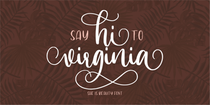 Hi Virginia handlettering font is a beauty & modern handlettering font. It's perfect for logo, invitation, stationery, wedding designs, social media posts, advertisements, product packaging, product designs, label, photography, watermark, crafting, special events or anything. This font include : Hi Virginia OTF, Standar Ligatures, Stylistic Sets, and also Multilingual support. Very simple installation PUA Encoded open Very great for branding, logotype, handletteing, invitations, or fashion branding. Multilingual Support Support for Adobe Illustrator, Corel Draw, Indesign, Adobe Photoshop or Procreate 4.3 (Updated) Support for MAC or WINDOWS
 - Apple Pie by FontMesa,
$25.00 You might call this a Bodoni Ornate font that Bodoni never made, close examination of this old 1800s font and it's plain to see that the top half of the letters is very Bodoni in appearance. Apple Pie is a revival of and old font from the William Hagar Type Foundry, which I've been able to date back to 1850. The William Hagar type specimen book from the 1850s only shows this font as a caps only typeface plus numbers, later in 1869 MacKellar Smiths and Jordan offered this font with a lowercase. Over a two year period I was able to collect enough letters to begin production of this old decorative font, the type specimen books only showed a small line of text for this font so I would search through old documents on eBay and also shows relating to Ephemera. I could have easily developed a new font based on a very small sample of letters but I wanted to wait and find as many letters as possible, I was unable to find the Q, X, Z and ten lowercase letters so those missing letters are of my own design. New to this font is the addition of an all Caps Greek character set, accented letters for Eastern Central and Western European countries is also within this font. Fill fonts are available for the Apple Pie font, you will need an application that works in layers such as Adobe Photoshop, Adobe Illustrator or Corel Graphics in order to use the Fill fonts. Some Fill fonts may be used as stand alone fonts but the versions for Apple Pie look best when layered behind the parent or main Apple Pie fonts. Be sure to check out the left and right hands located on the Less Than and Greater Than keys.
 - Provan by Matteson Typographics,
$19.95 Provan is a contemporary humanist sans serif with roots in calligraphy and incised letters. These timeless inspirations result in a typeface family that transcends fashion and adds a strong sense of authenticity to brands. The regular version of Provan has angled stem endings and oblique stress in curved shapes which add to its friendly and legible warmth. Provan Formal straightens these stroke endings to bring a more refined alignment of letters. The typefaces include swash capitals, small capitals, old style figures and special Celtic capital variants. The Inline version of Provan is useful for drop capitals, book covers and posters. Provan bucks the ubiquitous neutrality of geometric typefaces and exudes a sense of humanity, craftsmanship and warmth.
 - Provan Formal by Matteson Typographics,
$19.95 Provan is a contemporary humanist sans serif with roots in calligraphy and incised letters. These timeless inspirations result in a typeface family that transcends fashion and adds a strong sense of authenticity to brands. The regular version of Provan has angled stem endings and oblique stress in curved shapes which add to its friendly and legible warmth. Provan Formal straightens these stroke endings to bring a more refined alignment of letters. The typefaces include swash capitals, small capitals, old style figures and special Celtic capital variants. The Inline version of Provan is useful for drop capitals, book covers and posters. Provan bucks the ubiquitous neutrality of geometric typefaces and exudes a sense of humanity, craftsmanship and warmth.
 - Contigo Vintage by Resistenza,
$29.00 This new brushy script screams Summer! Make any layout look refreshing with Contigo Vintage. Designed with pointed brush and indian ink, this script has a lot of contrast thanks to 'pressure and release' technique. Perfect for food and restauration industry, packaging, illustration, greeting cards...
 - Filthy Creation by Wing's Art Studio,
$9.00 Filthy Creation; An Outrageously Cartoonish Slime Font - Barf Bag Optional! Creeping off my ink-drenched drawing board, these illustrated slime fonts offer designers a unique set of diabolical tools for use in their gruesome creations. The five hand-drawn font styles are reminiscent of the best in vintage horror comics, 80s trading cards, gross-out movies, paperbacks and Saturday morning cartoons. Each style comes with uppercase and lowercase characters, plus numerals, punctuation, language support and symbols. Added to this is a complete set of alternatives (no need to repeat those oo’s, tt’s and ee’s) and an extra collection of grotesque illustrations that’ll leave you reaching for the barf bag! When you need the most gory, disgusting and slimy looking titles, look no further than this Filthy Creation.
 - Liquid Embrace by Hanoded,
$15.00 Liquid Embrace is a rough 'n' ready brush font. It was created using a Chinese calligraphy brush and Royal Blue Ink (I had run out of black...). Liquid Embrace is fat and in your face, making your message stand out all the more. Comes with an ocean of diacritics.
 - Basuto by Red Rooster Collection,
$45.00 Basuto is a sans serif typeface that is characterized by its unusual shapes in the counters. It was originally created in 1927 by Stephenson Blake. After International TypeFounders, Inc. acquired exclusive rights to the Stephenson Blake Collection, Paul Hickson (P&P Hickson) and Steve Jackaman (ITF) created a digital revival in 1997. Basuto is an unusual yet highly legible typeface with upturned counters and crossbars. It brings a fresh, quirky feel to any project.
 - Conquera by Device,
$39.00 Conquera is an extended caps-only font in five weights plus an inline. It is refined and masculine without being heavy-handed - the angled stokes and pointed vertices lend it a stylish, upmarket Moderne poise. Suitable for man's grooming products, supercar showroom brochures, high-end developments, space vehicles and home technology. Letterspacing at small sizes adds extra sophistication. Includes an alternative A with a triangular crossbar and full international character set.
 - Arp by W Type Foundry,
$35.00 Arp is a neo-grotesk type system exploring the relations between contrast, functionality, and graphic character in one family. This typography comes in 5 different weights including fine strokes with inverted contrast (20), a sharp sans serif (80), and a high contrast heavyweight (240). Moreover, its design is formed by short ascenders and descenders aiming higher legibility, ink traps for display-functional purposes, and includes a wide range of icons, arrows, and symbols which allow creating consistent compositions in digital and print designs. All styles of 640 characters include a display weight with geometric and glyphic style alternates, which expand the proprieties and versatility of the system.