10,000 search results
(0.049 seconds)
- JICAMA - Unknown license

- peach sundress ~ - 100% free

- Child's Play - Unknown license

- Squeeze Me Baby! - 100% free

- Dr.Enoksen - Unknown license

- Quintus LeadedGlass - Unknown license

- Simple Melody - Unknown license

- La Rosa Muerta - Unknown license

- WALLRIDER - Personal use only

- Kylo Sans by The Northern Block,
$29.95 Kylo Sans is a carefully blended typeface, one-part humanist, one-part grotesque and a small dose of geometric. It takes the essence of three distinct forms to create a unique, readable typeface with an exact and understated personality. Additionally, the design process includes a hand-eye adjustment to three master weights, giving a greater range of usability across text layouts. Kylo Sans remastered to version 2.0 for improved OpenType features and usability. Details include six weights and italics, over 700 characters with alternative lowercase Q, a, g, l and y. Open type features include six variations of numerals, small caps, ligatures, and language support covering Western, South and Central Europe.
 - Leapfrog by Shapovalov Fonts,
$24.00 Leapfrog is a friendly and restless cursive font with no baseline containing 3 glyph variations per character. Each variant of the glyph is slightly different and is replaced randomly as you type, giving the impression of a unique handwriting. The font is suitable for logos, large headlines, posters, signs, children's books and comics. Its character is cheerful, kind and playful due to the random set and rounded stroke endings. Leapfrog contains extended latin, cyrillic, ligatures, peace sign and frog, the total number of characters is 1902. It contains OpenType functions: liga, numr, dnom, calt, ss01, ss02. The font is also case sensitive, has fractions, currency signs, and arrows.
 - Rig Sans by Jamie Clarke Type,
$25.00 Rig Sans is a streamlined geometric typeface, that speaks in a confident, affable tone. Its open, clean structure lends text a neutral, transparent quality. Distinct features enable Rig Sans to thrive, both in print and on screen: Minimalist Design Terminals clipped at 90º Generous x-height Wide apertures Distinct I,l,1 (uppercase i, lowercase L, Number 1) Rig Sans’ sturdy characters produce text settings with excellent clarity and readability. Their shape has been adapted from robust letterforms originally designed to withstand 3D distortions. This unique approach has resulted in an original sans serif rendition and an adaptive, durable type family. Rig Sans is comprised of eight weights and accompanying italics. Each weight contains 514 glyphs. OpenType features include: Alternate characters Three figure styles All caps punctuation Fractions Ordinals Superscript Subscript
 - Panhandler by SparkyType,
$19.00With a hand-inked look, Panhandler flows like decorative but unfussy cursive writing. The font has automatically substituting glyphs and ligatures to avoid some of the problems other connnecting scripts encounter. It also includes a set of swash capital letters and a decorative swash ending lowercase set. Panhandler is available in the OpenType format (both flavours) and will work with on all standard platforms and software. Advanced features will require OpenType compatible software. - Kostic Serif by Kostic,
$50.00 Kostic Serif is a classic transitional typeface (like Baskerville, Bookman, Caslon, Times) with tall, clean characters and a large glyph set to support all European languages - Greek and Cyrillic script included. Excellent for setting multiple pages of text and packed with OpenType features (proportional lining and oldstyle numbers, tabular figures, superscript and subscript, numerator and denominator figures, fractions and 31 ligature in 659 characters), it should meet the demands of even the most demanding typographic works. Kostic Serif is made with fairly large x-height, so the text is legible in very small sizes. Zoran began the work on Kostic Serif around 2002 and after completing Regular, Bold and matching italics, he wasn’t too pleased with the design, so he dropped further work on it to make other fonts. In 2010 Nikola came upon unfinished files for Kostic Serif, and decided to redesign the letters, while retaining basic proportions and widths that Zoran established earlier. When they were both pleased with the new look of the font, they made Medium and decided to add CE and Greek script to the glyph set, to make it pan-european.
 - Beni by Nois,
$18.00 Beni is a bold & strong sans serif font family beautifully crafted to perform in short headlines in posters or contemporary interface design. Each character has been optically adjusted for maximum effect in the space between; as such, this is a strong contender for movie posters, titling, album artwork, and any design project that needs a clean sans serif that makes an impact wherever it is applied. This type family is available in four unique weights that stand well apart from one another in visual style. Beni Light is the runway model of the family, standing with a narrow posture and towering height. It’s a fantastic choice for conveying a message in a limited horizontal space. Beni Regular and Beni Bold are shorter in stature but both pack a punch, carrying bold strokes that speak with confidence and offer great legibility. The heaviest of the heavy, Beni Black is the super-bold, go-to type design for projects that need an impossibly strong type design at the helm. Beni extends multilingual support to Basic Latin, Western European, Euro, Catalan, Baltic, Turkish, Central European, Pan African Latin, Igbo Onwu, and Basic Greek for design projects intended for an international audience.
 - Monotype Italian Old Style by Monotype,
$41.99Italian Old Style™ was designed by Frederic W. Goudy for the Lanston Monotype Company in the USA. Goudy was asked by Monotype to copy Cloister Oldstyle, a successful font that belonged to a competing foundry (it was designed by Morris Fuller Benton, see Cloister Open Face). Goudy refused on grounds of ethics, and instead talked Monotype into producing a new face. This he based freely on fifteenth century Venetian types, which were the same historical models used by Benton for Cloister and later by Bruce Rogers for Centaur. Goudy's result was Italian Old Style, released by Monotype in 1924, and considered by many to be one of Goudy's best fonts for book typography." - Gitchhand by Monotype,
$29.99By day, Ken Gitschier is one of Monotype Imaging's in-house type designers, busy creating fonts for on-screen typography - a demanding undertaking that requires meticulously editing fonts on a pixel-by-pixel basis. His tools are Fontographer software, a Wacom digital tablet, a high-resolution monitor and a keen understanding of typographic forms. But by night, Gitschier uses the same tools to indulge his passion for experimental typeface designs. GitchHand is one of Gitschier's nocturnal projects. The design has an almost painterly quality. Depth, texture and even a sense of color are found in the lettershapes. Edgy, iconoclastic, and not for the typographically faint of heart, GitchHand makes a strong visual statement. - Cocogoose Pro Narrows by Zetafonts,
$39.00 Cocogoose Pro Narrows has been completely re-engineered in 2020 to include extra features and technologies. A darkmode weight range has been added to the whole family, to keep consistency of effect when the typeface is used in reverse on the web and in dark mode interfaces. Also, a new Ultra Compressed subfamily has been developed for display usage. Designed by Cosimo Lorenzo Pancini in 2013, Cocogoose was first expanded in 2015 with the help of Francesco Canovaro who co-designed the decorative display weights and Andrea Tartarelli who developed the condensed widths. In 2020 a full redesign of the typeface has been published: Cocogoose Pro now includes new widths, weights, open type features and characters, thanks to the help of Mario De Libero. Influenced by vernacular sign-painting and modernist ideals, Cocogoose is drawn on a classic geometric sans skeleton, softened by rounded corners and slight visual corrections. Its very low contrast, dark colour and tall x-height make it a solid choice for all designers looking for a powerful display typeface for logos, headings and vintage-inspired branding. The tall x-height makes texts set in Cocogoose very readable even at small sizes, while the bold regular weight allows for maximum impact when used as a branding, signage or decorative typeface. Cocogoose Pro was designed as a highly reliable tool for design problem solving, and given all the features a graphic designer needs, starting from its wide range of widths and weights. Its 2000+ latin, cyrillic and greek characters make sure it covers over 200 languages worldwide, while its comprehensive set of open type features allows faultless typesetting thanks to small capitals, positional numbers & case sensitive forms. A wide range of alternate letterforms, developed along nine different stylistic sets, gives you an extra level of design fine-tuning. The layerable and colour-ready display variants include inline, outline, shadow and a letterpress version that can simulate the effect of old print, also thanks to programmed randomization of its letters.
 - Glorial by Runsell Type,
$17.00 Introducing Glorial - An Elegant Script Font The handwritten calligraphy script works perfectly for classy designs. Glorial Script includes a full set of uppercase & lowercase letters with beginning swashes , a full set of lowercase letters with ending swashes, a full set of contextual alternates lowercase letters , 50+ ligatures features that makes the font look more natural. Glorial fonts that special for fashion and matches applies in some designs such as the logotype, brand, magazine, website or blog headlines, packaging, branding, quotes, invitation cards, greeting cards, business cards, and wedding more. Glorial is coded with PUA Unicode, which allows full access to all the extra characters without having special designing software. Mac users can use Font Book, and Windows users can use Character Map to view and copy any of the extra characters to paste into your favorite text editor/app. Glorial Includes: - 50+ Ligatures, Contextual alternates, Stylistic alternates, and Swash - Uppercase, lowercase, numeral, punctuation and symbol - .OTF format files - PUA Encoded Characters - Fully accessible without additional design software - Multilingual support for English, French, Italian, Spanish, Portuguese, German, Swedish, Norwegian, Danish, Dutch, Finnish, Indonesian, Malay, Hungarian, Polish, Croatian, Turkish, Romanian, Czech, Latvian, Lithuanian, Slovak, Slovenian How to get access alternate glyphs with designing software to open type fonts check this link : http: //adobe.ly/1m1fn4Y If you have any question please do not hesitate to contact me. Happy creating!
 - Tepuy by John Moore Type Foundry,
$20.00 Tepuy is the name given to the ancient plateau-shaped mountains that abound in the Venezuelan Amazon. Tepuy is a display typeface inspired by the symbolic forms of the Venezuelan ethnic roots. It is constructed based on a very precise geometry of open forms that produce a double letter in form and counterform. Tepuy originates as an evolution curve of my Font Makiritare rectilinearly. Was devised for a book of photographs of the ancient mountains of the Venezuelan Amazon, its form and Makiritare are morphologically inspired crafts in the ethnic groups of the region. Tepuy is held in a very precise geometric construction based on rounded forms, each letter is a form envelope enclosing another in counterform, is a letter to display. Tepuy comes in four versions Regular, Light and thin, and there is a double line version enclosed. Tepuy recommended for creative headlines for the label and packaging design aimed at all ages.
 - FS Olivia Paneuropean by Fontsmith,
$90.00Antwerp On a visit to Belgium and the Netherlands while still an MA student at Reading University, Eleni Beveratou made some important discoveries. First, there was the letter ‘g’ from the Didot family seen at Plantin Moretus Museum in Antwerp, which seemed “almost like a mistake”. Then there were strange details such as the serifs on the “l”, “h”, “k”, “b” and “d” in Egmont Cursive and other typefaces by Sjoerk Hendrik de Roos, found in volumes of poetry she picked up from a chaotic bookshop in Amsterdam. These were characters that stood out from the text but seemed to blend harmoniously with the rest of the letters. “And there it was, the spark. I decided to design a typeface that would capture the details of the process of writing.” A guiding hand Eleni shared her initial thoughts with Phil Garnham and Jason Smith. They liked what they saw in her tentative first sketches, and gave her the chance to develop her ideas further. Phil, in particular, provided valuable input as FS Olivia took shape. Eleni’s main influence – the handwritten – would give the font its character. “When creating a typeface,” says Eleni, “it’s fair to say that it reflects some of the designer’s personality. And that’s certainly the case with FS Olivia. “Although technology is part of my everyday life. I am a great admirer of traditional graphic design where you can touch and feel paper and ink.” Irregular “What I particularly like,” says Eleni, “is that a printed item can develop its own personality sometimes as a result of imperfections in the print. “FS Olivia has some of these characteristics as it’s inspired by handwriting, and yet it also includes some very modern features.” Feminine and fascinating, FS Olivia captures the expressive twists and turns of (the poet’s?) pen on paper, with low junctions, deep top serifs and semi-rounded edges. Round outstrokes contrast with the rough corners of the instroke, while strong diagonals and inclined serifs create a richly textured pattern. Polytonic It’s only fitting that there should be a version of this poetic font for one of the birthplaces of poetry and song. Eleni, who hails from Athens, developed an extensive range of glyphs that could be used for the Greek language, in both modern and ancient texts. For the latter, there is a version of Olivia for displaying polytonic Greek (a system that utilises a range of accents and “breathings”), which brings the 21st century technology of OpenType to the presentation of poetic texts from Ancient Greece. Just think what Homer could have done with that. - FS Olivia by Fontsmith,
$70.00 Antwerp On a visit to Belgium and the Netherlands while still an MA student at Reading University, Eleni Beveratou made some important discoveries. First, there was the letter ‘g’ from the Didot family seen at Plantin Moretus Museum in Antwerp, which seemed “almost like a mistake”. Then there were strange details such as the serifs on the “l”, “h”, “k”, “b” and “d” in Egmont Cursive and other typefaces by Sjoerk Hendrik de Roos, found in volumes of poetry she picked up from a chaotic bookshop in Amsterdam. These were characters that stood out from the text but seemed to blend harmoniously with the rest of the letters. “And there it was, the spark. I decided to design a typeface that would capture the details of the process of writing.” A guiding hand Eleni shared her initial thoughts with Phil Garnham and Jason Smith. They liked what they saw in her tentative first sketches, and gave her the chance to develop her ideas further. Phil, in particular, provided valuable input as FS Olivia took shape. Eleni’s main influence – the handwritten – would give the font its character. “When creating a typeface,” says Eleni, “it’s fair to say that it reflects some of the designer’s personality. And that’s certainly the case with FS Olivia. “Although technology is part of my everyday life. I am a great admirer of traditional graphic design where you can touch and feel paper and ink.” Irregular “What I particularly like,” says Eleni, “is that a printed item can develop its own personality sometimes as a result of imperfections in the print. “FS Olivia has some of these characteristics as it’s inspired by handwriting, and yet it also includes some very modern features.” Feminine and fascinating, FS Olivia captures the expressive twists and turns of (the poet’s?) pen on paper, with low junctions, deep top serifs and semi-rounded edges. Round outstrokes contrast with the rough corners of the instroke, while strong diagonals and inclined serifs create a richly textured pattern. Polytonic It’s only fitting that there should be a version of this poetic font for one of the birthplaces of poetry and song. Eleni, who hails from Athens, developed an extensive range of glyphs that could be used for the Greek language, in both modern and ancient texts. For the latter, there is a version of Olivia for displaying polytonic Greek (a system that utilises a range of accents and “breathings”), which brings the 21st century technology of OpenType to the presentation of poetic texts from Ancient Greece. Just think what Homer could have done with that.
 - Gradl Initialen ML by HiH,
$12.00 Max Joseph Gradl designed Art Nouveau jewelry in Germany. At least some of his designs were produced by Theodor Fahrner of Pforzheim, Germany -- one of the leading manufacturers of fine art jewelry on the Continent from 1855 to 1979. I don't know if he designed for Fahrner exclusively, but every example I found was produced by that firm. I assume it was also the same M.J, who edited a book, Authentic Art Nouveau Stained Glass which was reissued by Dover and is still available. For an artist as accomplished as Gradl was, he is very tough to research. There just does not seem to have been much written about him. The jeweler is visible in most of his typeface designs. They exhibit a sculptural quality as if they were modeled in clay (or gold) rather than drawn on paper. His monograms, especially, reflect that quality. Those shown in plates 112 through 116 in Petzendorfer actually appear to have been designed specifically for fabricating in the form of gold or silver pendents. Of the initial letters that came out of Germany during this period, these by Gradl seem unusually open and lyrical. They seem to be dancing on the page, rather than sitting. Please note that Gradl designed only the decorated initials. All other characters supplied were extrapolated by HiH, including the accented initials. Orn.1 (unicode E004) is based on a jeweled gold clasp designed by Gradl (please check out Gallery Image on Myfonts.com). Also included are an art nouveau girl’s face, a swan and the face from Munch’s “Scream”, from scans of old printer’s ornaments. Gradl Initialen M represents a major extension of the original release, with the following changes: 1. Added glyphs for the 1250 Central Europe, the 1252 Turkish and the 1257 Baltic Code Pages. Added glyphs to complete standard 1252 Western Europe Code Page. Special glyphs relocated and assigned Unicode codepoints, some in Private Use area. Total of 341 glyphs. Both upper & lower case provided with appropriate accents. 2. 558 Kerning Pairs. 3. Added OpenType GSUB layout features: salt, dlig, ornm and kern. 4. Revised vertical metrics for improved cross-platform line spacing. 5. Refined various glyph outlines. 6. Alternative characters: 16 upper case letters (with gaps in surrounding decorations for accents above letter). 8. Four Ornaments: face1, face2, swan and orn1 (silhouette of Gradl clasp) The zip package includes two versions of the font at no extra charge. There is an OTF version which is in Open PS (Post Script Type 1) format and a TTF version which is in Open TT (True Type)format. Use whichever works best for your applications.
 - ITC Hedera by ITC,
$29.99ITC Hedera's roots can be traced to a suite of initials intended for book design. Olivera Stojadinovic, the face's designer, made the first sketches for the initials with a handmade tool consisting of two flexible metal strips tied to a wooden handle. This makeshift pen created the distinctive uneven double strokes of the letterforms. Stojadinovic says that she tried to keep the original flavor of the sketches in the finished font. Stroke roughness has been preserved in final execution, though the characters had some cleaning and polishing," she notes. Based on Renaissance letterforms, ITC Hedera has a classical quality that complements its calligraphic exuberance. The name Hedera? According to Stojadinovic, "It's the name of a common ivy. I chose it because of the organic image of the character strokes, which, to me, resemble shapes from nature's leaves or stems of plants." Rough-hewn yet elegant, ITC Hedera is an exceptional display design." - Cyan Neue by Wilton Foundry,
$29.00 Cyan Neue is a substantial update variation to the original Cyan we launched in 2006. Most notably the contrast has decreased making it more contemporary. Many glyphs have been improved especially in the italics. The design of Cyan Neue was inspired by features found in classic Roman. It shows a preference for geometric Roman proportions while incorporating open centers (B,P,R) and compact serifs. The characters stay true to the same features as the capitals, resulting in an unusually distinctive style. There are many subtle details in Cyan Neue that become more interesting in display sizes, for instance the subtle curves in the serifs and the overall smoothness. Cyan Neue is a robust font that will exceed your expectations. Cyan Neue is clearly ideal for headlines, inscriptions, publications, annual reports, corporate identities, packaging.
 - Medina Gothic by Design is Culture,
$39.00 Medina Gothic is a three-weight sans serif inspired by Latin American moderne. It was designed in response to the 2002, Altos de Chavon design conference in The Dominican Republic, which celebrated utilitarian driven gestures in graphic design. "There’s a rigor to Medina Gothic that takes care of all sorts of tenets of a hard-working, highly legible, objective font. But at the same time, it’s human. All the curved terminals and open counter forms make for a sort of kindness. For all the discipline, it doesn’t sacrifice its friendliness." – William Morrisey, Professor of Typography, Parsons The New School for Design.
 - Girasol by Lián Types,
$35.00 This is a cute story about a mother and her son. :) About a decade ago my own mother got very interested in my work. She used to say my letters had so many swirls and dazzling swashes, and suggested my job seemed to be very fun. She wondered if she could ever try to make her own alphabet... Well, she is a civil engineer and a maths teacher, and appeared to be a little tired of exact sciences... I remember answering this, while she was listening with her typical tender look: -"Mamá... While type-design may be a really enjoyable thing to do, it also involves having a great eye and knowledge about the history of letters: nice curves and shapes require a meticulous study and, like it happens in many fields, practice makes perfect"-. Well, she raised her eyebrows at me. -"and so what?"- She didn't have any experience neither in the field of art nor in the field of graphic design so, I told her that if she really wanted to get into this she should borrow some of my calligraphic books from my beloved shelves in my office. So... she did. Some weeks after that, she came to me with many sketches made with pencils and markers: some letters where very nice and unique while others naturally needed some work. I remember she added ball terminals to all of her letters (even if they didn't need them) because that was one of the rules she imposed. After some back and forth, we had the basis for what would be today, ten years later, the seed of this lovely font Girasol. Her proposal was nice, something I was not accustomed to do, that’s why many years later I decided to watch it with fresh new eyes and finished it. While she was in charge of making the lowercase letters, I helped with the uppercase and also added my hallmark in the alternates, already seen in others of my expressive fonts. The result is an upright decorative font that follows the behavior of the copperplate nib with a naive touch that makes it really cute and useful for a wide range of products. Many alternates per glyph make Girasol a very fun to use font which will delight you. Above posters are a proof of that! This font is a gift for my mother, Susana, who, in spite of her exacts academic background, taught me that beauty can also be found in the imperfect. 1 NOTES (1) In my fonts I'm always in seek of the perfect curve. When I designed Erotica and Dream Script, I read about Fibonacci’s spirals!
 - Lemon Squish by Mans Greback,
$59.00 Lemon Squish is a fun and funky sans-serif font that is perfect for adding a touch of humor and whimsy to any design. This font is inspired by the 70s hippie culture and has a retro feel that is reminiscent of comic books and graffiti. Lemon Squish comes in ten different styles, including Bold, Bold Italic, Italic, Light, Light Italic, Regular, and four Outline variations. These various styles provide versatility and allow you to create dynamic and eye-catching designs. The playful and lighthearted nature of Lemon Squish makes it ideal for anything from branding and logos to social media posts and advertisements. Its fun and quirky design will add a touch of humor and personality to your projects and bring a smile to your audience's face. The font is built with advanced OpenType functionality and has a guaranteed top-notch quality, containing stylistic and contextual alternates, ligatures and more features; all to give you full control and customizability. It has extensive lingual support, covering all Latin-based languages, from Northern Europe to South Africa, from America to South-East Asia. It contains all characters and symbols you'll ever need, including all punctuation and numbers.
 - Automobile Contest by Asd Studio,
$15.00 Introducing the new font Automobile Contest - Handbrush, the new version of Qillsey Einstein Font, a type of script that has a natural scratch texture. I made by using a brush pen that makes the impression seem natural. My font is complete with two StylisticSet which will make the writing more beautiful and charming. This typeface is suitable for use in a variety of design fields, such as event advertisements, product promotions, book titles, activity titles, logos, adventure, and others. This font can when paired with serif font types will make your design project more beautiful and perfect. I highly recommend using a program that supports OpenType featuresand Glyphs panels such as Adobe Illustrator, Adobe Photoshop CC, Adobe InDesign, or CorelDraw, so you can see and access all Glyph variations. This font is encoded with Unicode PUA, which allows full access toall additional characters without having special design software. Mac users can use Font Book, and Windows users can use Character Map to view and copy one of the extra characters to paste into your favorite text editor / application. I hope you enjoy the font, thank you.
 - Castile by Eyad Al-Samman,
$3.00 Castile is a central region of Spain that formed the core of the Kingdom of Castile, under which Spain was united in the 15th and 16th centuries. "Castile" is a Kufic modern Arabic typeface. It is suitable for books' covers, advertisement light boards, and titles in magazines and newspapers. It is very distinctive when used in black and white printout. It decorates colored pages and makes artworks more attractive. This font comes in three different weights. I adore Spain and the historical achievements of the Islamic civilization existed there in the past. By designing "Castile" Typeface, I wanted to refer to the Islamic civilization that Muslims had in Spain and especially in Andalusia. Today the name of Castile survives in two autonomous regions of Spain: Castile-La Mancha (capital city is Toledo) and Castile-Leon (capital city is Valladolid). The main characteristic of "Castile" Typeface is in its modern open-end style for some of its Arabic characters such as "Sad", "Dad", "Seen", "Sheen", "Qaf", "Faa", "Yaa" and others. The shape of the characters' "dot", "dots", and "point" is innovative; a triangle with a semi-circle shape. "Castile" Typeface is suitable for books' covers, advertisement light boards, and titles in magazines and newspapers. Its charactersí modern Kufic styles give the typeface more distinction when it is used also in posters, greeting cards, covers, exhibitionsí signboards and external or internal walls of malls or metroís exits and entrances. It can also be used in titles for Arabic news and advertisements appeared in different Arabic and foreign satellite channels.
 - Dixplay by Emtype Foundry,
$69.00 Dixplay, a typeface based on a pixel grid, is available in two weights: regular and black. Inspired by video game aesthetics of the 80s, was originally intended for display applications, but it works fine on paper as well. The font has been conceived in 20 px size allowing more freedom to manipulate it and making a big difference with other fonts of its kind, this difference it’s more evident in Dixplay Black. As a result, it’s optimized for screen use at 20 px and its multiples. Spacing is one of the most outstanding aspects of Dixplay. While pixel fonts doesn't have kerning pairs, Dixplay offers more than 300 manually done that fit perfectly to the grid. It is available in Open Type format and supports Western European Languages that uses the Latin alphabet. For more details see the PDF.
 - Castelan Hispane by Ixipcalli,
$35.00 La tipografía Castelan Hispane es una tipografía inspirada en documentos y textos antiguos históricos españoles del siglo XVI. Los trazos semi-medievales - cursivos, le dan una apariencia antigua pero también moderna para los proyectos en los que se desee utilizar la tipografía. Cuenta con seis estilos y tres pesos, ligera, regular y negrita. Cada peso contiene también su forma “itálica”. The Castelan Hispane typeface is a typeface inspired by ancient Spanish historical documents and texts from the 16th century. The semi-medieval - cursive strokes give it an ancient but also modern appearance for projects in which you want to use typography. It has six styles and three weights, light, regular and bold. Each weight also contains its “italic” form.
 - Klainy by Identity Letters,
$29.00 An unadorned Grotesque with a refreshingly personal touch. If “Grotesque” mainly means “industrial, mechanical, anonymous typeface” to you, Klainy might redefine your image of the genre. Yes, it’s a Grotesque—but with a contemporary look and a lot of personality. Klainy’s apertures are more closed at the top and more open at the bottom, creating an informal rhythm that sets Klainy apart: a confident, optimistic voice with a clean appearance. Terminals are subtly back-bent: these quaint “hooks” make Klainy a bit more personal, a bit friendlier. (You can find them in the a, c, f, and r.) Just like its old-style Grotesque ancestors, Klainy is optimized for display sizes and short texts. There, its unobtrusive quirks can be wholly appreciated. However, the familiar Grotesque appearance makes sure that the typeface is comfortable to read in smaller sizes, as well. Use Klainy whenever a basically classic sans-serif typeface with a modern and individual twist is called for. This font family comes in eight weights ranging from Thin to Black, each with a matching italic style. More than 500 glyphs and a bunch of Open Type Features make it a reliable companion for all of your projects. You can fine-tune the flavor of Klainy with Stylistic Alternates such as a one-story a and a two-story g. Their simple construction blends perfectly with the design concept of this typeface. Klainy is a seasoned blue-collar worker that surprises you with wit and team spirit. It’ll be a great addition to your font library.
 - Beef'd - 100% free

- Shrag Script by Open Window,
$- Shrag script is a brand new script from Open Window. It is finer than the model that won 35,00 friends. Originating from a fat marker drawing it's a comfortable font, fine performing in every minor detail. It is the embodiment of everything a fine handwritten script should be.
 - Toma Sans by JAM Type Design,
$- Toma Sans is a sans serif type family of seven weights plus matching italics. Influenced by the geometric-style sans serif faces that were popular during the 1920s and 30s, the fonts are based on geometric forms that have been optically corrected for better legibility. Toma Sans has a functional look with a friendly open touch. While the ExtraLight and the black weights are great performers in display sizes the light, regular and medium weights are well suited to longer texts. The small x-height and the restrained forms lend it a distinctive elegance. The typeface has an extended character set to support most European languages.
 - Mg Dalenaf by NJ Studio,
$19.00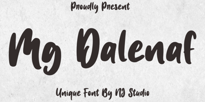 Hi...Thank for your visit :) Mg Dalenaf a unique font. It features unique characters that will take your projects to the next level! This font is PUA code which means you can easily access all the glyphs and swashes that are full of love! It also features many special features including glyphs. font designs that are made for various vector designs, printing such as digital wedding blogs, online shops, social media, while printing can be used in the field of product clothing, accessories, bags, pins, logos, business cards, watermarks and many others ... so it can make your product look cute and attractive, and also Multilingual support!!! Happy design ...
 - Havel by T4 Foundry,
$39.00Havel is an updated interpretation of a Czech type design from the 1930s. It is powerful and very condensed. At a quick glance you might find kinship with other condensed typefaces of the same period, like Spire (Sol Hess, 1937), Onyx (Gerry Powell for ATF, 1937) or Quirinus Bold (Alessandro Butti, 1939). But Havel has its very own look, rooted in the rapidly disappearing "Eastern European Type", a typographical tradition where poster and packaging design were the highlights. Torbjörn Olsson has revived this classical Czech beauty, and the Open Type version, Havel Pro, can also be used for Czech, Hungarian, Polish, Estonian, Latvian and Lithuanian. - Rustick by Thinkdust,
$10.00 Are you hungry for a font design that will blow you away? Do you want to invoke the rustic smell of wood smoke, the mouth-watering thought of antipasti, olive-oil, open French doors in the summer? Well before you book your ticket to Rome, check out the new font from Thinkdust, Rustick. Four weights (and italics) of indulgent, home cooked comfort, warm, earthen and familial. Before making its point, Rustick gives you a cup of deep, rich coffee and double checks you're warm enough. Just one look will start your stomach rumbling. Ideal for food packaging and warm, homey branding, Rustick will never let you go home hungry.
 - Double Back by Comicraft,
$19.00 Great Scott, Marty! This font is your density, charged up to 1.21 gigawatts through the Power of Love! Originally created by Comicraft for the official BACK TO THE FUTURE fan club, Remastered DOUBLEBACK has been rebuilt from the ground up, with a new vertical “Curve” weight, six new “Parallel” weights, stylistic alternate letters AMNUWY, and language support for Western & Central Europe and Vietnamese. And if that weren't enough, we've traveled into the future and brought back Solid & Open Variable Fonts which provide precise control of Time and Warp! We cannot be held responsible for any ruptures in the space-time continuum due to use of these fonts. SPECIAL INTRO SALE: from October 21 through November 12, get DoubleBack at half price and we will donate $20.15 of each sale to the Michael J. Fox Foundation for Parkinson's Research. We love ya, Mike.


